5 easy ways to style a hutch, according to interior designers
For a picture-perfect display to suit any style
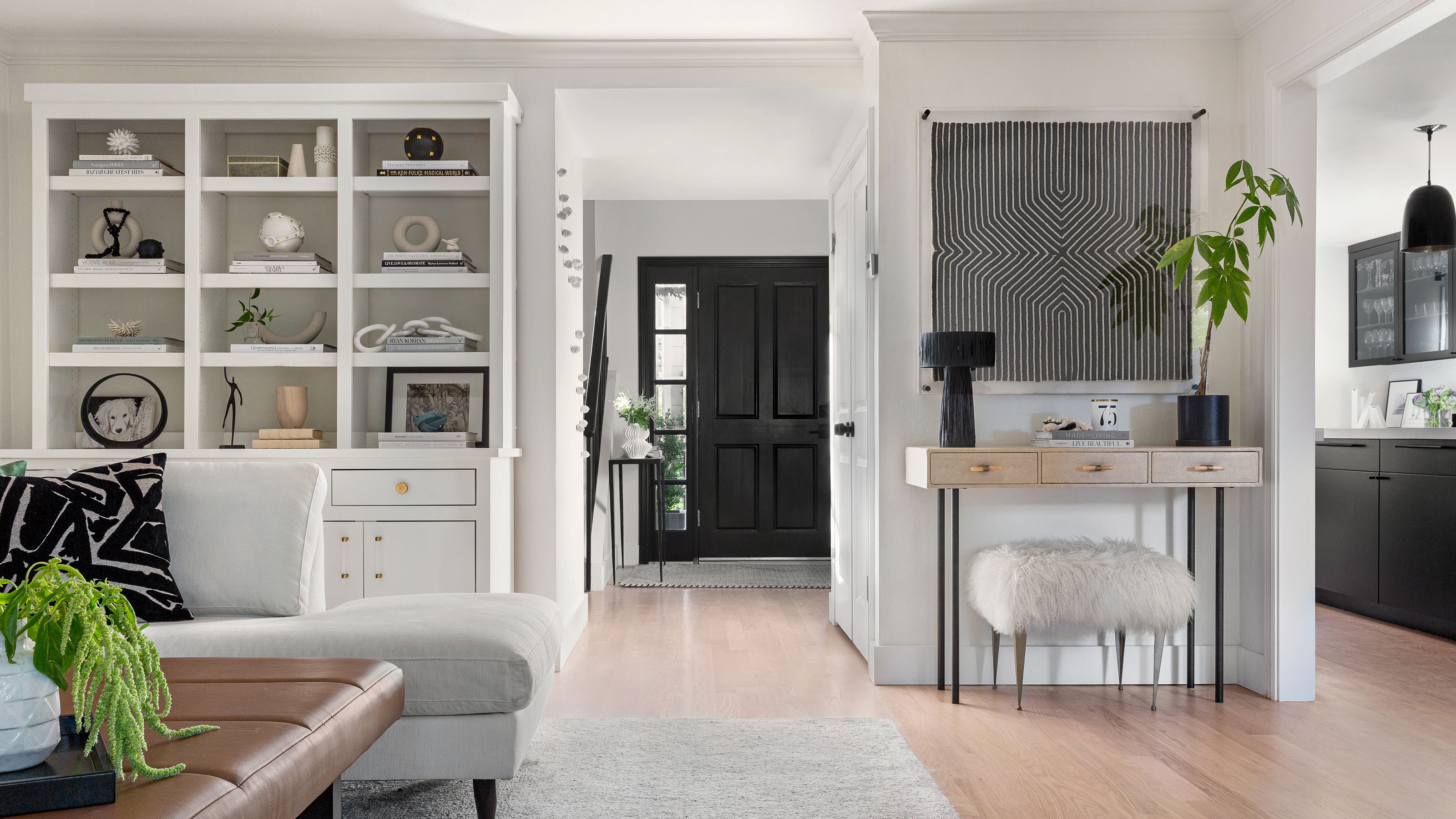

A hutch has a place in every home. Serving up most welcome dining room storage, all whilst defining a space. However, we should add here that this is only if you have styled your hutch the right way...
Since a hutch's design is often so unique and characterful, it is no wonder we neglect it. It looks so good as it is, the hutch does not need our help. When in fact, there is a high chance that you have not unleashed the full and beautiful potential of this dining room staple.
If yours is staring at you quite, dare we say, boringly, you will be pleased to know that we spoke to experts in the field. Let us leave the days of jumbled crockery displays behind, we all know we can do better.
How to style a hutch
First things first, how are you currently using your hutch? There is no need to hedge the truth here, just as when decluttering a hutch, you need to think realistically about how it is serving you and the space in the present. This way you can quickly identify the edits needed. There is little room for anything without purpose in a hutch, especially if it lives behind closed doors. This is how to approach styling your hutch for a picture-perfect display:
1. Consider first where the hutch lives
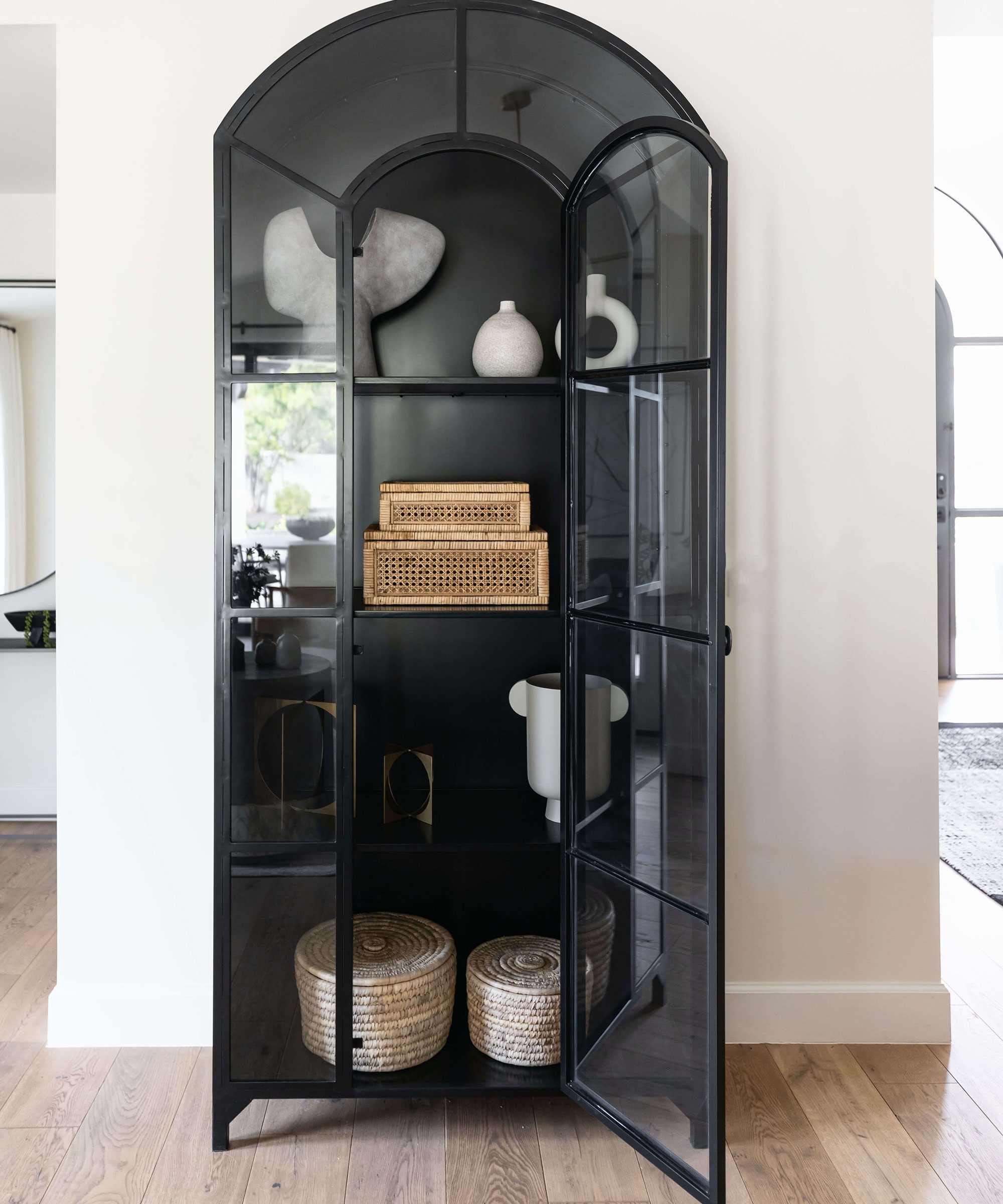
Though typically found in dining rooms, hutches often creep into our living room spaces, entryways, and even the bedroom to mimic the usual shelving or built-in cabinet. Therefore, choosing the location of your hutch is essential to consider before you start styling, as it will dictate what goes in it and help you decide what items should be visible, or stay hidden.
'There are many ways to style a hutch depending on where you are putting it,' says Design Principal, Kimberley Harrison. Take this hutch styled by Lauren Lerner, Principal Designer and Founder of Living with Lolo, it is beautifully curated and lends itself to its center-stage entryway position.
For example, a living room or entryway hutch could allow you to incorporate more (if not all) decorative pieces, that are not essential to the function of the space. Whereas in a dining room, prioritizing kitchenware that doubles as decor is encouraged – it goes with the territory.
The key is to look at your surrounding space and question the hutch's location to see if it is a match for its current home. If the routine in this space feels streamlined and quite nice, your hutch is doing some good. If dinner time, or using the space around the hutch feels disjointed and difficult, there is more design thought to tackle and it may be that you will need to declutter a specific room in the home to make room for items that do not belong in a hutch. You might need to relocate the hutch altogether, and it is best to do this from the start.
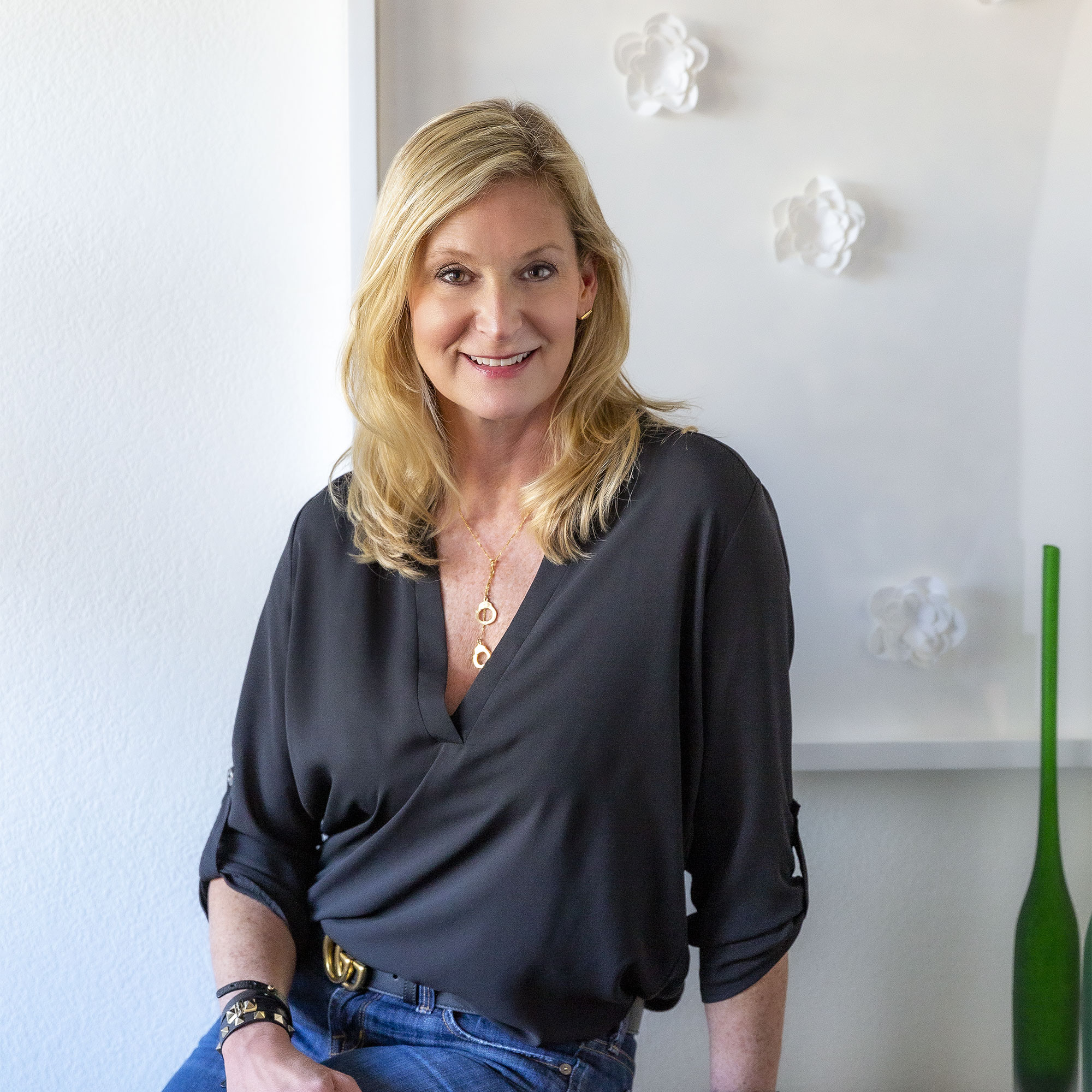
Intuitive, timeless, eclectic, and thoughtful, Principal Kimberley Harrison executes projects that are as varied as her clientele. Not one to apply a singular design vision to any of her projects, Kim draws direction and inspiration from her clients and how they live and want to feel in their environment.
Kim’s philosophy is simple: create custom spaces that are a reflection of her client's best self. Her design process begins with a deep dive to understand her client’s goals by looking closely at how they live, what they love, what matters most to them and creating spaces that speak to them.
2. Save the best for show and keep practical items hidden
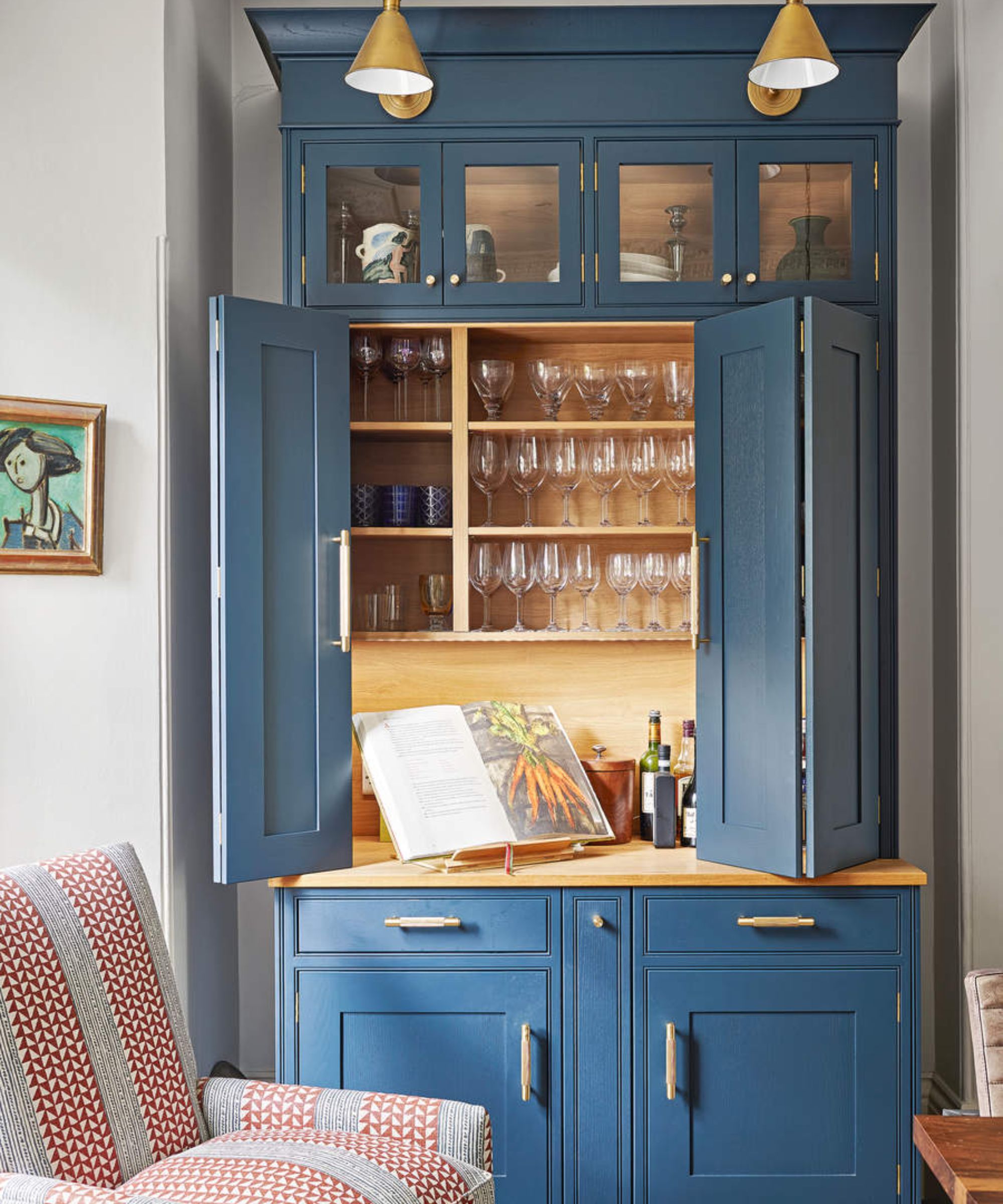
Decluttering a hutch will be a natural part of the styling process, especially when it comes to what you put forward for guests to see. Keeping your best-looking items in sight, and reserving anything less good-looking for behind closed doors is a wise move. 'If you are looking to style a modern piece in your living space, a mix of books and decorative items can enhance its overall appearance,' recommends Kimberley.
Much like when mixing storage and display in a living room, let 'design moments' reign and treat even glass-fronted arrangements with the same precision you would offer decorative shelving.
Typically, you might find small appliances, mismatched crockery, and bulkier items that will not add the right intrigue below.
'If your hutch is being used for tableware and dinnerware, storing your dishes in bags can be a practical way to protect them and maximize space,' recommends Kimberley. We found these China storage bags on Amazon which look like they would do the trick to protect and store crockery.
'By stacking the bags, you can efficiently utilize the available storage area. As for styling the open shelves on top, I would recommend displaying more decorative pieces such as teacups, mugs, small bowls, vases, or items that add visual interest.'
3. Play with levels and visual weight for interest
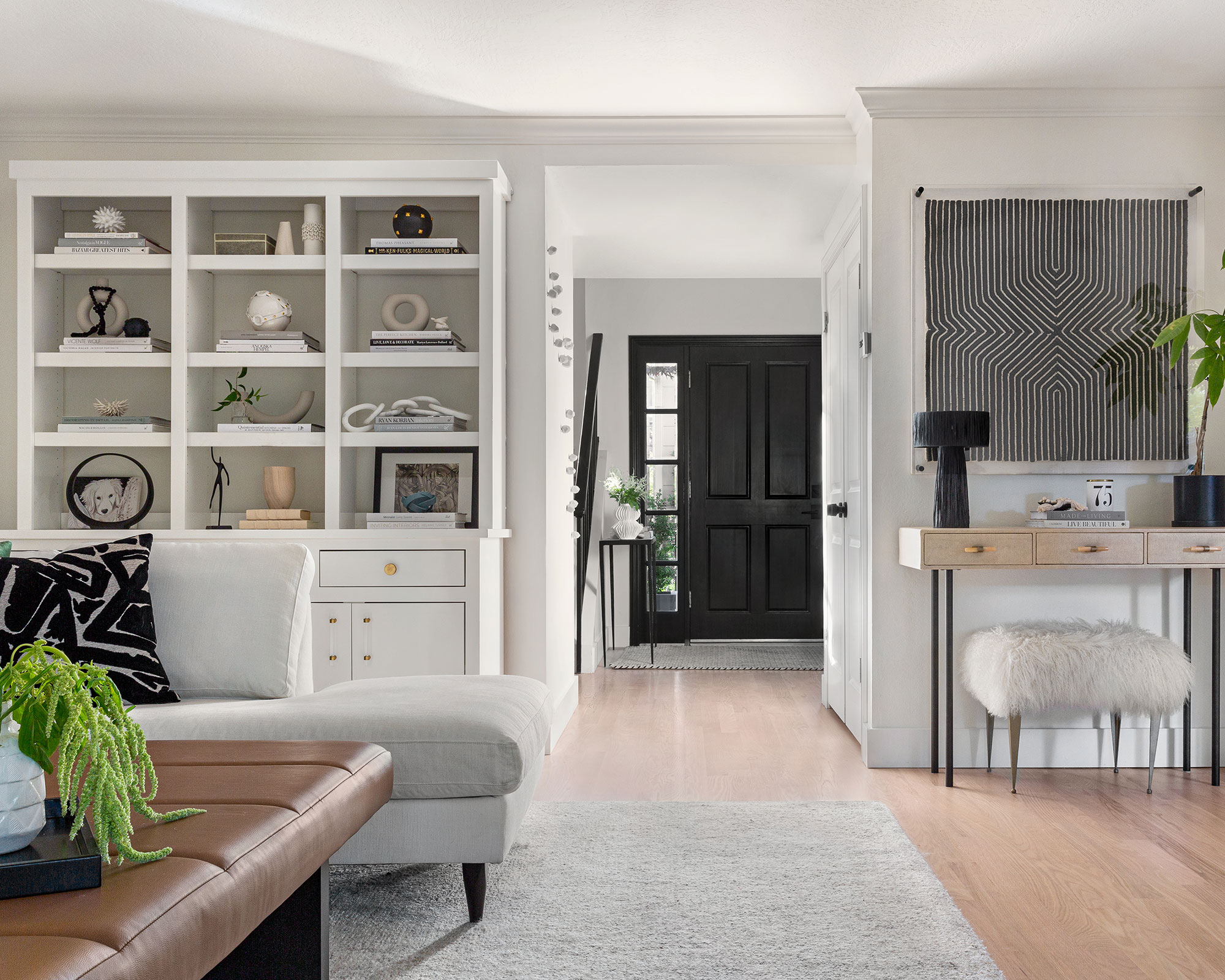
To draw the right kind of attention from guests, pay attention to the different heights and visual weight of items. 'Consider arranging them in a visually appealing manner, incorporating different heights and variations to create an attractive display. This can help add a touch of elegance and personal style to your living space,' continues Kimberley.
You can create balance by grouping decorative objects in odd numbers, and by playing with a contrast of rounded and more angular objects. For height, use vases or stacked plates from the same set.
4. Consider colorways and styles
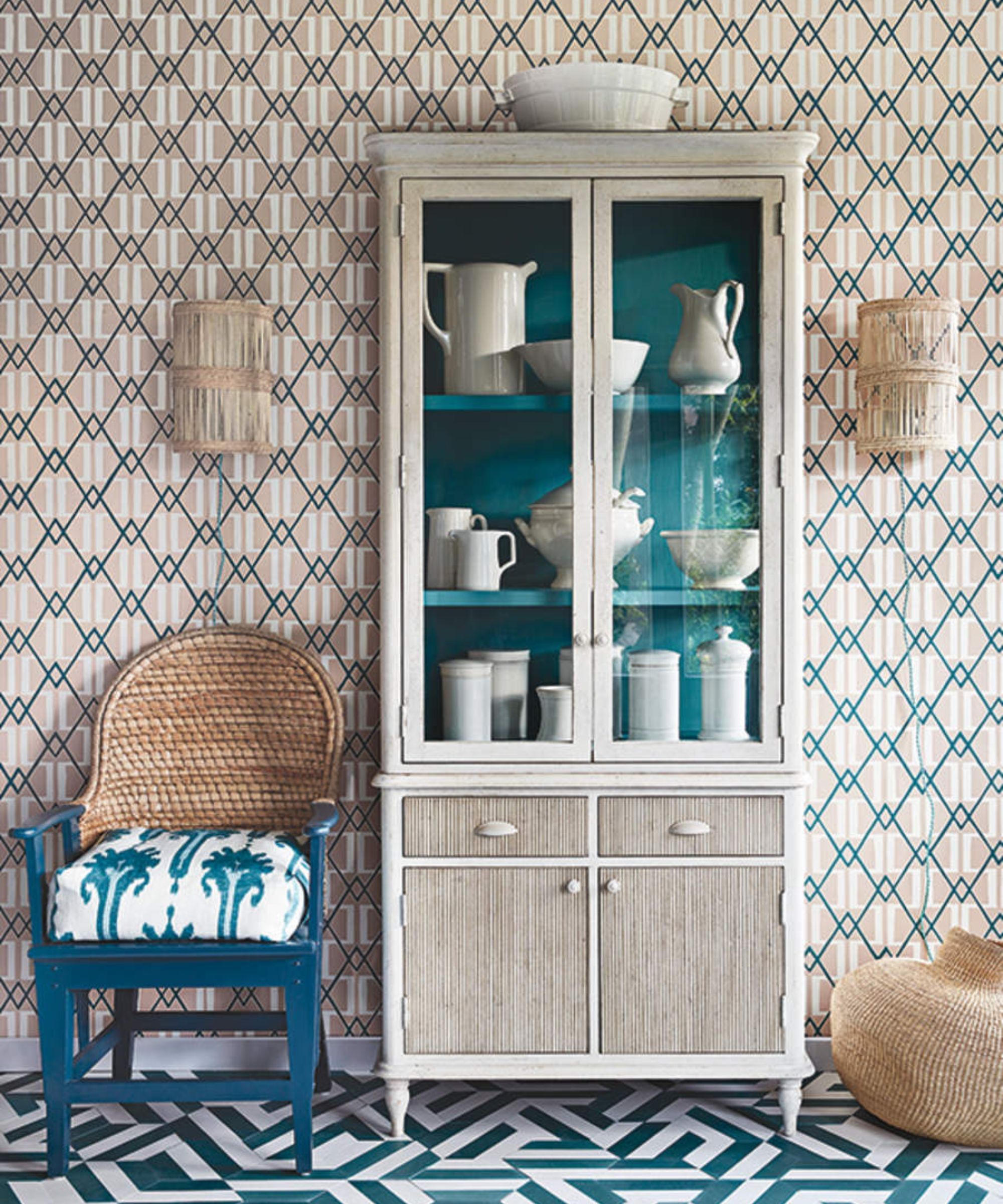
We approach mismatching crockery with caution, but dinnerware sets will naturally lose a side plate or two over the years. When refreshing sets, be conscious of how these will interact together on the hutch as you can contrast styles and colors in a good way, but it is a fine line between an artful display and one that is simply overly busy and jumbled.
A failsafe approach is to stick with one color and bring interest in with differing textures instead. Mix glass, stone, and ceramics for a display that's both simple and clutter-free, and yet has some depth.
5. Always leave a little blank or 'negative' space
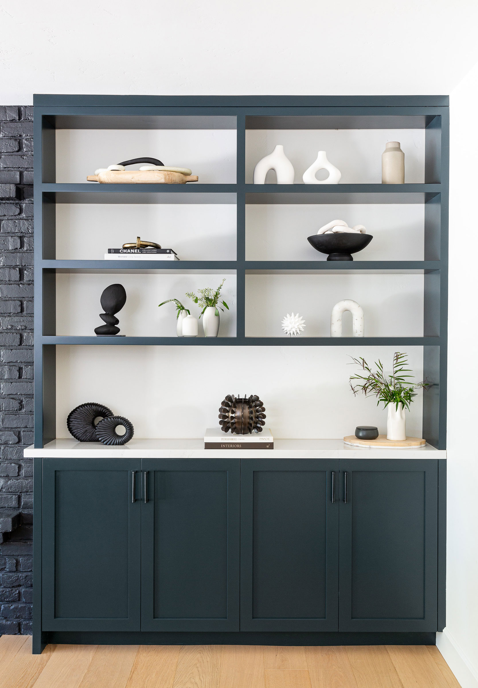
Much like in photography, Joshua Smith, Principal and Founder of Joshua Smith Inc says that negative space is essential for an iconic finish.
'You should be able to see empty space when styling areas like coffee tables, nightstands, or a hutch,' urges Smith. 'This leaves impactful negative space, which is just as important as the items we add. The negative space gives the other items room to breathe and lightens the feel of the room. Crowded surfaces and overflowing items make a space feel heavy and detract from the serenity.'

Named a Rising Star by House Beautiful and part of Traditional Home's New Trad Class of '23.
With projects on both coasts, Joshua Smith Inc, offers full-service residential interior design – and life-changing spaces. Joshua draws on decades of experience transforming functional spaces into inspiring environments that engage the senses and nourish the soul. By cultivating the connections between mind, body, spirit, and space, he helps his clients elevate their experience each day.
6. Let there always be a little greenery
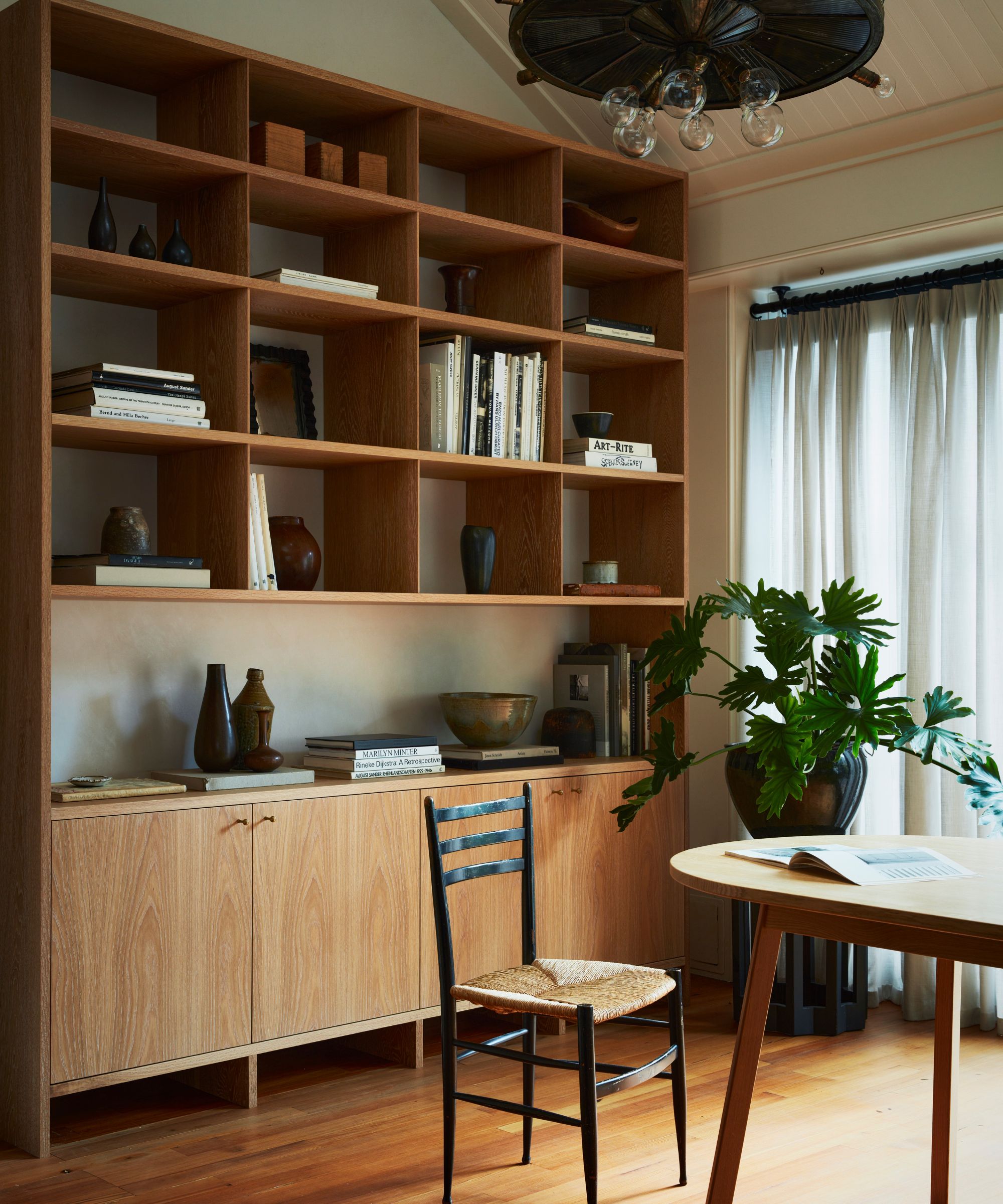
Even just a small branch of something green and luscious, or perhaps even dried, will bring depth, organic balance, and drama to a hutch.
Kimberley notes how all of the above elements combined are what will help achieve a balanced finish: 'It is important to consider the color scheme, size, and placement of these items to achieve a cohesive and aesthetically pleasing arrangement. Remember to mix various heights and textures for visual interest and don’t forget to add some greenery to give it some life.'
Choose easy houseplants in decorative vases or another vessel of choice to nestle in with your other select decorative pieces and it is sure to lift the entire room, not to mention the hutch display.
FAQ
Where else could you keep a hutch?
The dining room, living room, and entryway are all typical hutch locations. However, if you are stuck for bedroom storage, Harrison gives us the green light to place a hutch here instead. Who said you needed a dresser to organize clothes anyway? 'Using a hutch in a bedroom for extra storage can be a practical solution. To make the most of the space, you can store sweaters in the bottom cabinet portion.'
Take note, extra sweater storage does not mean letting style and clothing organization slide. Still complement your surrounding decor and interior, as if you were putting a unique outfit together.
'For the upper shelves, consider styling them with stacked fashion books to add a sophisticated touch. Additionally, you can use decorative accent pieces to hold your favorite jewelry items.' Multiple jewelry or mismatched items can be corralled in decorative bowls to keep them cleverly and beautifully concealed. Alternatively, small hooks built into the inside cabinets of the hutch can make a good spot for necklaces and the like.
Be creative and thoughtful when styling your hutch and let it be an asset to your home, wherever you have decided to place it. A final flourish will never go amiss either as Kimberley adds: 'To enhance the overall aesthetic, you can add a candle and a small bud vase for a touch of ambiance. Remember to arrange these items in a visually pleasing manner to create an attractive and organized display.'
Sign up to the Homes & Gardens newsletter
Design expertise in your inbox – from inspiring decorating ideas and beautiful celebrity homes to practical gardening advice and shopping round-ups.

Camille is the former deputy editor of Real Homes where she covered a broad range of topics, including house tours, small space design, and gardens. She studied English language and Italian at the University of Manchester and during a year abroad studying linguistics and history of art in Bologna, Italy she started documenting her adventures and observations in a blog. Camille is always creating and spends her downtime painting, taking photos, traveling, and writing short stories.
-
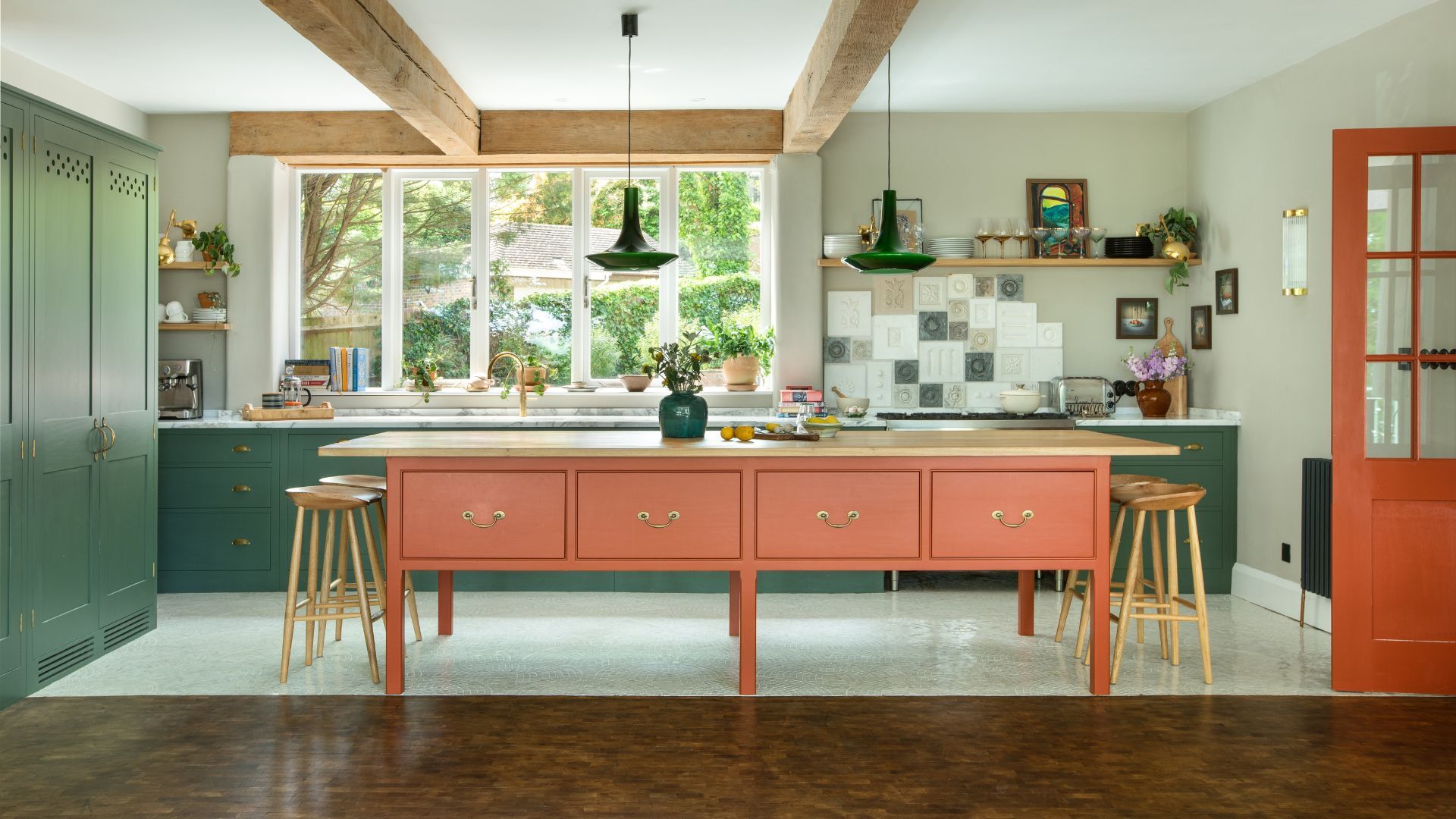 Orange and green is the bold color pairing quietly transforming homes in 2025 – here's 4 reasons why
Interior designers are making the orange and green combination work wonders – this is how you can too
By Sophia Pouget de St Victor Published
-
 This Michelle-Pfeiffer-approved chair is made of a forebodingly unusual material, opening the debate: Is it a rustic stunner, or a danger to sitters?
The actress took to Instagram with a chair made of a controversially sharp material – and fans are unsure of how they feel about it
By Sophie Edwards Published