How to style a bed in front of a window – 7 ways designers make this tricky layout look like it was done on purpose
Placing a bed in front of a window is never likely to be your first choice, but sometimes it's the only choice you'll have. Designers explain how to work with this difficult layout instead of against it
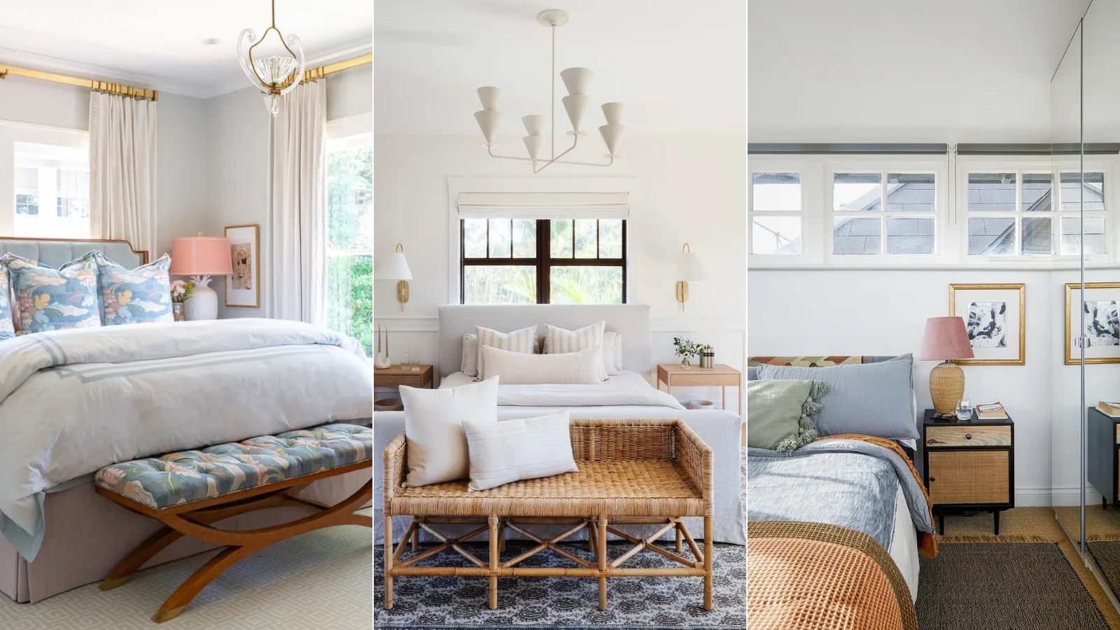
There are a few key bits of insider information you'll need when it comes to how to style a bed in front of a window. This is not an easy layout to work with, and one that should be approached with caution, in case you end up blocking the light, making it difficult to reach the window treatments or worse still, end up lying in a draft.
Happily, designers have been working around unfortunate window placements for years, and have honed their skills for making a bed in front of a window look not just like a necessity, but intentional. 'The goal is to enhance the bed and integrate the windows into the overall scheme, rather than making it appear as a last resort,' says interior designer and founder of House Nine Jojo Barr. And this is how to get this tricky bedroom layout right.
1. Create the illusion of height
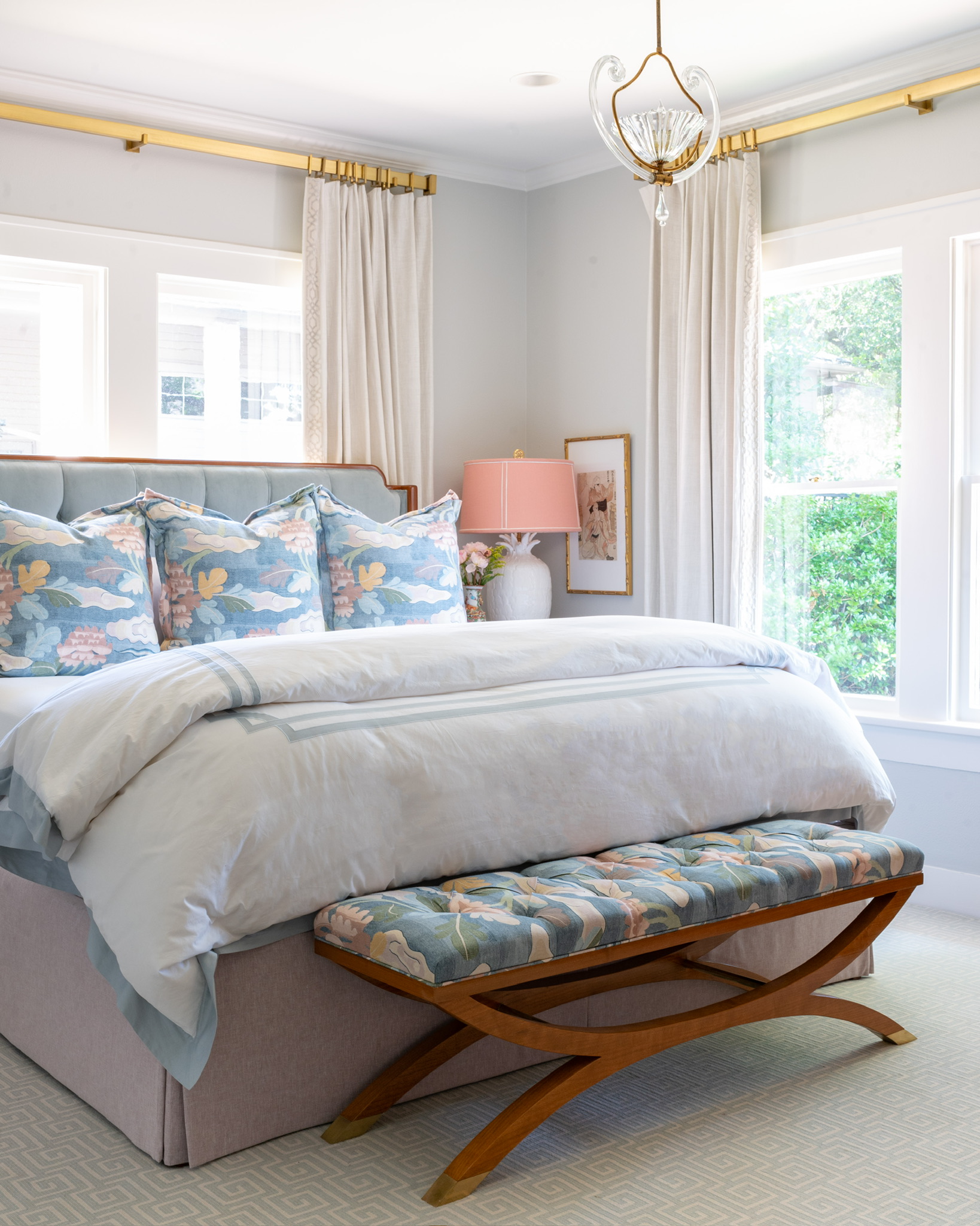
It's a clever optical illusion, but sometimes using a bed to hide part of the window can actually create the sense that there is more window than there is. As seen here in this project by Dallas-based Amy's Interiors, the high headboard and equally high curtain rail – much higher than the actual window – immediately trick the eye into thinking the windows are massive. It's a brave approach, but works here due the room being dual aspect, and there still being plenty of light flooding in from the side of the bed.
'The bed was placed in front of the window out of necessity because this Park Cities home was built in the 1920s,' says the studio founder Amy Smith Atkins. 'The bedroom is a downstairs bedroom which is an asset. This was the most comfortable bedroom layout which is always a priority when we are space planning. And we love when someone wants to work with the integrity of an original home so this was the best solution. It works great and we loved the way it turned out!'
2. Choose blinds for ease
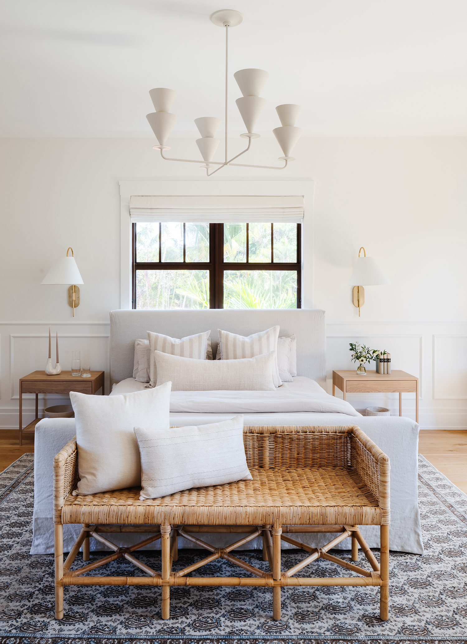
It can be hard to get behind a bed to curtains if it's right up to the window, so a blind is more practical choice. As seen here in this room by the Florida-based practice Calimia Home, it allows you to close it with a side-fastening mechanism, rather than having to stretch across.
'We chose a Linen Roman Shad over curtains for ease of opening, especially with the bed against the window, and to maintain a balanced focus between the window, bed, and sconces,' says Monique Miller, the studio's Creative Director and Founding Partner.
3. Make the placement look intentional
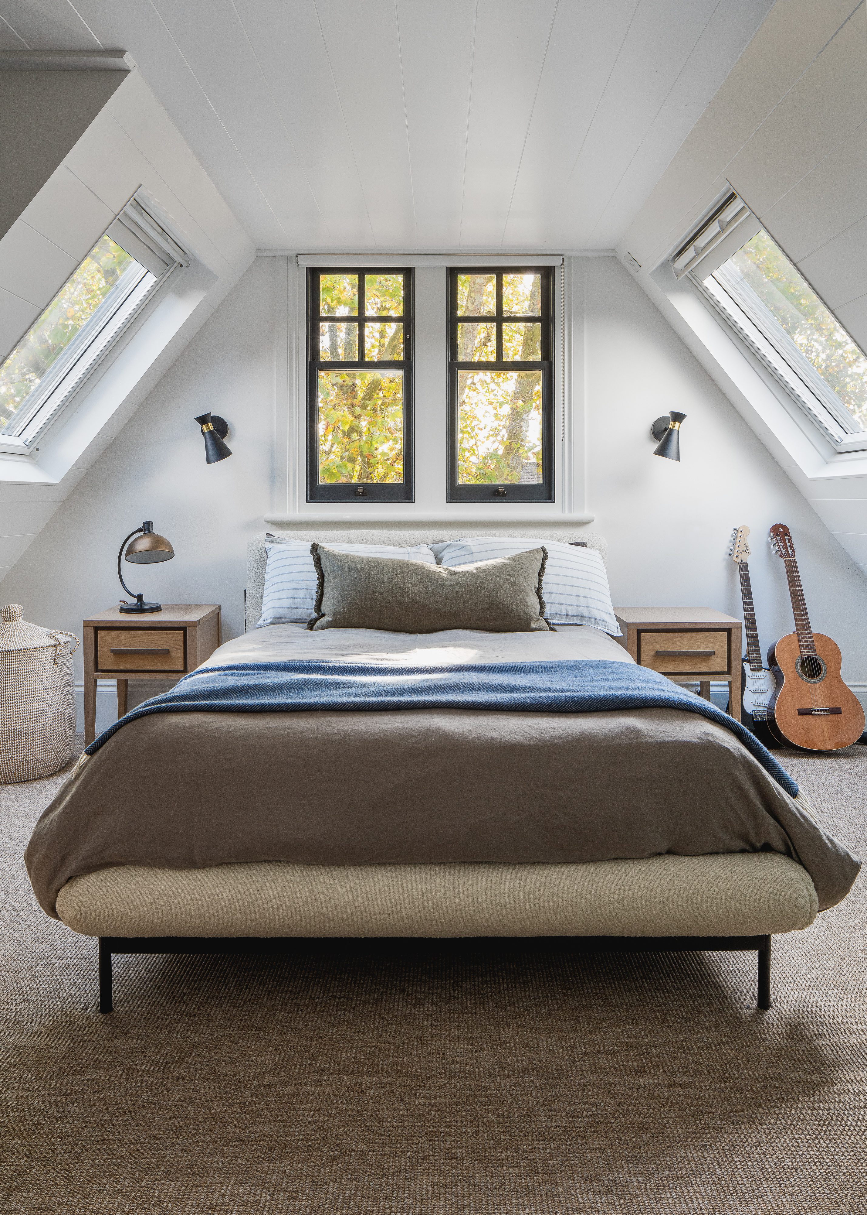
While placing a bed under a window may not be the first choice, it shouldn't look like the only option. The goal is to enhance the bed and integrate the windows into the overall scheme, rather than making it appear as a last resort. In this teenage boy's bedroom designed by House Nine, the studio decided to paint the window frames black, creating a striking impact and incorporating the windows as a key design element.
'While placing a bed under a window is usually a last resort, in this loft bedroom, it was the only available wall for the bed,' says the studio's founder and creative lead Jojo Barr. 'By making the window a focal point, we've created an intentional look. The window acts as a decorative headboard, framing the bed and achieving a similar effect to a traditional headboard.'
4. Ensure the windows are sealed
When placing a bed in front of a window, it's important to remember how this will feel, as much as how it looks.
'It's crucial to ensure your windows are well-sealed to avoid drafts,' Jojo says. 'Imagine what it will feel like lying in bed – you don't want any drafts. If you have old windows, such as sash windows that are difficult to seal, use heavy, well-lined, and interlined window dressings with blackout properties to prevent light leaks.'
5. Complement the window with the bedding

Admittedly, Studio Peake placed this bed up against the window instead of in front of it, but founder Sarah Peake used a decorative approach so clever and simple that it can – and should – be applied in layouts that more closely fit the headline of this article. By matching the color of the bedding to the window frame it makes the two work as one, and helps to ensure the placement reads as more intentional.
'I love using textured throws on beds for an extra layer of color and interest,' Sarah says. 'It’s easy to forget about beds when you’re putting together fabric schemes but they are such a big expanse in a bedroom so I put a lot of thought into what goes onto them. This mohair throw from Loewe was perfect and worked so well to pull in the other colors in the room.'
6. Keep the headboard low
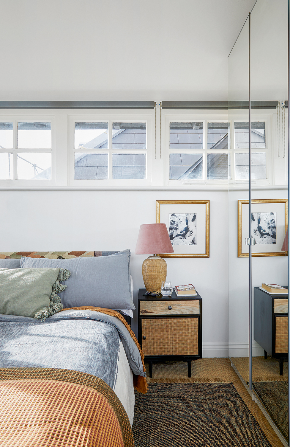
Of course, in order to maximize the daylight as much as possible, another approach is not to block the windows at all. A low headboard will mean that even if your windows are not as high as these ones, they are still as unhampered as they can be, despite having a large piece of furniture sat in front of them.
It helps that the window frames are painted the same color as the walls here, cutting down on the amount of visual distraction and allowing the small windows to seem bigger than they actually are.
7. Pick a cohesive color scheme
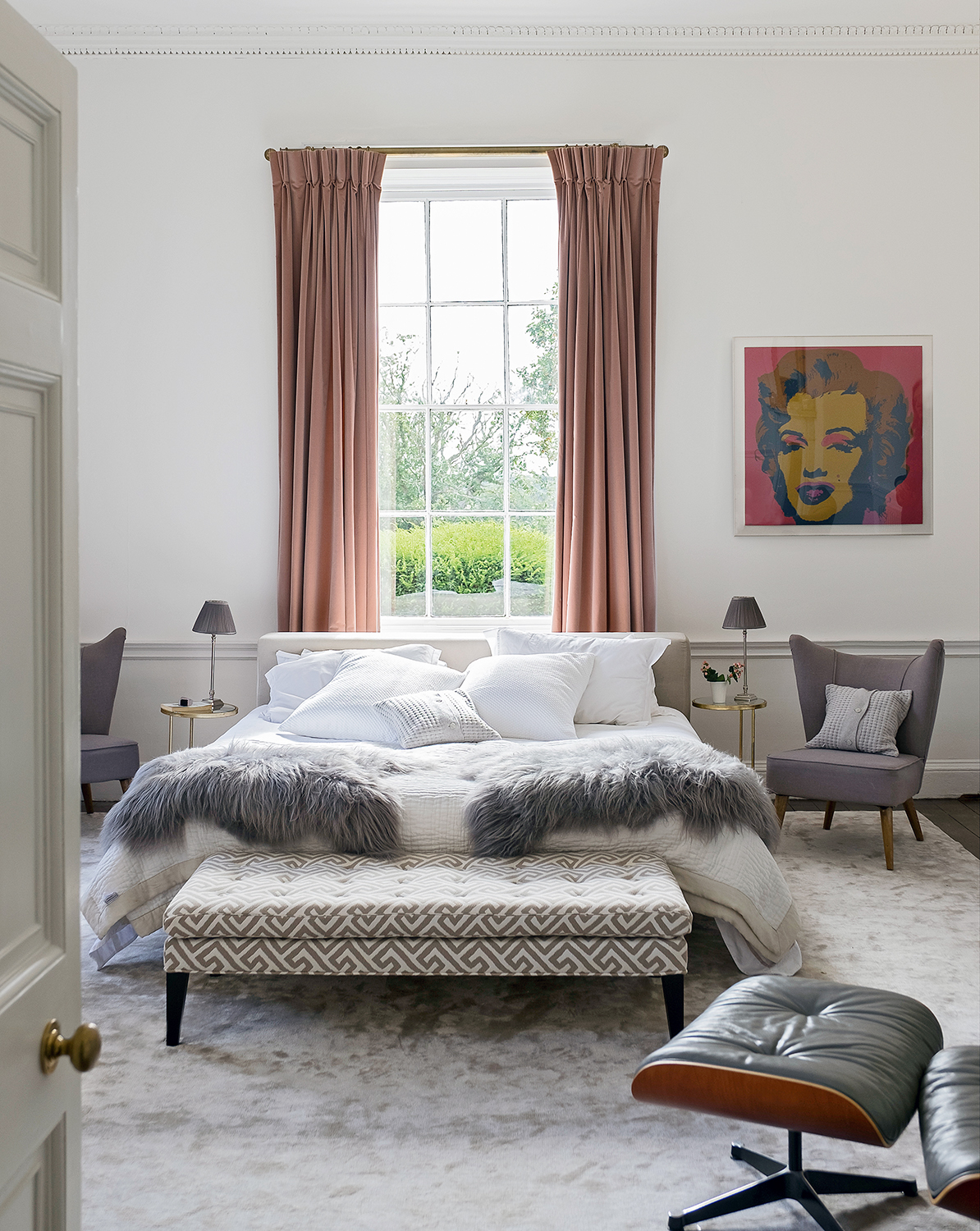
The grays in this bedroom all have a very subtle pink tint to them, a mauve tone that makes them warmer than blue-toned grays (which tend to read more 'Scandi' and have a coolness to them). This makes them kinder for a bedroom, as they seem a little more welcoming. It helps that they are enhanced by the pink of the curtains which also have a grey tint to them, lending a beautiful feeling of harmony.
Remember to think of the window dressings as part of the scheme, particularly when placing a bed in front of the window. It adds to the effect of being cohesive. 'If using traditional window dressings like curtains or blinds, ensure the fabric complements the bedding and overall design scheme,' Jojo says.
Having a bed in front of the window may be a tricky layout, but it's one that has plenty of ways around. The key it to ensure it doesn't feel too disjointed, you want the bed to look as if it's meant to be in that position rather than it was the only option. Following these simple, yet effective designer approved tips will ensure you get this layout spot on.
Sign up to the Homes & Gardens newsletter
Design expertise in your inbox – from inspiring decorating ideas and beautiful celebrity homes to practical gardening advice and shopping round-ups.
Pip Rich is an interiors journalist and editor with 20 years' experience, having written for all of the UK's biggest titles. Most recently, he was the Global Editor in Chief of our sister brand, Livingetc, where he now continues in a consulting role as Executive Editor. Before that, he was acting editor of Homes & Gardens, and has held staff positions at Sunday Times Style, ELLE Decoration, Red and Grazia. He has written three books – his most recent, A New Leaf, looked at the homes of architects who had decorated with house plants. Over his career, he has interviewed pretty much every interior designer working today, soaking up their knowledge and wisdom so as to become an expert himself.
-
 How to clean a patio – 6 different methods, and when you must use a chemical cleaning agent
From manual scrubbing, natural solutions or calling in the pros, industry experts reveal the benefits and considerations of each method
By Andy van Terheyden Published
-
 Kris Jenner's favorite air fryer, the Ninja Crispi, is the perfect small kitchen solution – it deserves a place on the most compact of countertops
Kris approves of this compact yet powerful air fryer, and so do our own kitchen appliance experts, praising it for its multifunctionality
By Hannah Ziegler Published
