8 tricks designers use to instantly make an entryway look more beautiful
Designers share their favorite tips for creating a stunning hallway that always makes a great first impression
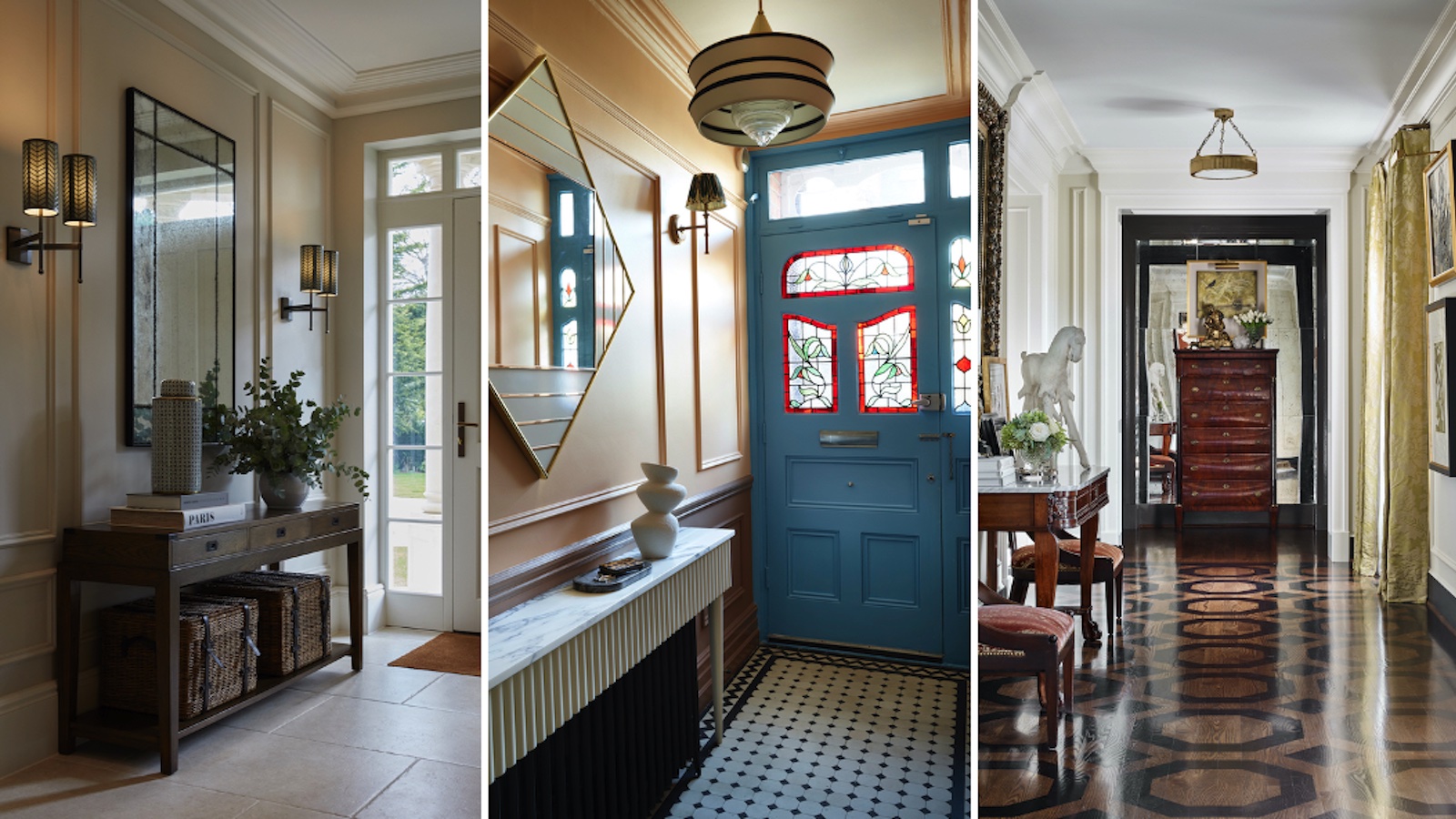

As the first opportunity to impress guests and a taster of what’s to come, entryways are under a lot of pressure to deliver your sense of décor style. And that’s before you consider the pressure they come under from dirty feet and all those piles of coats, bags and shoes!
‘Entryways should feel inviting and set the tone for the rest of the house. I like to incorporate a bit of dramatic pattern—wallcoverings, draperies or, even a painted floor—in an entry. A graphic pattern can draw the eye and create a sense of space and presence,’ says interior designer Roger Higgins.
Learning how to make an entryway more beautiful is about more than merely deciding what looks good in an entryway, although we’ll admit this is a great place to start. Professional interior designers will always take a more holistic approach, thinking about spatial design, light and traffic flow before they begin on the decorative details.
Always look for fresh storage opportunities when planning your new entryway ideas. As your home’s main thoroughfare, they are busy spaces that require clear passage so you can never have too much stashing space.
How to make an entryway more beautiful
Any entryway can be one of the most joyous rooms to decorate since it's such an easy space to overhaul. The smallest tweaks can make a huge difference.
1. Seek out striking furniture
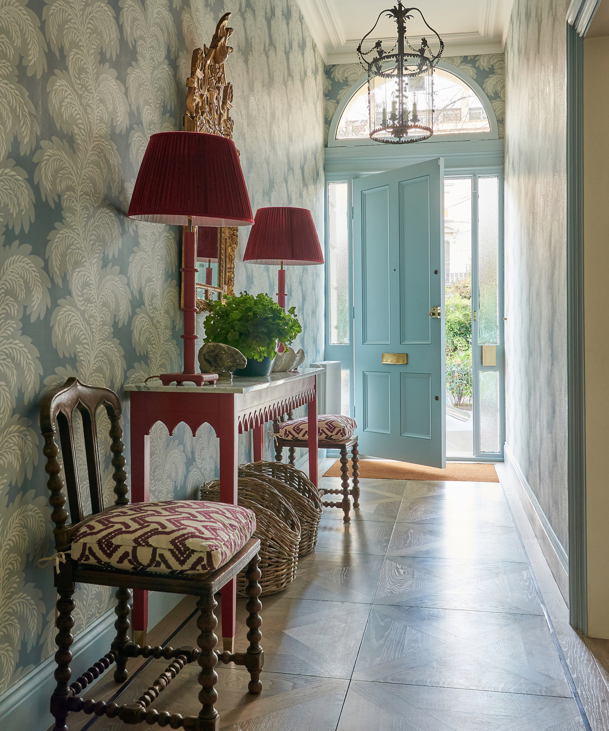
An entryway should never be overcrowded with furniture, but it only takes one or two statement pieces to transform your entrance from a boring thoroughfare to a proper living space with personality and pizzazz. Source slimline furniture that won’t create a bottleneck but will provide storage opportunities and that all-important creative touch.
Interior designer Sarah Vanrenen designer explains, ‘I think entryways should always make an impact, and furniture is such a great way to achieve it. I wanted the console used here to really stand out, which is why I used a strong red,’ she recalls. ‘I thought the impact would be even better if we also used red lamps and shades, which makes it modern but really look dramatic alongside the ornate gilt mirror.’
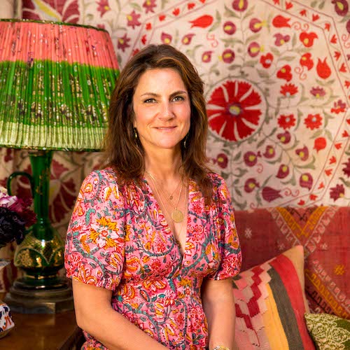
Sarah Vanrenen has worked as an interior designer for more than 20 years and describes her style as modern but loves mixing old with new so that the result does not look contrived. Sarah’s growing range of furniture, lighting, cushions and other accessories are all made in the UK and echo her love of colour and pattern.
2. Create impact underfoot
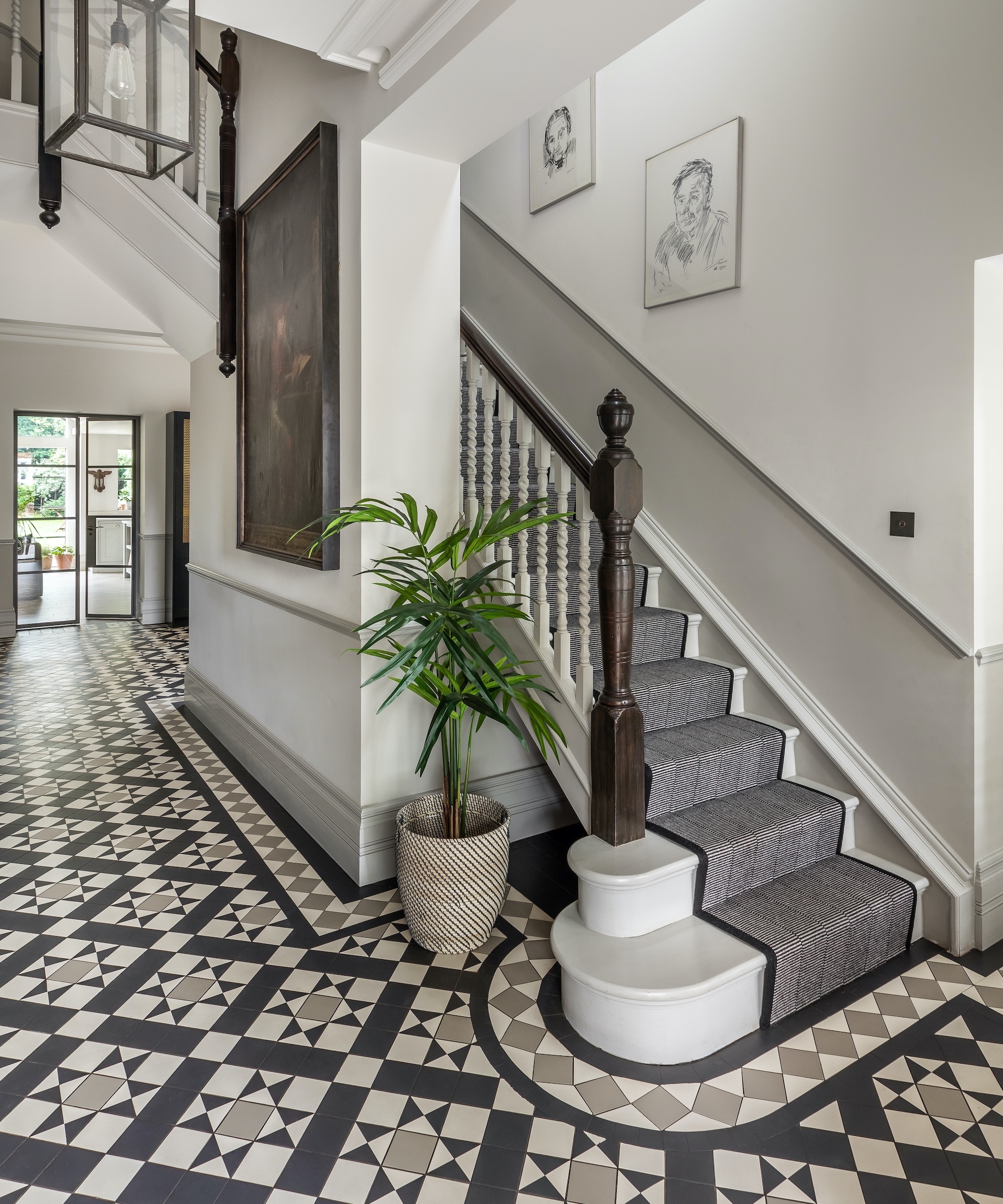
Entryway flooring must be hardwearing and low maintenance as a number one priority, but designers love to flex their creative muscles and bump up entryway flooring’s role as a decorative feature.
Otta Design transformed the fortunes of this previously dark, narrow entryway by moving the staircase to create an entrance hall fitting to the grandeur of the house, then commissioned the bespoke tessellated floor. The beautifully installed border tiles around the edge emphasize the curve of the new staircase and leads you inside.
‘The monochrome color scheme and larger than normal tile size is impactful, elegant and a perfect introduction to this wonderful home,’ adds Alex Keith, director, Otta Design.
3. Add a flower table
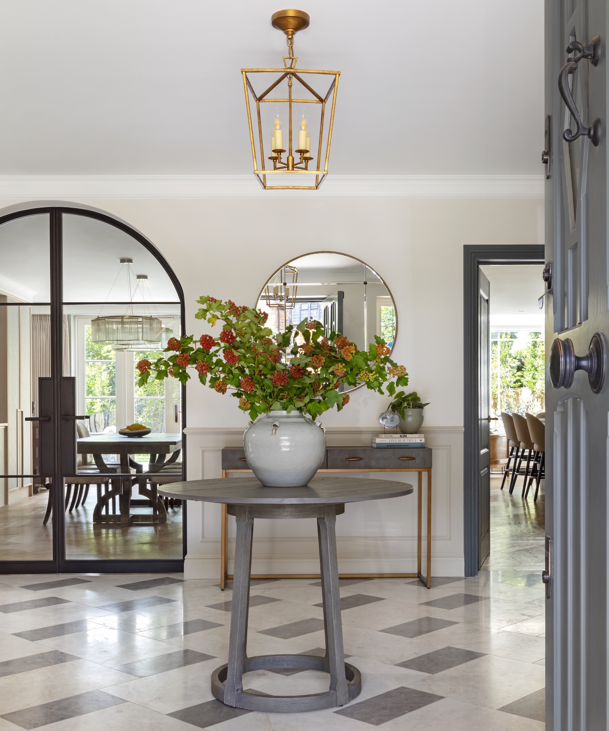
‘A well-styled center table as you walk into a home has the power to instantly lift the entrance space and create a welcoming vignette for guests,’ says Emily Carlisle, director, of Stuart Carlisle Interiors. ‘It gives the homeowner the opportunity to style up their entryway throughout the seasons with differing foliage and create some warmth and personality into a space that is often dominated by harder materials and practical storage solutions.’
Success relies on fresh foliage – there’s nothing welcoming about a sad vase of deadness. Some of the best flower delivery services offer membership options to help you keep those fresh blooms coming. Also, consider decorating with dried flowers or try your hand at ikebana.
4. Paint a half wall
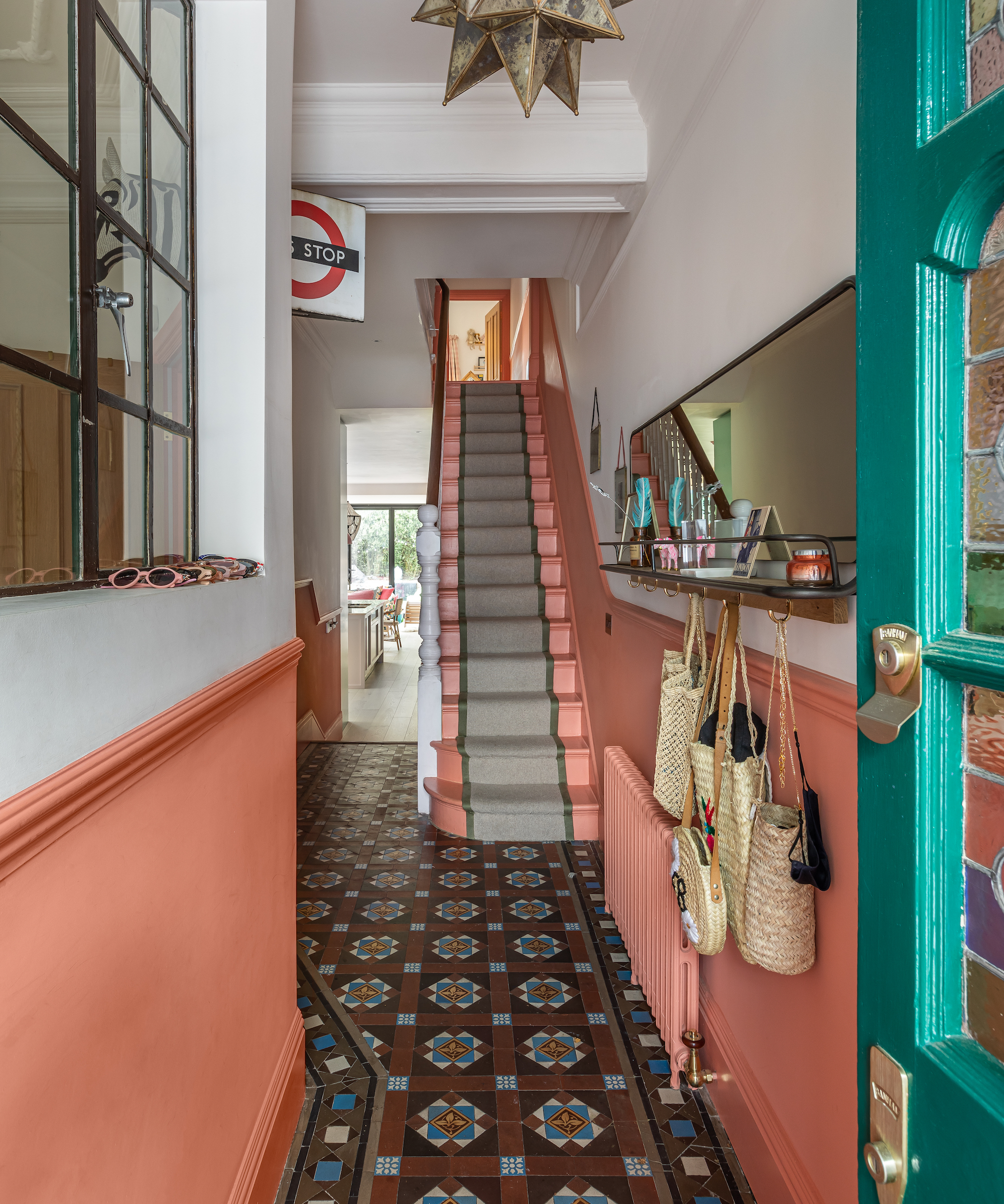
For entryway paint ideas with designer approval, choose a fun pop of color for the lower wall and add a touch of playfulness, says interior designer Lucy Barlow. ‘Floor-to-ceiling painted walls often feel rather intimidating and can leave an entryway appearing smaller; instead, a splash of paint to waist height is a great alternative!’ explains the co-founder of Barlow & Barlow.
‘Not only does the color create a sense of flow between rooms, but it’s also great for highlighting detailed flooring such as tiles. Here the pink accent perfectly blends between the dark, intricate tiles and the white walls above.’
5. Mix old with new
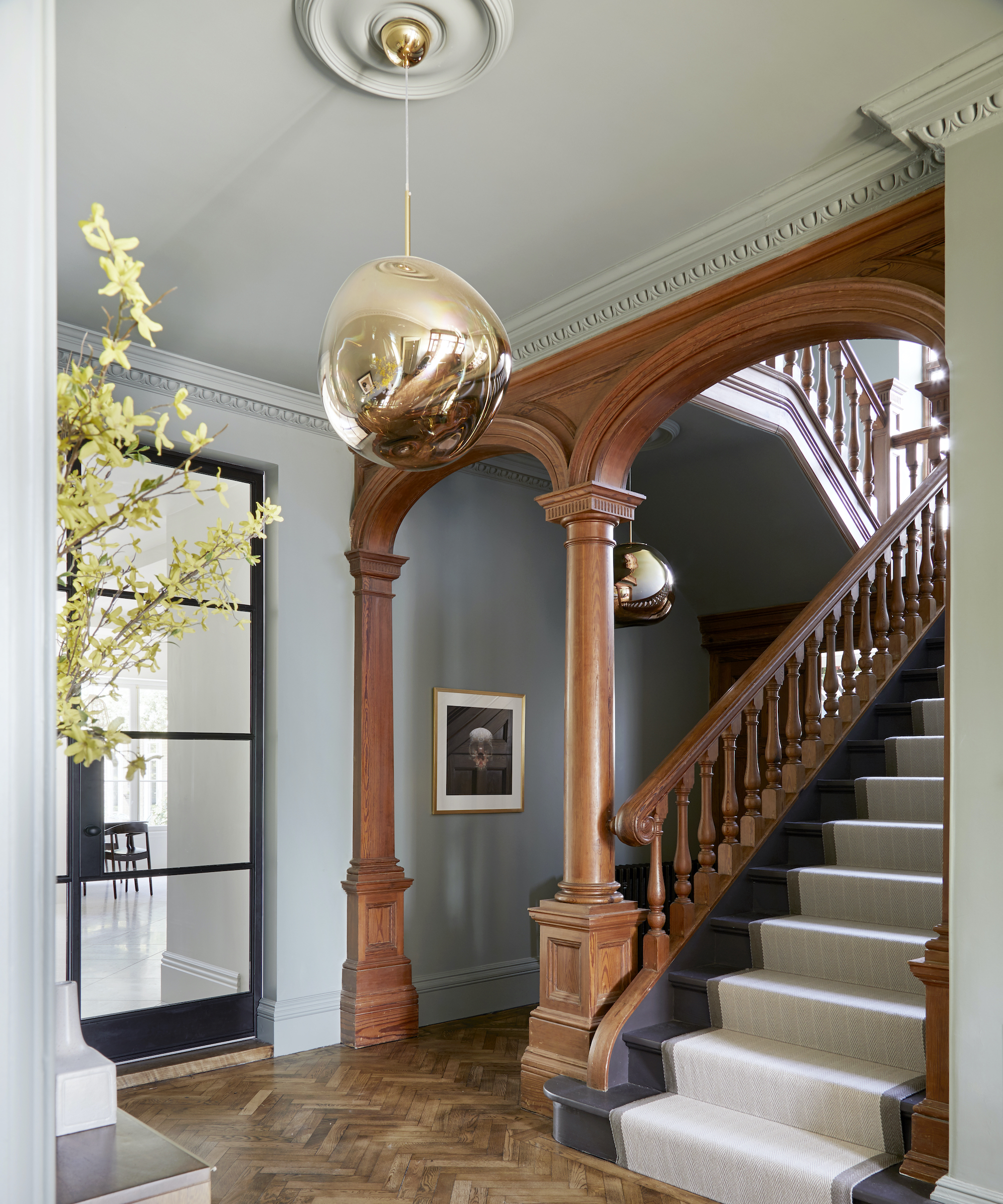
Renovating a home that is blessed with traditional features is an absolute bonus, but finding ways to bring old features up to date can prove challenging. Interior designer Fiona Duke recommends mixing in new architectural details and fittings to shake things up.
This entryway was very dark which initially made the wooden stairwell and archway features feel a little overpowering,’ recalls Fiona. ‘We decided to create a large opening in the main wall and install an oversized internal glass door that allowed the light to flood in. With sunlight streaming in it gave a far softer feel to the wooden features, and the new modern steel glass doors and contemporary Tom Dixon lighting creates a wonderful contrast and a far more inviting entryway.’
Designer Roger Higgins agrees mixing old and new can really elevate an entryway. He explains, ‘We like to use accessories or furnishings with a bit of visual weight in entryways. Gilded frames, bronze accessories and a mix of antiques and more contemporary elements is always a winning combination. We also like to incorporate a mirror—or even a mirrored wall—for a bit of drama and to boost the sense of space.’
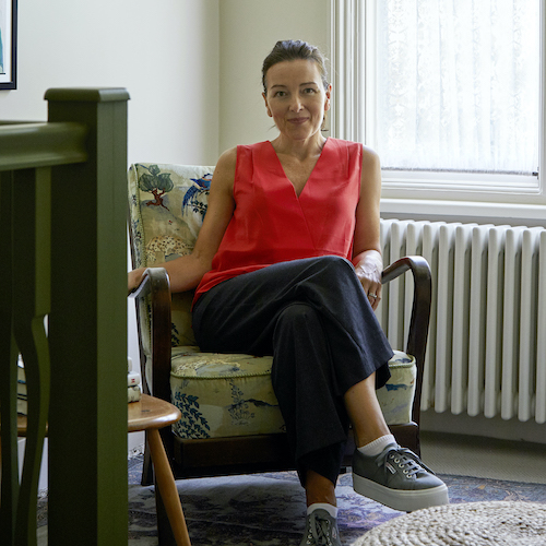
Fiona Duke is an award-winning Interior Designer specialising in high-end residential renovations. Using a mix of modern and vintage styles, Fiona creates inspirational, elegant spaces with a relaxed 'effortless' aesthetic. She believes that designing with a mix of styles creates a far more authentic way of living and helps to embrace the beauty of the 'imperfect' into every design.
6. Frame wallpaper with panelling
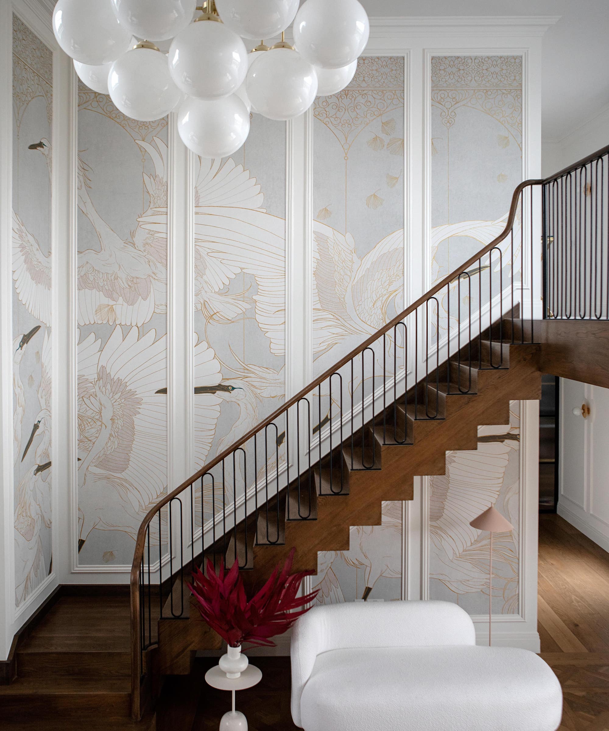
It’s no secret that papering the walls is a fabulous design trick for ramping up the drama in any room. But if you’re looking for something a little ‘extra’ in your entryway, follow interior designer Lisa Marconi’s lead and combine a wonderful entryway wallpaper with paneling.
For this big, double-aspect entryway, Lisa wanted to create maximum impact whilst keeping it chic and pared back so that it wouldn’t be overwhelming. ‘We introduced paneling to draw attention to the scale of the room and filled it with a stunning wallpaper to inject some interest into the space. We deliberately kept the colors of the wallpaper muted so that it didn’t take over the entrance hall,’ she explains.
‘Using paneling with wallpaper rather than just wallpapering straight onto the wall is a great way to inject pattern into a room whilst retaining some white space. Breaking up the wallpaper like this makes for a more interesting overall look and means the room isn’t overpowered by pattern, which could easily have happened in a space of this scale.’
Lisa Marconi has 10 years’ experience as a residential designer and her work has been published all over the world. Her practice, DesignLed, is based out of Dublin and takes on projects throughout Ireland, the UK and Europe.
7. Install outsized lighting
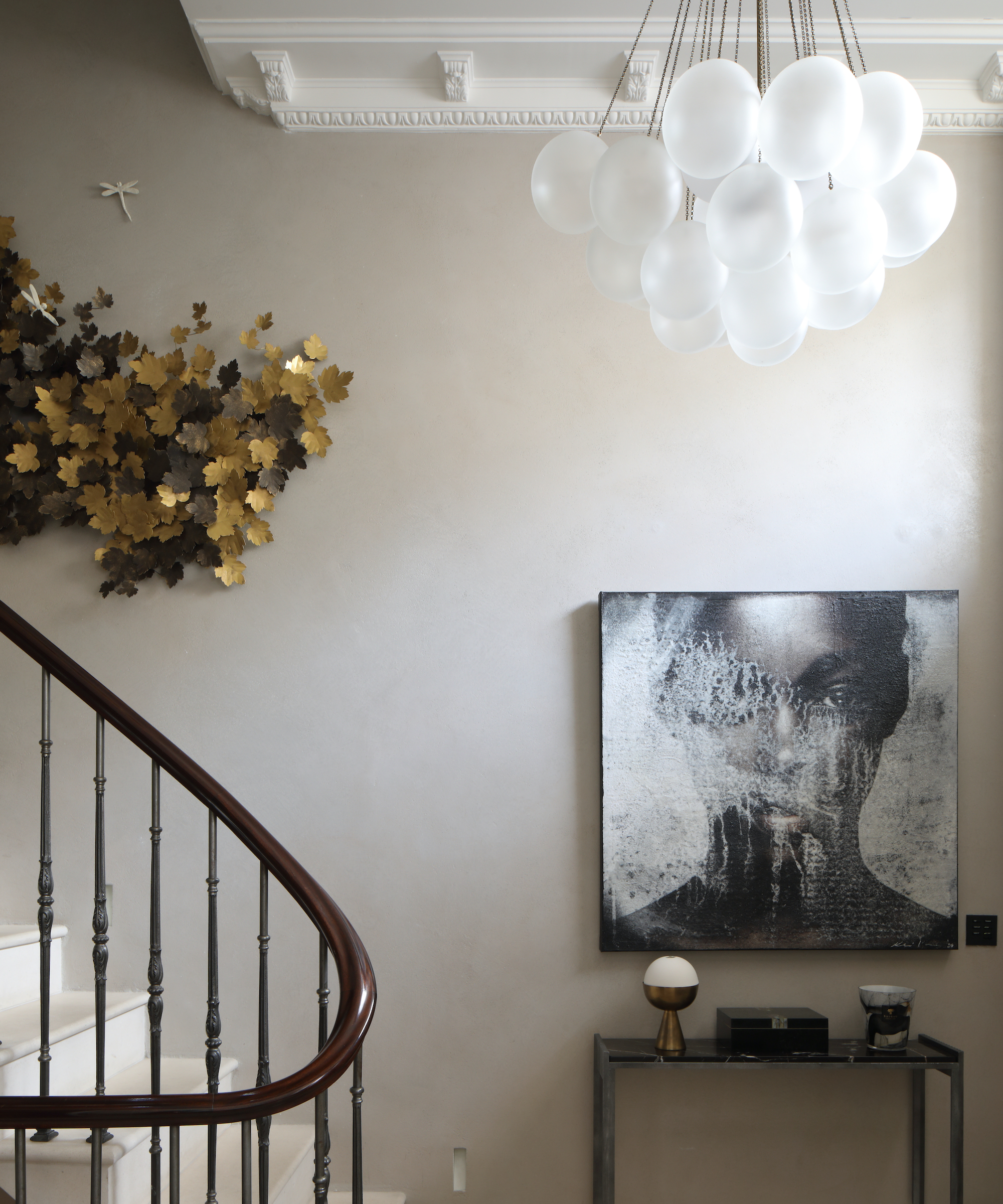
Add impact overhead with an eye-catching light fitting with upscaled dimensions that will provide maximum design points, without taking up an inch of precious space in your hallway. Juliette Byrne nails this design trick using the Cloud Chandelier by Apparatus.
‘We would always recommend oversizing the light fittings in entryways as this adds a dramatic element to your entrance,’ says Juliette. ‘We chose this fitting as we wanted to contrast contemporary decorative lighting with the original Georgian staircase. We used a polished plaster in dark grey on the walls so the white opalescent of the light remained the main feature.’
8. Cover the radiator
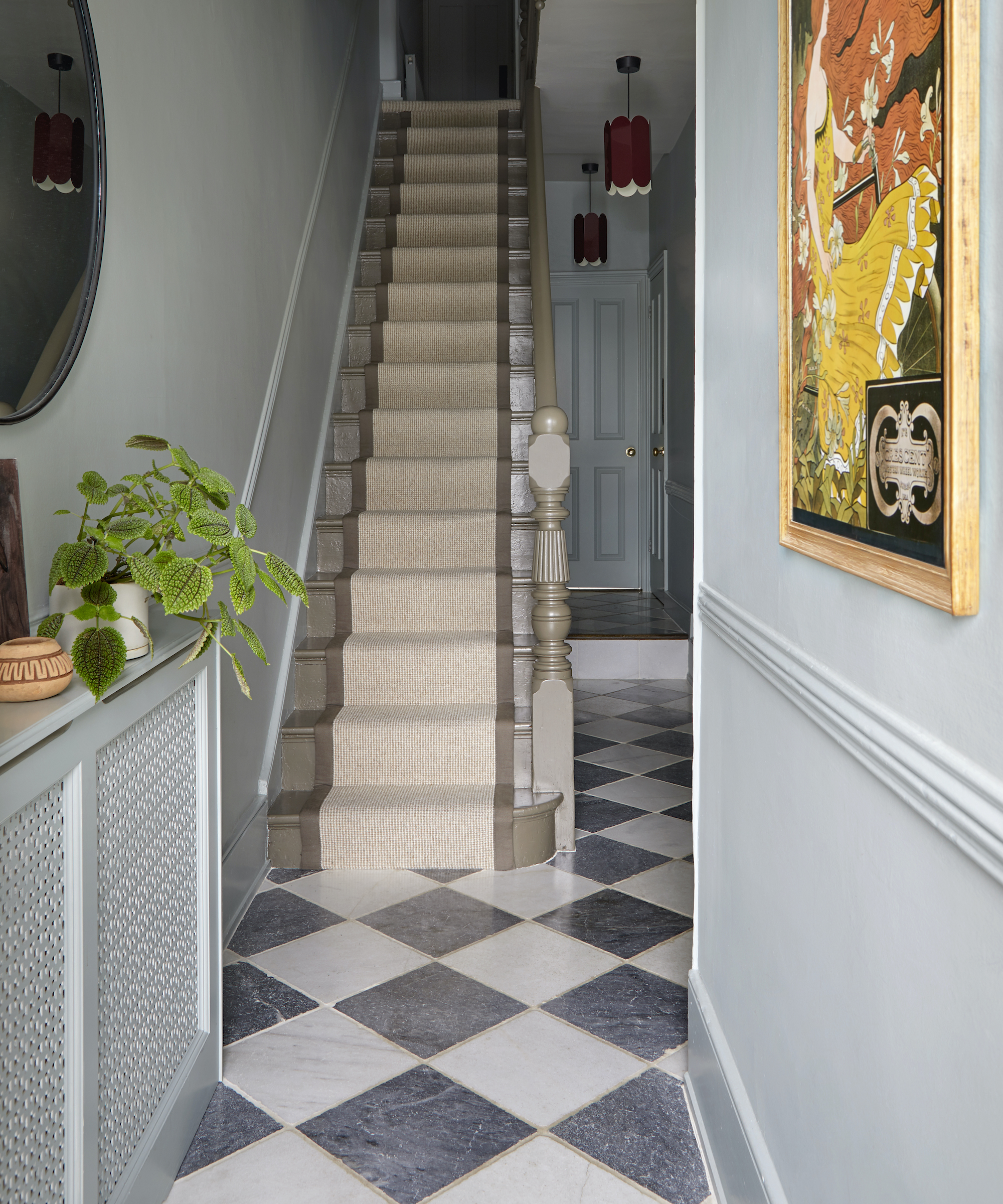
A radiator is essential for ensuring a warm welcome home, quite literally. Unless you’re lucky enough to have a stylish cast iron radiator, or underfloor heating, in your entryway, interior designer Andrew Griffiths recommends investing in a radiator cover.
‘A radiator cover is a simple way to not only hide less attractive radiators, but add some usable surface space in a narrow entryway. This is great for adding interest with plants or decorative pieces and creates a pleasing vignette with artwork or a mirror and some interesting lighting,’ says the founder of A New Day.
‘Finishing the covers in the same color as the walls helps them recede in a space where you might want other details to sing, like the chequerboard marble flooring in this space we designed,’ adds Andrew.

Andrew Jonathan Griffiths is founder of London based interior design studio, A New Day. The practice is known for creating thoughtful spaces that improve how you live and bring a smile to the face. Andrew oversees residential projects across London and the UK.
Looking for more tips on how to make an entryway look more beautiful? We found Shea McGee's new book The Art of Home really informative, there's a whole section on entryways, filled with really simple but effective tips.
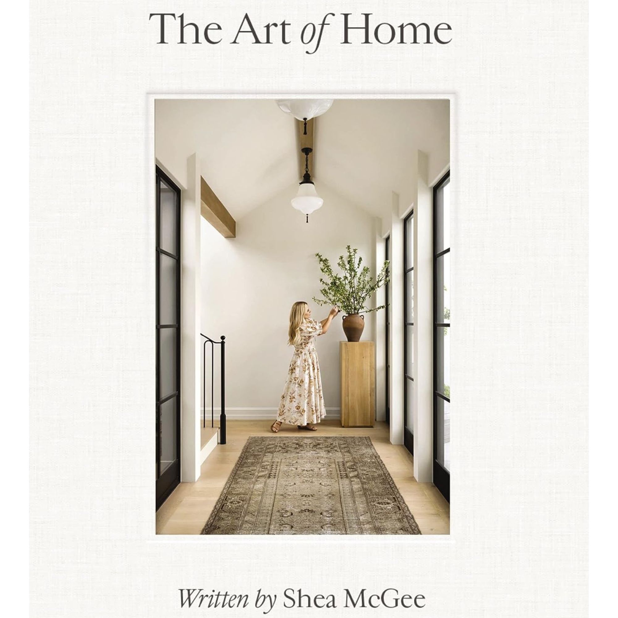
In The Art of Home, Shea McGee takes us through every room of the house, starting with an explanation of process and then guiding the way to a cohesive design. With step-by-step guides paired with her own design projects and the power of her personal stories, Shea helps us transform the most important parts of our lives and how we live.
How do you make a small entryway look nice?
No matter the size, entryways should always make an impact. Interior designer Sarah Vanrenen recommends using wallpaper to really make a statement. ‘If the space is narrow but the ceiling is high, you can afford to go for a wallpaper with large-scale pattern,’ she says. ‘Whatever size your entryway, it is always good to have a mirror to maximize the light, and obviously it’s useful for checking oneself before leaving the house!’
If your entryway is beyond poky, it could be worth investing in structural changes, for example, internal glazing that will bring ‘borrowed light’ from a well-lit adjacent room into the hallway, often with a transformative effect. Also, speak to an architect about changing the direction or shape of the staircase. A straight staircase can often be flipped, or a dog-leg added, to make the main entrance area more spacious.
Sign up to the Homes & Gardens newsletter
Design expertise in your inbox – from inspiring decorating ideas and beautiful celebrity homes to practical gardening advice and shopping round-ups.
Linda graduated from university with a First in Journalism, Film and Broadcasting. Her career began on a trade title for the kitchen and bathroom industry, and she has worked for Homes & Gardens, and sister-brands Livingetc, Country Homes & Interiors and Ideal Home, since 2006, covering interiors topics, though kitchens and bathrooms are her specialism.
-
 Bryce Dallas Howard's bedroom is the most creative, social space in her entire home – she uses 'conversational seating' to create a multifunctional 'salon'
The actress's bedroom doubles as a home office thanks to its clever layout and furnishings, proving that this area is much more than a sleep space
By Hannah Ziegler
-
 7 questions to ask yourself before moving house – realtors promise answering these questions will prevent buyer's regret
Don’t make your move harder, ask these questions before moving to avoid mistakes
By Chiana Dickson