How to make a home look modern – 9 design rules for a more contemporary home
From creative color schemes to out-of-the-box furniture, making a home look modern is easier than you may think. Here's how to give your home a fresh, modern update
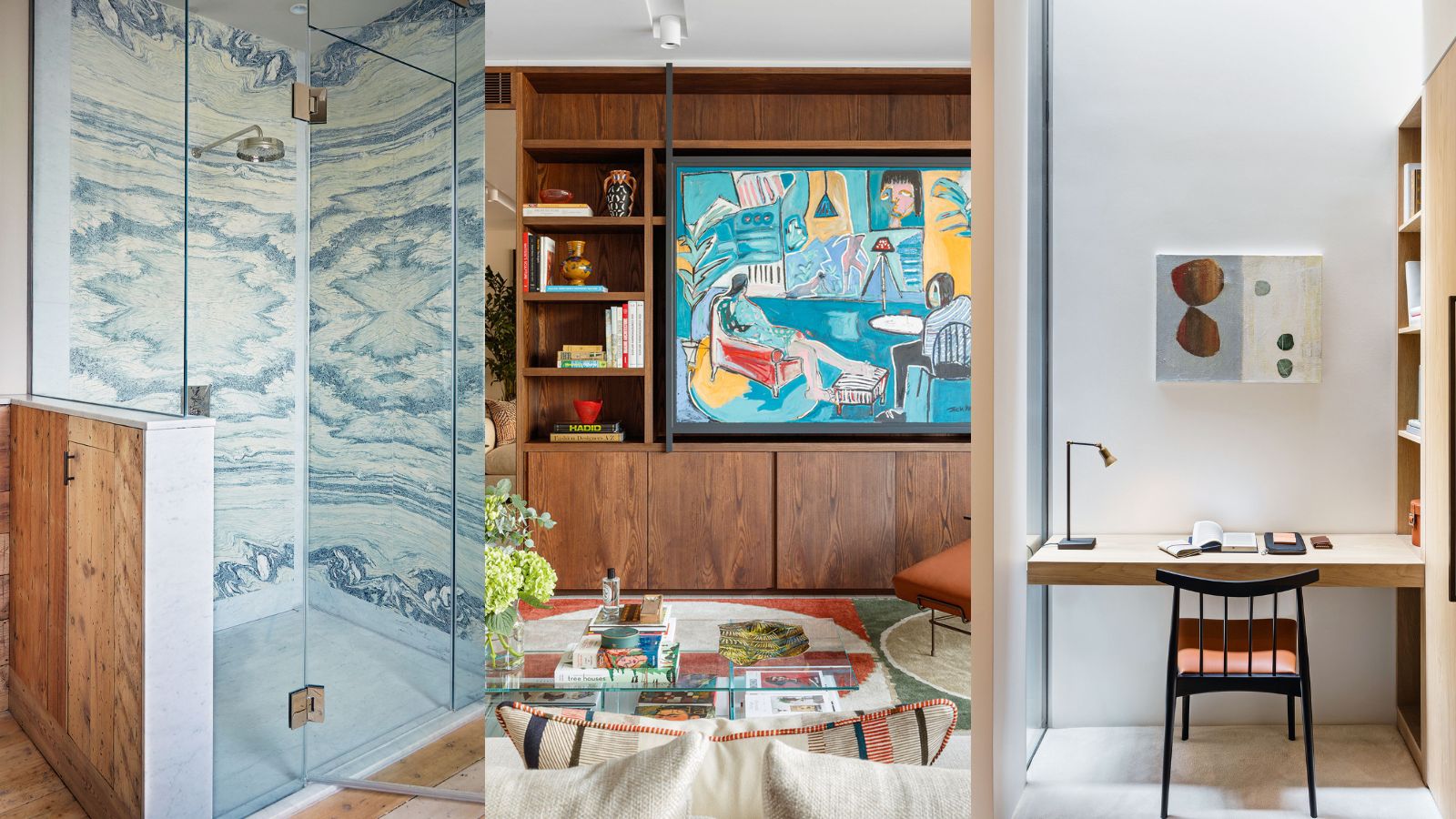

There is a common misconception that modern means clinical, sterile, or just plain boring, but that needn't be the case. Modern decor is back in vogue, but this time they feature exuberant color palettes, multiuse furniture, and beautiful details.
When thinking about how to make a home look modern, it is worth considering statement colors and streamlined furnishings as well as contemporary materials, especially if you want your space to look luxurious as well as modern.
Contemporary architecture can make a style statement while perfectly chiming with its environment. Success depends on using the right materials and opting for a sleek design that results in an effective blend of old and new.
Less is more, so be careful not to over-design when it comes to choosing your home decor ideas. Bear in mind too that very modern designs can sometimes feel stark and industrial, so balance this by introducing warmth with plenty of layered lighting and textured furnishings to add interest.
How to make a home look modern
Play with textures when it comes to making a home look modern. Shiny, flat glass looks wonderful against rough stone, while steel, used sparingly creates a sleek, modern contrast. Don't be afraid to make a statement with vibrant color choices and furnishings that are daring and bold.
Your home is your oyster, so curate a space that throws the rulebook out of the window, and reimagine your home into a modern space that reflects who you truly are.
1. Hide the fittings
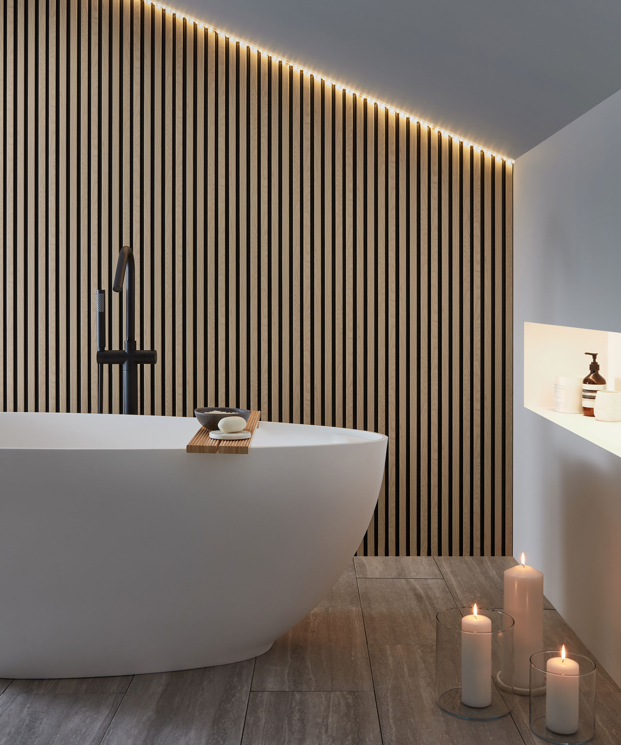
Decorative lighting doesn’t need to be seen to impress, at least not when it’s switched off. Hidden lighting, aka shadow lighting, is a contemporary approach that’s widely used to emphasize architectural details and textural materials in a modern bathroom.
‘Hidden lighting is an effective way to bring up textural finishes by directing the illumination close to the surface, providing streaks of light almost like running water,’ says Sally Storey, design director, John Cullen Lighting. LED strip lighting has revolutionized the process. These light-emitting diodes are easy to fit thanks to high-bond adhesive backing tape and come in IP65-rated versions for safe bathroom use.
2. Invest in steel-framed glazing
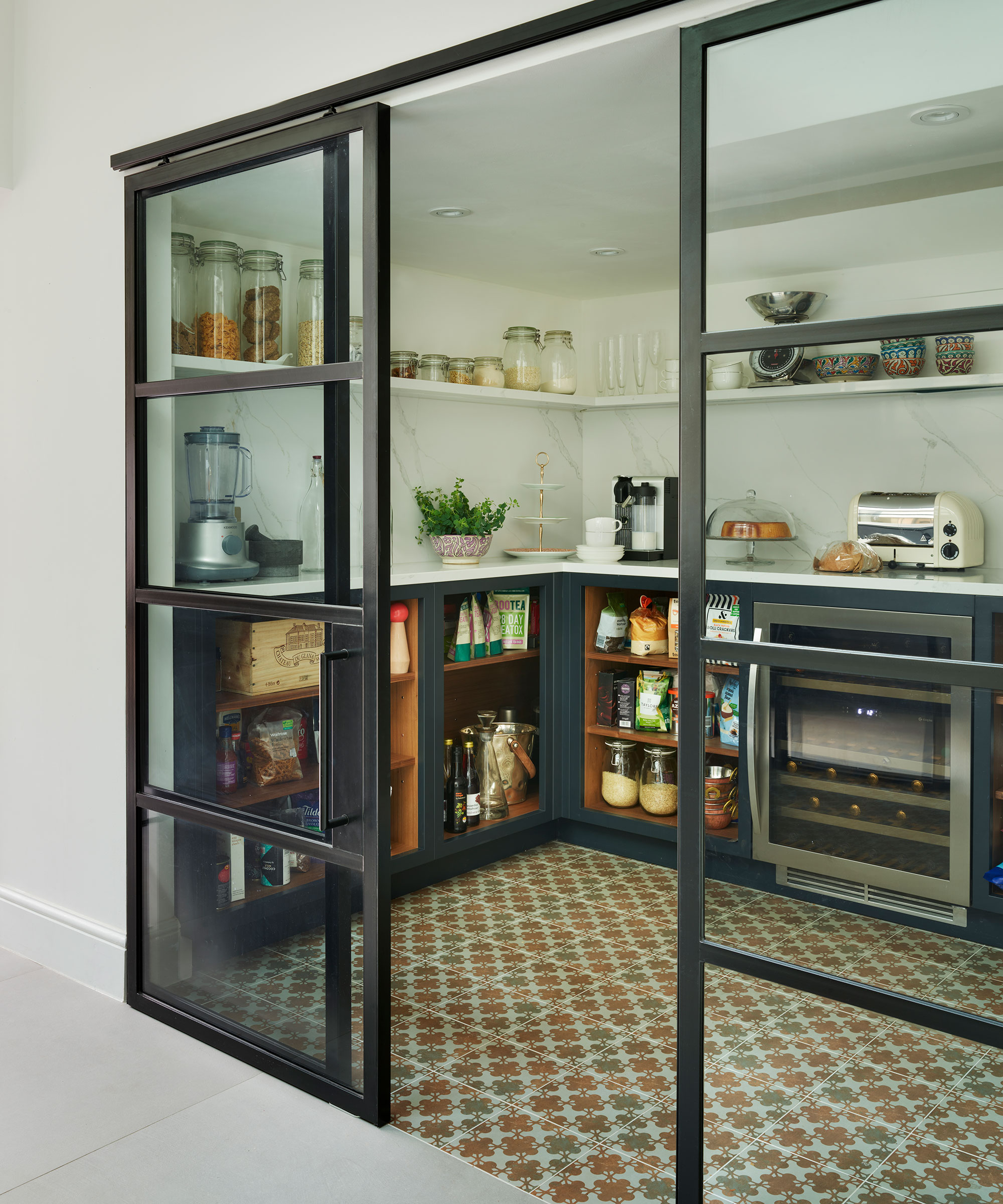
Forget notions of gloomy or sterile cupboards, the modern pantry is getting a glow-up – it's time to flex your decorating skills.
Crittall-style glazing is a clever way to enclose a walk-in pantry, without reducing the sense of spaciousness in the modern kitchen. Go for sliding doors rather than hinges for open, easy access.
‘Working inside the pantry becomes a pleasure as the space is integral to the whole kitchen, rather than being hidden away,’ explains Roundhouse designer, Robyn Gifford. ‘Metal-framed glazing is also a great modern design feature that enhances any style of kitchen.’
3. Use art to add decorative flair
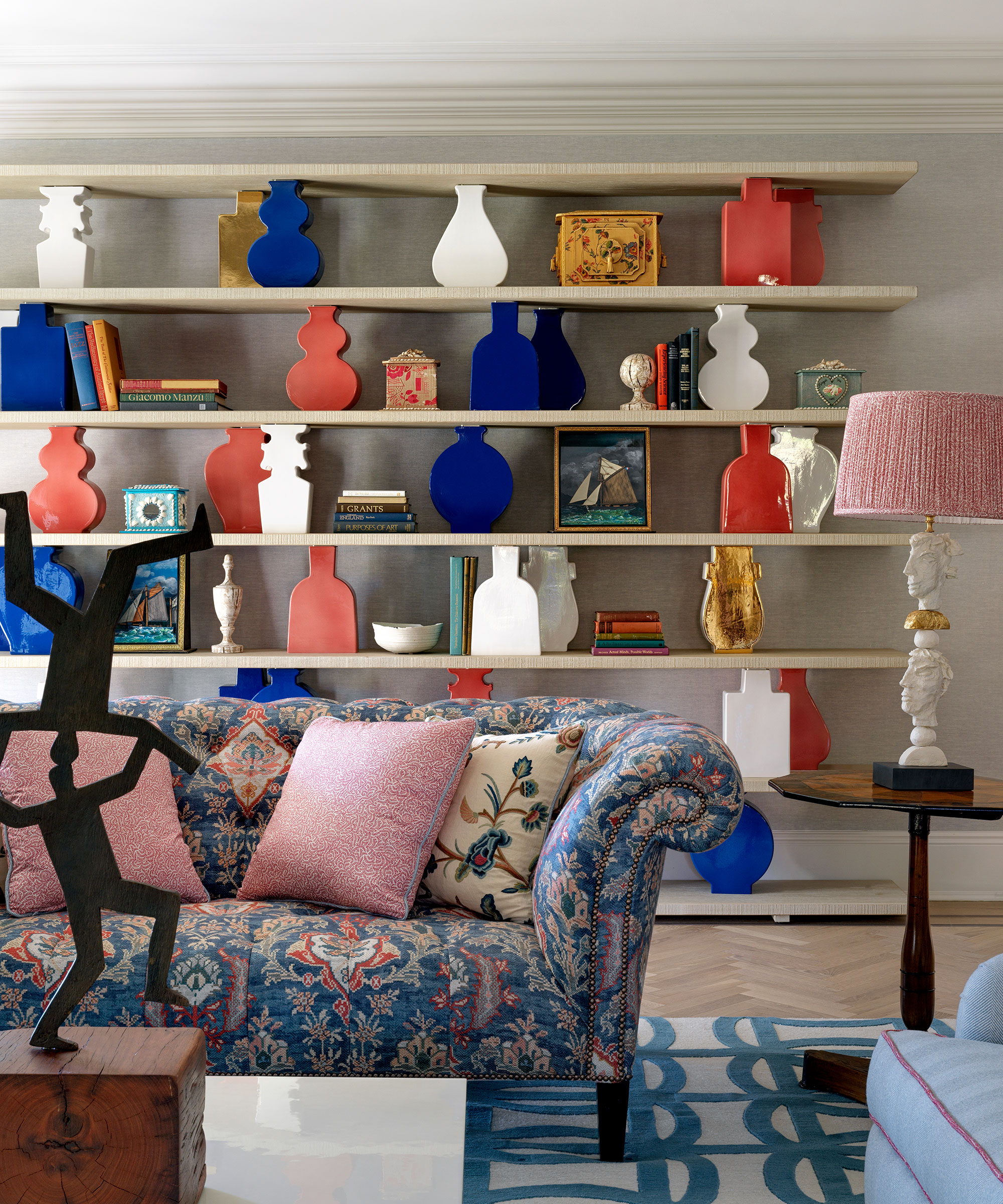
Shelves can act as modern art installations in their own right, without parting with thousands of pounds in the process. Displaying objects of the same kind creates a meaningful and significant statement but the items on show don’t need to be high art – the act of putting them together on display using a strong color scheme to create a coherent thread will have the required visual impact.
Here, a series of pots of the same size have been used to support each of the shelves above with great effect. It’s a classic and considered approach of Kit Kemp, founder and creative director of Firmdale Hotels and Kit Kemp Design Studio.
4. Cover a TV
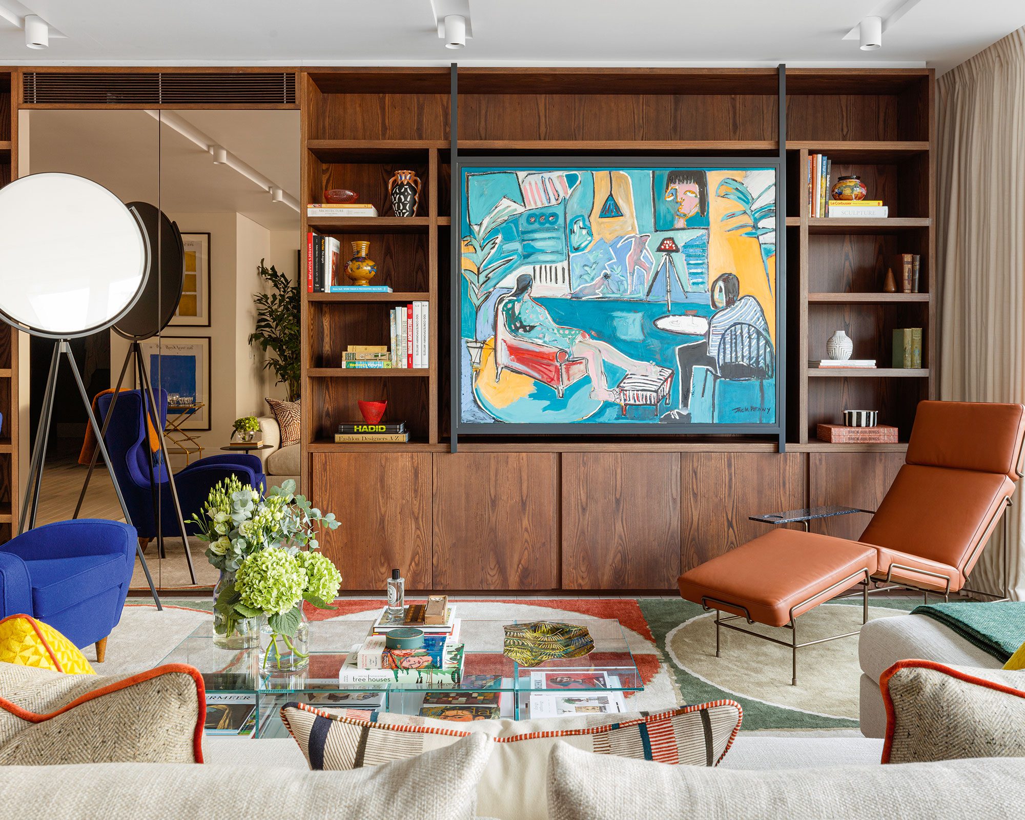
The TV is a ubiquitous presence in modern living rooms but its black reflective screen is regarded as an eyesore by decorators. The most common solution is to house it in a specially designed cabinet, but it’s not the only one. At first glance, this room looks colorful and bold using Studio Ashby’s signature mix of antiques, bespoke pieces, and contemporary design. The surprise is that the art can slide aside revealing the TV behind.
‘The TV must never be on show; that’s one of our rules at Studio Ashby,’ says founder and creative director Sophie Ashby. ‘In every project, we’ll commission joinery to conceal it like in this project in London’s Mayfair, where we’ve used this beautiful Jack Penny artwork to hide the TV.’
5. Keep clutter at bay
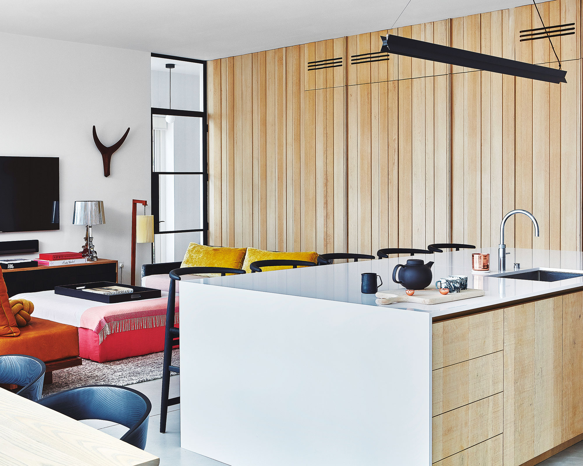
‘Making multiuse, hybrid living spaces work well is hugely reliant on practical and modern storage solutions,’ explains Magnus Nilsson, lead designer, Blakes London. ‘We advocate concealing as much of the functional aspects of a space as possible. By hiding mess and less sightly items, such as computers, fridges or drinks bar, behind complementary full-height doors, a room can be comfortably used for multiple purposes.’
6. Elevate with statement stone
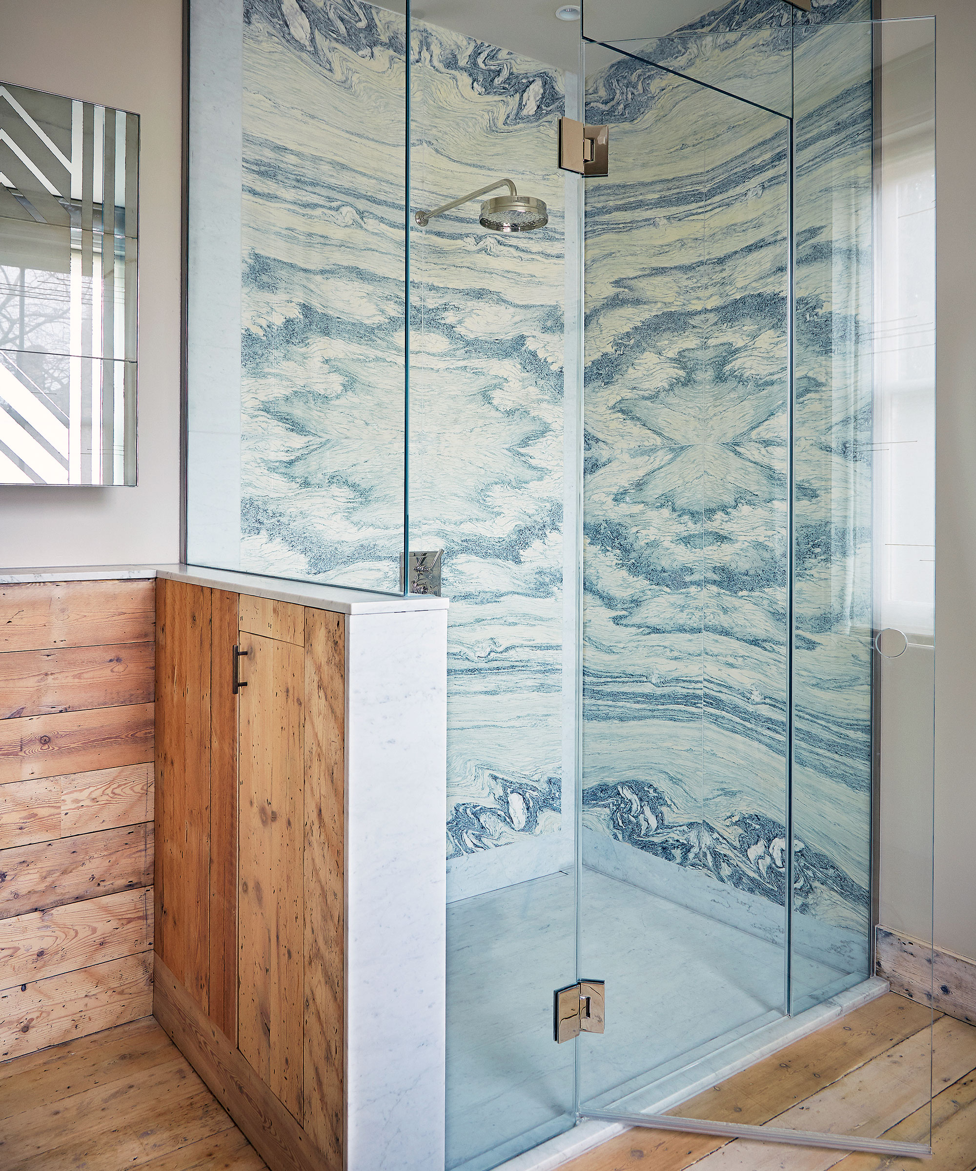
Book-matching is an elegant way to dial up the decorative impact of luxury stones, with space-boosting results. Here, eight pieces of stone, cut from the same block of marble, have been carefully book-matched to elevate this statement corner shower. ‘Using the marble floor to ceiling, without visible junction lines, helps pull the eye upwards and make the whole space feel larger,’ adds Maria Speake, founder, Retrouvius.
7. Be brave with color
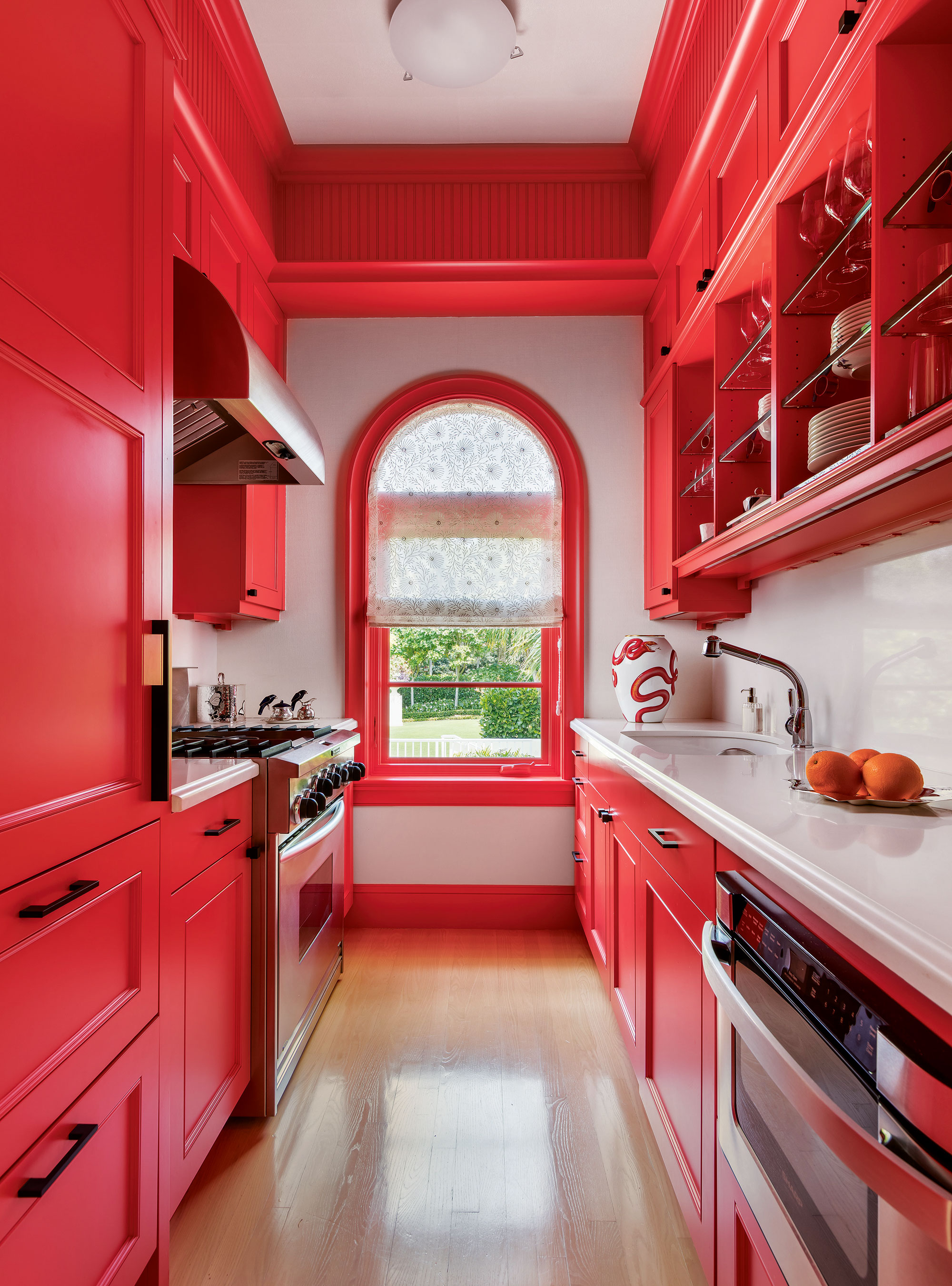
Bold color is one way to grow a space that physically has a small footprint. 'In this guest house, the modern and colorful kitchen is narrow, so I wanted to make it a star,' says Matthew Boland, principal, MMB Studio.
'The color – Sherwin-Williams’ aptly named Energetic Orange – grabs your attention and allows your eye to travel the entire length and height. The smallest spaces can be the most memorable if you keep the focus strong. Here, the focus was the paint color and we used it with vigor.'
8. Breathe life into unused spaces
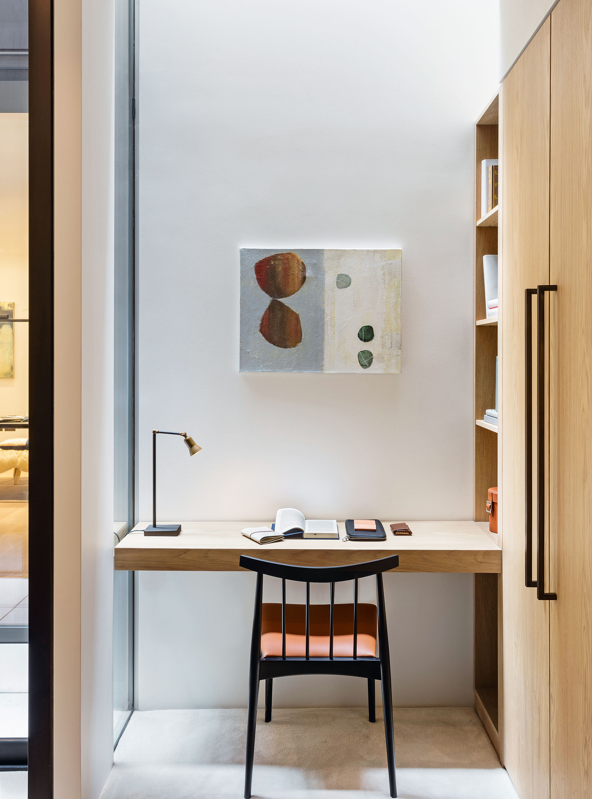
The best modern architecture and design take space into consideration, often adding value to 'dead' areas.
Small built-in desk areas can act as dressing tables, workstations, or areas to display objects. ‘In this space, the desk helped square off the wardrobe-cum-dressing area and the adjacent courtyard,’ says Steve Clinch, head architect at Echlin, who designed this table.
Keep colors subtle and angles sharp and straightforward to make the most out of every inch without too much distraction from the rest of the room.
9. Add smart partitions
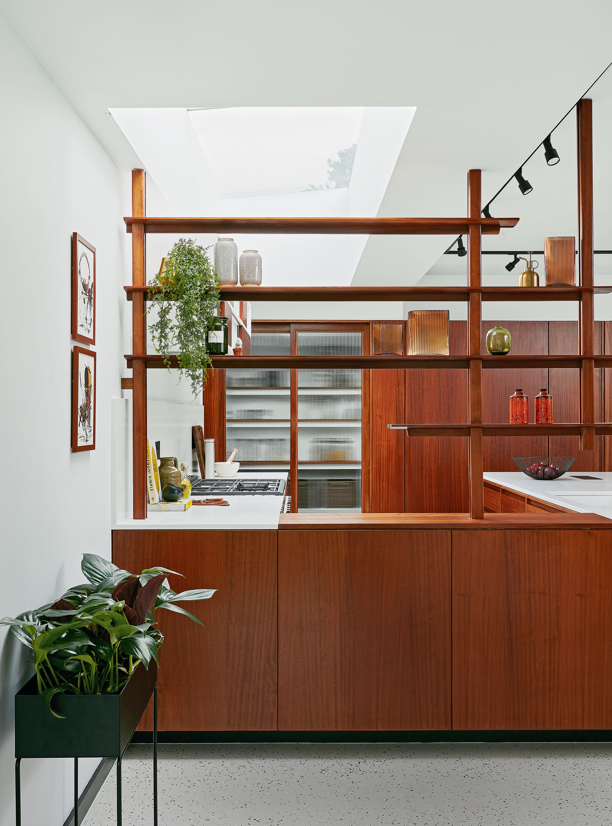
Most modern homes are open-plan, if this is the case in your house, install room dividers to break up a room.
Don’t be afraid to disrupt sightlines into a kitchen – not every chef enjoys an audience. Opting for an open partition, like this mid-century-inspired installation by Muchmore Design, is a smart move.
‘Designed to work as a beautiful display as well as a functional divider, it effectively bridges the feeling of coziness and openness within the contemporary open-plan living space,’ explains founder and creative director, Linsey Skepper.
Best places to buy modern furnishings
Sign up to the Homes & Gardens newsletter
Design expertise in your inbox – from inspiring decorating ideas and beautiful celebrity homes to practical gardening advice and shopping round-ups.

Jennifer is the Digital Editor at Homes & Gardens. Having worked in the interiors industry for several years in both the US and UK, spanning many publications, she now hones her digital prowess on the 'best interiors website' in the world. Multi-skilled, Jennifer has worked in PR and marketing and occasionally dabbles in the social media, commercial, and the e-commerce space. Over the years, she has written about every area of the home, from compiling houses designed by some of the best interior designers in the world to sourcing celebrity homes, reviewing appliances, and even writing a few news stories or two.
-
 What is an estate sale? Everything you need to know about how they work and what to expect, whether you are holding one yourself or shopping second-hand gems
It pays to know exactly what you are getting into when shopping at estate sales
By Ciéra Cree
-
 How to grow lady's mantle – for a shade-tolerant ground cover plant that will thrive in challenging borders
With lush green foliage and luminous lime flowers, lady's mantle can add color and impact
By Thomas Rutter