7 designer tips to instantly elevate your kitchen without having to remodel
Looking for ways to make your kitchen more beautiful without a total remodel? These are the places designers say to focus on
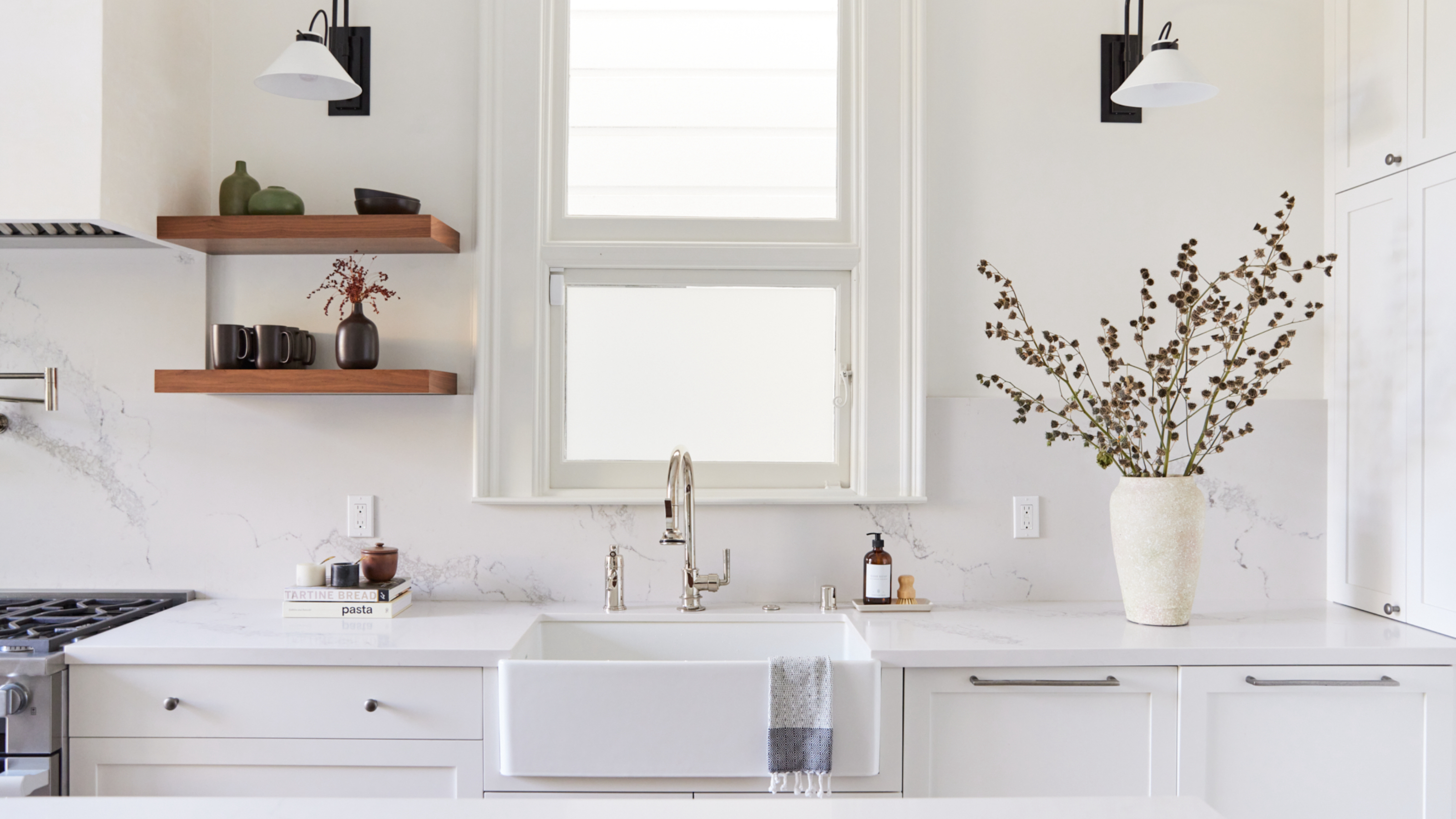

Kitchens at first appear tricky spaces to update, it's not as easy to switch things up with the trends as say in a living room or a bedroom. Everything is quite set in a kitchen. However, there are ways to elevate your kitchen and make it look more beautiful, without having to have a total overhaul.
There are smaller elements you can focus on that will have a huge effect on the space overall, making your kitchen feel like it's had a remodel without actually having to pull the whole thing out and start over. So, we asked designers for their kitchen ideas and where best to spend your budget and energy in order to update the space quickly and easily.
7 easy ways to elevate your kitchen
Since kitchen trends are always ever-changing, we understand the feeling of wanting to switch out your kitchen every season. However, starting from scratch isn't exactly a realistic option, but there are smaller switches you can make in order to give your space a refresh. Here's what designers suggest:
1. Switch out your tiles
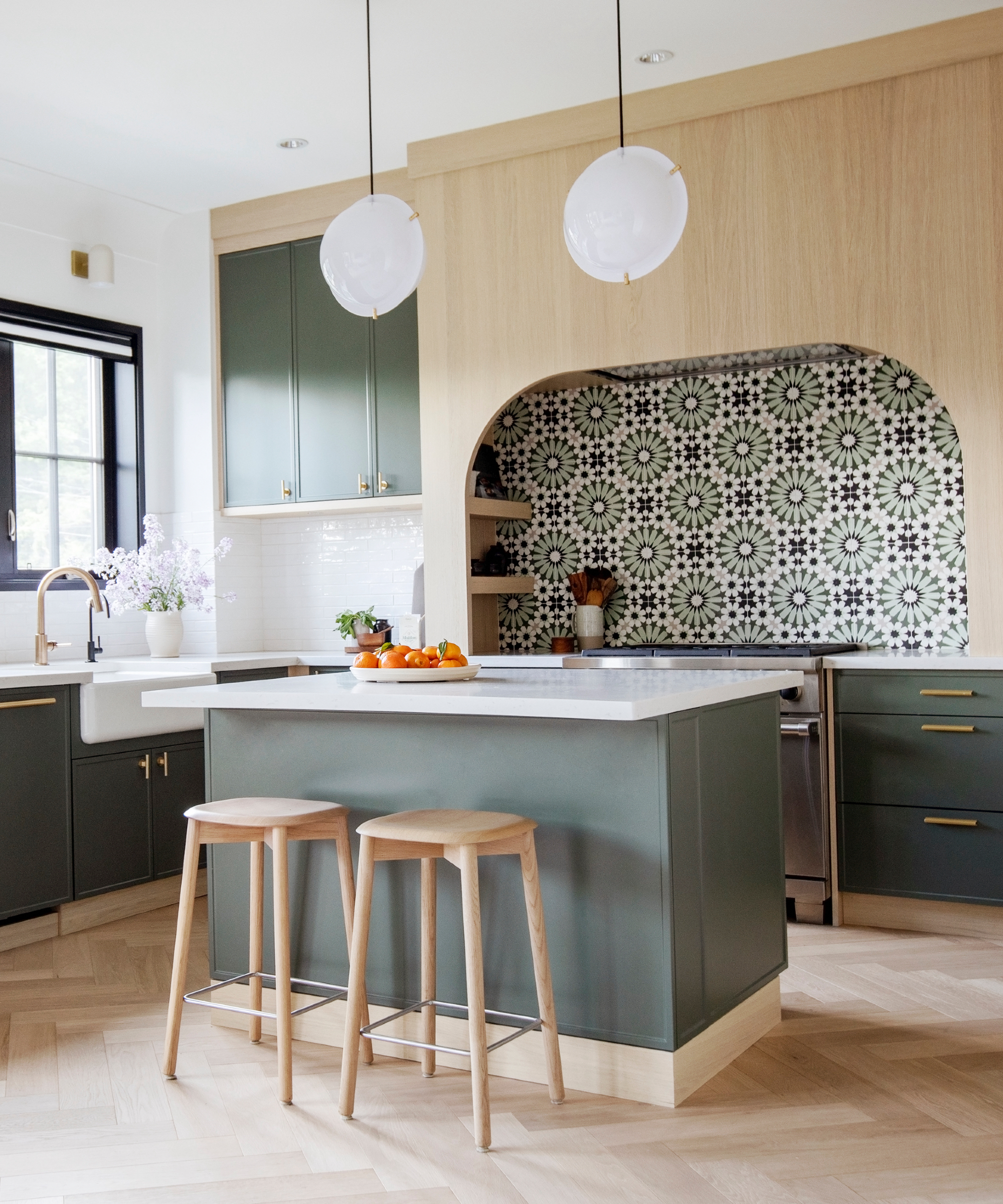
Kitchen tiles are a great place to focus if you want to update the look of your space. You can use tiles to bring in a new color, pattern, or texture. Sometimes it's an option to tile over old tiles, or even if you have to remove them and retile, it can still be done relatively quickly and cheaply, and the impact it will have on the overall look will be huge.
'To talk about the gorgeous tiles in this kitchen, we have to look at the whole picture,' explains Ami McKay, founder of PURE Design.
'Here we have a blend of 4 materials in different scales used in an interesting way. We have 1) the painted cabinets, 2) wood used in an interesting way to trim the top and bottom of cabinets (not just the predictable painted uppers and wood lowers), 3) the subtle kitchen backsplash tile above the counters make way for the gorgeous feature tile behind the range and lastly, 4) the clean and simple pendants.
'The combination of all these elements really elevates the kitchen. The scale of the arch and the pattern and colors of the tile pull the kitchen together. Look for ways to mix materials that are bold and different.' she adds.
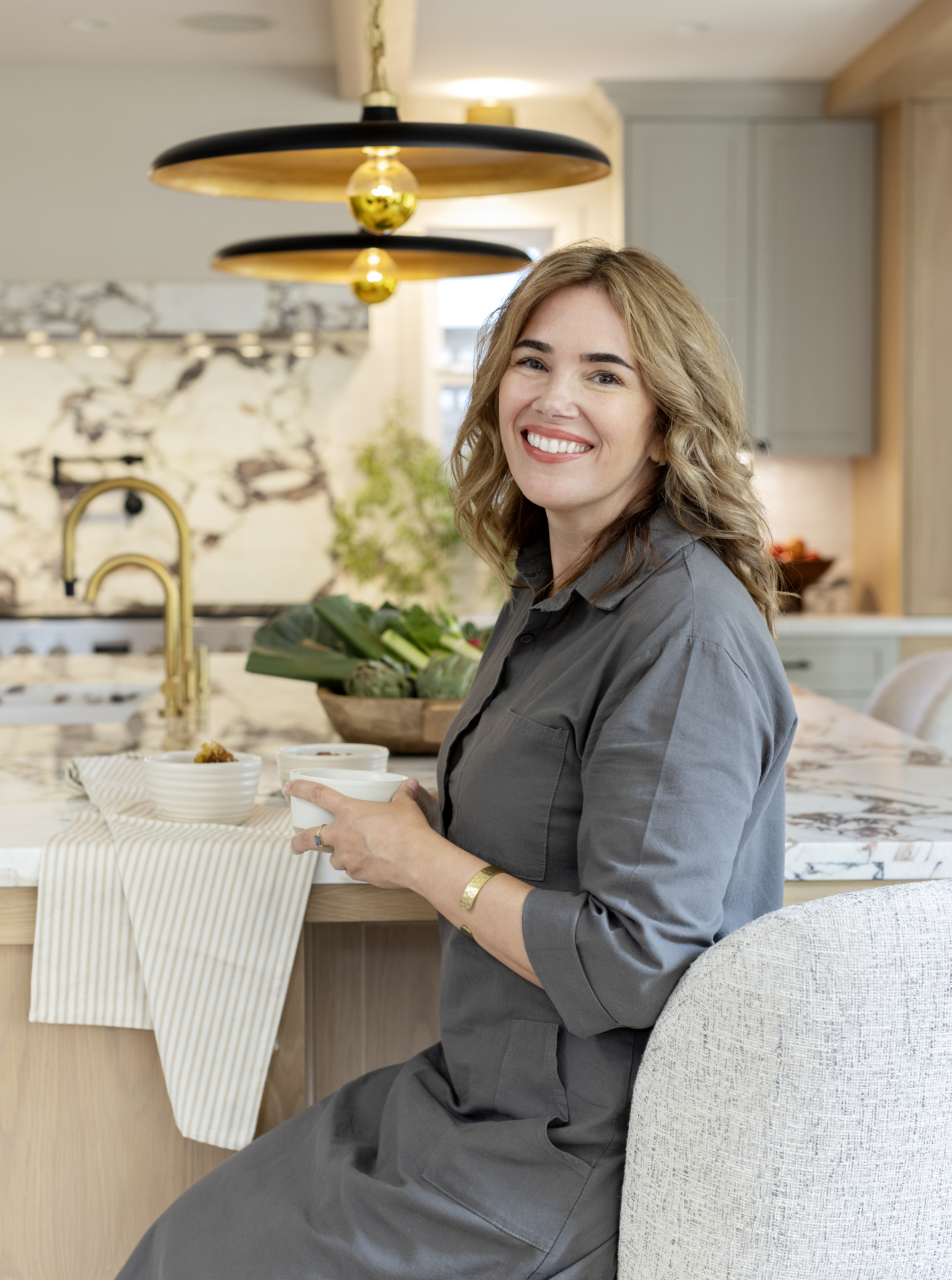
Ami McKay founded PURE Design in 2000 on the belief that design is found in the art of giving. The work that she puts into each project reflects her personal life experiences and she believes they are at the heart of her business. Today, she is proud to be named one of Canada’s Top Five Interior Designers.
2. Change up your hardware
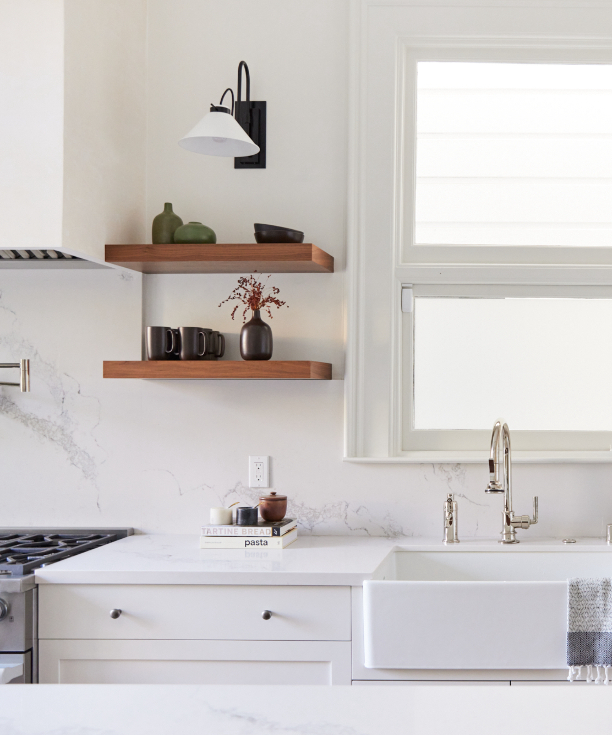
The finer details are often what can make or break a scheme and when it comes to hardware, it's about the quality and how good the finish is. So if yours is looking a bit lackluster, switching out for a more luxe material can instantly elevate your kitchen.
Chelsea Murawski, co-founder of Together Home Design Studio says, 'One tell-tail sign that a kitchen has skimped on finishes, is when all of the plumbing and cabinetry hardware are chrome. Chrome is the least expensive metal, and while one might think this is a great strategy to keep cost down next to the heftier price tag of countertops and cabinets, the opposite is actually true.'
'To avoid this mistake, we first work with our clients to help them select a metal finish for their kitchen that has depth, interest and works with their style. For example, if we select brass, we select a brass that is unlacquered or antiqued so the patina highlights the character and authenticity of the metal.'
'If we select nickel, we typically like it to be polished to bring out the timeless elegance of the material. Next, we select the style of the fixtures and complimentary cabinet hardware. Don't be afraid to mix-and-match warm-undertone materials together. Brass and nickel look amazing together.'
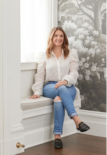
A Northern California native, Chelsea grew up with a father in real estate and an artist for a mother. As a child, she saw the transformation of countless homes, absorbing all she could about design and functionality. After graduating from college, Chelsea channeled her genetic creativity into landscape design and eventually, into designing furnishings and interiors for Anthropologie and Pottery Barn Kids. While creating spaces for the masses carried a certain appeal, Chelsea's passion has always been in the intimate details of creating something completely custom and entirely personal. Chelsea, along with her husband and two sons, continues to call the Bay Area home.
3. Layer up textures
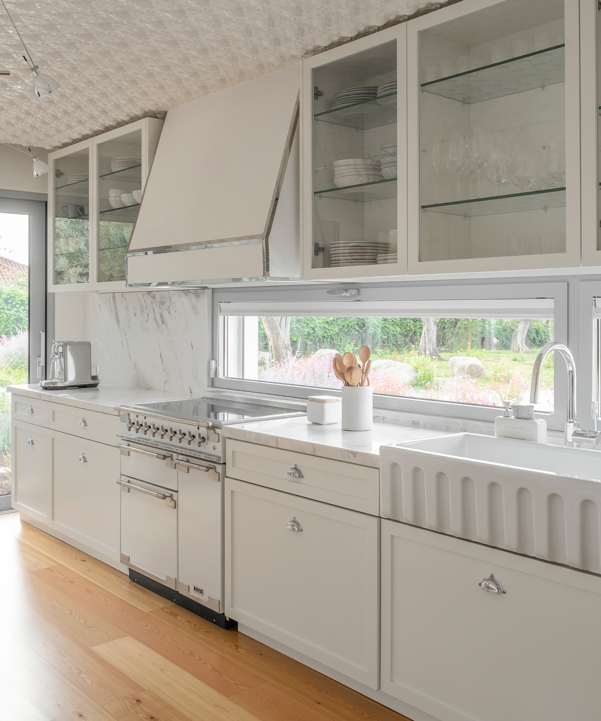
There are many positives about an all-white kitchen scheme – great for low ceilings and small kitchens in general and a hit if you love a minimalist style. But, they can be elevated even further with the use of texture. Joana Aranha, founder and head of creation at Joana Aranha explains:
'Texture plays a pivotal role in preventing an all-white scheme from appearing cheap. We deliberately incorporated elements outside of their usual context, injecting a sense of contemporaneity and a surprising twist into the kitchen's design. In this unique design, we took a daring step by placing these tiles in an unconventional location: the ceiling. This unexpected choice adds an almost sculptural dimension to the space.'
'We always use quality materials, avoiding mere imitations and emphasizing authentic, high-quality finishes. We firmly believe that quality materials are indispensable for achieving a sophisticated outcome.'
4.Update your color scheme
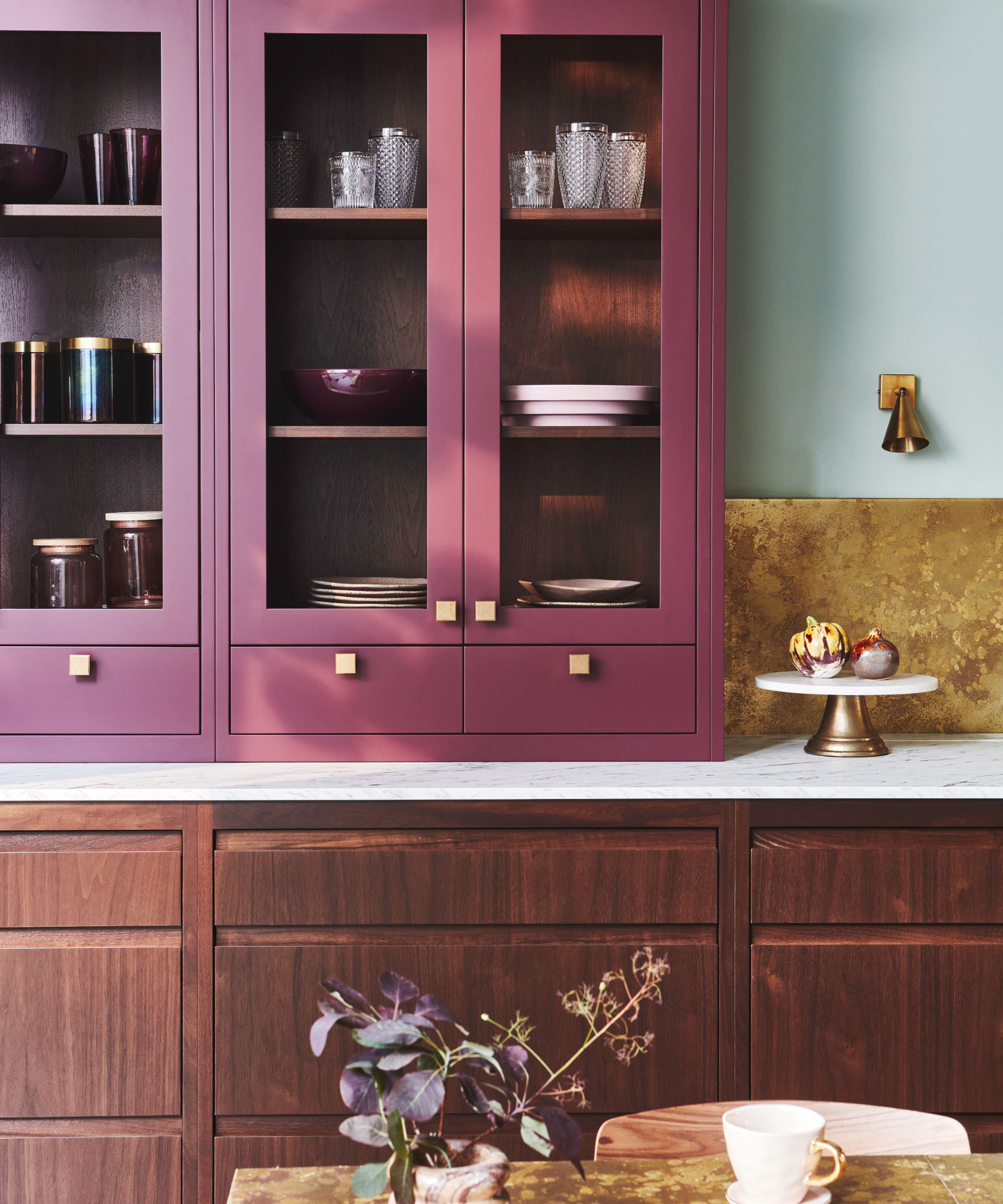
Painting your kitchen cabinets can give your kitchen a whole new look. It's a job you can do yourself if you are up for the task, but even if you bring in the pros it's faster cheaper, and quicker than installing a brand-new kitchen. You could even just update a smaller element like an island or the wall cabinets only.
'When done correctly, embracing color within the kitchen can create a luxurious feel. Opting for rich tones such as deep purple, navy blue, or forest green for cabinetry or the island offers the perfect base to highlight other materials used in the design,' says Elizabeth Sherwin, creative director, Naked Kitchens.
'Pairing with dark wood cabinets such as walnut will elevate the space as the depth and grain of the wood itself is brought out. Adding elements of brass into the scheme creates a strong contrast, allowing for the metallic to take center stage without fighting for attention – this balance is incredibly important when it comes to creating a classy, expensive-looking kitchen.'
5. Change up the lighting
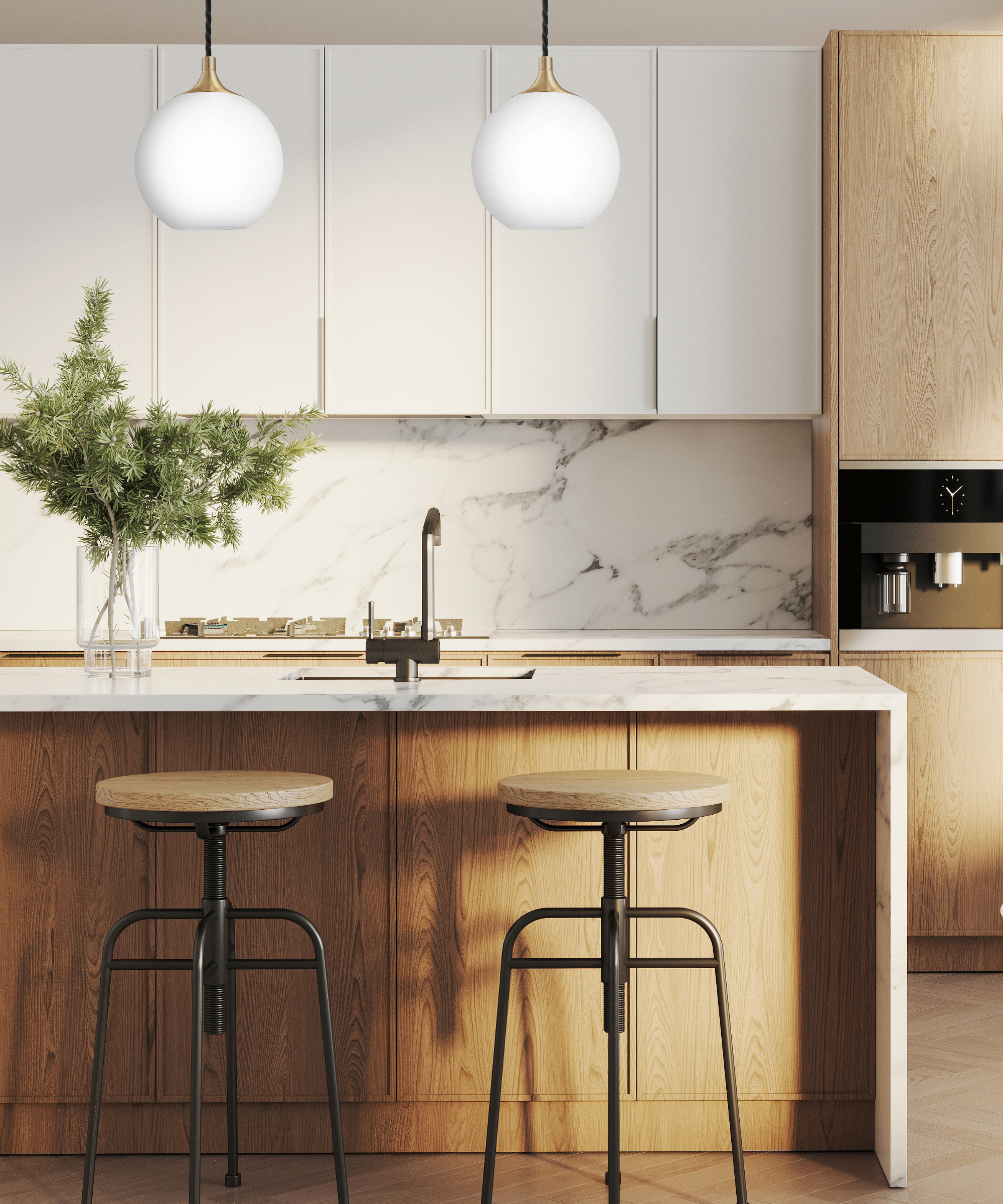
Lighting may not seem a key part of your kitchen design, but it has a huge impact, both practically and aesthetically. Switching up your fixtures can really elevate the room and make it more functional too.
'Kitchen lighting sets the tone for the space, so investing in the key fixtures brings an air of sophistication to your kitchen. Handcrafted fixtures are also key to giving a room an upscale look, as they add a level of detail that cannot be found in mass-produced lighting,' says Mara Rypacek Miller, managing director, Industville.
'If you have a more minimalist aesthetic in your kitchen space, look for sleek metal fixtures with simple shapes such as geometric pendants or linear sconces. If you prefer a more classic vibe, try out handcrafted chandeliers with intricate details like detailed filigree or rustic finishes. Whether you go for modern or classic pieces, ensure that the lighting fixtures are quality-made with durable materials like brass, iron, or steel.'
6. Integrate your appliances properly
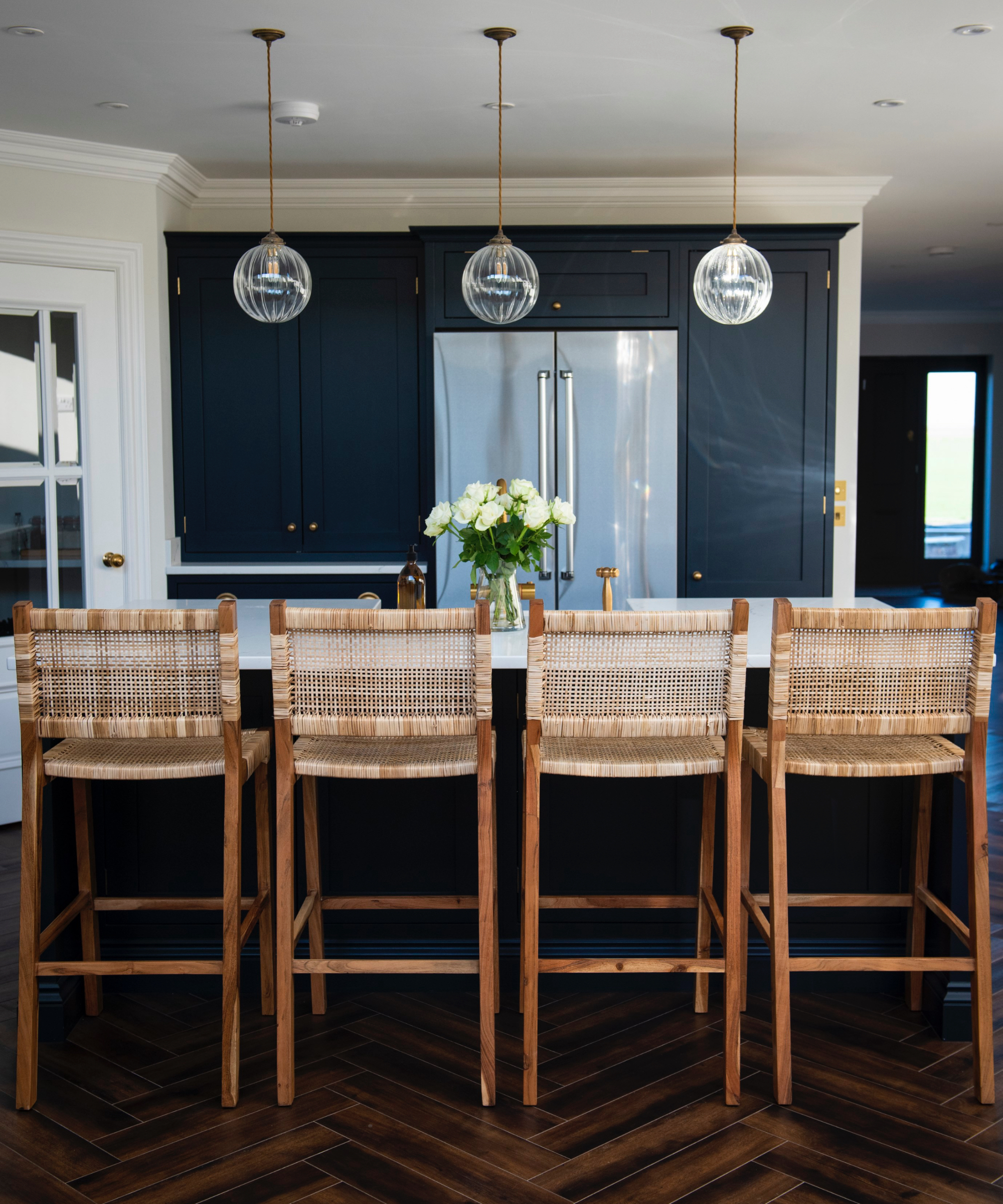
We all need them to make our lives easier, and if we don't have a laundry room or walk-in pantry then appliances need to find a home within the kitchen. However, having mismatched appliances or them not having a dedicated place within your kitchen layout can cheapen the overall feel of your kitchen.
The key to ensuring they don't bring the look of your space down switch out your appliances to ones that match, or if possible, have them integrated within the cabinetry - a small switch that can make all the difference.
'Appliances that don't match in color or style can make the kitchen look disjointed. Instead, opt for built-in appliances, or when it comes to larger additions like refrigerators, consider the artful option of boxing them in. This means creating a cabinet or enclosure around the refrigerator to integrate it into the kitchen design and provide a seamless, built-in appearance. This process can help achieve a more cohesive and customized look for the kitchen,' suggests Molly Chandler, designer at Willis & Stone.
7. Focus on your countertop material
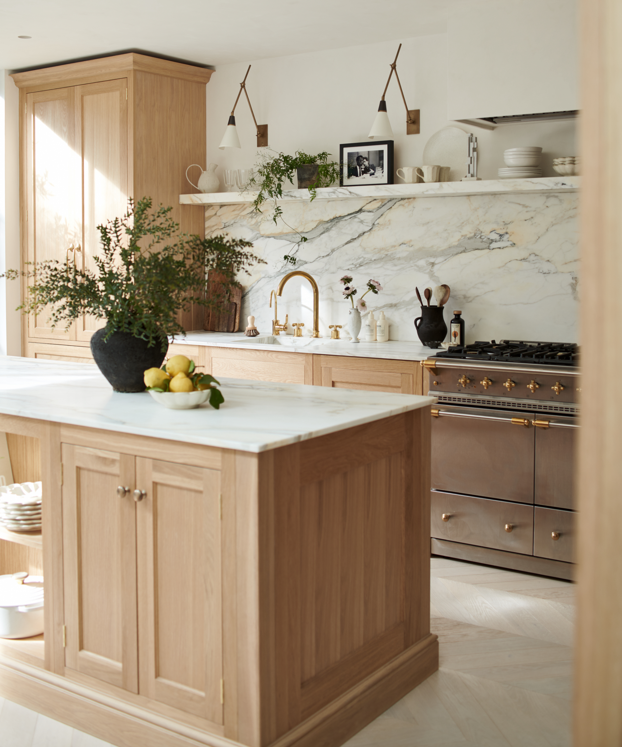
Countertops are an essential part of the kitchen and they need to work hard. So after a few years, they can start to look tired and can bring down the look of the space. However, they can be replaced without having to replace the whole kitchen, and opting for a new material or even just a fresher version of what you already have, can really lift the space.
'Kitchen countertops take a lot of punishment, and it is important to choose the right materials for the way you prepare and cook food,' advises Simon Temprell, interior design lead at Neptune. 'Low-grade work surfaces such as melamine will have seams where the sections are joined together, and these will gather dirt and grease. The seams will also ‘cheapen’ the look of your kitchen cabinetry and melamine has a definite man-made appearance.'
If you are on a budget then wooden countertops are a good value option. Simon adds, 'Timber countertops are less expensive than natural stone or marble and they can instill some welcome warmth, but you will need chopping boards and trivets to prevent the wood from becoming scarred or burnt.'
FAQs
What adds value to a kitchen?
'A beautiful and unique hood fan will add value to your kitchen, think about a plaster or lime wash finish on the hood fan, or tile it! Gorgeous tiles in your kitchen (floor, backsplash, hood fan) add visual interest and your personality as well as value. Limewash on your walls, a useful island, a coffee station and an appliance garage all add value to your kitchen,' says Ami McKay.
What colors make a kitchen look expensive?
'Muted earthy tones such as green, mustard, and plum for paint or millwork work beautifully in a kitchen. We often add black accents as they add sophistication and anchor the eye,' adds Ami.
'Color is subjective but, for me, darker colors seem to suggest luxury and sophistication,' says Simon. 'Navy blue, dark green, teal and chocolate brown on kitchen cabinetry will elevate even the most prosaic cabinetry, making it feel more substantial and expensive. Cabinet hardware is important too and darker colors seem to work better with antique brass, dark bronze, or copper tones. Consider painting a contrasting color on the inside of your cabinets for a dramatic ‘reveal’ every time you open a drawer or cupboard.'
Sign up to the Homes & Gardens newsletter
Design expertise in your inbox – from inspiring decorating ideas and beautiful celebrity homes to practical gardening advice and shopping round-ups.

Sophie has been an interior stylist and journalist for over 20 years and has worked for many of the main interior magazines during that time, both in-house and as a freelancer. On the side, as well as being the News Editor for indie magazine, 91, she trained to be a florist in 2019 and launched Flowers Inside My Head where she curates beautiful flowers for modern weddings and events. For Homes & Gardens, she writes features about interior design – and is known for having an eye for a beautiful room.
-
 How to grow crepe myrtle in pots – and transform even the smallest of yards with dazzling flowers this summer
Growing crepe myrtles in pots will inject splashes of brilliant color into your outside space
By Thomas Rutter Published
-
 I've spent over 200 hours testing vacuums and swear by my two Dysons – this is how I properly clean a Dyson vacuum filter for longer-lasting appliances
Your Dyson vacuum will last much longer and clean at its best
By Dan Fauzi Published