How to do maximalism in a small room – 15 ways to make a statement in a tiny space
Create head-turning small spaces brimming with color, pattern and personality with these inspiring schemes and expert tips
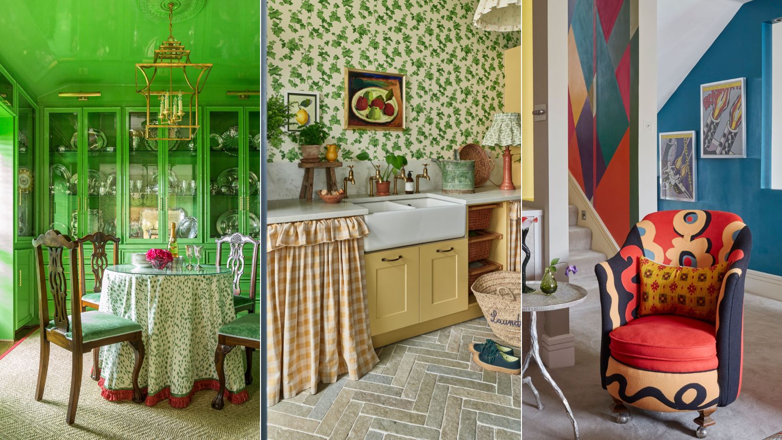
- 1. Opt for a vibrant color drench
- 2. Bring an element of surprise to a powder room with a bold wallpaper
- 3. Choose an ornate wallpaper
- 4. Decorate with contrasting colors
- 5. Layer small scale prints
- 6. Go for a large scale mural
- 7. Wallpaper a small bedroom
- 8. Introduce statement furniture
- 9. Embrace frills, tapes and borders
- 10. Pair bold patterns but co-ordinate the colors
- 11. Don't scale back furniture
- 12. Use the 60 30 10 rule
- 13. Embrace texture
- 14. Fit wall to wall shelves
- 15. Decorate the ceiling

Maximalism is the decorating trend centered around the idea of taking decor to the max in order to create rooms with wow-factor and impact. While minimalists believe less is more, for maximalists, more is more.
Maximalists don't hold back, they like to push the boundaries and fill spaces with the things they love. The look is characterized by the liberal use of color, pattern, statement furniture, and art. Contrasting colors are welcomed, alongside a wealth of patterned fabrics and decorative trims. The beauty of the look is there are no rules. Styles are mixed across the eras and old is juxtaposed with new.
Some may argue that this abundant look can only work in large rooms, but in fact maximalism can work really in small spaces - the question is - how do you get the balance right? We consulted interior designers on how to do maximalism in a small room to get their ideas and advice.
How to do maximalism in a small room
Creating a maximalist look in a small room can be seen as a challenge. Often we think small rooms offer less scope for creativity, but there’s no need to have a large room to create a space big in personality. On the contrary, many interior designers argue that small rooms are the best spaces to embrace maximalism and offer endless creative possibilities.
'There is an unwritten rule, which I do not agree with - to approach small rooms with a pared back, plain or neutral approach, often leaving small spaces feeling unloved, says fabric and wallpaper designer Molly Mahon. 'I would much rather embrace a small space and create a joyful and inviting maximalist interior with layers of pattern and color.'
To inspire your scheme we've rounded up an array of small maximalist rooms alongside some handy tips from interior designers.
1. Opt for a vibrant color drench
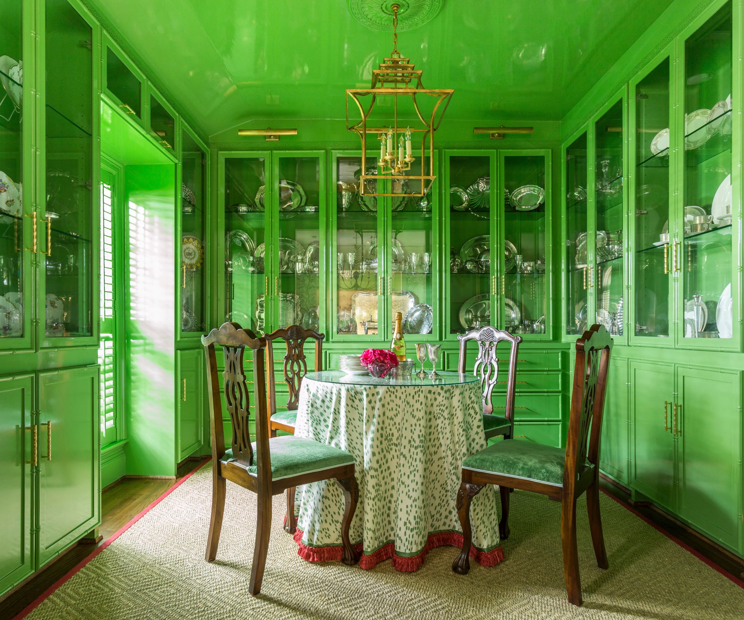
Color drenching walls and the ceiling in one color is an easy way to bring wow-factor to a small room and is a fabulous way to create a sense of occasion in a dining room. Some also argue that it can make rooms feel larger by blurring the boundaries between surfaces. For this green dining room, interior designer Courtnay Tartt Elias, founder of Creative Tonic Design chose Fine Paints of Europe’s Hollandac paint in a custom green color; dark colors make a good alternative for those looking for more cozy, cocooning spaces.
‘To create a bold look in a small room I try to unify the space with color. You could paint everything the same shade or try using fabrics all in the same color but mixing in different tones and patterns,’ says Courtnay Tartt Elias. ‘This dining room is actually a more intimate dining room that opens into a larger dining room covered in a bird wallpaper with a creamy background. I thought a pop of green would really pull your eye in and set off the front room, almost like a picture frame sets off a painting.’
For extra pizzazz why not go for a gloss paint? ‘I chose the high gloss lacquer finish because it is the most beautiful at night with candles on the table. The light flickers on the reflective walls and the space turns into the most beautiful, magical area. It’s quite effective in a small space and truly turns a dinner party into the most intimate maximalist romantic experience.’
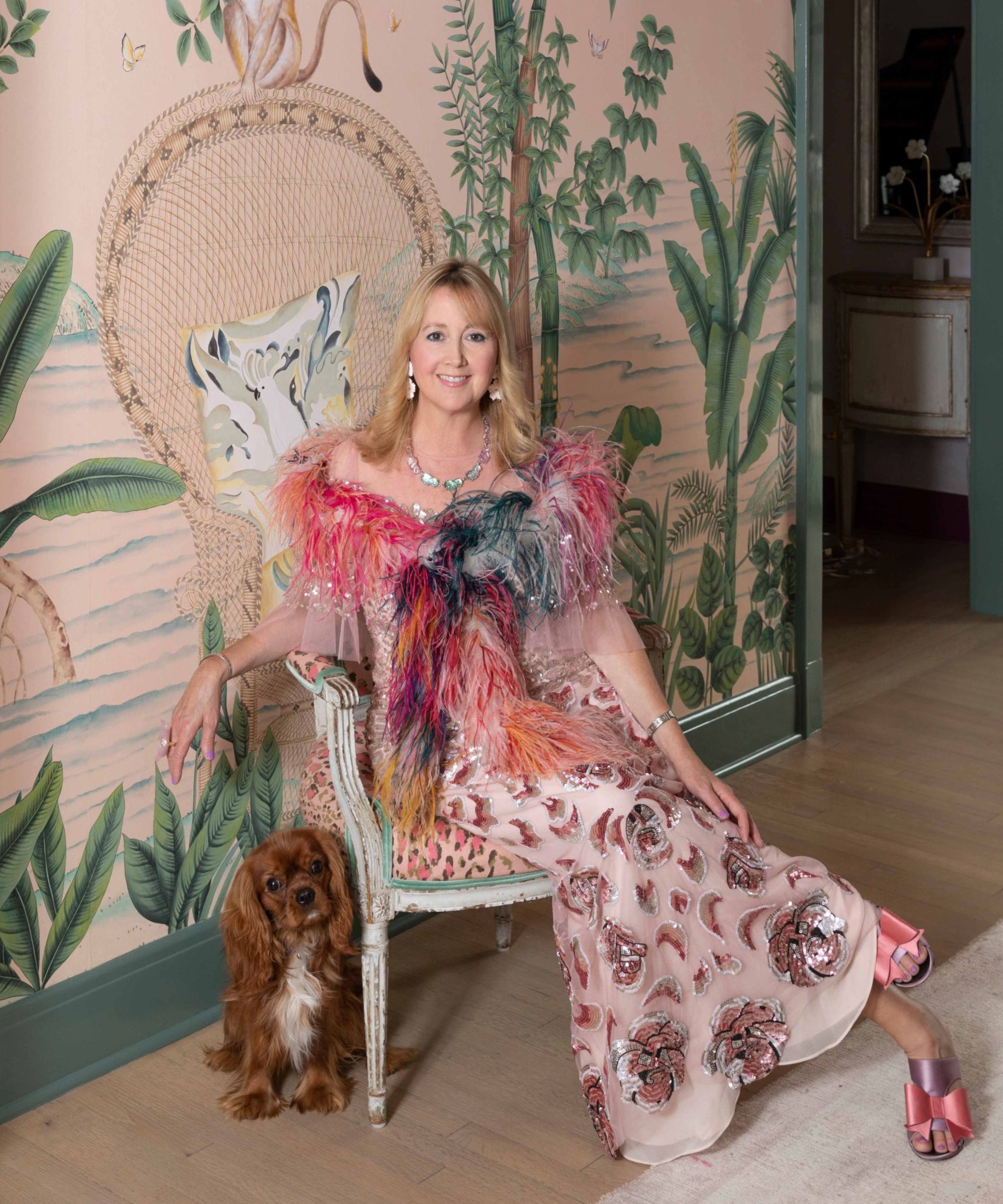
Courtnay Tartt Elias is the founder and creative director at Creative Tonic Design. Based in Houston, Texas, Courtnay and her team offer full interior design services nationwide from architectural and construction consulting to full-home renovation and comprehensive design installation. She is passionate in creating layered environments with textures, tones and prints and her interiors are characterized by an adventurous spirit and aim to be a reflection of her client's personal style.
2. Bring an element of surprise to a powder room with a bold wallpaper
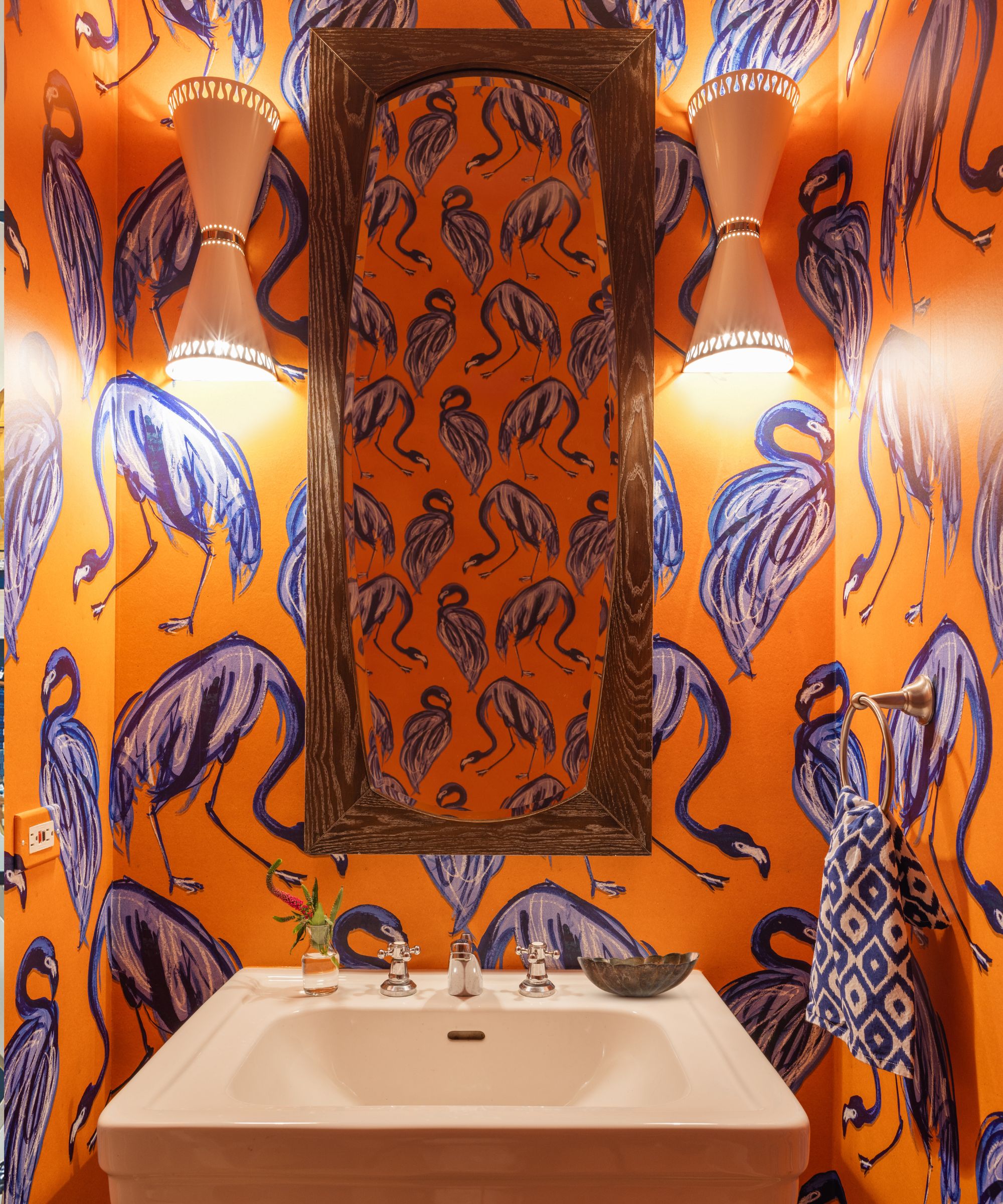
Connecting spaces and transitory rooms used for short amounts of time such as hallways, powder rooms, mud rooms, and utility rooms are all perfect spaces to be a little more daring with decor. Similarly, guest bedrooms or bathrooms can be a great place to create a talking point, whether it’s using a bold wallpaper, vibrant paint ideas or by decorating with art and collectibles.
‘When creating a tantalizing feast for the eyes, my go-to treatment is wallpaper that is unexpected and fun,' says Chicago based interior designer Jessica Blue, founder of Jessica Blue Interiors. 'Typically, the best opportunity for this is a powder room. Guests are pleasantly surprised when they visit, and clients get the opportunity to do something they probably would never pull the trigger on in other parts of the home.'
'Another approach to maximalist decor in small spaces is curating a vibrant mélange of colors and patterns through window treatments, throw pillows and furnishings. Things don’t have to be matchy-matchy. Pull colors from something that inspires you like a painting or an article of clothing from your closet and build on that with layering in unexpected colors and differently scaled patterns,' adds Jessica Blue.
3. Choose an ornate wallpaper
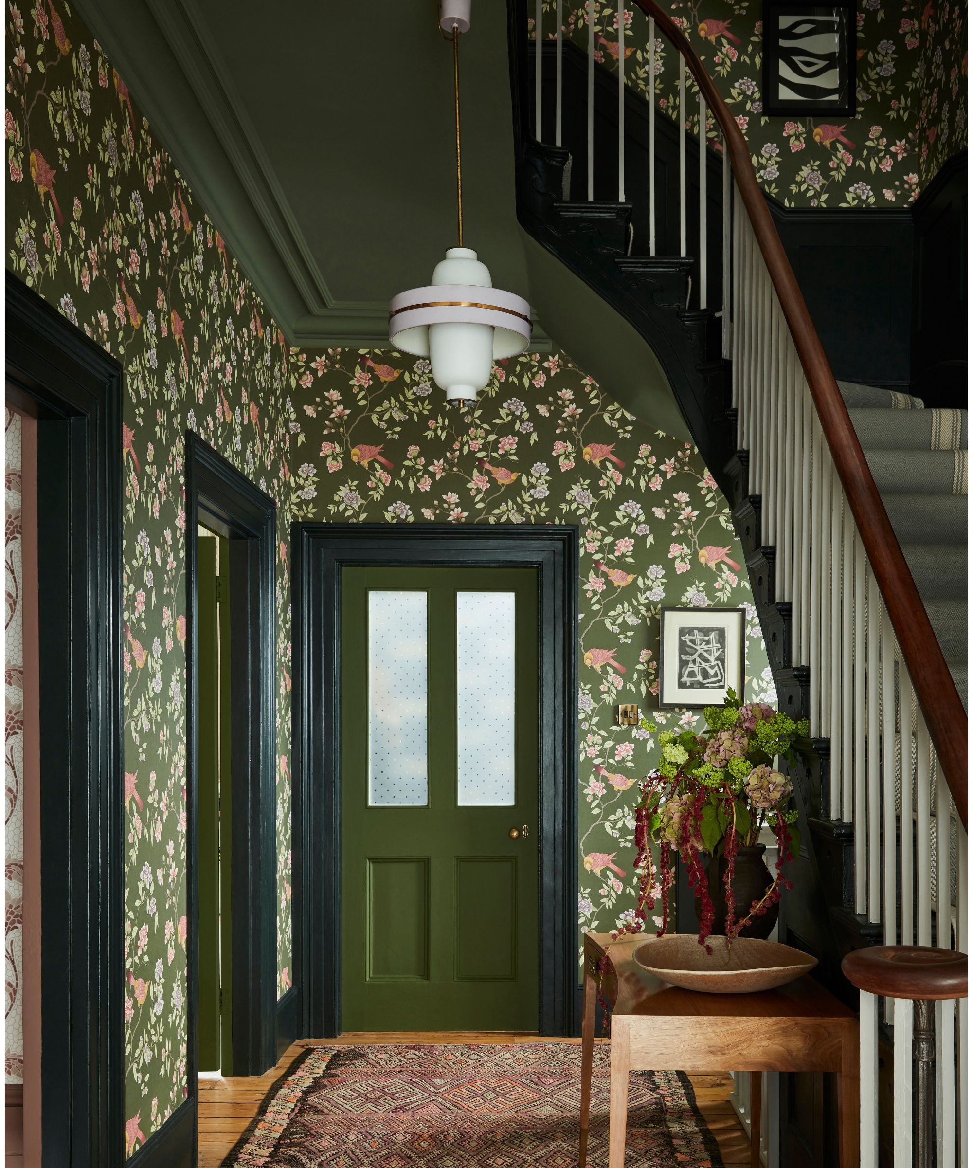
Being liberal with pattern is a hallmark of the maximalist look. Used in large everyday spaces, patterned wallpapers can be overwhelming, but small hallways are perfect places to embrace them. Not only will papering a hallway bring an element of fun and surprise, it’s a great way to reflect your interest and stamp your unique style on your home.
For extra impact choose contrasting color for paintwork, alternatively match your woodwork to the paper for a harmonious look.
‘Don’t be afraid to embrace all-over patterns, as often smaller rooms such as laundry rooms and hallways are transient spaces where you won’t spend lots of time and you can therefore go to town with something more impactful, adding character and showcasing your personality,' says Ruth Mottershead, creative director at Little Greene. 'Choose a pattern you love and tie your scheme together with coordinating paint colors, or why not embrace all the surface areas and wallpaper across the ceiling too, this will create a wonderful cocooning feel and evoke a sense of joy.’
4. Decorate with contrasting colors
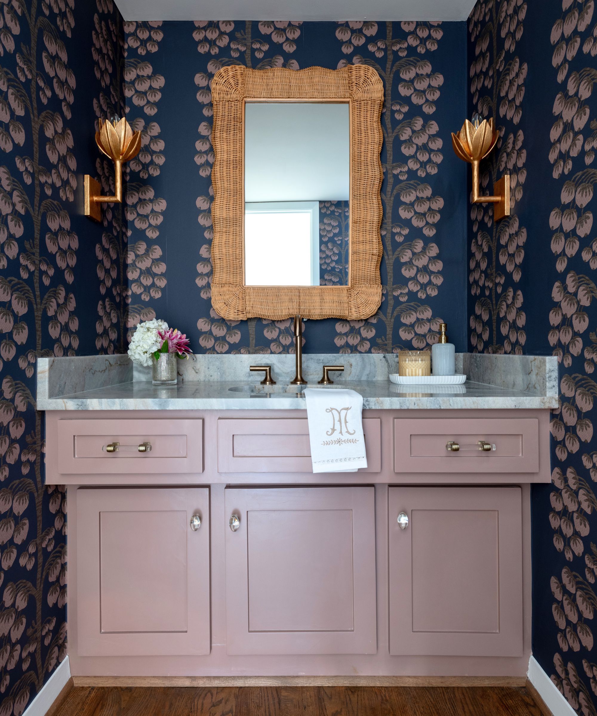
Decorating with contrasting or clashing colors creates instant impact. If you’re daring go for saturated tones, alternatively, team pastels with dark colors for a toned-down take on the look. The color wheel is a great tool for planning color schemes - choose tones opposite each other on the wheel to make a statement. To soften the look, add in a range of materials and decorative finishes says interior designer Gaia Guidi Filippi, founder of Gaia G Interiors.
‘Don’t be afraid to mix bold, unexpected colors. The mauve vanity against the dark botanical wallpaper creates a striking contrast in this tiny guest bathroom. Next, I like to go for larger-scale prints. They can add drama and make the space feel grander. Incorporating metallic touches for a bit of luxury is another necessary element of maximalism, in my opinion,' says Gaia Guidi Filippi. 'The floral brass sconce lights in the bathroom are both pretty and glam. It’s also important to mix up textures to keep things interesting. The rattan mirror with the marble countertop and soft wallpaper help give this space depth and richness.'

Gaia Guidi Filippi is the owner and Principal Designer of Gaia G Interiors in Dallas, TX. She founded her interior design firm out of a love of combining her innate creativity, discerning eye and endless resourcefulness to help people create spaces they can’t stop looking at. Her creative process merges beauty and functionality, culminating in bespoke, design-forward yet welcoming spaces.
5. Layer small scale prints
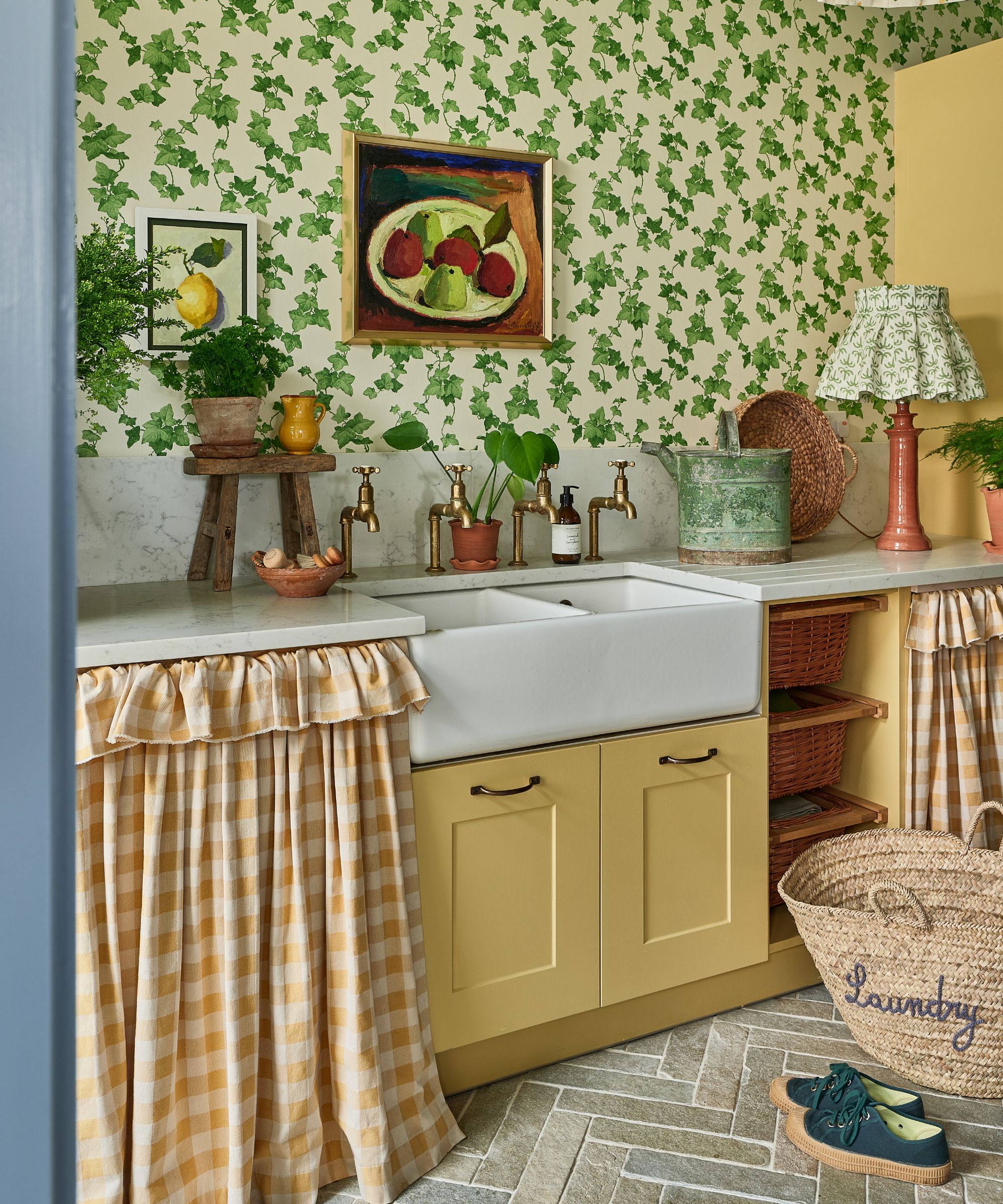
Maximalists don’t shy away from pattern. Large scale, small scale, murals and layering - anything goes. For compact spaces mixing small scale patterns and ditsy prints is a great option for capturing that abundant look without it giving you a headache. Similarly, try limiting your palette to a few carefully chosen, harmonious colors - this will help make it easier on the eye, as demonstrated in this beautiful utility room by Megan Robson, founder of Kit & Co.
‘As a proud maximalist, I love the fact you don’t have to be anchored to one pattern. It’s about enjoying the mix of patterns and prints, trinkets and treasures around you - curated comfort,’ says Megan Robson. ‘Mixing print with a stripe or check is always a winner in my opinion. Trust your instinct and embrace color, it can bring instant happiness to a room.’
Herringbone Farley limestone floor tiles from Ca' Pietra add another layer of subtle pattern and texture alongside the marble countertop.
6. Go for a large scale mural
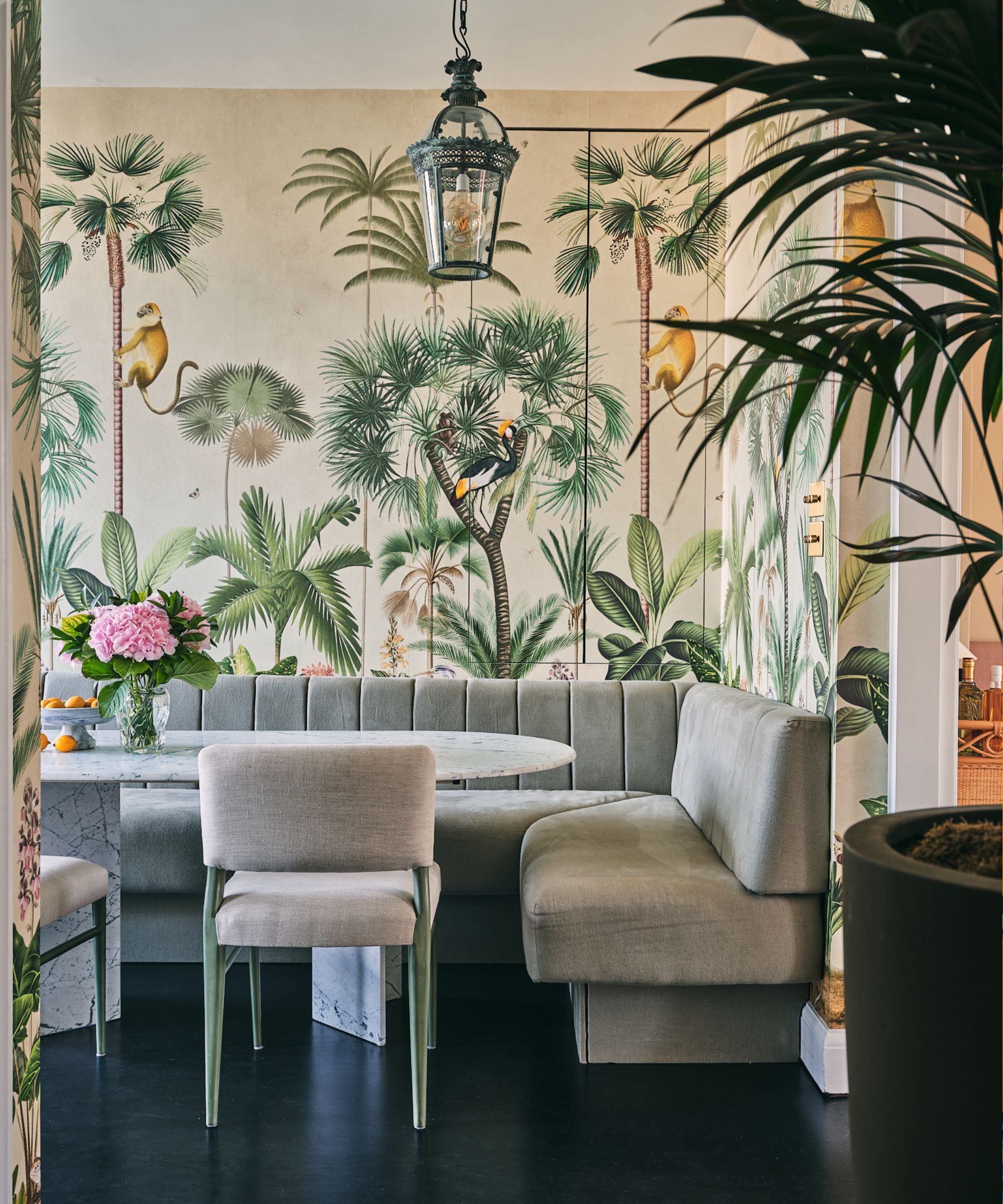
For a maximalist look you can't go wrong with a large scale wall mural. Designs covered in flora and fauna are guaranteed to inject a sense of adventure, magic and whimsy. They work particularly well in dining rooms to create an element of escapism and wonder, as demonstrated here by British interior designer Alice Crawley.
‘This space was initially a little dark, being set in the middle of the house, and used to be a bit of a passageway as a result. What we really wanted to do was bring both life and function to this area, turning it into what our client likes to now call the “breakfast room” - it’s where she and her family like to sit and have their mornings and the life and color from the wallpaper brings them much joy; there is something about being surrounded by beautiful botanical plants and animals that puts one in a good mood!’ explains Alice Crawley.
‘I personally love the combination of an old-fashioned Chinoiserie mural with contemporary furniture – the curved dining table is bespoke made by Atelier278 and the circular velvet-covered antique mirror is from Goldborne Road.’
7. Wallpaper a small bedroom
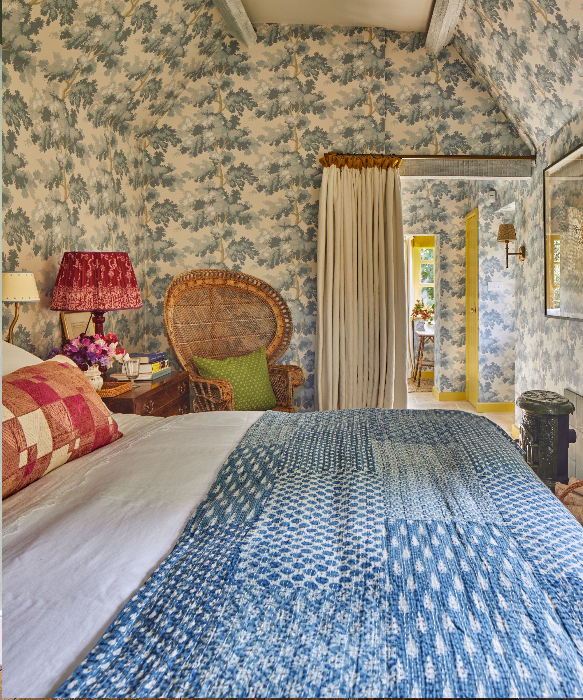
When it comes to spaces with awkward angles like small attic bedrooms a maximalist approach to wall decor, curtains and blinds can be a great way to distract from the compact size. Don’t try to pair things back in small spaces says interior designer Sarah Vanrenen. Embrace the small size and paper over all surfaces and onto the ceiling to create a cocooning feel.
‘A small room deserves just as much attention to detail as any other room. It may be more attention is paid to the perimeter of the room, on curtains or blinds. Make it special with wallpaper on all the surfaces, including cupboards to unify the different surfaces and make the room feel less segmented,’ says Sarah Vanrenen.
8. Introduce statement furniture
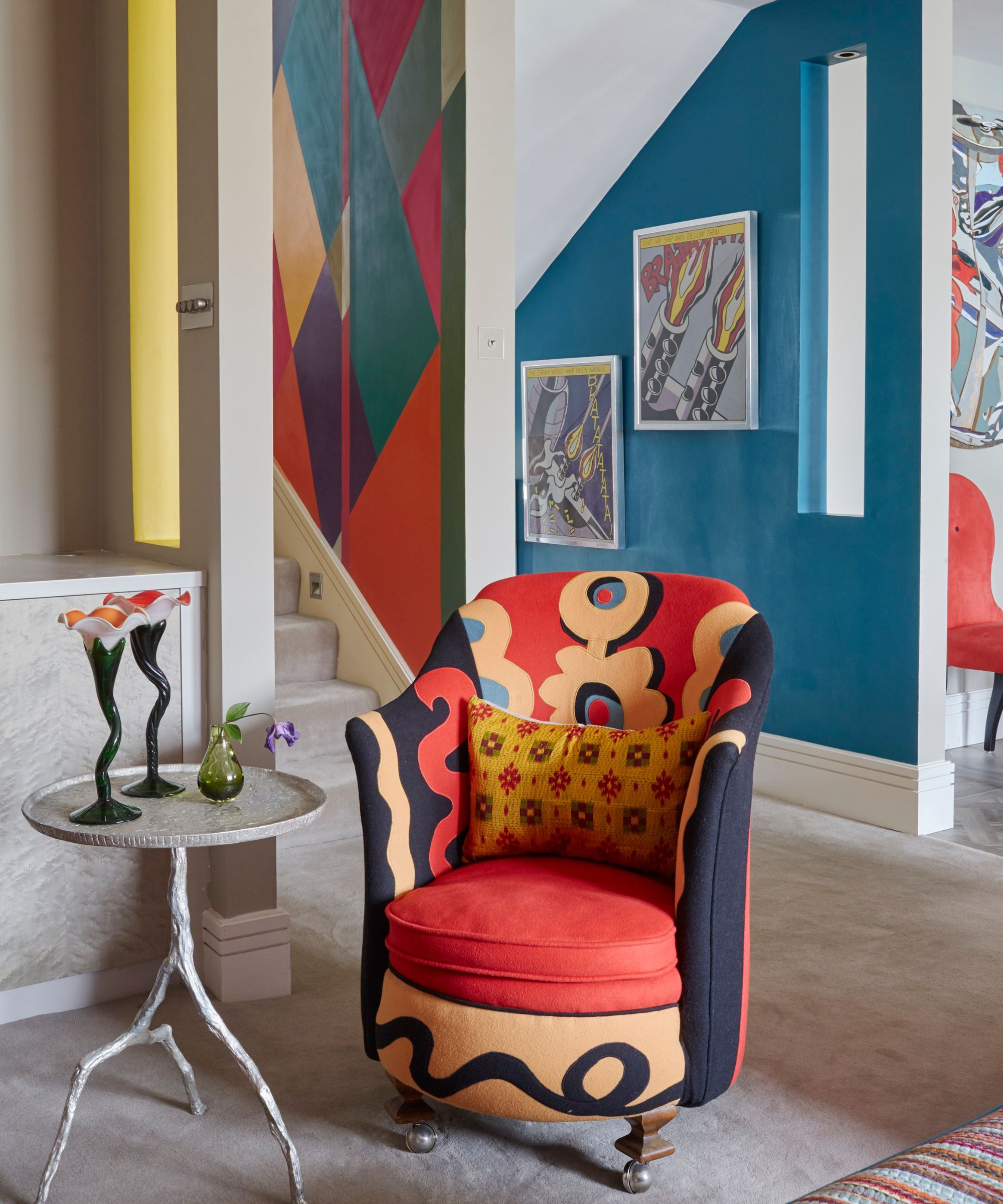
When it comes to maximalism, paint and wallpaper are often the go-to for creating instant impact, but statement furnishings can play an important role, too. Furniture is a big investment which can often last a lifetime, so it's important to pick pieces that you truly love explains interior designer Emma Deterding, founder of Kelling Designs – don’t be afraid to go for bold, statement pieces. Why not choose bespoke and create a unique piece? You could even create unique pieces by painting furniture with decorative paint effects.
‘The important thing is to fill your home with furniture, accessories and designs that you love and that are a true reflection of your own personality and style,’ says Emma Deterding. ‘In the living room or entrance hall, use accent chairs to not only create extra seating, but to introduce color and pattern as well. Opt for a statement shape and style that you love and pair it with a beautifully bold print that will complement any existing upholstery. Contrasting piping will help to tie your color scheme together whilst bringing that all-important balance to the space.’
‘In the bedroom, why not create a focal point by choosing a shapely upholstered headboard for a real statement? Choose luxurious velvet upholstery fabrics in vivid prints and colors and use this as the anchor to base your design scheme around.’
9. Embrace frills, tapes and borders
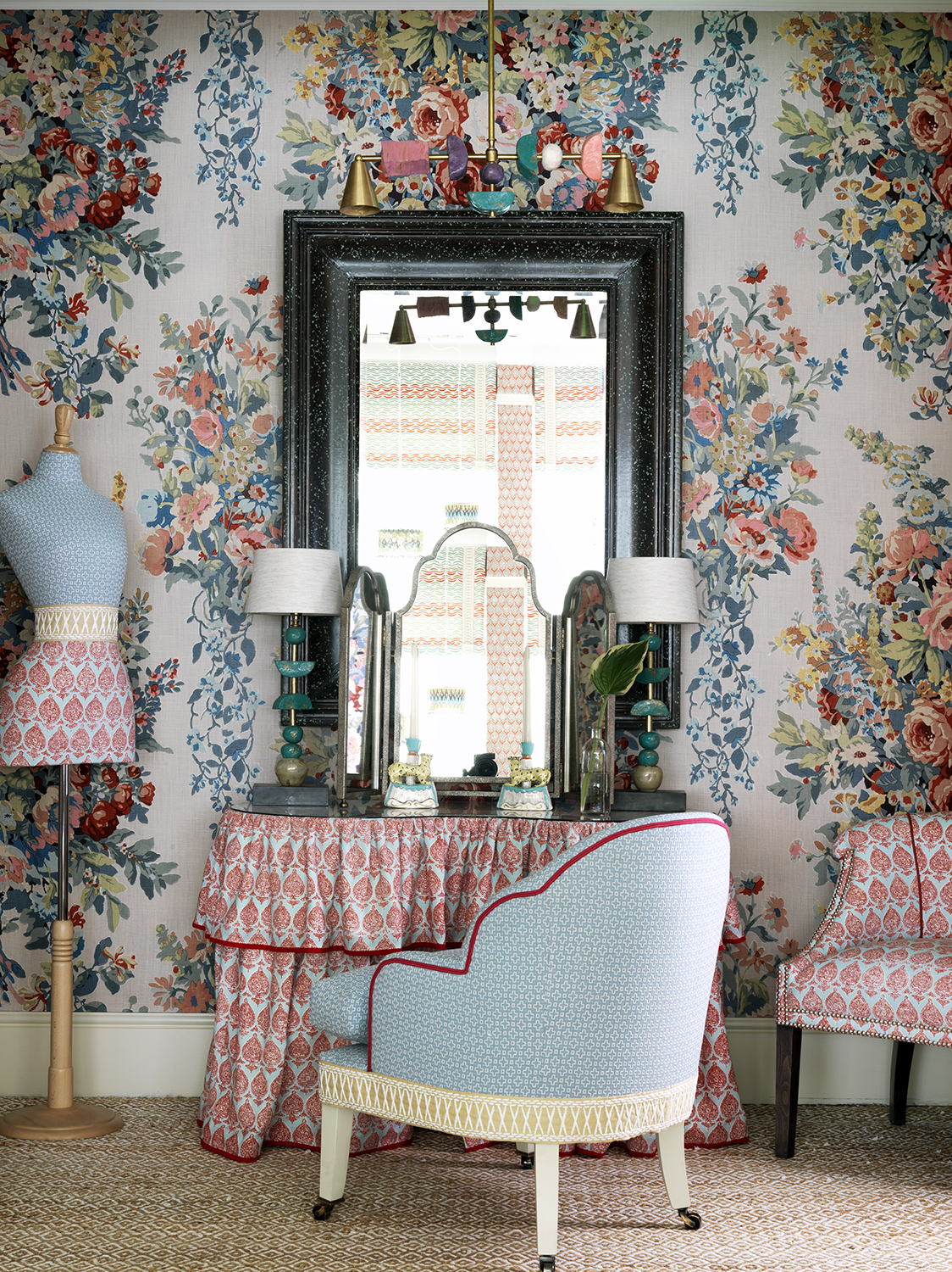
Maximalism is all about dialing up the decor – use every surface as an opportunity for a decorative flourish. Embrace frills on furniture, sinks, pelmets and dressing tables and add decorative fabric tapes to upholstery, cushions and curtains. You could also edge doorways and architectural features with decorative wallpaper borders.
10. Pair bold patterns but co-ordinate the colors
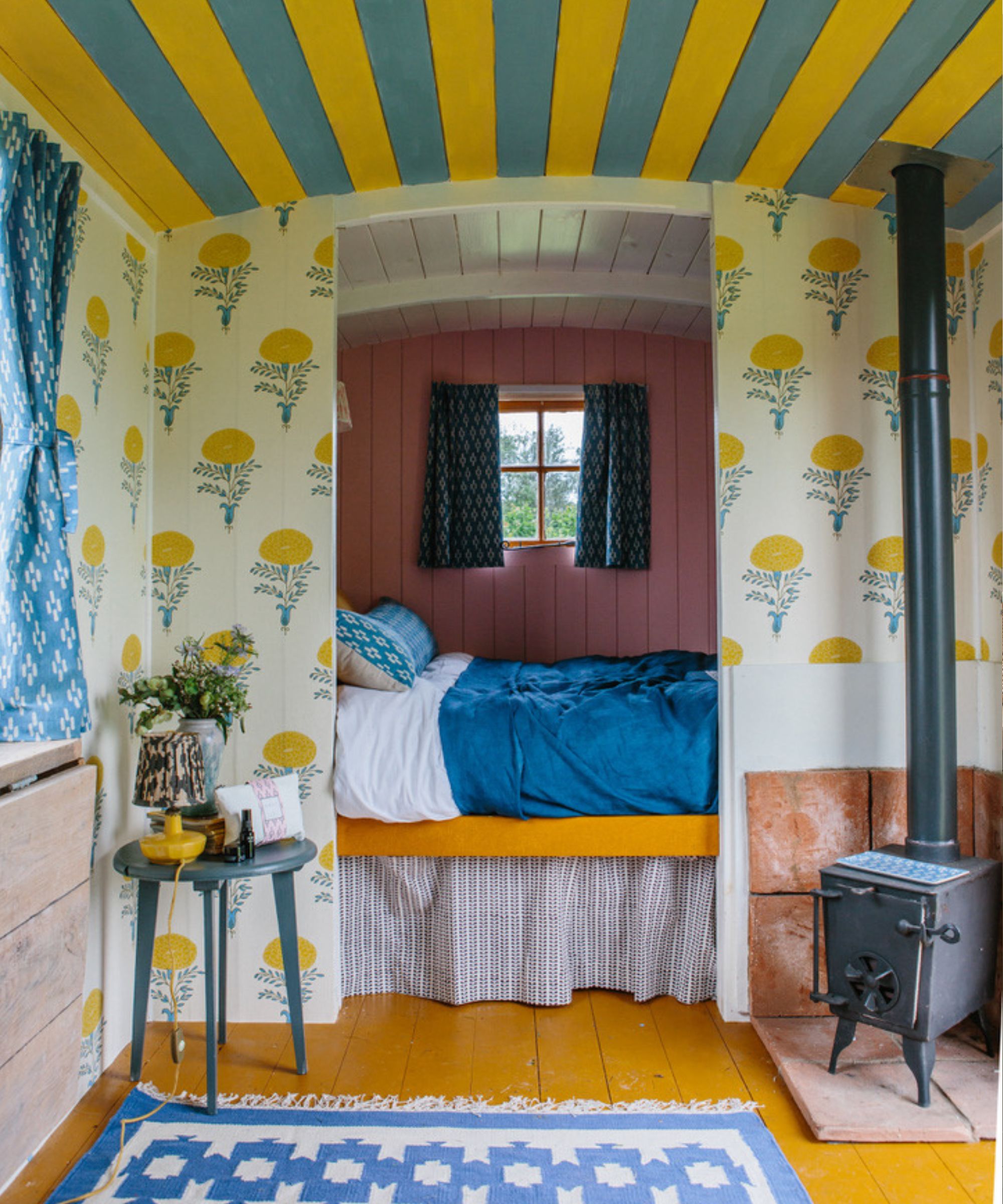
Bold stripes and florals are having a moment right now and have been used to great effect in this small shepherd’s hut to create a mood of fun and escapism. Here the yellow and blue stripes are purposely chosen to co-ordinate with the paper alongside the blue rug to ensure the space remains coordinated and harmonious despite being bold in color and print.
‘Even in a small space it’s possible to add plenty of pattern, playing with scale and color to great effect and it often makes the room feel larger so can be a clever trick,’ says fabric and wallpaper designer Molly Mahon. ‘My go-to combination is our floral block prints, grounded with a matching colored stripe. You tend to be closer to the print in a smaller space and so can really enjoy the artisanal effect of block print which is easy on the eye. Be bold and use colors that bring you joy.’
11. Don't scale back furniture
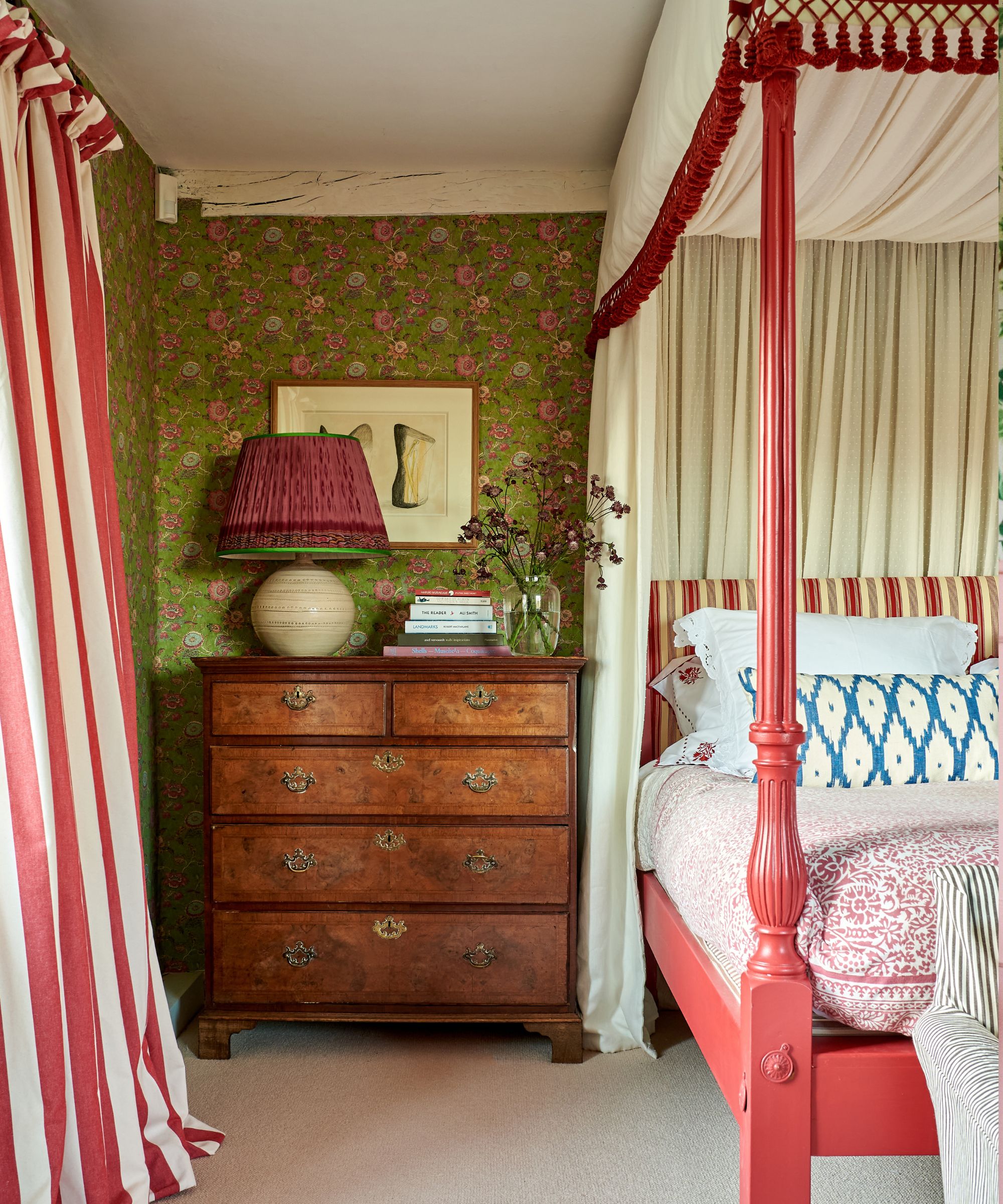
When decorating a small room you might assume it practical to scale down your furniture, in fact, there's no need – treat large rooms as you would small advises Sarah Vanrenen. Don't be afraid to go big and fill the space. Large pieces bring an air of confidence to a space while scaled-down pieces can sometimes lack intention.
‘Contrary to what you might think, small spaces should be treated in almost the same way as large spaces in that large lamps, lampshades, sofas, chairs, and accessories should be used to fill the space and make them look just as luxurious and comfortable as they would be in a huge room. Just because there is less space, it doesn’t mean you need to be mean with proportions. You still need deep sofas, wide beds, and beautiful, decorative things.'
12. Use the 60 30 10 rule
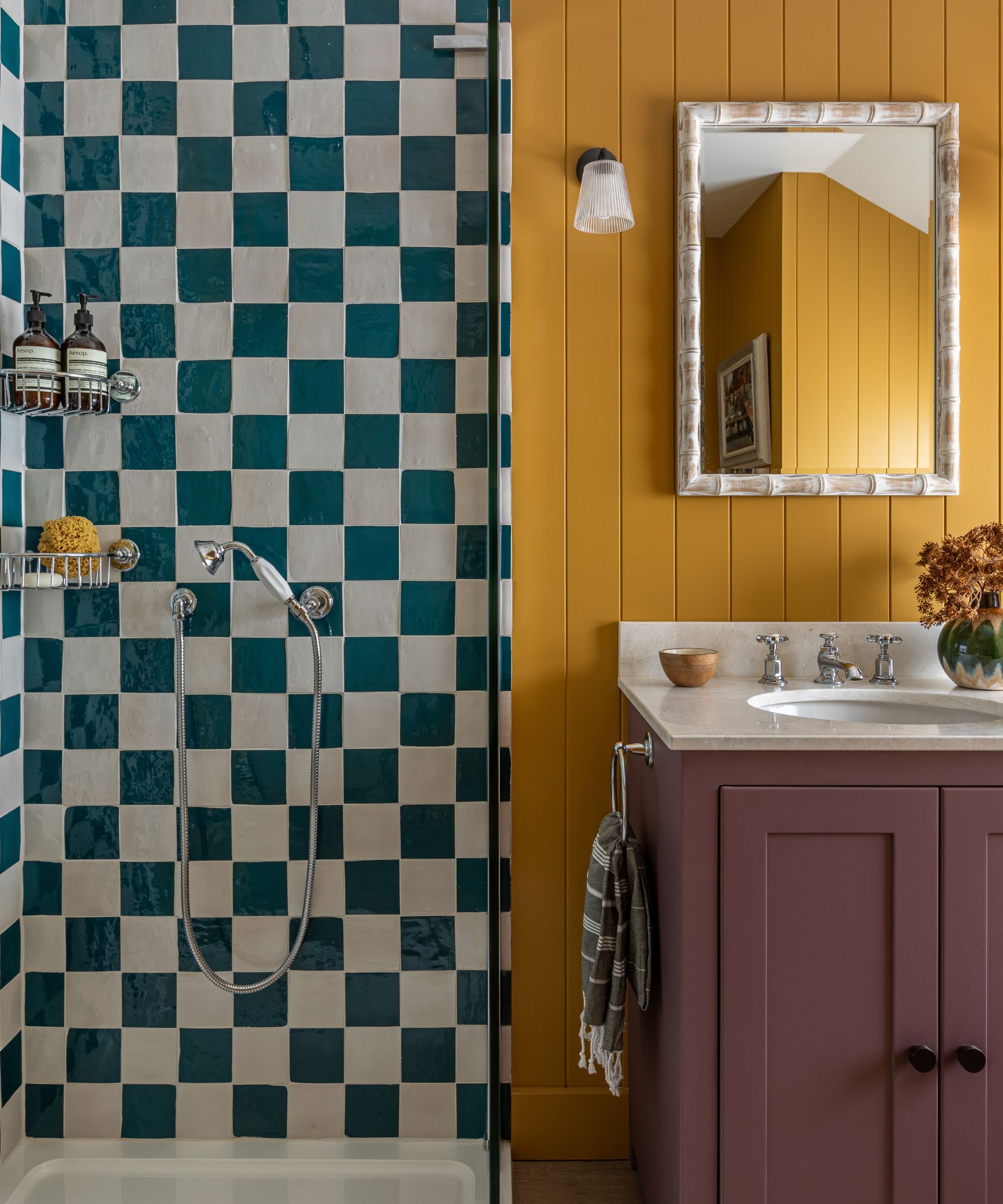
Juxtaposing contrasting colors is a great way to bring life into spaces like bathrooms which can feel cold and lifeless. Maximalism is all about being confident with color, but to ensure the scheme doesn't become too much think about exercising the 60:30:10 rule as done in this colorful bathroom by Otta Design.
'Using three colors creates a layered visual harmony without overwhelming the space with too many colors. Also known as the 60-30-10 color rule – 60% is the dominant, 30% is the secondary and 10% is the accent,' says Alison Johnson, director at Otta Designs.
13. Embrace texture
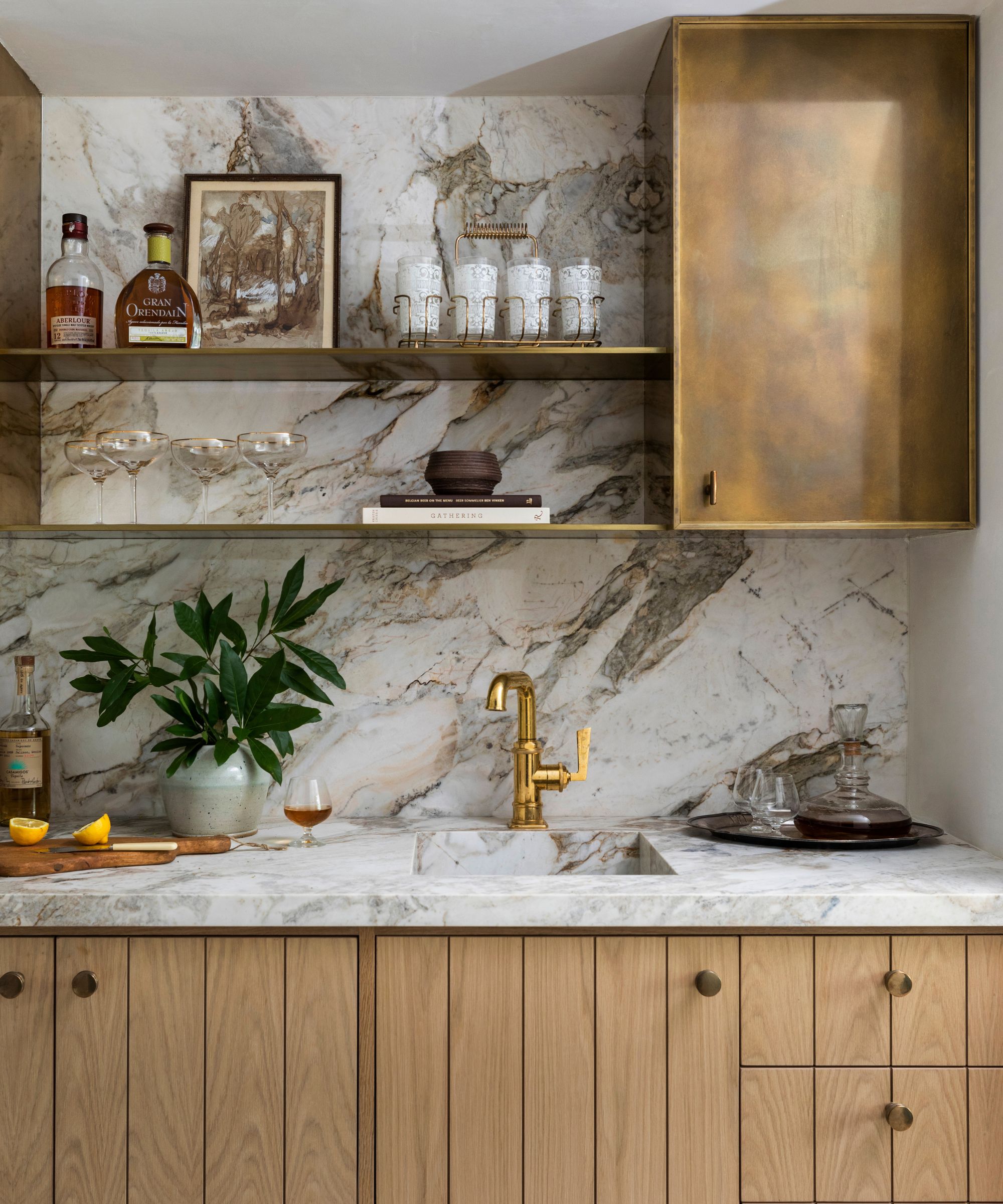
Maximalism doesn’t need to be a riot of color, muted schemes can be just as effective and make a great option for small spaces. For a sophisticated take on the trend decorate with an array of natural materials. In this beautiful kitchen by Marie Flanigan, burnished brass and natural wood kitchen cabinets are teamed with a marble kitchen countertop to create a space full of texture and interest perfect for the neutral maximalist – have we just coined a new trend here?
14. Fit wall to wall shelves
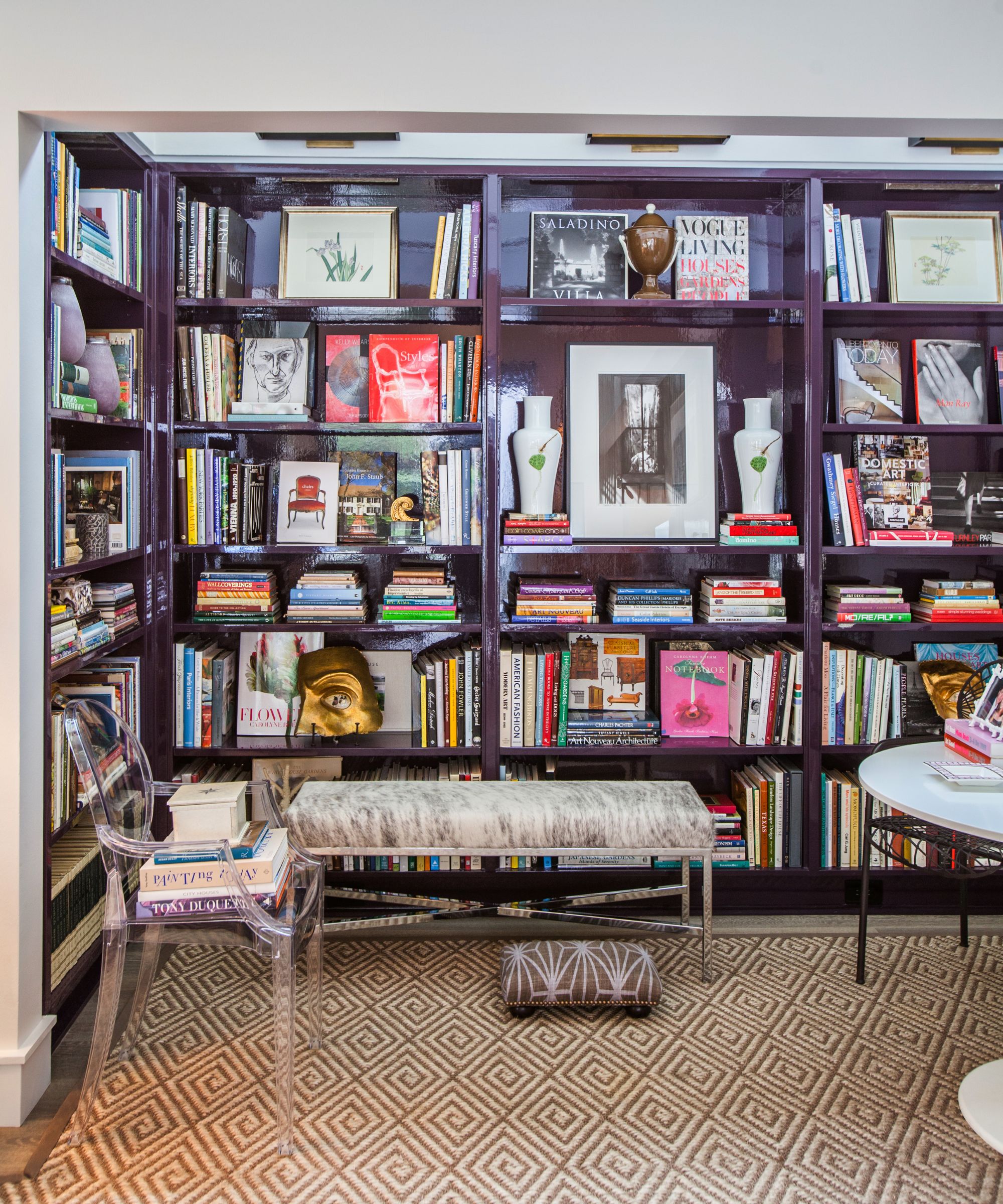
Fitting walls with floor-to-ceiling bookshelves is a great way to achieve a maximalist look which is functional, too. Paint the bookcases in a color you love and use the shelves to display artworks and collectables, too. Styling wall-to-wall bookshelves to create a laid-back look is a trend that's having a moment right now and is sometimes referred to as the bookshelf wealth trend. If dedicating a whole room to a small library is too much why not fit bespoke shelving into a large nook or alcove as a small home library.
‘I have a large collection of design, art history and garden books I’ve collected for over 30 years. I chose to high gloss the bookcase in a deep aubergine custom color in Fine Paints of Europe Hollandac paint… it’s the only brand I trust for a flawless high gloss finish,' says Courtnay Elias of her home library. 'My favorite color is lavender but using that color in the reading nook of my living room would have been too “sweet”… I live with my husband + three rowdy boys! So I experimented with aubergine until I landed on this perfect shade. It has lots of black in it… but when lit by the picture lights above the deep purple comes through without looking too purple!'
15. Decorate the ceiling
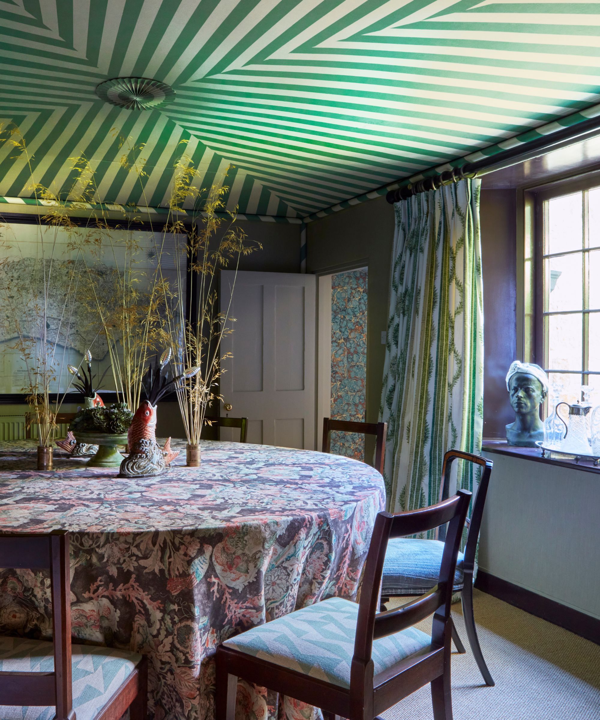
For maximalists, every surface provides an opportunity to be creative. Increasingly the ceiling is becoming a fifth wall and we're noticing more and more people embracing fun surface ideas overhead. Applying a patterned fabric or wallpaper ceiling idea is guaranteed to create an air of curiosity and surprise in a dining room, plus it can help make the room feel larger by leading the eye upwards.
'This tented ceiling - made with our green 'Cary' fabric - gives an added sense of drama to my moody dining room. It not only brings the ceiling into being part of the room, but the trompe-l'œil effect of the wallpaper, with stripes reducing as they reach the middle of the room, also gives a sense of height to the low ceiling,' says Richard Smith, director at Madeaux by Richard Smith.
There are endless ways to embrace maximalism in small rooms. Color drenching a room in bold paint hues or introducing an ornate wallpaper are easy ways to create instant impact. Don't forget the ceiling can make a wonderful fifth wall for introducing a creative pop of color or patttern. For extra wow factor use both in tandem and decorate with fabrics and upholstery in contrasting colors. Alternatively, stick to a palette of two or three tones to introduce a little harmony.
Sign up to the Homes & Gardens newsletter
Design expertise in your inbox – from inspiring decorating ideas and beautiful celebrity homes to practical gardening advice and shopping round-ups.

Pippa is a contributor to Homes & Gardens. A graduate of Art History and formerly Style Editor at Period Living, she is passionate about architecture, creating decorating content, interior styling and writing about craft and historic homes. She enjoys searching out beautiful images and the latest trends to share with the Homes & Gardens audience. A keen gardener, when she’s not writing, you’ll find her growing flowers on her yard for styling projects.
-
 I'm an expert vacuum tester, and no, you really don't need a mattress vacuum – here's what to use instead
Before investing in a new gadget, the tried-and-true methods still work
By Dan Fauzi
-
 Charli XCX's front door color 'feels deliberate, and almost calculated' – estate experts say it carries authority (but it comes with a warning)
The singer's sophisticated front door color gives a 'psychological head start' to sellers, but it has a potentially unlucky downside
By Megan Slack