How to design awkwardly shaped spaces – an expert guide to making the most of corners, slopes, and alcoves across your home
The secret to working with an awkward space is leaning into its quirks, and other designer tips for making unusually shaped rooms sing
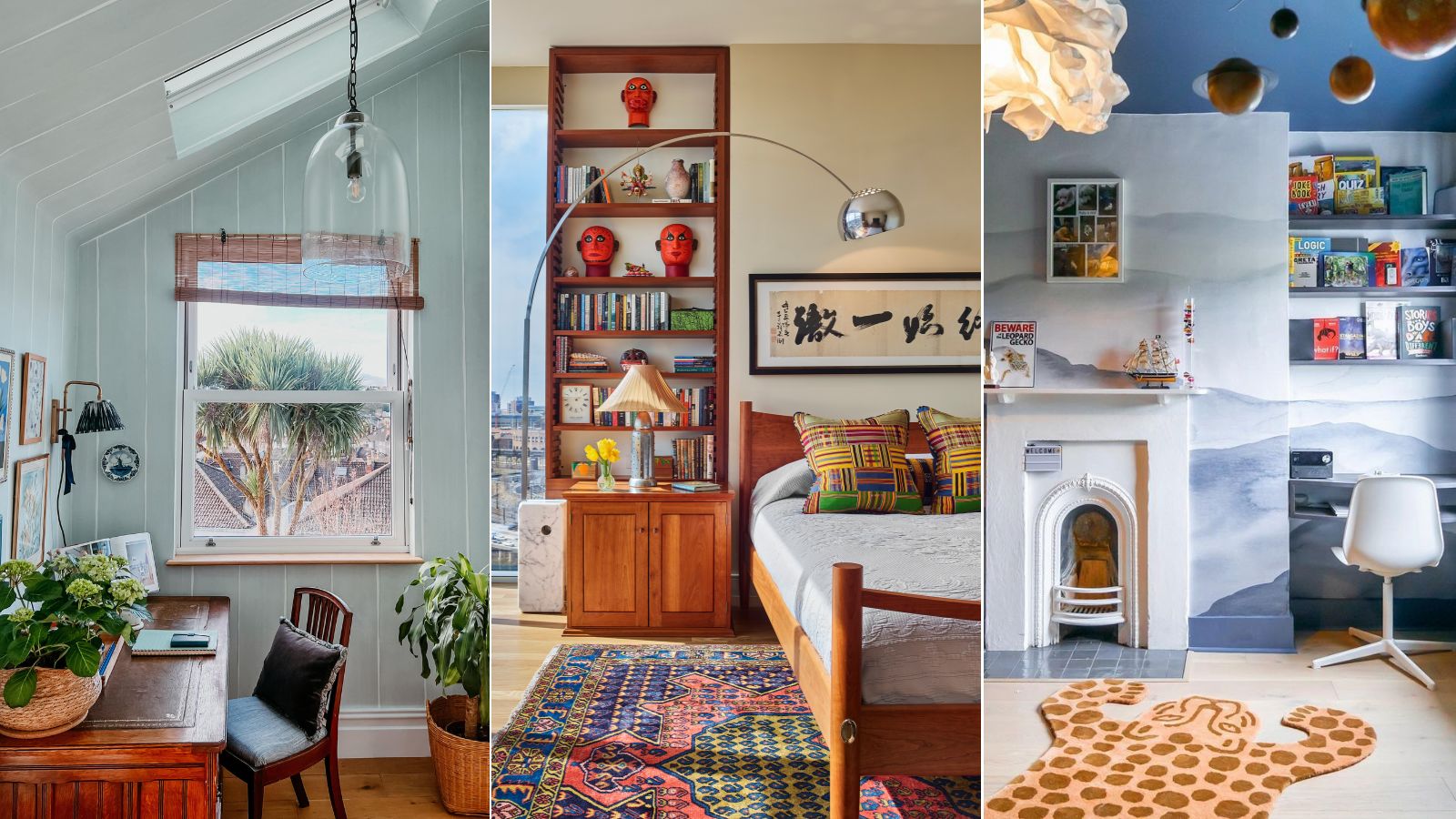
- 1. Measure everything and think it through
- 2. Embrace awkward shapes and angles
- 3. Opt for custom finishes
- 4. Make the most of your space
- 5. Consider integrating shelving
- 6. Use light strategically
- 7. Create zones within your space
- 8. Get creative with paint and wallpaper
- 9. Make your space multifunctional

When it comes to interior design, there's nothing more boring than a plain, white box. Homes with unique architectural details, from slopes and slanted ceilings to cozy nooks and alcoves, are full of character and charm.
But they can be a bit unpredictable – many of the design rules you know and love won't necessarily apply. You'll have to get creative and craft a bespoke solution for your space.
If you're not quite sure where to begin when faced with an unusually shaped corner or angle, don't fear. We spoke with interior designers who have successfully transformed awkward spaces into elegant, out-of-the-box design moments. Instead of disguising or hiding these difficult spaces, they've made stylish statements that stand on their own. These are their top nine tips on how to fix dead spaces in your house, and tackle each unique space – no matter its size or style.
9 tried-and-true tips for designing awkwardly shaped spaces
Recommended by designers who have experience designing awkwardly shaped spaces, these nine tips will take the stress out of transforming unique nooks. By thinking through the process, taking stock of all your options, and making the most of each square inch, you'll be left with a show-stopping space that embraces every twist and turn.
1. Measure everything and think it through
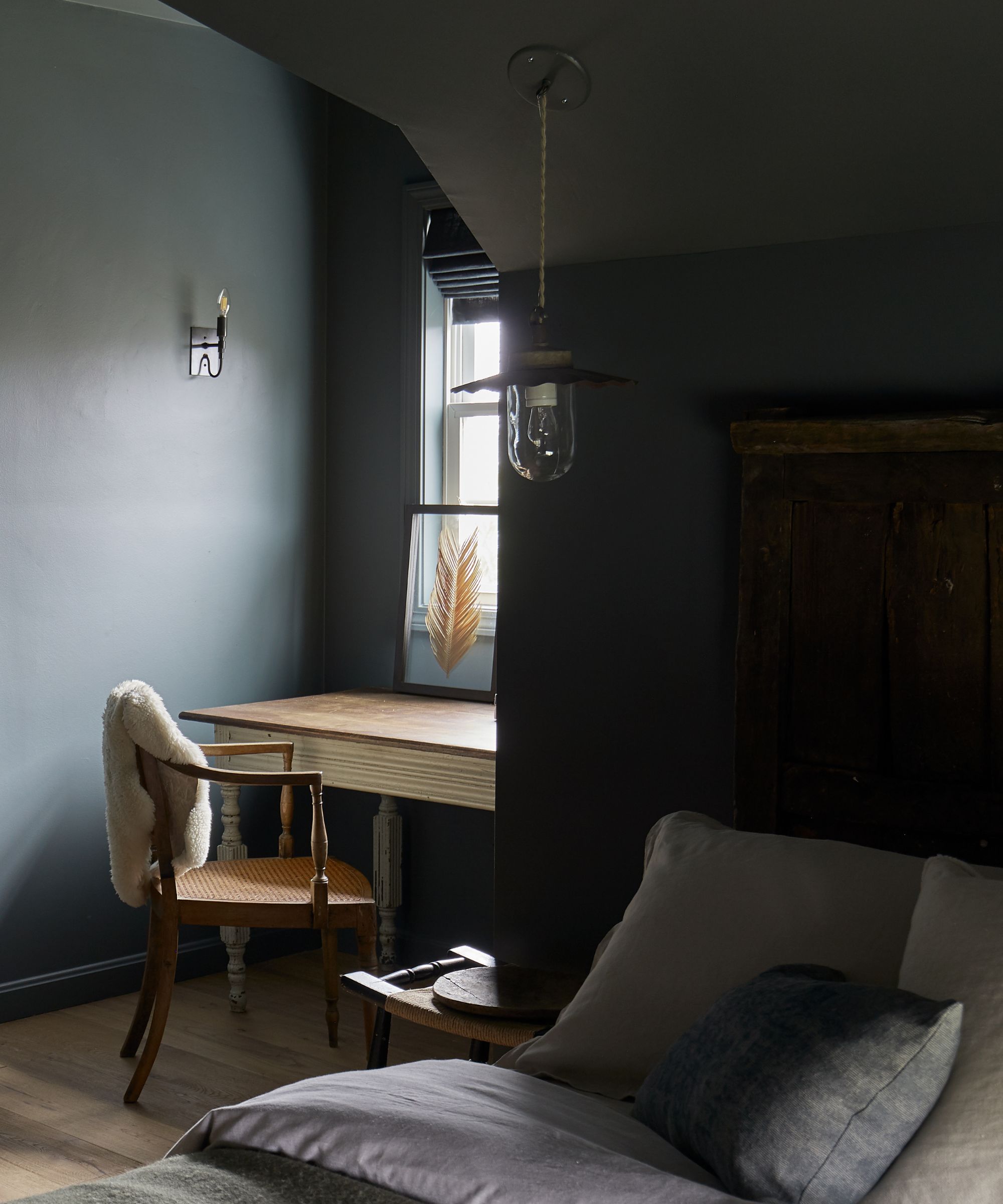
'When tackling a project with a lot of awkward spaces, start with detailed measurements and sketches and a specific purpose for the space,' says Angelica Ferguson VonDrak, a real estate broker and interior designer based in upstate New York.
The first part of every successful design project is planning, and the layout stage is even more important when you're working with unusual angles and slopes. Brainstorm plenty of ideas, take stock of every nook and cranny, and make sure you have a clear plan before investing in any furnishings or finishes.
'Explore different layouts to see what works best,' Angelica continues. 'Always keep in mind how the space will be used and what aesthetic goals you want to achieve. Be flexible and ready to adjust your plans as you go, because some things might look good in your mind but don't work functionally in the real world without some finessing.'
2. Embrace awkward shapes and angles
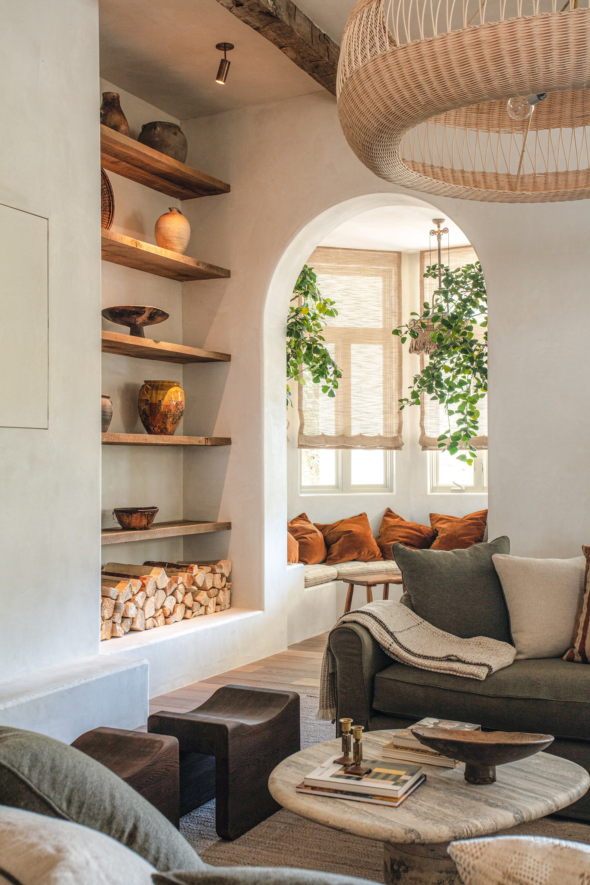
'The most important tip is to think outside of the box,' says Philip Consalvo, founder and principal of New York City-based PJCArchitecture. He recommends allowing the awkward space to be just that: awkward. By leaning into the shape and style of a unique alcove, you'll be left with a space that's one of a kind and well-designed.
'Really look at the space and its adjacencies to other spaces in the house or apartment. Try to establish a potential function for the space. Awkward and leftover spaces are unique and, in fact, special because of this. If you can find a way to embrace the special quality of that space, it can transform your entire home,' Philip continues.
Lauren Kavanagh, art director at Hovia, adds that a common mistake you should always avoid is leaving these unique spaces empty: 'This can draw unwanted attention to them and detract from the rest of your room, which you’ve worked hard to design. Instead, view these areas as creative opportunities to do something unique and playful.'
'My top tip is to embrace the uniqueness,' Angelica adds. 'First off, don't shy away from those quirky shapes. Instead, celebrate them! Highlight unique architectural features with accent colors, interesting textures, or different materials to turn them into focal points. Don't treat them like a problem, treat them like a design feature.'
3. Opt for custom finishes
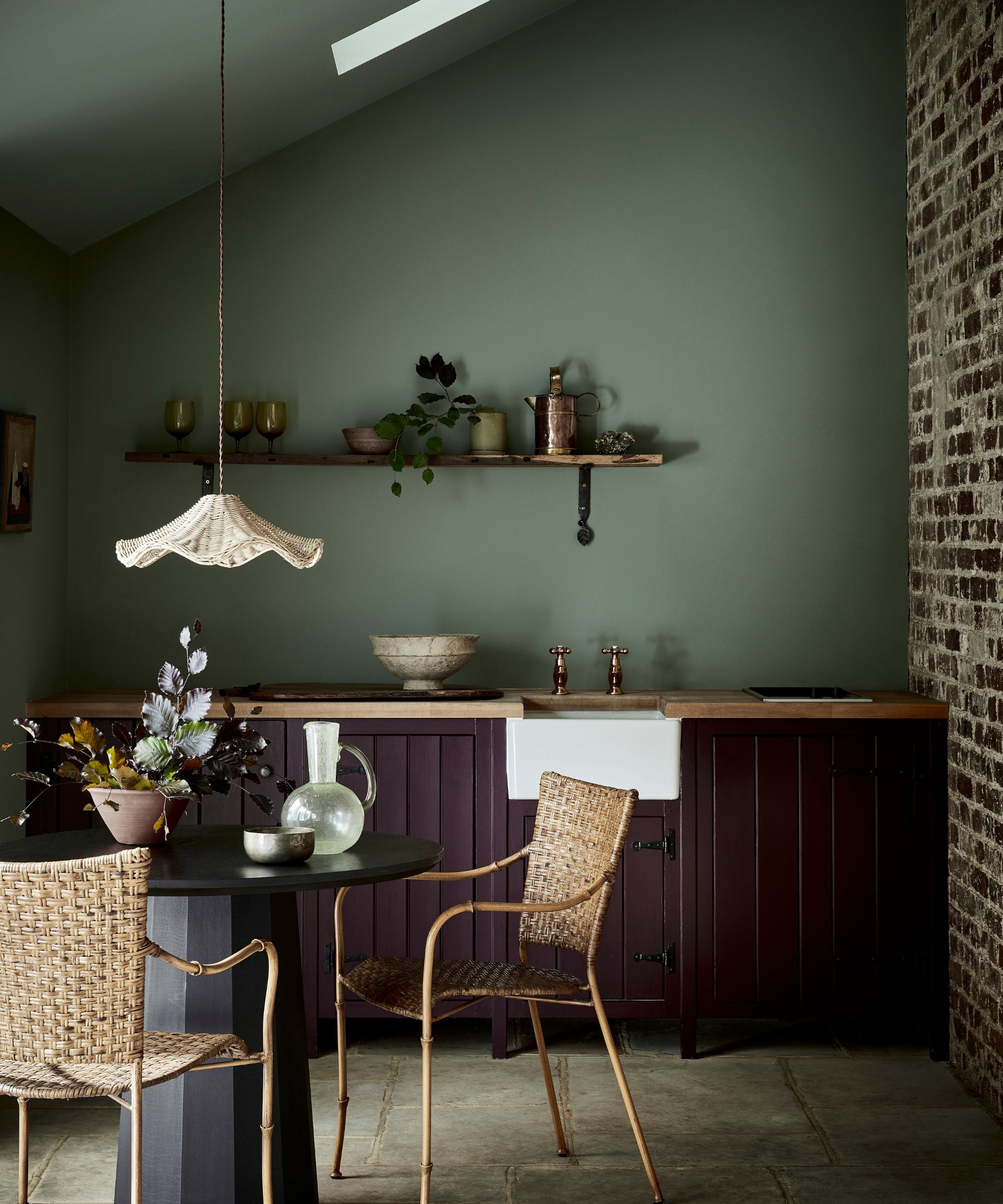
Awkwardly shaped spaces provide a perfect excuse for bespoke, tailored furniture, from built-in shelves to designated desk space. Angelica says that investing in one-of-a-kind pieces can maximize functionality, and help you to 'lean into what the space is giving you.'
'Built-in solutions are your best friend in awkward spaces. Think custom shelving units, cabinets, or even built-in seating. Multi-purpose furniture is another great trick – pieces like storage benches or fold-out desks can really maximize the utility of a space without making it feel cramped,' she says.
Martha Franco, founder and principal of Montreal-based Martha Franco Architecture & Design, adds that custom furniture levels up even the most unusual spaces: 'For awkwardly-shaped bay windows, consider creating custom furniture to fit the space, giving the impression of intentional design.'
4. Make the most of your space
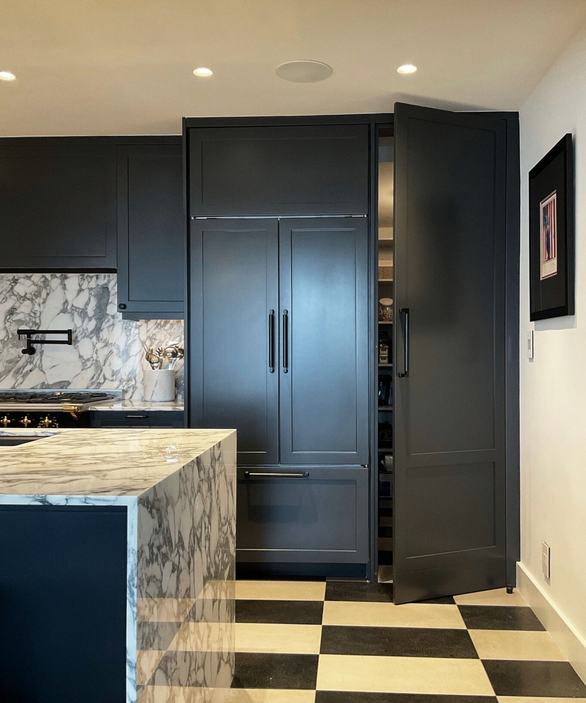
Each corner of your home is valuable – don't overlook the many possibilities even the most awkward spaces have to offer. Philip shares that his firm recently combined two adjacent apartments on New York City's Upper West Side, a project that involved integrating two entry doors from the hallway into the kitchen design. The result is an unexpected, clever use of an awkwardly shaped and placed corner of the home, pictured above.
'The family’s new layout only required one main entry, which left an awkwardly placed second entry door and hallway,' says Philip. 'To make use of this leftover space, we decided to incorporate it within the footprint of the new kitchen. The space became a usable kitchen pantry. We incorporated the space into the new cabinet design, hiding the full size of the space so it appears as a typical cabinet rather than a walk-in pantry.'
Angelica adds that awkwardly shaped areas can quickly become your home's most prized, most frequented spaces: 'For nooks and crannies, think cozy reading spots with built-in seating or mini offices tucked under the stairs. Sloped ceilings are perfect for low-profile storage or intimate sleeping areas. Oddly shaped walls can become striking gallery walls or statement moments with bold wallpaper or unique paneling. And irregular corners are great for custom shelving or displaying plants which can really fill a space with dimension due to their organic shapes.'
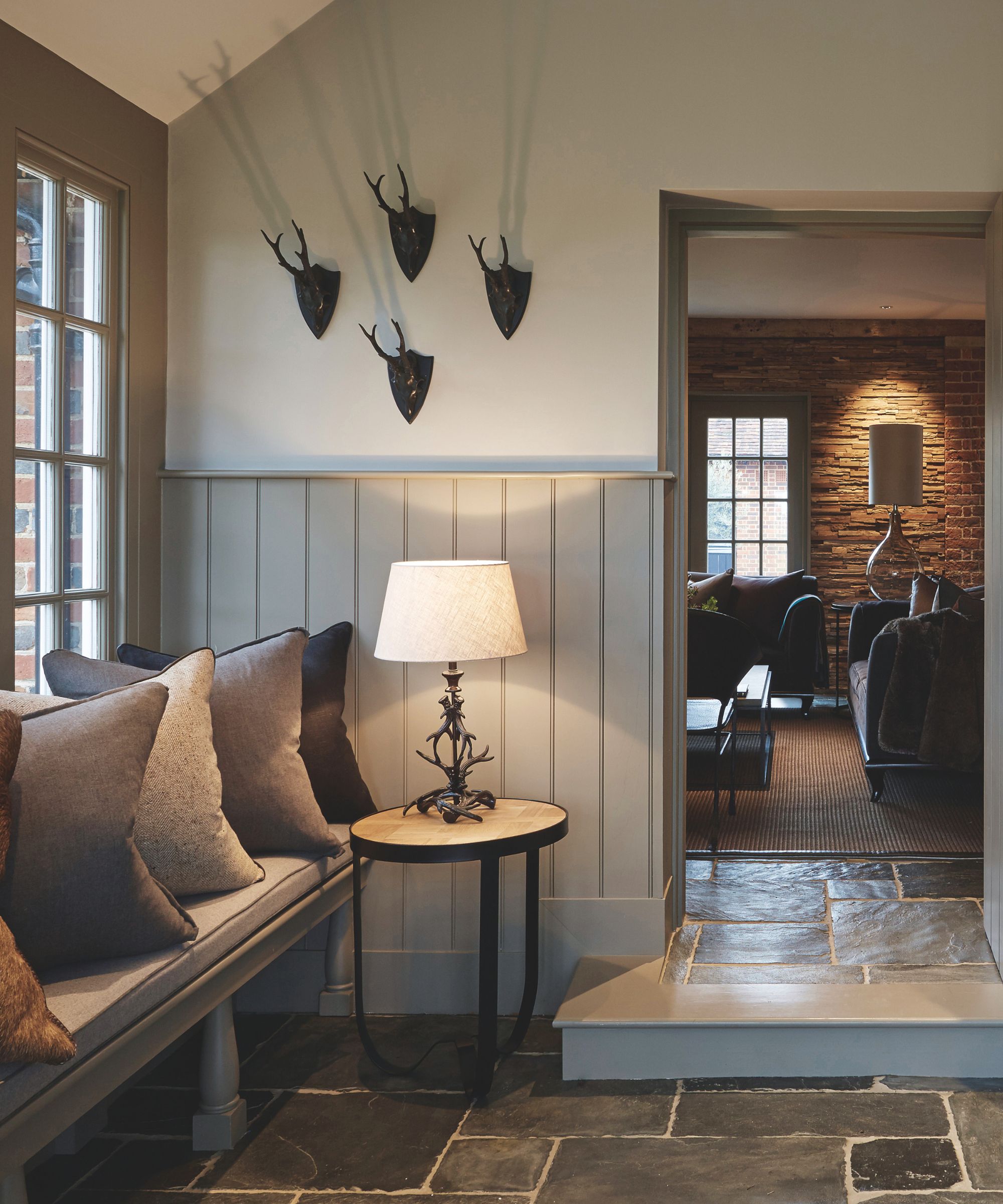
'The key to designing around awkward spaces is to consider the functionality of the space,' adds Louise Bradley, interior designer and founder of her eponymous firm. 'In this country estate, we transformed this small space into an inviting entrance.'
By choosing complementary paint colors, Louise accentuated the room's quirks rather than shying away from their complications. She also introduced paneling, drawing the eye up to the room's high, airy ceilings. 'Both considered design approaches offer the illusion of a larger space by implementing contrasting elements,' says Louise.
'We also wanted to make this space practical for our client, so we added a bench with ample storage space underneath. This allows the entrance to function as a mudroom while maintaining a luxurious design and keeping the storage hidden,' she continues.
5. Consider integrating shelving

Alcove shelving is an easy solution to awkward spaces, especially when you're working with smaller square footage. Lauren says that small alcoves can be 'puzzling to decorate.' Though they 'might seem too cramped for a bookcase,' they 'offer unique opportunities for creative displays.'
'My favorite solution is to install small, stacked shelves,' she says. 'These shelves can showcase houseplants, books, vases, and other decor items, creating an attractive and personalized display. Another great idea is to place a couple of woven baskets underneath the shelves. Fill them with soft furnishings like throws and pillows to add both storage and a lovely pop of texture to your room.'
'Alternatively, you can transform the alcove into a mini home office, which has become increasingly popular as more people work from home without having a dedicated office room,' she continues.
6. Use light strategically
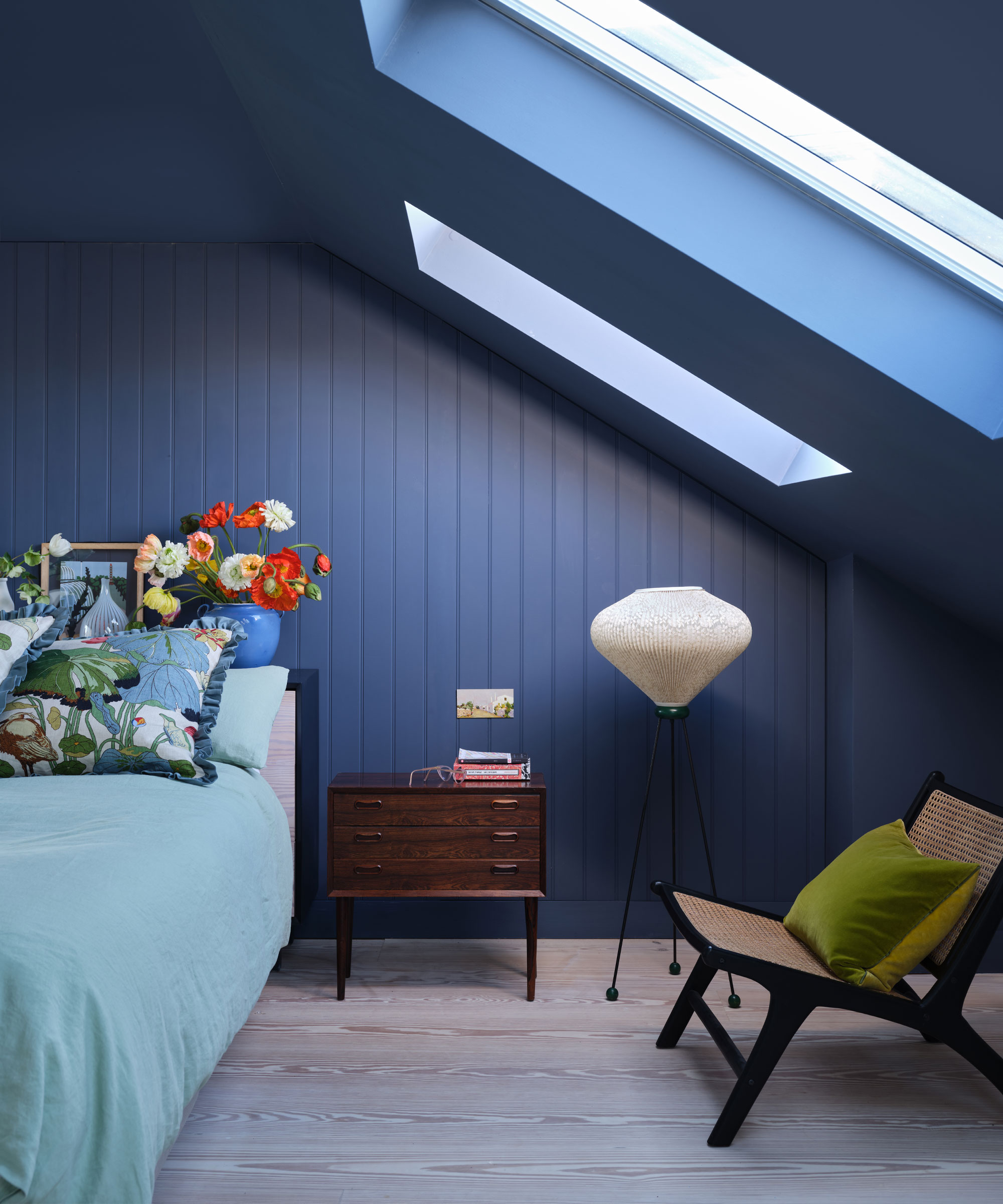
Lighting won't alter the physical layout of your space, but it makes a huge impact on the look and feel of any awkward nook or alcove. Martha suggests 'using strategic mirrors and lighting to create the illusion of more space,' and adding in plants to 'soften harsh angles.' This nature-inspired approach will ensure you love how your home feels, even when spending time in its unusual spaces.
'Never underestimate the power of good lighting!' adds Angelica. 'Inadequate lighting can make an already awkward space feel even more cramped, but good lighting can make it feel intentional and special.'
'Maximize natural light with mirrors, lighter-colored walls (or maybe a feature wall), and well-placed windows or skylights,' she continues. 'Layered lighting – combining different light sources like ambient, task, and accent lighting – can add depth and make even the most awkward spaces feel warm and inviting.'
7. Create zones within your space

Zoning in interior design is a game changer, transforming a scattered space into a complete, cohesive scheme in just a few simple steps. Angelica notes that especially when dealing with awkward spaces and shapes across your home, zoning goes quite a long way. 'Differentiate the spaces in the room' in any way you can to create a beautiful, functional design that'll last the test of time.
'Using rugs, lighting, and clever furniture arrangement to define distinct zones within a room can make the space feel more intentional and organized,' says Angelica. 'Don’t forget to use vertical space as well – tall shelves or hanging elements can draw the eye up and make the area feel more spacious.'
8. Get creative with paint and wallpaper
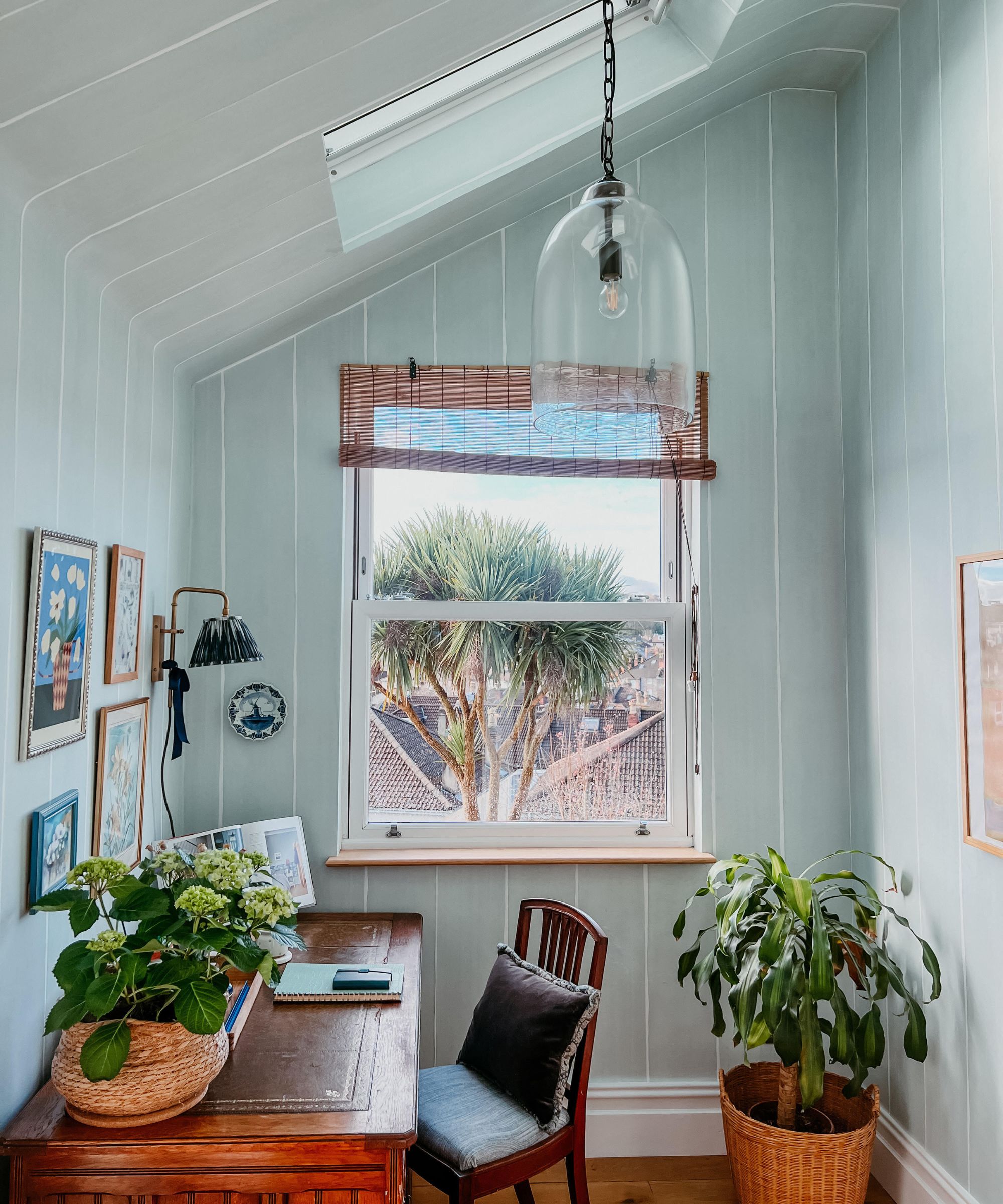
'One of my favorite go-tos for awkwardly shaped rooms is to drench the ceiling and walls in the same color,' says Roger Higgins, founder and principal of Nashville-based R. Higgins Interiors. 'Refraining from including crown molding can also help create seamlessness in the space.'
'If wallpaper is needed, consider covering both the ceiling and walls without any delineation between the two. This can help make the room feel bigger without drawing your attention to any one specific detail,' Roger continues.
Lauren agrees, saying that using paint or wallpaper across the entire space can make designing a tricky area of your home just a bit easier: 'This technique helps blend the different angles together, softening the space and making it more cohesive. The key is to work with these angles, not against them.'
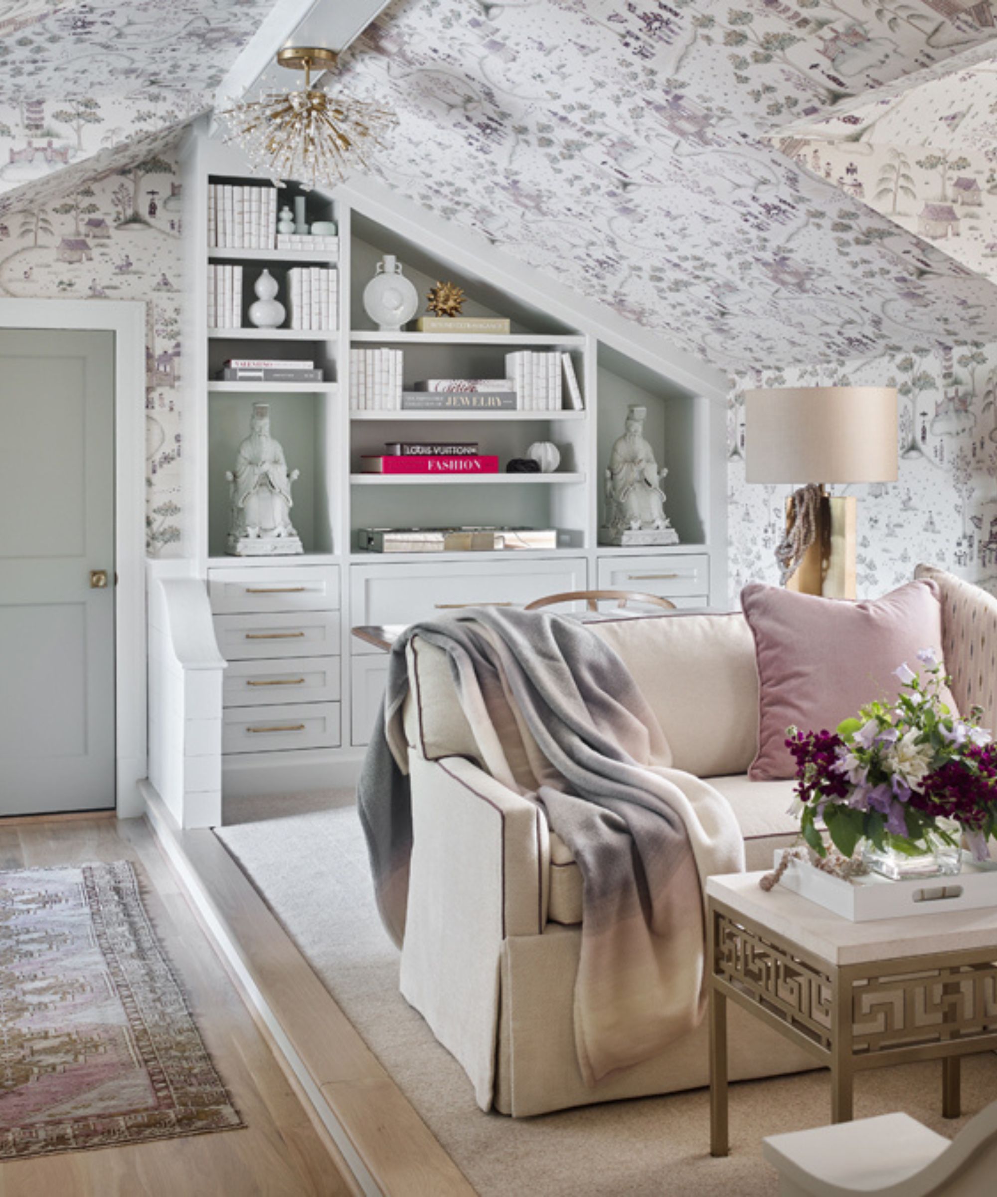
'When challenged with varying slopes and ceiling heights, the less contrast the better. Here, drenching the walls and ceiling in the same color and sheen draws attention away from the awkward conditions by unifying the interior architecture,' says Marco Angelucci, design director and principal of Philadelphia-based Marguerite Rodgers, referencing the living room pictured above.
'If opting to use a wallcovering in a space like this, avoiding linear and directional patterns is always a good idea, as they won’t line up on any angles or exaggerate any unappealing forms,' he continues. 'Instead, sticking with textures or non-directional coverings and free-flowing patterns will help mask the varying slants. If space allows, floating your furniture arrangements away from the walls, drawing your eye inward, is another technique to consider.'
9. Make your space multifunctional
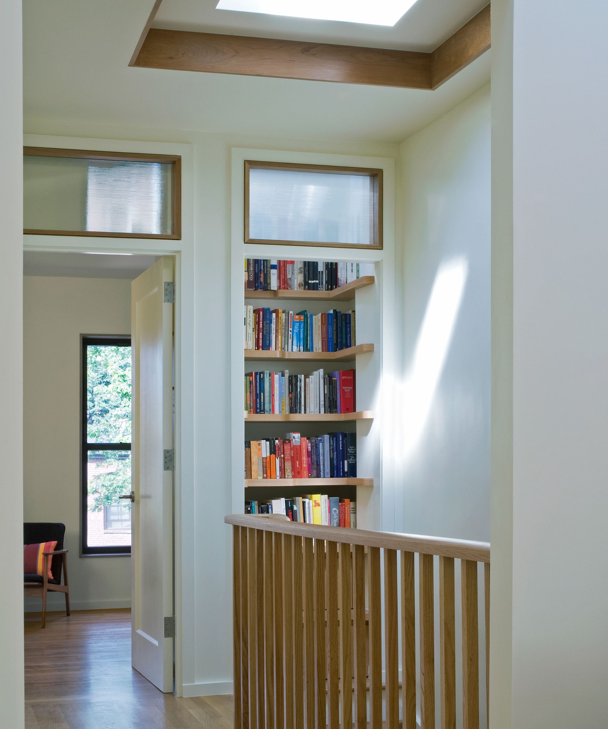
When possible, make your awkwardly shaped space work double – by giving a small area of your home two functions, you'll be making the absolute most of your layout. Philip shares that a small, closet-like space in this Brooklyn townhouse proved quite the challenge, but a bit of clever maneuvering made the awkward area multifunctional (and quite stylish).
'The purpose of this awkward space was to serve as a direct connection from the third story interior to the roof. In order to maintain this access, the space occupied by the ladder was required to remain free and clear, so that it could be easily accessed by residents,' says Philip. 'We decided to rework the space while maintaining access to the roof. Our solution was to turn the opening to space 90 degrees so that it now opened up directly from the top of the adjacent main stair.'
'We replaced the ceiling hatch above with an operable skylight hatch,' he continues. 'This allowed natural light into the space while maintaining access to the roof. We transformed the existing ladder into custom millwork with a series of shelves and drawers for books and storage.'
'The shelves were designed in a way to provide a place for one’s feet and hands, so that one could still access the roof if needed. This awkward space now has two usable functions and serves as a focal point of the space, especially when it’s flooded with natural light.'
Dominique Bonet, Miami-based lead interior designer with LD&D, shares that she recently made an awkward kitchen layout multifunctional by integrating sleek room dividers: 'Forward-thinking and effortlessly functional, the kitchen has floor-to-ceiling wood partitions to give the owners the opportunity to welcome guests to gather throughout the space, or close it for a chef’s privacy and fine dining experience – not an open or closed kitchen, instead one floorplan with both options.'
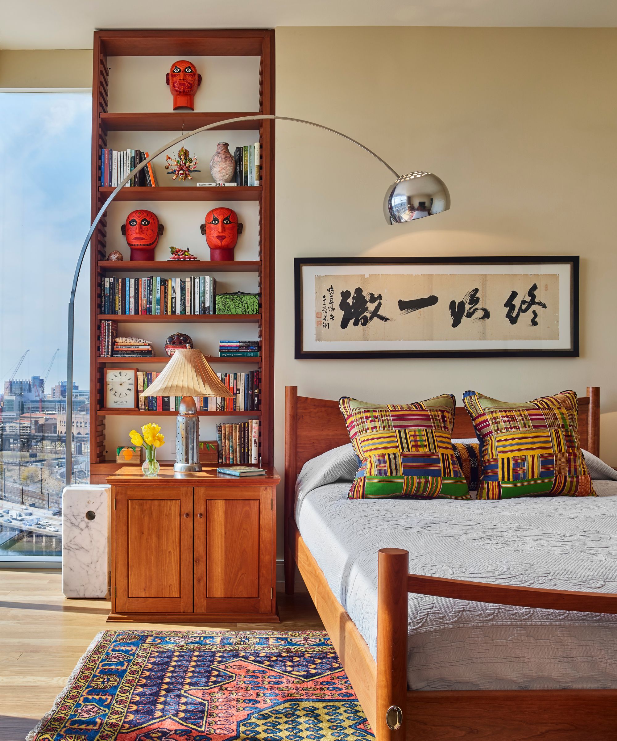
'Some key things to consider when approaching awkwardly shaped spaces are to add symmetry and utilize every inch, adds Kaitlyn Murphy, senior designer with Marguerite Rodgers, speaking about the space pictured above. 'In this home, there was an odd jog on the wall that we wanted to put the bed and nightstands on. So, we decided to fill out the space with custom millwork to maximize its versatility and allow for a symmetrical furniture layout.'
Designing an awkward space doesn't have to be a dilemma. Instead, treat it as the exciting opportunity it truly is. Go in with an open mind, form a plan, and make the most of your space. The final result will be quirky, characterful, and one of a kind.
Sign up to the Homes & Gardens newsletter
Design expertise in your inbox – from inspiring decorating ideas and beautiful celebrity homes to practical gardening advice and shopping round-ups.

Abby was the Interior Design News Editor at Homes & Gardens and is now studying for her Master's degree in Journalism at City University, London. Prior to joining our team, she worked with Better Homes & Gardens, where she wrote and edited content about home decor, gardening tips, food news, and more. She studied Journalism and English Literature at New York University and moved to London to pursue her love of writing in 2023.
-
 5 things professional cleaners always do to overcome a cleaning roadblock – they're surefire ways to feel 'motivated and clear-headed' experts say
Get your cleaning schedule back on track
By Ottilie Blackhall
-
 Martha Stewart used this vintage-style pan to make cute bunny cakes for Easter – it's a real heirloom piece (and only $40 now)
It's not Easter without bunny-themed baked goods, and Martha set a precedent with a novel cake pan – it's American-made and has exceptional durability
By Megan Slack