Is this the best beige paint? Why designers love Stone Hearth by Benjamin Moore
We asked our experts what it is about Stone Hearth that makes it such a useful color
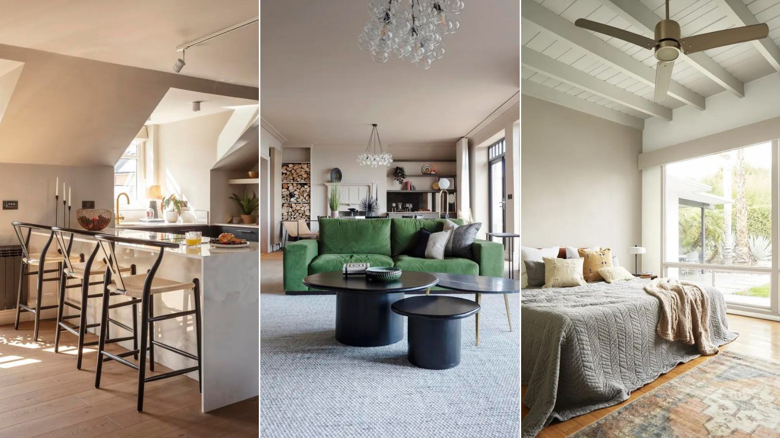

Decorating with neutrals is always a popular design choice for both inside and outside the home. With an enduring appeal, neutrals offer some of the most relaxing colors to live with, providing a calm and welcoming feel to any room. But with grey being a cool color and beige sometimes running the risk of being a little ‘bland’, the best paints to embrace the current trends for warmer neutrals straddle the divide between the two.
Enter Benjamin Moore Stone Hearth, a perfect blend of grey and beige with warm undertones that’s perfect for a variety of situations and a perennial favorite with designers. We think it’s one of the best beige paints you can buy precisely because it straddles the line between grey and beige, offering a warmer almost taupe feel that’s welcoming, cozy and inviting.
What color is Stone Hearth?
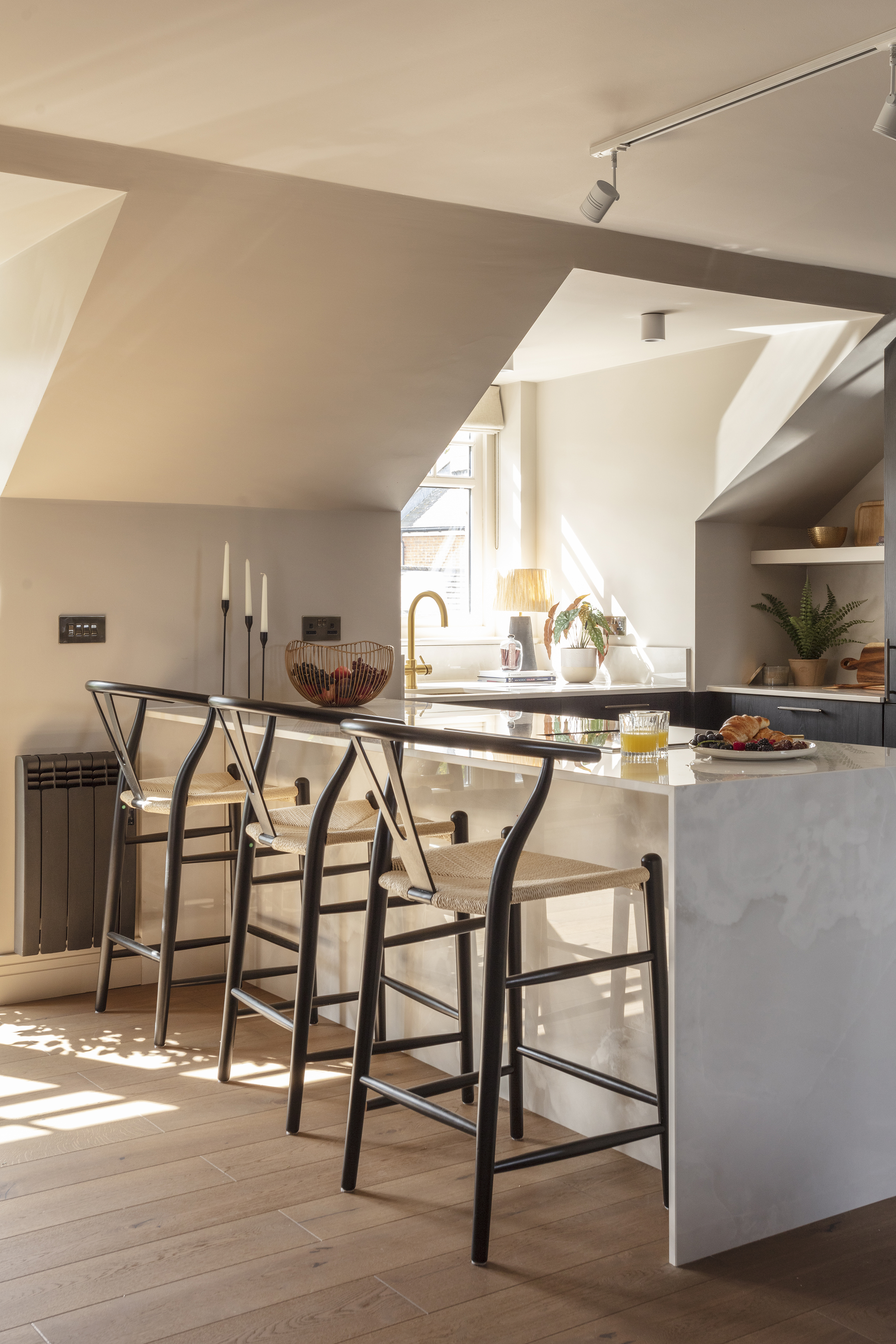
'Though it has a very lived-in and familiar feel, Stone Hearth is actually a very complex mix of grey and beige colors,' explains Helen Shaw, Director of Marketing (International) at Benjamin Moore. Stone Hearth is a fantastic transitional color, blending with or enhancing a huge variety of other colors and tones. Exuding classic elegance, it complements a huge range of architectural styles in both exterior and interior settings, making it one of Benjamin Moore’s most popular colors.
Adaptable and versatile, Stone Hearth is popular with designers because of its ability to work is so many different spaces. Adapting beautifully to different lighting conditions, it reveals subtle changes of color that add interest to any space. It’s also remarkable for its ability to work with so many different hues and colors. But what do designers love about the color? We asked experts for their thoughts.
1. It has timeless appeal
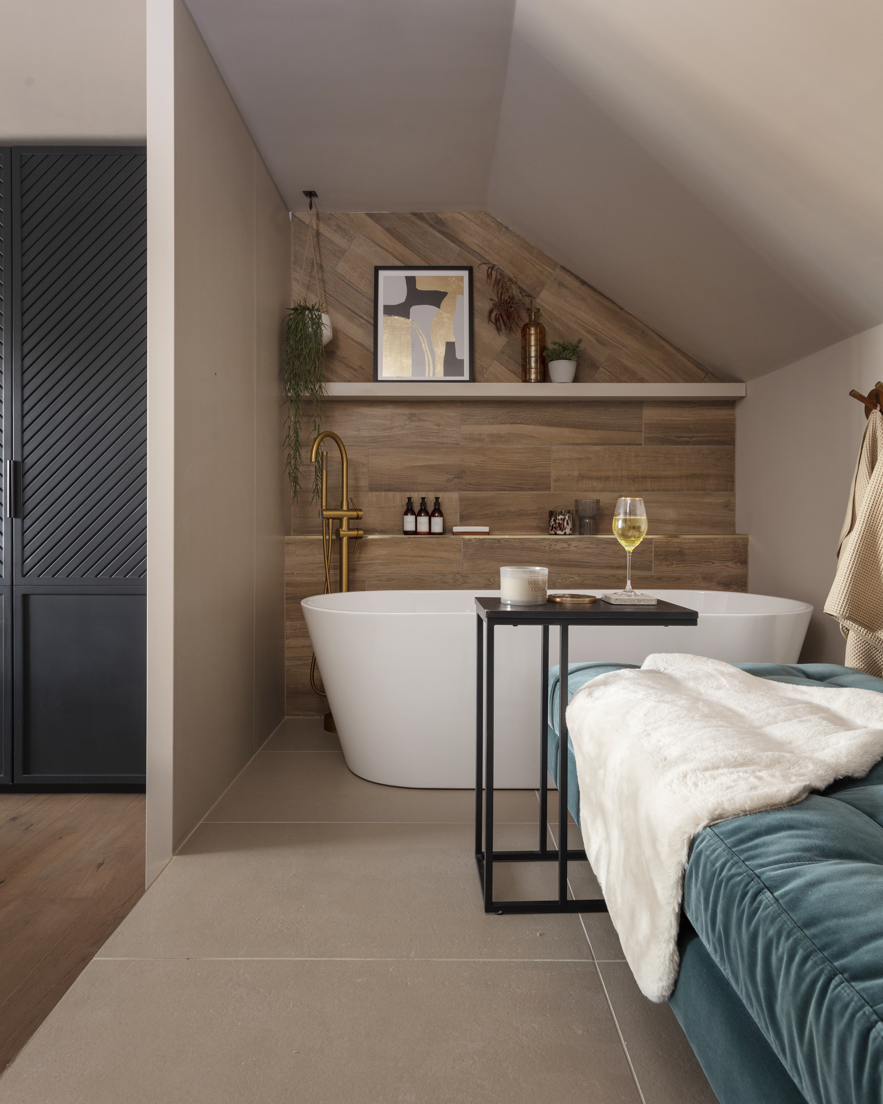
'Designers love Stone Hearth by Benjamin Moore for its timeless aesthetic appeal,' says paint specialist Ben Thomson, Manager at Promain Paints. 'The warm, earthy undertones create a cozy and inviting atmosphere that fits a number of different designs and styles, both traditional and modern. The subtle layers of complexity add visual depth and character to almost any living space, making Stone Hearth a popular choice among professionals in search of a sophisticated yet approachable hue.'
For this reason, we also think that Stone Hearth works as beautifully for an exterior color as it does internally. The classic color’s welcoming hue compliments a variety of architectural styles, whilst the paint’s ability to adapt to different light conditions and show subtle changes of color give warm, interest and depth to a home.

Helen Shaw is part of Benjamin Moore's UK division. Color expert and international marketing director, Helen and her husband Craig are founders of Shaw Paints, acquired by Benjamin Moore in 2020.
2. It pairs with multiple color choices
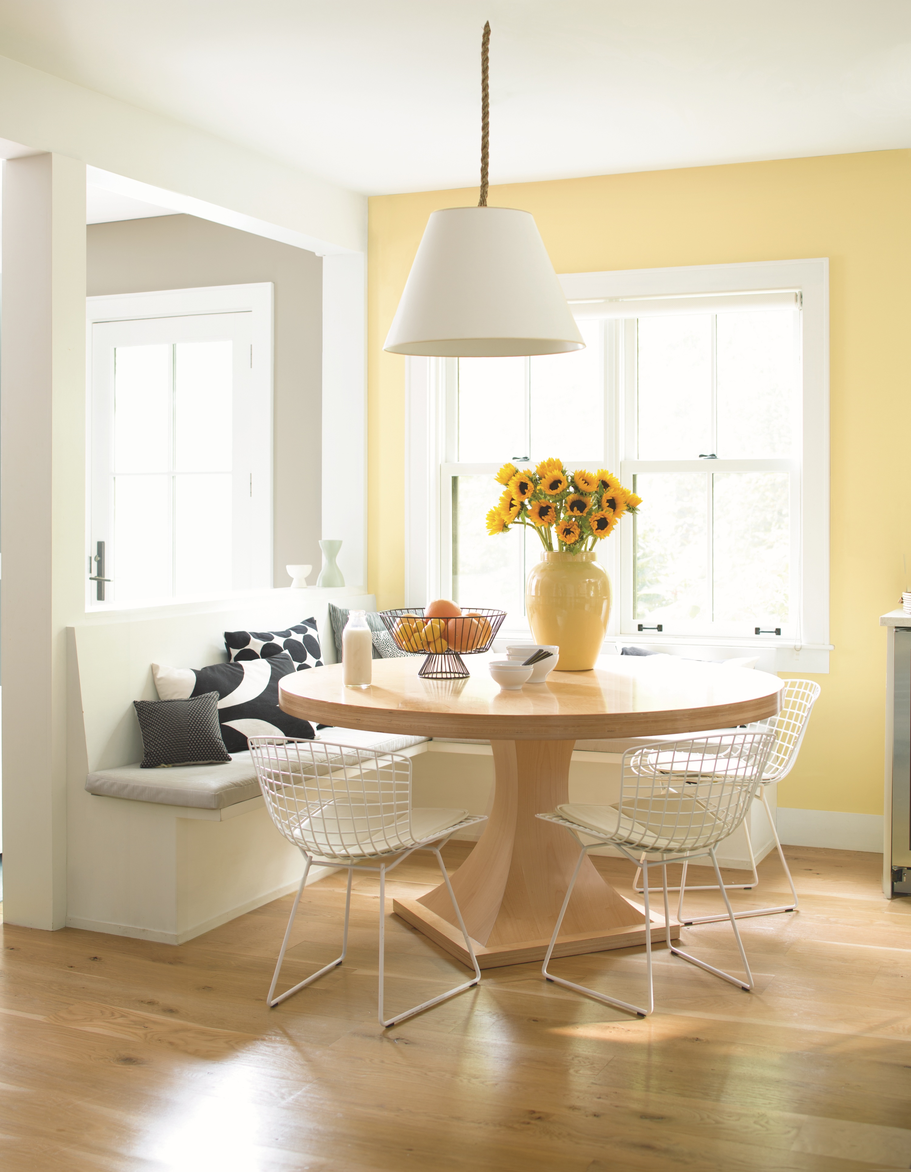
'Though it has a very lived-in and familiar feel, Stone Hearth is actually a very complex mix of grey and beige colors,' says designer Kathy Kuo, CEO of Kathy Kuo Home. 'It has the sophistication of stone grey, but also somehow radiates warmth, depth, and luxury. It's easy to pair with warm contrasting colors like terracotta, rust, and cream, while being equally at home next to slate blues and cooler beige hues that skew a little greener in the undertones.'
Interior design expert, Anh Nguyen, agrees, 'I adore how inviting and comfortable Stone Hearth makes a room feel. It provides depth without darkness, gentle warmth without weight. subtle red and orange give it character separating it from plain colors. I find joy in pairing it with various textures and shades, whether light or rich. It creates a dependable backdrop for any scheme. The versatility I've found with Stone Hearth never fails to impress. Completely wrapping a space or accenting trim, it consistently delivers coziness. Natural elements elevate its earthy tone while patterned fabrics enhance underlying notes.'
'Don't be afraid to layer in tone-on-tone patterns, too. Pulling out the subtle red and orange undertones with fabrics in cranberry, forest green, or terra cotta is one of my tried and true methods. It's like giving the color more personality.'
Cathy Dean, CEO & Founder of Studio Dean thinks Stone Hearth is the perfect neutral, 'Stone Hearth crosses the boundaries of colors perfectly. With its nature inspired stone based undertones it works with so many color combinations; it is a go-to for us. The warmth in the undertone of Stone Hearth helps in any scheme, from bringing homeliness to ultra-slick contemporary minimalist spaces to warming a dark and decadent scheme – this is a must-have in your palette.'
3. It’s endlessly adaptable

'Stone Hearth by Benjamin Moore is a versatile, warm beige tone that complements a wide range of decor styles. Its balanced, neutral undertones make it an ideal choice for creating a cozy and inviting atmosphere without overpowering other design elements,' says Nick Cryer, founder of Berkeley Place.
The earthy-toned shade of Stone Hearth is hugely flexible and gives designers and homeowners alike a huge degree of freedom when it’s applied, as Ben Thomson explains, 'In my experience, Stone Hearth pairs remarkably well with crisp whites and soft neutrals. The color works as a backdrop for both bold and muted accents, granting you the freedom and flexibility to easily customize the look and feel of your home, depending on your mood. Don't be afraid to try out different combinations! Experimenting with a range of lighting conditions will help you appreciate the rich undertones and endless adaptability of Stone Hearth.'
Arianna Barone, Color Marketing Manager at Benjamin Moore agrees, 'Balancing between gray and beige, Stone Hearth is not too warm nor too cold. With a light reflectance value (LRV) of 48, it has a good amount of depth which helps it from washing out in rooms with a lot of natural light. Stone Hearth can make spaces feel warm and inviting while still feeling modern and fresh. Pair it with warm off-whites for a subtle color flow, or crisp white paint colors for additional contrast. Given its natural versatility, it works for both interiors and exteriors as a color palette staple.'

Kathy Kuo is the CEO of Kathy Kuo Home, a recognized TV personality, and a celebrated interior designer. Published in the press as an international guru within the home and lifestyle space, Kathy has an unmatched eye for curating, sourcing and designing luxury furniture and homewares. Today, she continues to develop one of the fastest growing online platforms in the home and design industry. Kathy has 20+ years of experience in the home industry and now serves as a speaker and activist for female entrepreneurs. It is her mission to support women to intentionally grow and scale value-focused teams.
4. It embraces organic materials
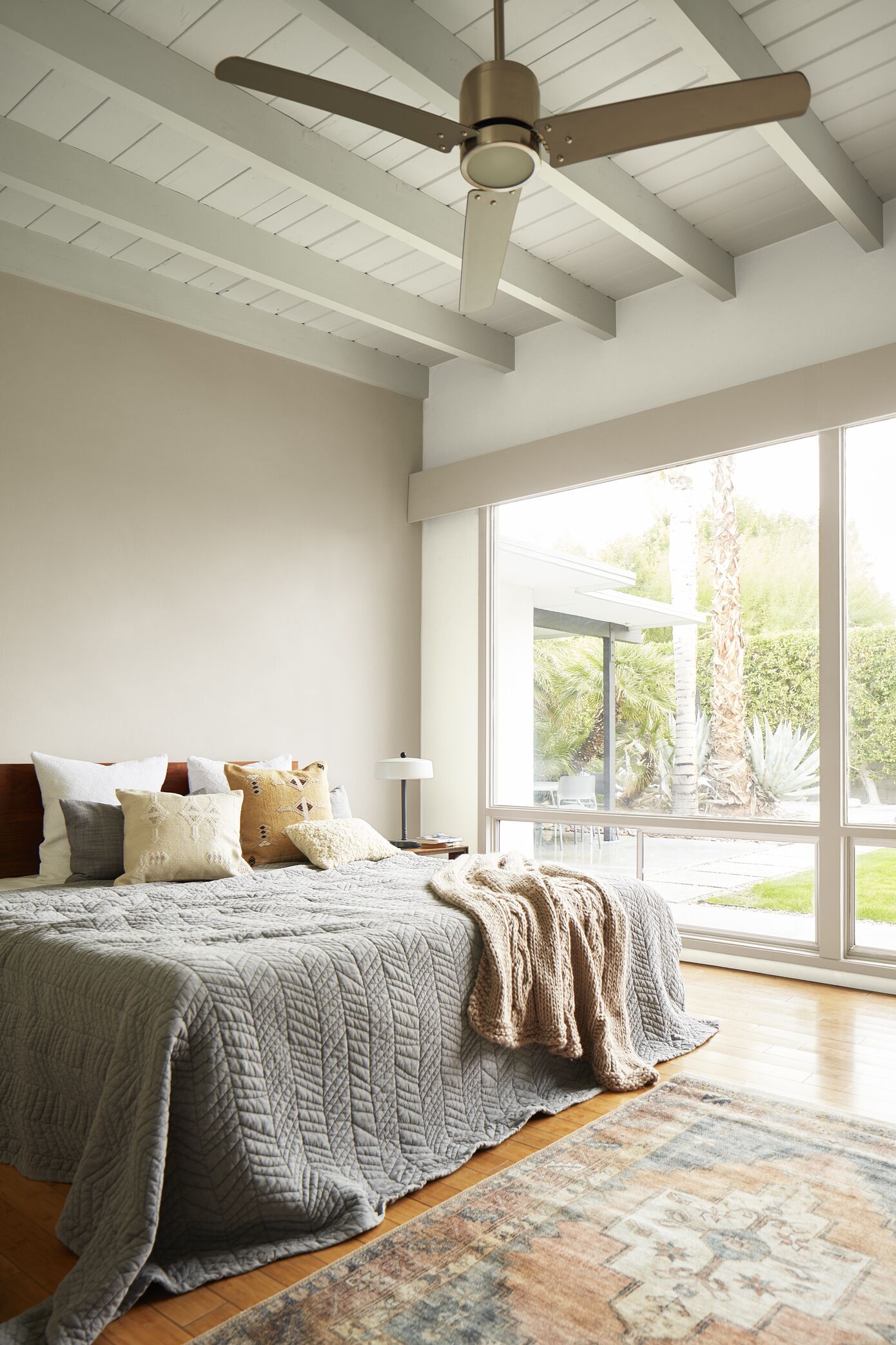
'Organic materials and silhouettes are going to look great with the subtle, earthy warmth of Stone Hearth – think materials like reclaimed wood, natural stone, and natural woven materials like rattan, sea grass, and jute; alongside asymmetrical vases, wabi-sabi inspired curves, and decor inspired by the great outdoors,' suggests Kathy Kuo.
Stone Hearth could also be a fantastic choice if you’re embracing the Organic Modern trend, which uses modern organic color schemes alongside a blend of minimalism and mid-century modern décor. The warm tones of Stone Hearth give a harmonized and sophisticated look, particularly when blended with organic materials.
Stone Hearth is such a versatile paint, with a host of uses and potential applications. If you’re looking for a color that bridges the gap between grey and beige, giving you multiple options in your home, it’s hard to see why this wouldn’t be the first paint you’d consider.
Sign up to the Homes & Gardens newsletter
Design expertise in your inbox – from inspiring decorating ideas and beautiful celebrity homes to practical gardening advice and shopping round-ups.

Jo Plumridge is a freelance writer and photographer with over 20 years of experience writing for a variety of magazines, websites and books. She writes, perhaps unsurprisingly, about photography, but also on all things interior design and sleep-related, alongside reviews of home and tech products. Jo loves exploring the latest design trends, although she’s yet to find a carpet that doesn’t show up the cat hair from the cats she and her husband foster.
-
 Ina Garten's storage pantry is an insightful window into all of the best cookware used by the chef – and it's easy to recreate on your kitchen shelves from $48
The beautiful dishware in The Barefoot Contessa's Hamptons pantry showcases the tools she uses most often to cook – this is exactly how you replicate it
By Sophie Edwards Published
-
 Extend the lifespan of your appliance with 5 simple but crucial washing machine maintenance tips
From cleaning the filters to keeping the door open, experts reveal the washer tips they swear by
By Andy van Terheyden Published