Designers share how to decorate with Sherwin-Williams' 'Romantic Period' color palette – 5 on-trend, calming neutrals for all design styles
These elevated neutral paints are endlessly calming and versatile to use in any room of the home
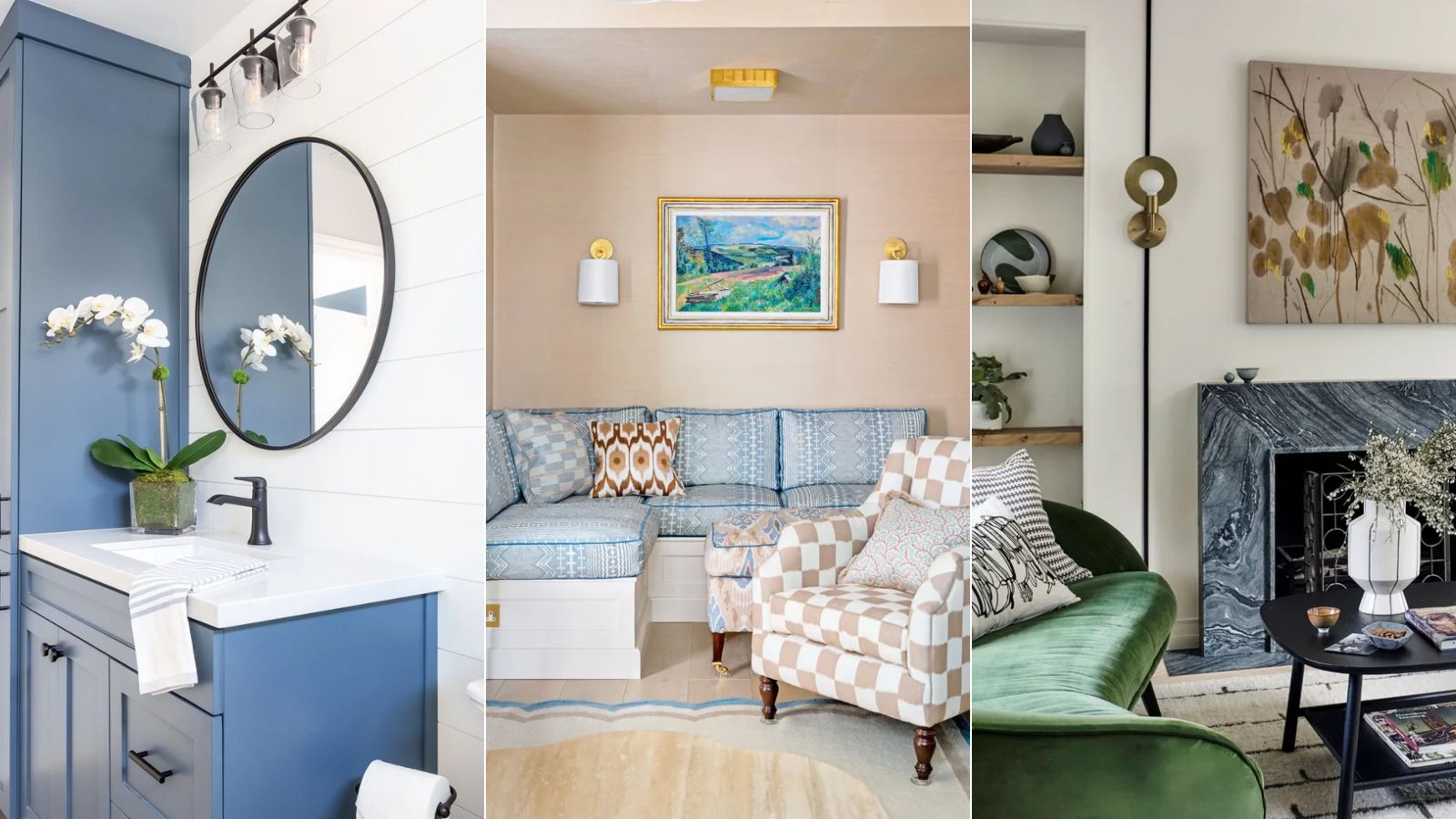

If you love decorating with calming neutral paint colors throughout your home, then Sherwin-Williams' latest color palette is for you. Inspired by the Romantic Art Period, this color palette is an elevated take on neutrals, and each color is incredibly versatile for many decorating styles.
While stark whites and cool grays are quickly becoming branded as bland, we're seeing plenty of appeal for earthy neutrals which provide more depth and warmth, and this palette fully embodies this cozy approach.
We spoke to interior designers and Sherwin-Williams' color experts to find out more about this soothing color palette. Read on if you want to know the best ways to decorate with paint ideas inspired by this color scheme throughout your home.
A post shared by Sherwin-Williams (@sherwinwilliams)
A photo posted by on
The palette includes five paint colors, all of which lend themselves to decorating with neutrals. Classic Light Bluff SW 0050 is a versatile warm white paint that works as a backdrop color in any room; Renwick Rose Beige SW 2804 is a muted terracotta; and Sycamore Tan SW 2855 is a cool beige. The final two shades are slightly darker tones: Smoky Blue SW 7604, a muted blue-gray; and Avocado SW 2861, a muddy green.
'This palette was inspired by the Romantic Art period,' says Emily Kantz, Color Marketing Manager at Sherwin-Williams. 'With its dusky rose, earthen tones, and creamy white, it reflects the emotional and mysterious nature that is found within these historic pieces of art within the romantic design period.'
'There is a bit of a resurgence in this new romanticism as of late: many people are gravitating towards these authentically earthen tones that have a layered complexity in their muted beauty. After years of stark whites and grays, these tones add an element of quiet elegance.'
How to decorate with the Romantic Period color palette
All five colors within the palette are slightly muted, making them incredibly versatile. Whether you use them for color drenching a room or as accent colors, each color will create a calming feel that appears liveable and timeless.
Sign up to the Homes & Gardens newsletter
Design expertise in your inbox – from inspiring decorating ideas and beautiful celebrity homes to practical gardening advice and shopping round-ups.
Interior designer Melissa Read, Creative Director at Studio Burntwood recommends using Avocado on kitchen cabinets for an on-trend look. 'Avocado works beautifully on kitchen cabinets, the green adds a fresh and vibrant look. Pair it with Carrara or Calacatta marble kitchen countertops and natural wood pieces for a balanced space.'
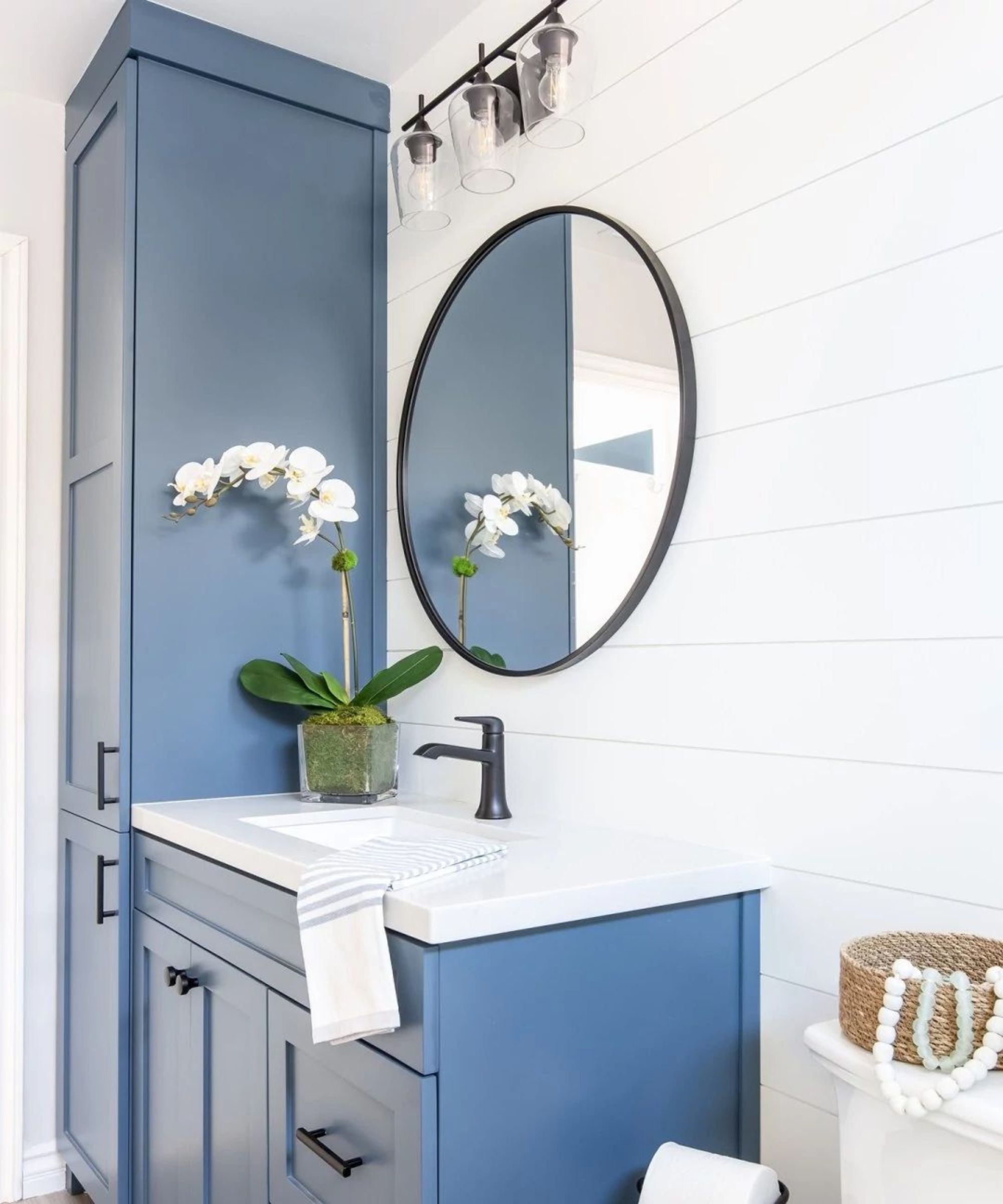
Sherwin-Williams Smoky Blue
Smokey Blue is a great choice for a slightly more colorful take on neutrals and works well in bathrooms paired with white for a coastal decor scheme as seen here. Alternatively, Melissa suggests using it in home offices for a calming and grown-up color scheme.
'Smokey Blue is an excellent choice for a study, creating a serene, focused atmosphere. Combine it with Classic White Buff for contrast and a more classic and sophisticated look.'
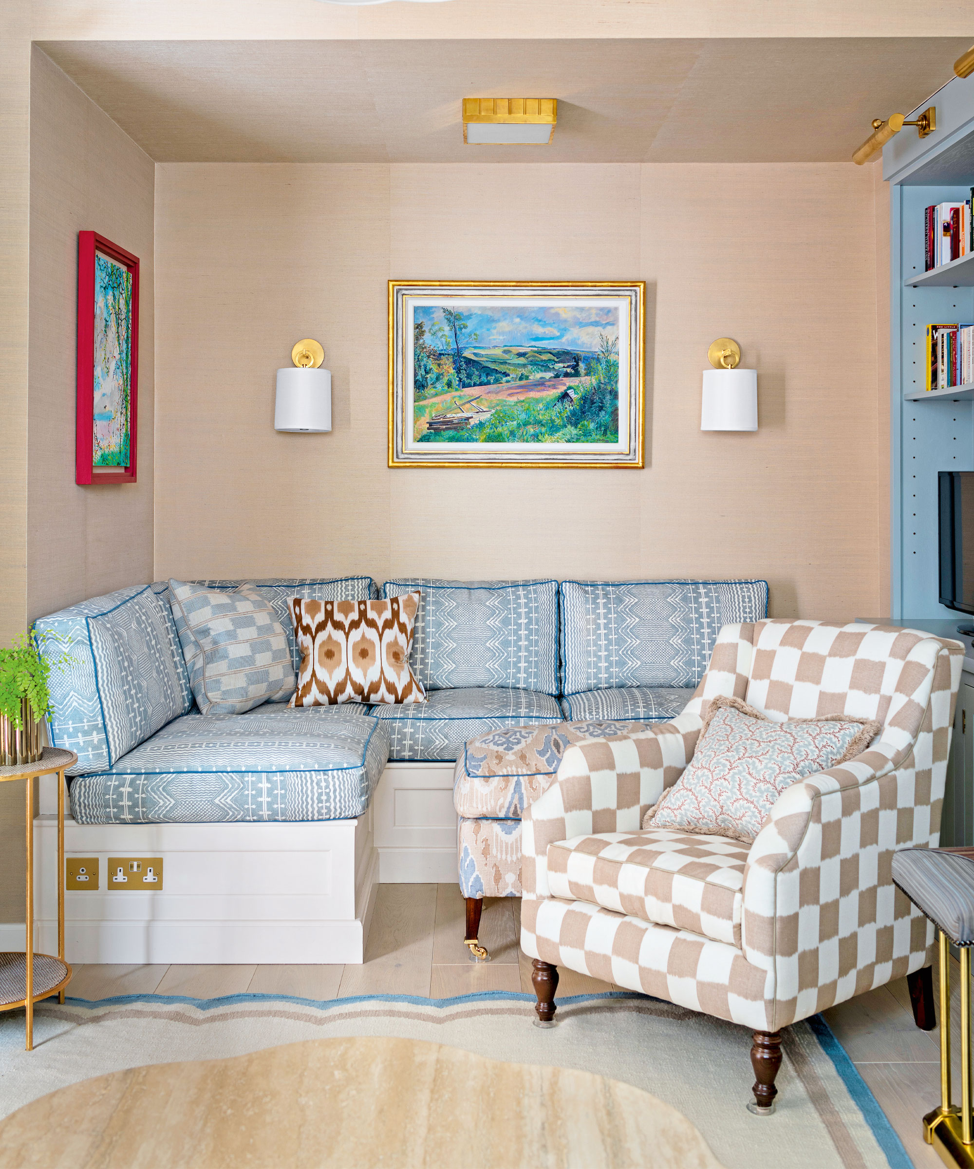
Both Sycamore Tan and Renwick Rose Beige are go-to choices to create a pared-back and cozy feel. In a living room, use either of these hues across all four walls for a warmer alternative to white, similar to this small living room with colorful decor.
Alternatively, Melissa adds that these two warm neutrals would also work well in bedrooms and bathrooms: 'Sycamore Tan is ideal for a bedroom or bathroom, providing a warm, intimate space. Renwick Rose Beige evokes a feeling of comfort and relaxation, perfect for a bedroom wall color or joinery. Pair it with brass or gold accents for a stylish touch.'
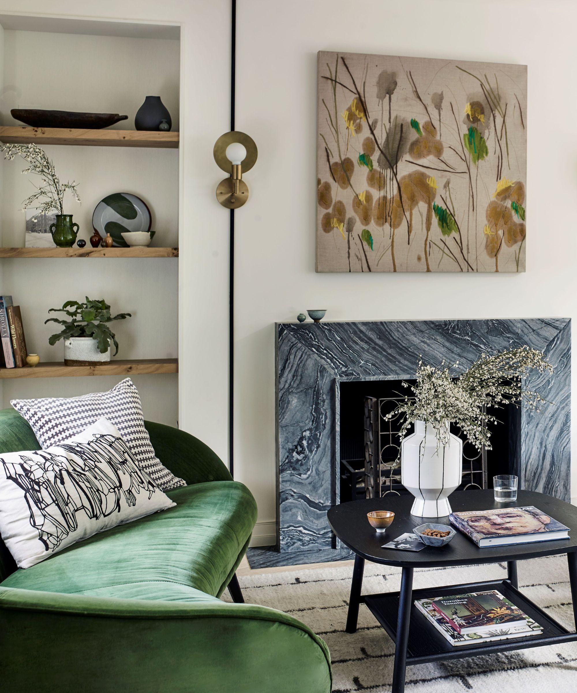
If you're drawn to lighter neutrals, opt for Classic Light Buff, and use it as the main color in a living room to create a timeless look that will withstand trends. 'I love neutral wall colors because they are perfect for framing the decor of a space and letting it speak for itself,' says interior designer Kathy Kuo.
While light neutrals can risk lacking interest, make sure to reflect personality through the rest of the room's decor, as Kathy suggests: 'There are so many ways to create an interesting and eye-catching interior design motif against a neutral background. Have fun with wall art, lighting ideas, and decorative accents!'
Neutrals are the most timeless colors to use throughout home decor ideas, creating a calming feel in any room they're used in. With these five on-trend neutral paints, you can benefit from a soothing space while also creating a cozy feel – from the kitchen to the bathroom.

Emily is a freelance interior design writer based in Scotland. Prior to going freelance in the spring of 2025, Emily was Homes & Gardens’ Paint & Color Editor, covering all things color across interiors and home decor for the Homes & Gardens website. Having gained specific expertise in this area, Emily is well-versed in writing about the latest color trends and is passionate about helping homeowners understand the importance of color psychology in home design. Her own interior design style reflects the simplicity of mid-century design and she loves sourcing vintage furniture finds for her tenement flat.
-
 How to grow lupine – expert advice on growing this dramatic and vibrant cottage garden flower
Vibrantly colored flower stalks make swathes of lupines a sight to see in meadows and cut flower gardens alike
By Ellen Wells
-
 I’m a professional cleaner, and I swear by these quick and easy tips to clean pet hair from wooden floors
Staying on top of the mess makes it 10 times easier
By Carolina Kazimierski