How to decorate with peach tones – 5 ways interior designers make the color for 2024 work
Peach Fuzz has thrown this pale pinky shade to the top of color trends, but how can you realistically use it in your home?
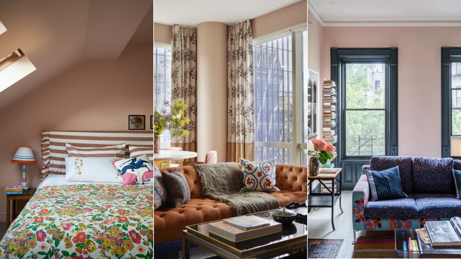

Pantone's Color of Year is always an anticipated announcement, it's a zeitgeist for trends and the cultural feel of the moment, and no matter what the color it always seeps heavily into interior design trends (even if they are short-lived).
This year it's Peach Fuzz, described by Pantone as 'An appealing peach hue softly nestled between pink and orange, PANTONE 13-1023 Peach Fuzz inspires belonging, recalibration, and an opportunity for nurturing, conjuring up an air of calm, offering us a space to be, feel, and heal and to flourish from.' It's a nice enough shade, it's useable for sure. But what we are interested in is how to use this shade in a way that won't just date in a few months, how can we adapt it to ensure it has longevity?
There has already been a steady shift towards warmer color trends over the last few years, especially earthy neutrals that we see far more of now than bright whites and grays. So bringing peach tones into your home is both current and since these are very livevale, neutral colors it's classic too. We spoke with designers on how to embrace a peachy palette, making it feel timeless and sophisticated.
5 easy ways to decorate with peach tones
When following interior design trends, you want to be cautious. It's easy to get caught up in the hype for one color, or one style because it's the way to do it at the time, however by committing hard to a trend, you do risk ending up with rooms that feel dated a few months down the line.
So bringing peach tones, or any Color of the Year inspired scheme, into your home needs to be done in a way that's timeless and works with your personal style too.
1. Bring peach tones in as an accent color
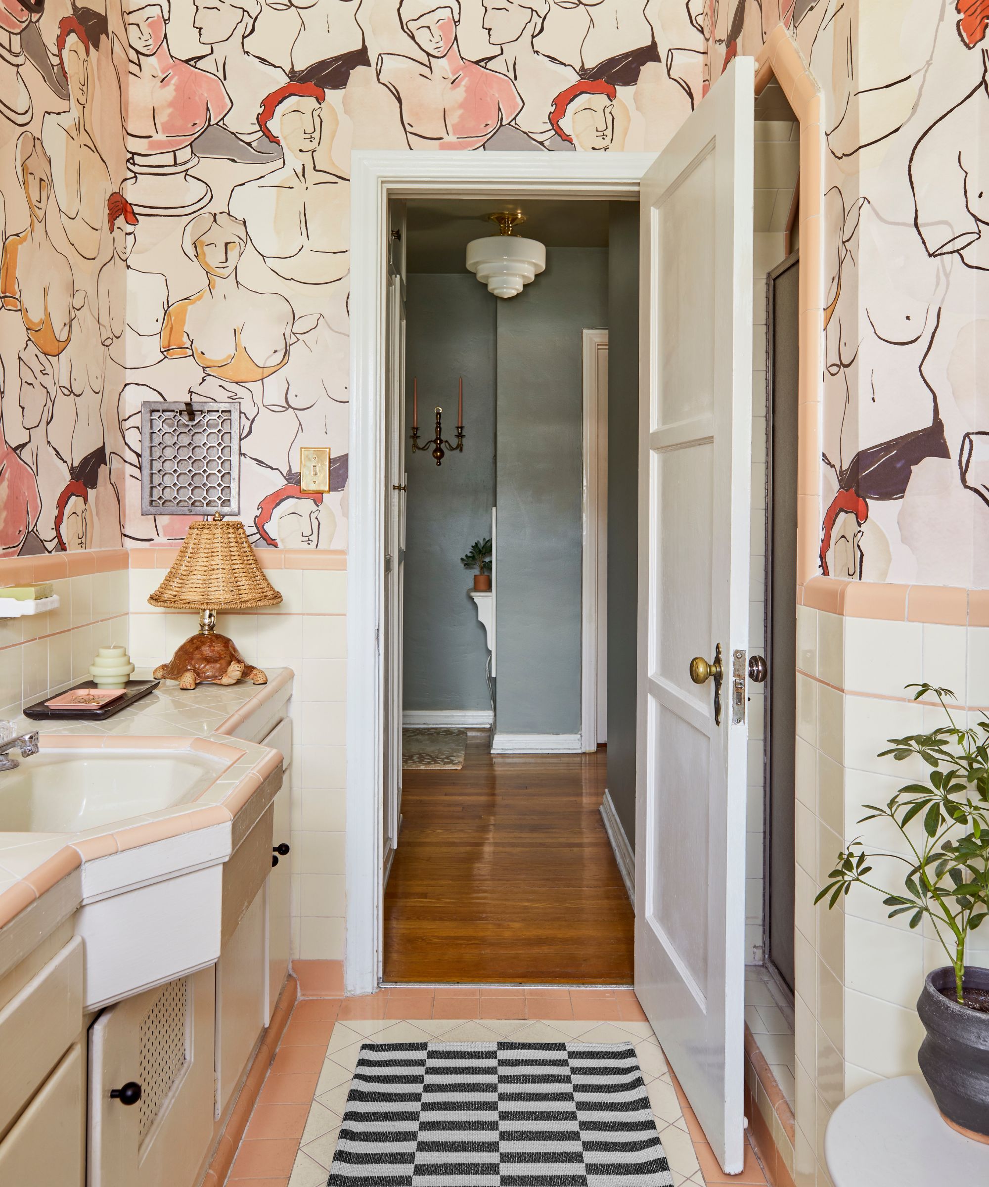
Bringing peach tones is an accent color, paired with other shades, or just adding in a few peachy accessories, is a nice way to experiment with the trend in a non-committed way. You still benefit from all the warmth and whimsy the shade brings, but you can make small switches to ensure it doesn't look dated too.
'Peach tones, when used thoughtfully, can infuse a home with a sense of warmth and tranquility. To avoid a dated look, I'd suggest using peach as an accent rather than the dominant color,' explains designer Jennifer Davis. 'Incorporate it into elements like soft furnishings, artwork, or a single statement piece of furniture, pairing it with neutral tones and textures to maintain a modern, sophisticated ambiance. By striking a balance between peach accents and complementary hues, the space can exude a timeless charm that feels inviting and fresh.'
Kathy Kuo agrees, 'Peach Fuzz is officially the new warm neutral on the block! I love that this color can read as more feminine and pastel or as more of an earthy tone depending on what it's paired with. Try bringing in smaller decor items in Peach Fuzz like wall art, throw blankets, and decorative vases and bowls to see how the color reads in your home and then expand from there!'

Kathy Kuo is a celebrated interior designer and international guru within the home and lifestyle space. She has 20+ years of experience in the design industry.
2. Treat peach like a neutral and color drench a room
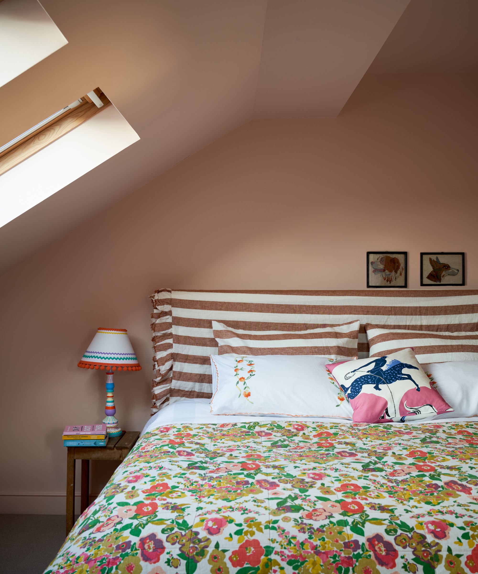
The most timeless approach to pink peachy shades is to go super muted. These muddy peaches have become classic colors, up there with grays and whites, and are looking very unlikely to date anytime soon. They also make for perfect color-drenching paints since they are so close to being a neutral, they never overwhelm a room and can be so cozy and cocooning. A small bedroom would be the perfect space to test it out.
'Peach shades are warm-toned and well suited to both bright and dim rooms and can be used as a pop of color or almost as a neutral across all surfaces,' says Charlotte Cosby, Creative Director of Farrow & Ball.
And in terms of what pink paints she recommends, 'Dutch Pink, our peachiest pink, takes its name from the original Dutch pink, an artist’s yellow pigment made from bark and berries. Its warm yellow undertone means it shifts beautifully between orange, yellow, and pink depending on the light, making it perfect for different room aspects. Pair with deep browns like Cola and Mahogany for a dark accent, with a warm neutral like Dimity on the ceiling.'

Patrick O’Donnell is Farrow & Ball's color consultant & brand ambassador and has been with the brand since 2012. Patrick works with designers in the UK and North America, helping to bring their projects alive with the iconic, F&B color palette.
3. Contrast the warm tones with accents of blue
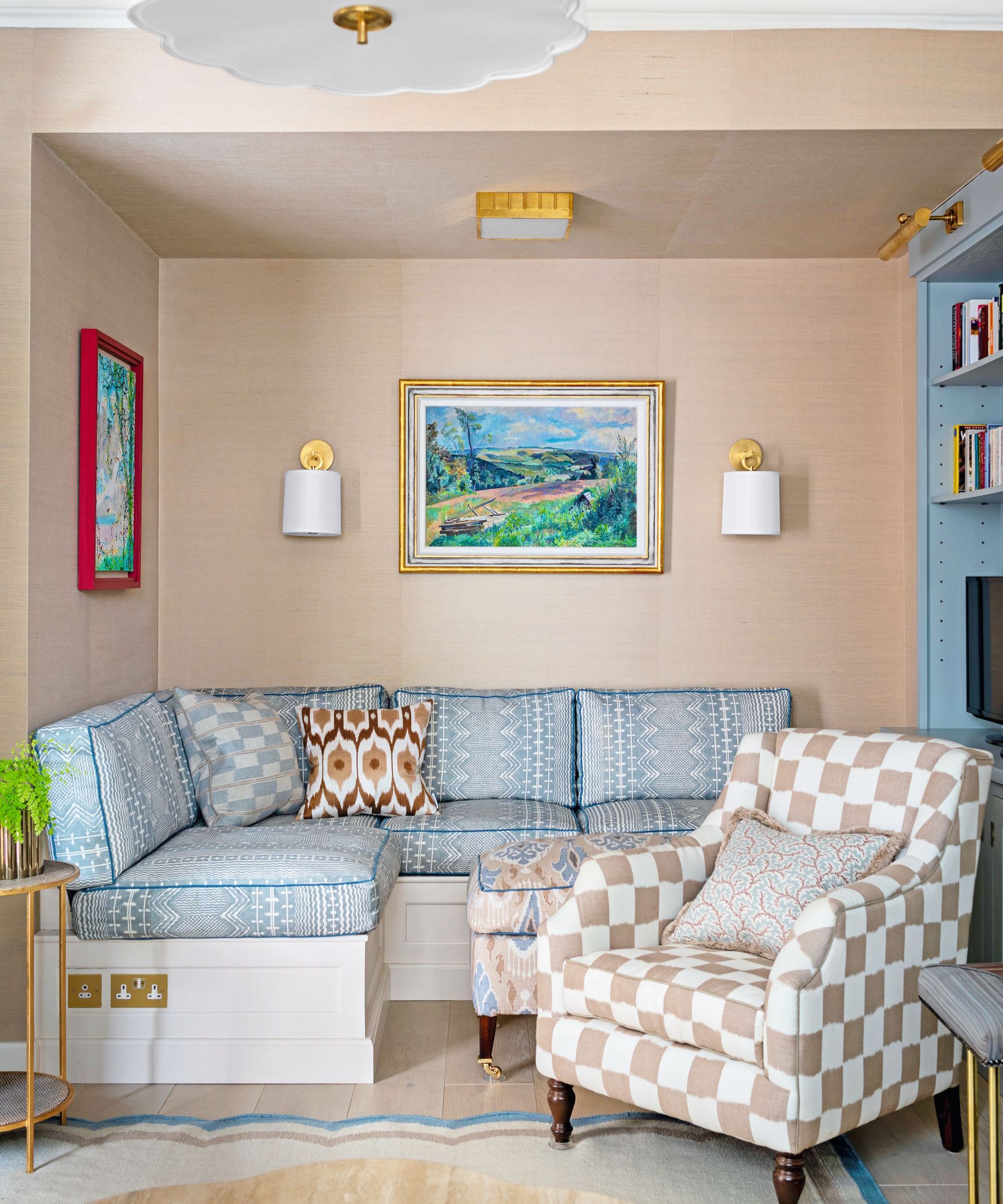
'Peach Fuzz, the Pantone Color of the Year is a beautiful, versatile, and serene color that works great in a contemporary on traditional setting. Decorating with peach tones can create a warm, inviting space, and when contrasted with light blue, it can add an element of serene, cool balance,' suggests designer Kati Curtis.
'Begin by integrating peach tones into your space through wall colors or larger pieces of furniture. This color serves as a neutral, yet vibrant, base. And for a striking contrast yet soothing color combination, incorporate light blue accents. Consider a light blue area rug, curtains or throw pillows. These blue elements will pop against the peach backdrop, adding visual interest.'
'Additionally, don't hesitate to experiment with darker shades of peach for statement pieces. A darker peach armchair or artwork can add depth and richness to the room. This strategy allows you to maintain a cohesive color story, while also creating a dynamic, layered look.'
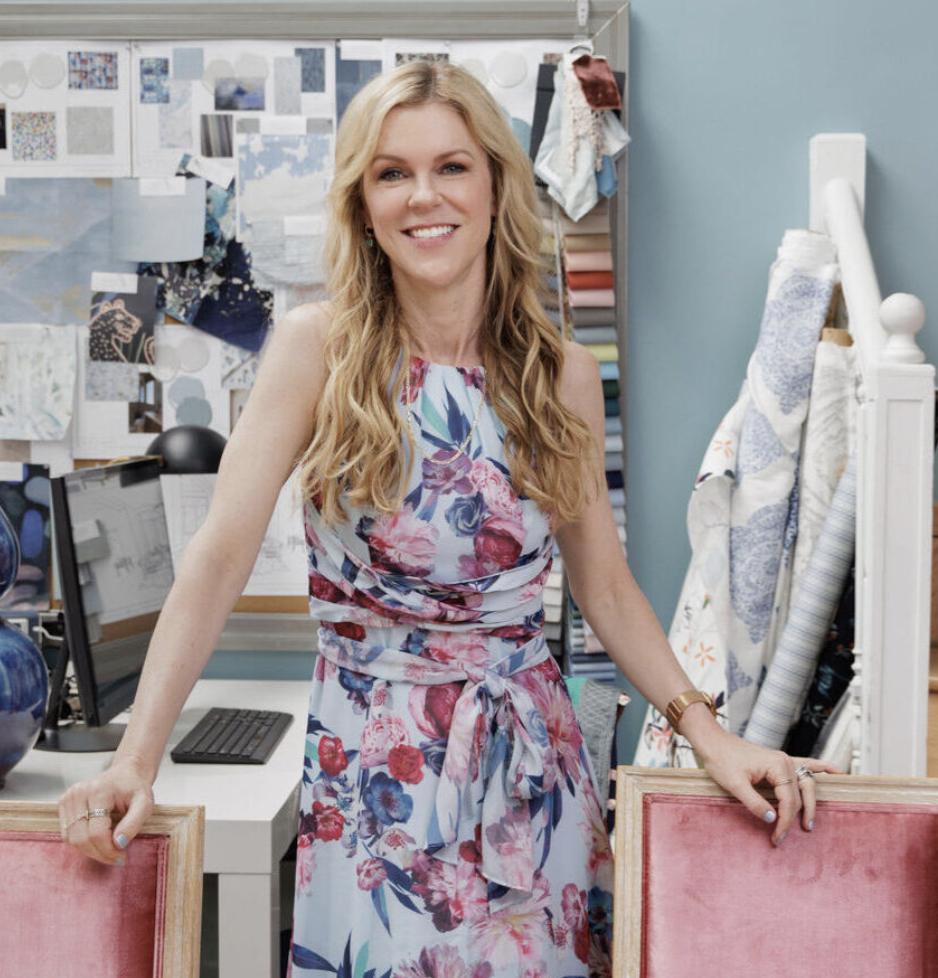
Kati Curtis is the founder of Kati Curtis Design, an design firm based in New York City specializing in classic design with a global influence. Kati founded the studio in 2005 after 12 years of working with international architecture and engineering firms.
4. Ground peach with darker shades
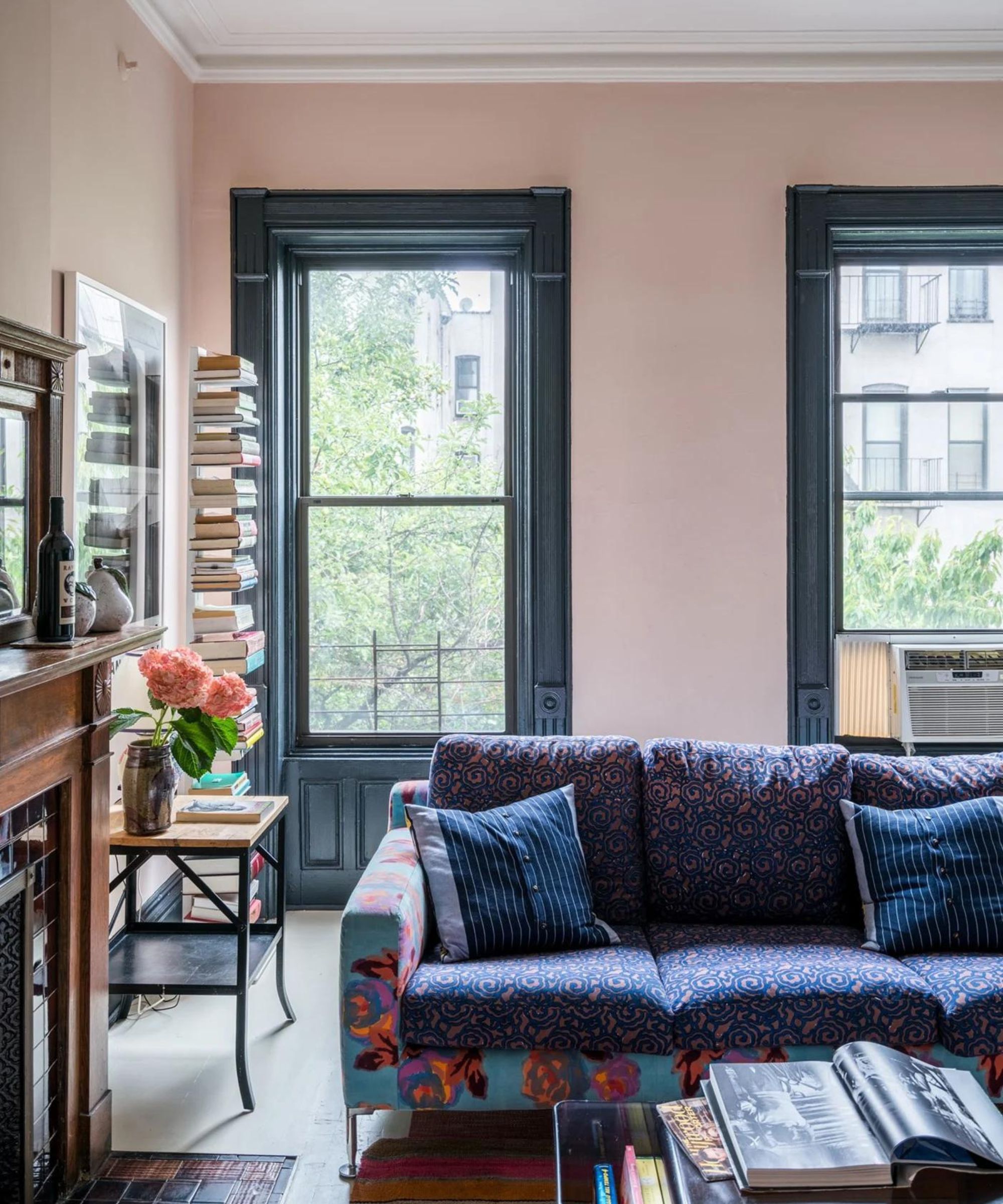
There is the risk with any pinky, peachy shade that they can look a little sweet. The easiest way to balance it is to add in some darker shades to tone down that saccharine side. The combination of peach walls and deep blue-black window frames and woodwork works perfectly in this living room, you get the fun and freshness of the peach, but the darker color makes it feel more sophisticated.
When pairing peach with a dark paint you want to ensure the undertones work together. For example, if you are picking a very warm peach with yellow undertones and a warm dark color like a deep brown will work far better than a blue. However, if your peachy is more cool-toned and pinky, then blue or a dark charcoal gray is the way to go.
5. Create a tonal scheme with layers of browns and grays
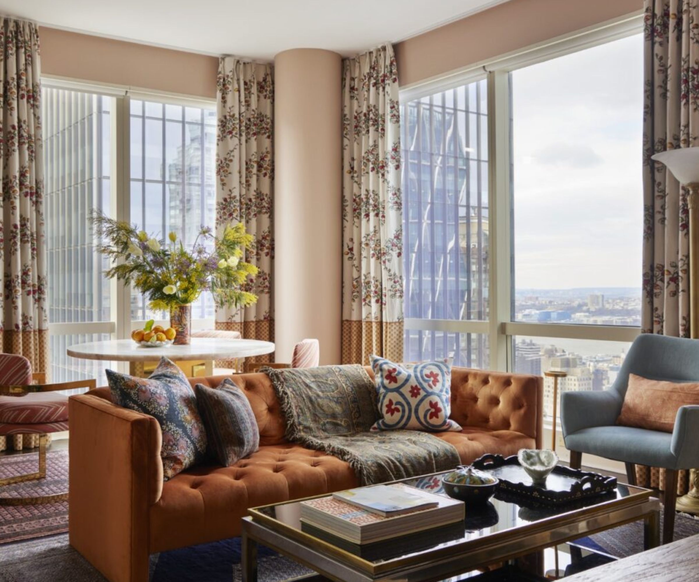
Tonal schemes work wonderfully with peach. Bring in paler forms of the shade and deeper ones too, browns and earthy oranges to create a very chic neutral scheme, You can add in cooler tones too like pale grays to balance out all the warmth and tone down the pinkier shades.
'Peach can be a bit of a love or hate color. Used well it adds a wonderful character and warmth to an interior, but it can also be little saccharine. As a studio, we advocate timeless interiors that aren’t led by trends. To balance out the use of peach and keep it feeling contemporary, layer it with accent colors such as cool greys, neutrals, and mid to dark green tones.' suggests Tom Rutt, Founder of TR Studio.

Tom Rutt has worked in the offices of Norman Foster and Michaelis Boyd before founding TR Studios in 2015.
Decorating with peach tones can work with any style and it can be a timeless palette too. The key is to keep it muted, tonal and only bring in as much of the shade as works with your aesthetic. Bring in touches of darker hues to ground the shade - browns and blues work best.
Sign up to the Homes & Gardens newsletter
Design expertise in your inbox – from inspiring decorating ideas and beautiful celebrity homes to practical gardening advice and shopping round-ups.

I am the Head of Interiors at Homes & Gardens. I started off in the world of journalism in fashion and luxury travel and then landed my first interiors role at Real Homes and have been in the world of interior design ever since. Prior to my role at H&G I was the digital editor at Livingetc, from which I took a sabbatical to travel in my self-converted van (not as glamorous as decorating a home, but very satisfying). A year later, and with lots of technical DIY lessons learned I am back to writing and editing, sometimes even from the comfort of my home on wheels.
-
 The great bedding debate: top sheet vs no top sheet − which side are you on?
I asked an expert panel of bedding designers whether you really need a top sheet to keep clean and cool or if it's just another ploy to make you spend money
By Emilia Hitching Published
-
 Thoughtful modernism – how one Dallas home makes bold contemporary design feel warm, welcoming, and comfortable
With its mix of textural finishes and carefully curated furnishings, this modernist home is a refreshing retreat
By Karen Darlow Published