What are intermediate colors? Color experts explain how to decorate with these in-between hues
Intermediate colors are the neon avoidant's alternative to a vibrant color pop. So how do you decorate with them? We've asked the experts

Color is a powerful tool in interior design, capable of setting the mood of an entire home. While primary and secondary colors are most likely firmly on your radar, have you ever considered including intermediate colors in your decor?
Intermediate colors, otherwise known as tertiary colors, are born from the mix of neighboring primary colors and secondary shades on the color wheel. The result is subtle yet vibrant and brings a subtle burst of color into any space. Tertiary colors are often used in complementary color schemes to accent and make the main, more vibrant tones in your scheme stand out. However, the experts think intermediate colors can (and should) also take center stage.
From creating a harmonious palette to infusing warmth into a room, intermediate colors might just prove to be the unsung heroes of the color wheel. Here, we've spoken to color experts to help us unlock the secrets of decorating with these in-between hues.
What Are Intermediate Colors?
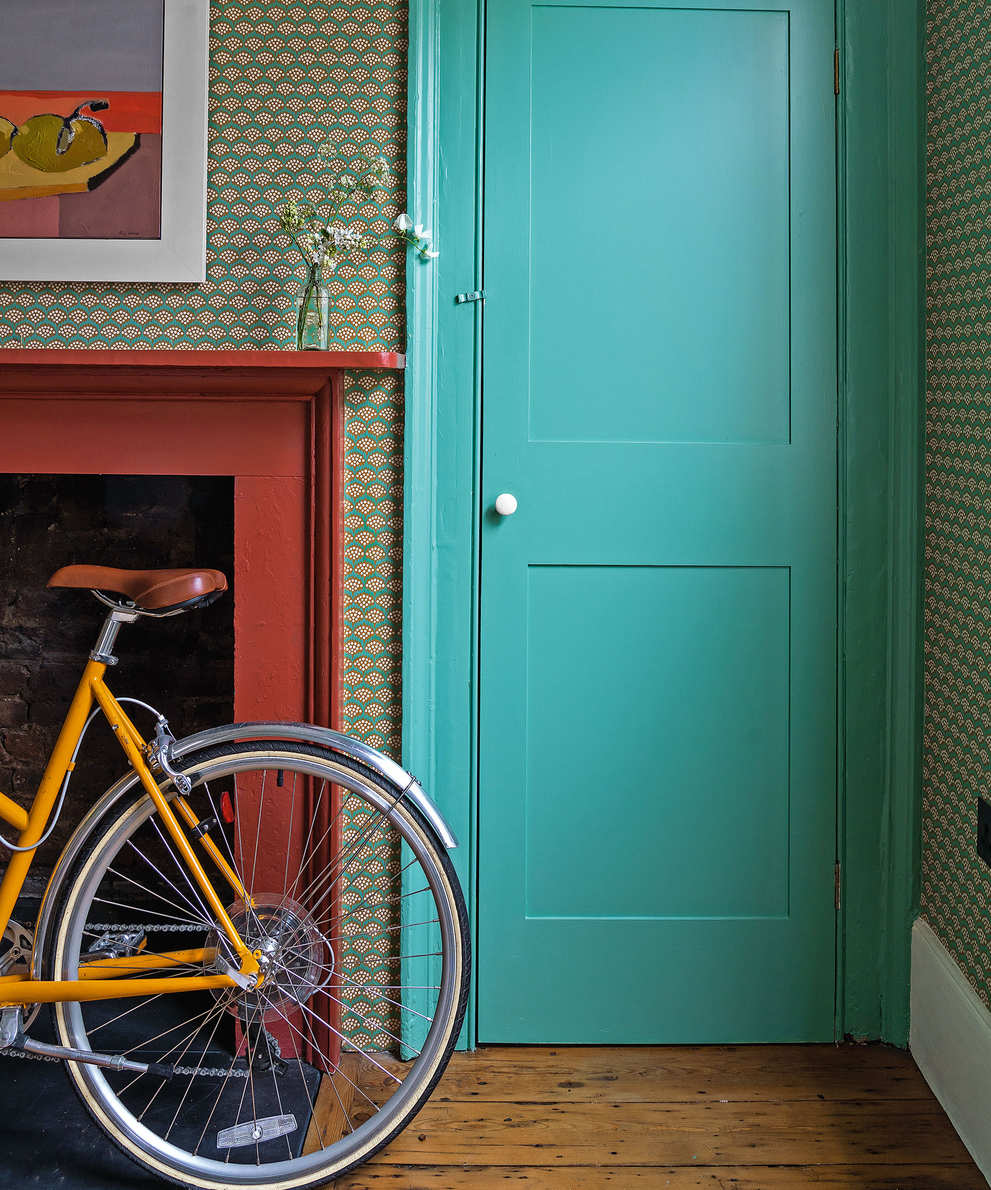
Intermediate colors are created by mixing a primary color with a secondary color that sits adjacent to it on the color wheel. The color wheel includes the three primary colors: red, yellow, and blue, and the three secondary colors, green, orange, and purple (which are formed by combining equal parts of two primary colors).
Finally, you have the six intermediate (or tertiary) colors, a mix of primary and secondary tones. These are:
- Red-Orange (Coral)
- Yellow-Orange (Mango)
- Yellow-Green (Lime)
- Blue-Green (Aqua/Turquoise)
- Blue-Purple (Iris)
- Red-Purple (Magenta)
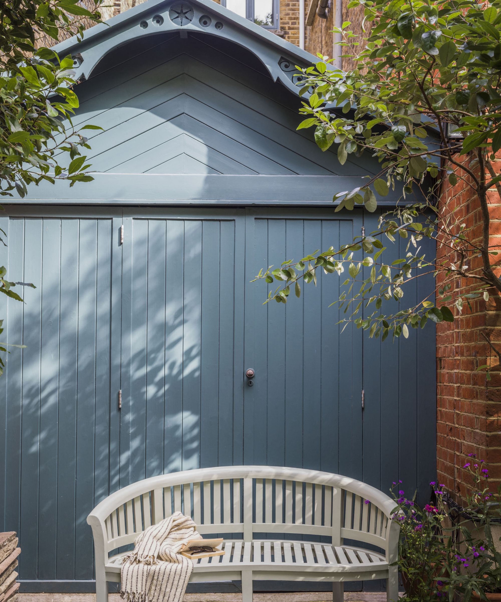
Charlotte Cosby, creative director at Farrow & Ball, says: 'Bold intermediate colors are an incredible accent for every space. The combination of pigments creates a more nuanced version of the primary color, with more depth and a beautiful reaction to changing light.' They boast a combination of the vibrancy of the primaries with the depth of the secondaries, offering a rich spectrum to decorate with.
'When choosing an accent paint color for the home, you may not want something as expected as primary hue,' says Erika Woelfel, VP of color and creative services at Behr. 'Tertiary colors are great options to add pop and depth to walls as they often feel like they have more personality.'

Erika Woelfel is the VP of Color and Creative at Behr. She has over 20 years of experience across color consulting, visual merchandising, graphic design and marketing.
How To Use Intermediate Colors In Interior Design
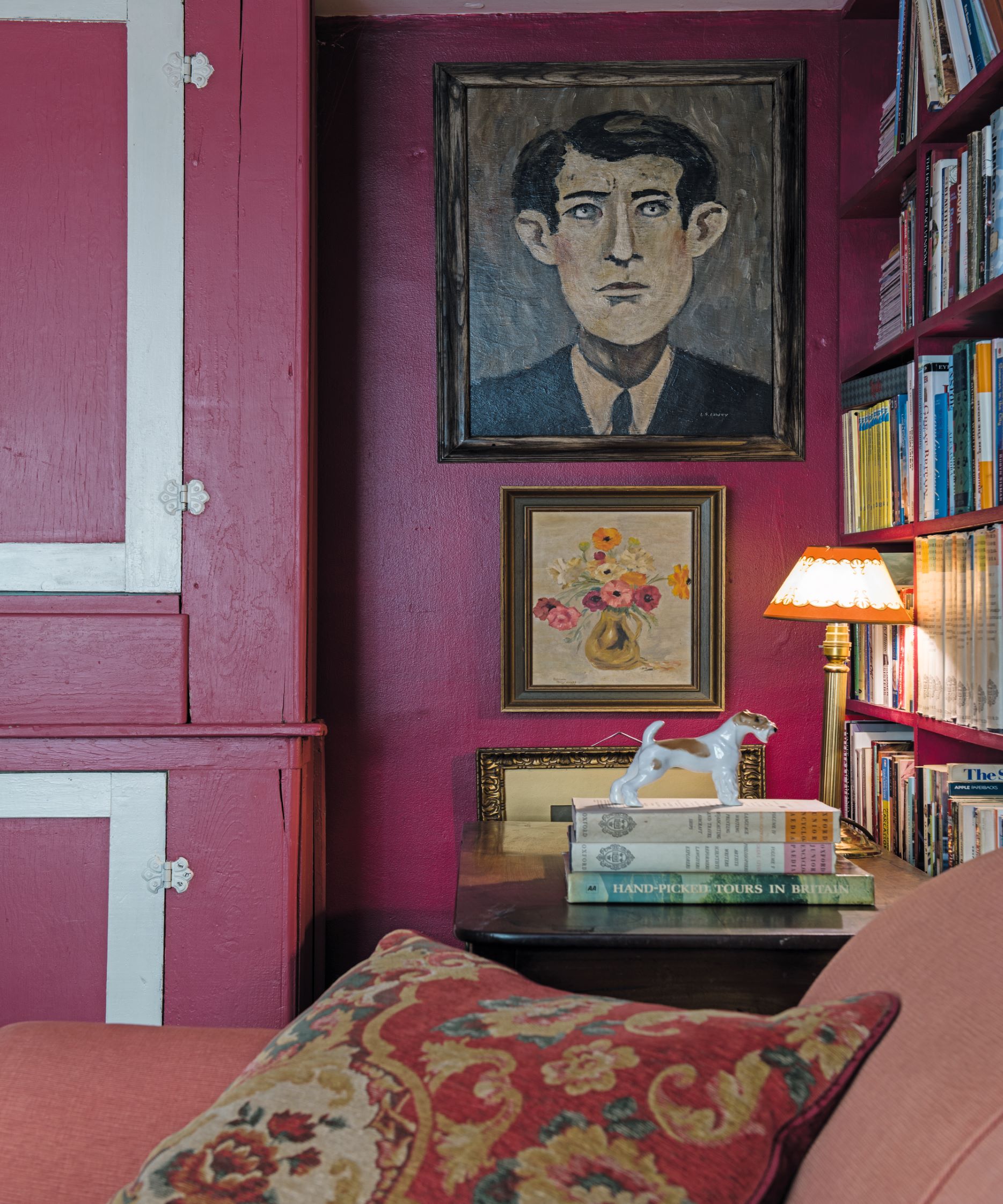
Intermediate colors are exceptional tools in color trends due to their ability to bring depth, sophistication, and versatility to a scheme – without overbearing. They offer a nuanced palette that strikes a balance between vibrant and subtle, making them ideal for those who shy away from neon brights but want something a little more than a muted color scheme.
Playing a pivotal role in bridging the gap between primaries and neutrals, by bringing intermediate colors into your home you can start to establish a more cohesive palette. Or introduce subtle color pops without overwhelming the space (or you), allowing for a harmonious and refined aesthetic.
'Intermediate colors provide a diverse range of hues that can add depth and complexity to interior spaces,' explains Ashley McCollum, GLIDDEN® paint by PPG color expert. 'Their harmonious qualities create a sense of unity and offer the opportunity to strike a balance between warm and cool tones. Additionally, layering different shades of intermediate colors through furniture, textiles, and decor can create visual interest and richness.'
'Since these are a mixture of different colors, keep in mind the potential undertones that come through in different artificial lighting settings and with changing natural light conditions throughout the day,' she advises.
Designers will often leverage these tones as accents. Start by considering your room's purpose, lighting – both natural and artificial – and existing features, flooring, and furnishings and decide whether you want to create focal points by highlighting specific areas, or go bigger and bolder.
With these considerations in mind, you can start to navigate the spectrum of intermediate colors with confidence.

Ashley McCollum is a Marketing Manager and color expert for PPG’s Architectural Coatings business in the U.S. and Canada. Prior to joining PPG in 2017, Ashley's career was heavily focused on color and visual merchandising for retail environments. Ashley earned her MBA in Marketing/Management from Slippery Rock University of Pennsylvania.
Decide on the look and feel you want to achieve
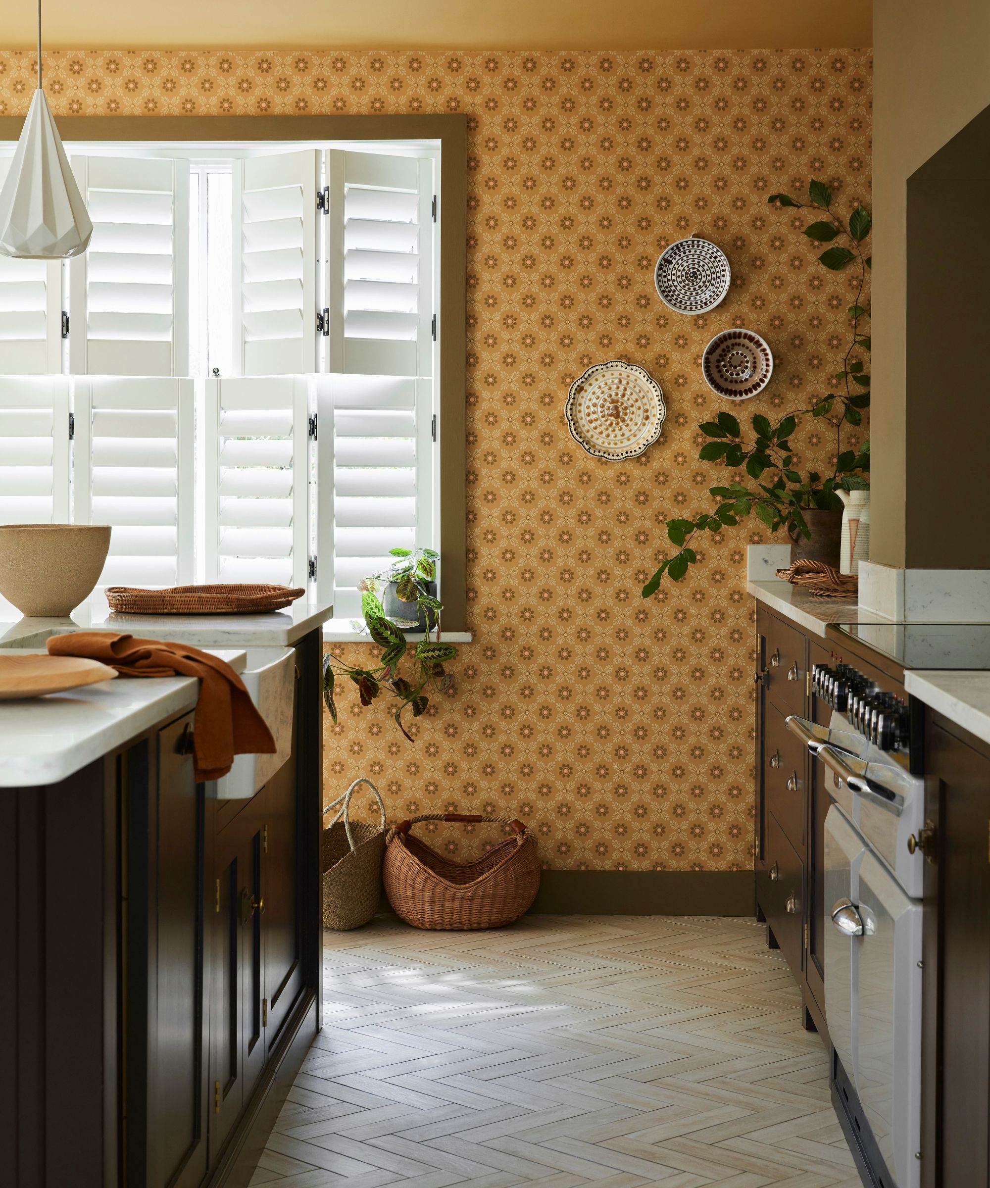
If your home’s color scheme is feeling a little flat, using intermediate colors can add depth and warmth. For example, incorporating red-orange or yellow-orange tones can create a cozy and inviting atmosphere without the vibrancy of their primary counterparts.
'Keep in mind the mood you want to create in each room when decorating with tertiary colors,' advises Behr's Erika Woelfel. 'Warm hues like red-orange and yellow-orange can create a cozy and inviting atmosphere, while cool hues like blue-green and blue-purple can evoke a sense of calm and relaxation.'
'Paint an accent wall in a tertiary color like Desert Coral to create a focal point in a home's entryway area. Alternatively, you can use a cool tertiary color like Caribe or Sophisticated Teal for a bedroom accent wall behind the bed,' Erika adds. Really consider the look and feel you want your rooms to have.
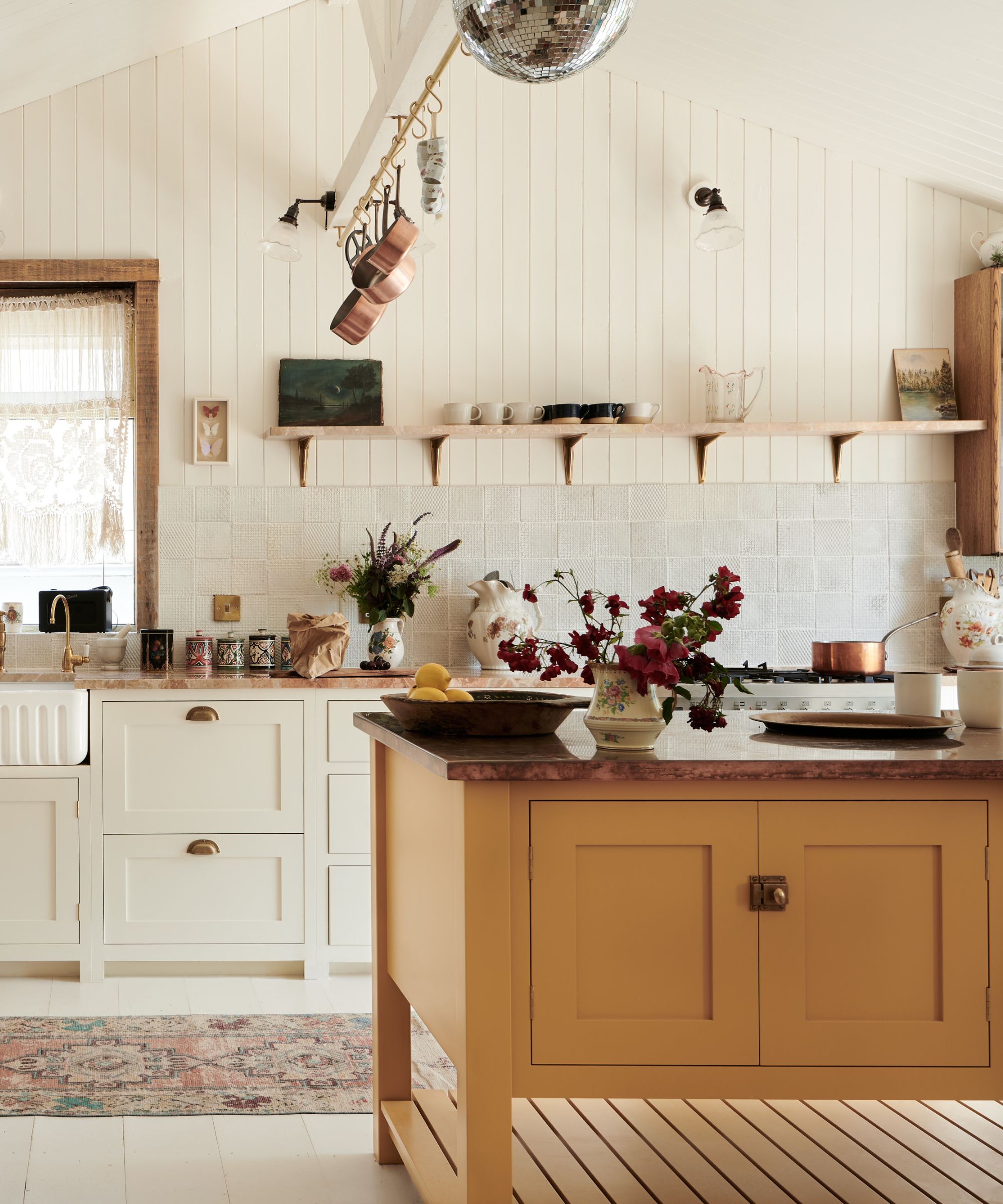
‘Energetic and social spaces such as kitchens and dining rooms work fantastically well with uplifting, warm, and energized colors,' says Ruth Mottershead, creative director at Little Greene. 'Intense and rich yellow-oranges will lift the mood, creating a joyful, positive atmosphere.’
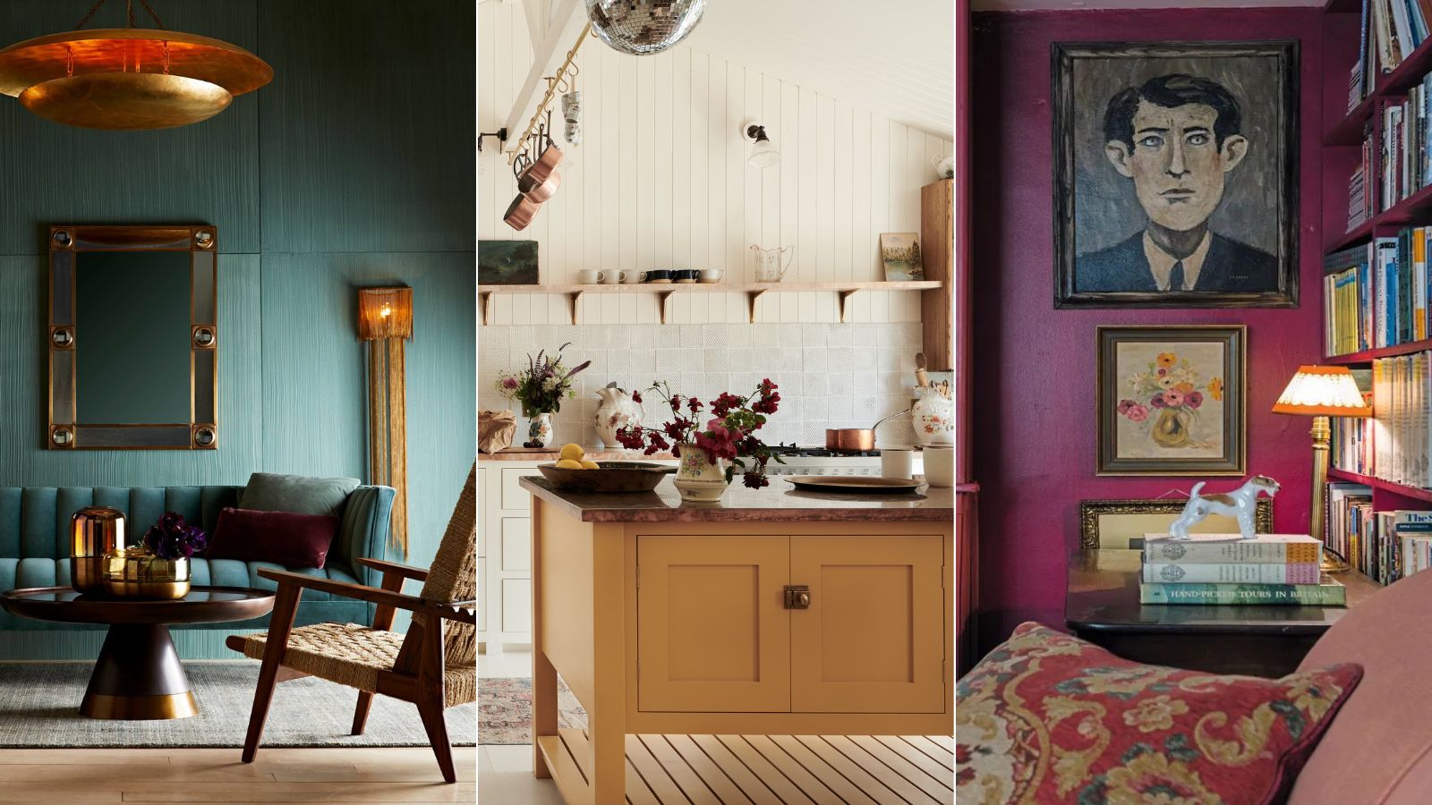
Embrace the power of contrast and don't be afraid to experiment, allowing your personality to shine through, like in fashion designer Pearl Lowe's kitchen seen above, designed by deVOL Kitchens and featuring a mustard yellow statement kitchen island. 'India Yellow is a perfect moody yellow-orange shade, this deep mustard will bring buckets of cheer for a pop of color or in a scheme with a gentle neutral such as Shadow White,' advises Farrow & Balls' Charlotte Cosby.
On the other hand, the blue-green shades can create a sense of calm and connection to nature. 'The beauty of blue-green, even in its brightest of tones, is that it combines wonderfully with other greens, just as in nature, hues of green sit alongside each other harmoniously,' explains Ruth. 'Pair with soft whites for a fresh, uplifting finish.’
'Yeabridge Green from Farrow & Ball is a fresh, clean green with a yellow undertone that can be used in period and contemporary spaces alike for an energizing and surprisingly cozy atmosphere,' adds Charlotte.

Ruth Mottershead is the creative director of the family-run paint and wallpaper businesses Little Greene and Paint & Paper Library, which specialize in creating luxurious paint and wallpaper that represent 300 years of decorative history.
Pair intermediate colors with neutrals for a softer color pop
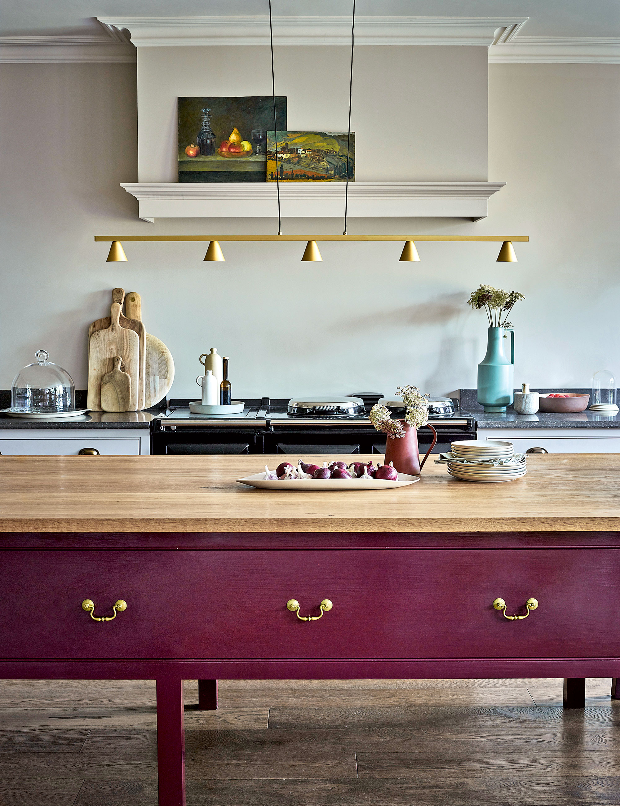
Intermediate colors will add depth and character to your space, while creating focal points allows you to highlight specific areas for visual interest. Create a palette that balances dominant tones with accents and apply these hues strategically, whether through wood trims, furniture, or decorative elements like rugs and cushions.
'Intermediate colors are the unsung heroes of interior design, seamlessly bridging the gap between bold statements and subtle accents,' explains Tobie Lewis, head of marketing at Valspar. 'Mood-uplifting tones are trending this year – they possess the versatility to elevate any space, offering a harmonious balance that effortlessly ties together diverse elements.'
'Use these colors in your home as accents and pair them with a neutral scheme to create contrast for a harmonious ambience,' advises Tobie. 'Embrace these nuanced hues in your decorating journey, allowing them to whisper sophistication and depth into every corner of your home.'
These subtle tones are ideal for accentuating specific areas or elements in a room and help can draw attention to architectural features, furniture, or decor items.
Combine intermediate colors with complimentary hues
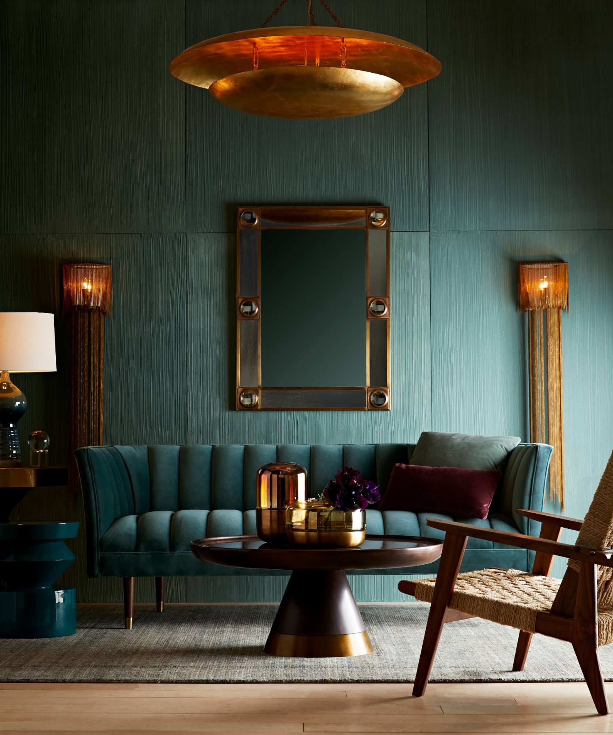
Pairing intermediate colors with complementary colors is a foolproof way to ensure harmony in your scheme. For instance, if you're working with a blue-green intermediate color like in the space by Arteriors seen above, its complementary color, a red-orange, can be incorporated to create a striking contrast.
'The lovely thing about using an intermediate color is it gives you a ready-made palette which you can use for your accessories and other furniture,' says Helen Shaw, director of marketing at Benjamin Moore. 'For example, if you use a teal color such as North Sea Green from Benjamin Moore, you can pair it with both blues and greens for a natural partnership that will work beautifully to give your space a watery, outdoor effect.'
'You can also layer complementary colors (those that sit opposite one another on the color wheel) to add a dash of invigoration,' advises Helen. 'These will bring out the warmer undertones of teal and add visual interest to the room.'
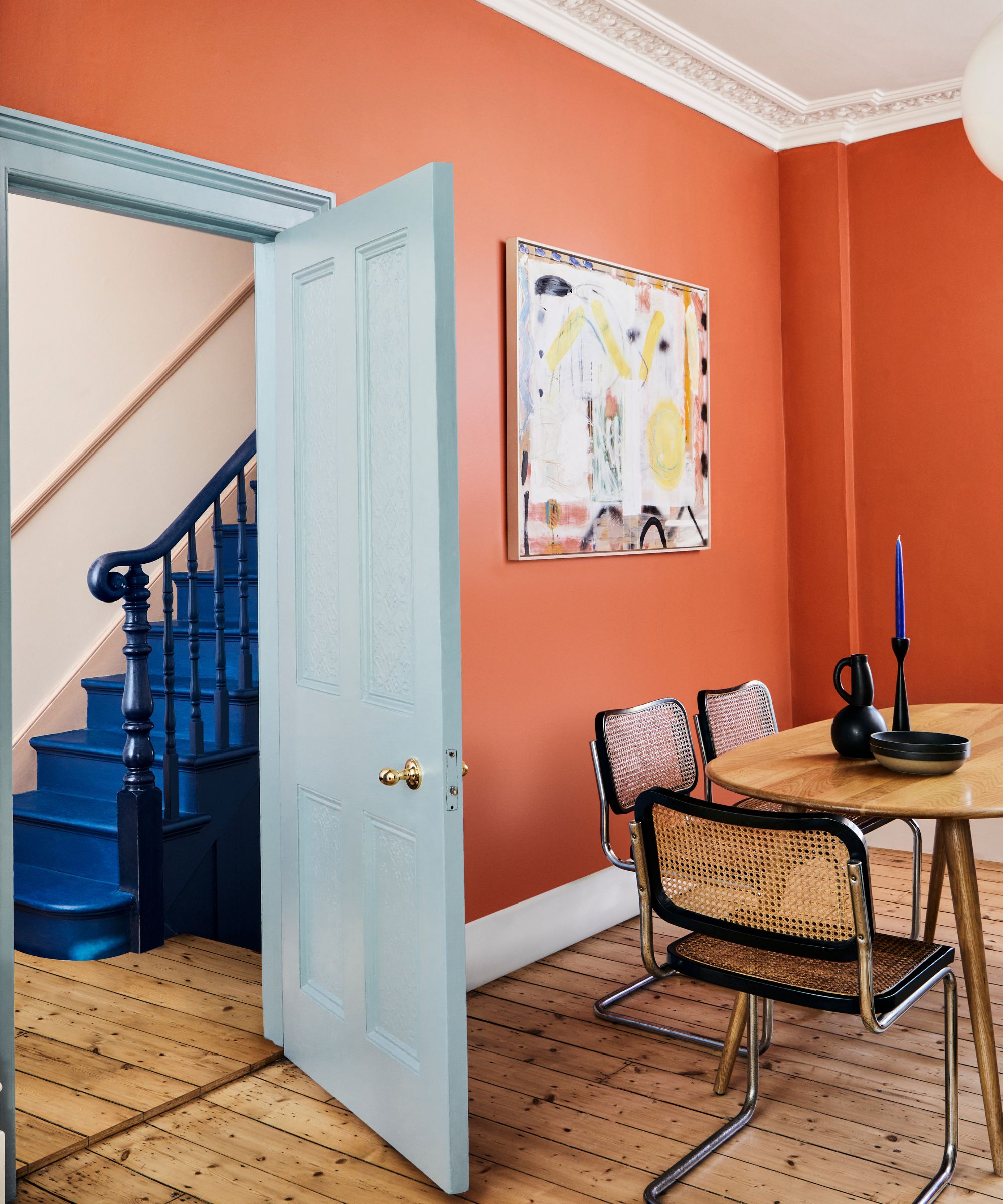
The key is to use complementary colors judiciously, ensuring they complement rather than clash. 'Red walls are a bold choice but can be brought to life with hints of orange,' suggests Dominic Myland, CEO of Mylands. 'The orange neutralizes the intense redness, making it a great choice to accent door and window frames, as well as entire walls.'
'Blue Maize is a rich blue-violet, and with its sophisticated red undertone, it brings a dash of unexpected warmth to a room, particularly when paired with gentle off-whites and a pop of bold red Romesco from Farrow & Ball,' adds Charlotte Cosby.
Intermediate colors offer the palette for those who seek vibrancy and color, without the brightness of neons and primary hues. From the careful selection of tones to the strategic placement of complementary colors, embracing intermediate colors allows you to go bolder. So, whether you're embarking on an all-out transformation or seeking subtle refinements, let the spectrum of intermediate colors be your starting point.
Sign up to the Homes & Gardens newsletter
Design expertise in your inbox – from inspiring decorating ideas and beautiful celebrity homes to practical gardening advice and shopping round-ups.

Charlotte is the style and trends editor at Homes and Gardens and has been with the team since Christmas 2023. Following a 5 year career in Fashion, she has worked at many women's glossy magazines including Grazia, Stylist, and Hello!, and as Interiors Editor for British heritage department store Liberty. Her role at H&G fuses her love of style with her passion for interior design, and she is currently undergoing her second home renovation - you can follow her journey over on @olbyhome
-
 What is cozymaxxing and have you tried it yet? Here are 7 ways to embrace the trend and create an oasis of calm
Experts reveal how to take the cozymaxxing trend from social media into your home with color, texture, lighting and natural materials
By Emilia Hitching
-
 Mid-century modern bedroom ideas – 9 ways to channel this classic style with a current and contemporary feel
This timeless interior design style is defined by organic shapes, earthy neutrals, and a focus on functionality, qualities that make it a great choice for a bedroom
By Lilith Hudson
