

If you know how to decorate with Farrow and Ball's Pink Ground then the ability to create soothing, liveable, relaxed, and uplifting spaces is right at the end of your paintbrush.
Pink Ground is just the perfect shade of pink, a blush shade with gentle yellow undertones that gives it a sunniness and warmth. When used well, it breathes life into rooms and makes homes so warm and inviting.
'Whilst pink comes in many shades, from the softest plaster shades to bubble gum brightness, look towards the former to inform the right shade for relaxation and gentle tranquillity,' says Farrow and Ball's color ambassador Patrick O'Donnell. 'Something delicate like Pink Ground will fulfill your requirements and, if drenched in natural light, will just register as a warm neutral. If your bedroom is in the attic or a gabled ceiling of an old cottage, then this color is soft enough to take all over the ceiling too, softening those awkward wall heights you can get in attic spaces!'
Designers turn to Pink Ground often, a go-to when a gray isn't interesting enough and anything stronger reads as too vibrant. Here is their advice for decorating with one of Farrow & Ball's most popular paints.
1. Pair Pink Ground with stronger yellows

In this nook by the Los Angeles-based designer Ginny Macdonald, a vibrant wallpaper covered in Sicilian lemons is underpinned by Pink Ground on the cabinetry. Remember that Pink Ground has yellow undertones so was always going to work with this citrus print.
'We used Pink Ground in this room to add a dusting of color to an already bold wallpaper,' Ginny says. 'It would have been easy to just throw a white on cabinets but we liked the idea of adding a tone that is almost non-existent that compliments the other colors in the paper. Pink Ground was a good option because it's a milky pink so is still light but noticeable as a color.'
2. Use Pink Ground as a backdrop for gold

More ways to pull out that yellow undertone, as Studio Milne found Pink Ground to to be the ideal backdrop for gold fixtures in this pretty little powder room.
'My client found the pink marble tiles and I chose the color that worked best with the tile,' says the studio's founder Ruth Milne. 'I designed a pink marble bathroom previously and the Pink Ground worked so well in the space it was a no-brainer to use it again. Here, the tiles have various shades of terracotta, pinks, and hints of gold, and so Pink Ground was perfect to pick out the softer, gold tones within the tile.'
Ruth went on to praise Pink Ground more generally, against other similar shades. 'Pink Ground has a powdery softness to it, this differs from the more muted shades that [other Farrow and Ball colors like] Setting Plaster and Templeton have. When used in a bathroom setting, Pink Ground creates a delicate touch to the walls helping to create the feeling of calm that I feel is important for a bathing space.'
3. Contrast with olive greens

Pink and green is a classic color combination, working together in perfect harmony. With Pink Ground, an olive green works well.
'I chose Farrow and Ball's Pink Ground for my daughter's bedroom because it's a warm and inviting shade that serves as a lovely neutral backdrop,' says the homeware designer Chloe Jonason, who used it in her own home, above.
'Unlike more intense pinks, Pink Ground is subtle and understated, making it versatile and timeless. Isn't pink a neutral anyway?! It beautifully complements the stronger green accents we've chosen, creating a balanced and harmonious look. I believe this soft, sophisticated hue will stand the test of time, making it suitable from her nursery years through to her teens.'
4. Choose Pink Ground for kitchen cabinetry

Pink Ground is a perfect paint choice for kitchens, a room that tends to be busy and used often. A soothing hue, it helps to make this functional space seem more like somewhere you'd want to live in.
'I was looking to create a soothing Mediterranean feel when planning our kitchen extension that brought a sense of calm to our busy family home.' says the interiors expert India Hares of Our House Edit. 'Pink Ground was the absolutely perfect soft blush shade to do this, with its warming cosy tones that compliment the terracotta floor to perfection.'
5. Go big and take Pink Ground over every wall

The interior designer Alice Crawley used Pink Ground in her own home, and realized that the more she used it, the more joyful it became. It's a color that doesn't have to be an accent, but can cover great swathes of wall space and millwork.
'I have a theory that sometimes the more you use a color, the less you notice it,' Alice says. 'My decorators thought I was mad when I said I wanted to paint our entire lower ground floor (the level we basically live on) in pale pink. The walls, kitchen units, the woodwork, you name it – the lot. But by using this lovely warm and inoffensive “neutral” pink in such a way means that you don’t really notice it as even being pink. It’s warm and cozy and changes throughout the day according to the light, never have loved or used a color more than this one.'
6. Let Pink Ground flatter you

Designers often gravitate toward using Pink Ground in bathrooms because it has the ability to look soft in electric lighting, creating a reviving reflection of yourself when you look in the mirror. Here, it was paired with a vibrant green window frame, a color that makes Pink Ground look almost gray.
'Pink Ground is lovely for a bathroom because it's a calming dusky soft pink that's not too sugary and creates a very warm and flattering light,' says Fiona Parke, interior designer and founder of Johnston Park Interiors, who created this space. 'It also worked really well with the Christopher Farr fabric we used on the blind.'
7. Pair Pink Ground with patterns

Because Pink Ground is such a soft neutral, it's almost guaranteed to go with any pattern because it pairs well with most colors. The designer Kate Cox of HAM Interiors used it in her own bedroom – quite an endorsement of the shade from someone who is as expert at colors as she is.
'Pink Ground offers a warm, neutral backdrop that beautifully complements decorative patterns,' Kate says. 'Its subtle tone enhances intricate designs without overpowering them, while the yellow undertones create a cozy and inviting feel. Versatile and timeless, it gives any space a calming quality. I chose it for my bedroom and love how it ties everything together.'

-
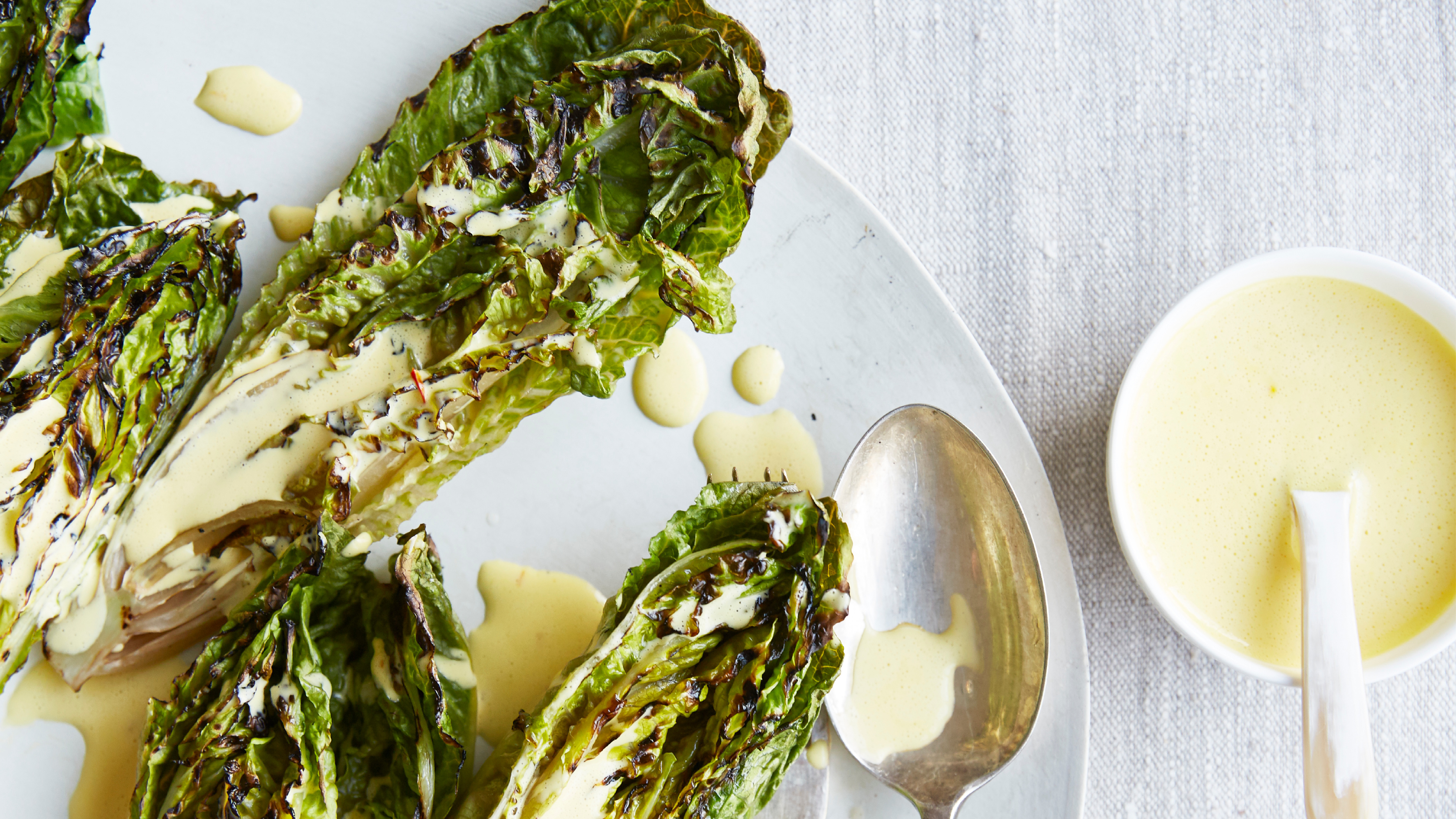 Charred little gem with saffron dressing
This recipe with charred little gem is both easy to make and sure to impress guests. It's the perfect side for fresh spring menus
-
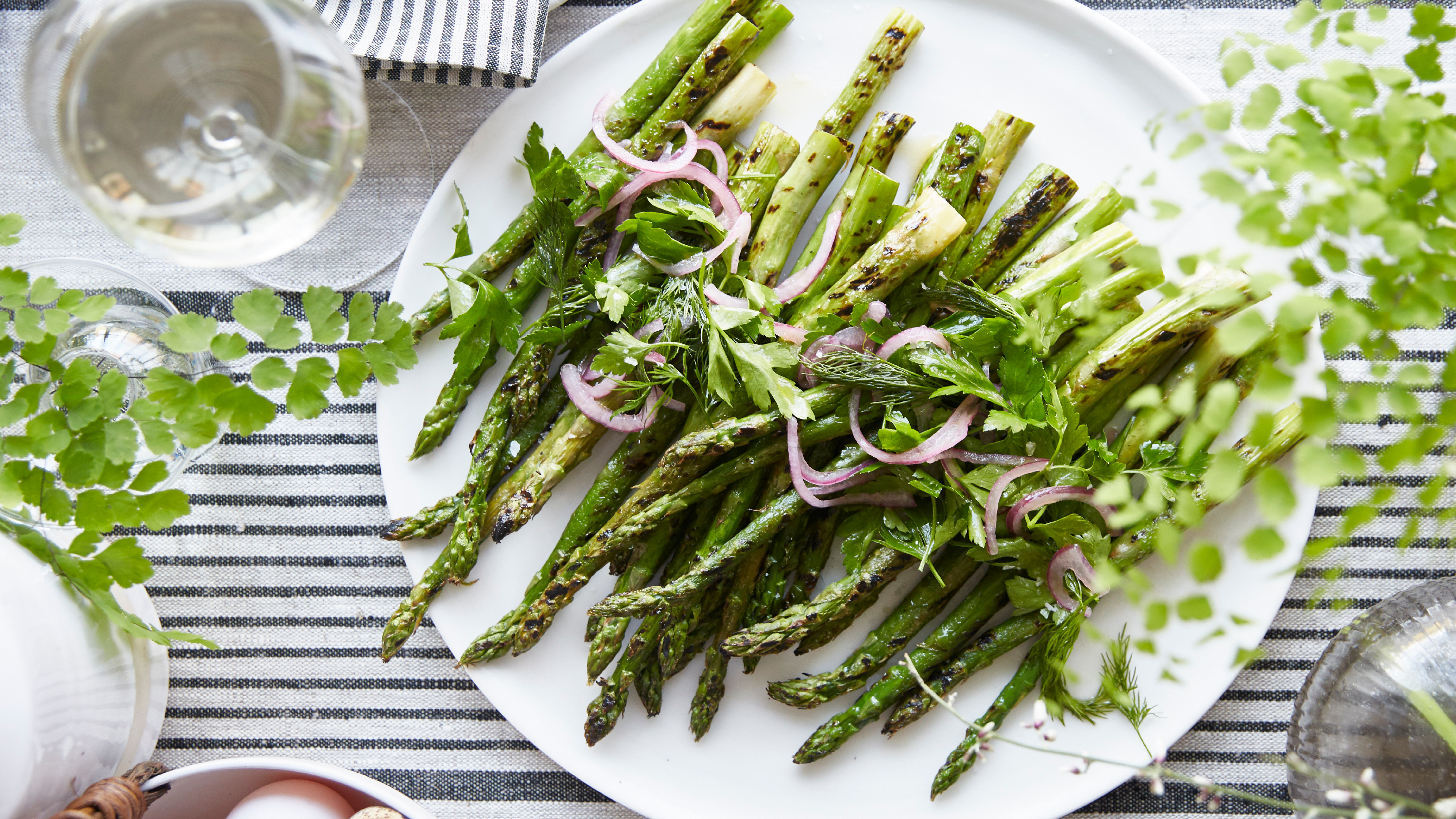 Grilled asparagus with herb and pickled red onion
This grilled asparagus couldn't be easier, and it's a wonderful way to get the best flavor from our favorite spring veg. It's perfect alongside fish or lamb

