Is emerald the new way to do green in 2025? Designers explain why this more vivid luxurious hue is replacing softer shades
A rich, jewel-like shade of green is trending in the design world. We spoke to interior design experts about how to decorate with emerald green
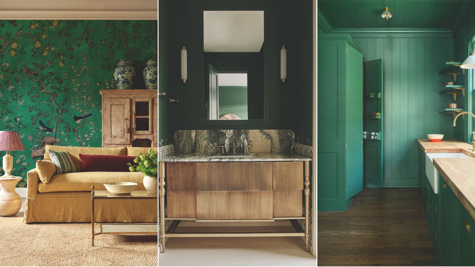

Holly Ransome
Green is having a moment in interior design, specifically, a mid-tone glittering, jewel-like hue – emerald. The captivating color reminiscent of precious stones is actually surprisingly easy to work with, and really rather versatile.
It brings both sophistication and vibrancy to a room, and ties into the nature-inspired and cossetting interior schemes that we seem to be choosing again and again. And isn't it just refreshing to see bolder shades of green get some use after years of us all favoring the softer more muted variants?
We spoke to a handful of interior design experts about decorating with green and why specifically this deep, jewel-toned shade of green is trending, with a look at some of the spaces in which they've used it successfully. To add an opulence to your home while evoking a connection to nature, this rich hue that pairs beautifully with neutral tones and warm colors might be the perfect timeless choice for your space.
How designers are decorating with emerald green
Emerald green is a big color trend in interior design due to its versatility and sophistication, adding both vibrancy and a nature-inspired feel to rooms. We hear from the experts on why it's a color you might want to consider before you redecorate.
1. To evoke classical grandeur
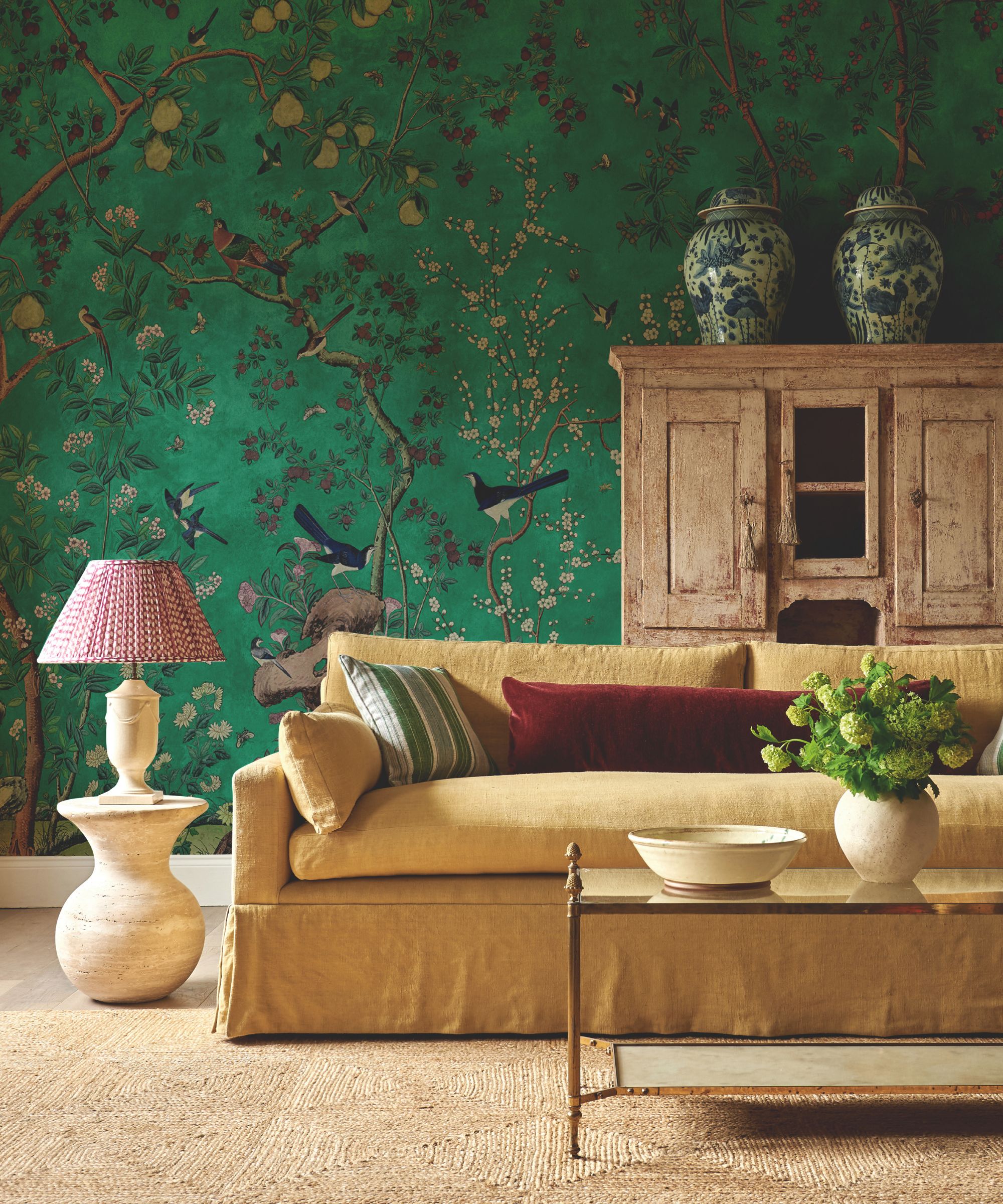
Chinoiserie Panorama in Malachite, Zardi & Zardi.
Despite the color trending right now, Emerald green is by no means a fad. It is a time-honored color that has a place in historical decorating schemes, as explained by the director at wallcovering specialists Zardi & Zardi when we got in touch about their recently launched dazzling green design.
Director PJ Keeling explained, ‘Our Chinoiserie Panorama wallcovering in Malachite is a supremely elegant design. Taken from a hand-painted original, this color was chosen for its rich, jewel-like quality inspired by grand 18th-century country estates where green was widely used. The richness of the green creates a cocooning feel. We wanted the complimentary colors to zing, so we included deliberate accents of raspberry, deep violet ,and lustrous blue.’
2. To contrast with lighter accents
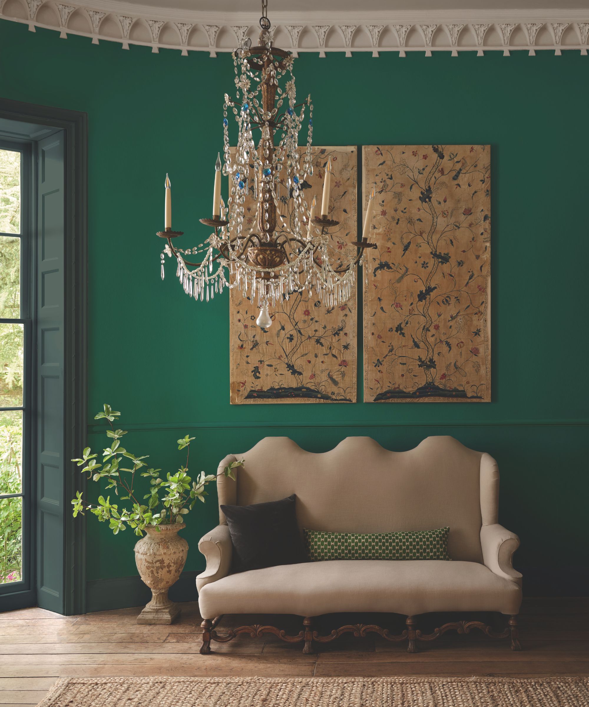
Ceiling in Stone III Pure Flat Emulsion; Wall and dado rail in Malachite in Architects’ Matt; Architrave, shutters, skirting and window in Nori in Architects’ Eggshell, all Paint & Paper Library.
The benefit of using an emerald green is that it's bright enough to create vibrancy, yet it also works as a great contrasting backdrop to paler elements. Andy Greenall, the creative director of Paint & Paper Library, explains of the brand's emerald shade, Malachite, ‘An exotic emerald shade with a sublime natural nuance, it has been read directly from a rare piece of 'velvet malachite'.
He continues, 'It creates a statement in a living room or dining room where its sumptuous depth will frame furniture and artwork. Pair it with Nori across windows, architrave, and skirting for a striking yet harmonious scheme where the color quietly speaks volumes.’
3. To create a feeling of escapism
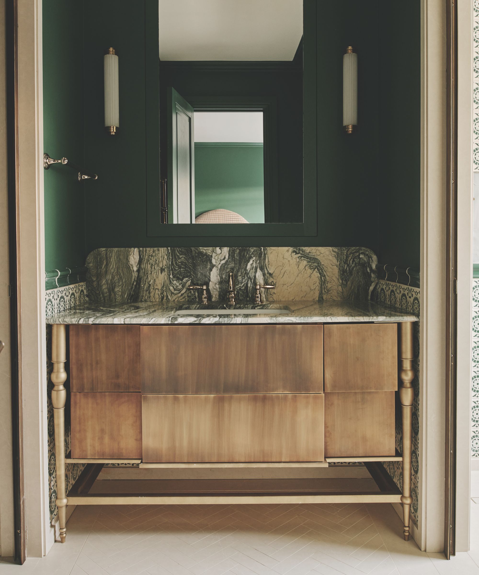
Interior Design, Lucinda Sanford Design. Azure Green, Little Greene.
For interior designer Lucinda Sanford, she likes to use rich, jewel-like colors to evoke far-away places and create a feeling of global style. In this bathroom, she used color to help create a Moroccan feel. She told us, ‘I like to be adventurous with color and I’m a huge fan of bold greens.'
Lucinda explained, 'This bathroom with its sloping ceilings had a Moroccan feel and we felt this Azure Green from Little Greene enhanced this whilst bringing impact and luxury. It complements the green veining of the stone and sets off the gold hardware like jewelry.’
4. To create a sense of harmony with a garden view
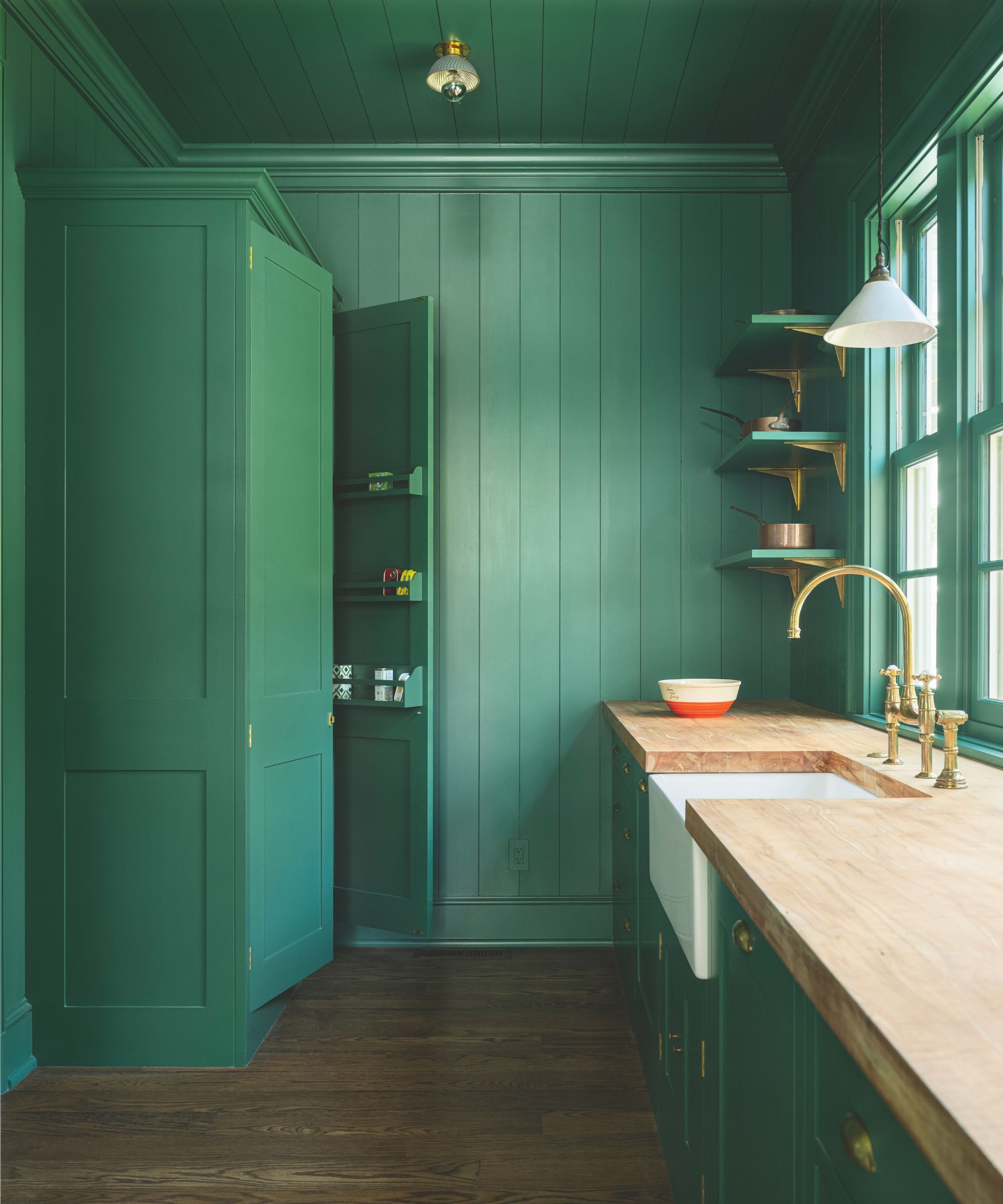
Kitchen by Rachel Halvorson and Plain English.Cabinetry in Sprouts from the Colour Collection No. 2 at Plain English.
For Merlin Wright, design director of Plain English, who created this kitchen with the help of interior designer Rachel Halvorson, using green was a way to connect to the garden view beyond the kitchen, create a sense of playfulness, and also to pair nicely against warm woody accents.
Merlin tells us, ‘This butler’s pantry is painted in Sprouts, a rich green which works perfectly with the timber floor and frames the verdure beyond. The main kitchen is painted in a muted pink called ‘Silver Polish’. I love this pairing of pink and green. It may seem odd but it reflects the colours of nature. Sprouts would also be fun paired with Tea Caddy, a vibrant blue.’
Emerald green continues to be a timeless and elegant choice in interior design, with its rich, jewel-like quality evoking both opulence and nature. From historical homes to modern spaces, its versatility allows it to spaces that manage to feel both calming and vibrant. Whether paired with complementary tones or used as a bold standalone statement, decorating with emerald green is unlikely to lose momentum anytime soon.
Design expertise in your inbox – from inspiring decorating ideas and beautiful celebrity homes to practical gardening advice and shopping round-ups.

Pippa is a contributor to Homes & Gardens. A graduate of Art History and formerly Style Editor at Period Living, she is passionate about architecture, creating decorating content, interior styling and writing about craft and historic homes. She enjoys searching out beautiful images and the latest trends to share with the Homes & Gardens audience. A keen gardener, when she’s not writing, you’ll find her growing flowers on her yard for styling projects.
- Holly RansomeEditorial Assistant (print and digital)
You must confirm your public display name before commenting
Please logout and then login again, you will then be prompted to enter your display name.