
There is no denying that some colors are easier to decorate with than others. With failsafe hues like navy, rose pink, and forest green that we see adorning our social feeds on a daily basis, there are certain colors that we just know will definitely work well with them.
These hues have reigned in the most popular shades for decades, but we are starting to see a shift to more... unique shades. More complex colors that have more depth and interest. One of those shades is Benjamin Moore's Antique Pewter, which is quickly becoming one of Benjamin Moore's most popular paints.
Combining both soft gray and earthy green, this warm gray or cool green inherently has a lot of depth and interest. But with two visible colors in one, how do we know what shades will pair nicely with it?
'Part of the Classics collection, Antique Pewter 1560 has an enduring charm that captivates at first glance,' says Helen Shaw, director of marketing at Benjamin Moore. 'Reminiscent of a rich patina, this green hue is grounded by a touch of gray that falls within the spectrum of pewter shades.'
How to decorate with Antique Pewter

No matter what interior design style you're going for, Antique Pewter will be able to play a shining role in the backdrop of your scheme. 'It's a versatile mid-tone that can suit a variety of design aesthetics in different lighting conditions,' says Helen.
'It offers a perfect base to build any scheme around. It can create a modern and sophisticated atmosphere when paired with contemporary furniture or evoke a classical ambiance when combined with period lighting and upholstery,' Helen continues.
We've spoken to several top interior designers and experts to find out how they would use this shade, and lucky for us, they came up with lots of different ideas and color combinations. So learn from the best and incorporate this challenging, sophisticated hue in your home. You won't regret it.
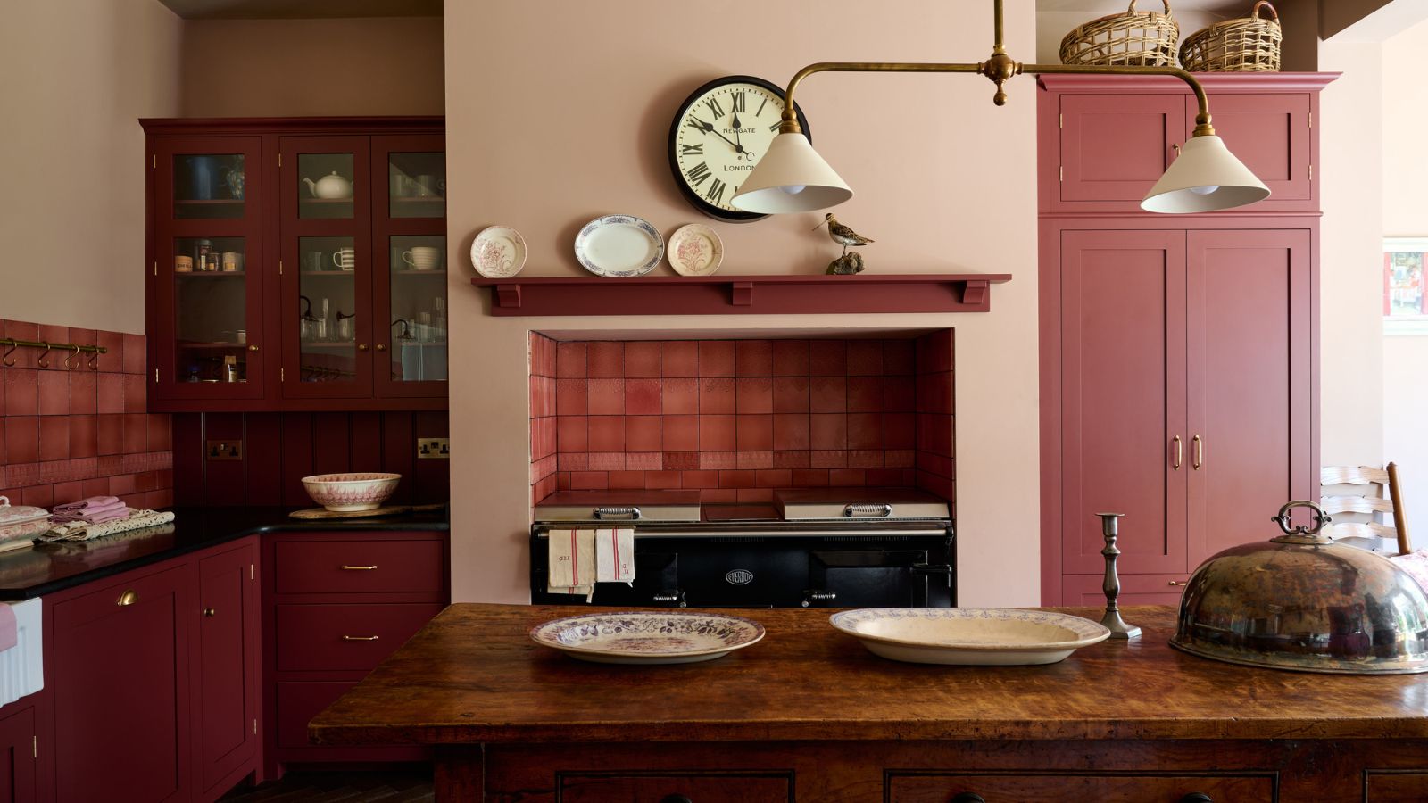
Antique Pewter is great for kitchen diners and bathrooms

Audrey Scheck, designer and founder of Audrey Scheck Design, loves using Antique Pewter in kitchens and bathrooms.
'Using Antique Pewter in your dining room and kitchen gives flexibility for design, leaving plenty of room to play with your style,' she says. As Antique Pewter is a neutral shade, it can either create a calming and airy space, or it can act as a blank canvas for other, brighter shades.
'When using this in a kitchen, pair it with natural materials, such as stone worktops or wooden floors, to provide an inviting and contemporary space,' she says.
'Bathrooms and laundry rooms are another great space for Antique Pewter's serene and fresh vibe. Blending elegantly with mixed metals and stainless steel, creating a harmonious interior.' In this bathroom, the black hardware brings a sophisticated and sleek twist to the shade.

With more than a half-dozen years of experience in remodels and renovations, Audrey Scheck leads Audrey Scheck Design, a full-service interior design firm based in Austin, Texas.
Combine Antique Pewter with Pristine in an adjoining room

Helen Shaw, director of marketing at Benjamin Moore, suggests using Antique Pewter cleverly across two adjoining rooms.
'Contrasting hues can work really well in adjoining rooms,' says Helen. 'For a subtle play on a complementary color pairing, match this mid-tone gray-green with Pristine OC-75. This delicate off-white with dusty rose undertones gives a pleasing level of contrast. Yet, there is also a softness that makes this combination very approachable and sophisticated.'
The way that a color feels in a room is greatly impacted by the colors that are used elsewhere in your home. Consider different viewpoints, such as your view into the living room from the hallway, or your view into the dining room from your kitchen.
'Color drench the first space by painting walls, trim, and ceiling in the rich Antique Pewter 1560. Then utilize Pristine OC-75 in the adjoining room. The contrast from a cool earthy hue to a warm light shade creates an impactful effect,' says Helen.
Add depth and interest by layering up textures

Becky Shea, creative director at Becky Shea Design , advises going all out with textures to bring subtle interest to an Antique Pewter scheme.
'To enhance Antique Pewter, I recommend incorporating a mix of textures for added depth and interest,' says Becky. 'Plush textiles like mohair or bouclé for upholstery, and natural materials like wood and stone for flooring and furniture, and metallic accents in lighting and decor work beautifully.'
'Antique Pewter complements a range of metallics, but the metallics you use will make a huge difference to the overall feel of the shade. Brushed nickel or matt black brass will enhance its cool undertones, providing a sleek, modern look,' she says.
'To bring more warmth to the scheme however, I'd go with antique brass fittings with a natural patina. This will add a luxurious and homely feel to the space.'
Becky Shea is an award-winning interior designer based in New York City. She is the founding partner and creative director of Becky Shea Designs, where she provides creative and operational direction alongside her team. She loves simple design, natural materials, and takes a sustainable approach to design that embraces the local artisan community.
Combine Antique Pewter with neutrals

Trish Knight, interior designer and co-founder of Knight Varga Interiors, suggests combining Antique Pewter with other neutral hues.
'I particularly love seeing this color paired with whites, creams, and shades of off-black,' says Trish. 'In a neutral room, adding a cognac leather accent chair or ottoman would emphasize the earthiness of Antique Pewter beautifully.'
The neutral shades of the furniture and accessories in this dining area work to make Antique Pewter look warm and enhance its green undertones.
When using alongside neutrals, the shade can be used in a huge variety of ways. 'Antique Pewter can serve as an all-over color in rooms of any size, an accent on wainscoting with printed wallpaper above, or as a distinctive millwork color. Its depth makes smaller dens or bedrooms feel cozy and inviting,' says Trish.
As Antique Pewter is such a subtle shade that looks so different in different lights, Trish also suggests checking that your artificial lighting is neutral too. 'For lighting, it's best to keep your light bulbs in a neutral tone of around 3000K, which will complement the color's clean and sophisticated look,' she says.

Designer Trish Knight is a co-founder of Knight Varga Interiors. Collectively with two decades of experience this Vancouver-based multi-award-winning design firm has become known and sought after for creating well-curated interiors. The firm provides complete bespoke residential design services throughout Vancouver, BC Canada and North America.
Let the aspect of your room lead the way

Michael Rolland, paint expert and managing director at The Paint Shed, suggests Antique Pewter works best in south-facing rooms.
'South-facing rooms typically provide more natural light, so these are the kinds of rooms where Antique Pewter can be used in excess,' says Michael. Spaces that are south-facing also tend to receive a warmer light, which would bring out more of the green, earthiness of the paint color.
'North-facing rooms, in comparison, receive less light, so it is advisable to use this shade more sparingly in these spaces, as it could potentially appear a little gloomy,' says Michael.
With this in mind, you could use Antique Pewter on the woodwork, or just on one feature wall in a north-facing room, rather than drenching all four walls in the shade. North-facing rooms receive a cooler light, and so Antique Pewter would appear more gray than green. This is why it's so important to try out a sample on your wall before buying – the color will appear different in every room!
You can see why Antique Pewter is becoming such a popular shade. Its mix of gray and green makes it a unique shade to work with but it also makes it a really versatile shade too. It's a chameleon hue that changes under different lights and when combined with different colors. Just be sure to order a switch to see how it settles in your space.
-
 Everyone is obsessed with vintage tiles right now – bring the nostalgic charm of this classic design feature into your home with our 5 design ideas
Honor the past with our favorite ways to decorate with vintage tiles, as suggested by interior design experts
-
 'It's a fast reset button' – using the 1, 2 ,3 ,4, 5 decluttering method cleared my persistent mess in seconds
It's easy, effective and so quick to do

