5 ways to decorate with Beacon Gray – Benjamin Moore's 'luminous' and versatile blue-gray paint
Perfect for brightening spaces, Beacon Gray is endlessly versatile
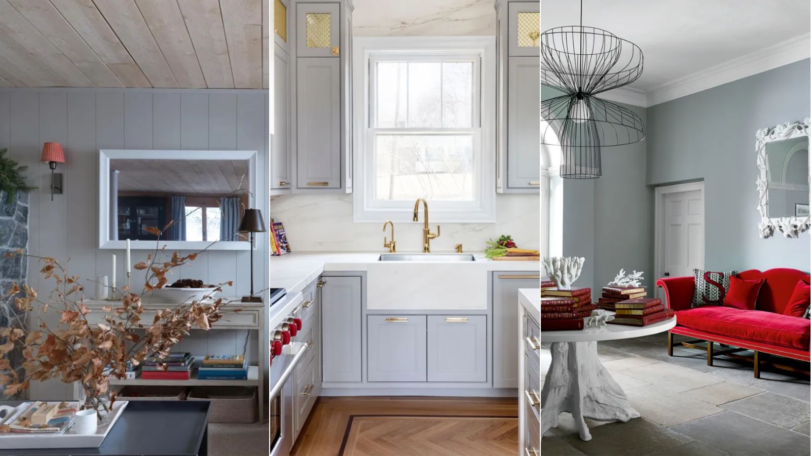

It's no secret that gray is not as loved as it once was in the interior design world. At a time when super minimalist interiors led the way, gray was hugely popular, embodying a truly modern style. But now, as we return to more layered and eclectic styles, warmer tones have somewhat replaced gray.
However, that's not to say that gray is no longer relevant. Recently, we've begun to see new variations of gray tones emerge, reinventing this classic cool hue in ways that feel more relevant to today's popular interior styles. And Beacon Gray by Benjamin Moore is one such shade.
From greige tones which bring warmth to this classic color, to blue or green-toned grays, there are plenty of gray paints to embrace that don't result in that much feared dull and dreary look we so often associate with this neutral hue. Proving just that, Benjamin Moore's best-selling paint, Beacon Gray is a much-loved gray paint that falls somewhere between gray and blue.
What color is Beacon Gray?
'The most popular grays are not just simply gradients of black and white, instead they are comprised of other pigments that add to the complexity and appeal,' explains Helen Shaw, Director of Color Marketing at Benjamin Moore. 'For instance, Beacon Gray has a slight blue undertone so it creates a cooler hue. Clean and luminous, this light blue-gray instantly gives the illusion of extra light and space, making it perfect for smaller rooms that need brightening up.'
As Helen explains, Beacon Gray is a light hue so it has an instantly uplifting quality to it. Plus, its blue tones distinguish it from a typical neutral and instead promote a colorful feel when used throughout the home.

Beacon Gray is a light paint that falls somewhere between gray and blue. It has all the neutral qualities of gray yet unlike some grays, doesn't feel dull.
5 ways to decorate with Beacon Gray
Below, we've rounded up five different ways you can incorporate Beacon Gray into your interior schemes and embrace decorating with gray in an up-to-date way. From the kitchen to the bedroom, there are endless ways of styling this popular color.
1. Color drench for an on-trend look
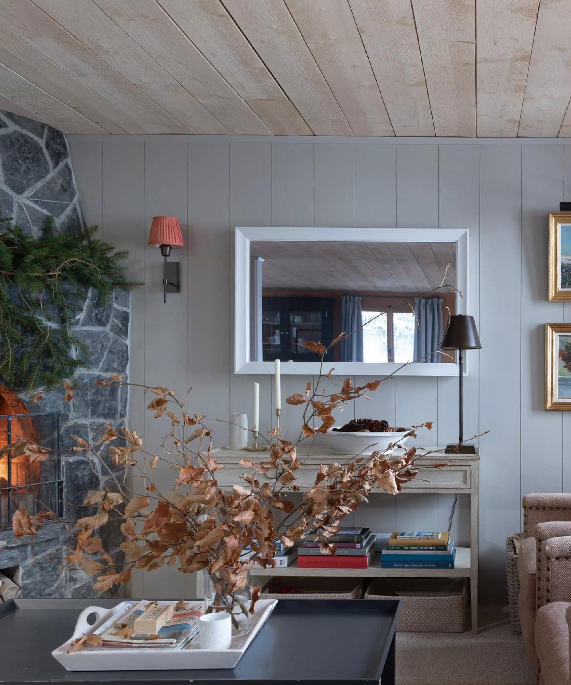
Color drenching is an on-trend way of decorating with paint, where one color is used across all walls as well as on the ceiling, trim details, or even furniture. Not only is this an interior design trend, but it's also an excellent way of creating a cohesive look that feels design-led.
Kara Piepmeyer, interior designer and founder of Los Angeles-based design studio Studio Kosma suggests that Beacon Gray lends itself to a color-drenched scheme, explaining: 'The color is medium intensity with a great dusty quality, so I'd love to apply it as a color drench to a room – painting the walls, ceiling, and maybe even cabinetry or large furnishings.'
For an added point of interest, you could also choose to introduce a similar, yet darker, accent color, as Helen suggests: 'Drench walls and woodwork in this refreshing color for a contemporary pared-back feel, then introduce an accent color with similar undertones such as Flint to create a contrasting yet harmonious scheme.'

Helen Shaw is part of Benjamin Moore's UK division. Color expert and international marketing director, Helen and her husband Craig are founders of Shaw Paints, acquired by Benjamin Moore in 2020.
2. Pair with white
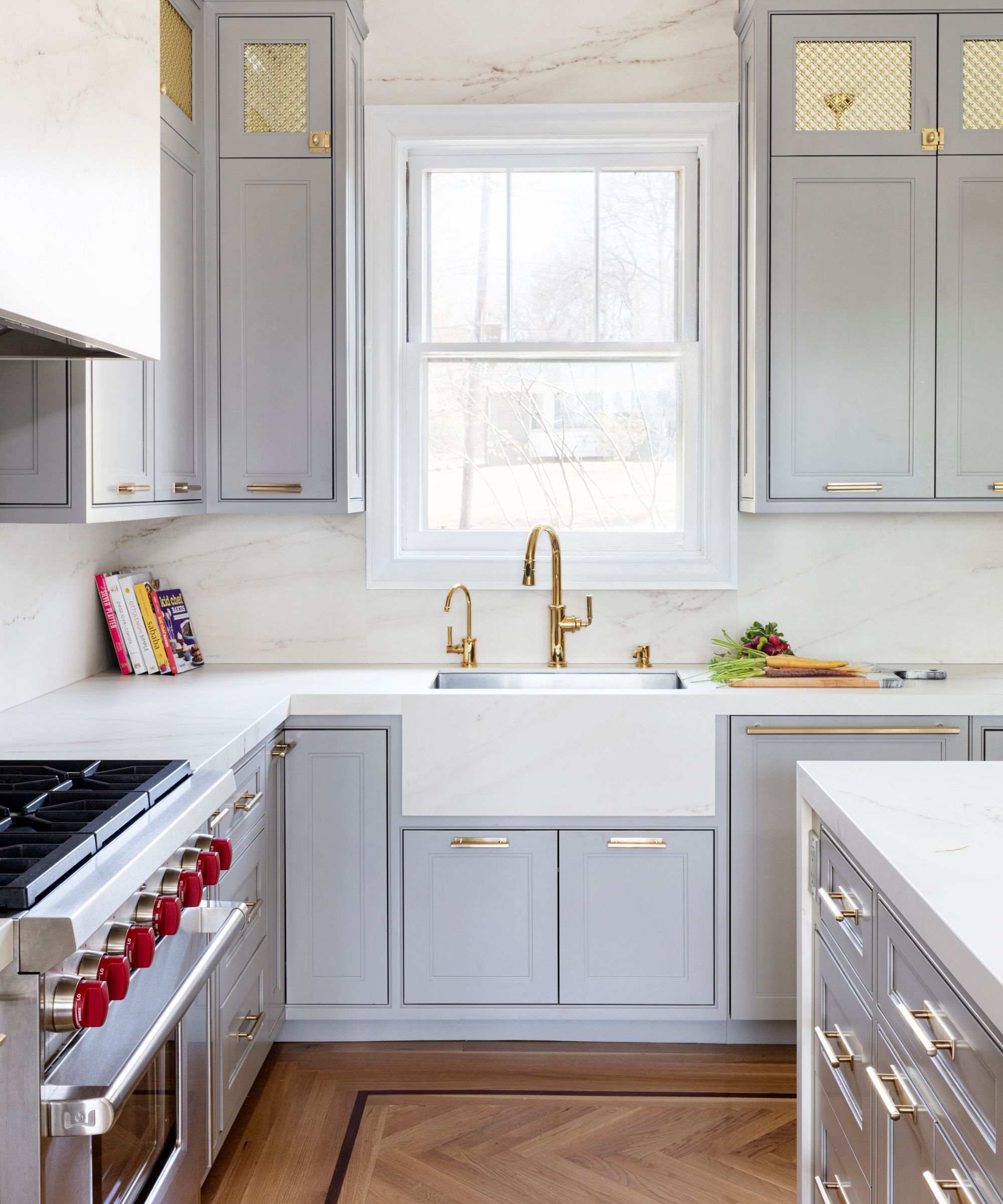
Since Beacon Gray is a soft color that doesn't feel harsh, it also works well paired with classic white. This can help achieve a modern look that feels fresh and bright in any room of the home but works especially well in a kitchen, especially alongside warm tones from natural wood.
Tyson Ness, interior designer and founder of Studio Ness explains: 'This tone works well with cooler neutrals and whites. The cooler hue of the paint also nicely compliments warm woods. Just be clear: do not place with warmer ivories and sandy neutrals.'
Knowing which shade of white paint is best for your scheme can be tricky, but Helen makes the following suggestion to complement Beacon Gray: 'If incorporating elements of white, opt for a crisp and slightly cool, wintery white such as Frostine to enhance the flattering combination.'
3. Elevate your entryway

Beacon Gray also makes an excellent choice for an entryway or hallway. If you prefer a pared-back look in this space as opposed to making a dramatic statement with deep and dark hues, neutrals do work well in these spaces but can also feel uninspiring. Classic beige tones or off-whites can often feel too bland, whereas Beacon Gray maintains the classic look of neutrals yet its blue tones give it an added edge.
In a traditional, large entryway with classic furniture styles, the use of Beacon Gray on the walls will help create a sophisticated look. But thanks to the luminous quality of the paint, it also works equally well in small entryways, bringing brightness to the space.
4. Create a relaxing bedroom
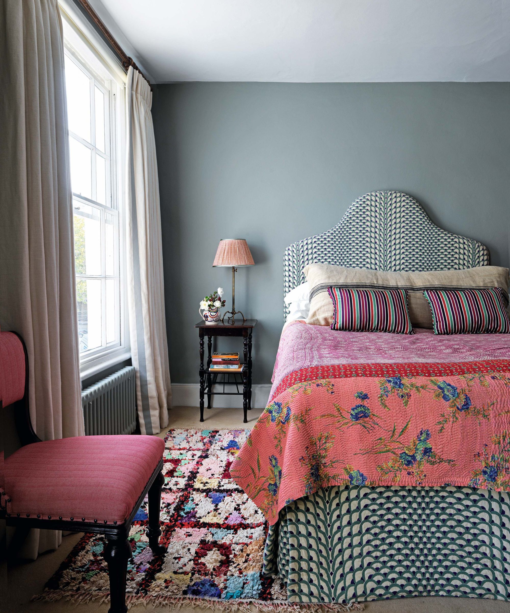
Blue is well known as being one of the most calming colors, so opting for a blue-toned gray, such as Beacon Gray, makes for a great choice in a bedroom. 'Beacon Gray is a great and calming color for a bedroom, paired with crisp white linens and greens, blues, and grays,' explains Tyson.
To fully establish a calming feel, follow Tyson's advice and opt for pared-back decor, with white bedding and earth-inspired hues. Or, if you're looking to create more of a colorful scheme, you could also pair Beacon Gray with contrasting furnishings such as bright pink.

Tyson Ness is the founder and director of Studio Ness, a NYC-based full-service interior design studio. Studio Ness is known for its collaborative approach to residential and select commercial and workspace projects across the US and abroad, crafting spaces that are unique to the client. Tyson has over a decade of experience in the NYC design sector and has worked on a number of projects that have been featured in publications both in print and online.
5. Opt for statement decor
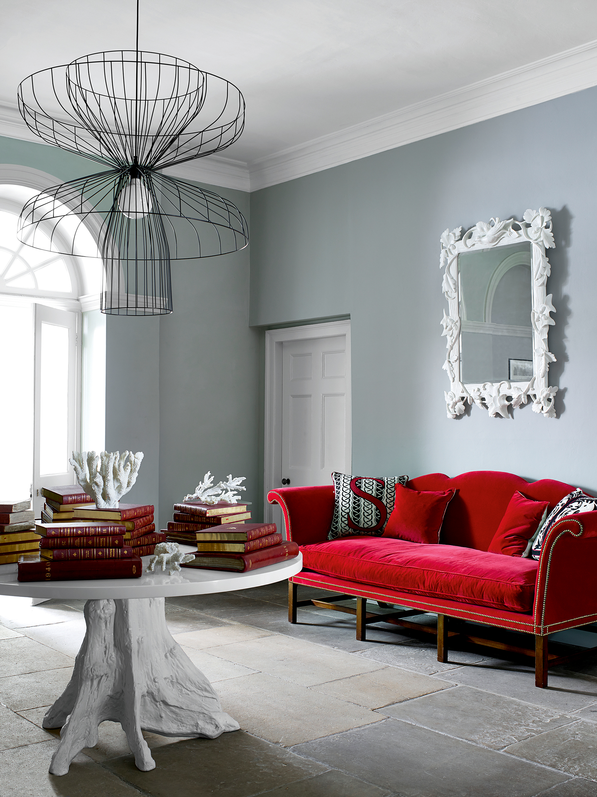
Although Beacon Gray is a fairly understated color, that doesn't mean you can't go all out and create a dramatic interior scheme. By incorporating rich, colorful hues and luxe materials into your Beacon Gray scheme, you can achieve a statement look that feels energizing and uplifting.
'The color is soft enough that it pairs well with bright, intense colors as well,' suggests Kara. 'Its cool factor would balance beautifully with Carrara marble, making it ideal for a powder room or a guest bathroom.'
Beacon Gray is a versatile color that can be incorporated in many ways throughout your home decor ideas. Whether you want to achieve a pared-back look and lean into its calming qualities, or rather pair it with contrasting hues to make more of a statement, there are lots of ideas to try. Just make sure to avoid pairing it with warm neutrals such as beige or ivory.
Sign up to the Homes & Gardens newsletter
Design expertise in your inbox – from inspiring decorating ideas and beautiful celebrity homes to practical gardening advice and shopping round-ups.

Emily is a freelance interior design writer based in Scotland. Prior to going freelance in the spring of 2025, Emily was Homes & Gardens’ Paint & Color Editor, covering all things color across interiors and home decor for the Homes & Gardens website. Having gained specific expertise in this area, Emily is well-versed in writing about the latest color trends and is passionate about helping homeowners understand the importance of color psychology in home design. Her own interior design style reflects the simplicity of mid-century design and she loves sourcing vintage furniture finds for her tenement flat.
-
 I tried this one easy dishwasher trick and made the annoying need for manual drying a thing of the past
If you hate those little pools of water left on your cups and crockery, this towel trick is for you
By Punteha van Terheyden
-
 Renovation Aloha's Tristyn and Kamohai Kalama share the front color you need to sell your home – they explain, 'it's one of the areas you can go a little bolder'
In Homes & Gardens' exclusive interview with the Kalamas, they explain the renovations to make to the front of your home for property value
By Sophie Edwards