How to decorate with a muted color scheme to create a space that feels anything but dull
Looking to add some color to your home but bold hues aren't your style? Create a calm cohesion in any room with a muted color scheme
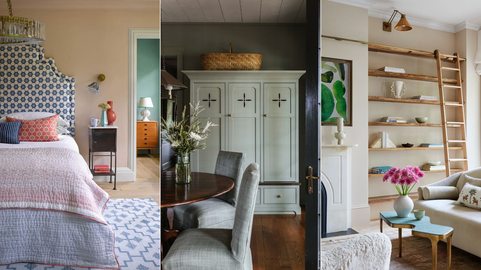

A muted color scheme helps to invite a calming atmosphere into any space. Perfect for those who feel a little jarred by a punchy, dopamine-fuelled color palette; adopting a more pared-back scheme helps you introduce a variety of shades to your home in a low-key way, without overwhelming the overall aesthetic.
Subtle yet strong, this palette will stand the test of time (and color trends) in a way that is anything but dull. 'The first thing to remember is that 'muted' does not equal 'boring' - it has much more to do with subtlety and a very careful use of color, rather than wanting to tamp the color down,' notes designer Kathy Kuo.
Due to their comforting hue, muted colors have real staying power in interior design. Despite 2023 being dominated by bold color, in 2024 we're seeing warmer, more grounding tones reminiscent of the earth coming to the fore due to their endless adaptability to fit nearly any design style, from Scandi decor to uber modern to farmhouse.
In essence, by embracing a more subdued, almost neutral color palette you’re able to allow your home to seamlessly adapt to your evolving tastes and therefore offer endless scope for nuanced, layered looks suitable for every room. Here, designers and color experts share how they work with a muted color scheme to create a calm cohesion, from working with natural light to embracing texture.
How to decorate with a muted color scheme
When it comes to choosing color combinations for your spaces, striking the right balance can be tricky – particularly considering just how many tones and shades there are to play with. Nailing the perfect scheme is the secret to making a home feel harmonious and giving it a sense of flow as you move between rooms. There are a few key approaches used by experts (color theory, color wheels, analogous schemes vs complementary schemes - to name a few) but it needn’t be quite so scientific.
Color holds power. It can impact our mood, emotions, and behavior. And while an individual’s response to color can stem from personal experience, embracing a muted palette is a tried and tested way to create a physically soothing space that feels calming and cocooning. Just ask the experts.
1. Consider natural light
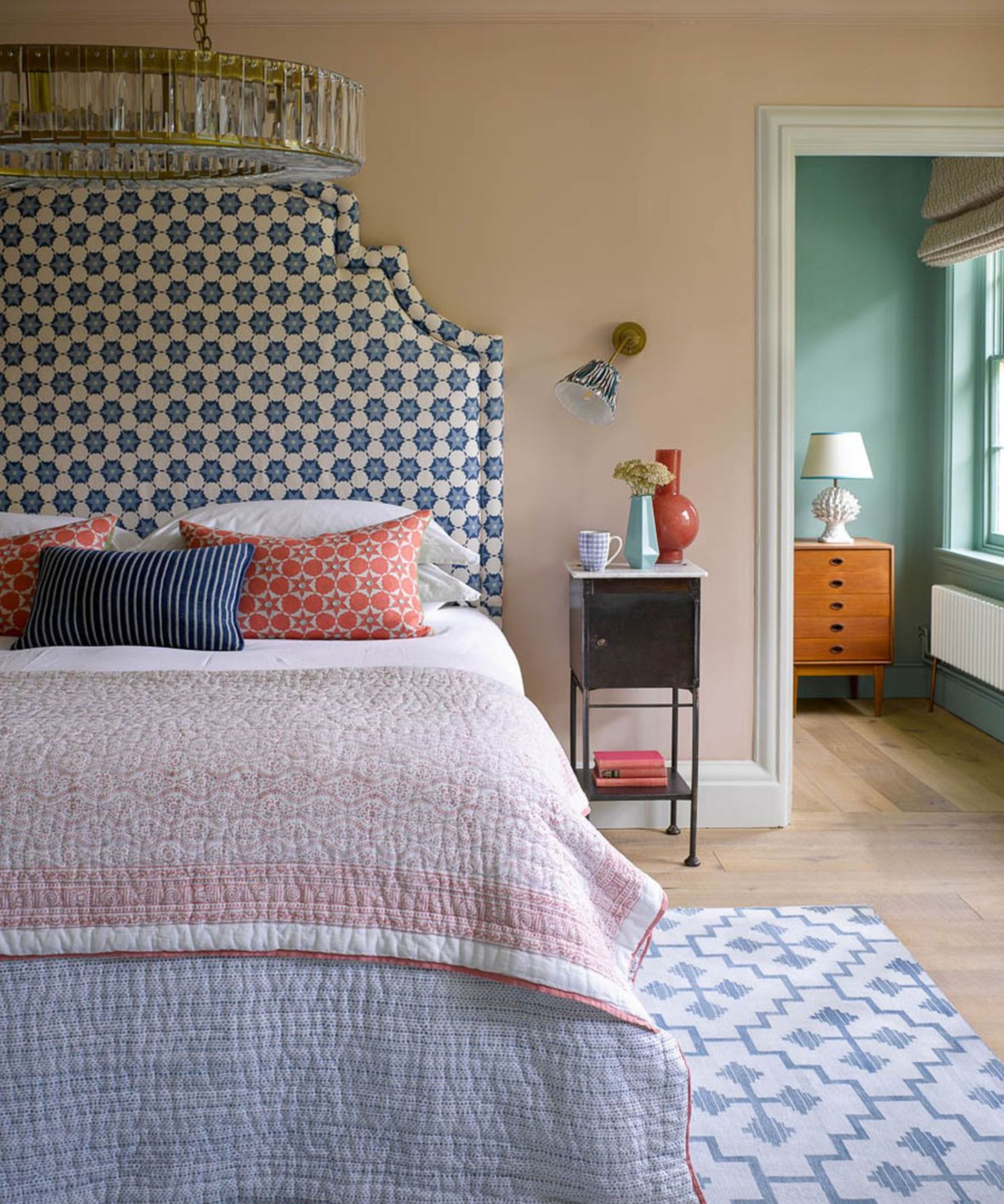
The impact of color in a room depends on the use of natural light within that space and should be one of your first considerations when choosing the right tone for your home.
First, determine the aspect of your room and the light it gets throughout the day. In morning light, muted colors might wash out altogether, while without any natural light the color may appear darker and more saturated.
If you have a cooler-toned space, take the opportunity to embrace the warmer side of the color wheel with soft pinks, reds, and oranges to create a balance. But if your room is filled with warm light, you're lucky enough to be able to welcome blues and greens indoors without it feeling cold and uninviting.
According to Helen Shaw, Director of Marketing at Benjamin Moore, muted colors work particularly well in brightly lit rooms to give a spacious feel, without being too stark. 'Soft, muted shades such as sage green, dusky lilac, and plaster pink will create a relaxing, sanctuary feel to a room. Their connection to botanicals and nature helps relax our brains and entices creative thinking, perfect for a bedroom or home office,' she explains.
'They can be used from ceiling to floor or combined with crisp whites and soft greys to create a smart Scandi-style interior scheme,' Helen continues. 'Muted whites such as White Diamond and Decorators White are a popular choice for people looking for a minimalistic and uncluttered look for their homes as the subtle grey undertone gives a softer, more contemporary feel.'

Helen Shaw is part of Benjamin Moore's UK division. Color expert and international marketing director, Helen and her husband Craig are founders of Shaw Paints, acquired by Benjamin Moore in 2020.
2. Then, pick your foundation hue
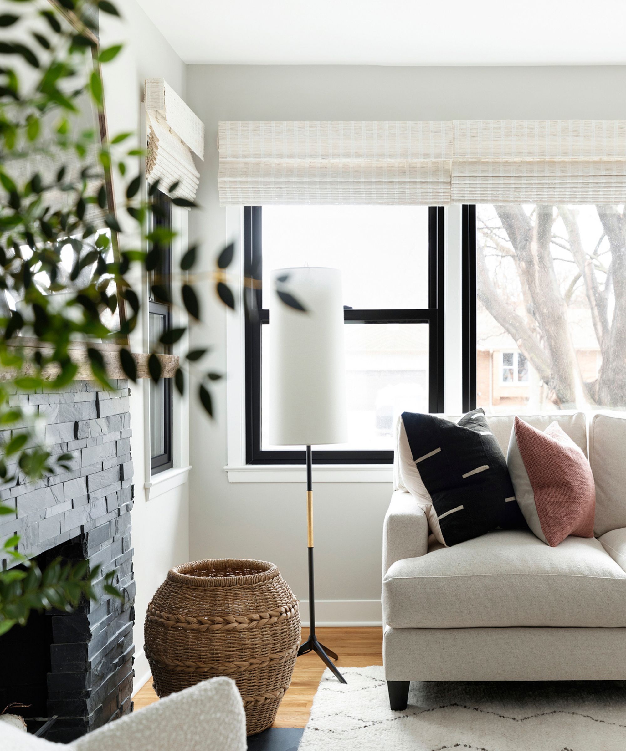
The simplest and most direct advice is to start by choosing a desaturated primary color as your base. This allows you to not feel too overwhelmed by choice and provides a blank canvas from which to build your palette using complementary tones.
'Creating a space with muted colors involves a nuanced approach to color selection and coordination,' says designer Jennifer Davis, of Davis Interiors. 'Begin by choosing a primary muted color, such as soft taupe or a muted blue, as your foundational hue. Then, complement it with neutral tones like off-white or creamy tones to build depth within the room,' she advises.
When paired with harmonious accent colors, your foundation color will sit quietly in the background, allowing the secondary colors to really pop - particularly when taken all the way onto the ceiling, for an enveloping feeling that doesn't seem as oppressive as darker colors might.
'Introduce a variety of textures - think linen, wool, or velvet - in similar muted shades to create visual interest without overshadowing the serene palette. By layering these elements, you establish a balanced yet sophisticated ambiance,' Jennifer adds.

Jennifer fell in love with design at a young age and has been working in the industry for over 25 years. She has developed an eye for detail and a talent for creating timeless designs. Jennifer offers a balance of creativity and forward-thinking with a structured, organized, and detailed mentality. Jennifer is driven by her deep passion for design while curating an exceptional client journey, ensuring pure delight from the very beginning to the end.
3. Combine with neutrals
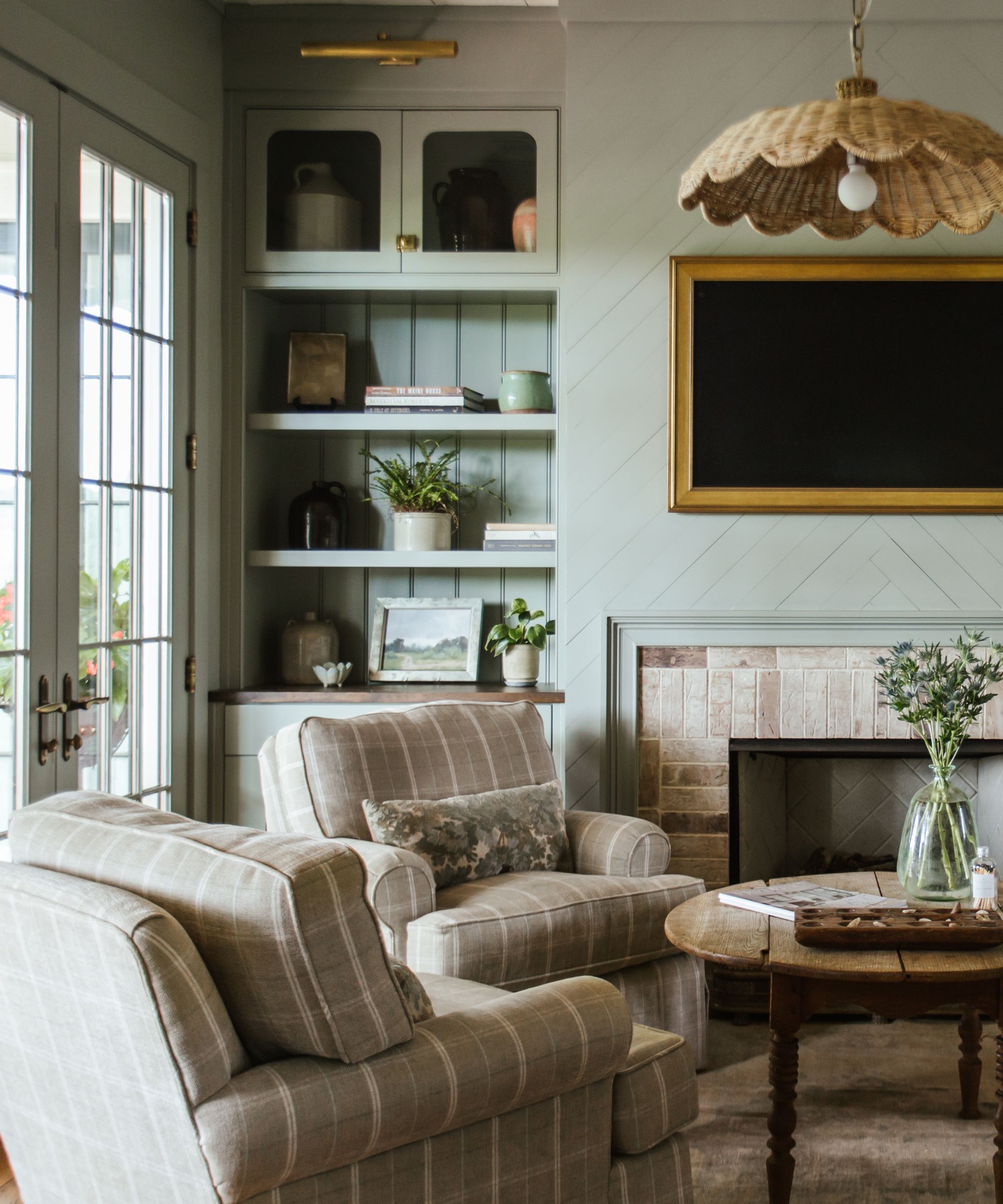
To ground the space in a way that doesn't feel discordant with the light nature of a muted color scheme, try to combine your palette with neutrals from existing furnishings, decor, or organic elements. This way, you can dip your toe into the interior design trend with accents such as painted woodwork, ceilings, or walls - without having to purchase an entirely new suite for your living space.
The beauty of such a palette is the versatile nature to be layered up with its surroundings. 'Muted colors offer incredible flexibility to bend and be influenced by surrounding textiles and art. They are open-ended and allow for decor additions and shifts,' says Monica Stewart of The Misfit House. 'I never want a space so fixed that it wouldn’t allow for a beautiful painting or pottery piece to be found and added along the way.'
'Utilize accent colors sparingly, selecting slightly bolder muted hues to highlight specific elements and create visual focal points,' adds Jennifer Davis. 'Curate artwork and accessories that complement the muted palette, layer in natural elements for warmth and contrast.'
4. Or make mute colors the accent shades
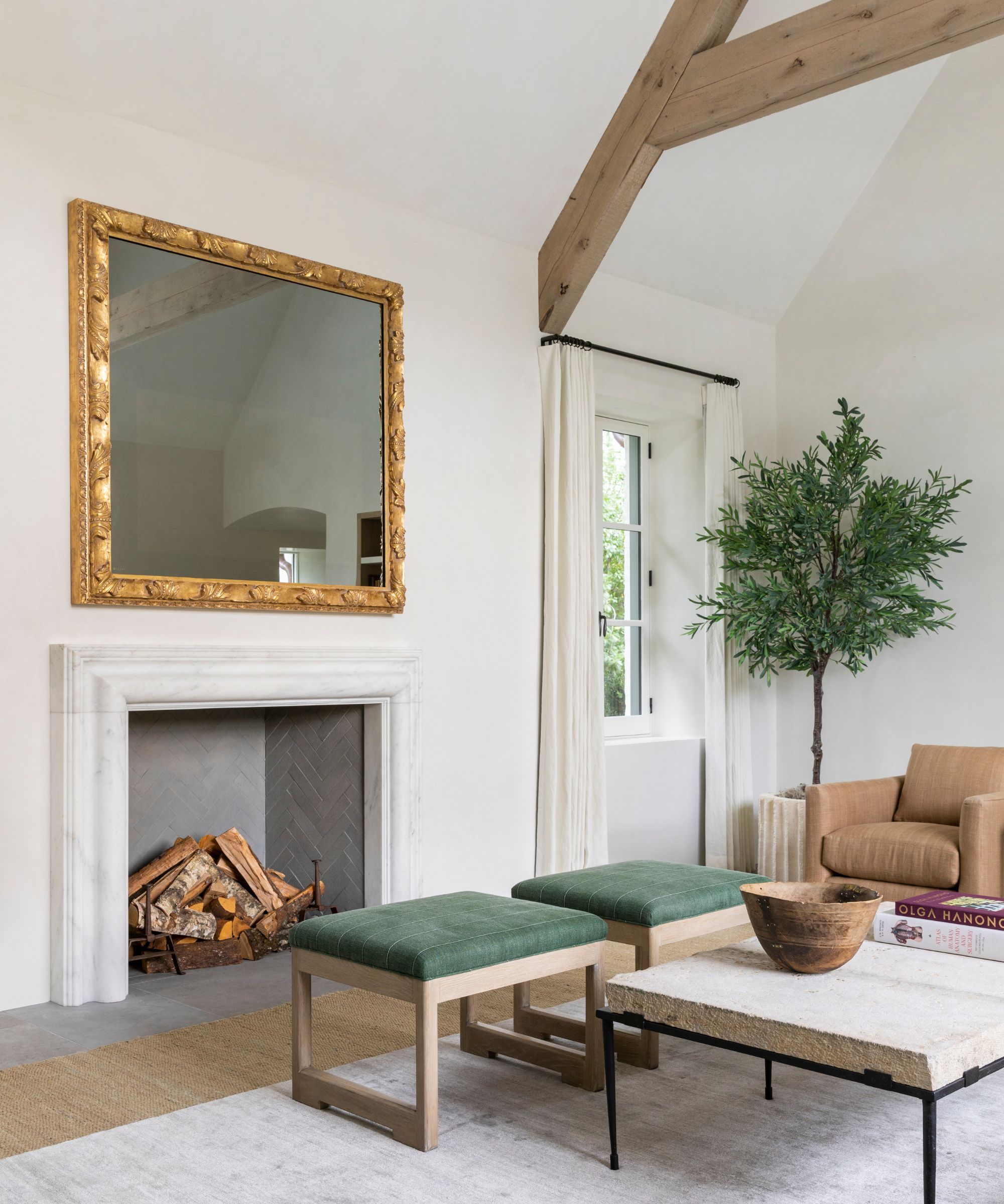
Or perhaps, try it from the opposite approach. 'Decorating with a muted color scheme is a go-to for us as it can feel incredibly peaceful and calming,' says Tama Bell, senior designer at Tama Bell Design.
'We tend to use white, off-white, and shades of oatmeal as the base in walls, rugs, and bedding and then layer on top of that with pale, muted colors, and some pale or muted patterns,' she adds. This gives the space a quiet interest that can be added with art, lighting, and textures as opposed to solid wall color.'
5. Level up with texture
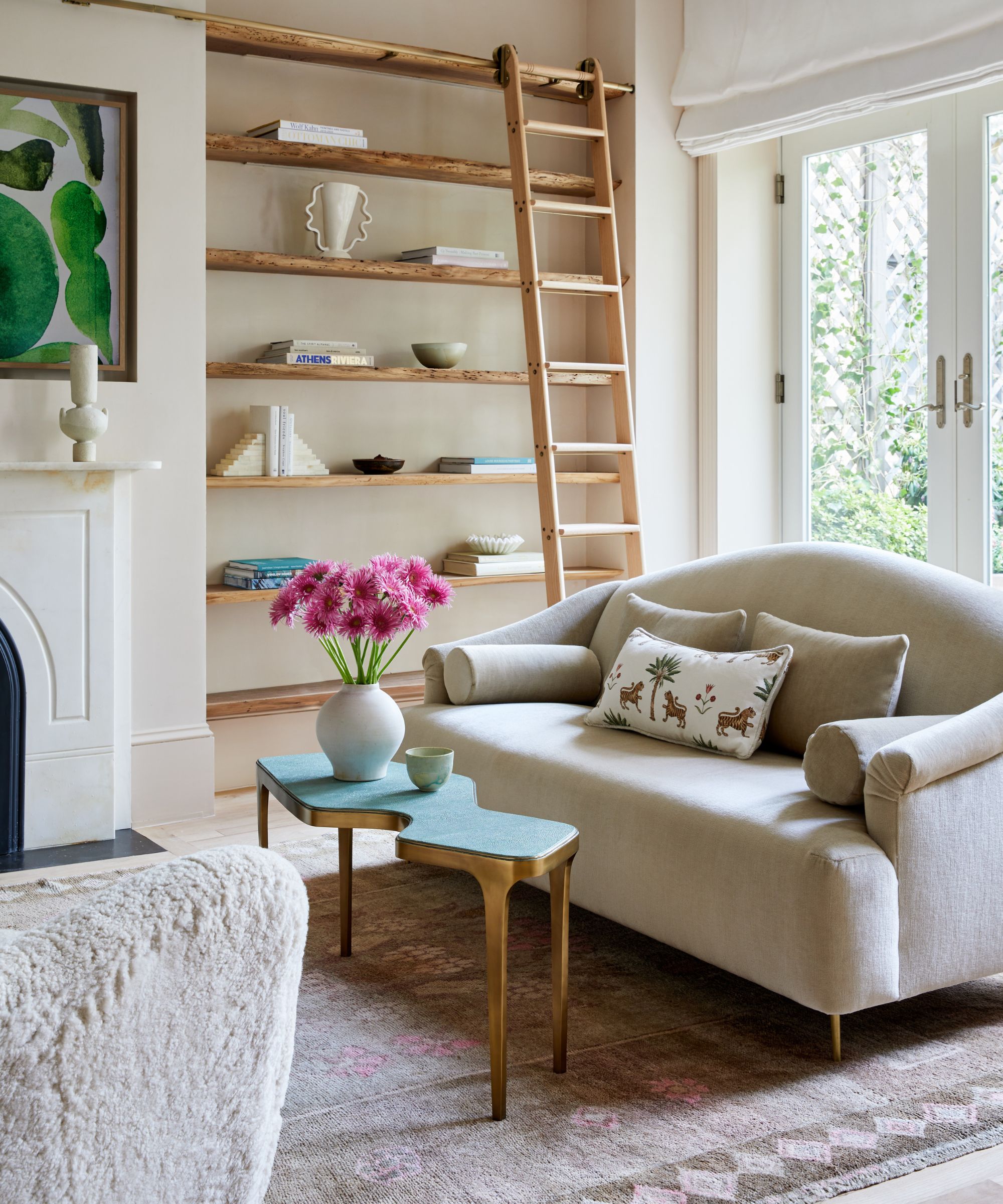
Consider adding in texture as the most important factor to creating the ultimate relaxing den, including materials like wood, marble, cashmere, velvet, and wool to add depth to your color scheme. Every detail counts.
'When working with a muted color scheme, it's important to layer in different materials, textures, and shapes so that space feels compelling, as well as soft. I tend to lean towards warmer neutral spaces with pops of brighter colors that feel inviting,' says Molly Torres Portnof of DATE Interiors.
Jennifer Davis agrees. 'To further enrich the decor, strategically incorporate subtle patterns, like soft stripes or florals, within the chosen muted color range. These patterns, whether through textiles or accents, add dimension to the space.'
'Integrate metals, like brushed brass or aged copper, in small doses to elevate the space's sophistication,' she adds.
This embracing of muted tones allows your investment pieces like furniture, built-ins, and textiles to do the heavy lighting in a room. 'I find that muted colors - like sage, dusty rose, and slate blue - often look great rendered in luxurious textures like velvet, linen, and boucle, and muted tones are also great choices for rugs and wall art because they act as a versatile backdrop rather than an in-your-face statement,' says Kathy Kuo.

After moving next door to the Empire Stat Building, designer Molly Torres Portnof founded DATE Interiors (an acronym for ‘Designing A Tiny Empire’). Her design style brings together her background of fashion, pop culture, and music to nearly every space she designs.
What is a muted color scheme?
Often confused with a neutral color scheme, the distinction lies in the degree of saturation and vibrancy within the palette - with a muted color scheme specifically focusing on colors that have been toned down or softened, rather than a lack of color.
Considered neutral because they don’t lean towards any particular hue on the color wheel, a neutral scheme tends to comprise shades of whites, grays, beiges and muted brown to create a blank canvas from which to layer other elements of design.
On the other hand, a muted color scheme specifically leans towards the warmer ends of the spectrum with tones like dusty rose, soft sage, and ruddy blues coming to the fore - colors that retain a certain level of saturation, but lack the boldness of their brighter counterparts.
Lending itself to a soft ambiance, a muted color scheme can affect a space in a variety of positive ways, whether to coax architectural elements into the limelight, allow pops of color to sing, or affect our mood.
The origins of muted color schemes in interior design are deeply rooted in a connection to nature, creating a design approach that is both classic and adaptable to evolving tastes. If you're looking to inspire a distinctly peaceful atmosphere into a room, or your entire home, perhaps a muted color palette is just the thing for you.
Sign up to the Homes & Gardens newsletter
Design expertise in your inbox – from inspiring decorating ideas and beautiful celebrity homes to practical gardening advice and shopping round-ups.

Charlotte is the style and trends editor at Homes and Gardens and has been with the team since Christmas 2023. Following a 5 year career in Fashion, she has worked at many women's glossy magazines including Grazia, Stylist, and Hello!, and as Interiors Editor for British heritage department store Liberty. Her role at H&G fuses her love of style with her passion for interior design, and she is currently undergoing her second home renovation - you can follow her journey over on @olbyhome
-
 I just discovered the best non-toxic product for getting rid of ants in your yard – and you probably already have it in your bathroom cupboard
This household item is an effective ant deterrent that doesn't leach harmful chemicals into your soil
By Tenielle Jordison Published
-
 7 spring home maintenance mistakes to never make – overlooking these now can lead to pest problems and structural damage
Home improvement pros share common mistakes and what to do instead
By Eve Smallman Published