

When we think of creating a calm interior space, our minds automatically go to shades that are soft and gentle to the eye; such as stone, oatmeal, gray and grounding colors of nature like pale blues and earthy greens.
Embracing a bolder color palette for more relaxing room color ideas isn't something that many of us may naturally consider, but it can be very calming if you choose the right shade that resonates with you personally.
Below we've sourced ten easy to use bold colors that we feel can still create a calming space, and why they work so well – with some great expert design tips from key interior experts.
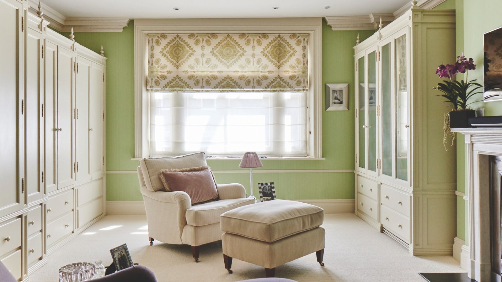
1. Emerald green

Perhaps one of the more obvious choices due to its link to nature, green is a calming color for most of us. But it's more about the shade we pick for our green room ideas that matters. Some of us will prefer a more subtle shade to invoke calm, whereas others feel more cocooned in a bolder more vibrant tone like forest green.
'When looking for inspiration to create a bold office space, we turned to the client's favorite color: kelly Green,' says Theresa Butler, principal and founder of Theresa Butler Interiors.
'Color drenching the space in Behr's rich shade, Hills of Ireland, turned it into a cozy working nook, accented with wood tones to inject an organic touch. Varying textures and neutral furnishings help to ground the space,' Theresa adds.
We agree, it's about creating visual contrasts with your accessories and furniture choices that help to create the calming element.
2. Burnt orange

Rich warming shades can offer a cozy safe feel, and you can make this work for a modern scheme too.
'Living rooms are often the room in the house where everyone comes together to relax, serving as a space where relaxation and time spent together as a family is key,' says Andy Greenall, creative director at Paint & Paper Library.
According to Andy, living room color ideas can be used to create a warm and welcoming environment that will ensure everyone is inspired to gather together and socialize. 'Atlas from Paint & Paper Library is an earthy, rich shade of burnt orange that takes its name from the Atlas Mountains, this impactful color creates a cocooning and enlivening environment that feels immediately reassuring and enveloping, working brilliantly on all four walls, imbuing a space with warmth and depth.'
Keep the flooring and seating pale to ground the look, consider oatmeal or stone as they are good neutral palettes that always work for a touch of natural warmth.
3. Teal

'Being bold with color can be scary, especially when mixing several together, but done well it’s a unique and unusual choice that can make for a very cheerful home,' says Helen Parker, creative director of deVOL Kitchens.
If you choose the right color combinations for rooms, using a palette that you love, then they'll have a calming feel in your space. If you want to be brave and use a bolder shade, like this pretty teal for example, but not for color drenching ideas, then team it with other colors that go with teal, like this plaster pink shade – it grounds the teal painted cabinetry perfectly.
4. Sunshine yellow

The definition of calm is different for us all, and certain colors conjure up different feelings for us all, as David Harris, design director at global brand Andrew Martin explains, 'Yellow is mellow and uplifting all at the same time. It transports us back to long lazy sun-drenched days in the Mediterranean and it can brighten us up on the darkest of winter days.'
So what colors go with yellow that we can use to dampen it down a little? 'It works brilliantly with blues, teals, greens and reds, and for real crisp freshness, use with white,' says David.
We think the sunshine yellow wallpaper ideas shown above looks great with the striped couch and artistic artwork.
5. Black

Decorating with black is certainly a bold choice for many and not necessarily a color we think of as calming, but that doesn't mean it should be ruled out.
'Painting a room all black, or any neutral dark color really, creates a cozy cave-like environment that is very calming and cocooning to some people. (However, some people's psychological make-up might view it as the opposite!) I always joke that people are either cave dwellers or vista dwellers,' says Rebekah Zaveloff, co-founder and creative director of Imparfait Design Studio. 'For those more drawn to the former, nothing feels as warm and soothing as being swathed by a room painted in a dark and moody neutral.'
The beauty of black room ideas is that they can look fabulous with bold patterns – treat your floor to some decorative tiles and to balance it out add in some contrasting, plainer elements such as tan leather and off white accents.
We explore what colors go with black in our dedicated feature.
6. Purple

'Purple shades with an undertone of magenta are emerging in popularity,' says Andy Greenall. 'This is partly in response to growing color confidence and partly because we associate these shades with a sense of instantaneous joy – a feeling we all want in our homes! Used singularly across a multitude of surfaces it makes an assured, joyful statement; perfect for indulgent, private spaces such as a generous bathroom, modest dressing room or even a tiny cloakroom.'
For the bathroom color ideas in this space, the bright purple shade looks great with the soft blush pink and the jet black roll top, the result is a bold bathroom with a vibrant, warming and inviting energy. Of course, there are many purple shades to choose from, if your chosen purple shade was less strong it would sit on the pastel end of the spectrum, and wouldn't be so impactful.
It seems that purple is making a comeback for 2025, so if you're wondering what bold color to pick be brave and give it a go.
7. Inky blue

A dark blue can be a dramatic choice, but it is possible to create a calm space if you get the rest of the scheme right.
'When creating a cozy and inviting scheme, we often paint walls, trim, and ceilings in an inky blue tone, then layer the client’s favorite colors,' explains Regan Billingsley, founder of Regan Billingsley Interiors.
By adding in some warmer elements, such as wooden accents, the scheme will have a relaxing, balanced feel. In the case of this living room, there's both hardwood and bamboo with each adding character and a sense of contrast. 'This approach strikes the perfect balance, grounding the space while transforming it into a personalized happy place,' adds Regan.
8. Scarlett red

When we think of bold colors, decorating with red is right up there at the top (and for good reason). Vibrant and strong, it's a shade that represents energy, passion, and courage. On the flip side, it's warmth can be perfect for creating a calming, cocooning feel.
Designers decorate with red more often than you think (as we explore in our dedicated piece, how designers decorate with red paint). The key is to pick the right tone of red, a blue-based red will feel cooler and in this case might be the opposite to what you need. However, a warm yellow or orange-based red will have a wonderful feel that's welcoming and comforting. It can work well in a bedroom, snug or entryway.
9. Cerise pink

A cerise pink is a good choice because it's vibrant yet soothing, and to make it even more relaxing you can team with pastels and softer neutrals to add contrast.
It also makes for a really good contemporary look, as shown in this beautiful bathroom designed by Paloma Contreras. Bold and bright, the Katie Ridder Peony wallpaper brings wonderful natural character to the bathroom, with the white and cream accents and cabinetry helping to ground the overall look. Looking to nature for inspiration will always help to create a grounding, relaxing space – even with bold brights such as cerise pink.
10. Go for a combination

'For schemes that are perfectly poised between personality and liveability, try a muted base of easy-to-live-with tones, whether soft blue, ochre or tobacco, highlighting architectural features such as window frames and fireplaces with a bolder color for grounding contrast,' says Helen Shaw, color expert at Benjamin Moore.
This bold color scheme is a great idea if you love more than one color and want to opt for an eclectic space. Choose the colors that you love the most and pick similar tones so they work in harmony. 'A gloss finish on details introduces a retro note, while gentle silhouettes, from a curved sofa to a loosely gathered linen window treatment, feel instantly freshening.'
There's no doubt that you can create a calming space with bold colors. To make it work you need to balance out the bold shade with more neutral shades, textures and accessories. The other important factor is to choose a color that works for you, a bold color that you find soothing might not calm another. So pick a shade that brings you joy and you will continue to love for years to come.
For more decorating tips, we explore how to decorate with rich colors in our separate piece.

You must confirm your public display name before commenting
Please logout and then login again, you will then be prompted to enter your display name.
-
 7 expert-approved painting hacks to minimize clean up – to make an already exhausting task easier
Avoid a backbreaking clean-up after your next painting project with advice from the professionals
-
 Gwyneth Paltrow's quiet luxury kitchen is so beautiful, we almost overlooked her ultra-smart cabinets – they make the use of 'every inch' of storage space
The Goop founder makes use of dead space in her kitchen with customized cabinetry that reaches to the ceiling, providing ample storage

