How to commission decorative plasterwork – for unique interior detailing
Decorative plasterwork can make a dramatic impact in modern as well as older homes. Here’s what you need to know

Design expertise in your inbox – from inspiring decorating ideas and beautiful celebrity homes to practical gardening advice and shopping round-ups.
You are now subscribed
Your newsletter sign-up was successful
Want to add more newsletters?
Plasterwork can be used in endless ways to improve your home whether you're looking to repair the decorative details of a traditional building or to add some interest to a modern property.
Wall and ceiling finishes are a vital element in the interior design of your home and it’s important to consider what would suit the style or era of the house but also the overall aesthetic that you'd like to achieve.
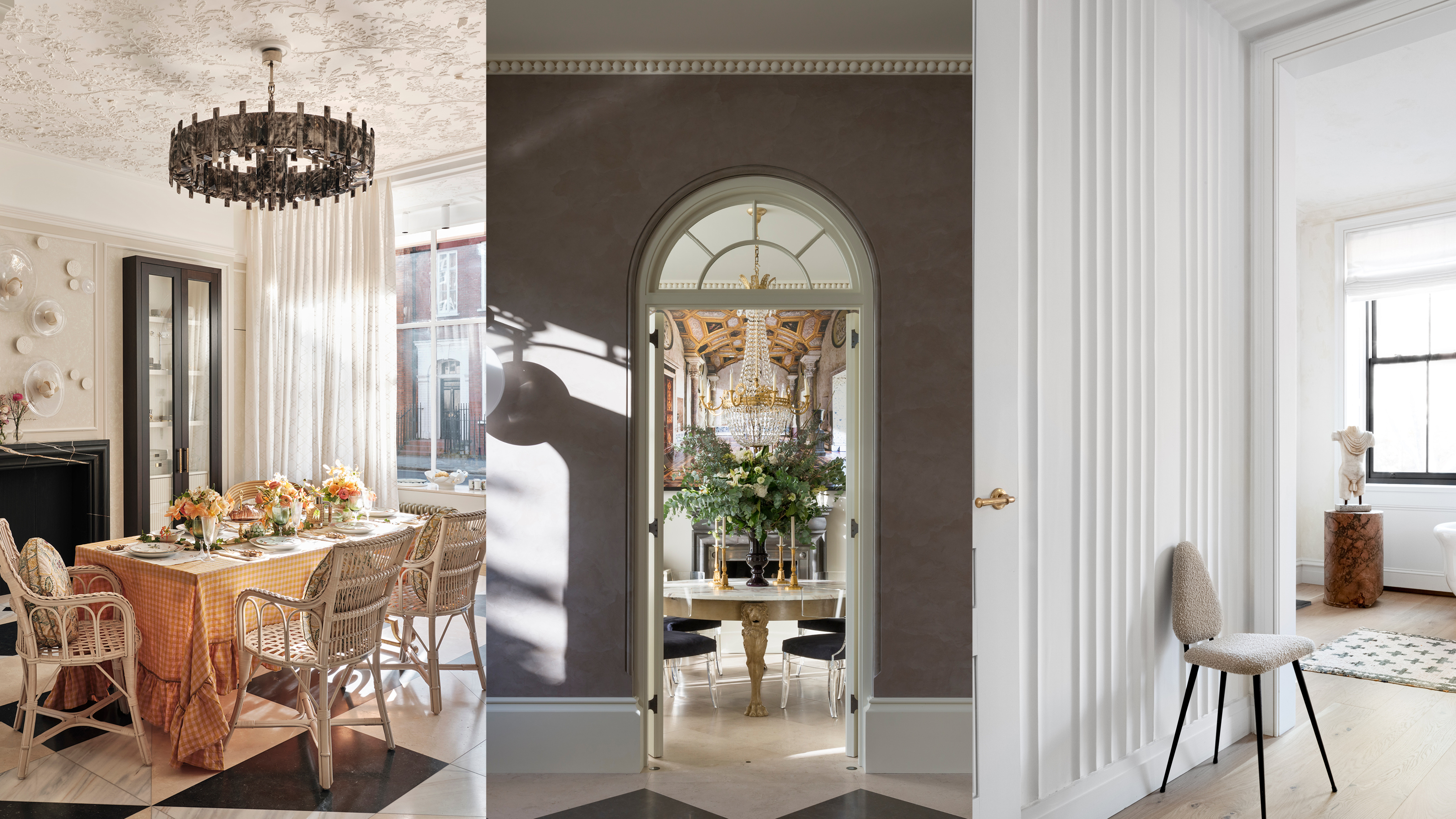
Cornicing, ceiling medallions and fluted moldings all make a decorative impression. Here, from the experts, is all you need to know when commissioning plasterwork for your home.
Article continues below 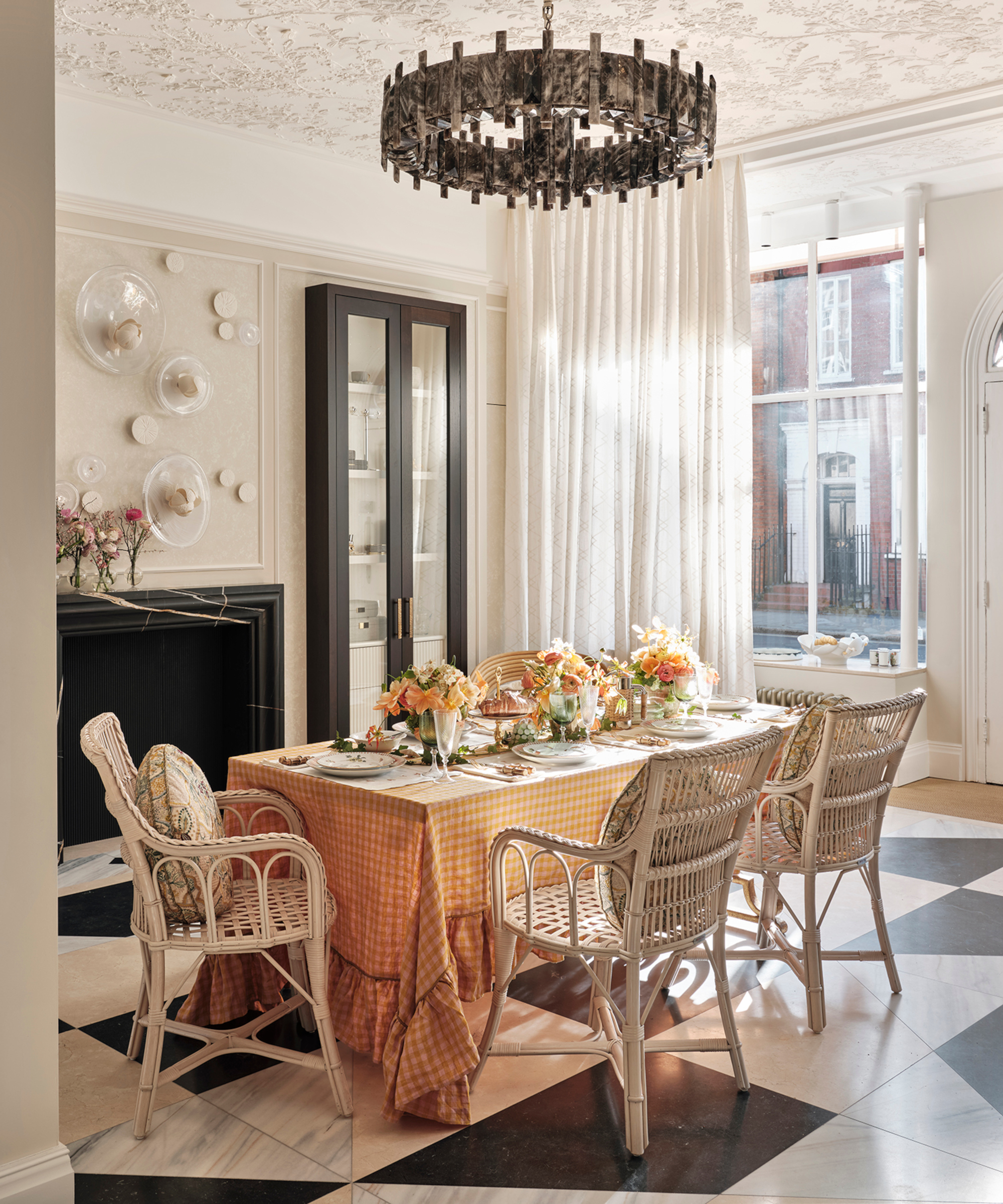
Choosing plasterwork for a room
When replacing (or introducing) decorative plasterwork in a traditional setting, consider the hierarchy of the rooms, says Simon Willcox of molding specialists Locker & Riley.
'The principal rooms will tend to have the most detailing which could include ornate ceiling medallions, cornicing and paneling. Depending on how elaborate you want to be you can choose between a range of very decorative or something plainer. We have a library of designs and also make up new ones bespoke.'
Are there any rules to follow?
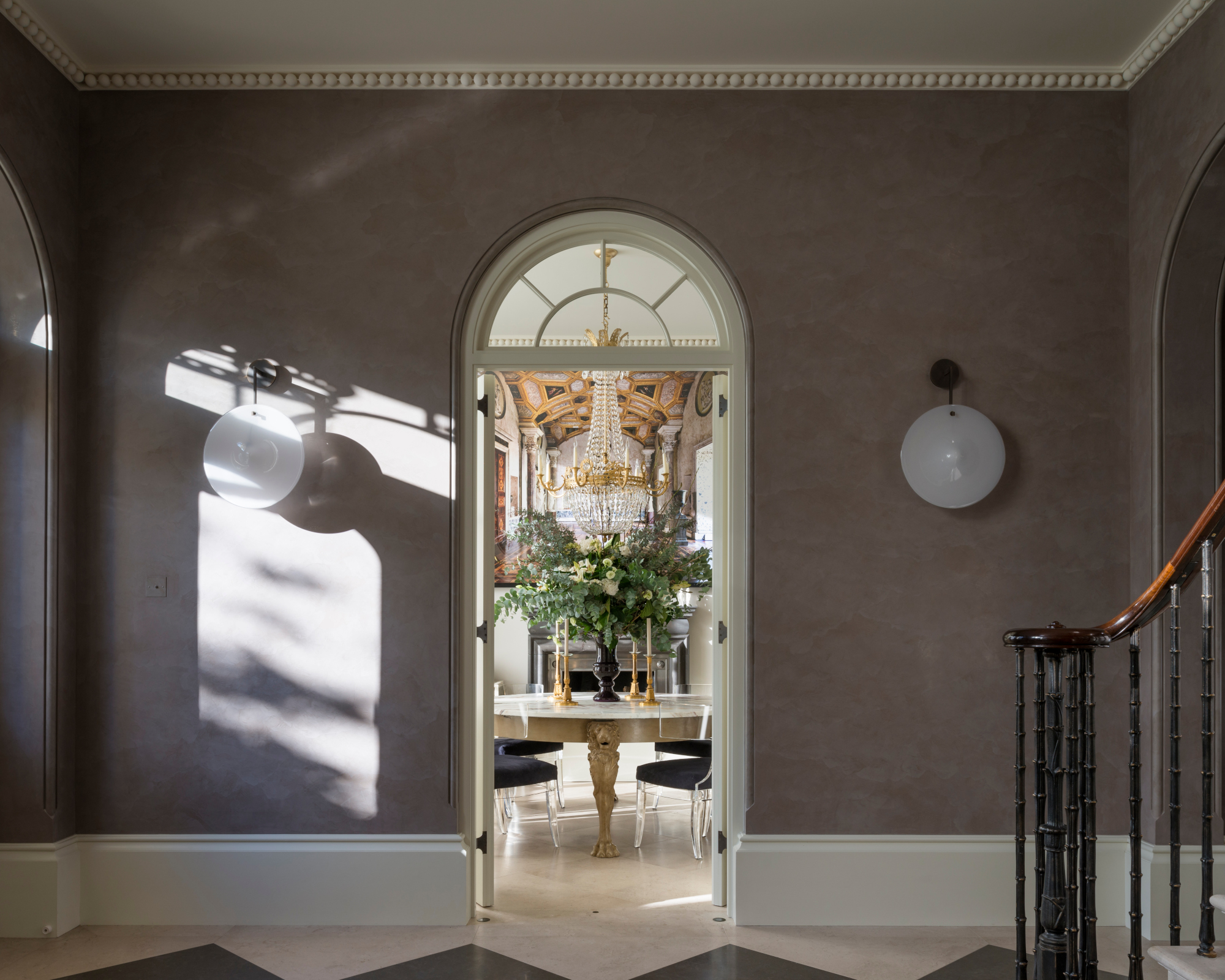
Cornicing hides the junction between the wall and the ceiling but more importantly helps to give character and definition to a room, says Mike Fisher, founder of Studio Indigo.
As a rule, the cornices should be in proportion to the size of the room. 'In rooms with low ceiling heights, we use cornices that are short on the wall and spread out on the ceiling. We then paint the wall and cornice in one color, giving the illusion of higher ceilings,' he says.
Design expertise in your inbox – from inspiring decorating ideas and beautiful celebrity homes to practical gardening advice and shopping round-ups.
Profiles of moldings tend to get slimmer and less detailed as you travel up the house. 'By the time you get to the top of the house, moldings will tend to be small and plain,' says Simon.
How to choose the perfect style
Bomb damage or water ingress over the course of the 20th century means that many ceilings in older houses have been replaced without any molding details included. When starting from scratch, be guided by the period of the building, scale of a room or its importance. 'A Georgian cornice never looks right in a Victorian house or vice versa,' says Mike.
The decision to add or reinstate cornices would truly depend on two variables: the look you want to achieve and the history of the building. When a UK building is listed, bear in mind this means that its interior and exterior are protected and approval is required for any changes, including the cornices and any architectural detailing. 'We have in-house architects and conservation specialists and frequently work with Decorative and Ornamental Plasterwork (DOP) or Stevenson’s of Norwich who are world-famous experts.'
What are the modern options?
The alternative to cornicing is a shadow gap which is very contemporary but may not always be appropriate to the building. For those wanting something that lies between traditional and contemporary, choose a modern molding design with clean lines and less detailing, recommends Clara Ewart of Kitesgrove.
'We might juxtapose a traditional molding with a statement contemporary chandelier. Modern paint treatments are also very effective, for example painting a cornice in a statement color rather than the traditional white.'
Mix it up and break the rules
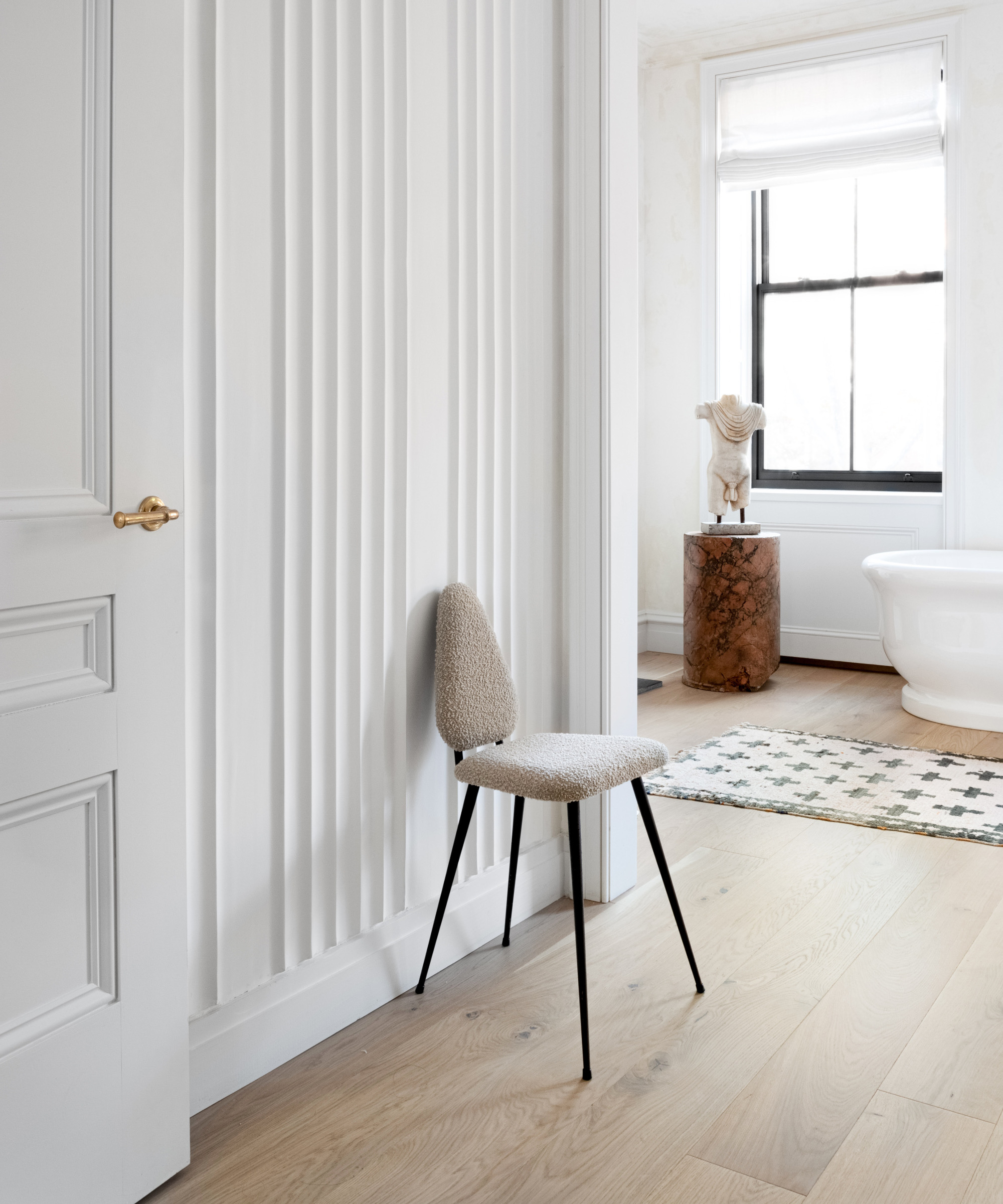
Another approach which is currently popular is to have a wall of fluted molding. Interior designer Athena Calderone has hand-trowelled fluted plaster walls by Kamp Studios leading to the bathroom in her Brooklyn home and says it lends an otherwise unremarkable passageway a sense of distinction. 'Flutes are probably here to stay as designers are coming up with new innovative ways to make them interesting and relevant,' says Kamp’s founder, Kim Collins.
Don't forget the fifth wall (the ceiling)
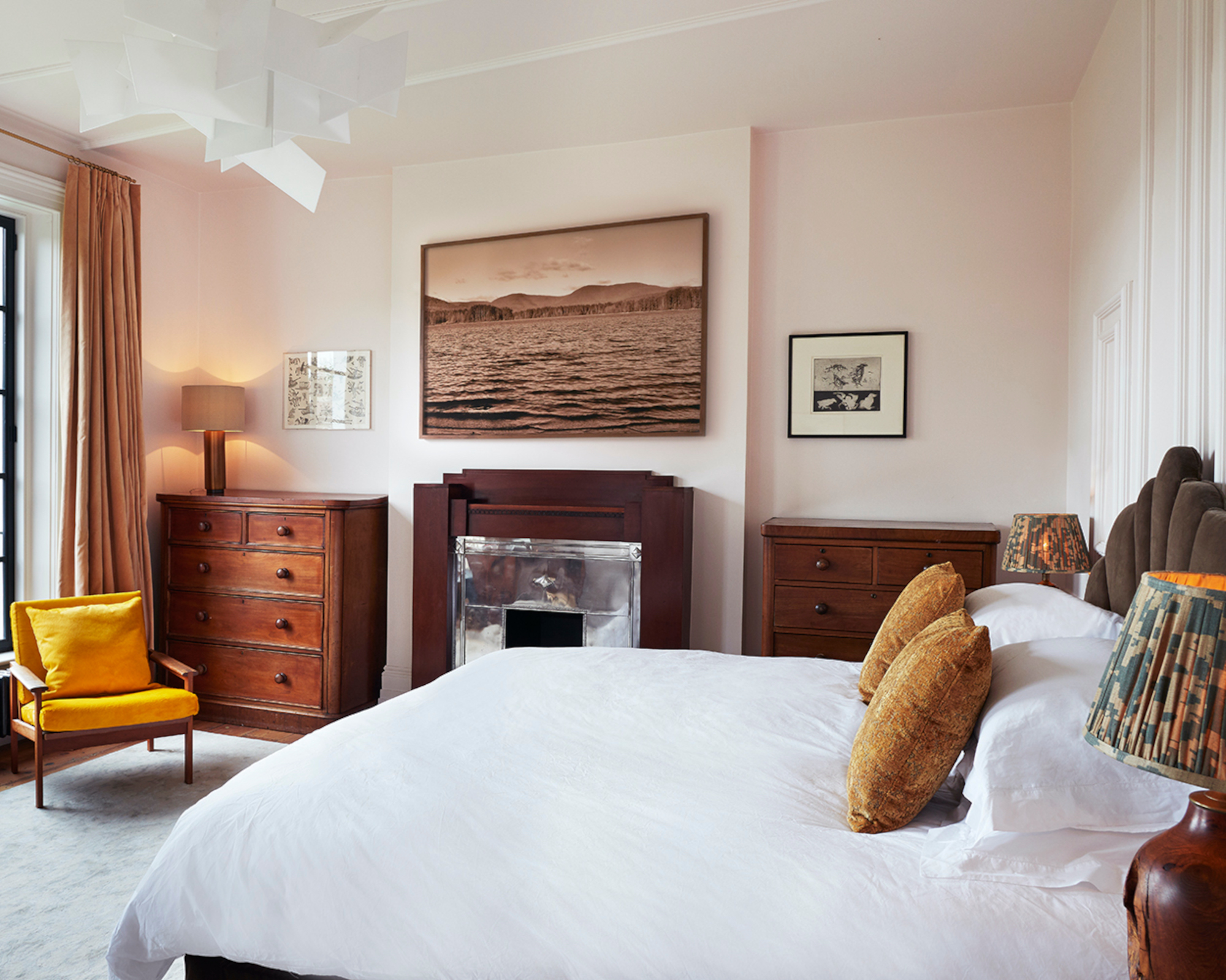
Ceilings offer a further surface for decorative expression. Plaster ceiling medallions were traditionally used as centerpieces for elaborate ceiling designs but, nowadays, they are often used to complement light fittings or disguise wiring on bare ceilings. Very complex designs will be fitted on panels first and then installed. 'I’d say the biggest trend recently is adding ceilings into the scope of my work,' says Kim.
'Maybe we have been pushing that trend a bit because we know how incredible our plaster looks when it is all-encompassing. There really is nothing better. Plastered walls and a painted ceiling fall a little short for us so we are happy that it’s catching on.'
'I like to use architectural moulding in unsual ways,' adds interior designer Rachel Chudley. 'For the main bedroom of a recent project in north London, I installed exaggerated strips of diagonal molding run up the wall behind the bed and continued across the ceiling. We looked at the movement of light from sunrise to sunset, and reflected this in the moldings, which wrap around the room, and over the ceiling.'
Add detail through paneling
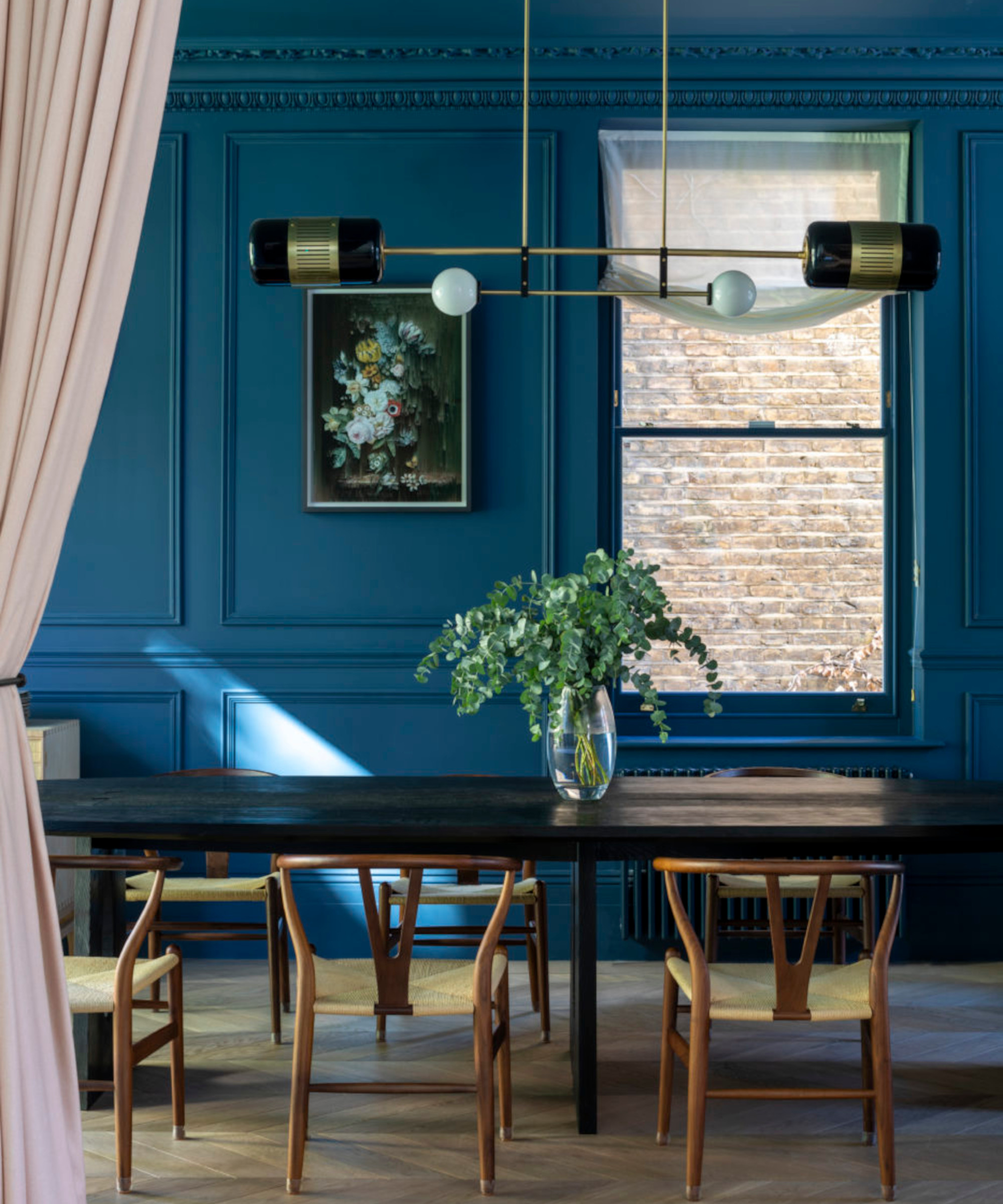
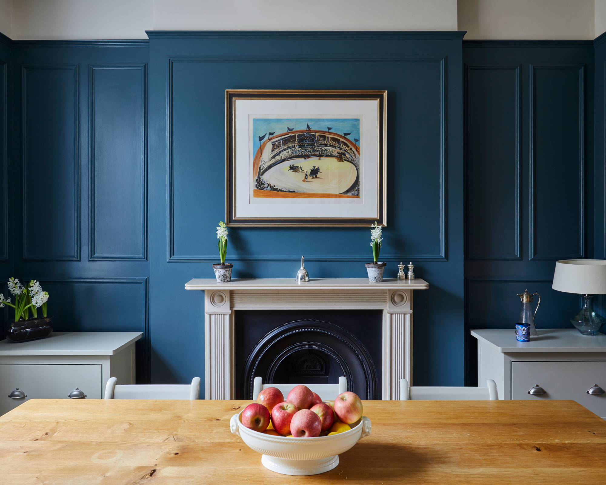
Wall paneling – be it in timber or plaster – is another way to add decorative definition to a room. This is a good solution if rooms lack a focal point, such as a fireplace. 'It creates a sense of atmosphere and depth in a room,' says Eamonn Agha of interior design studio Huntsmore.
'We like to paint the area above the picture molding the same color as the ceiling to create more of a feature and add to the illusion of height, and add a sense of grandness to the room. Moldings on the panels are used to create shadow and catch light which creates definition in a room – this is particularly important when you opt for painted panels,' recommends Bruce Hodgson of bespoke joiners and furniture makers Artichoke Ltd.
'You can also use it to trick the eye in rooms with lower ceilings by having tall panels which don’t chop the room up horizontally.' It can look great in a contemporary environment, too, as a way of framing large flat surfaces.
'Think about art first. If large pieces are likely to straddle frames or whether it’s worth creating a panel to form a frame around a piece of art, it’s important to start knowing what’s going to hang where and work backwards.'

Arabella is a freelance journalist writing for national newspapers, magazines and websites including Homes & Gardens, Country Life, The Telegraph and The Times. For many years she has specialized in writing about property and interiors, but she began her career in the early 2000s working on the newly launched Country Life website, covering anything from competitions to find the nation’s prettiest vicarage to the plight of rural post offices.