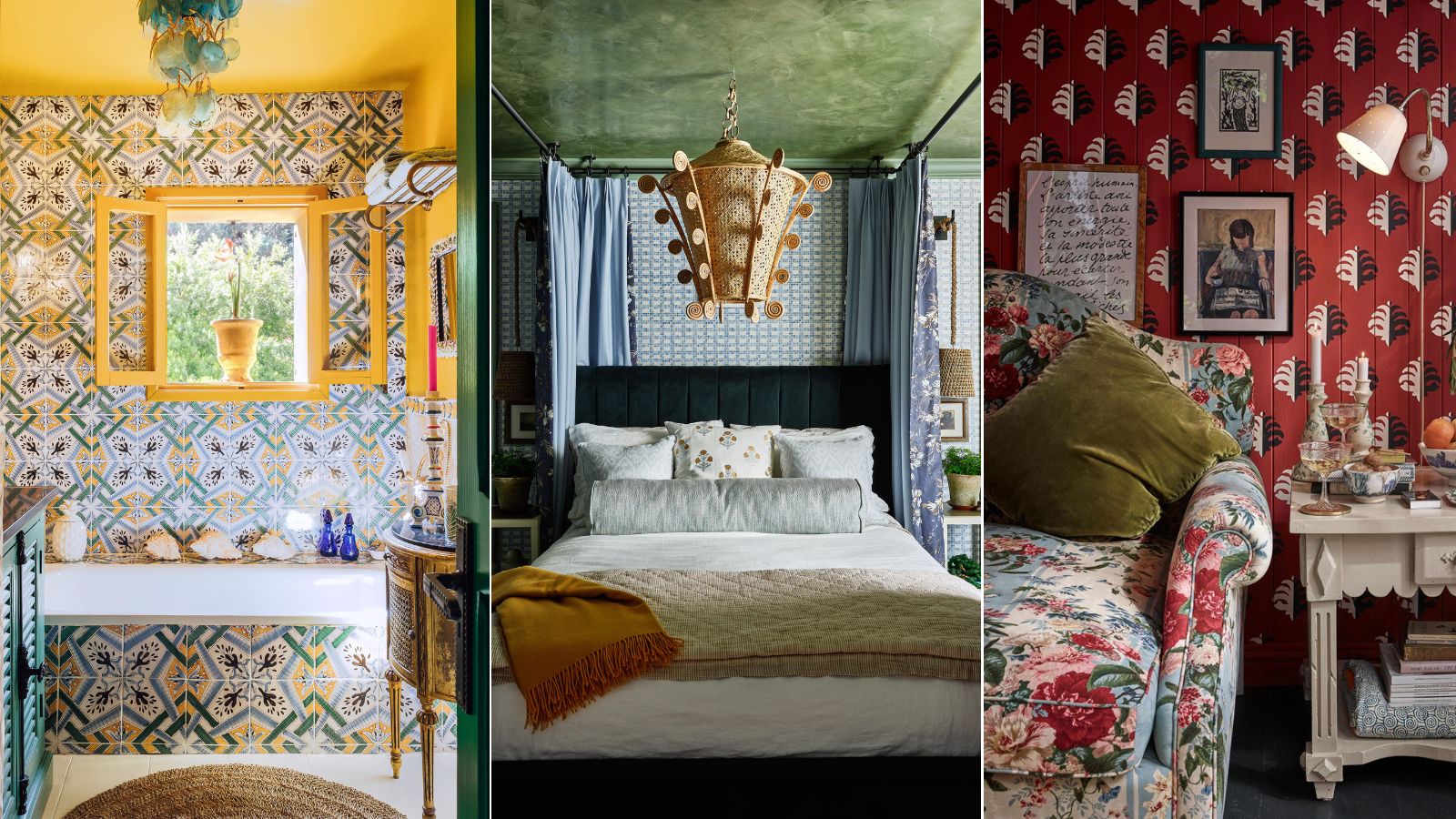
Pattern clashing is the tricky trend we are loving – 10 rules designers always follow to ensure it works
Summer is the perfect season to introduce a bit more pattern into your design scheme, but getting the pairing just right is tough. Here's how designers get the look down
- 1. Find a common color thread
- 2. Experiment with scale
- 3. Mix and match pattern types
- 4. Start with geometrics and stripes
- 5. Use bold accents to create contrast
- 6. Start with neutral shades, then build
- 7. Take inspiration from fashion
- 8. Don't forget about texture
- 9. Let the patterns clash a little
- 10. Take your time to perfect the look

Bright, bold patterns bring any design scheme to life, but they can be a bit intimidating to those who tend to stick with pared-back color schemes and neutral palettes. For many, bringing just one out-of-the-box pattern into the living room can feel overwhelming – much less introducing four or five to coexist and contrast.
But colorful patterns are an important part of interior design no matter your aesthetic, and knowing how to use them well can make a good design scheme great.
Whether you love pattern or are just testing the waters, it's best to go to the experts before you begin. That's why we spoke with interior designers all about mixing pattern in interiors – here, they share their top tips and tricks for blending contrasting patterns without letting them clash.
A designer-backed guide to deliberately clashing patterns
Mixing a striped throw pillow with a subtle floral lamp is well and good – and an easy way to channel the much-loved Nancy Meyers aesthetic – but some spaces call for a bit more pop. If you're looking to bring multiple lively patterns into a single space, it's normal to feel a bit out of your depth. This is how interior designers navigate the process of decorating with pattern.
1. Find a common color thread
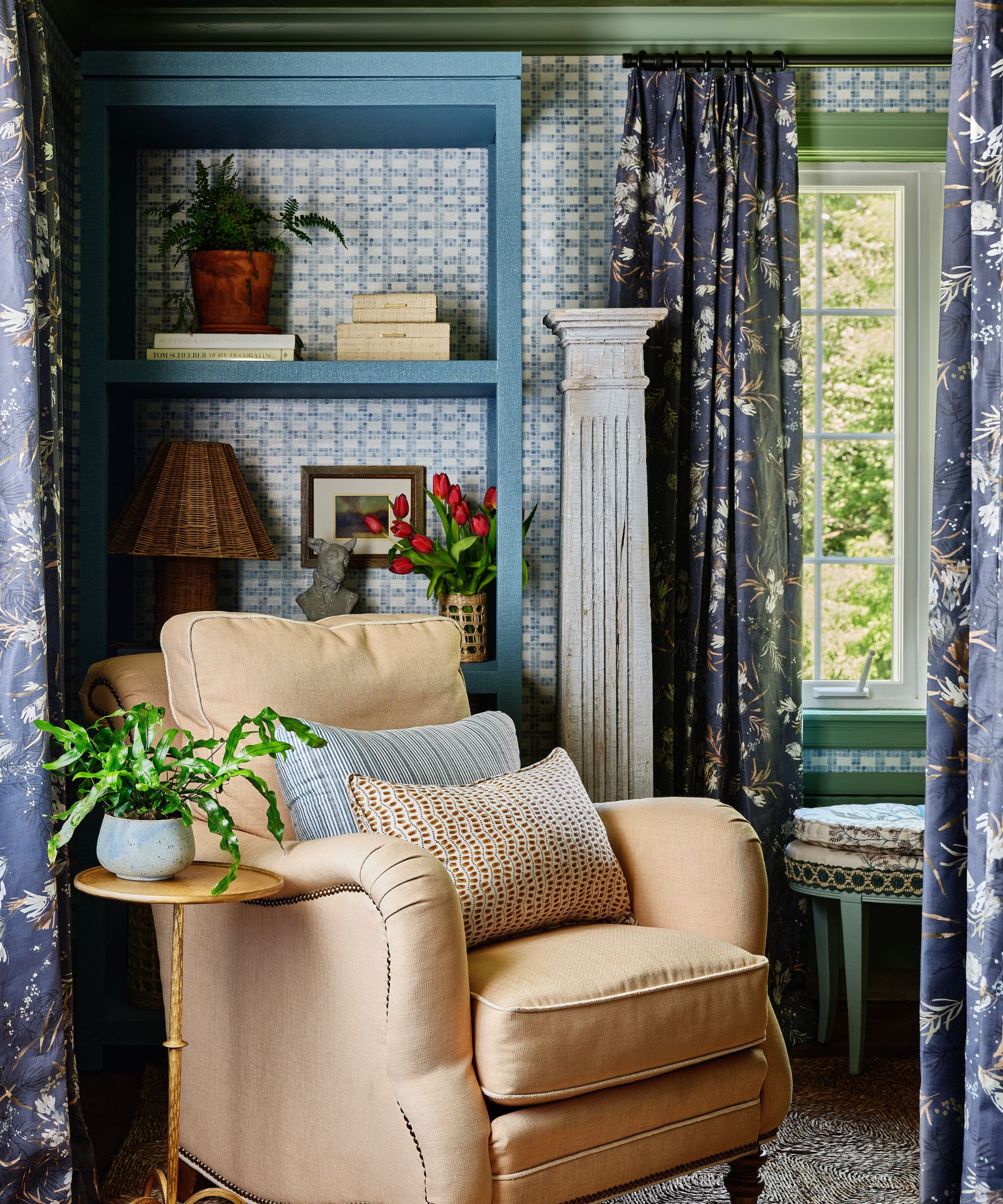
A color scheme is always a solid place to start, even when you're looking to mix multiple types, scales, and shades of pattern. No matter your plans for later in the process, 'it's all about balance and cohesion,' and a color story makes achieving that goal much easier, says Jodi Peterman, CEO and owner of Elizabeth Erin Designs.
'Start with a common color thread to tie everything together, ensuring that your bold elements complement the neutral tones rather than clash,' says Jodi. By selecting shades within the same color family, you'll be off on the right foot from the very start. The base of each pattern will naturally pair, meaning you have much more freedom to experiment with exciting shapes and scales.
'The success of mixing bold and colorful patterns can be found in color theory. When choosing your fabrics, consider if the main colors in the prints are complementary, monochromatic, analogous, and so on. If the dominant hues are consistent, the patterns will gel beautifully and tie the look together,' says Bailee Roberts, founder and principal at House Rupert Interior Design Studio.
Aman Than, creative director of Ontario-based Aman Than Interiors, adds that this approach opens up plenty of options. Whether you prefer neutrals or want to go bold, having some color combinations in mind makes the road a bit clearer.
'For colors, neutrals like white, black, gray, beige, and taupe provide a harmonious backdrop,' says Aman. 'Different shades of blue, from navy to soft pastel, pair well with a wide range of patterns, offering a calming effect. Greens blend well with both warm and cool tones, adding a natural touch. Soft pastels, including light shades of pink, yellow, lavender, and mint, provide a subtle pop of color. Monochromatic schemes using varying shades of a single color create depth and ensure patterns work together seamlessly.'
2. Experiment with scale
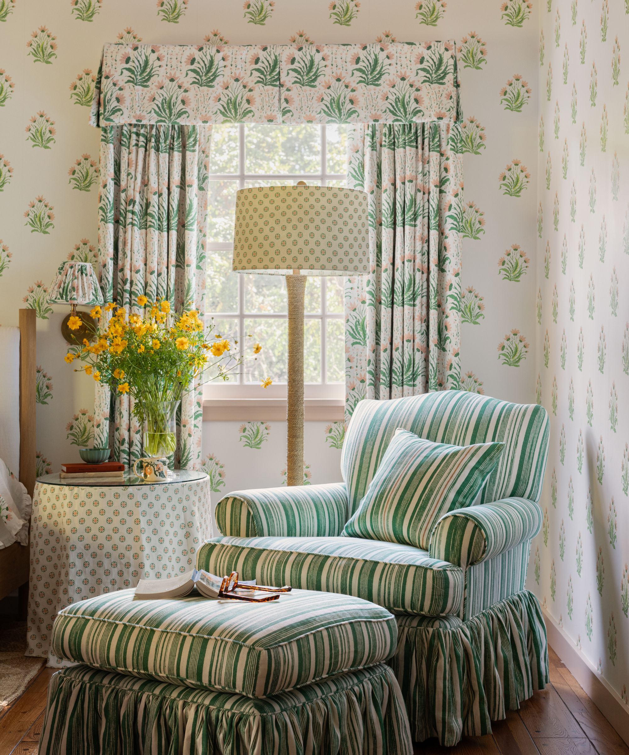
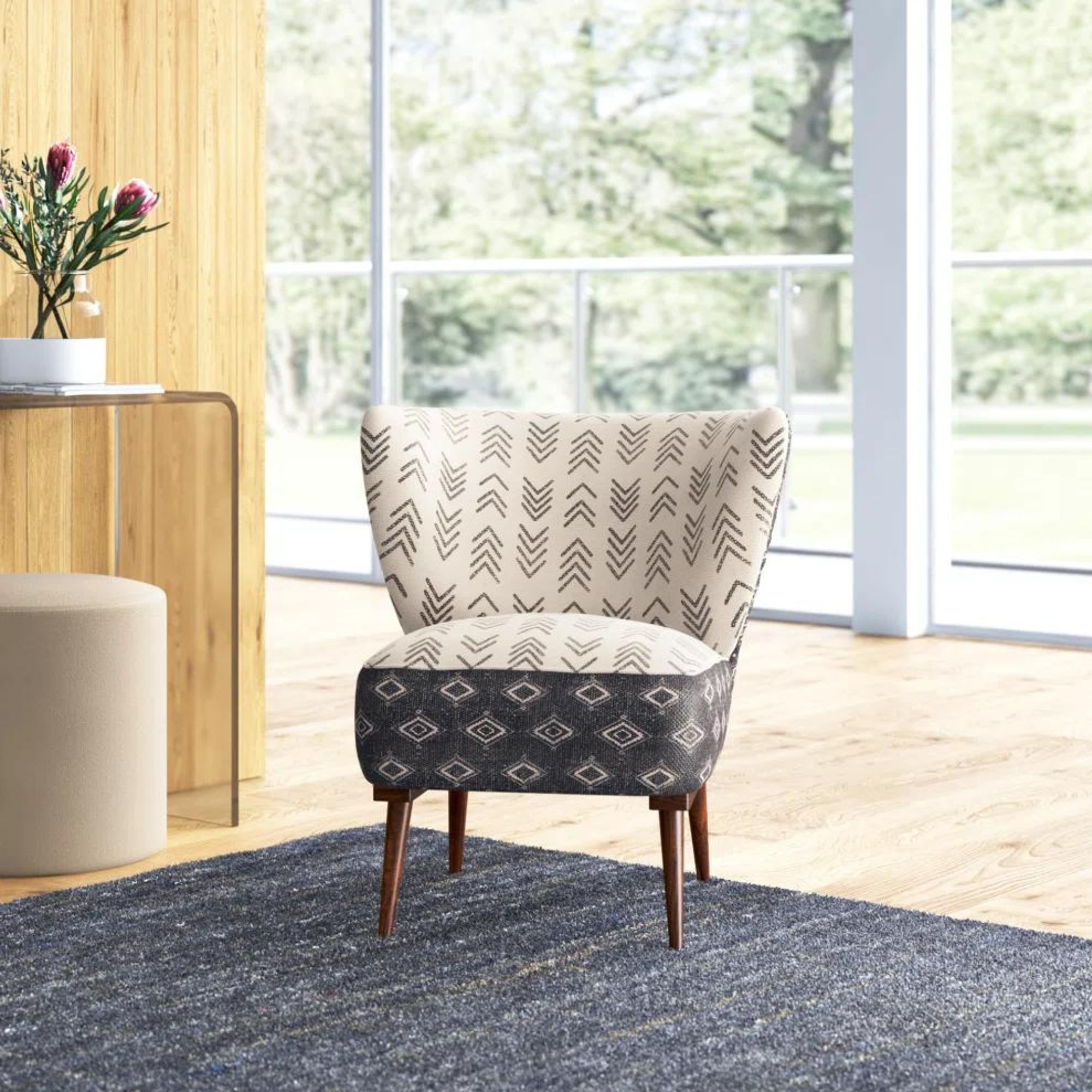
Color isn't the only consideration when it comes to pattern – scale has a sizeable impact on how patterns look when placed side by side. Placing smaller patterns alongside larger ones will create balance and help you avoid visual overwhelm.
'Mix large and small patterns – don’t use all dense, detailed patterns, as that will feel too busy and a bit fussy,' says Anna Burles, co-founder of design studio Run For The Hills. 'So mix smaller prints with larger prints and some which have very little print and are more about texture. Add a few textiles in the mix that aren’t so busy or colorful, which help tie the other bolder ones together.'
'Pay attention to the scale of the pattern. The key is to avoid the same scale of patterns next to each other,' adds Lance Saunders, director of design at Philadelphia-based Stokes Architecture & Design. 'Also, think about the style and period of the pattern, and match like with like in that way.'
As Bailee notes, 'too many large patterns all jumping out for your attention can push the boundaries of eclectic style,' a trending look that's lovely, but can easily go over the top. 'For me, Kit Kemp is the master of mixing the bold and still achieving a whimsical, elevated space. When done correctly, bold pattern mixing can create a stunning and cohesive look,' she says.
3. Mix and match pattern types
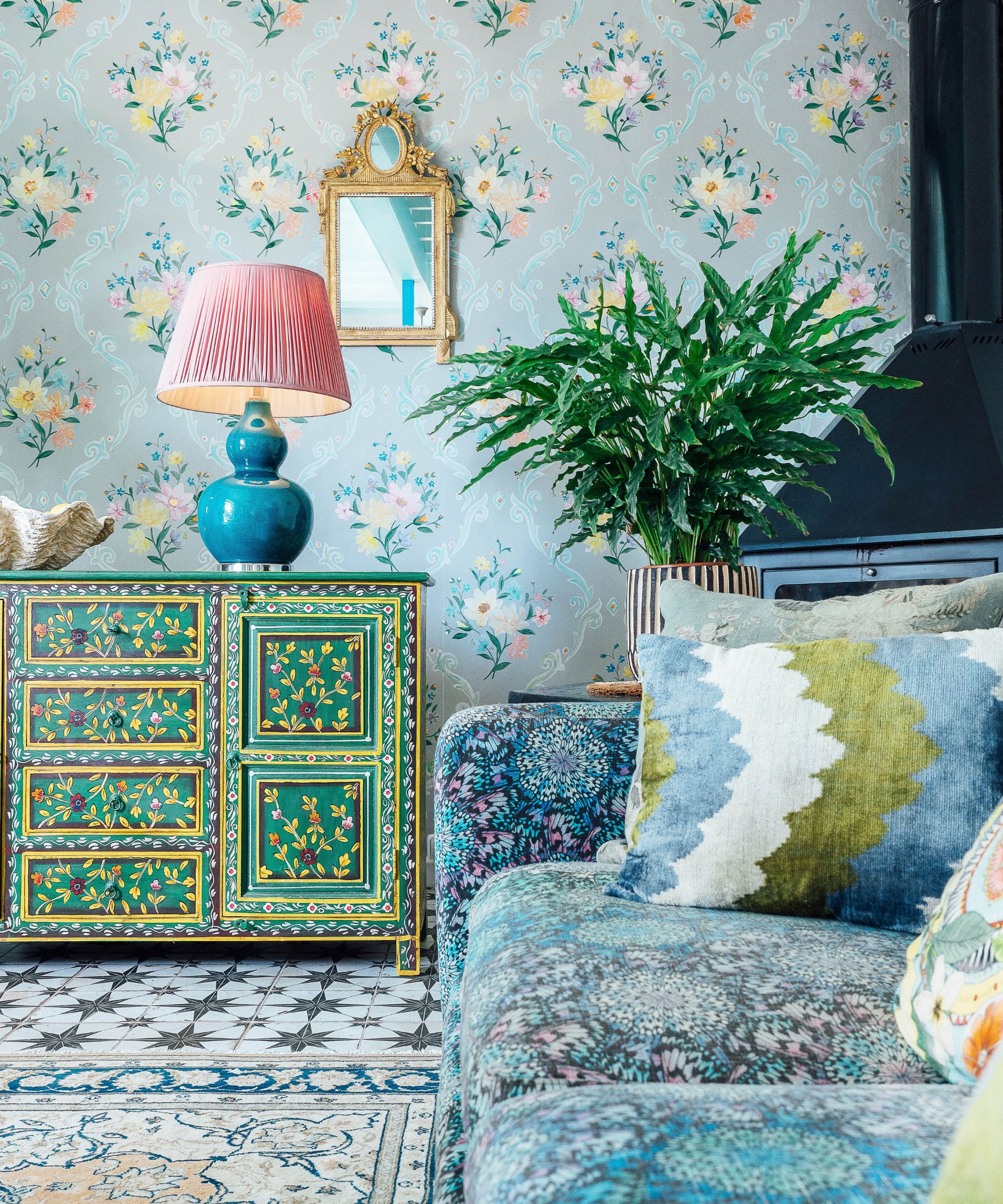
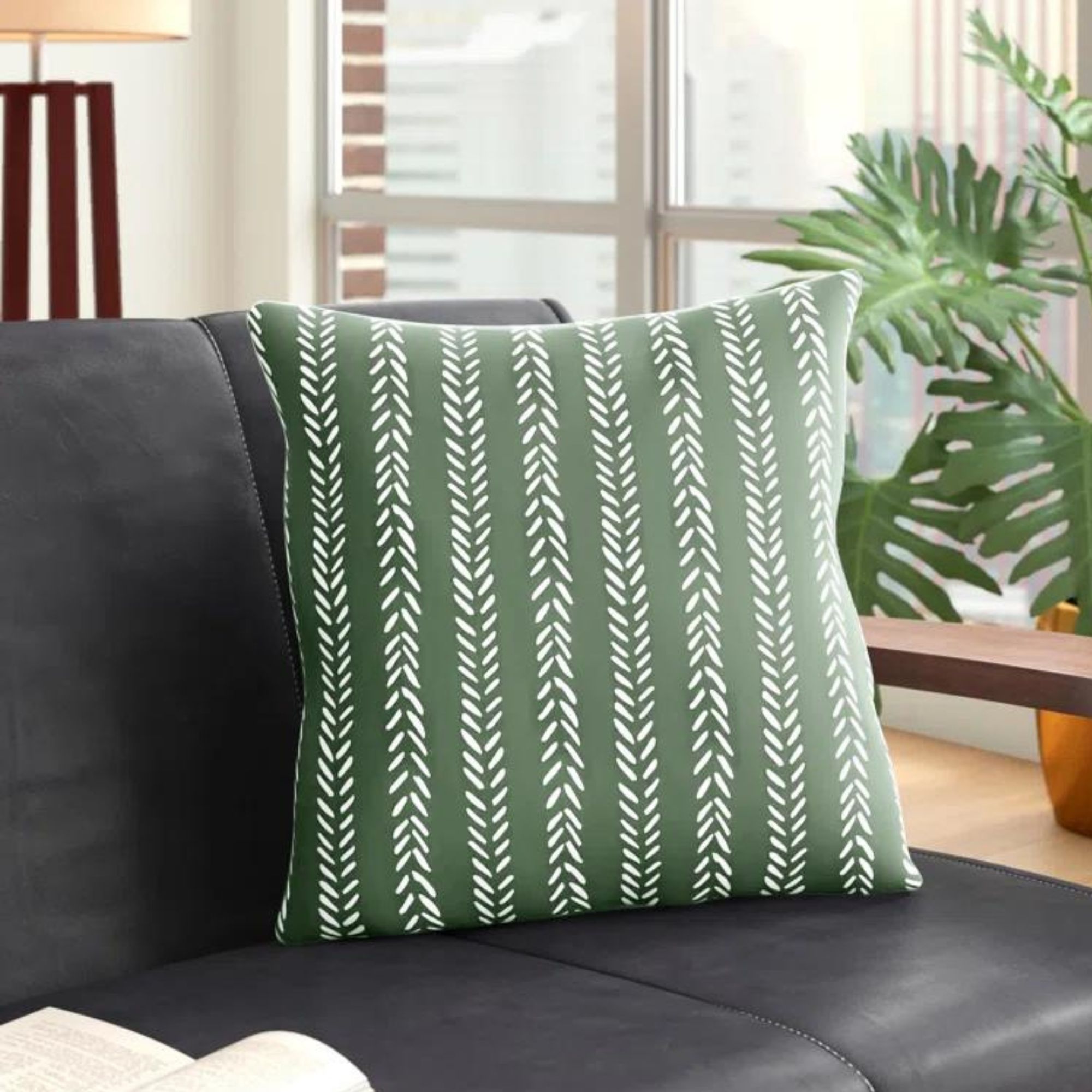
It might feel less overwhelming to stick with one type of pattern all throughout the space. If you love stripes, you might consider picking out three or four colors and widths to create a diverse yet cohesive design scheme. But designers say branching out, and combining different types of patterns, is the way to go for an elevated and inviting interior scheme.
'Don’t be afraid to mix different types of patterns and textures, such as combining a vibrant floral print with a geometric design,' says Jodi.
Just because they don't look lovely right on top of each other doesn't mean they won't work in a larger living room. Even small touches of different pattern types, integrated in accents like throw pillows and drapery, can make a room much more interesting.
4. Start with geometrics and stripes
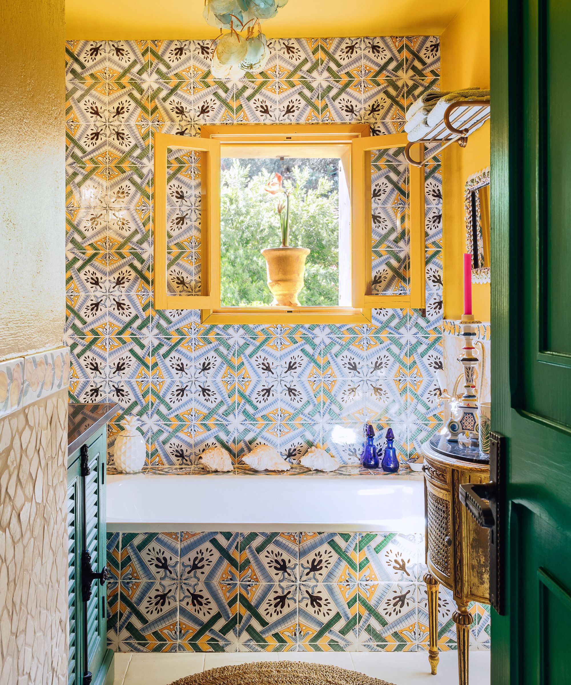
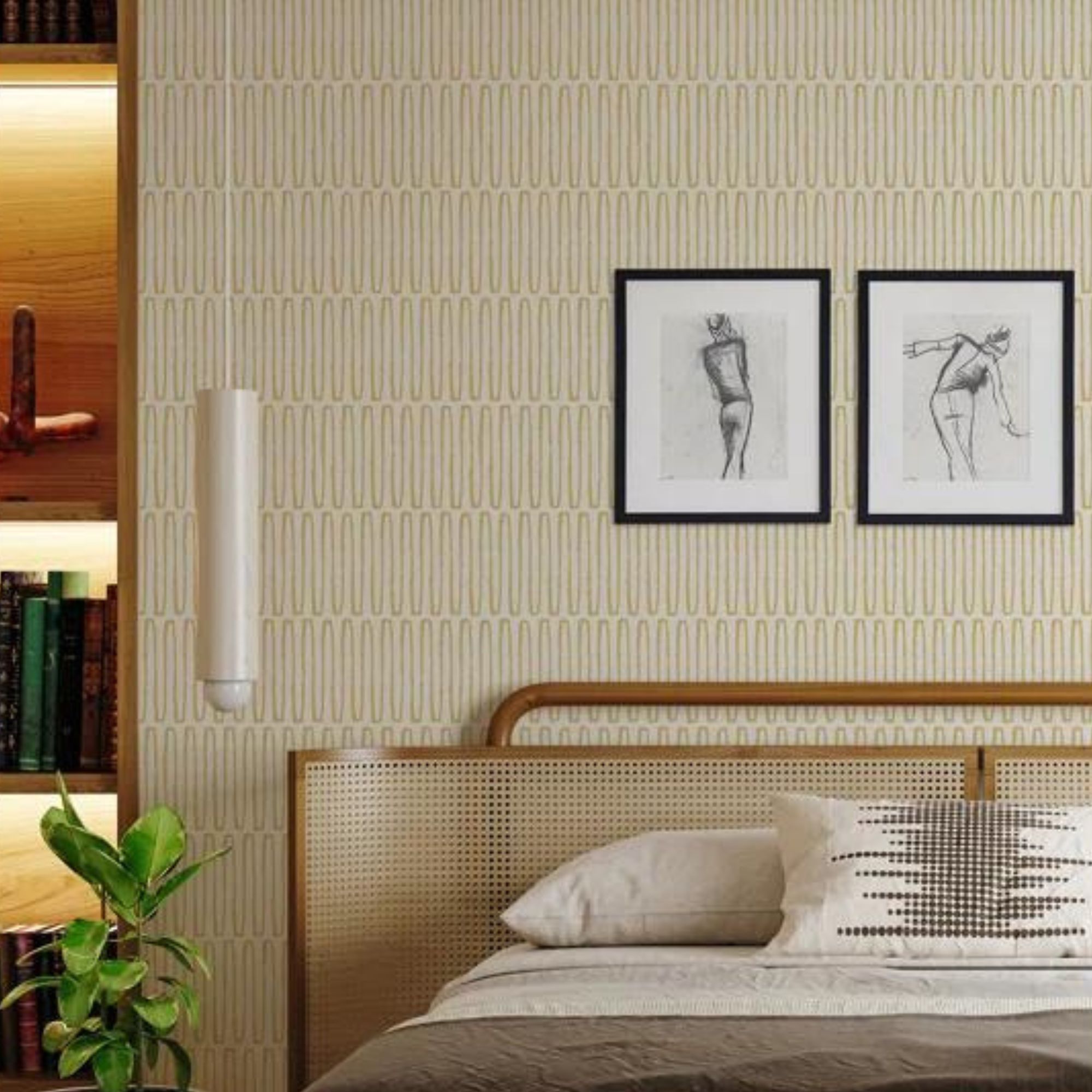
'Certain patterns mix well with almost anything, making them perfect for creating a balanced and visually appealing space,' says Jodi. 'Geometric patterns are incredibly versatile and pair beautifully with a variety of other designs. Their structured lines and shapes contrast nicely with more organic or intricate patterns. I love mixing geometric patterns with textured fabrics, as this combination adds depth and interest without overwhelming the room'
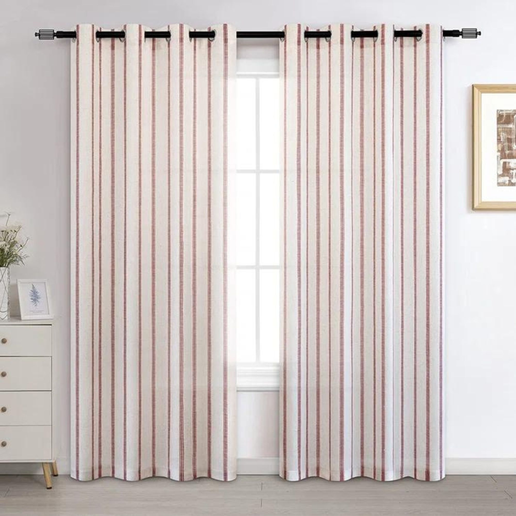
'Stripes are another classic choice that blends seamlessly with florals, abstracts, or any other pattern due to their simple and consistent nature,' she continues. Many designers agree that geometrics and stripes tend to pair nicely with a wide range of colors and other pattern types. Kathryn Hunt, founder and principal of New York- and Connecticut-based Kathryn Hunt Studio, agrees that stripes, along with 'checks and plaids,' mix well with a wide variety of patterns.
'Stripes and geometric shapes mix well with almost anything, and neutral tones anchor bolder hues without creating chaos. Avoid using too many patterns of the same scale and intensity, as this can look jarring,' adds Erik Munro, founder of design firm Munro.
Aman explains that stripes pair 'seamlessly' with florals, geometrics, and polka dots – and polka dots are 'a fun element' that blends with florals and abstract designs. 'Geometric patterns like chevrons and hexagons bring a modern touch and complement more complex designs. Checks and plaids offer a structured look that balances fluid patterns. Florals, when used in moderation, mix beautifully with stripes, polka dots, and geometrics,' she continues.
5. Use bold accents to create contrast
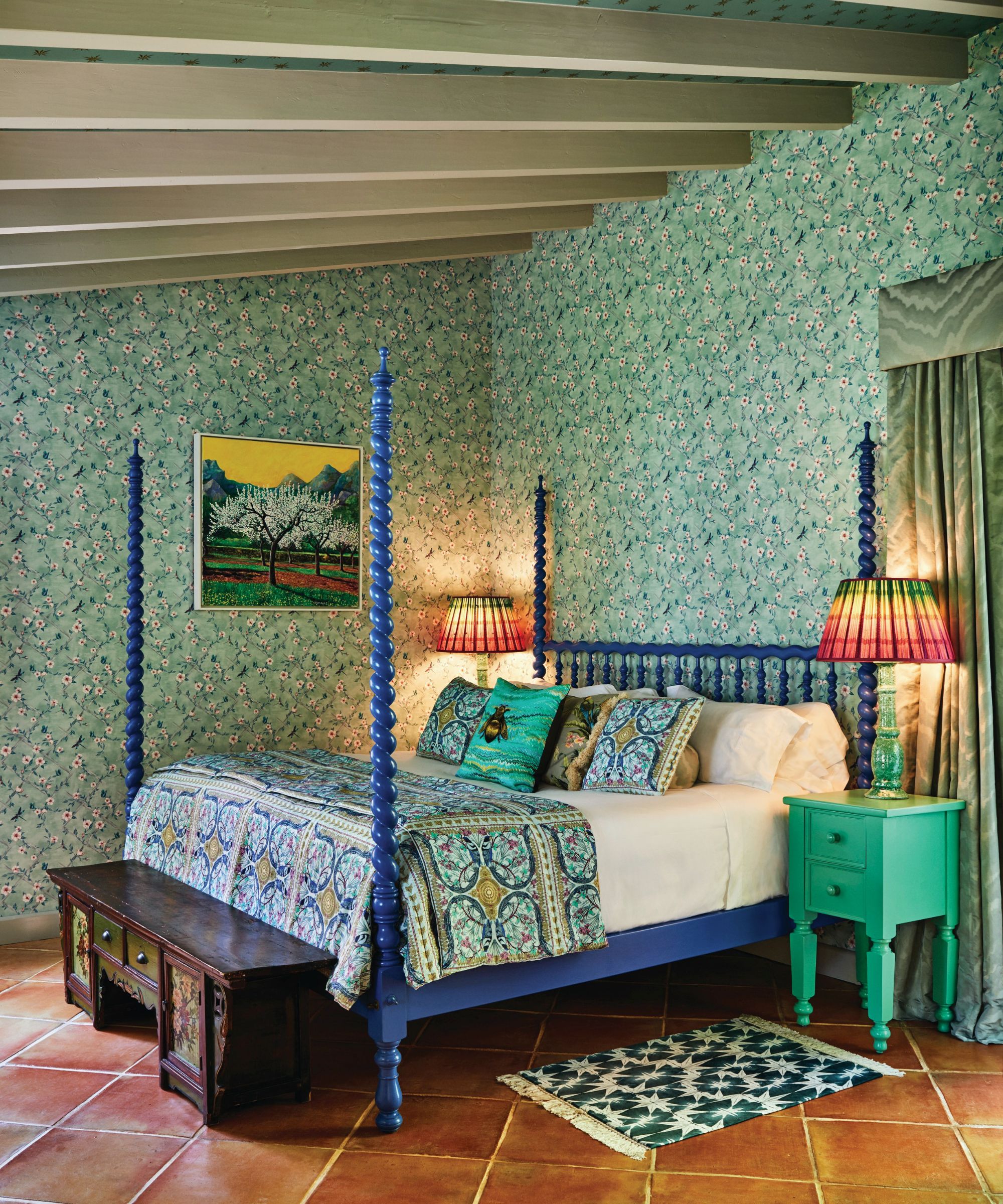
Although patterns in general often act as accents, it's important to designate a bolder accent or two when blending multiple patterns together in the same design scheme. As Jodi says, 'sticking to the same color or trying to match everything perfectly can make a room look flat and uninspired.'
By 'layering different tones and colors,' including dynamic complementary shades, you'll 'add depth and richness to your design,' she explains. 'This approach lets each element stand out while still contributing to a cohesive and inviting atmosphere,' Jodi continues.
Anna adds that the 80/20 rule when it comes to color applies to pattern matching too. By blending about 20% 'super poppy, colorful, and bold pattern' with about 80% 'still colorful or textural, but more pared back and subtle,' you'll be on the right track for a visually interesting but not overwhelming design scheme.
'It can’t be random – it needs careful consideration. Accents tend to work better if they are metallic, or if they are more punchy versions of a color,' she says. 'You can then have one pattern that introduces a "pop" accent – like a brighter or bolder tone or a pop of neon – but only one of the patterns can do this. The others need to "support" that bold accent. Or, just pick up the bolder shade in the piping of a cushion so they talk to each other but in a subtle way.
6. Start with neutral shades, then build
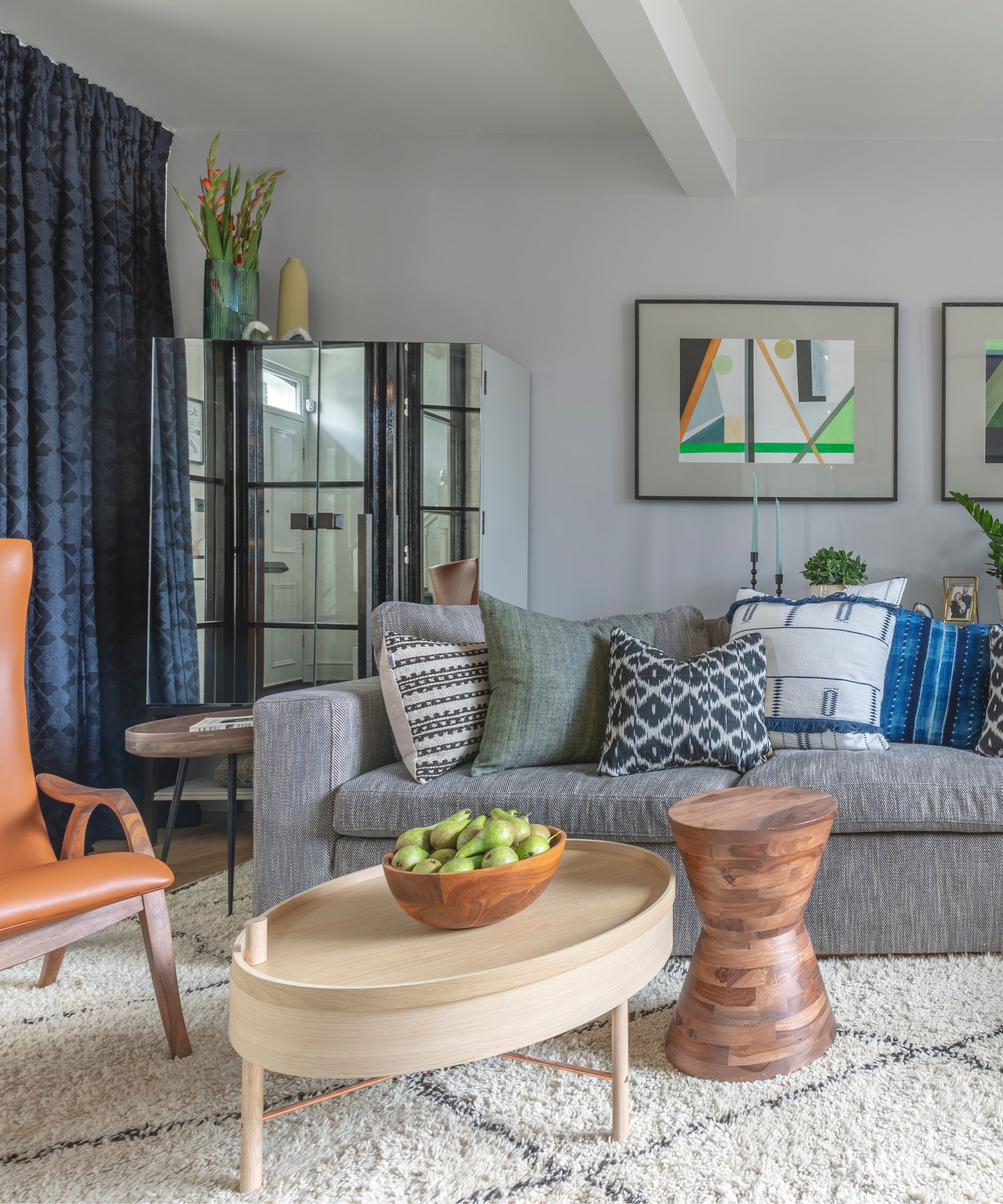
Even when layering bright, exciting hues through pattern, returning to the neutrals is key. Whether you start with a pared-back base or just bring in one or two more simple selections, 'using a neutral base' will 'keep the look grounded,' says Jodi. The neutrals you choose can lean a bit moodier too – it doesn't need to be all white and beige – but the basics will keep the scheme from going off the rails.
'I love mixing different hues with high contrast, like blue, black, navy, gray, ivory, and white. These colors offer a perfect blend of depth and sophistication, with the darker shades providing a dramatic backdrop and the lighter tones adding brightness and balance,' says Jodi.
'Blue and navy bring a calming, classic vibe, while blacks and grays add a touch of modern elegance. Ivory and white introduce a crisp, clean feel that ties everything together. By playing with these contrasting hues, you can create a dynamic and cohesive look that stands out beautifully,' she continues.
7. Take inspiration from fashion
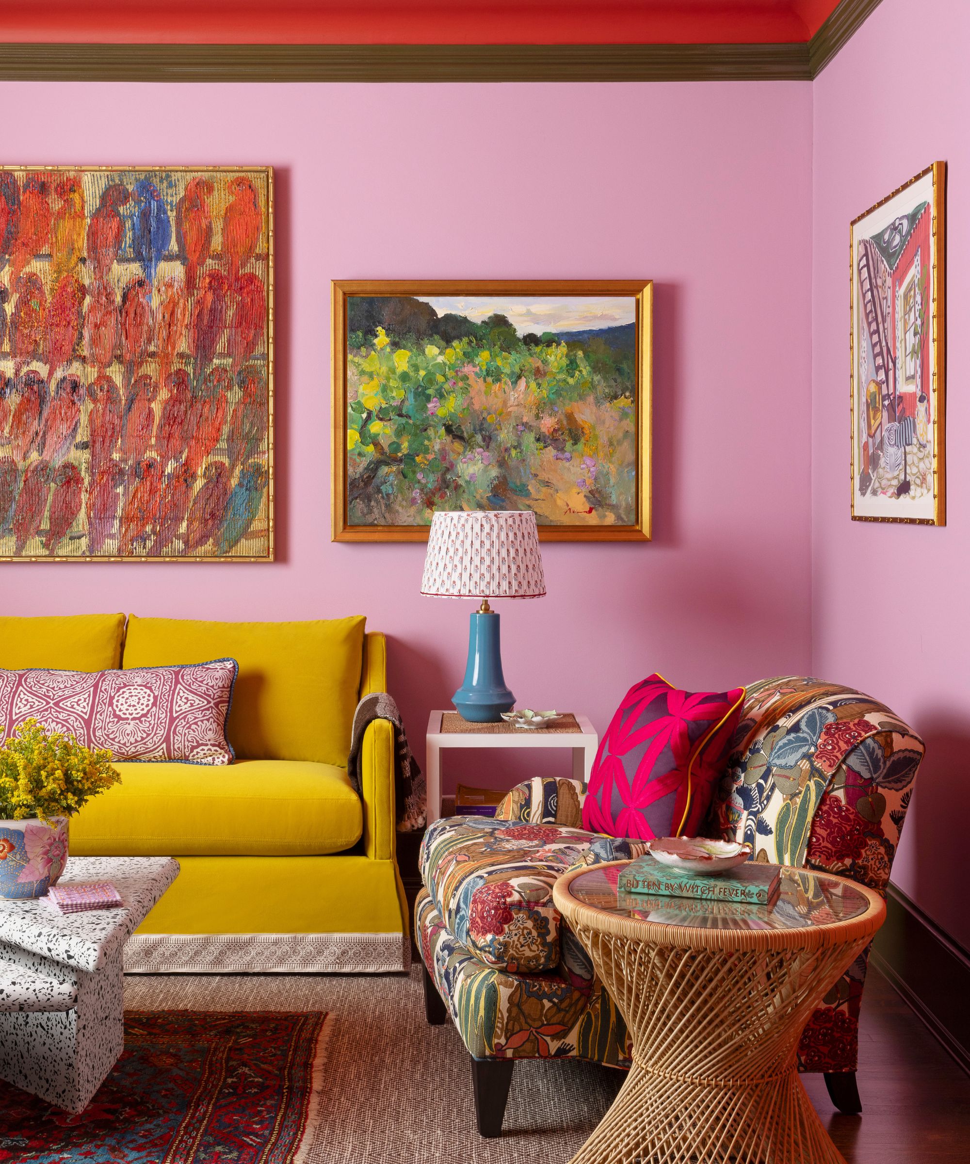
Many interior design trends intersect with key fashion trends, and the way we use pattern is no exception. If you're in need of a bit of design inspiration, look to the world of fashion, says Anna. She says that often, mistakes people make when blending patterns in design can be remedied by referencing the 'rhythm' of successful clothing designers.
'Use fashion to inspire you – look at the [ways] fashion designers or even high street retailers put colorful patterns together. You will start to see the rhythm and do's and don’ts will jump out at you. Be bold. Be brave. Don’t play it too safe. Just plan it carefully and it will look amazing,' she says.
8. Don't forget about texture
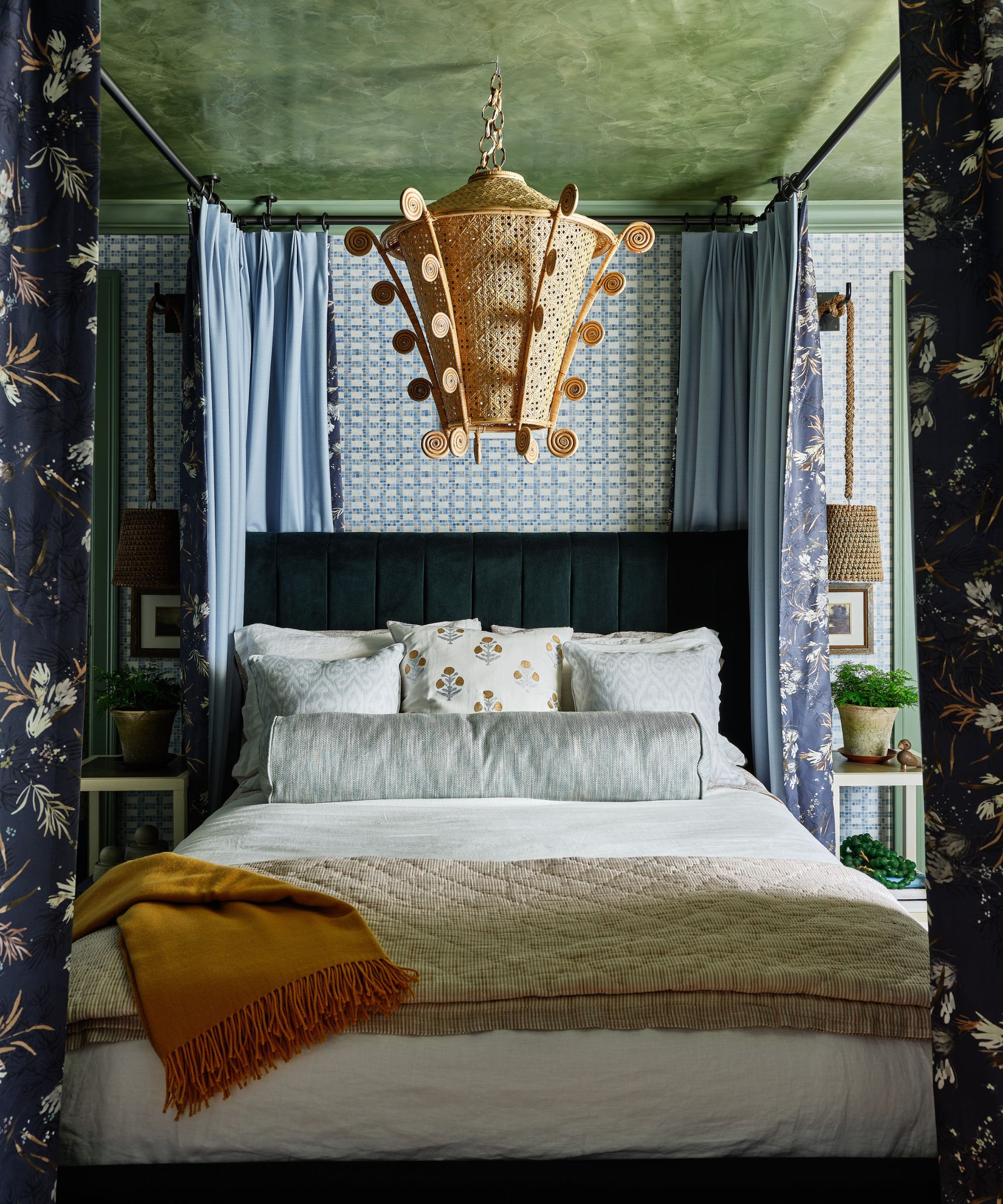
'Texture is also key, so think about pairing smooth, shiny fabrics with rough, textured ones for added depth,' says Aman. 'Choose one pattern to be the star of the show and build around it with more subtle patterns. Placement matters too – use bold patterns on focal points like walls or accent pieces. Always consider the room's purpose; for example, in a living room, balance bold patterns with calming elements for a comfortable vibe.'
Using texture in interior design is key to achieving a successful scheme, and patterns are great ways to introduce a bit of extra depth to your space. Seek out patterns that combine interesting colors with eye-catching designs, and take note of these features while pairing the patterns. Added texture can overcomplicate a pattern pairing, but it can also elevate the whole scheme – with careful consideration, you'll be able to get the look down.
9. Let the patterns clash a little
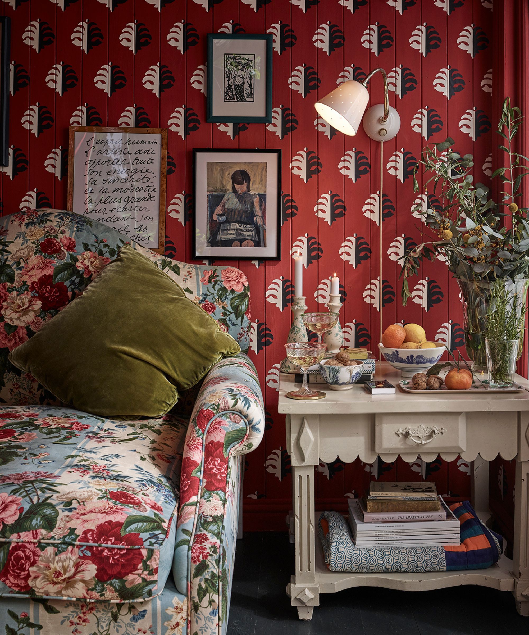
The best part about mixing and matching patterns is that the final result doesn't have to be perfect. In fact, as Anna says, too much perfection can become a design scheme's downfall. Look for cohesion and flow, but allow for contrast and a bit of mismatching. Sometimes, an unexpected or mismatched pattern can make the whole look sing.
'The key is to make sure the colors in all of your patterns work together – but the patterns can absolutely clash,' says Anna. 'In fact, sometimes it’s essential that they clash to look stylish and trendy rather than twee. If you play it too safe with pattern clash it can feel fussy and old fashioned.'
10. Take your time to perfect the look
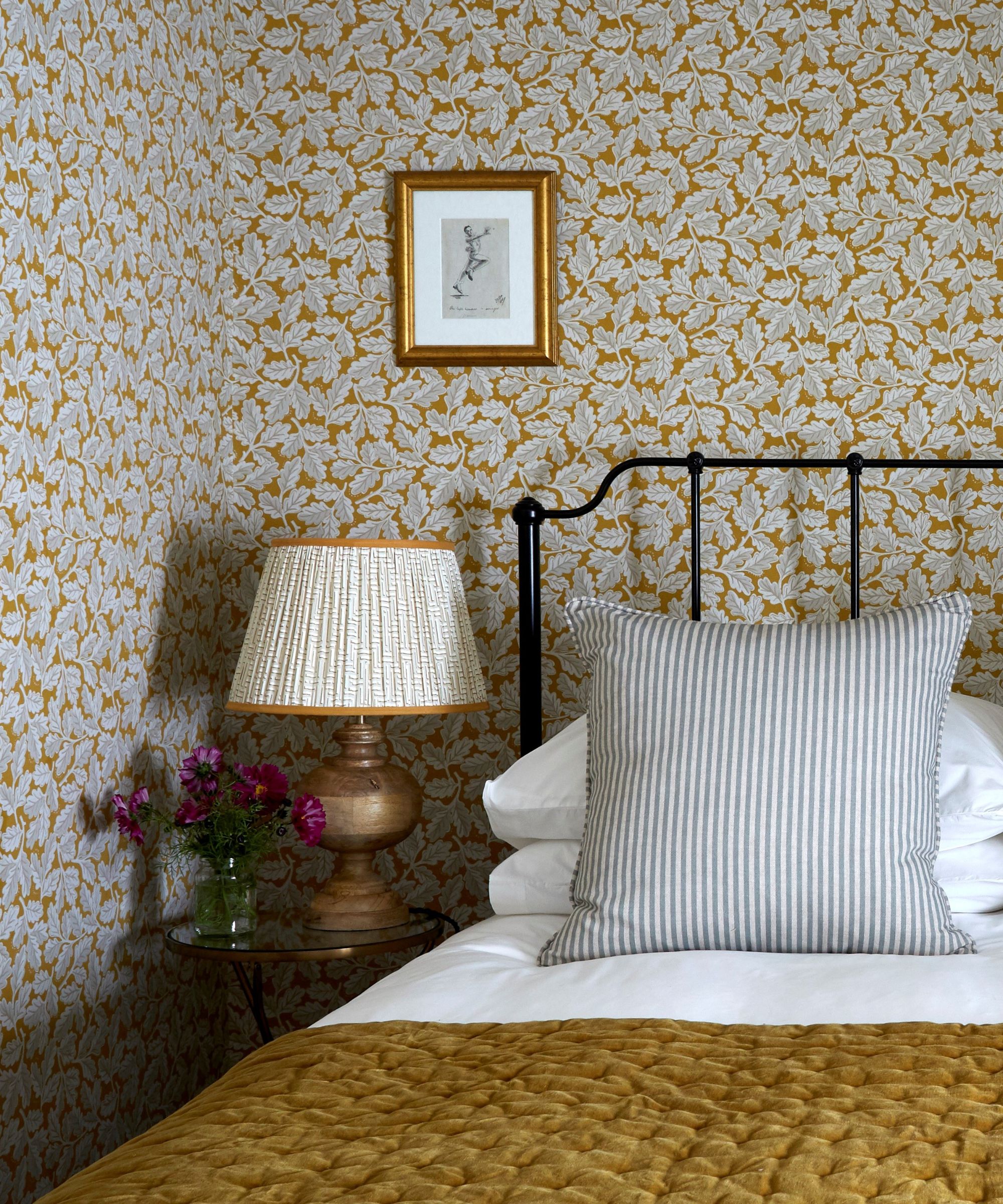
'Pattern mixing is an art, not a science,' says Erik. 'Trust your instincts and have fun with it. Start with a few key pieces and build from there, always stepping back to see the whole picture. Successful pattern mixing can add depth and personality to any space.'
Even the most experienced designers don't often get pattern pairings down on the first try. Part of the process (and part of the fun) is trying out options that don't look quite right before landing on the final product. Keep going and keep testing different combinations until you're left with a combination you love.
'The key is to test and adjust until you find the right mix that adds visual interest and personality to your space without overwhelming it,' says Jodi.
'Never shy away from using patterns in your home. You can always start small and gradually work your way up to larger, bolder designs,' Aman concludes. 'Choose something you love to look at and let that be your starting point. Patterns add personality and interest to any space, making your home uniquely yours.'
Sign up to the Homes & Gardens newsletter
Design expertise in your inbox – from inspiring decorating ideas and beautiful celebrity homes to practical gardening advice and shopping round-ups.

Abby was the Interior Design News Editor at Homes & Gardens and is now studying for her Master's degree in Journalism at City University, London. Prior to joining our team, she worked with Better Homes & Gardens, where she wrote and edited content about home decor, gardening tips, food news, and more. She studied Journalism and English Literature at New York University and moved to London to pursue her love of writing in 2023.
-
 Ina Garten's storage pantry is an insightful window into all of the best cookware used by the chef – and it's easy to recreate on your kitchen shelves from $48
The beautiful dishware in The Barefoot Contessa's Hamptons pantry showcases the tools she uses most often to cook – this is exactly how you replicate it
By Sophie Edwards Published
-
 Extend the lifespan of your appliance with 5 simple but crucial washing machine maintenance tips
From cleaning the filters to keeping the door open, experts reveal the washer tips they swear by
By Andy van Terheyden Published
