How to choose the best paint colors for awkward spaces – expert tips and tricks from designers on tackling tricky rooms
From long, narrow living rooms to tiny box rooms and attic bedrooms, here's how the experts pick colors for awkward spaces
When choosing what color clothing to wear, certain shades suit some complexions more than others. And the same rule applies when choosing which color to decorate your rooms. Depending on the size, shape, and aspect of your room, certain colors will enhance what you have, and others just simply won't feel right.
See your walls as a blank canvas, and consider what feeling you'd like to create from your artwork. Do you want it to feel open and airy, or cozy and cocooning, do you want to foster creativity and socializing, or relaxation?
Once you've planned your room's purpose, there are some clever paint ideas you can use to help you achieve it. And your room's specific size and shape must be taken into account of course.
Whether you've got sloped ceilings, a tiny box room or a long, narrow space, here are the tricks of the trade you need to know about to maximize what you have.
An attic bedroom
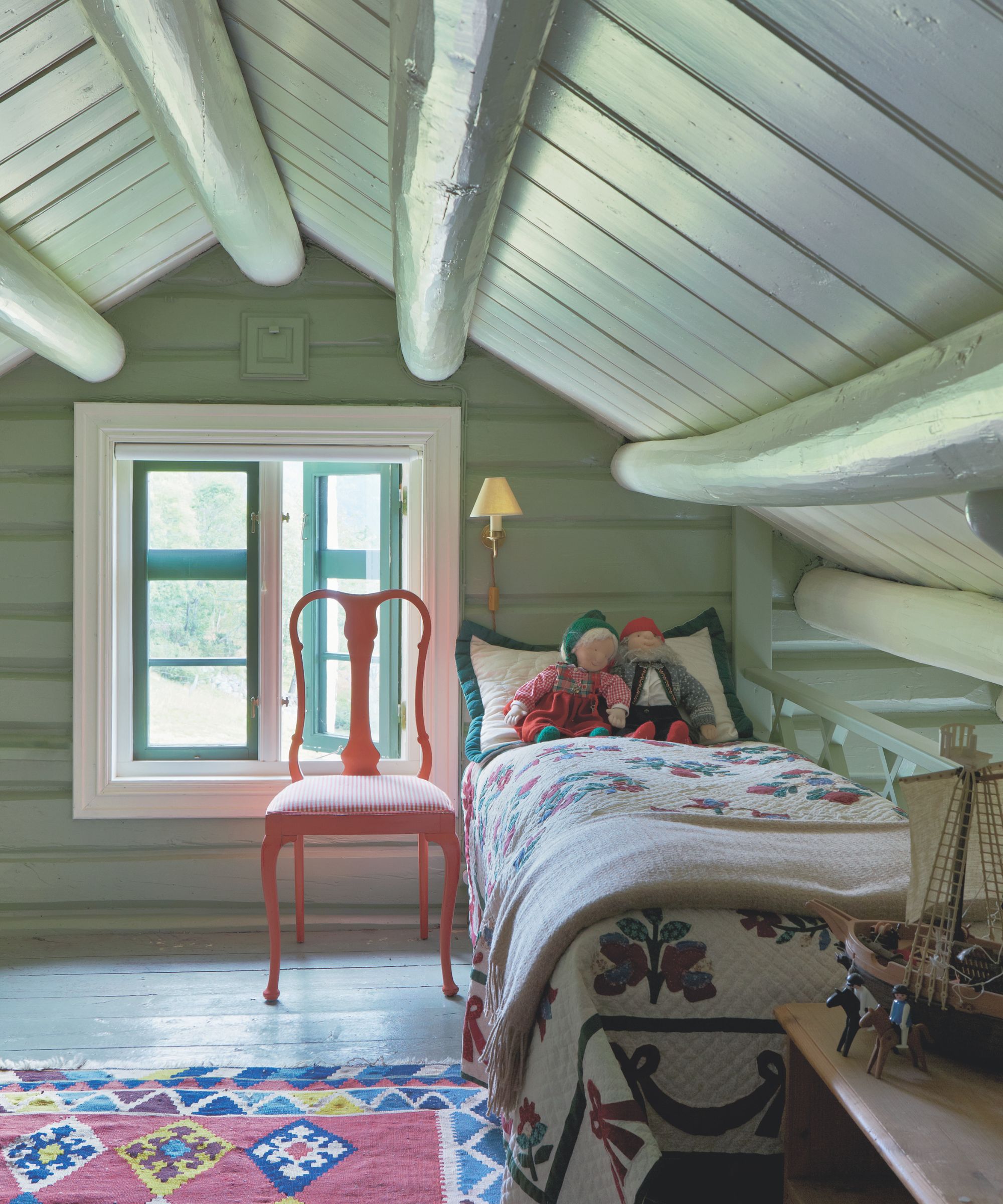
While unusually shaped rooms can bring character and charm, they can also be fairly trick to decorate. Features such as sloped ceilings or unusual shapes can sometimes make a room feel smaller than it is, but color can be used to visually open up the space.
'Unusually shaped rooms can either be celebrated for their uniqueness or subtly disguised by cleverly using paint,' says Anna Hill, brand director and color consultant at Fenwick & Tilbrook.
'If a room's shape feels awkward and you’d prefer not to highlight it, consider painting the entire space in one cohesive color, including the ceiling, especially if it's sloped – this is know as color drenching. This approach minimizes the visual impact of any irregularities, preventing the eye from being drawn to breaks in color.'
Design expertise in your inbox – from inspiring decorating ideas and beautiful celebrity homes to practical gardening advice and shopping round-ups.
In the above scheme, the soft green paint is used on all the walls and ceilings to minimize the impact of the sloped ceiling and beams and make this child's bedroom feel larger and inviting.
A long, narrow living room
Rooms that are long and narrow are notoriously difficult to decorate, zone and furnish. The aim with these rooms is to prevent them feeling like a corridor and give a purpose to both ends of the space.
Emily Kantz, color marketing manager at Sherwin-Williams, suggests three very different ways to use paint in rectangular rooms to make them feel more square.
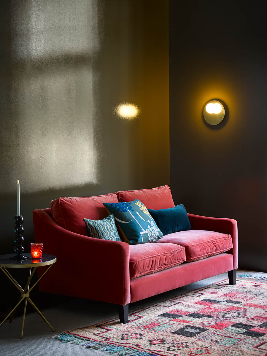
'A clever design choice for long, narrow rooms is to go for a two-tone approach, and try a deeper shade on the shorter walls and a lighter shade on the longer walls,' says Emily. 'This will create the illusion that the room seems more square shaped.'
'You could also use an overall off-white shade such as Sherwin Williams' Egret White SW 7570, which can make the room appear larger,' she says.
'Alternatively, go bold on all walls and incorporate a deep navy such as Naval SW 6244 or a dark green such as Pewter Green SW 6208. Darker colors make the walls recede also allowing the room to feel larger,' she adds.
Here, the darker black paint is used on the smallest wall, while the lighter bronze color is used on the longest wall. This, along with the reflective qualities of the high-gloss metallic bronze paint, work to visually enlargen the space and balance out the length of the walls.
An open-plan living space
In large, open plan spaces with multiple zones, such as kitchen diners or living rooms and playrooms, color can be used to visually divide up the two (or more) areas.
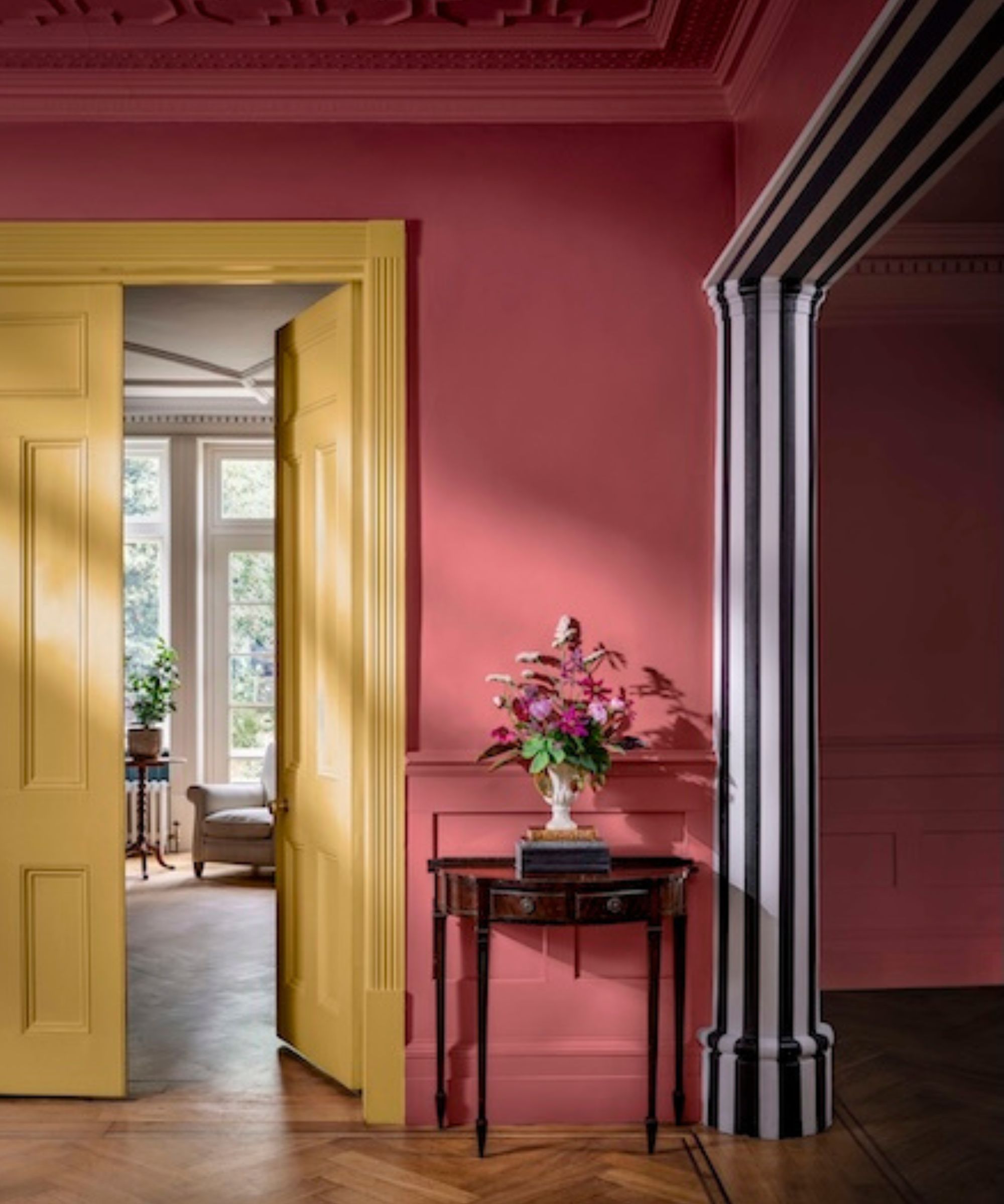
'In many open-plan spaces with a transition between different functional areas, a pop of color at the threshold - over the ceiling and down to the floor - can be a fun and effective way to visually separate the zones,' says Anna. 'This can work really well even when the scheme is neutral elsewhere.'
Making the divisions between the two functional zones clear is essential for preventing your space from feeling too large, chaotic and un-cozy.
In this open plan entryway, the black and white striped design splits the room in two, making the two spaces feel separate while keeping all the benefits of open plan. It's also a fun and quirky design feature that gives the muted, earthy color scheme an edge.
A room with a nook
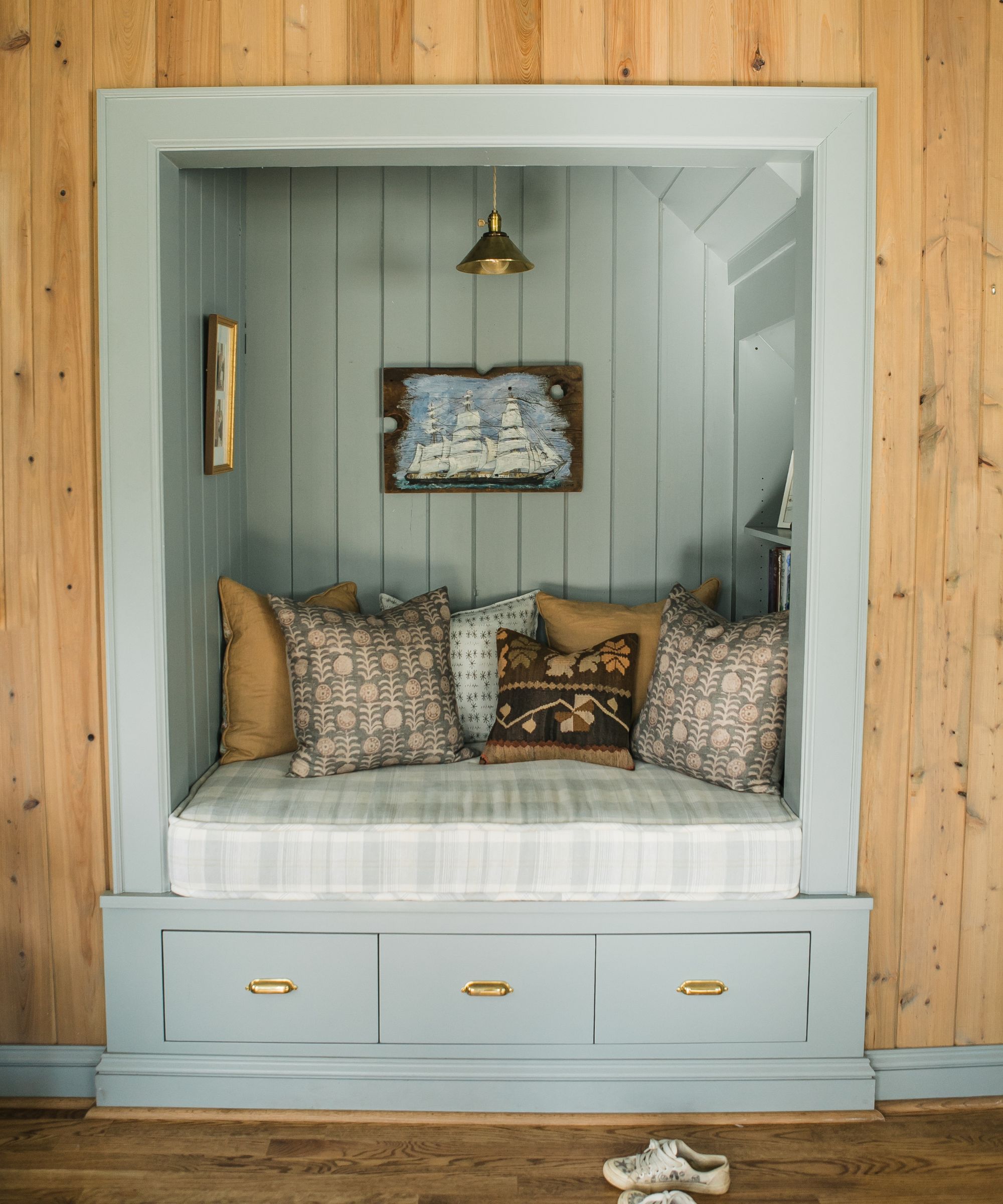
If you're lucky enough to have a room with a built-in nook, you can use color to enhance this and make it fit for your intended purpose.
'Rooms with nooks can be made to stand out beautifully by painting them in a different color, perfect for creating cosy reading corners or inspiring workspaces,' says Anna.
'Choose paint colors that align with the room’s purpose and your mood – for instance, an inky blue for concentration, or a vibrant yellow like Gorse for creativity.' In this reading nook, the soft blue contrasts against the wood paneling and creates a tranquil escape that's perfect for curling up and getting lost in a good book.
A tiny room
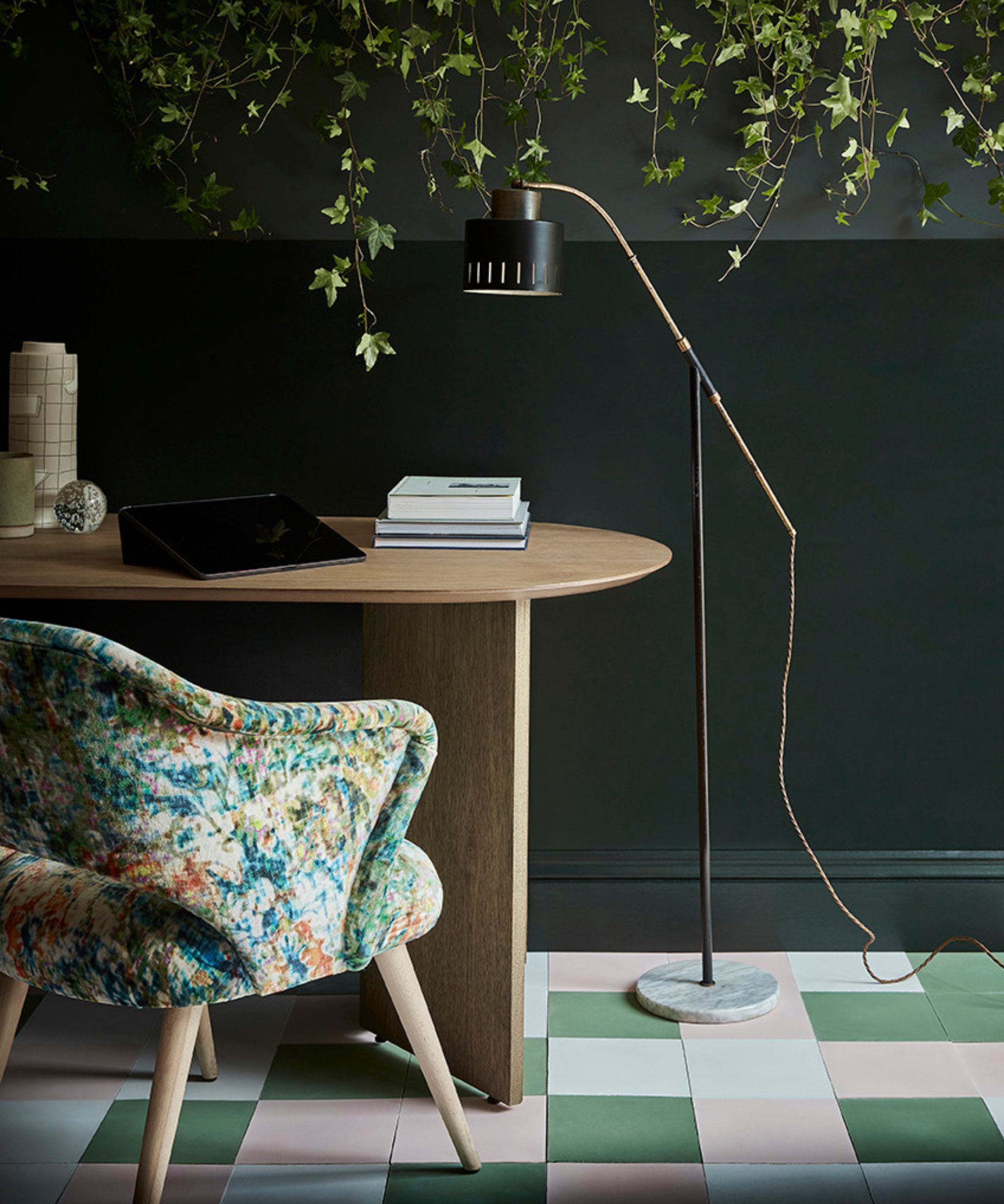
Contrary to popular belief, you can embrace the cozy and cocooning factor of a small room by decorating dark.
'It is commonly thought that in smaller rooms it is best to opt for a neutral scheme, but often the results can be a little disappointing, and you can be left with a room that feels a bit dull and uninteresting,' says Ruth Mottershead, creative director at Little Greene.
'Why not embrace a wonderful cocooning and rich color which will serve as a focal point, drawing visual attention and creating a sense of drama, as well as making a real design statement and create a space that will feel cozy and wonderfully enticing,' adds Ruth.
This home office, a dark green works to bring drama and decadence to the space, making it feel rich and cozy – the perfect cocoon for maximizing concentration.
A slim hallway
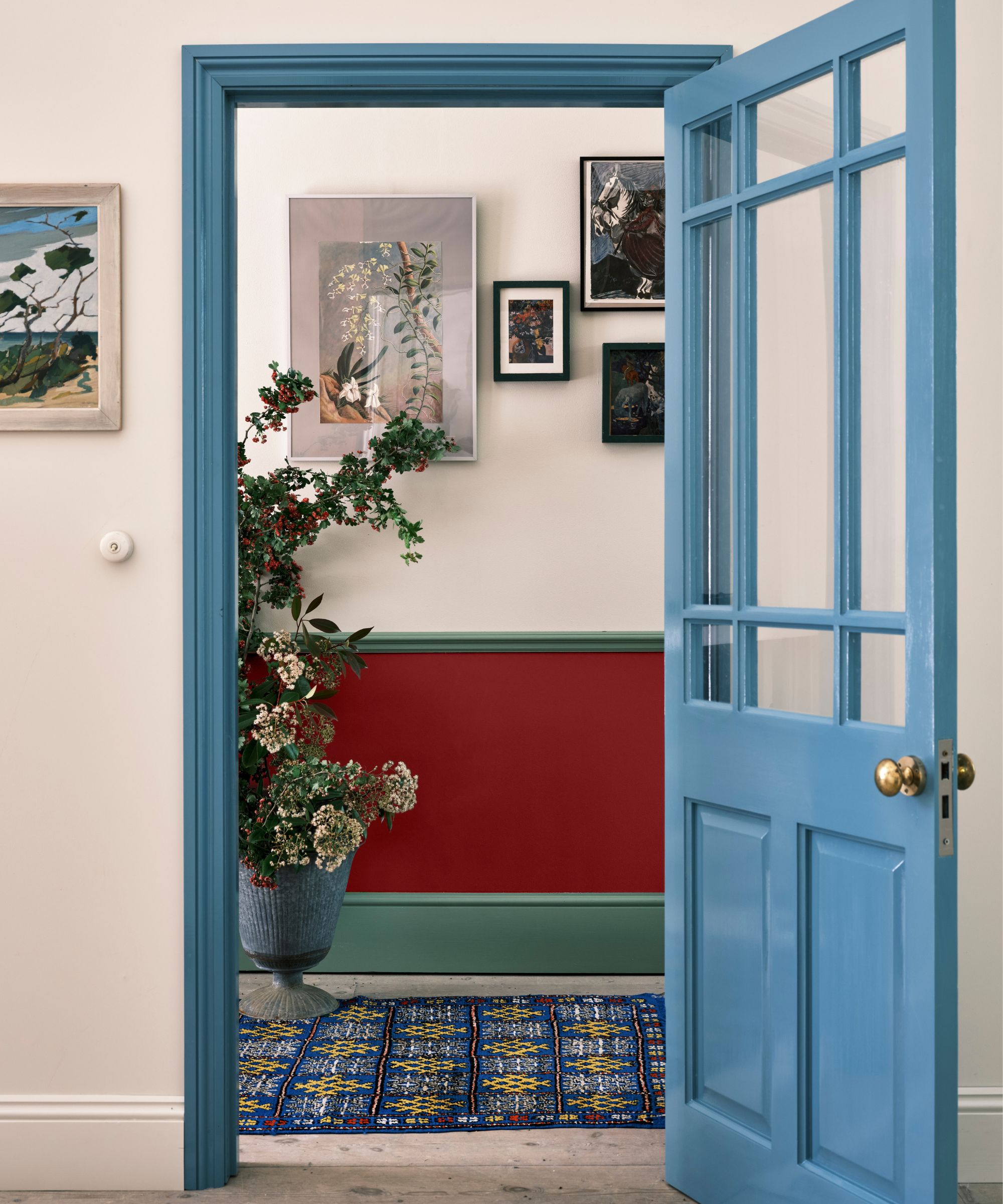
More often than not, entryways are long, slim spaces that receive minimal natural light. As the first thing your guests see when they enter your home, you want it to set the right impression, and using paint in a clever way can do just that.
'Paint is a brilliant tool for creating a 'trompe l’oeil' effect within a space, drawing the eye and playing with the framework of a room,' says Ruth. 'This can be very useful in tricky, narrower areas of the home, such as a hallway.'
'Consider pairing a darker shade on the lower half of the walls such as Little Greene's earthy Portland Stone Dark with the lighter shade, Portland Stone on the top half of the wall,' Ruth continues. 'This combination of a tonal play of light and dark will instantly make the space feel more expansive and light filled .'
Choosing colors for an awkward space can be tricky, but the right shade can really make a space. Usually, the right approach is to lean into the awkwardness of the space, embrace and even enhance the quirks.