How to choose the best exterior color combinations to boost curb appeal
Our interior design experts give their advice on how to choose the right colors for your exterior
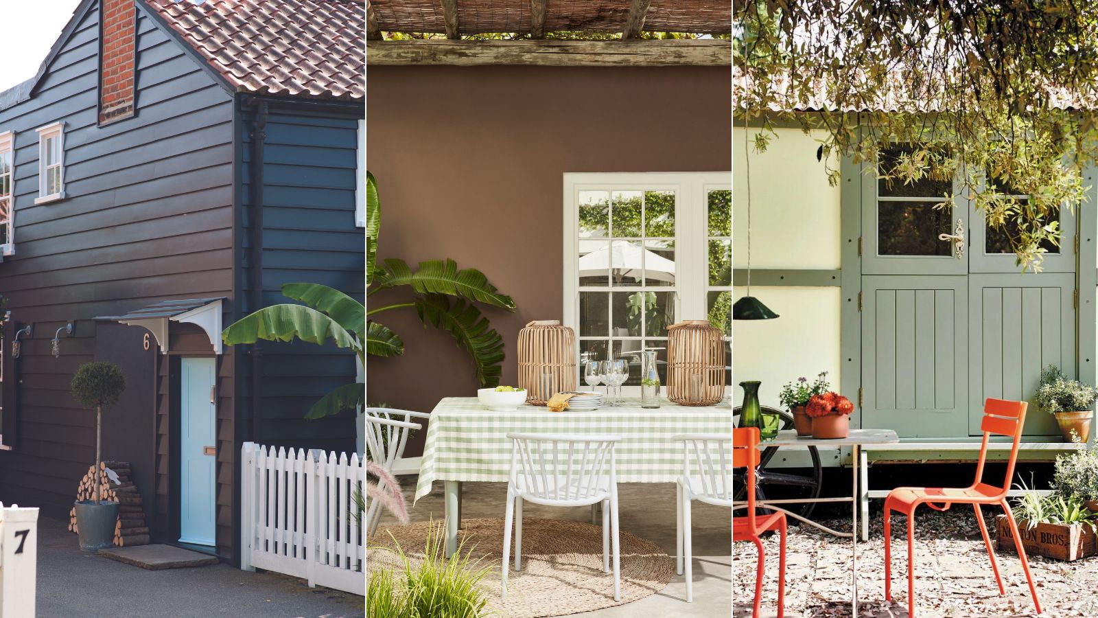

Be honest, how often do you think about your exterior spaces and the colors they’re currently painted? When it comes to thinking of paint ideas, most of us tend to focus on the interior spaces that we spend most of our time in. But exterior paints are coming to the fore, with plenty of on-trend paint colors designed to paint your house, fencing and garden furniture in an exciting range of shades.
From classic neutrals to pops of color, the right paint choices can make your house look more expensive or work with your garden color schemes for a more attractive outdoor space.
How to choose best exterior color combinations
The exterior color choices you make should reflect you and your own personal style as much as the inside of your home. But, when it comes to the exterior of your house, it’s worth remembering that this is the first thing that you, your neighbors and anyone visiting your house will see. It’s worth following the rules when it comes to finding your perfect color, such as making sure you test your colors first.
'One of the biggest mistakes is not sampling your chosen color on a small area of your home’s exterior,' says Tash Bradley, director of interior design and color psychologist at Lick. 'Colors can look dramatically different in various lighting conditions and on different surfaces. Always test first to see how the color interacts with your specific environment. Remember that exterior colors appear 50% brighter than they do on a sample card, this means you might need to choose a shade darker than you initially thought to achieve the desired effect.'
What to consider before you start
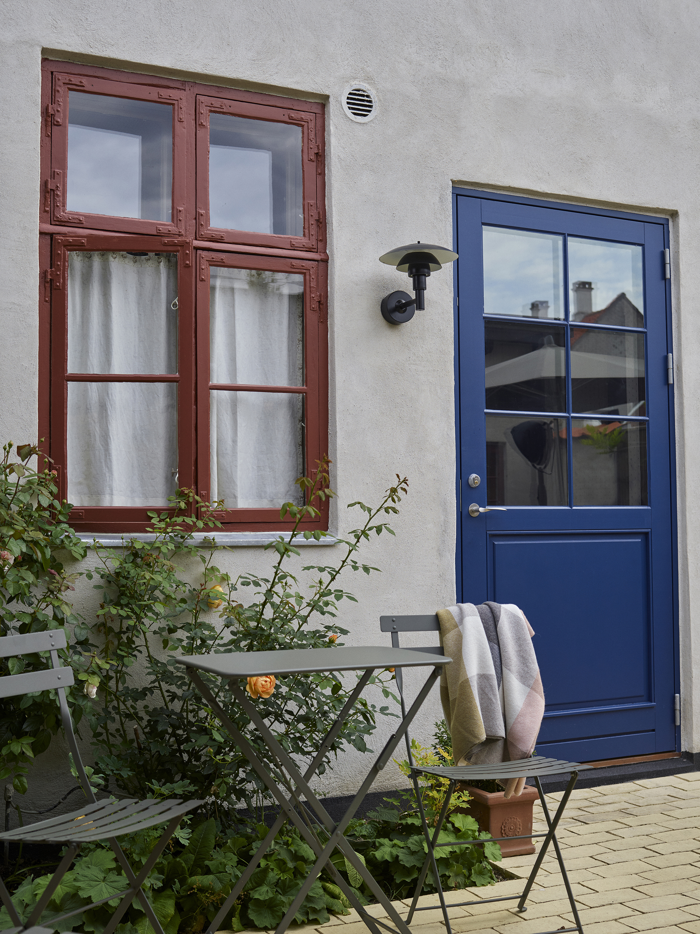
Photographer: Asger Mortensen, Wester Agency
Farrow & Ball paint colours Etruscan Red No.56 and Serge No.9919
Before you even start to think about choosing paint colors, you need to think about what you’re trying to say and express with your choices. Tash suggests taking inspiration from where you live, 'Look at your home and other similar houses in your area and decide what appeals to you. Do you have a glorious front garden that you want to show off, or do you live on a street where everyone has colorful houses or classic red brick? Deciding whether you want to stand out from the crowd or blend in with your neighbors should be your first port of call.'
Just as with choosing interior colors, you need to decide if you want your house and garden to stand out, or whether you want them to blend into the rest of the landscape and neighborhood. There’s nothing intrinsically wrong with either pick, but your decision is likely to have a big effect on the colors and combinations that you should choose.

Tash Bradley is home decor brand Lick’s Director of Interior Design and Color Psychologist. Tash is driven by her mission to help you understand color, the emotional reaction we have to it, how it impacts our everyday lives and the spaces we call home. Not only is Tash the curator of Lick’s distinctive color collection, but to date, she’s had color consultations with over 3000+ decorators across the UK, EU, and US, giving them the color confidence they need to transform their homes into spaces that they love.
Don’t dismiss classic combinations
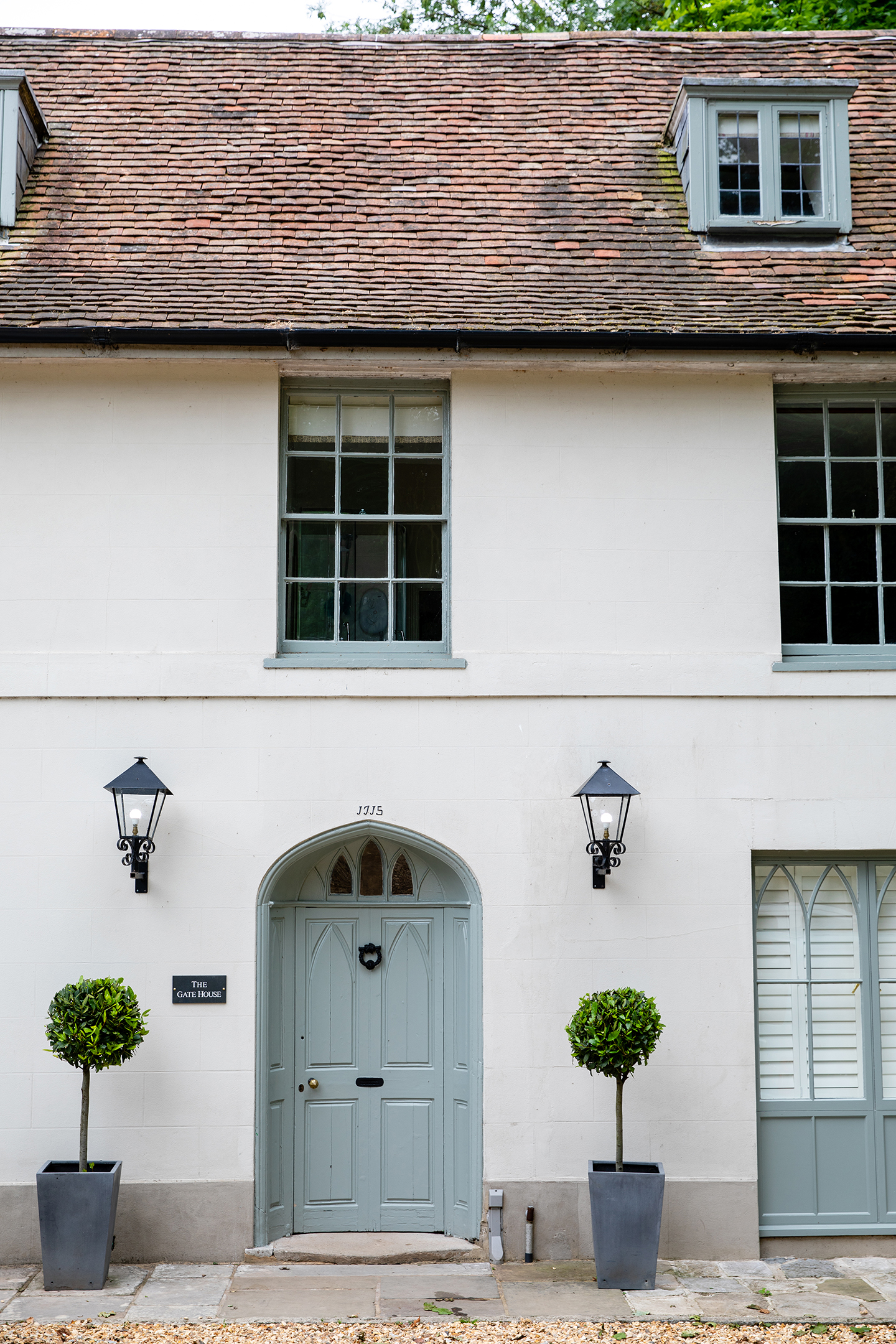
Farrow & Ball paint colour Pigeon No.25
'I don’t think you can go wrong with beige and white paint for your exterior,' explains Amy Youngblood, founder of Amy Youngblood Interiors. 'Paint the main surfaces beige or even taupe with a crisp white trim and you have a very classic, curb-appealing look. If you want to spice it up a bit, go with a white and black combination. I love the crisp look of a white house (especially white brick) with black trim and doors.'
It's a sentiment that Tash agrees with, 'A timeless combination to take inspiration from is an off-white paired with a classic beige, such as Lick Beige 01 and Lick White 03. The neutral tones blend seamlessly with natural surroundings and offer an elevated alternative to brilliant white, which can look harsh, especially in areas with grey light. Earthy, muddy colors with grey undertones tend to look more sophisticated and harmonious. This combination is fresh and sophisticated and is the perfect backdrop for contrasting foliage and seasonal blooms.'
The beige-gray or ‘griege’ color trend is proving incredibly popular, with it being one of the on trend gray options for 2024. But it can also be an excellent choice for your exterior, giving a neutral tone more interest. Softer, gentler and neutral tones are welcoming and comforting, offering a clean look that will stand the test of time.
Work with the surrounding environment
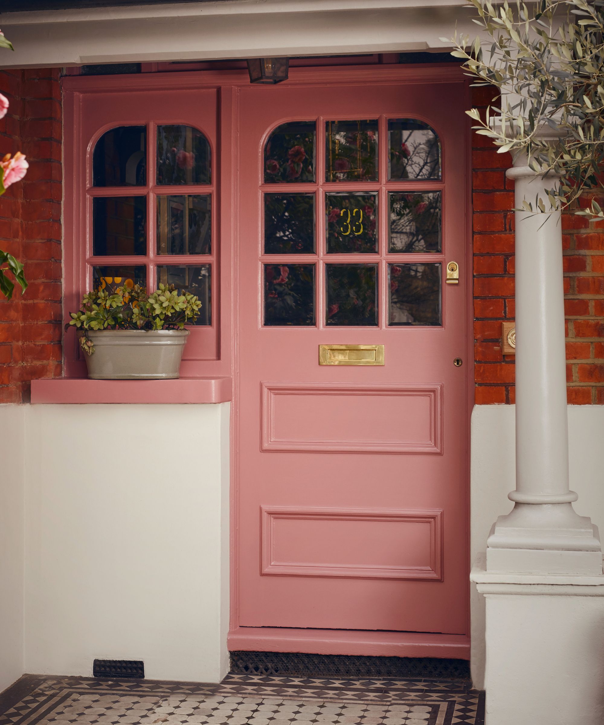
'Incorporating earthy tones and into exterior color schemes is a popular choice,' explains Martin Waller, founder of global design house Andrew Martin. 'Earthy colors such as terracotta, olive green, and warm browns create a harmonious connection with nature, providing a soothing and grounded aesthetic. These tones blend seamlessly with natural surroundings, making them an excellent choice for those who want their outdoor spaces to feel more organic and serene.'
These are tones that can work equally well on your house or in your garden, giving a finish that’s sympathetic to the environment around it. Taking this further, you can also choose your colors according to your home’s location. Nick Cryer, founder of Berkeley Place, gives this example, 'For our projects in the countryside, we suggest a combination of soft, warm tones that blend with the natural surroundings. Popular choices are creamy beige with either sage green or muted yellow, both of which blend well with the stone accents. These combinations preserve the home’s traditional charm and setting.'

Patrick O’Donnell has been bringing his impeccable eye for colour to Farrow & Ball since 2012. Over that time, he has been a Showroom Manager, Global Colour Consultancy Manager and now Brand Ambassador. However, he is best known as the much-loved face of Farrow & Ball on social media.
Embrace vibrant colors
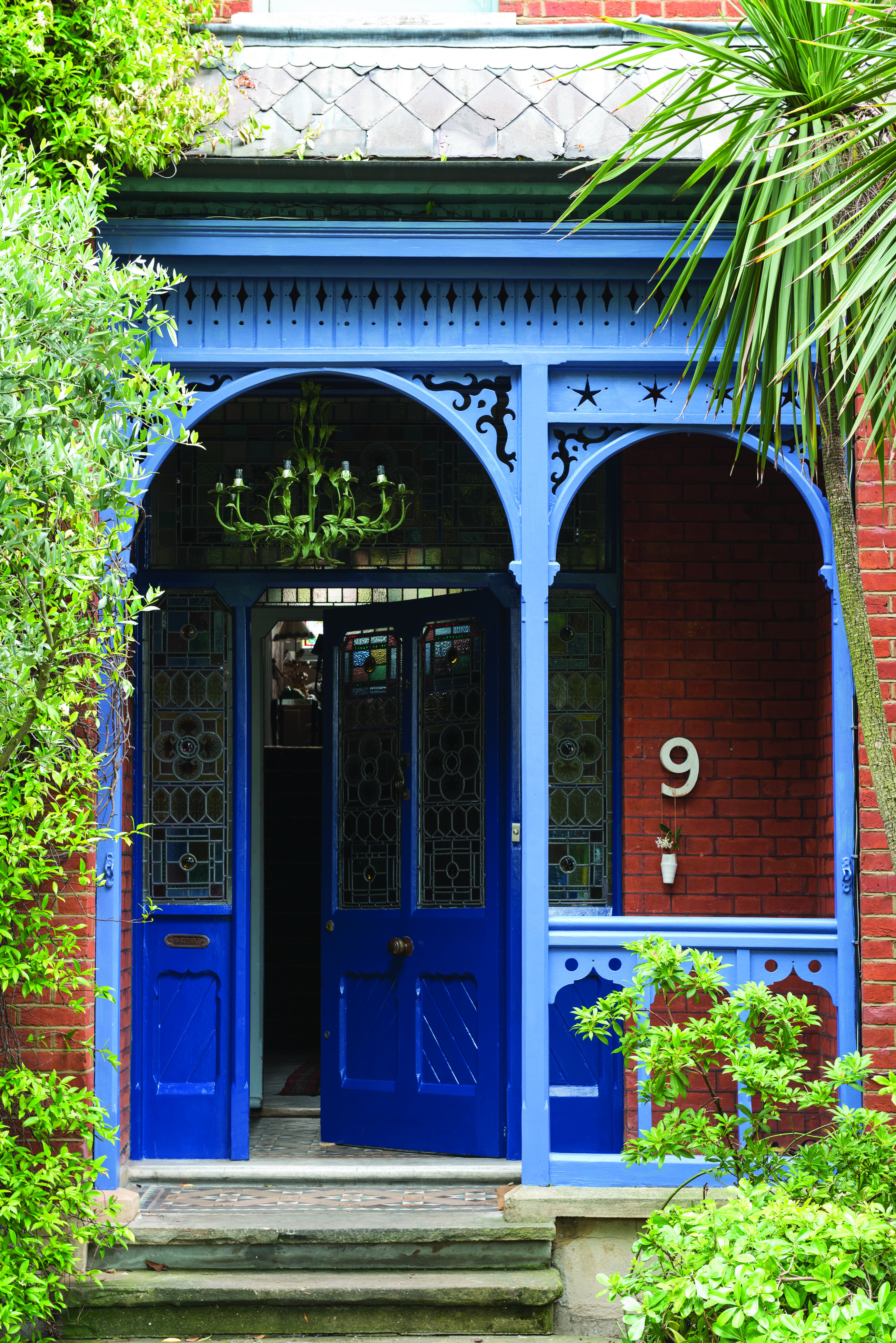
'The use of bright colors in outdoor designs is on the increase, adding a playful and fun feel to outdoor spaces,' says Martin Waller. 'Primary colors like blue, red, and yellow are especially popular. These vibrant hues bring energy and a sense of joy to exterior environments, making them feel more inviting and livelier.'
Not feeling quite that brave? The garden is a perfect place to experiment with exteior color combinations, adding some artistic flare into your outdoor space. 'For a vibrant yet earthy feel, make terracotta your go-to,' suggests Tash. 'Lick Red 03 is a mid-terracotta paint with pink and brown undertones, which pairs perfectly with a warm, peacock teal color, such as Lick Teal 06. This is a great example of a contrasting combination which works well in both urban and rural settings, adding oodles of personality and fun factor.'
Of course, outdoor spaces also present the opportunity to be that bit braver with your color combinations. Patrick O’Donnell, Brand Ambassador at Farrow & Ball shares these tips, 'If you have a small or rather bland exterior space with some generic fencing, why not bring it to life with some pops of color and clever container planting? Dark colors, such as Scotch Blue, always work well on walls and act as a lovely backdrop to planting.'
'To bring in an element of fun for that summer drink ‘al fresco,' add a splash of vibrant color to the seating area. If you have a tired wooden bench, sand back to get a good key, then give it a coat of primer/undercoat followed by two coats of exterior eggshell in a sunshine color such as Dutch Orange. Sprinkle the space with fairy lights, pour yourself a Negroni and enjoy!'
And if you’re selling your home…
If you’re looking to sell your home, then you should follow the same advice as for painting your interiors and stick to neutral color combinations. White is a neutral color that reflects light, helping to make a house look brighter and more spacious, instantly giving it more curbside appeal.
You can also add a pop of color, as Tash suggests, 'Sophisticated and modern, off-white and velvet black, such as Lick Black 01, is an ideal pairing for a sleek, contemporary look. The contrast between the light and dark tones adds depth and interest and is a perfect pick for those looking to stand out from the crowd.'
White allows buyers to envision putting their own stamp and look onto a home, and keeping colors neutral and simple could be the easiest way to ensure a quick sale of your property.
When it comes to exterior color combinations, there are so many varieties of shades to experiment with. The key thing you need to decide is what look and feel you want to attach to your home. Start with a color wheel to find complementary colors and go with the journey this takes you on.
Sign up to the Homes & Gardens newsletter
Design expertise in your inbox – from inspiring decorating ideas and beautiful celebrity homes to practical gardening advice and shopping round-ups.

Jo Plumridge is a freelance writer and photographer with over 20 years of experience writing for a variety of magazines, websites and books. She writes, perhaps unsurprisingly, about photography, but also on all things interior design and sleep-related, alongside reviews of home and tech products. Jo loves exploring the latest design trends, although she’s yet to find a carpet that doesn’t show up the cat hair from the cats she and her husband foster.
-
 Ina Garten's storage pantry is an insightful window into all of the best cookware used by the chef – and it's easy to recreate on your kitchen shelves from $48
The beautiful dishware in The Barefoot Contessa's Hamptons pantry showcases the tools she uses most often to cook – this is exactly how you replicate it
By Sophie Edwards Published
-
 Extend the lifespan of your appliance with 5 simple but crucial washing machine maintenance tips
From cleaning the filters to keeping the door open, experts reveal the washer tips they swear by
By Andy van Terheyden Published