How to choose a color scheme that flows throughout your entire home, according to color experts
Why is developing a color scheme for your home as a whole so important? We've asked the experts for their take on one of the most
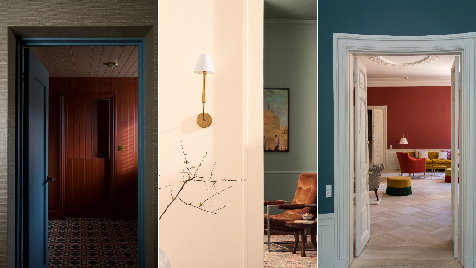

It's no secret that color plays an important role in our homes. The right color palette not only enhances the design appeal of the space but contributes to the overall harmony and, in turn, your mood too.
From color trends to consulting the color wheel, there is a lot of advice out there when it comes to choosing a scheme for each and every room of your home. But what about considering the whole house as one?
Curating a color palette that flows throughout your entire home is one of the most important tools in an interior designer's toolkit. And, whether you're an expert or just starting out with a project, choosing a cohesive color scheme for your entire home is a process that requires a thoughtful approach.
Here, we speak to color experts and interior designers to share their process of executing a whole home color scheme in a way that flows seamlessly, giving you the tools and confidence to go forth and decorate. Let's get into it.
How to choose a color scheme for your home
So why do you need to consider a color palette for your entire home, as opposed to going room-by-room? There are many reasons, from creating continuity to flow and ending with the consideration of how color makes us feel.
Imagine you're moving through a home filled with calming neutrals, a muted color scheme is the thread that connects and grounds each room, and you suddenly enter a space filled with bright, highlighter shades. It's going to feel rather jarring, right?
In order to achieve that sense of harmony in your home, and avoid a feeling of uneasiness, we've consulted design and color experts for the tips and tricks they use when choosing a color palette.
One final note? So much of color selection is personal to you, and don't forget it's your home and there's is no right or wrong answer here. Take a moment to consider your preferences – whether you're drawn to decorating with neutrals, bold patterns, or a mix of vibrant brights – your color choices should align with your style, creating a space that truly feels like 'you.'
1. Consider your surroundings
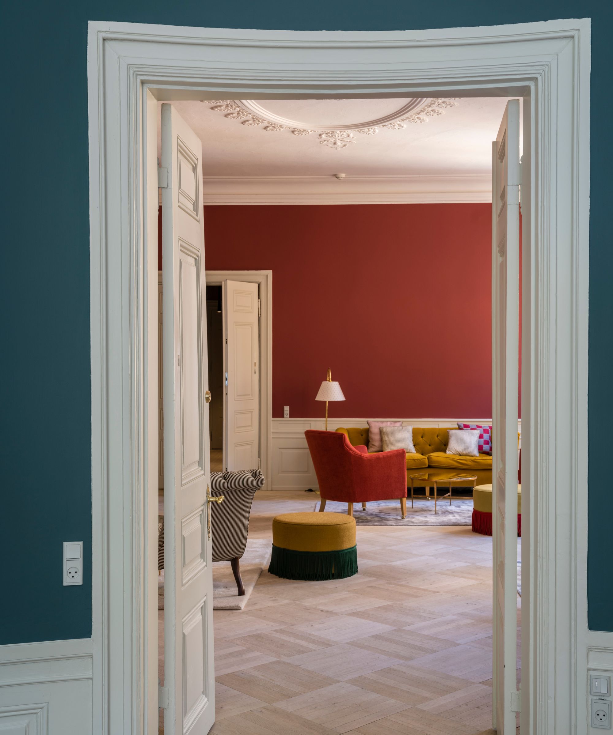
The first place to start is thinking about what's staying. This goes for existing wall colors, wallpaper, furnishings, and even character features of your home like fireplaces, tiles, and trims.
As Patrick O’Donnell, color consultant and brand ambassador for Farrow & Ball says, 'First think about all the elements that are going to exist in your chosen room- from fabrics, furniture, flooring and of course, your wall and woodwork colors. Order samples where possible and create a mood board, either physically or digitally. This will really help you to understand the cohesion of a scheme and see how all the elements will sit together.'
Erika Woelfel, VP of color at Behr, agrees that considering what is already around you is the best place to start. 'There are a few factors to consider when choosing a color scheme for your entire home. Consider the furnishings and hard surfaces that are already in the space. Will flooring, cabinetry, or window treatments stay the same or are they changing out? This plays an important role in selecting wall colors for an overall scheme,' she advises.
From here, you can start to consider the foundations of your scheme as a whole, rather than thinking room-by-room.

Patrick O’Donnell is Farrow & Ball's color consultant & brand ambassador and has been with the brand since 2012. Patrick works with designers in the UK and North America, helping to bring their projects alive with the iconic, F&B color palette.
2. Shed some light on the situation
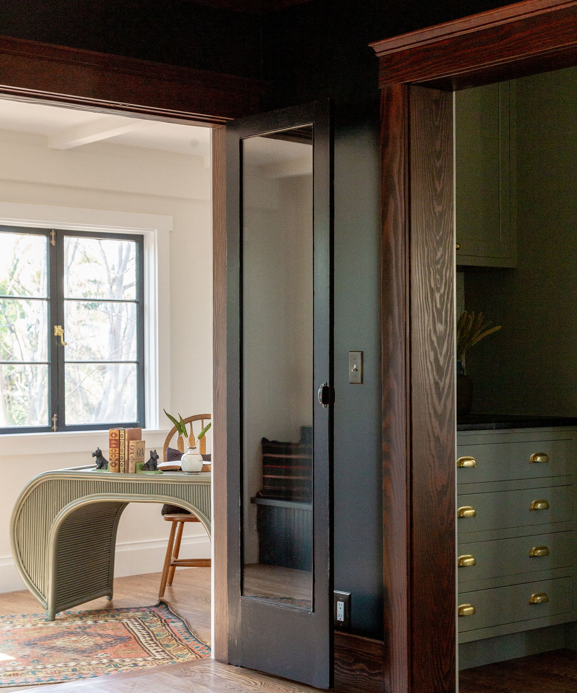
Before even taking out your color charts or paint swatches, you need to get to know the lighting in each room, and, crucially, how it behaves and at what time of day.
'Lighting is another important factor. Colors can transform based on the light exposure in your home throughout the day. For example, a warm white paint like Swiss Coffee from Behr can appear warmer in bright natural lighting while dimmer lighting creates a cooler, muted look,' says Erika Woelfel.
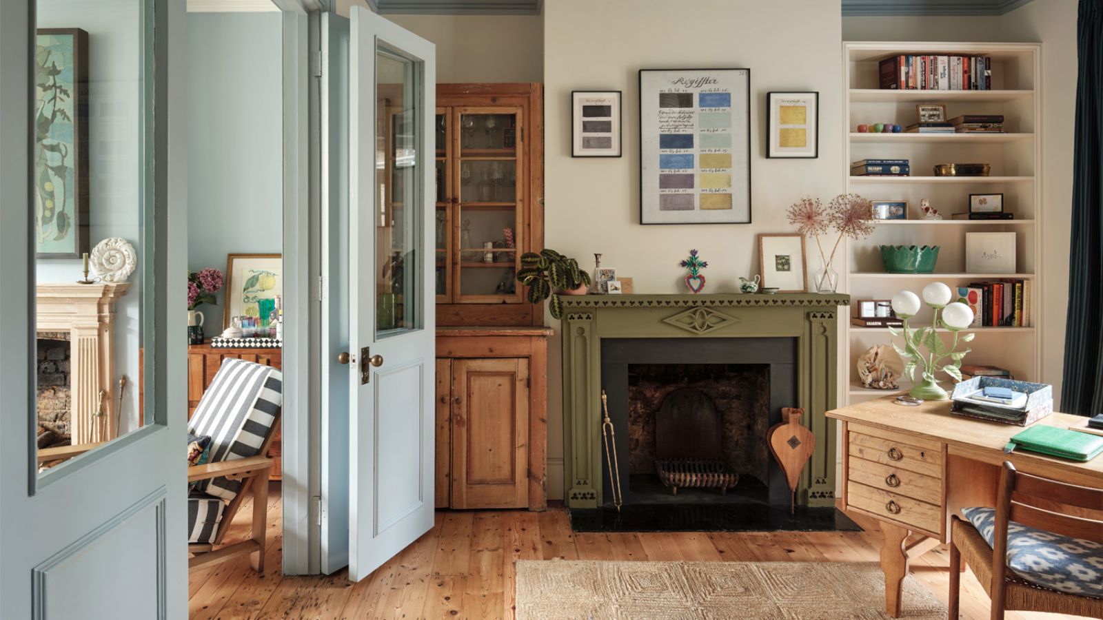
Different colors can present differently depending on the lighting in a given space. Dominic Myland, CEO of Mylands, also urges you to consider lighting – particularly when working with an off-white palette. 'South-facing rooms with plenty of light can take cooler whites with their undertones of blue or green, but we always recommend warmer whites for darker, north-facing rooms,' says Dominic. 'We always advise testing paint choices in situ first to see how they appear in different lights throughout the day,' he adds.
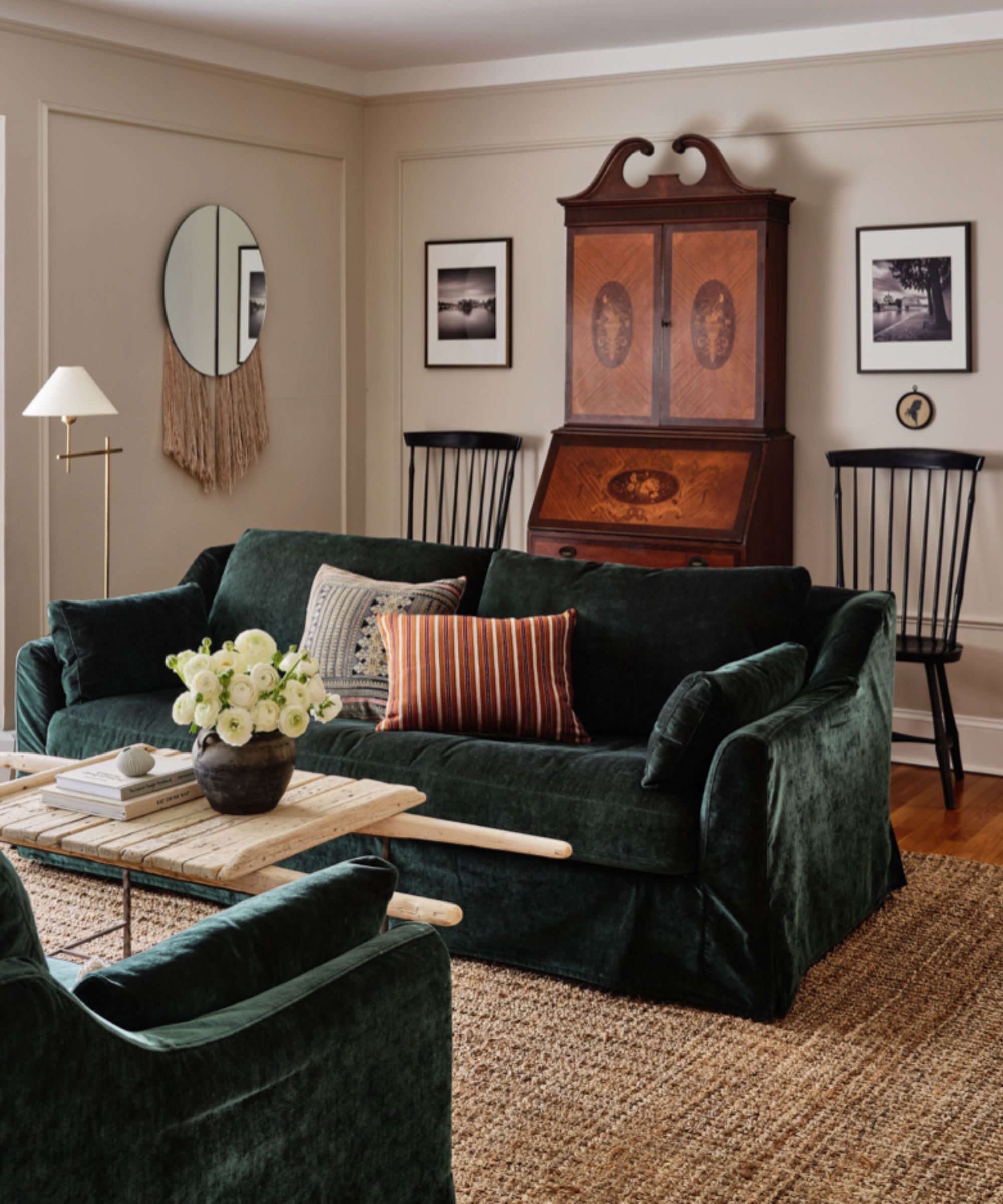
Sarah Lloyd, senior brand manager at Valspar, agrees. 'Lighting can have a big impact on the way color looks. As natural light changes throughout the day, so will the appearance of color. Light can be so influential that one color can look different in each room.' This is why swatching on every wall of the space, and checking it throughout the day, is vital.
Patrick O’Donnell maintains that the best way to decide on paint colors is by looking at what aspect the room is facing, as the natural light will have a significant impact the appearance of a color.
'In south-facing rooms, pretty much anything goes, which is thoroughly liberating!' he says. 'Although it is sometimes best to keep these rooms light to enhance the all-day sun. For east-facing rooms, you get the natural morning light which reacts beautifully to soft blues and greens. West-facing rooms have the afternoon and evening sun, which is lovely and warm, so again most colors will work here.'
'Finally, the one everyone worries about is the north-facing rooms. Here, you have two options, either use warm-based colors with elements of red or yellow or embrace the limitations and use dark, moody inky tones,' Patrick adds.

Color and paint expert Sarah Lloyd is a senior brand manager at Valspar and has worked for the paint brand over the last three years.
3. Get to know your personal style

Seeking out inspiration should always be a high priority. It can be daunting scrolling through Pinterest when you have several rooms or an entire home to plan, but this is the time to get your mind working on your favorite colors and how to incorporate a touch of them into every space.
Ruth Mottershead, creative director Little Greene, advises taking the time to research schemes that you would like to recreate by browsing magazines, Instagram, and Pinterest or requesting color cards to get your creative cogs turning. 'If you are a hands-on decorator, mood boards are a great way to edit and add to ideas. The key is deciding what sort of style or atmosphere you want to create,' says Ruth. 'Consider the whole property and how rooms flow into one another, which areas can you see through an open door or along a hallway, and create a color scheme that feels considered and coherent.'
Interior designer Tama Bell says that one of her favorite elements of the design process is creating a palette for a home as it sets the tone for the project.
First of all, she advises you to consider the vibe. 'I always start by thinking about what aesthetic or interior design style we are trying to evoke. Is it skewed modern or more traditional? Starting with the style allows me to funnel the choices in terms of a direction with paint.'
'Do we want to use one color, saturated throughout the house or are we wanting to add color and contrast and create a more complex palette? Are we using any additional layers such as wall treatments like paneling or wainscot, plaster, or wallpaper to add color and/or texture to the spaces? These questions and the choices are the basis for starting the search for the perfect color scheme,' notes Tama.
Once she has this direction, Tama turns to the floor plan to begin laying out where she will be using color. 'I like the bird's eye view so that I can understand the relationship between the adjoining spaces and think about how they will work with one another,' she adds.

Tama was drawn to design at an early age, recognizing how the spaces we spend time in matter to our overall wellbeing. Tama Bell Design was founded on that mission to create sanctuary spaces that are beautiful but also make people feel good.
4. Decide on your foundation colors
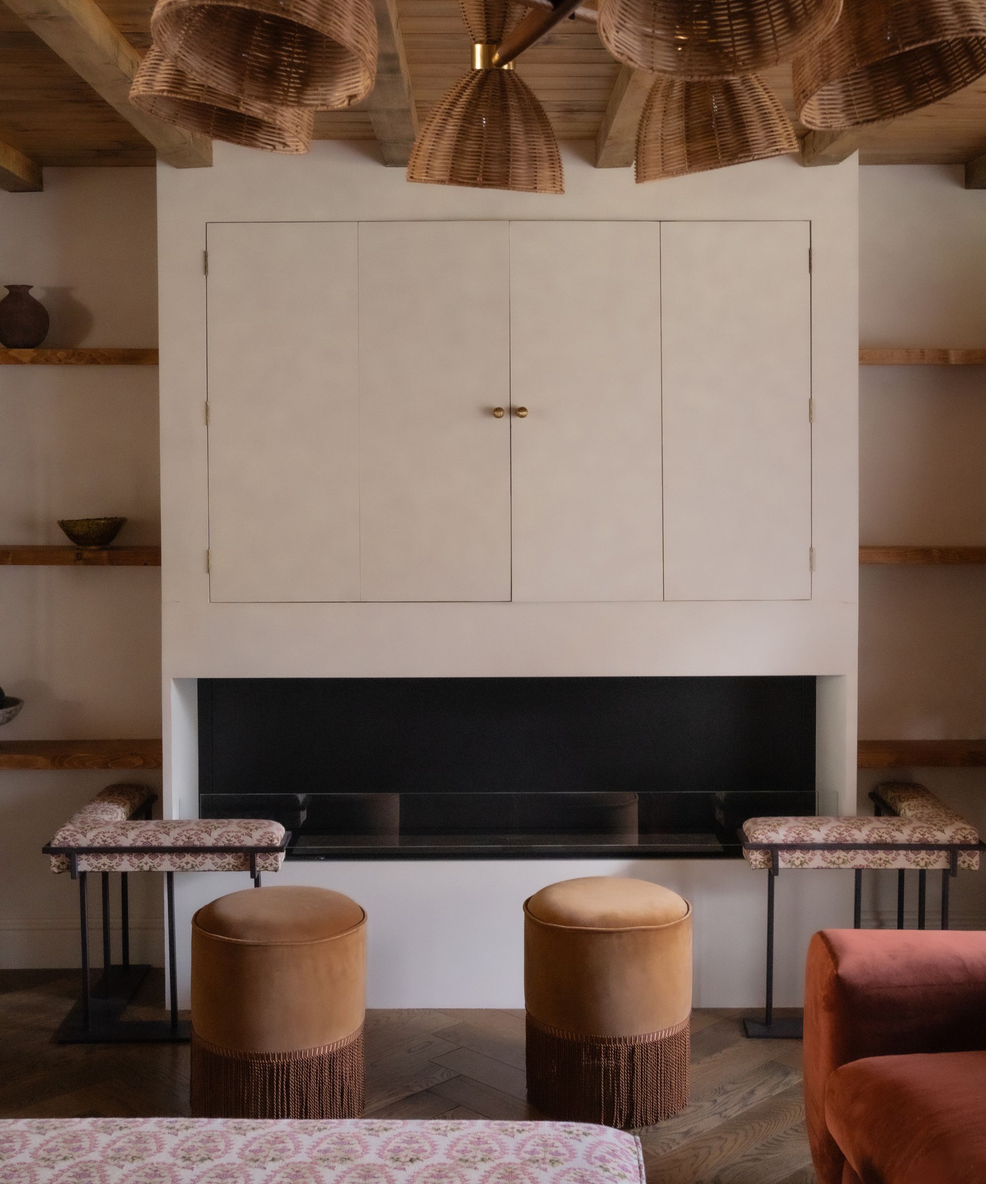
A simple way of creating a natural harmony throughout your property is to decide on your foundation or hero colors, and then build the palette around that.
'I think once you have two or three main colors in the primary rooms in your home, you can really begin to have fun in the spaces that lead off from these, perhaps taking one of the colors along the woodwork throughout to retain some sense of cohesion if you are lacking in decision confidence,' says UK-based designer Alice Gaskell, founder of Alice Grace Interiors.
But be sure to have some flexibility in that palette, assessing the purpose and needs of each room, and how light affects the space. 'Whilst choosing the same colors throughout gives you a good base to start from, you might find that certain rooms will always need added warmth or dimension through the help of paint – be that due to the direction they face, available natural light source, etc.,' Alice adds.
A simple way to create color uniformity is to limit your paint palette to a maximum of 3-4 colors to use throughout your home, advises Behr's Erika Woelfel. 'When choosing the color scheme, we typically recommend starting with a versatile neutral in the cream or white color family as the base color. By choosing a neutral as the backdrop, it allows for the furniture to still have some of the spotlight and a pop of color can easily be incorporated as an accent within the rooms.'

Alice Gaskell is the founder of UK-based design studio Alice Grace Interiors.

Joa’s White is a light and clean taupe with the merest hint of black pigment which makes it perfect to combine with the limestone, leather and linens often used in contemporary homes.
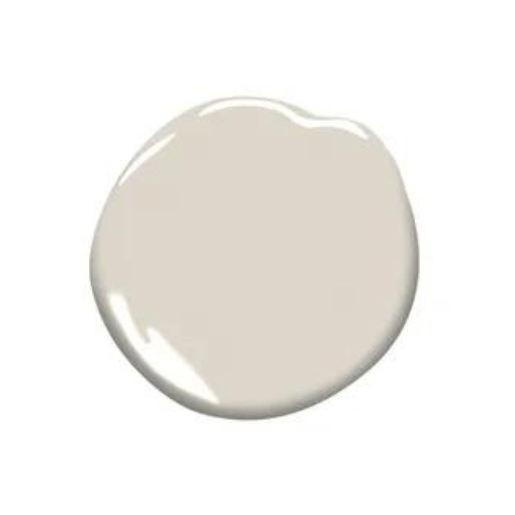
Pale Oak is a versatile neutral with the softest hint of warmth, making it a quintessential light, useable grey. The muted hue works perfectly as a backdrop that’s low-key but still makes a statement.

When you want the brightness of a white without sacrificing a warm coziness, try the softness of Alabaster by Sherwin-Williams. And turn up the peaceful.
5. Work with the color wheel
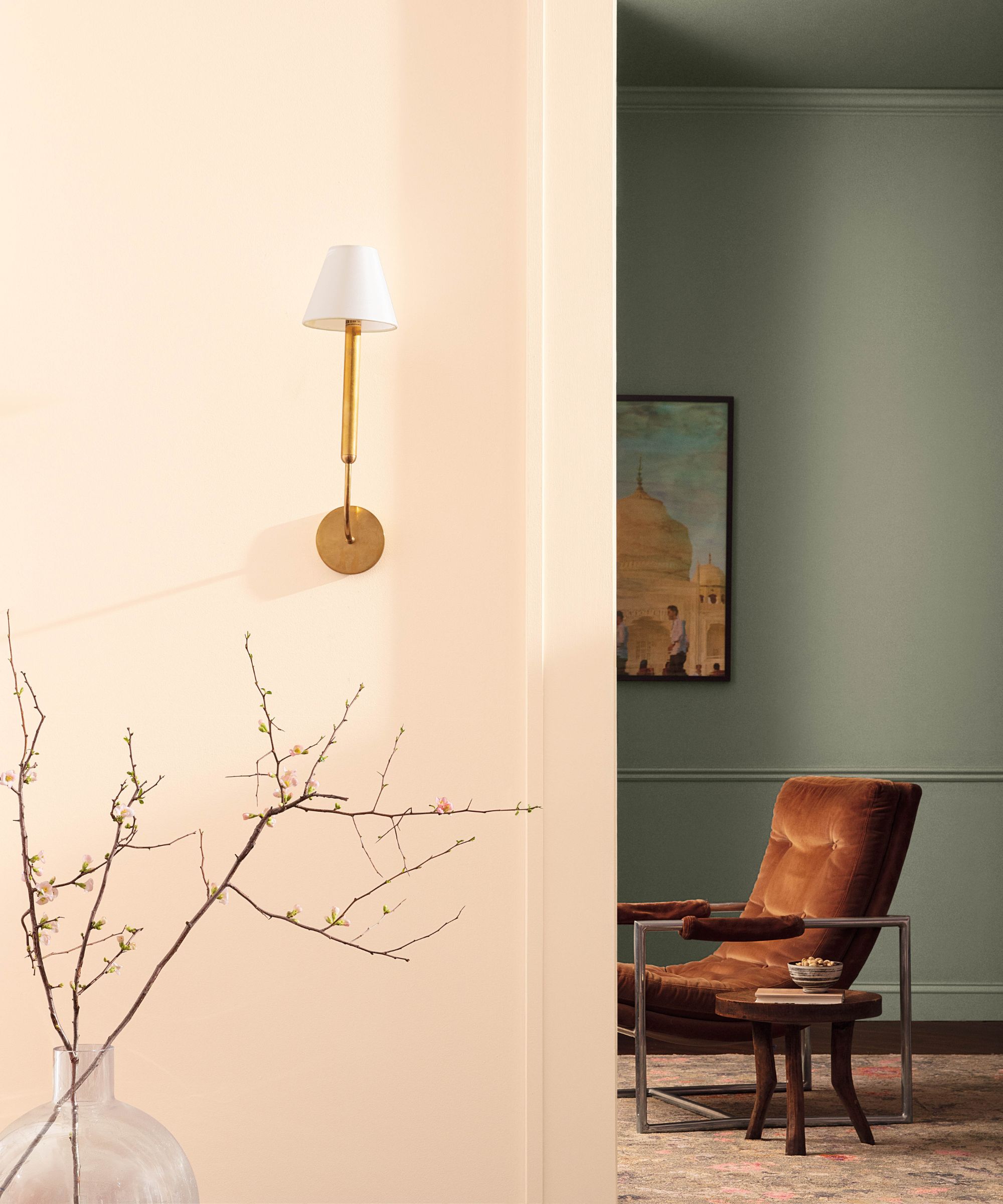
To truly create a cohesive feel you need to consult the color wheel to ensure you're working with tones all within the same color family. Or instead, consult paint experts who know the color wheel inside and out.
'Deciphering what colors go well together depends on where on the color wheel they sit. Consider creating a monochromatic scheme that uses varying levels of saturation of one color,' says Helen Shaw, director of marketing at Benjamin Moore. 'This can be a great way to take your room from bland to bold by instantly shifting the dimensions,' she adds.
'Alternatively, an analogous scheme uses adjacent colors on the wheel. Due to their proximity, they work incredibly well with one another to create a harmonious scheme that’s easy to live with.'
'Using two colors that sit opposite one another can add a dash of invigoration, this is called a complementary scheme and is a sure-fire way to create a beautifully vibrant look; try a paler shade of one and a darker hue of another which will instill energy into your room without being too overpowering,' adds Helen.

Helen Shaw is a color expert and Director of Marketing (International) at Benjamin Moore. Helen and her husband Craig were also founders of Shaw Paints, acquired by Benjamin Moore in 2020.
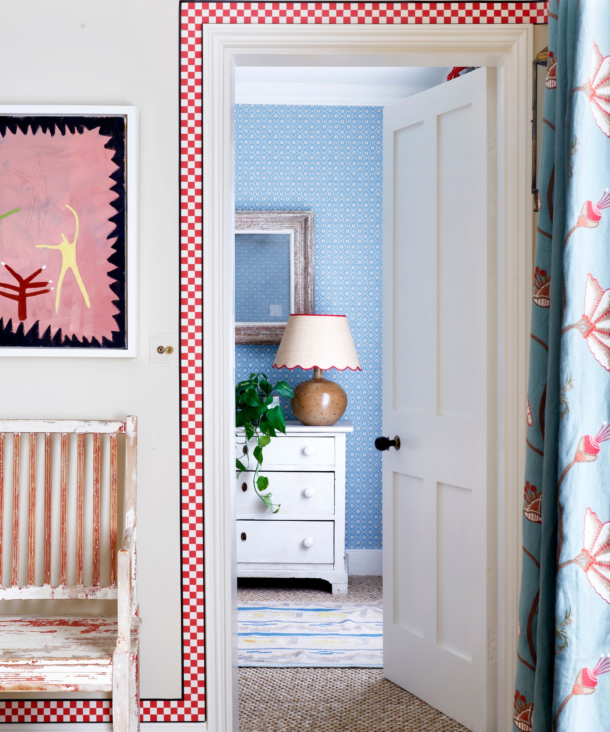
Once you know what colors you are drawn to and how best to make them work in each room by considering the existing fixtures and fittings and the natural light, there are a few color theory principles that will help marry it all together.
Susie Atkinson, founder & creative director of Studio Atkinson, looks to the undertones of paint shades to create a cohesive color scheme.
'I always aim to include both warm and cool tones, offsetting one against the other so there is a harmony,' advises Susie. 'Warm tones bring coziness and a welcoming feel, while cool tones offer a sense of calm. For instance, warm-toned furniture or accents can pop against cool-toned walls or vice versa. Whether it's through wall colors, patterned textiles, or decor choices, the interaction of these tones can create a space that is both inviting and visually interesting,' says Susie.
6. Finally, create a thread
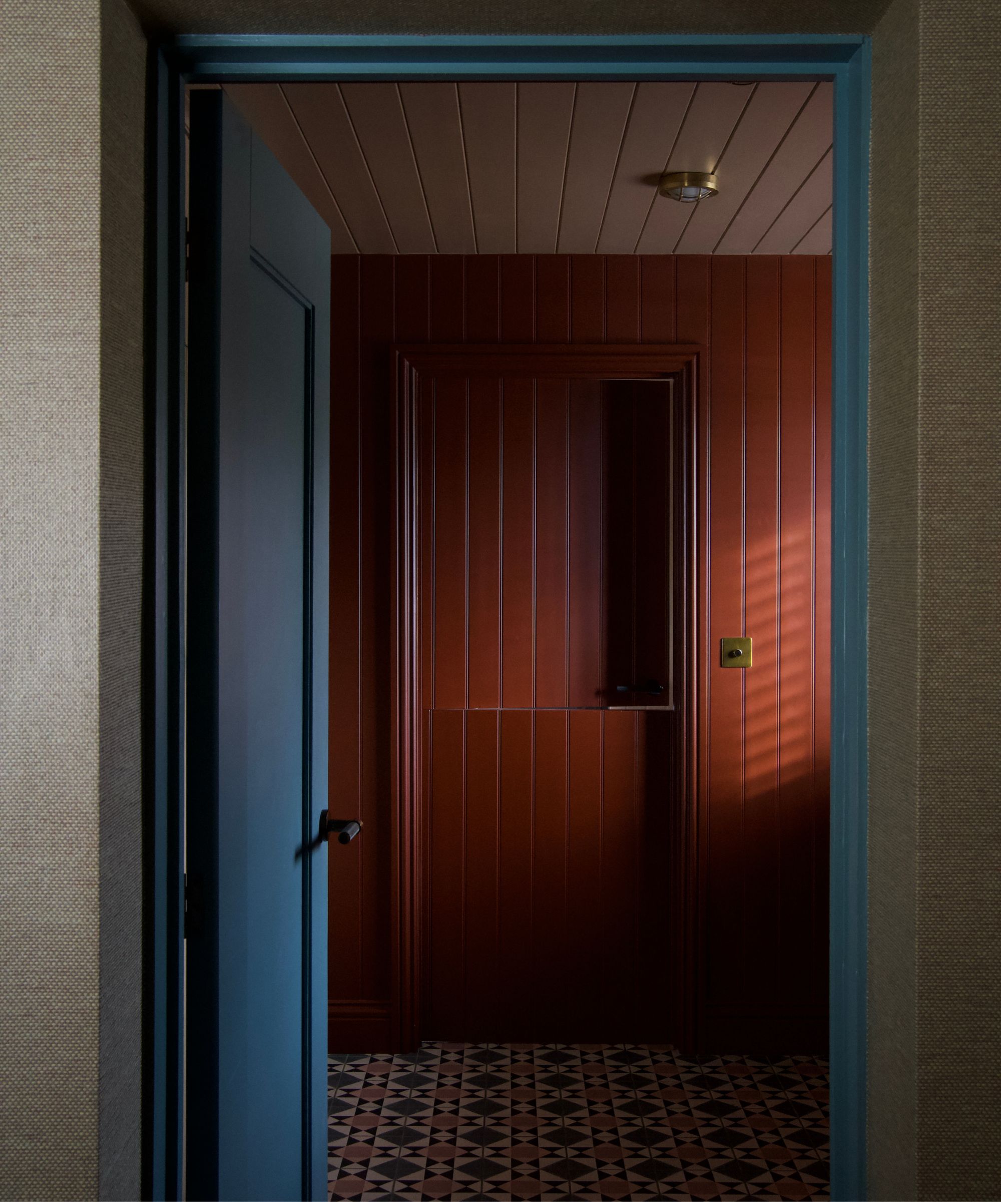
As you start to plan the color palette for your first few rooms, you're going to want to think about ways to thread that color throughout the home. This can be as simple as with accessories like vases, soft furnishings, or accent furniture, or by painting woodwork and trims.
'To make the colors flow room to room, it is important to incorporate touches of the same color throughout your home whether it's through paint colors or materials,' says Behr's Erika Woelfel. 'An easy way to do this through paint is by using the same trim color in each room. Also, it is important to use the base color on connected spaces to ensure cohesion such as the hallway, entryway, etc,' she adds.
Always have your mood board to hand and as decorating room-by-room, remember to keep that thread of color going.
'When redecorating your entire home, it’s important to consider the mood or atmosphere you’re looking to create as well as establishing your signature style,' says Benjamin Moore's Helen Shaw who also advises creating a flow of color via your hall stairs and landing, to connect one space to the next.
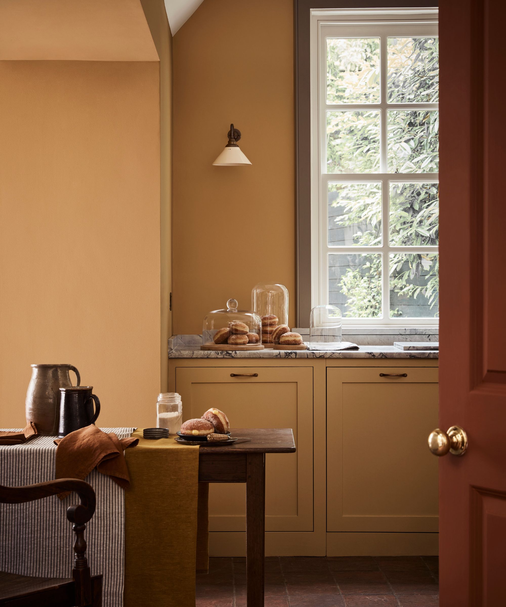
For Patrick O’Donnell, considering the undertones and weight of colors, as well as assessing lighting helps to create a flow from room to room. 'Using the same woodwork shade throughout the home is another way to create flow, particularly if colors of different weight, and tone are desired,' he advises.
Think of your home as a story; each room is a chapter that seamlessly connects to the next. While colors can of course vary, maintaining a consistent undertone or theme helps establish a smooth transition throughout.
The key, according to Sarah Lloyd, lies in testing. 'Generously apply paint to the wall or an old cut-off piece of wallpaper. Keep looking at it throughout the day to see how natural – and synthetic – light changes it. This kind of testing can also be useful to try color schemes side by side to get a feel for the color flow from room to room.'
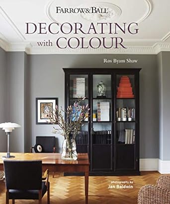
Learn all about how to decorate with color in your home in a way that feels cohesive with this Farrow & Ball book, filled with inspirational images of different styles of homes.
Establishing a cohesive color scheme for your entire home is no mean feat. But by understanding your style, embracing natural light, harmonizing with existing fixtures, considering the color wheel, and establishing flow, you can create a home that reflects your personality and feels coordinated as you move throughout it.
Remember that the right color palette is the one that resonates with you and enhances the way you feel in the space, not the one dictated by interior design trends. One final tip? 'Always check your color choices in the space. Paint can be tricky and undertones and light change how paint looks in different homes. So, always double-check before pulling the trigger on the final color scheme,' adds Tama Bell.
Sign up to the Homes & Gardens newsletter
Design expertise in your inbox – from inspiring decorating ideas and beautiful celebrity homes to practical gardening advice and shopping round-ups.

Charlotte is the style and trends editor at Homes and Gardens and has been with the team since Christmas 2023. Following a 5 year career in Fashion, she has worked at many women's glossy magazines including Grazia, Stylist, and Hello!, and as Interiors Editor for British heritage department store Liberty. Her role at H&G fuses her love of style with her passion for interior design, and she is currently undergoing her second home renovation - you can follow her journey over on @olbyhome
-
 5 surprising but brilliant ways to clean with old socks – from perfectly buffing stainless steel to deterring pests naturally and more
Tackle dust in tricky corners, clean your mirrors and even banish bad odors with those rogue single socks
By Andy van Terheyden Published
-
 How to grow astilbe – expert advice on cultivating this shade-tolerant flowering perennial
Shade-tolerant and pest-resistant - astilbe are hardy and tough perennials that can thrive in many settings
By Ellen Wells Published