Sad beige nurseries are out – here's how to introduce color to your once-neutral space
Feeling bored of colorless nurseries? Here the experts share how to add some vibrancy with a few quick additions
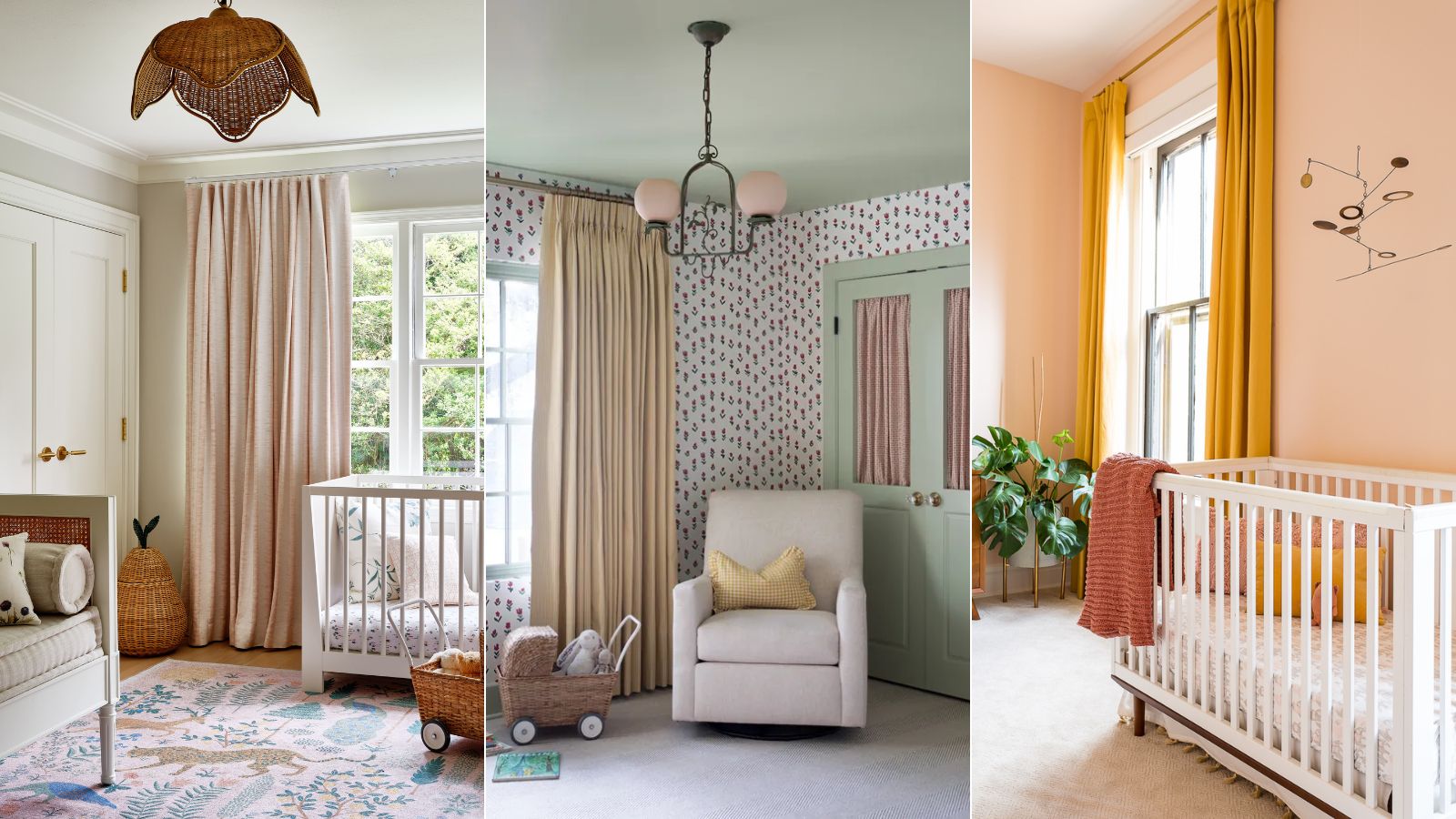

Once all the rage, all neutral nurseries are starting to date. So if you're looking to add some color to a beige, colorless children's room, you've come to the right place.
Have you heard of the 'sad beige baby'? An influencer favorite, the sad beige baby trend is a social media coined term used to describe the beige, gray, and muted tones that have dominated as the color palette for baby’s clothes, toys, and nursery ideas. While timeless, gender-neutral, and trending, design experts (and parents) are tiring of the neutral schemes beloved by minimalists.
If you're keen to add in some colorful hues but don't want to undertake an entire redecoration, there is absolutely no need. Here, we've tapped the minds of design experts to find out their favorite low-lift ways to add some color to a beige nursery.
How To Add Color Into A Sad Beige Nursery
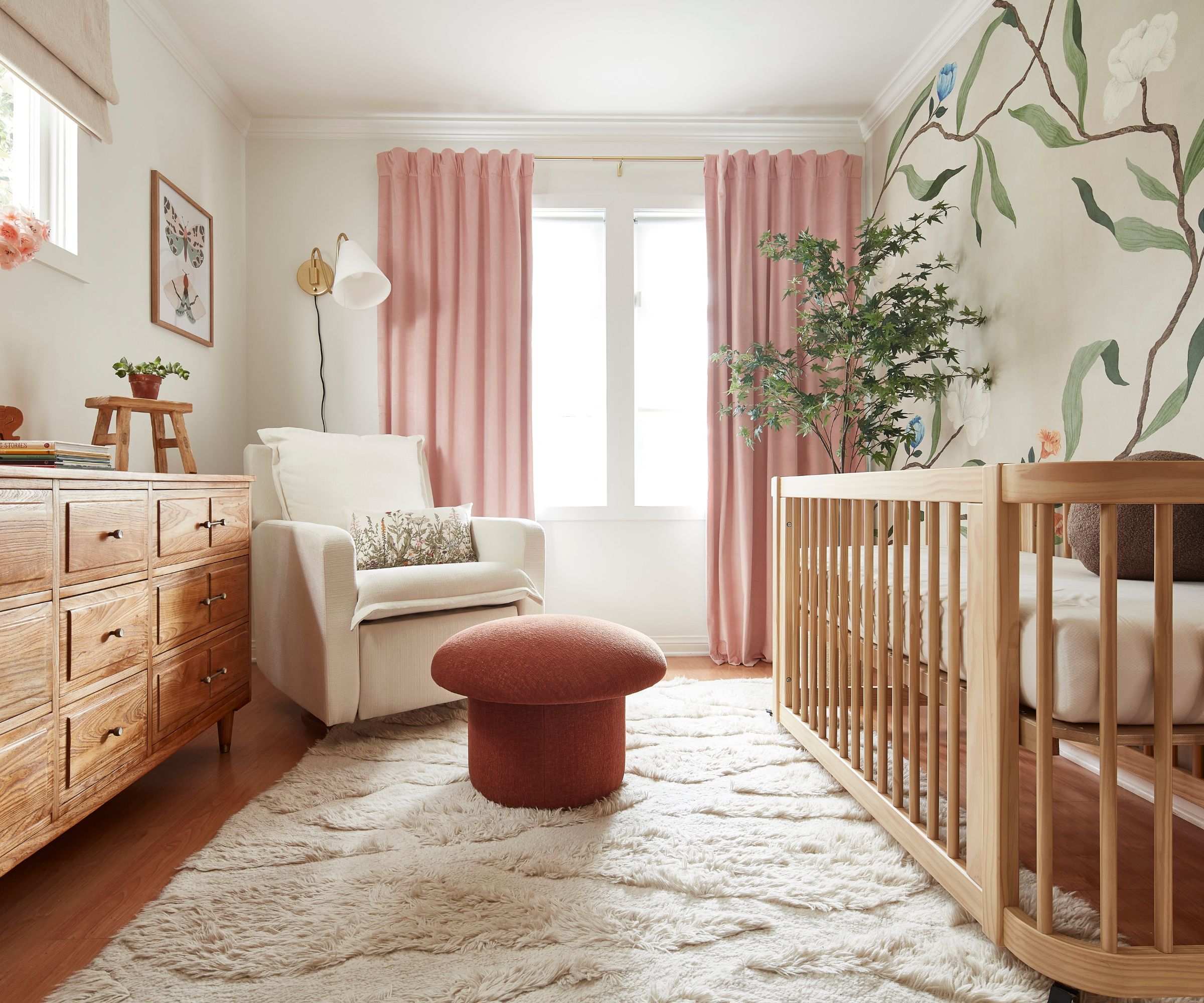
'In my opinion, a nursery is no place for an all-beige color palette!' says interior designer Kathy Kuo.
'You want your nursery design to be able to grow with your child and easily transition from a nursery to a kid's bedroom or playroom, and a joyful and lively color palette is very important for that,' she advises. 'This doesn't mean that you need to go with wacky colors or make it feel overly childish (as a new parent, you'll be spending plenty of time in the nursery too), but consider the fact that color is always your friend when working with a nursery or kid's space.'
Here are 5 soft steps you can take to add some color and personality to a neutral nursery.
1. Add wallpaper or a mural
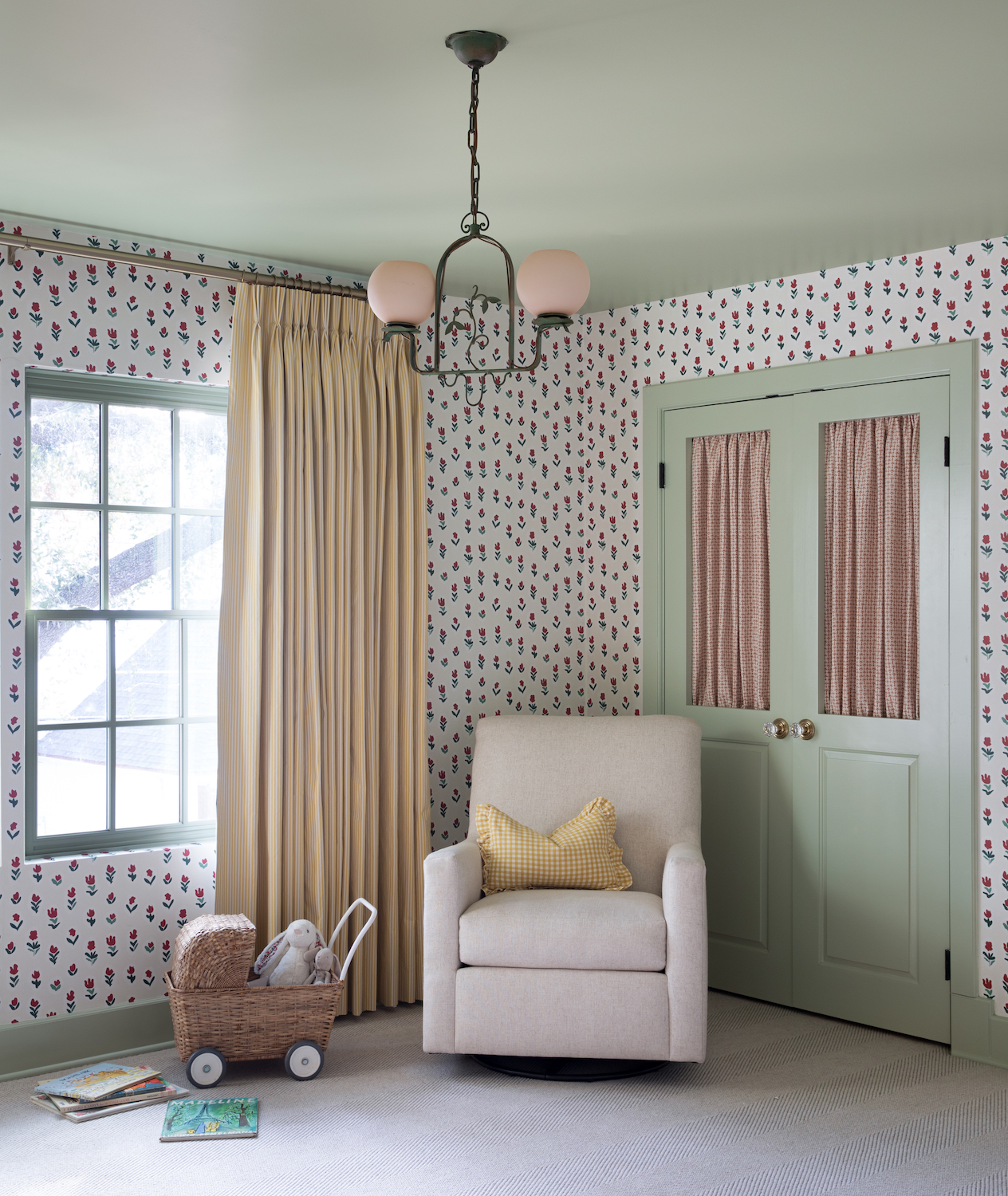
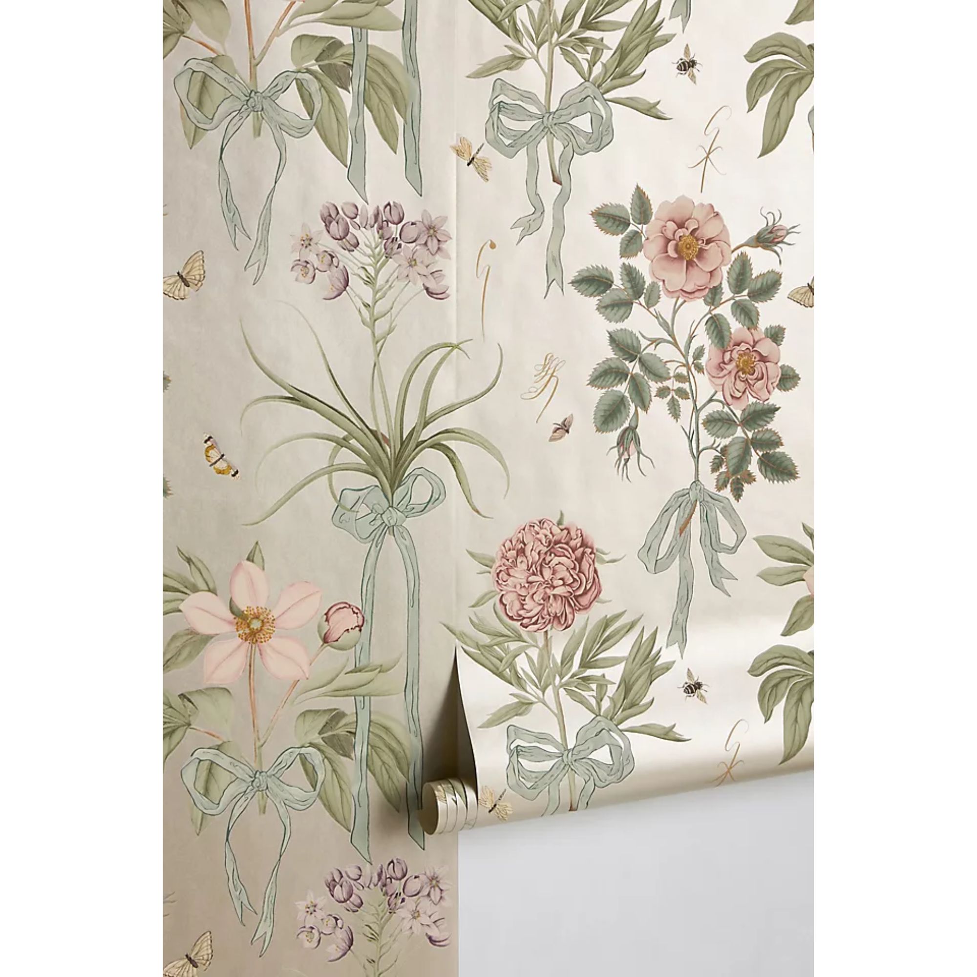
The simple addition of wallpaper wall-to-wall or on an accent wall will bring an instant uplift to your decor. In the nursery seen above designed by Shannon Eddings, she chose a stenciled floral design and painted the ceiling and woodwork in a soft green to add interest to the neutral space.
Alternatively, without having to change anything else in your nursery color scheme, you can simply let the pattern or print of your choice do all the talking and keep the rest of your pieces as is.
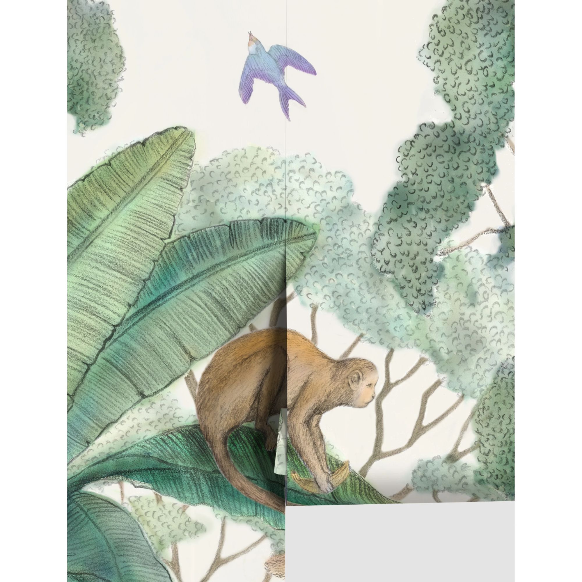
'At a recent project, we took a jungle theme and paired it with soft sage greens and warm rustic wood tones to create a nursery that can evolve and grow with the child,' says Kristina Khersonsky of STUDIO KEETA. 'On the crib wall, we installed a vintage jungle-themed mural wallpaper that only consists of 2 colors – off-white and pistachio-toned animals and trees. It is a woven textured wallpaper that adds interest and depth to the wall whilst the jungle scene lays softly in the background, instead of overwhelming the space.'
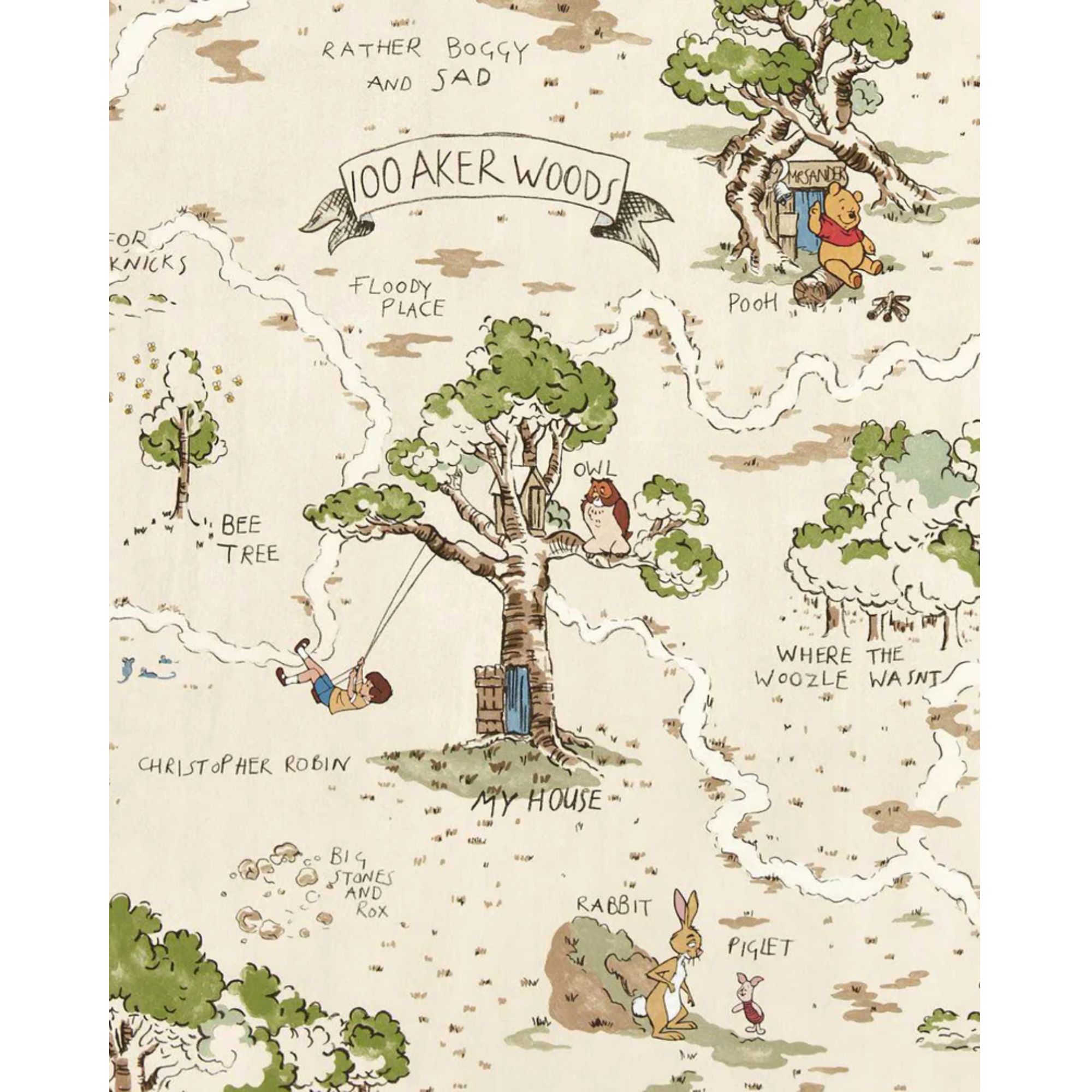
Stocked at McGee & Co., this Disney Home collaboration with wallpaper giants Sanderson depicts the Hundred Acre Wood from Winnie The Pooh and could not be more beautiful. There are so many illustrative scenes to keep your little one's interest piqued.
2. Try color blocking
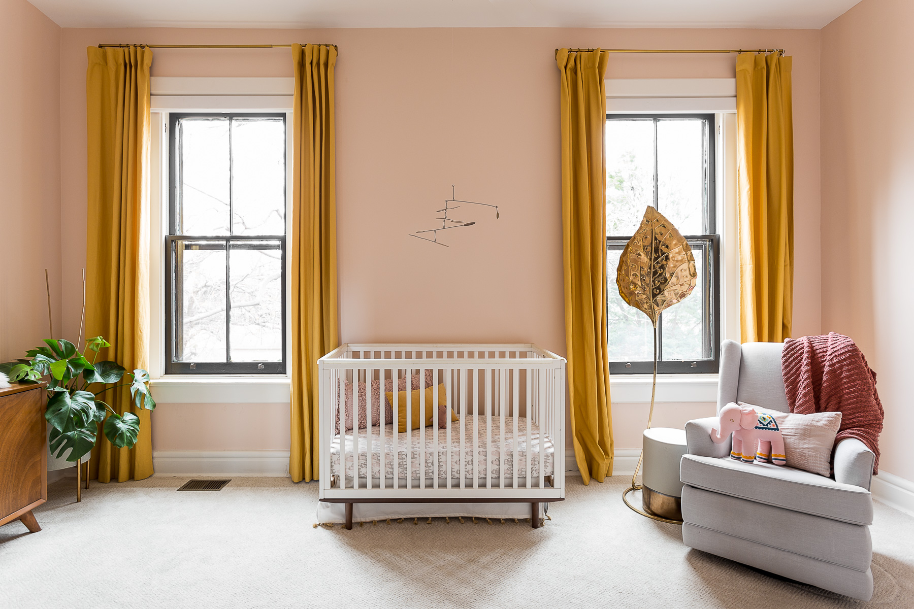
Interior designer Bethany Adams is a fan of using block colors rather than prints to jazz up a bland nursery scheme. Here, she chose sunset tones to give the room a soft lick of color.
'Color blocking is a fun twist on the color drenching trend,' she explains. 'Rather than choosing a single hue, choose a couple and trade-off. Steer clear of patterns and prints and instead go for similarly saturated hues in quirky combinations, like peach and mustard, for a nursery that is sweet without being too twee.'
A few well-placed blocks of solid, yet complementary, colors will work wonders amongst a sea of beige.
3. Paint the ceiling
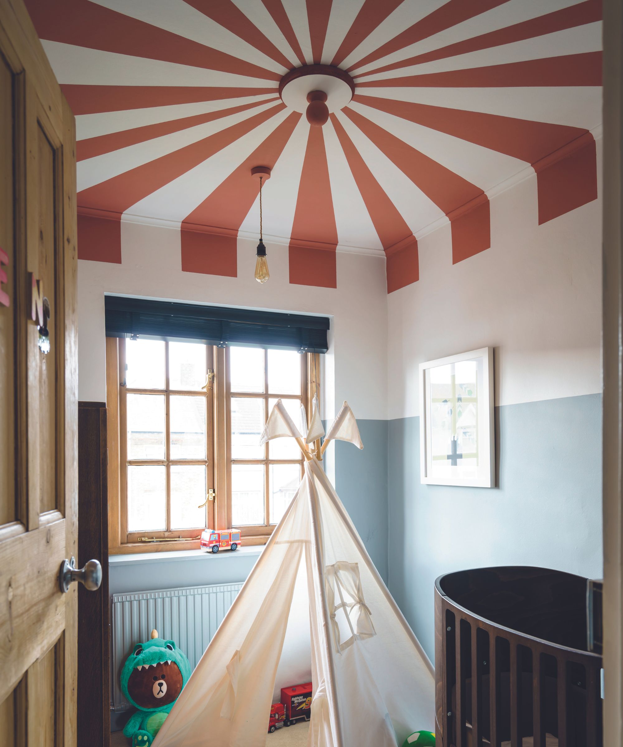
Perhaps the boldest suggestion of the lot, a painted ceiling can create a canopy of color that won't require much further accessorizing.
In the playful playroom seen above, the homeowner used various Farrow & Ball hues to create the image of a circus tent-esque striped ceiling. For those who prefer a hands-on approach, painted ceilings offer a DIY-friendly and customizable solution. Experiment with different patterns and colors to achieve the desired effect, whether it's a bold singular tone or a fun stripe.
An accent ceiling is not only more on-trend than a feature wall, but helps to cover the entire room in your chosen color - dispersing it evenly across the room and creating a bigger impact.
4. Introduce colorful furniture
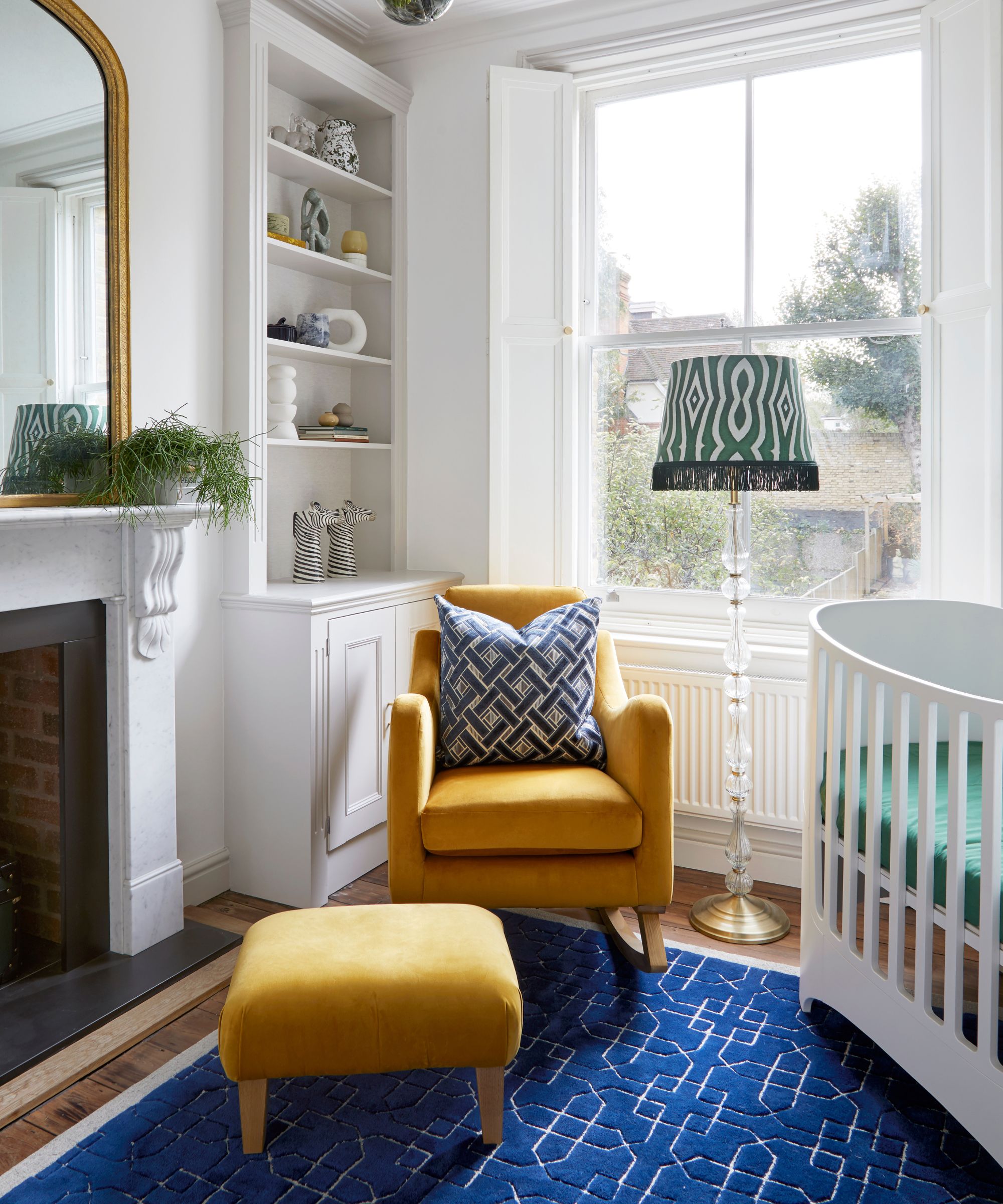
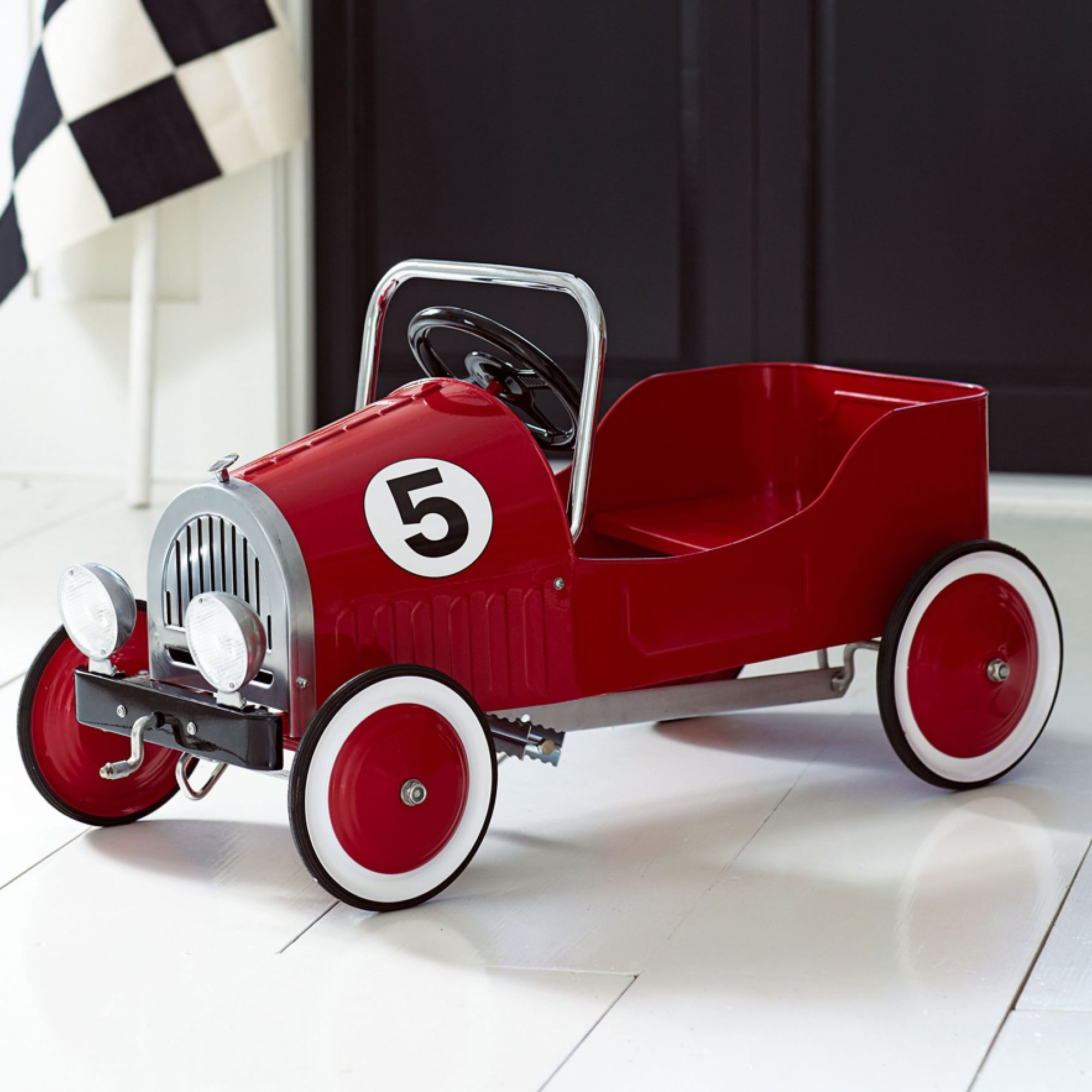
Of course, it's not all about paint and paper. You can simply move in a new piece of furniture to make a huge difference to the space.
Joanna Landais, founder of Eklektik Studio, designs charming children's spaces with a unique approach to color. 'To create a cheerful and engaging environment for both baby and parent, consider introducing bold colors through key elements that go into a nursery,' she suggests.
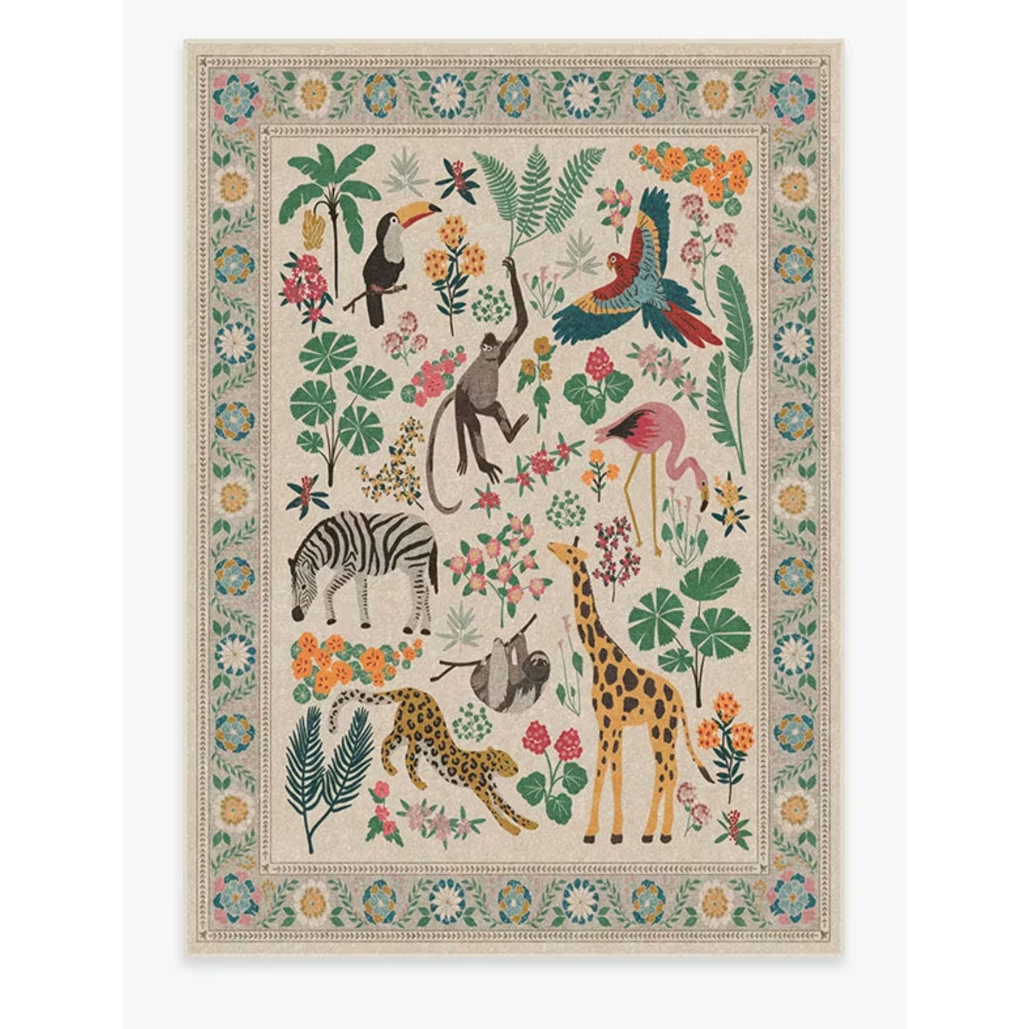
'For instance, a bright teal or sunny yellow nursing chair can serve as a focal point, inviting comfort and warmth,' explains Joanna. 'Complement this with a patterned rug that features playful hues, grounding the room while adding texture and visual interest.'
5. Layer in vibrant accessories
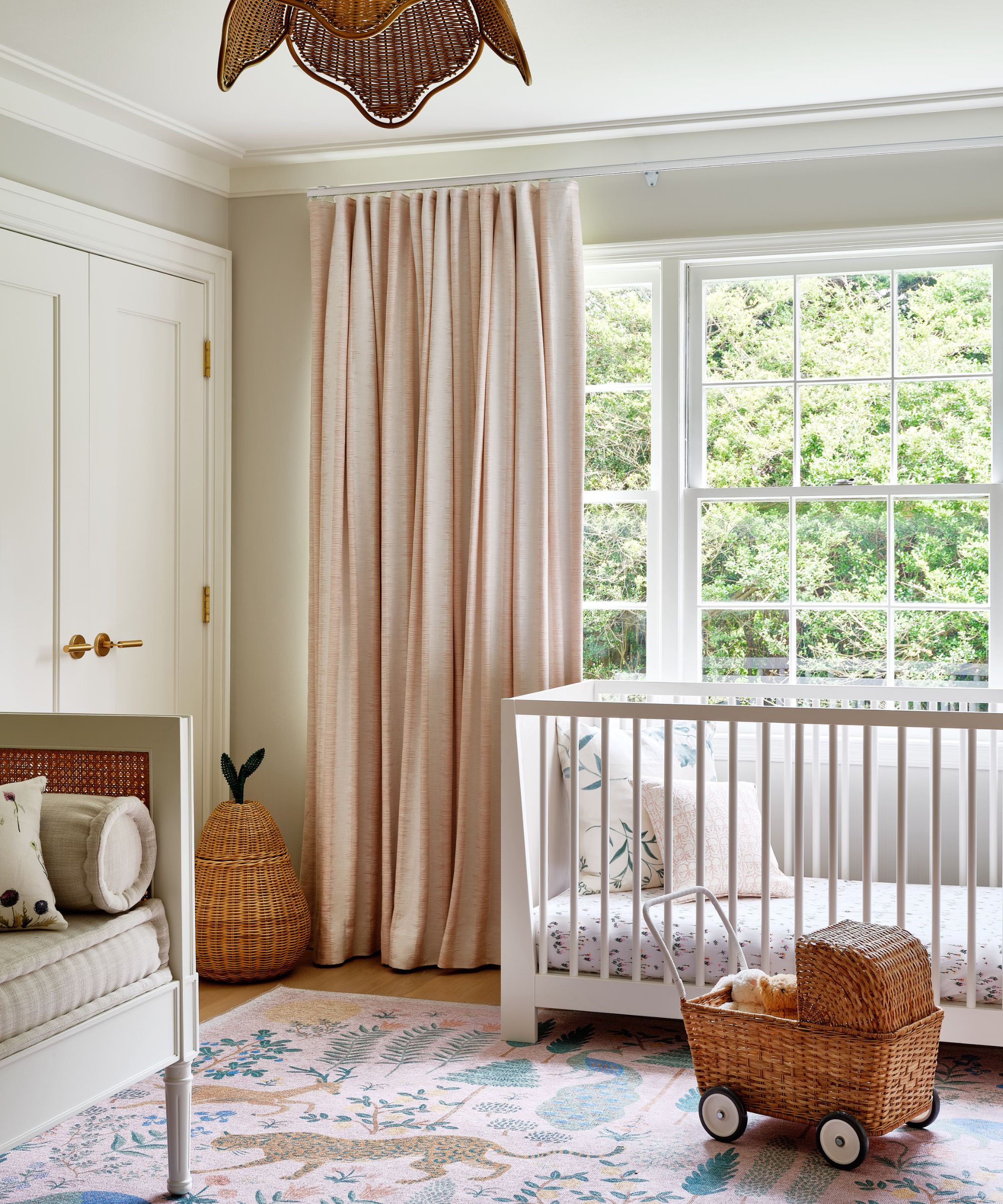
Don't underestimate the power of nursery decor and accessories to elevate a bland space. Think about collecting some rugs, curtains, lighting, wall art, and whimsical pieces to tie everything together.
'A whimsical lampshade in an interesting print will not only illuminate the space but also add a different, interesting color to the color palette,' suggests Joanna. 'By layering these vibrant pieces against a neutral backdrop, you will transform a neutral-looking nursery into a vibrant sanctuary that simply sparks joy.'
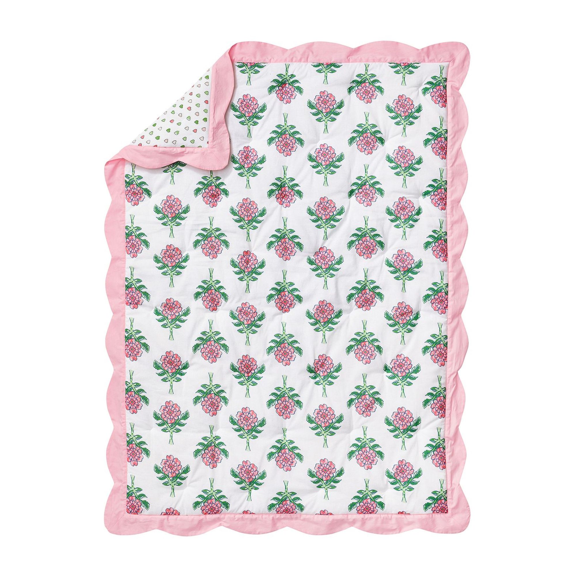
If you're looking to introduce some cottagecore style, this quilt with its rosebud print and scalloped edge is perfect. Plus it is reversible, with a heart motif on the back.
If you got wrapped up in the influencer-induced beige nursery decorating frenzy of the last few years, you're not to be blamed. But it is really time to start adding in some color with these low-lift tips from interior designers to help you elevate your nursery color palette.
Sign up to the Homes & Gardens newsletter
Design expertise in your inbox – from inspiring decorating ideas and beautiful celebrity homes to practical gardening advice and shopping round-ups.

Charlotte is the style and trends editor at Homes and Gardens and has been with the team since Christmas 2023. Following a 5 year career in Fashion, she has worked at many women's glossy magazines including Grazia, Stylist, and Hello!, and as Interiors Editor for British heritage department store Liberty. Her role at H&G fuses her love of style with her passion for interior design, and she is currently undergoing her second home renovation - you can follow her journey over on @olbyhome
-
 It’s a concept straight out of a fashionista's playbook, but I used the Sandwich Method to organize my kitchen shelves – it’s never looked sleeker
It transformed messy to mesmerizing in a matter of seconds
By Punteha van Terheyden Published
-
 The moody kitchen in this Victorian home has the most unique wall design I've ever seen – it's the perfect way to bring an elegant, aged feel to the space
The hand-painted feature has brought a sense of history and patina back into the remodeled kitchen
By Molly Malsom Published
