How do I make the most of a small room? 11 space-boosting tricks that interior designers want you to know
Maximizing space is sometimes just a matter of turning unused spots into practical – and pretty – features

Jennifer Ebert
In small houses, rooms will often be multipurpose, so you'll want to ensure that you are making the most of every inch.
Though small rooms can present many interior design challenges, there are several benefits to compact living. A well-designed bijou space can feel just as comfortable as a larger space, with all the warmth and snugness you crave.
Increasing the sense of space in rooms that are small in stature is a design issue everyone wants to solve. We spoke to a few of our favorite interior designs, architects and decorators to find out their solutions.
How to make the most of a small space
As well as trying to make a small room look bigger, it is also worth considering how you organize each room in your home, too. 'The best way to organize a house and make use of the space is to write down how each room is used, says interior decorator Nicola Harding, founder of Nicola Harding & Co.‘
Below, we showcase our favorite ways to make the most of a small room – with tricks of the trade to help turn that awkward, tiny room into something sophisticated and functional.
1. Look to unused corners and nooks
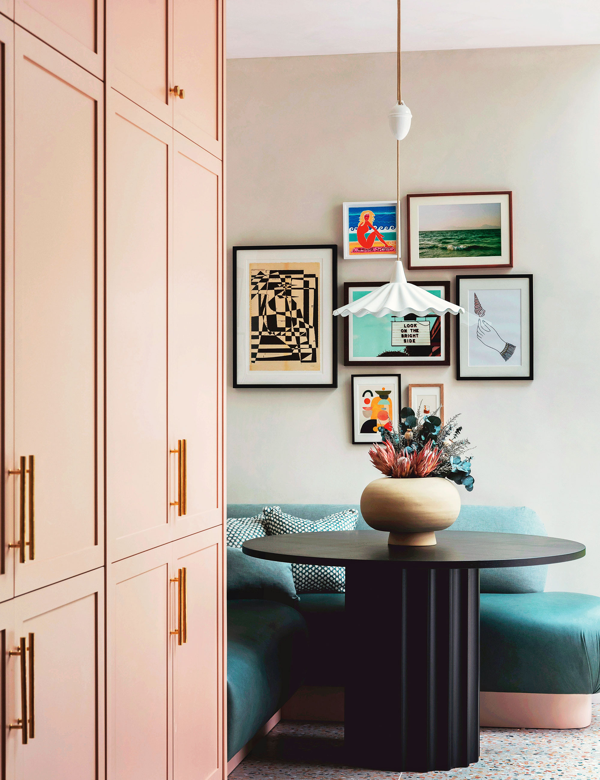
Carving out room for a table where floor space is at a premium will often require putting one in the corner. For that to work, there are two rules: firstly, the table should be round both to set a contrast to the right angles of the corner, but also to avoid anyone catching themselves on the table edges and, secondly, to use bench seating.
‘A breakfast nook is such a cozy corner,’ says Tiffany Duggan, founder of Studio Duggan, who created this scheme. ‘We’ve designed lots of these recently and tend to add a pendant light to make it more “hygge”. We often upholster the seat in a hard-wearing fabric such as leather. We wanted this one to feel “loungey”, so we kept the back low and rounded the edges.’
2. Think ahead when planning a child's room
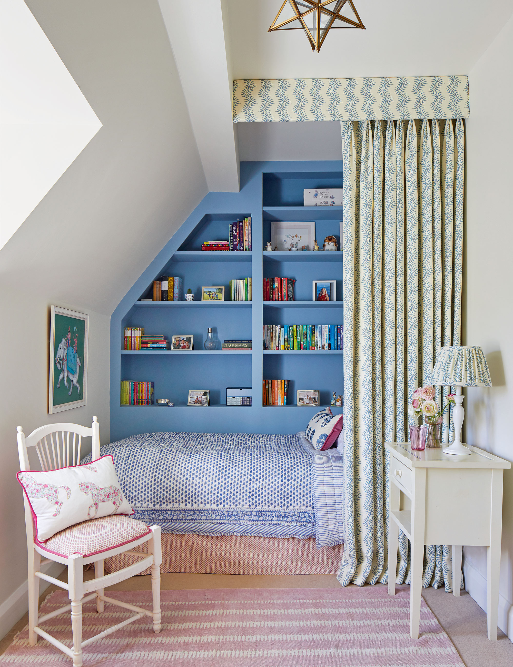
There’s a danger when designing children’s rooms that, as they grow older, they’ll fall out of love with a scheme. One alternative is to design a room that will stand the test of time, through teenage years to adulthood, which is what interior decorator Lucy Marsh was asked to do by her client.
‘It was difficult as the room is long and thin, so we created a design that looked meant to be, adding shelving, cupboards, and drawers to create a flow,’ she says. The paint is French Blue by Edward Bulmer Natural Paint. ‘Blue is difficult to work with, but this shade is warm and enveloping.’ A vertical pattern for the fabric (Scrolling Fern Frond by Soane Britain) heightens the room while curtains add privacy and softness.
3. Negotiate a niche for multiple uses
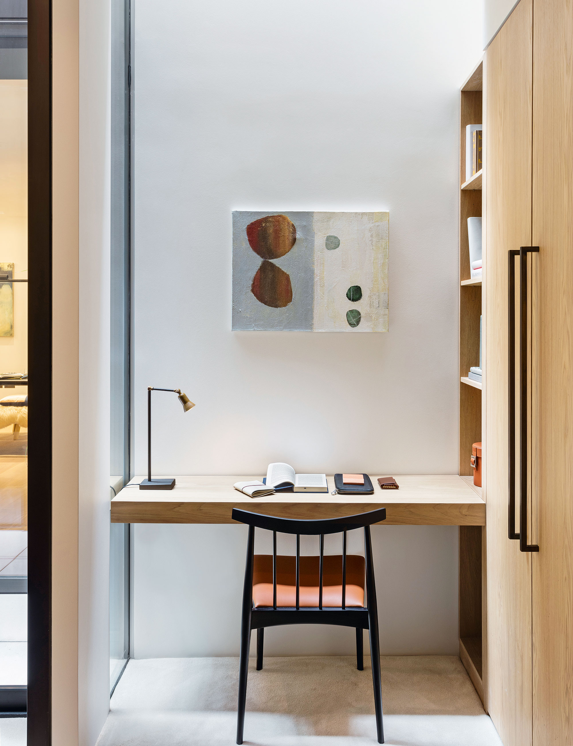
Nooks and niches lend themselves to storage with style – and are perfect as a display area. But it’s not just their contents that are crucial but also how they’re decorated, which can elevate the interior of a small space.
Small built-in desk areas can act as dressing tables, workstations, or areas to display objects. ‘In this space, the desk helped square off the wardrobe-cum-dressing area and the adjacent courtyard,’ says Steve Clinch, head architect at Echlin, who designed this table.
4. Ensure a compact space is well-dressed
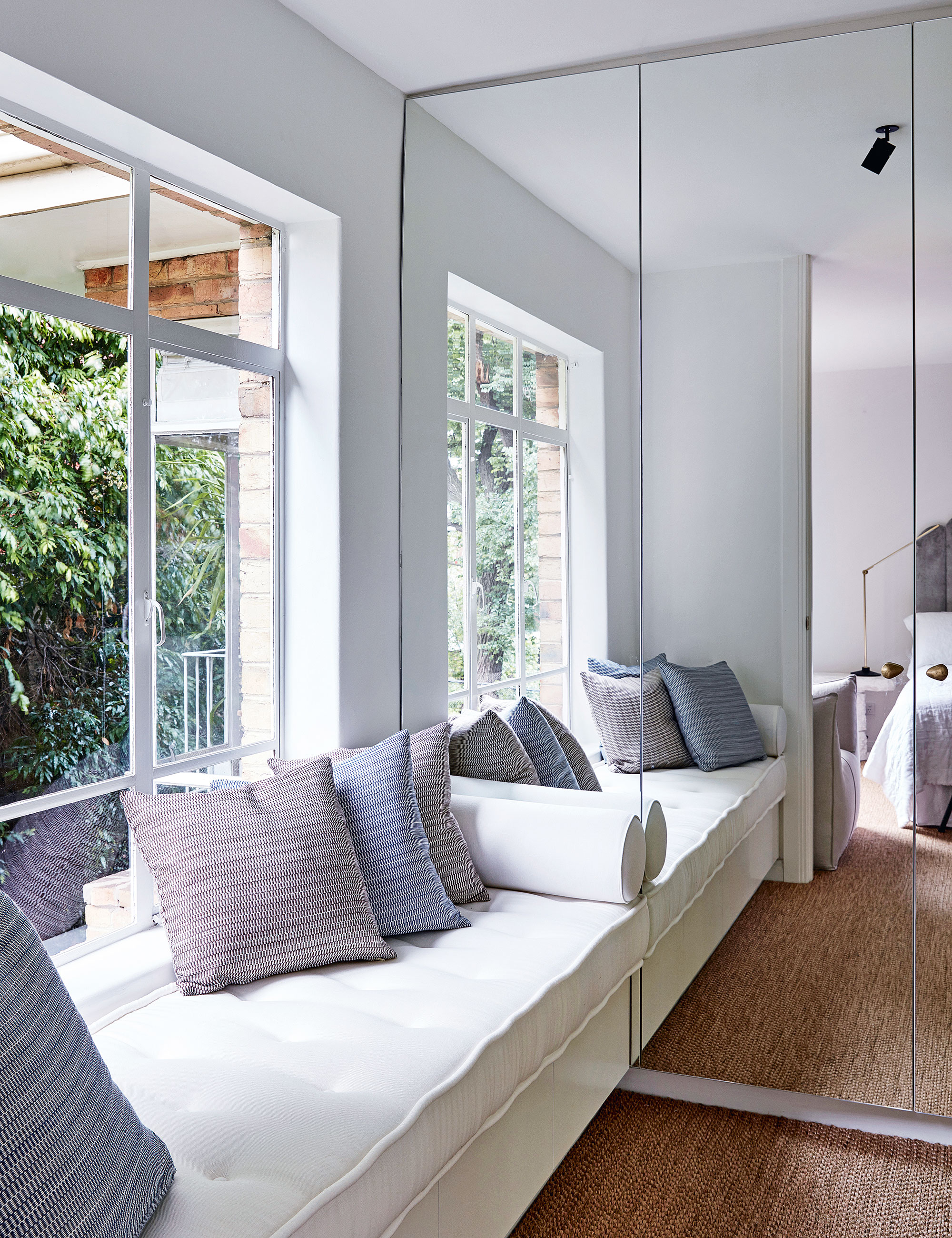
Decorating with mirrors has more benefits in a dressing room than just giving you a place to check your outfit. A wonderfully versatile design feature, mirrors are well-known to maximize the sense of space in your home.
Ideally, every dressing room should have good light and a full-length mirror. When space is tight, follow the example of decorator Tamsin Johnson and install mirror-fronted wardrobes. To add a much-needed soft touch, Tamsin designed a bespoke window bench seat.
5. Set up a seat within an alcove or nook
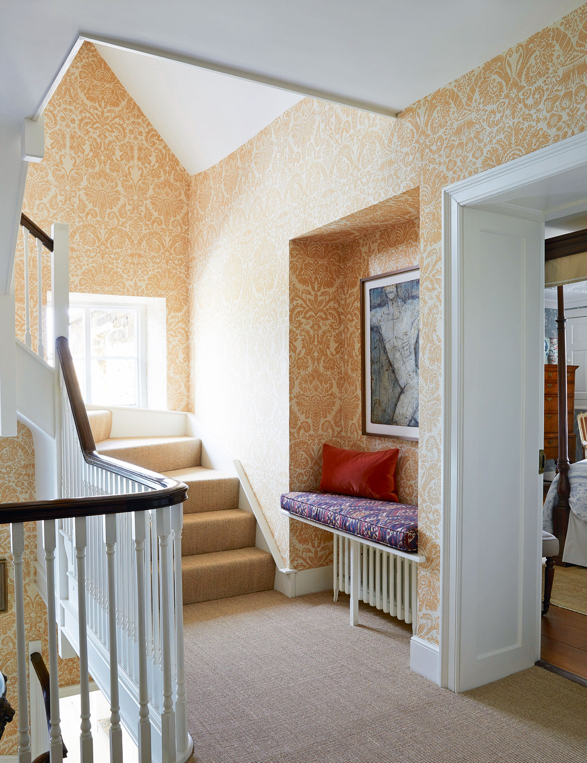
Architectural features such as alcoves are ideal for storage or seating. Here, interior designer Henriette von Stockhausen of VSP Interiors has made a feature of the alcove on a landing by placing an upholstered seat over the radiator and hanging a painting above.
'Entryways and landing risk being rather empty and full of hard surfaces; the insertion of a little seat with an upholstered cushion breaks that up,' says Henriette von Stockhausen.
6. Maximize the space below the stairs
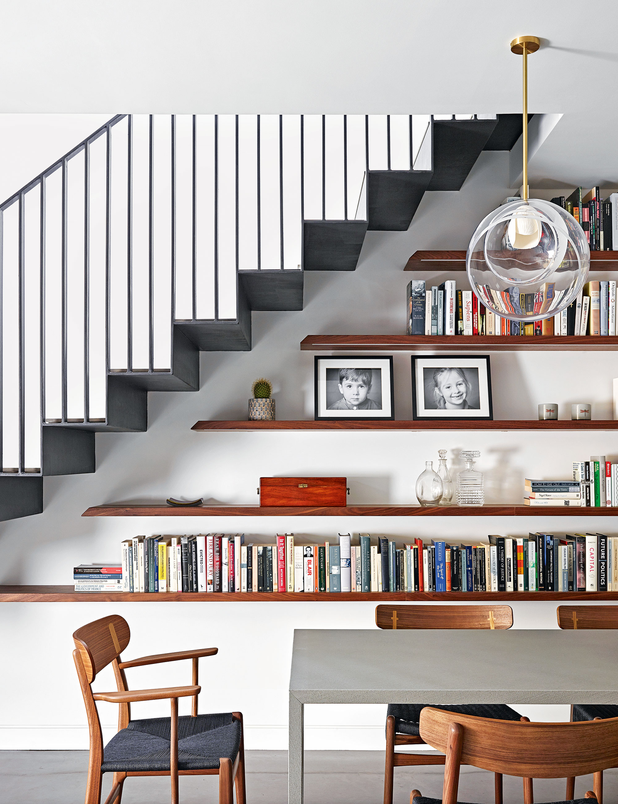
‘Awkward spaces present the perfect opportunity to be creative,’ says interior designer Emma Sims-Hilditch of Sims Hilditch. ‘We always make a point of devising intelligent storage solutions for our clients to help them to get the most out of their home.’
One of the obvious underused spaces is the void under a staircase – especially at the basement level where there’s no cellar to access. For a contemporary scheme, take inspiration from this design by Woodstock Furniture, which features floating shelves in walnut.
7. Bend the rules to create interesting architectural details
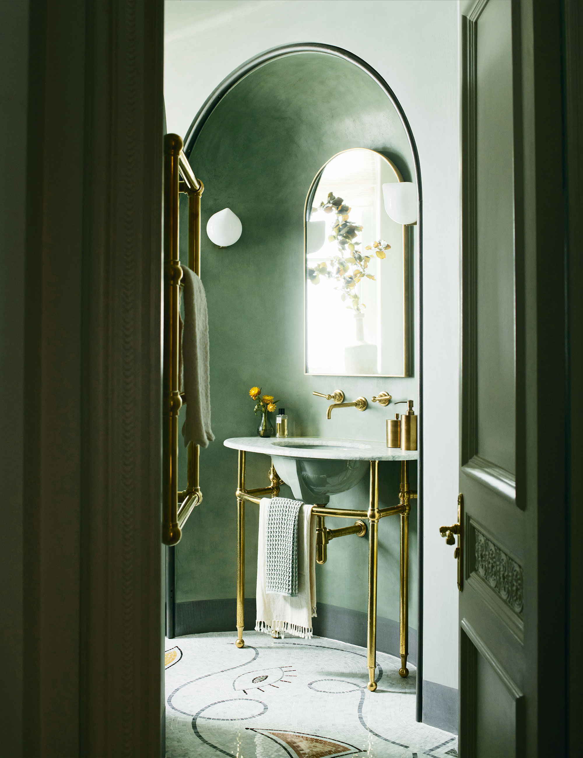
Architecturally inspired curves are of the moment, with soft, rounded lines cropping up everywhere, especially in small spaces where interest is often lacking.
The team at Maddux Creative had to reconfigure this small bathroom to create a more interesting flow. ‘The angled wall with an inset arched niche was created to house the elliptical washstand and arched medicine cabinet,’ say founders Scott Maddux and Jo Le Gleud. The dynamic relationship between the room’s architecture and the shapely, curvaceous sanitaryware strikes a note here.
8. Use wallpaper to disguise doors
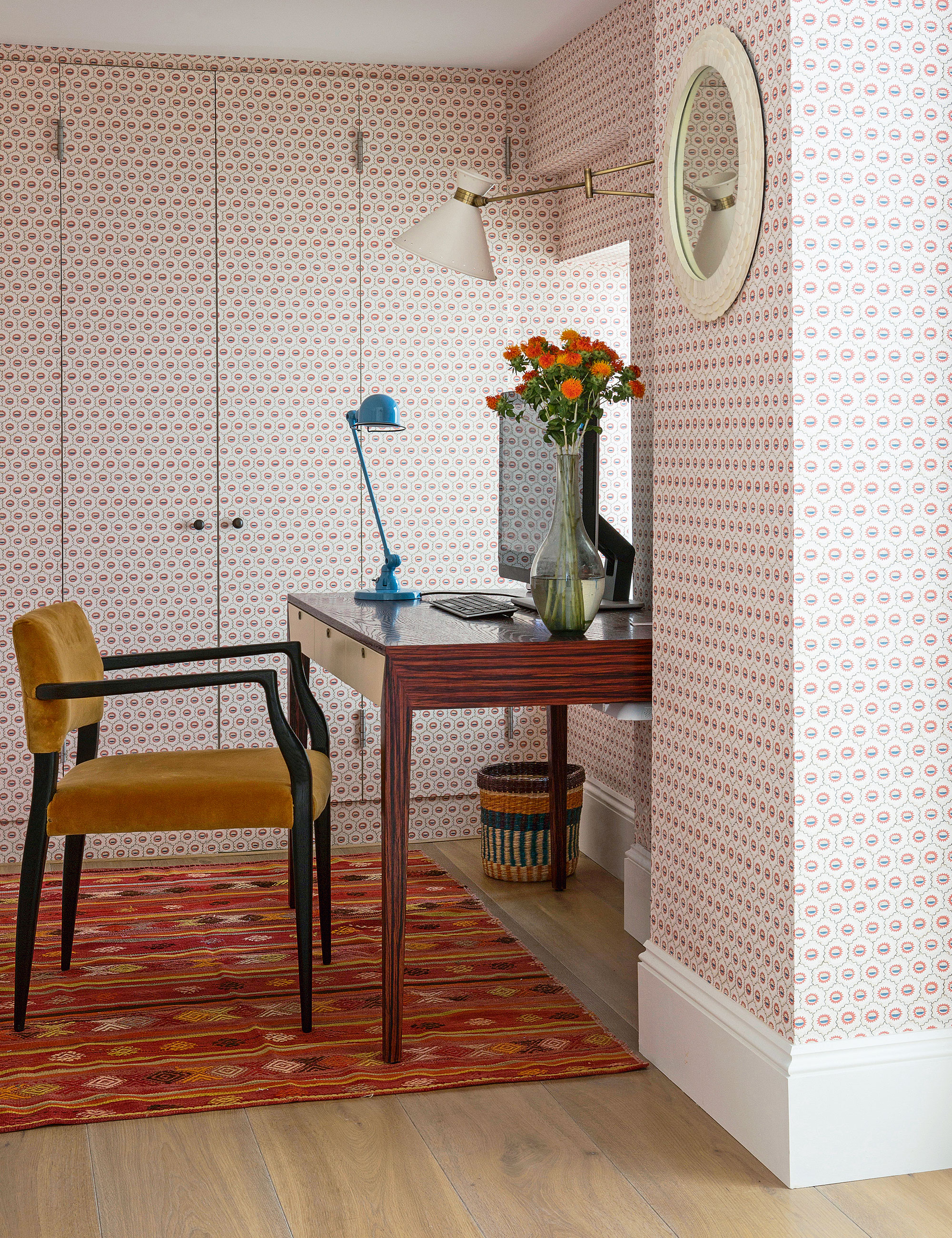
In recent years, many have been carving out spaces for small home offices – and lusting after ideal examples including garden studios or rooms above garages. The truth is, provided there is good light and an internet connection, an office can almost be set up in any room, as this scheme by interior designer Anna Haines demonstrates. The bi-folding doors down one wall that lead to the plant room of the house are almost undetectable thanks to the use of a pretty wallpaper by Robert Kime.
‘The design creates depth and averts the eye from the different levels,’ Anna says. Anna added an articulated wall light by Hector Finch and a desk light by Holloways of Ludlow. A kilim from Susan Deliss adds warmth and color.
9. Build-in seating
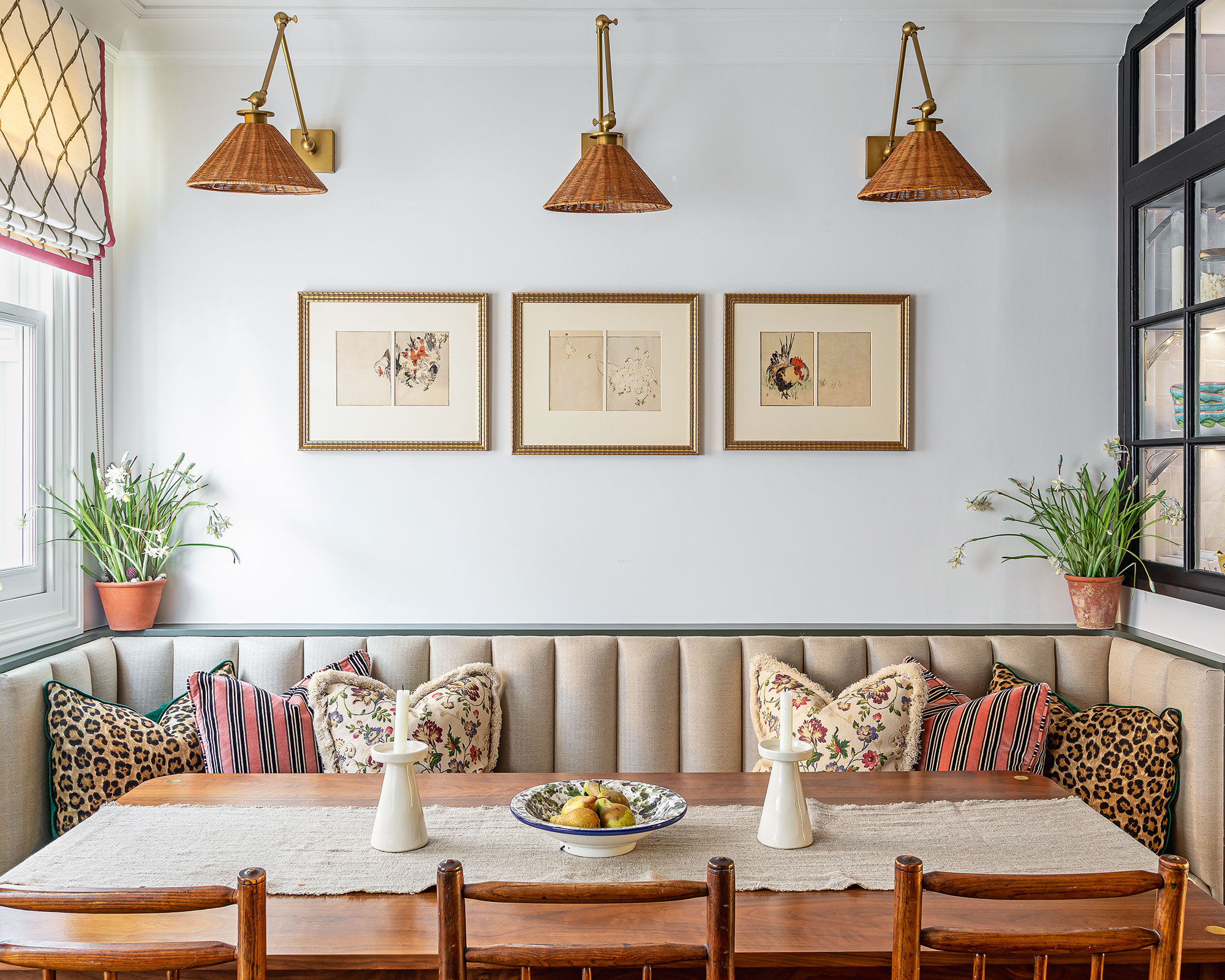
Individual dining chairs will always take up more space than a bench, but to move firmly away from furniture reminiscent of uncomfortable school lunches the best solution is to embrace a banquette. This one was created by the interior design studio Barlow & Barlow. Tucked between the wall and a glass-enclosed pantry, it results in a cozy nook that’s a perfect spot for dining.
'Fluted upholstery adds coziness to a space – I always think that kitchens are greatly improved with a bit of softness and lots of comfort,' says Lucy Barlow.
10. Invest in bespoke joinery
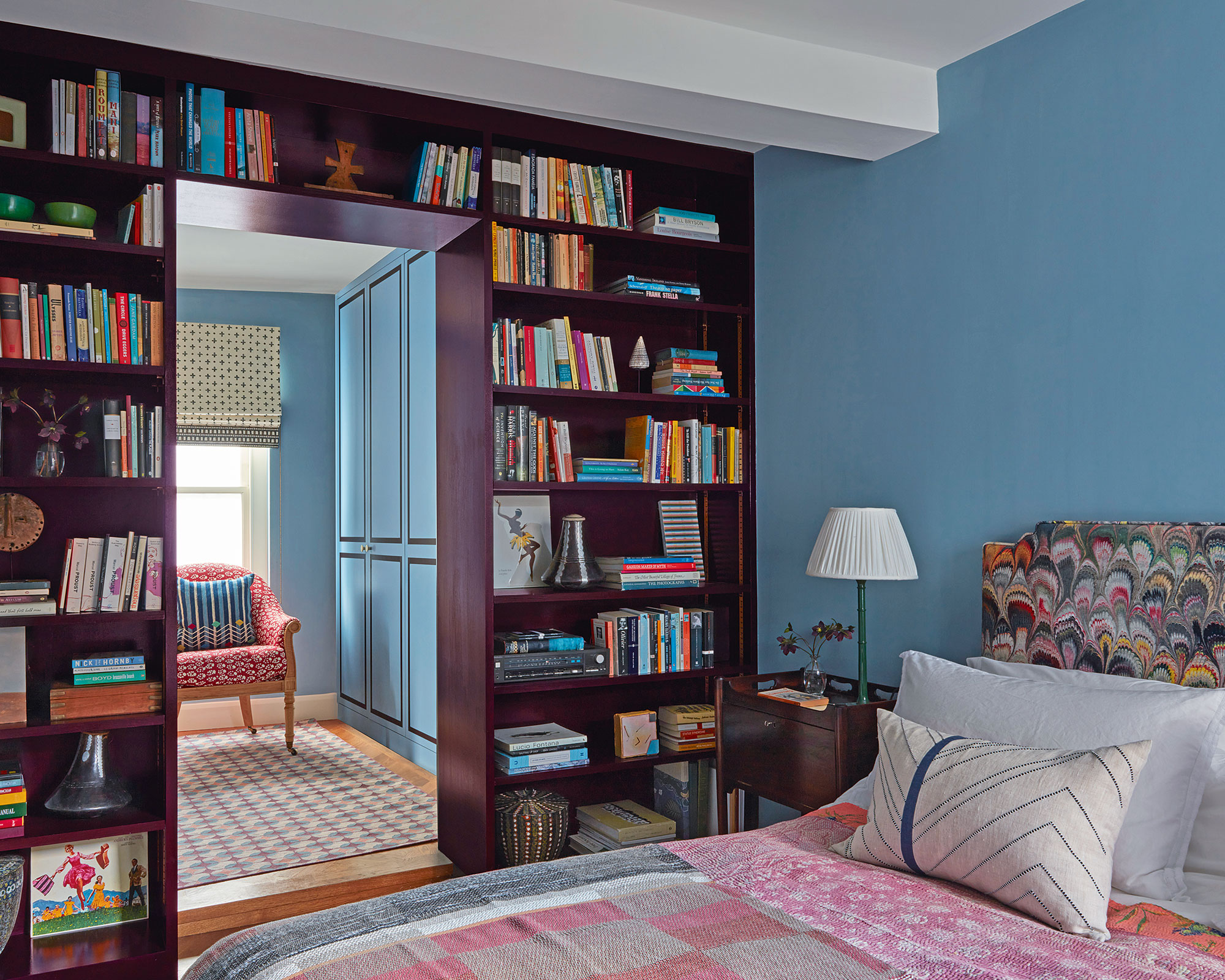
Bespoke joinery is a good way to zone spaces in an open-plan room. In this design by Kate Guinness, bookshelves create a pause between a small bedroom and dressing room, but the same technique could just as successfully be used to delineate between a living and small dining room. Kate painted the shelves in French Blue by Edward Bulmer Natural Paint and sourced the Kantha bedspread through 8 Holland Street.
11. Curate a magical environment with furnishings
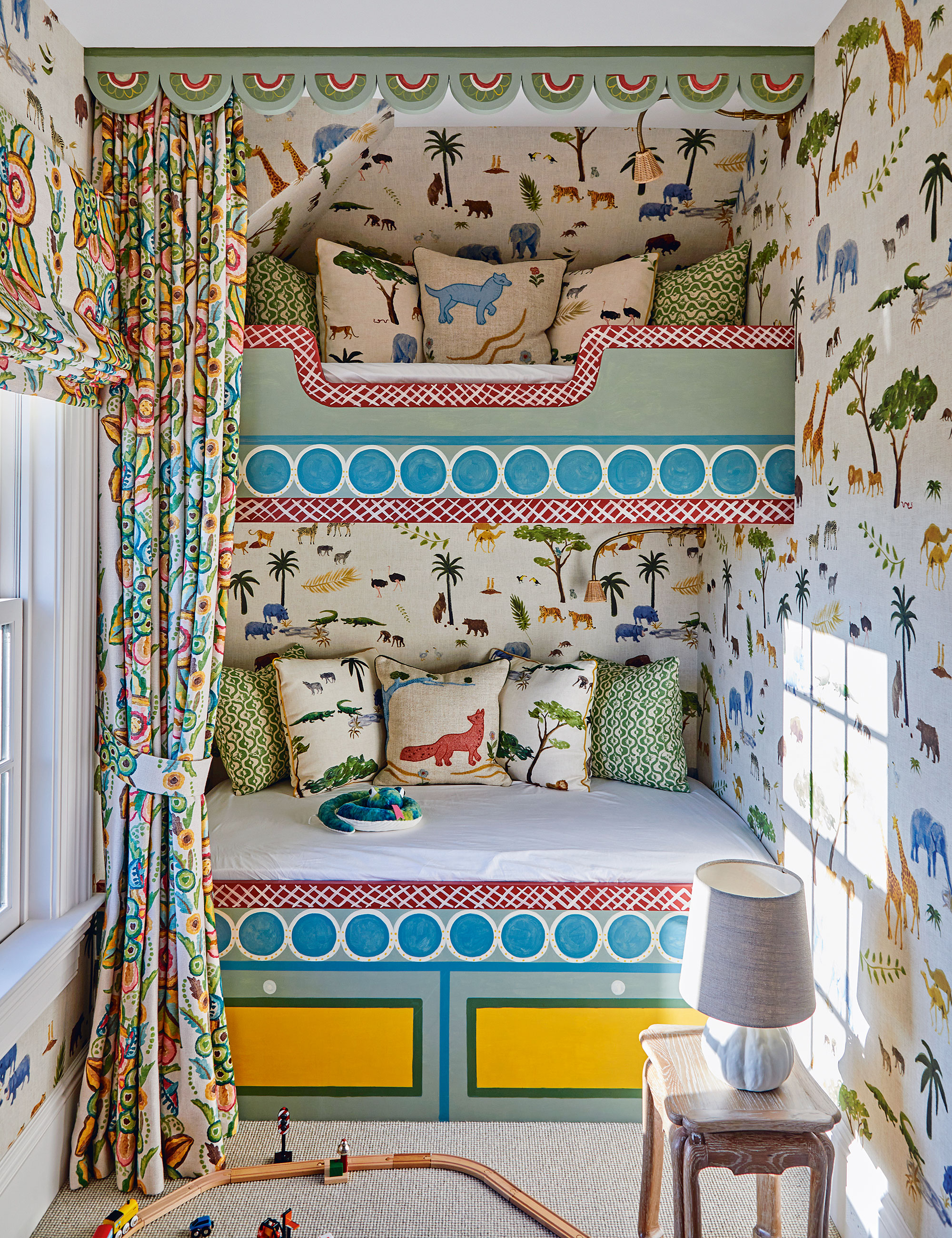
Built-in loft beds are one of the best space-saving options for a child’s room – and means they can have sleepovers. The addition of curtains to create cubby-hole bunk beds is also a perfect way to give siblings or friends their own space within the room.
Bespoke joinery is a big investment but ticks so many boxes as a cool way to inject some style into a room. Create a magical environment with furnishings that will kick-start young imaginations, as shown here. Making a smaller space sing with character, whimsicalness, and fun was all part of this project, says designer Kit Kemp.
‘You’d never want to grow up if you slept in this room with painted bunk beds, lyrical wallpaper and curtains inspired by The Bloomsbury Group.’
How do you make a small room more functional?
The best way to make a small room more functional is to go bespoke. Space planning with a budget to spend on bespoke joinery is the ideal solution to the small-room conundrum. Ceiling-high shelving or shelves that run up and over a door provide useful extra space. Rooms with low-sloping roofs also cry out for some clever joinery. Those that are too low to stand in but high enough to accommodate a desk and chair present an opportunity to partition off an office space from a bedroom, for example. When designing, floor-to-ceiling wardrobes, keep the top shelf open for baskets. It will add to a sense of height. Invest instead in low-lying drawers to keep shoes or bed linen.
Another option is to get creative with your storage ideas. Open shelves are a must for easily accessible and useful places to store everyday items – they are especially handy in a home office environment, where ideas for inspiration need to be on standby. But they must be kept tidy: an overflowing mess is the fastest way to make a small room feel even smaller.
‘One of the best ways to make a much-used busy room, such as my small home studio, appear less cluttered is by storing things cleverly but also creatively,’ says designer Molly Mahon. ‘I use our hand-block-printed storage boxes to store smaller things – they are cheerful to look at and can fit into smaller spaces or on work surfaces.’
Sign up to the Homes & Gardens newsletter
Design expertise in your inbox – from inspiring decorating ideas and beautiful celebrity homes to practical gardening advice and shopping round-ups.

Arabella is a freelance journalist writing for national newspapers, magazines and websites including Homes & Gardens, Country Life, The Telegraph and The Times. For many years she has specialized in writing about property and interiors, but she began her career in the early 2000s working on the newly launched Country Life website, covering anything from competitions to find the nation’s prettiest vicarage to the plight of rural post offices.
- Jennifer EbertDeputy Editor (Digital)
-
 How to clean a patio – 6 different methods, and when you must use a chemical cleaning agent
From manual scrubbing, natural solutions or calling in the pros, industry experts reveal the benefits and considerations of each method
By Andy van Terheyden Published
-
 Kris Jenner's favorite air fryer, the Ninja Crispi, is the perfect small kitchen solution – it deserves a place on the most compact of countertops
Kris approves of this compact yet powerful air fryer, and so do our own kitchen appliance experts, praising it for its multifunctionality
By Hannah Ziegler Published