How do I fix dead space in my house? 7 transformative tips from designers
From underused spare rooms to empty corners and awkward alcoves, learn how to make the most out of the 'dead zones' in your home
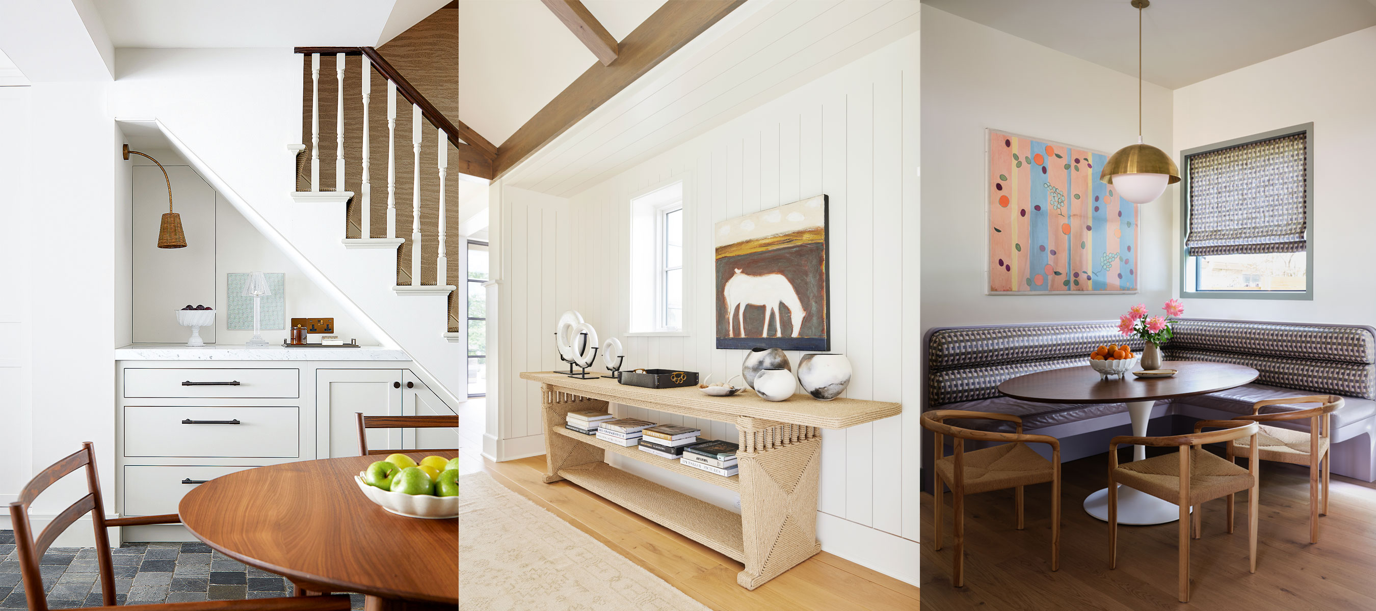

Every inch of your home should work hard to create a beautiful and functional space that is a joy to live in – and working out how to tackle those tricky dead spaces can really make a difference in the overall look and feel of a successful interior design.
A dead space provides the chance to create a truly unique design feature and enhance a room with both style and practicality.
From innovative storage ideas under the stairs to unique alcove ideas that transform niches into practical workspaces, we have asked a collection of interior designers to share their favorite tips and tricks to help you harness the potential of the dead zones in your home.
Learn how to transform dead spaces into something special
'Unlocking the potential of dead space in your home is like finding an unopened gift. With a bit of imagination, the possibilities are endless.
Take time to consider the functional challenges of your home, whether it be a lack of space for storage, display, or work, or perhaps a cluttered entrance. Think of how this previously untapped space could be the answer to your design woes,' says Brenda Petrunick, founder of, Simply White Interiors.
Explore how to fix the dead space in your home with seven ideas from design experts in the know.

Interior designer, Brenda Petrunick is the founder of Simply White Interiors, a full-service design studio based in Niagara-on-the-Lake in Canada. An experienced designer, Brenda is at the helm of every project at the firm, from creative concepts to seamless installations.
1. Under the stairs – smart storage
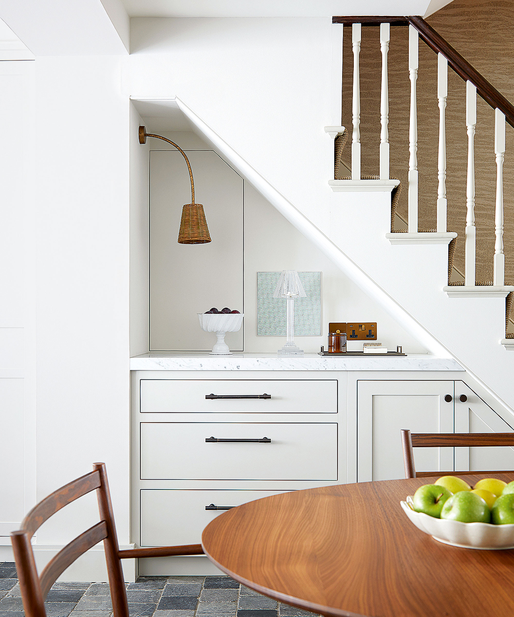
One of the most common dead zones left underused in the home is under the stairs. Often a very awkward, angular space, this area can be uplifted with everything from unique shelving and cabinetry to a beautiful piece of artwork on the wall.
If you have a set of stairs that sit in a hallway or entryway, the empty space underneath provides the perfect area for additional storage, as Brenda Petrunick says, 'with the addition of shelving, doors or drawers, the irregular space under your stairs can become the perfect home for coats, shoes, and seasonal items likes hats and mittens – or even a dog crate.'
We also love the under-the-stair space in this dining room; a design that utilizes the dead area to create beautiful bespoke storage and eye-catching display space.
2. Awkward alcoves – create a colorful workspace
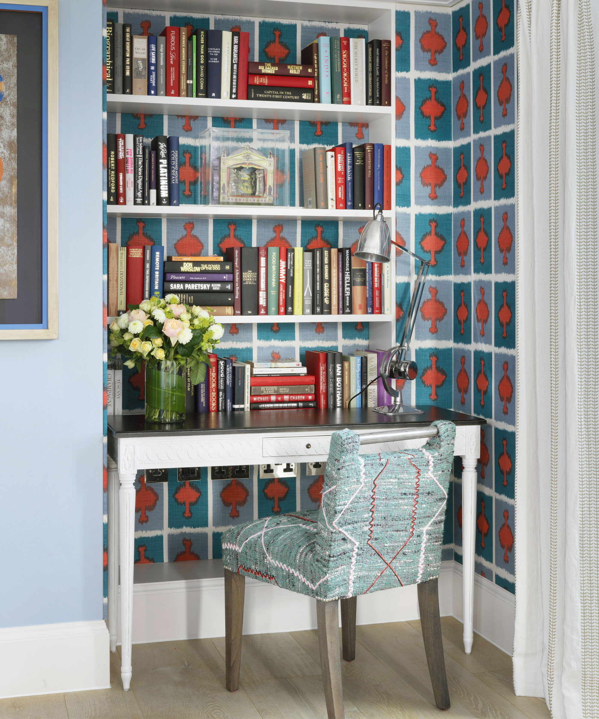
Many of us are now working from home, but not all of us have a spare room that can be used as a designated home office. Interior designer, Amanda Shields explains how dead spaces, such as nooks and alcoves, provide the perfect opportunity to create a unique workspace set-up.
'Alcoves and nooks can be an ideal spot for adding in a small desk, chair, bookshelf, and other office essentials. To optimize this area, consider adding built-in shelves or cabinets to increase storage. Lighting is also crucial, particularly if your nook lacks natural light. You can incorporate a small table lamp, or pendant light, or install recessed lighting to brighten up the space.
Transforming underused areas into a compact home workspace is an excellent way to turn dead spaces into functional areas that can enhance productivity and elevate the value of your living space.'
As shown in this colorful living room, designed by Kit Kemp, the recessed space has been transformed into a stylish working area, with the vibrant wallpaper ideas helping to zone the space.
She says of the design, 'you can be really adventurous in a smaller space – it makes more of a statement. Color is a great way of breaking up space, and so is introducing a patterned wallpaper – such as on the back of a bookcase. If you then style it with some books and a few ornaments, it can actually become a very decorative corner of the room.'
Kit explores how to style a nook in her dedicated feature.
Amanda Shields is an award-winning decorator and designer based in Newmarket, Canada. With a Bachelor of Design and experience working alongside Joseph Mimran as a product designer, Shields then went on to set up her very own design firm.
Renowned British interior designer and founder of the hotel chain, Firmdale Hotels, Kit Kemp has been creating and designing beautiful interior spaces for over three decades.
3. Bay windows – create a cozy reading nook

A beautiful bay window creates an extra area of space that should really be celebrated – so why not make the most out of the natural light and create your very own cozy reading nook?
'Anytime we have awkward spaces to fill, we really want to be purposeful in giving it intention. Making a nook or dead space feel inviting, welcoming, and interesting, will only help your overall design feel more unique and well thought out. We love adding benches in bay windows to create the perfect spot to curl up. I also love finding just the right piece of furniture in a small space to make it feel like it was made just for that very space,' says interior designer, Samantha Struck of StruckSured Interiors.

Samantha is the founder and principal designer at StruckSured Interiors. She lives on a 5th generation farm on the Columbia River, and her design style is ever-inspired by her travels, the mountains, rivers, and the seasonal shifts of the Pacific Northwest.
4. Empty corners – enhance with seating
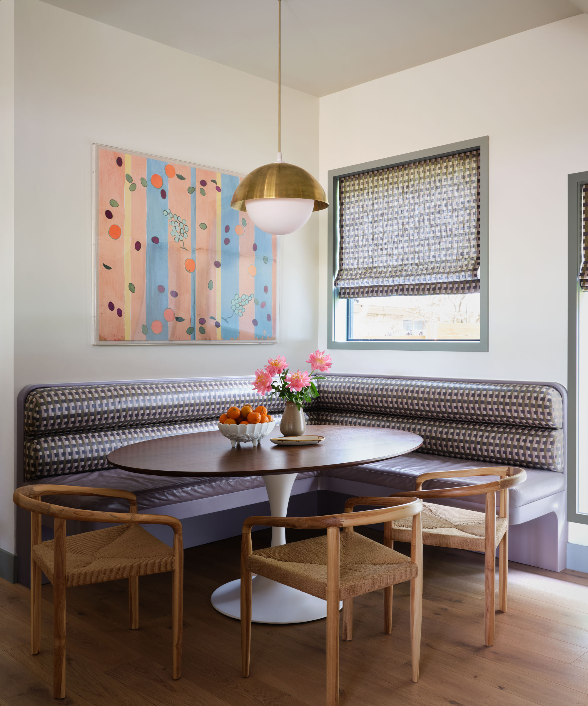
A large empty corner in a kitchen or open-plan living space can make for a prime spot for practical, additional seating – and can even create a whole separate dining zone, as shown above in the design by Annie Downing Interiors.
Annie says of the design, 'I love to fill in empty spaces with extra seating, and in recent projects, that impulse has resulted in several banquettes. There’s much to appreciate about a banquette. It makes a compact breakfast nook more capacious because it eliminates chairs, there is less awkward maneuvering around the table, and the cushions offer a fun opportunity to decorate with patterns. For a connected and cohesive feel, in this project above we matched the upholstered seating to the window treatment.'

After assisting friends with various interiors projects, Annie Downing went on to set up her own interior design firm. ADI has projects throughout Austin, and surrounding areas, and was named Best New Southern Tastemaker by Southern Living in 2018.
5. Transitional spaces – bring in beautiful decoration
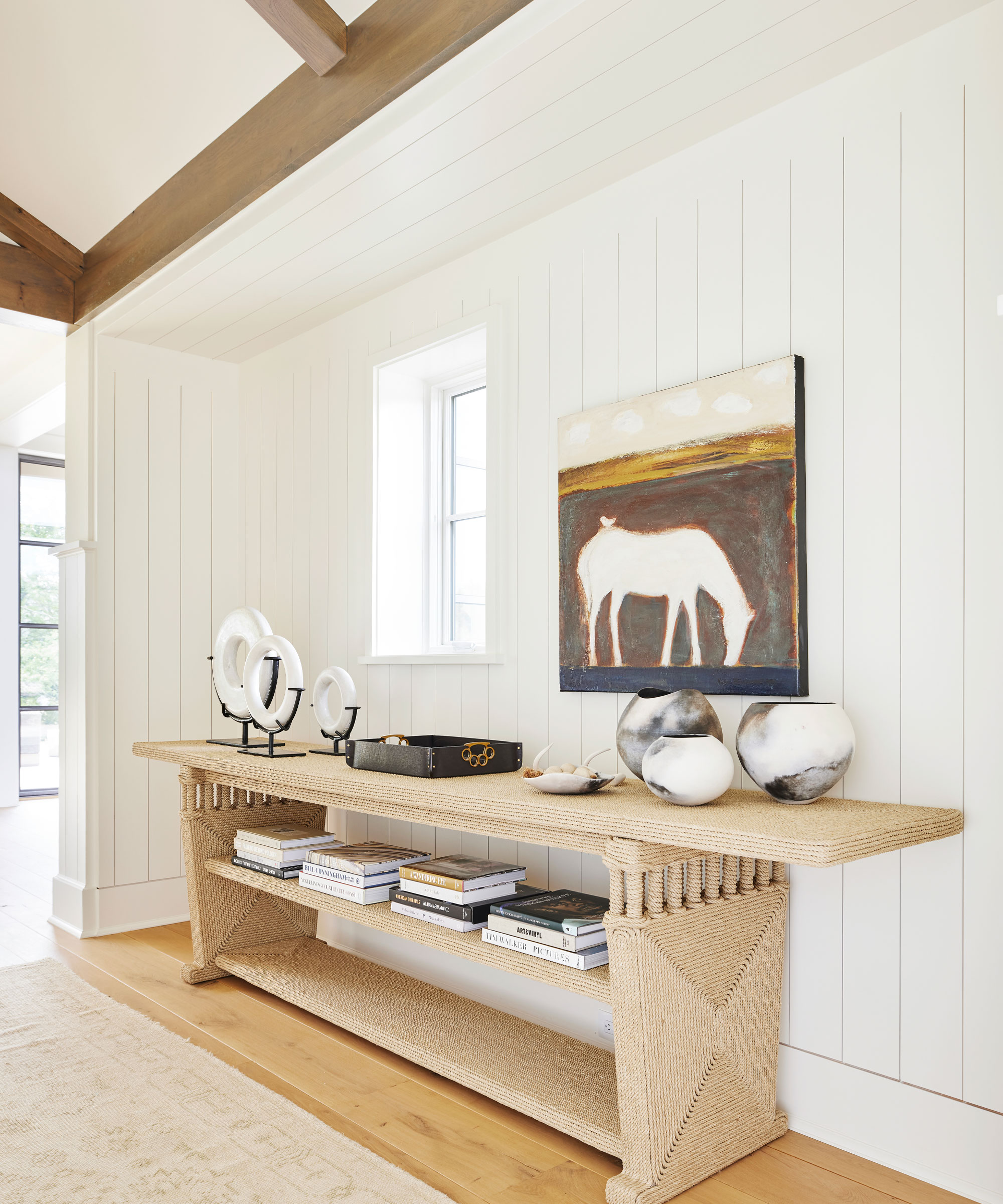
Transitional spaces that connect the 'main' rooms in the home, such as corridors, entrances and stairways, can often be left under-appreciated and un-loved, but these areas of the home should be just as much as part of your design scheme as any other room.
From an eye-catching console table in a hallway that creates an engaging focal point as people walk through the door, to colorful artwork that lines a corridor, a few simple decorations can transform these practical areas into something beautiful.
As designers, Trish Knight and Nicole Varga from Knight Varga Interiors say, 'some common examples of ignored dead spaces in the home are wide hallways, corridors between rooms, stairs and landings between floors. If a hallway feels too bare, consider adding a runner carpet or a series of photos or art on the wall before considering furniture with no purpose – you do not want to over-clutter the space!'
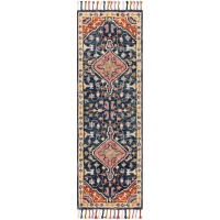
Carroll Handmade Wool Navy/Orange/Gray Rug | From $160 at Joss & Main
Handmade in India, this area rug has been made from wool using a looped/hooked technique, and has a classic Persian-inspired pattern in deep shades of pink and navy; perfect for uplifting a hallway or entryway.

Designers Trish Knight and Nicole Varga are both co-founders of Knight Varga Interiors. Collectively with two decades of experience this Vancouver-based multi-award-winning design firm has become known and sought after for creating well-curated interiors. The firm provides complete bespoke residential design services throughout Vancouver, BC Canada and North America.
6. Underused spare rooms – maximize storage
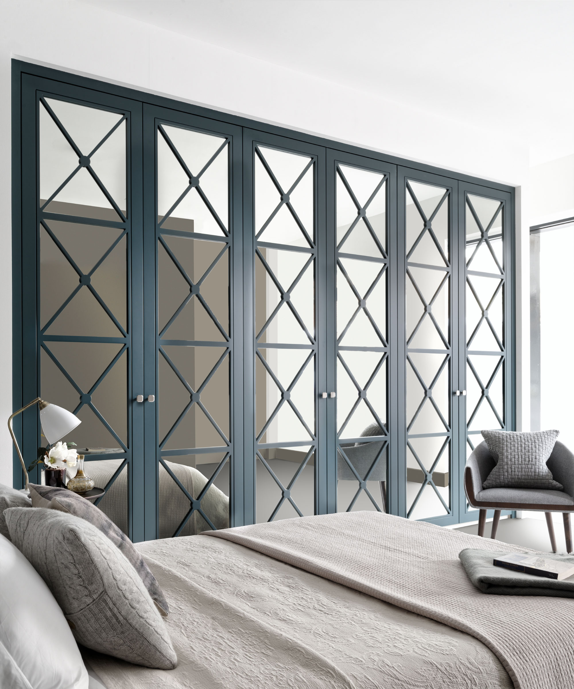
Many of us are guilty of using a spare room or guest room as a dumping ground for items we do not know what to do with – but this extra space in the home should always be properly utilized.
From guest room office ideas to a stand-out walk-in closet, a spare room should work hard to not only provide a place for guests to stay but to help your lifestyle day to day, too.
Philipp Nagel, director of bespoke furniture brand, Neatsmith says, 'for those with the extra space, the desire to take an existing and under-utilized spare room and make it into a walk-in wardrobe or dressing room has been a big priority for many of our clients. We’ve seen an increased demand for bespoke designs, which often take a rarely used or cluttered spare room that is transformed into a beautiful, organized and relaxing space clients can use every day.'
7. Establish a 'design moment'
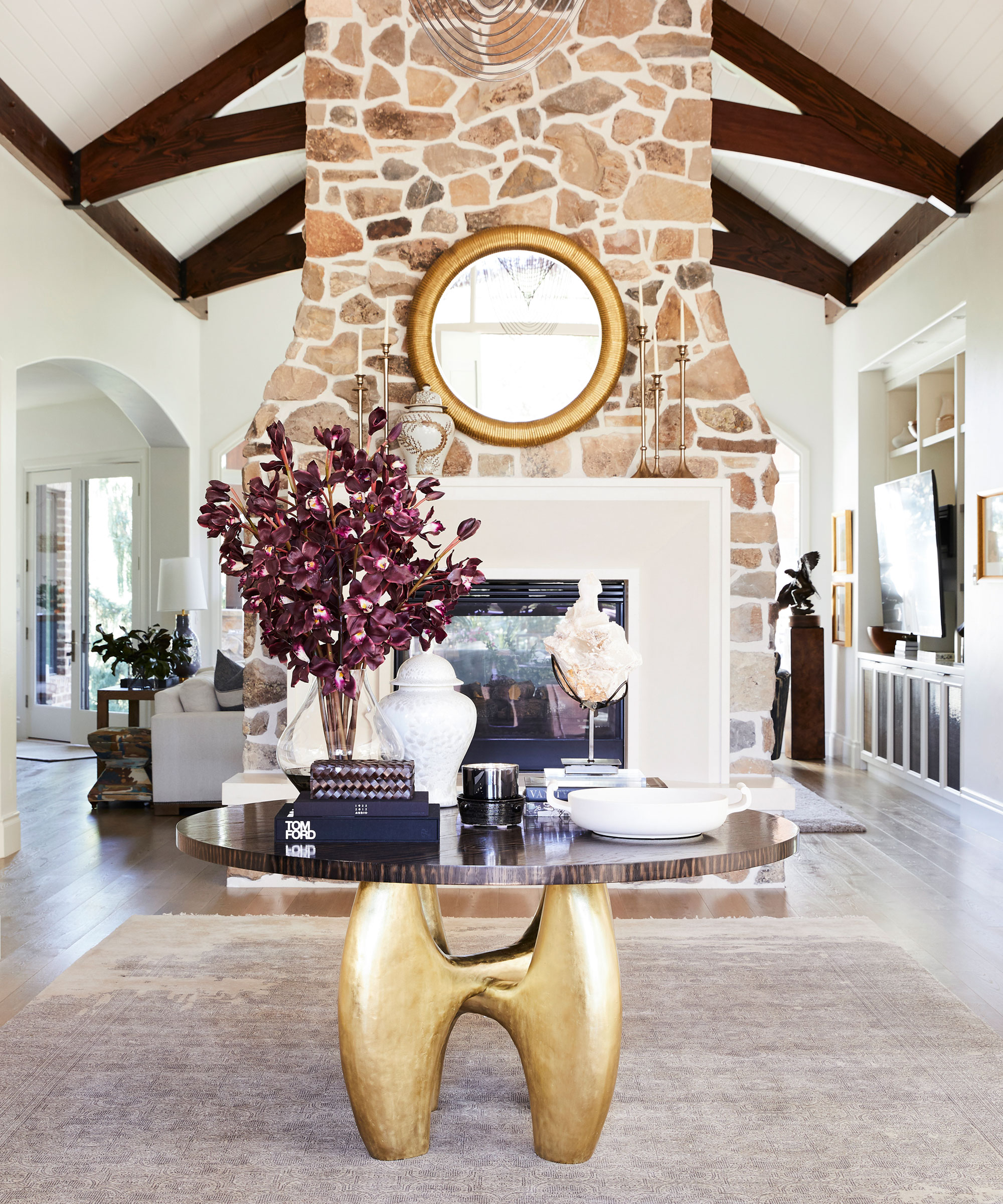
Interior designer, Andi Morse of Morse Design says, 'dead spaces in a home can create an exciting and creative design opportunity. If you have an empty, dead zone in a room, creating a “design moment” will be the perfect complement to the room. From a vintage occasional chair to some great art, thoughtful decorations can work to beautifully transform these small yet impactful areas.'
Whether it's a vase of flowers placed on a table in the center of a large hallway, or a small side table in an empty corner that provides an elegant pedestal for a unique decorative ornament or treasured antique, these 'design moments' will establish a unique focal point and sense of focus in a room, inviting you to pause and take in a beautiful design feature – just like you would when perusing an art gallery.

Based in Atlanta Georgia, Andi Morse is the founder of Morse Design, a boutique, full-service, interior design studio focused on furnishing projects, renovations, and new construction.
FAQs
How do you fill dead space in the middle of a room?
One way you can fill a dead space in the middle of a room is to rearrange your furniture and bring it closer together. It can be very tempting, especially in a small room, to push all of the furniture up against the walls – in a bid to free up more space, but more often than not, this will create an awkward dead zone in the center of the room.
Think about how you can cleverly position the furniture to create a zoned layout that feels cozy and inviting. For example, in a living room, place your seating around a TV or fireplace to create a more engaging and intimate seat space, rather than having it distanced around the room.
In a large hallway or entryway, position a table in the center of the room, this will create a natural focal point as people step foot into your home, and disrupt the awkward sense of space.
Or in a kitchen, why not really make the most out of a large empty space and incorporate a dining table or kitchen island?
When fixing dead spaces in the home, remember, do not be tempted to over-fill rooms with unnecessary clutter or furniture – sometimes empty space can be a good thing!
As Trish Knight and Nicole Varga from Knight Varga Interiors conclude, 'having open spaces within your home, no matter the size, can also help to keep it feeling light, airy and less cluttered. I think it is important to note that certain negative or empty spaces are a design element within themselves,' – it's all about creating the right sense of balance, rhythm and flow throughout your home.
Sign up to the Homes & Gardens newsletter
Design expertise in your inbox – from inspiring decorating ideas and beautiful celebrity homes to practical gardening advice and shopping round-ups.

Zara joined Homes & Gardens in February 2022 as a Content Editor. After studying English Literature at University, she worked as an Ecommerce Website Editor, Content Writer and Buying Intern at multiple independent businesses within the luxury retail and lifestyle sectors. Her role at Homes & Gardens unites her love, experience and passion for the world of design and desire to create inspiring written content. She enjoys nothing more than discovering new trends, brands and products, whether that be in fashion, interior design or lifestyle.
-
 5 things professional cleaners always do to overcome a cleaning roadblock – they're surefire ways to feel 'motivated and clear-headed' experts say
Get your cleaning schedule back on track
By Ottilie Blackhall
-
 Martha Stewart used this vintage-style pan to make cute bunny cakes for Easter – it's a real heirloom piece (and only $40 now)
It's not Easter without bunny-themed baked goods, and Martha set a precedent with a novel cake pan – it's American-made and has exceptional durability
By Megan Slack
