'I didn't buy anything for 100 days' – 5 tricks I used to make my home look better without spending
Want to upgrade your home at no cost? Yes, it is possible! These interior design tricks will give you an elegant home without the spend

If you've been wondering 'how can I make my home look better without buying anything?' You are not alone in your desire to curb spending.
It is so easy to get caught up in a rapid cycle of consumerism. Before you know it, your quest to live a more intentional and sustainable life is drowned out by yet even more stuff. So with this in mind, I decided to embark on the '100 day no-buy' challenge: exactly 100 days dedicated to cutting out extraneous purchases in order to reset my spending habits.
Remember, room transformations don’t always have to be grand or expensive affairs. Instead, they can be slowly curated through minimal – and free – updates using items that you may already own. All your home needs are a few thoughtful details to give it that five-star status that you have always desired.
In this article, we’ll explore the benefits of the '100 day no-buy' challenge, and clever tricks you can use to improve your home throughout. Each one is easy but impactful – and above all, beautiful. So, if you have time on your hands and are in need of inspiration, keep scrolling...
How can I make my home look better without buying anything?
Before you invest in designer décor, think critically, because spending a small fortune on furniture and furnishings does not always guarantee a bold, beautiful, and bodacious look.
Here, some of our favorite interior designers offer their simple home decor ideas, advice, and expertise on making a home look better without buying anything. It is easier than you think.
1. Curate a talking point with objects you already own
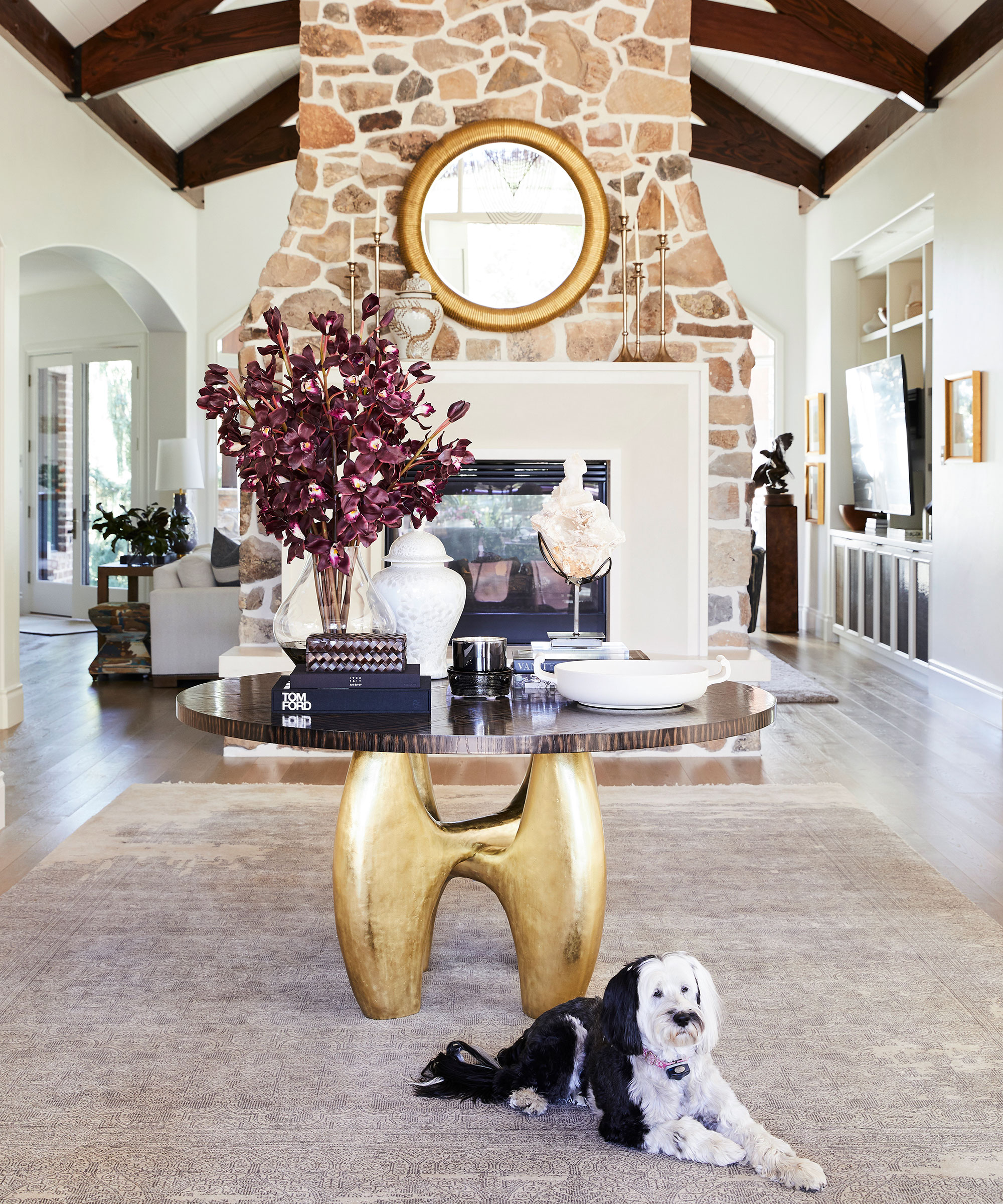
The way art is displayed can have a transformative impact on a space, and chances are, like me, you also have a plethora of pretty trinkets and objects that you've stowed away.
An eye-catching table display makes a conversational starter for guests, and it is one of the focal points in my home. After inheriting it from my parents, it is also my most treasured piece of furniture, and I imagine it will be a key piece in every home I live in.
I spoke to interior designer Jessica Bennett, founder of Alice Lane Interiors who also shares my passion for using tables to display art. 'Here, my client has a generously-sized round table that I knew I couldn't leave bare, so I turned it from drab to decorative using items already in their possession.
'It now doubles up as an inspirational work table and somewhere to display my finished pieces – an ideal option for anyone wanting to arrange art anywhere other than on a wall,' she says. 'The key to making a successful arrangement is to mix height and scale, she adds.’
Camilla Clarke, co-founder and creative director of Albion Nord agrees: 'We love the combination and balance of using antique, found, and contemporary objects together to create a sense of evolution in a space.'

Jessica started her creative journey at Utah State University. Her studies there led to her work in an ad agency as an art director but building her home brought back her earliest passion: interior design and trends.
2. Rearrange bedroom furniture to aid sleep
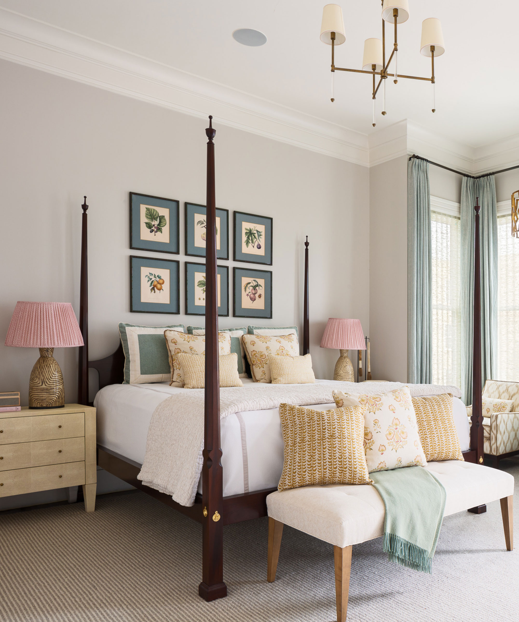
Being able to sleep soundly is an issue we all want to solve, but doing so could be as simple as rethinking your bedroom layout and Feng Shui furniture placement. Without the distraction of a shiny new purchase, I was able to spend my time readjusting the layout according to bedroom Feng Shui, and not only am I sleeping better, but I feel like I have a brand-new space.
When it comes to the placement of furniture in a bedroom, a lot will clearly depend on the size and orientation of the room. Feng Shui experts recommend ensuring the bed is located in what is known as the ‘command’ position – that is, so that you can see the entrance of a room, looking towards the door but not being directly opposite. Nor should it be positioned under a window (too drafty), or against the party wall (in case sounds from next door interrupt sleep).
3. Take the rule of three to your houseplants
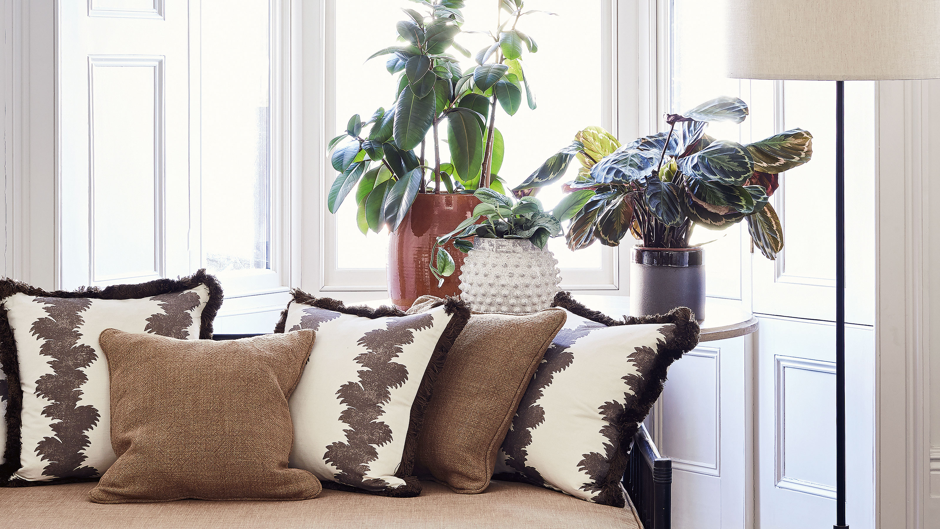
It is common knowledge that fresh flowers or a houseplant can also inject some life into an otherwise simple space, but I wanted to curate a unique freshness to my current foliage by using the rule of three – an interior design device that experts use to ensure that the spaces are visually pleasing.
'To make an impact with a decorative display, the magic number is definitely three,' says Lucy Searle, editor-in-chief of Homes & Gardens. 'Grouping three objects is a technique the world's best interior designers employ frequently to make the items they collect together a feature worth attention. It is a simple technique that I use in my own home to great effect.'
While many designers often use this on a grander scale, to add impact with lighting, furniture, and color schemes, it also works with cushions, artwork, and yes, even houseplants. It’s a strategy that makes the space less formal than one where symmetry is to the fore.
Here, the pyramidal arrangement leads the eye around the group of three – and it’s a shape that’s frequently employed by designers exploiting the power of three.

Lucy Searle has written about interiors, property and gardens for over 30 years, and has more recently renovated numerous homes and gardens. Lucy is a savvy decorator and can spot a design flaw in an instant.
4. Swap rugs from room to room
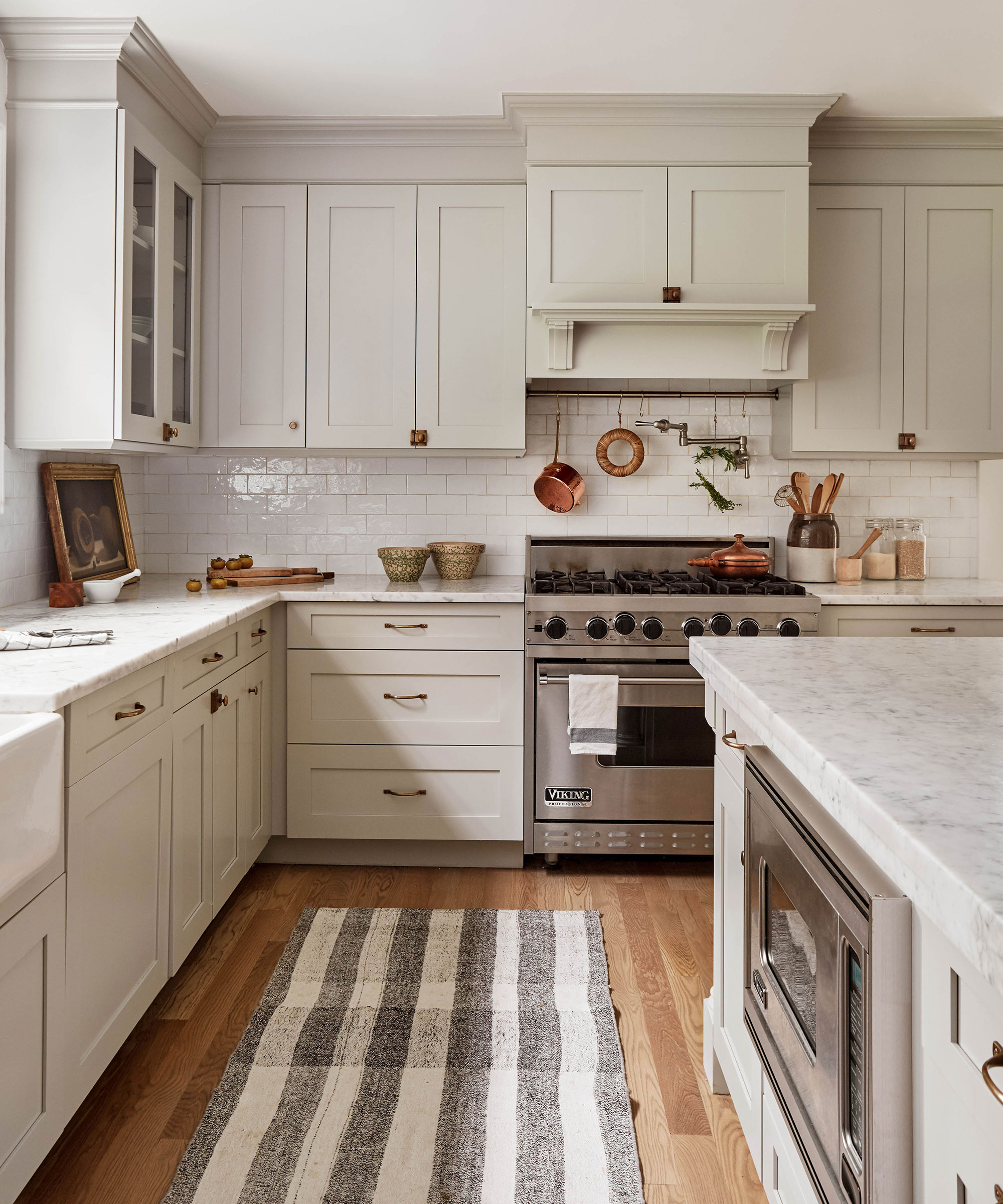
Rugs establish a focal point in a room and bring a level of coziness that floorboards – which I love for their aesthetic – often lack. However, like with most things, I do tire of seeing the same rug in any one room for too long. The solution? I love to regularly swap rugs from room to room, and the results are too incredible not to share.
'If you have a whole house color scheme, this is a wonderful way to add new life to each room,' agrees designer Louise Grey, of House of Grey. 'You can also change the room by the way you style a rug, and I love to play around with this: either you place your furniture on top of it, or you place it around it, so the furniture frames the rug. They are two very different looks.'
Another free styling trick to consider is hanging a rug on the wall: it acts as a great piece of art, fills a big space and, just like on the floor, acts as an extra layer of insulation for sound and heat – making the room cozier. Rugs can be an expensive purchase, so this simple trick is a must for adding depth and dimension.
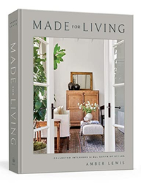
Made for Living: Collected Interiors for All Sorts of Styles, Amber Lewis | From $24.58 at Amazon
This national best-seller is a success for a reason: within the pages, interior designer Amber Lewis shares her most loved design secrets and know-how.
5. Create conversational seating
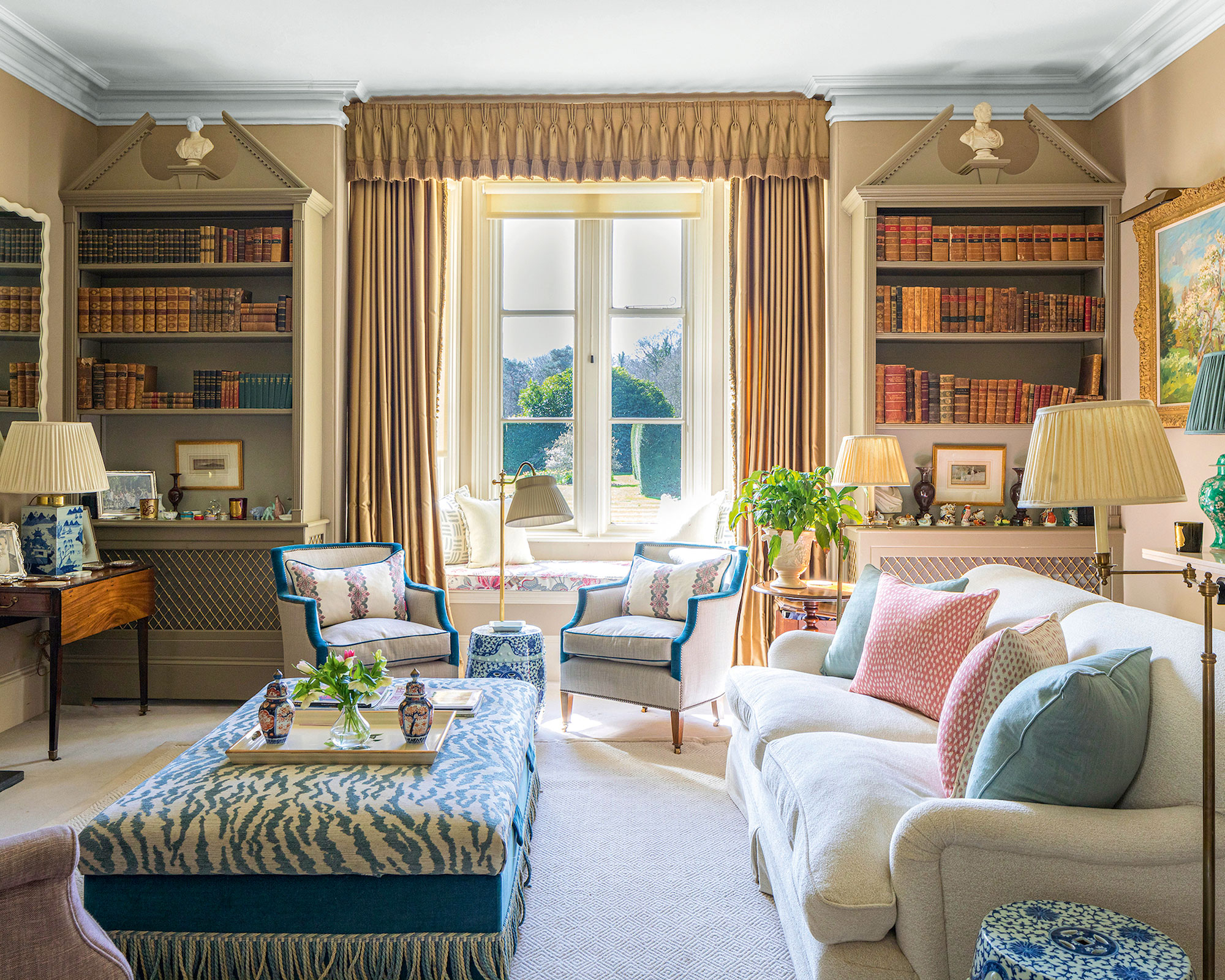
Back in the 19th century, the French invented the 'gossip' or 'conversation chair'. Essentially an S-shaped seat that sat centrally in a room, and where two people could sit side-by-side and face-to-face and swap news, it was considered the height of sophistication, and was de rigueur in living spaces for decades.
Over time, its popularity waned with the advent of TVs and media rooms, however, interior designers are reporting that more and more of their clients are asking for 'conversational seating' once again. Rejoice!
'When you have people over for gatherings, you notice when you’ve got the seating arrangements right, says renowned interior designer, Nina Campbell. 'Seating plans are very important – and not just at a dinner table. I like to think of seating plans for the living room – what I call conversational seating.'
'I find that two people sitting side by side do not always speak to each other, so having an occasional chair pulled in at a diagonal can create conversational triangles. 'I like a room to have a central focal point, such as a fireplace, and then I arrange the living room seating so that groups of three can sit and talk,' says Nina.
FAQs
How can I make my house prettier?
One of the easiest ways to make your house look prettier is to employ basic interior design tips.
Balance in interior design should inform the very essence of your room, and it doesn't have to cost anything. 'It is one of the most important concepts in all of my projects,' says New York City-based interior designer Phillip Thomas. 'Balance is a principle of design that visually stabilizes a space. It is the harmonious arrangement of objects and furniture – it ensures that no single element in a room overpowers another in terms of visual weight or dominance.'
If you are looking for something simple, why not try your hand at flower pressing? Drying flowers is such a wonderful way to preserve backyard blooms – or even a cherished bouquet – and enable you to display them in your home. It is a fun afternoon activity for the whole family, and the next one I want to tick off my ever-expanding list of free home updates.
Finally, if you are considering a more sustainable life, or simply want to make the most out of the interior furnishings you already own, I implore you to try the 'no-buy' challenge for yourself. My home feels refresher and I have certainly picked up a few design tricks along the way. Win-win!
Sign up to the Homes & Gardens newsletter
Design expertise in your inbox – from inspiring decorating ideas and beautiful celebrity homes to practical gardening advice and shopping round-ups.

Jennifer is the Digital Editor at Homes & Gardens. Having worked in the interiors industry for several years in both the US and UK, spanning many publications, she now hones her digital prowess on the 'best interiors website' in the world. Multi-skilled, Jennifer has worked in PR and marketing and occasionally dabbles in the social media, commercial, and the e-commerce space. Over the years, she has written about every area of the home, from compiling houses designed by some of the best interior designers in the world to sourcing celebrity homes, reviewing appliances, and even writing a few news stories or two.
-
 I've spent over 200 hours testing vacuums and swear by my two Dysons – this is how I properly clean a Dyson vacuum filter for longer-lasting appliances
Your Dyson vacuum will last much longer and clean at its best
By Dan Fauzi Published
-
 Bethenny Frankel calls this $695 machine the 'Rolls-Royce Cullinan of coffee' – it's a must-have luxury buy for iced-coffee lovers this springtime
The Real Housewife swears by a luxurious machine that makes nitro cold brew, cold brew, and cold espresso at the touch of a button – here's why it's worth it
By Sophie Edwards Published
