How can I make a sunroom look expensive? 5 luxury upgrades to increase value and style
We asked the experts how to give your home's sunroom a stylish upgrade...
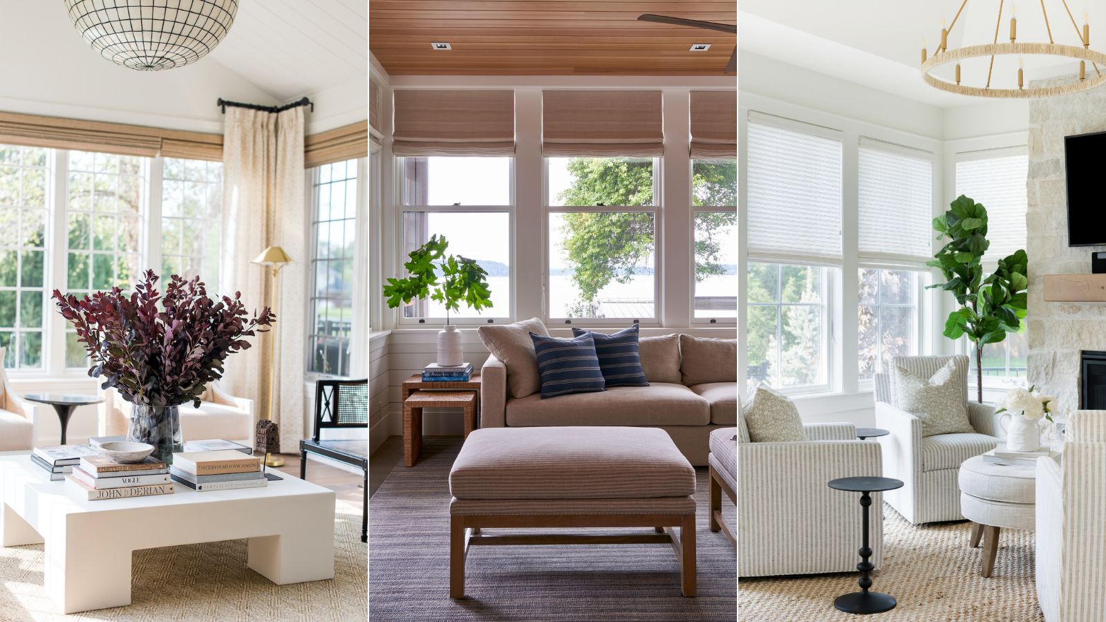

You may not agree, but the smallest rooms in our homes are often the most delightful to design and decorate. Though small rooms, such as a sunroom or three-season room, can present many interior design challenges, there are several benefits to designing a sunroom that puts quality and luxury at the forefront. They provide the perfect space to relax and enjoy the beauty of your backyard, especially when the weather is less favorable.
But before you invest in a complete sunroom revamp, think critically, because spending a small fortune on fixtures, fittings, and paint does not always guarantee a smart, tailored, or value-for-money look.
A complete sunroom transformation doesn’t always have to be a grand or expensive affair. Instead, some of the most beautiful spaces have been slowly curated over time, through minimal updates that don’t break the bank but leave your space looking expensive yet elegant.
Below, we showcase our favorite ways to make a small room look expensive – with tricks of the trade to help turn a tired-looking sunroom into something sophisticated, functional and luxurious.
How do you beautify a sunroom
Whether you are after a whole new setup or just want to upgrade your existing space, we have plenty of advice from the experts on what materials, colors, and furniture to choose in order to make your sunroom look more chic and expensive.
1. Decorate in a tonal color scheme
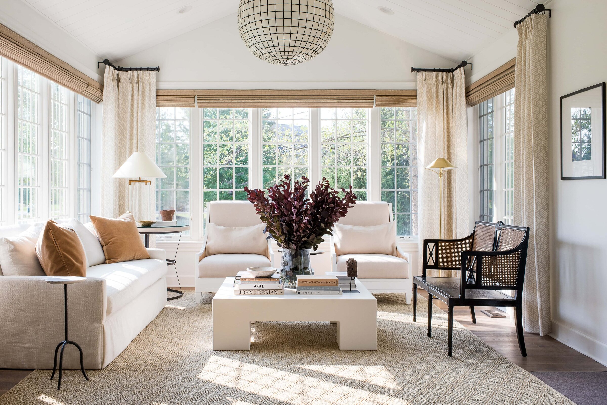
The easiest way to give your sunroom a luxurious, expensive look is to mimic the warm neutral colors found in nature. The power of a neutral color palette to add luxury, and elegance to a room should not be underestimated. Decorating with neutrals, inspired by colors from the natural world, adds a gentle and soothing touch to interiors that can be layered with textures and tones to ebb and flow with the seasons.
'I love the calmness and sense of luxury and sophistication that you create when you have a neutral palette in a room, especially if you wish to replicate the popular quiet luxury aesthetic', says interior designer Tamsin Johnson.' But this choice definitely doesn’t have to mean boring: you can create an interesting and exciting space by layering different tones, such as off-whites and beige, then introducing a range of caramels and even accents of black.'
This space had one intention in the new design: relaxation. 'We designed this as an opulent place to converse during family gatherings without the interruption of a TV,' says interior designer Whittney Parkinson. 'This room already had the advantage of the eastern morning sun, we just provided the neutral layers, shapes, and textures for a tranquil Xanadu.'

Whittney then began her career as co-owner of the architecture & interior design firm, MAWR Design, working with her father from 2008, until founding Whittney Parkinson Design in 2016. As a young designer in the field, Whittney designed projects varying from high-end residential to a vast array of multi-million dollar commercial projects around the Midwest.
Farrow and Ball: Recipes for Decorating | $43.16 at Amazon
Farrow & Ball is a leading producer of high-end paint and luxury wallpaper, and their design experts share their wisdom for creating harmonious interiors and beautify home décor in this inspirational book.
2. Invest in bespoke joinery
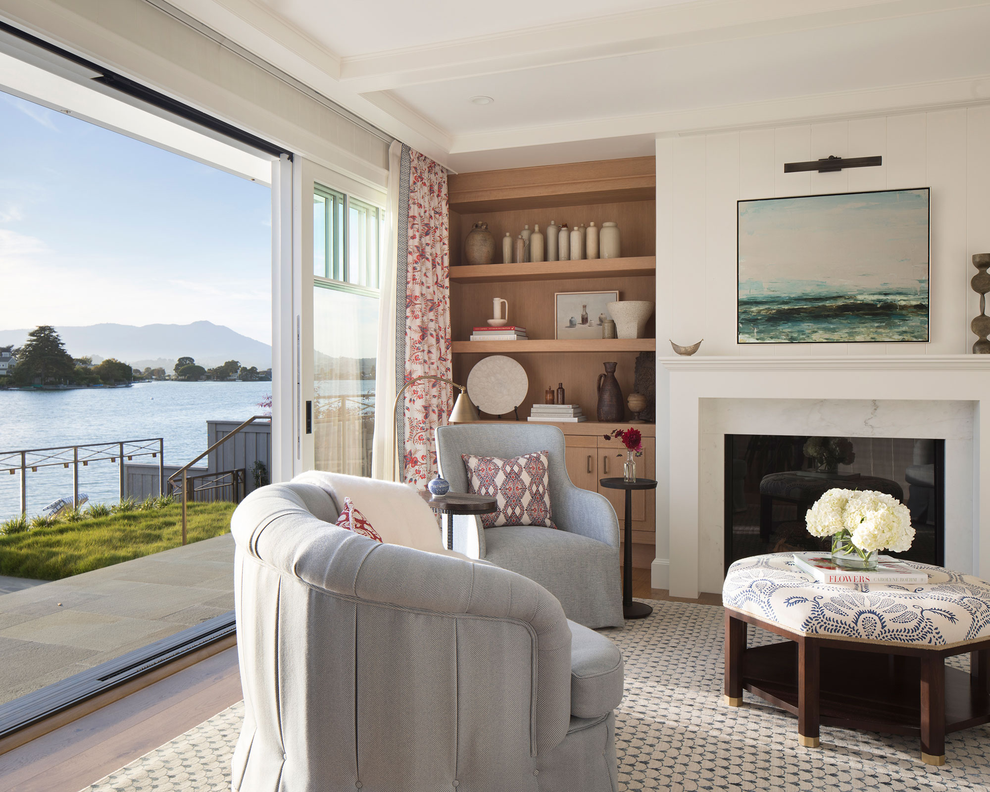
Bespoke sunroom storage solutions will result in a home that's ordered and calm but also one that's beautiful, so if budget allows, invest in fitted joinery for form and function.
Without exquisite joinery, even the grandest room will be nothing more than a box. That’s what Bruce Hodgson, founder of architectural joinery specialist Artichoke, believes. ‘Beautifully crafted and conceived joinery can add drama to an interior, employing light and shade to lend depth, as well as framing openings and significant features,’ he says. ‘It can also play a vital role in manipulating proportions.’
Commissioning fitted joinery is a financial commitment so it’s worth doing groundwork beforehand. ‘The point about bespoke joinery is that it’s built to suit your needs – and nobody else’s,’ explains interior designer Henriette von Stockhausen of VSP Interiors.
Finally, steer clear of current interior design trends. You could soon get bored of a scalloped edge, so stick with classical designs is my advice, just as Julie Rootes, founder of Julie Rootes Interiors has done.
3. Introduce an abundance of textural elements
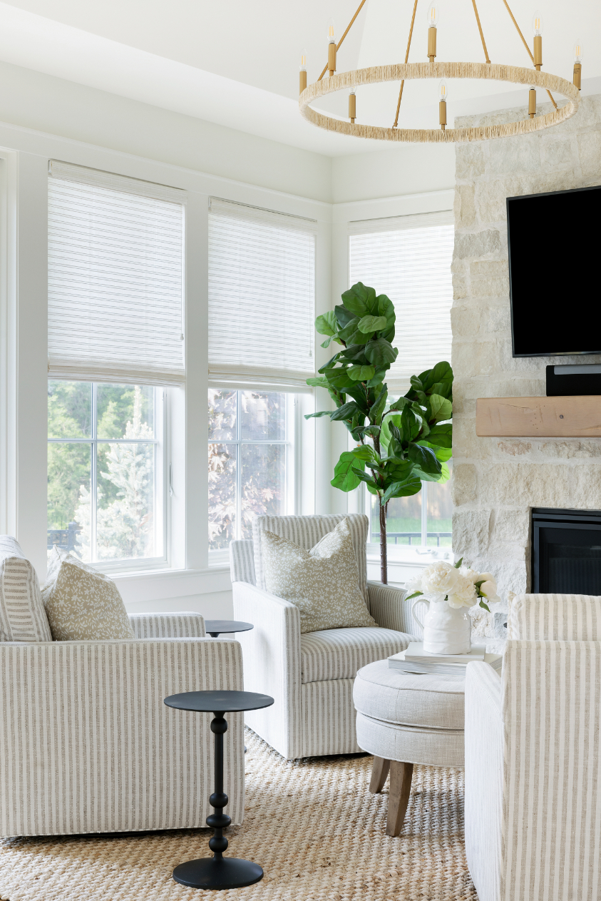
The power and importance of using texture in interior design should not be underestimated. Interior designers use texture in the form of tactile objects like fabrics, wood, and stone to add physical comfort and visual interest to a space. If you want to make a sunroom look expensive, then mixing materials and layering is key to making textural elements work well.
Tiffany Leigh, of Tiffany Leigh Design, explains: 'Texture in interior design is all about creating tactile moments that invite touch. It refers to the feel, appearance, or consistency of a surface or material. Textures help to keep a space from feeling flat or one dimensional.'
Chrissie Rucker OBE, founder and CEO of The White Company shares our penchant for texture: 'Touch and comfort are key sensory triggers. When decorating with white and neutrals, it is crucial to add in natural elements and pile on texture; a soft rug underfoot, or a diaphanous drape at a window can truly transform a room. Natural materials, such as weathered wood, linen, or marbled slate, connect us back to nature and add interest.'
Layering textures helps to add depth too. The layering of materials, colors, and shapes all amount to give your interiors an overall texture that can define the look and feel of a space. In this cozy and comforting sunroom, Bria Hammel, creative director and CEO of Bria Hammel Interiors uses a combination of layering and texture to great visual effect.
4. Keep it minimal and serene
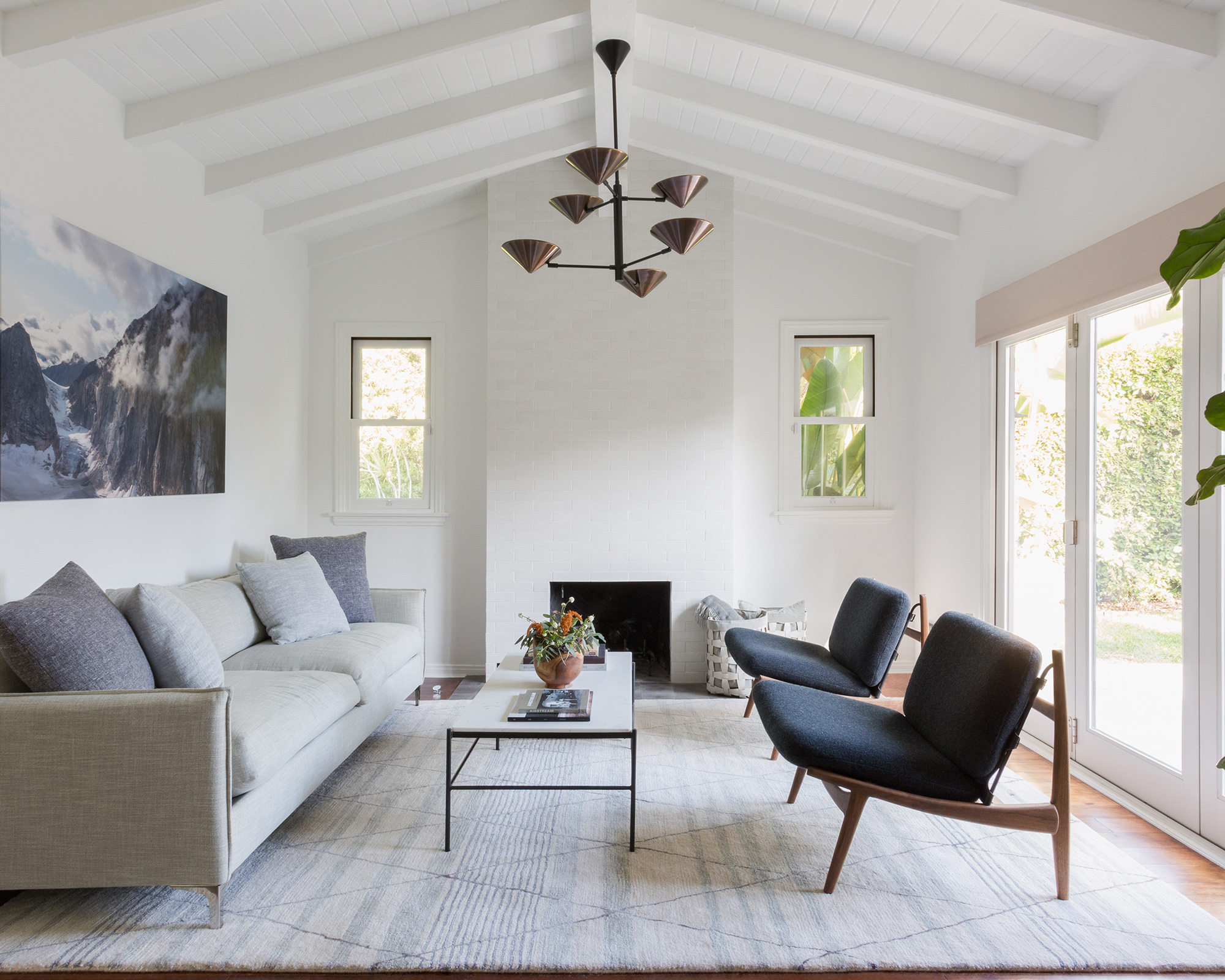
More often than not, the most luxurious, expensive-looking schemes are the most minimal.
In this hectic modern world, having a restful sanctuary to return to has never been more important, so it’s no wonder that homeowners are turning to the principles of minimalism and creating pared-back spaces perfect for switching off and unwinding.
Minimalist sunrooms, like any room, can be tricky to get right. Creating a pared-back space that also exudes luxurious comfort can be a hard balance to strike, but with careful consideration, it can be achieved.
'If you want a minimalist sunroom that is still warm, inviting, and luxurious, then remember that less is more when it comes to decor,' says interior designer Genna Margolis, the founder of SHAPESIDE, and the designer behind this serene space in Santa Monica.
'The house had no common thread that pulled the space together, she says. 'There were so many different styles – it was all rather confusing, so we scrapped the lot and started entirely from scratch. The goal here was to create a space that exuded modernity while maintaining the integrity of the home.'
The key to success is to find a common 'thread' that pulls the room together. Here, the tonal color scheme and unfussy furniture truly master minimalism.
5. Only use timeless materials
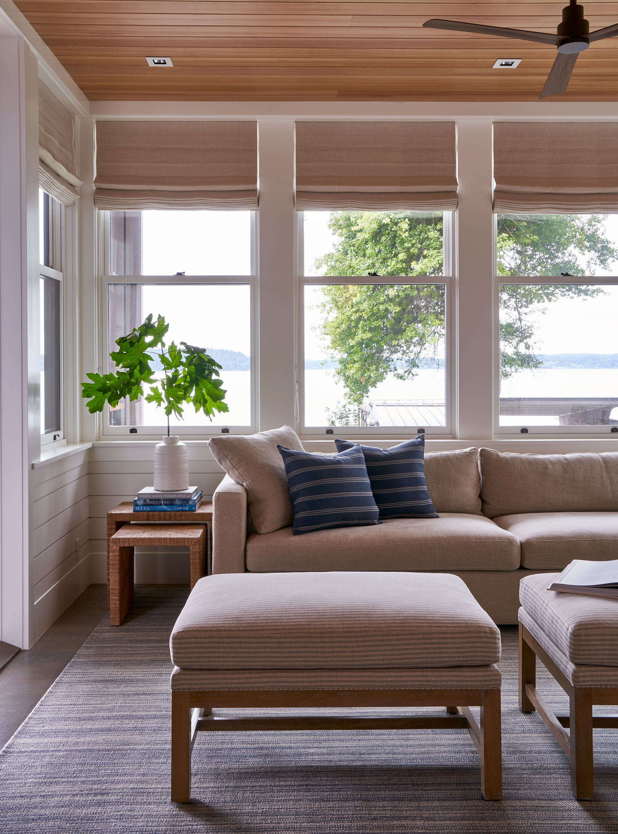
When I talk about timeless materials, there is usually only one material that comes to my mind, and that is timber. Old or new, pale or dark, the warm and tactile nature of wood ensures it enhances any home.
Thanks to the desire to create a sanctuary at home, the living spaces in our homes have become a retreat, an oasis to help restore mental and physical well-being. With this comes a move away from clinical style. Wood is now the material of choice for its natural beauty and warmth; it conjures the quiet luxury of a boutique hotel. There are many ways to introduce timber to your scheme, from a simple small end table to timber-fronted wall paneling. And if you thought Shiplap was going out of style, you'd be sorely mistaken.
In this coastal hideaway, Kelie Grosso, founder of Maison Luxe uses timber to accentuate and enhance the room's architectural proportions. Its handcrafted nature adds to the tactile aesthetic, while the patina on the timber furniture will only get better with age.
Sign up to the Homes & Gardens newsletter
Design expertise in your inbox – from inspiring decorating ideas and beautiful celebrity homes to practical gardening advice and shopping round-ups.

Jennifer is the Digital Editor at Homes & Gardens. Having worked in the interiors industry for several years in both the US and UK, spanning many publications, she now hones her digital prowess on the 'best interiors website' in the world. Multi-skilled, Jennifer has worked in PR and marketing and occasionally dabbles in the social media, commercial, and the e-commerce space. Over the years, she has written about every area of the home, from compiling houses designed by some of the best interior designers in the world to sourcing celebrity homes, reviewing appliances, and even writing a few news stories or two.
-
 5 hydrangea myths debunked by experts – and what you need to know instead for beautiful blooms
From ways to change their color to when to prune, there are certain misconceptions to steer clear of when growing these flowering shrubs
By Holly Crossley Published
-
 How the 'ODT' method can help you to tackle your overwhelming decluttering checklist – and streamline the process from start to finish
Avoid 'analysis paralysis' and tick off tasks quickly and easily by making just one decision at a time
By Ottilie Blackhall Published
