'I wanted to avoid the Nantucket cliché' – how this designer balanced colorful maximalism with classic style
Take a tour of a colorful, characterful vacation home that's a lesson in how to do maximalist style in 2024

Design expertise in your inbox – from inspiring decorating ideas and beautiful celebrity homes to practical gardening advice and shopping round-ups.
You are now subscribed
Your newsletter sign-up was successful
Want to add more newsletters?
Maximalism seems to have taken on a different form over the last few years. Maximalism, to most, once meant very bold, busy interiors a style to be admired for its nerve but not one to be replicated if you were looking to create timeless, livable interiors.
But slowly maximalism has been changing, becoming more curated, more considered in some ways more pared back but still full of charm and excitement. This Nantucket home designed by Robin Gannon is the perfect example of how maximalist style can be achieved in a way that feels chic and classic.
Robin says so herself, 'As a designer, people tend to categorize you as a maximalist or a traditionalist, but my interiors don't veer toward one aesthetic. I want homes to feel layered because that's what life feels like- you collect memories and experiences and stack them over time. And when you live in a layered house, you keep adding things you love until there's a fullness. When a home is too minimalist, it can be beautiful but look cold and austere.'
Article continues below 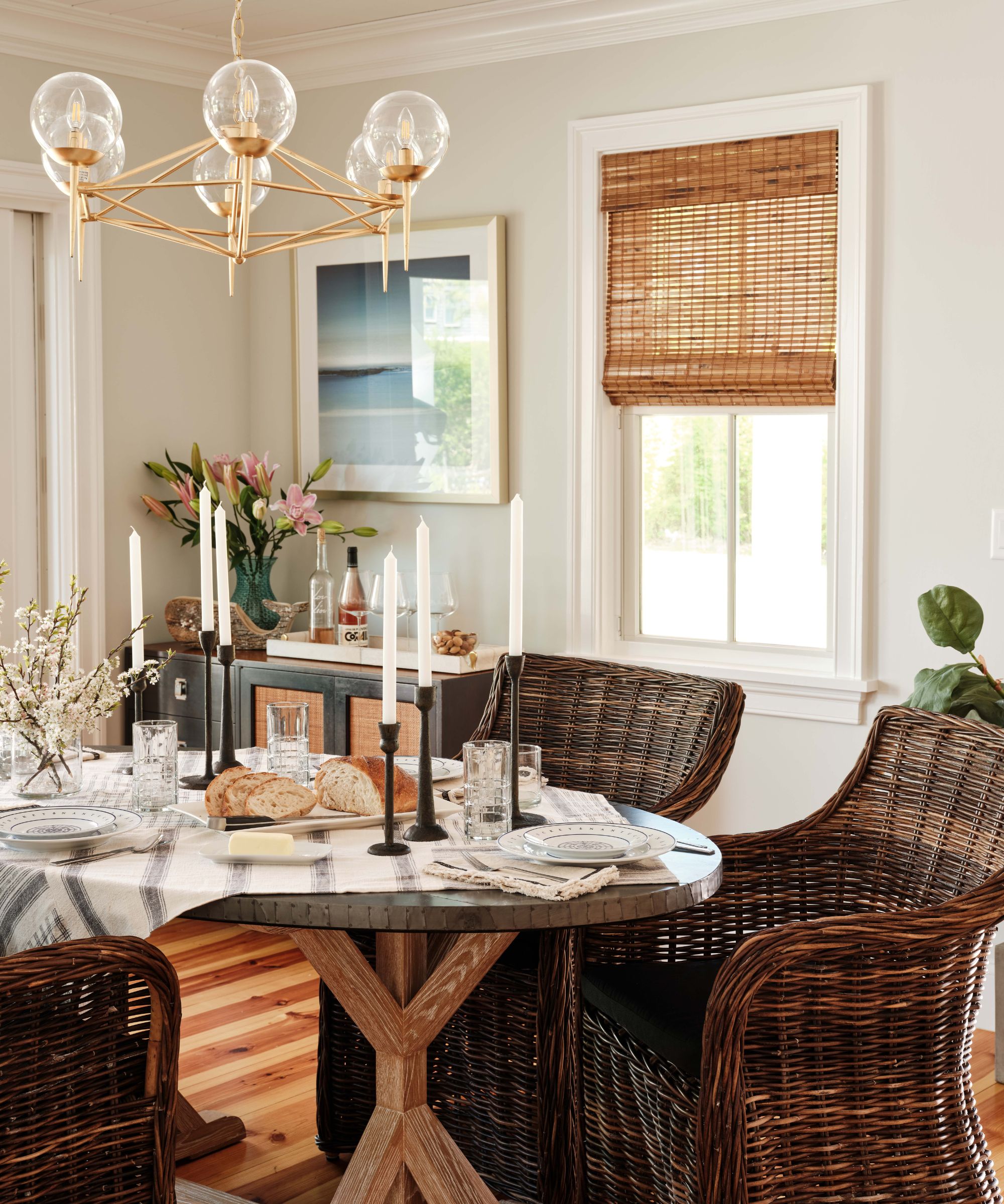
For this Nantucket project, Robin was hired by two business partners who wanted her to design a vacation home that they had built for the two families to share. One has two little boys, and the other has two little girls. The brief was that they wanted it to be family-friendly and “designed” and elevated for when they entertain business colleagues.
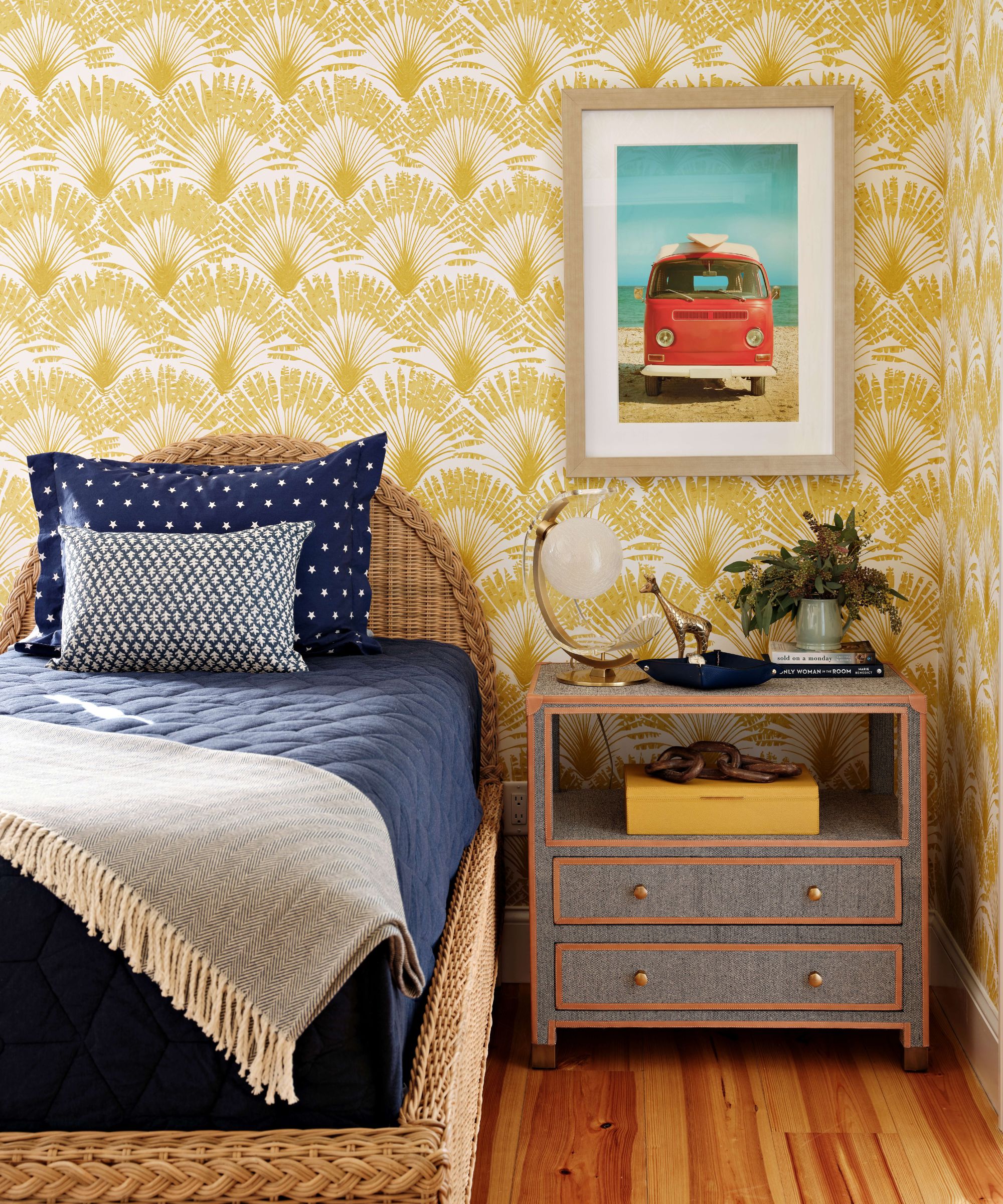
They also stressed they wanted something different than a typical Nantucket look which can be a little too serious and devoid of color. Robin went about starting with texture and wall coverings. The easiest and most cost-effective way to add some “joie de vivre” into a home. She designed this home to be a relaxing and “happy” home that is layered and collected to feel lived in and warm.
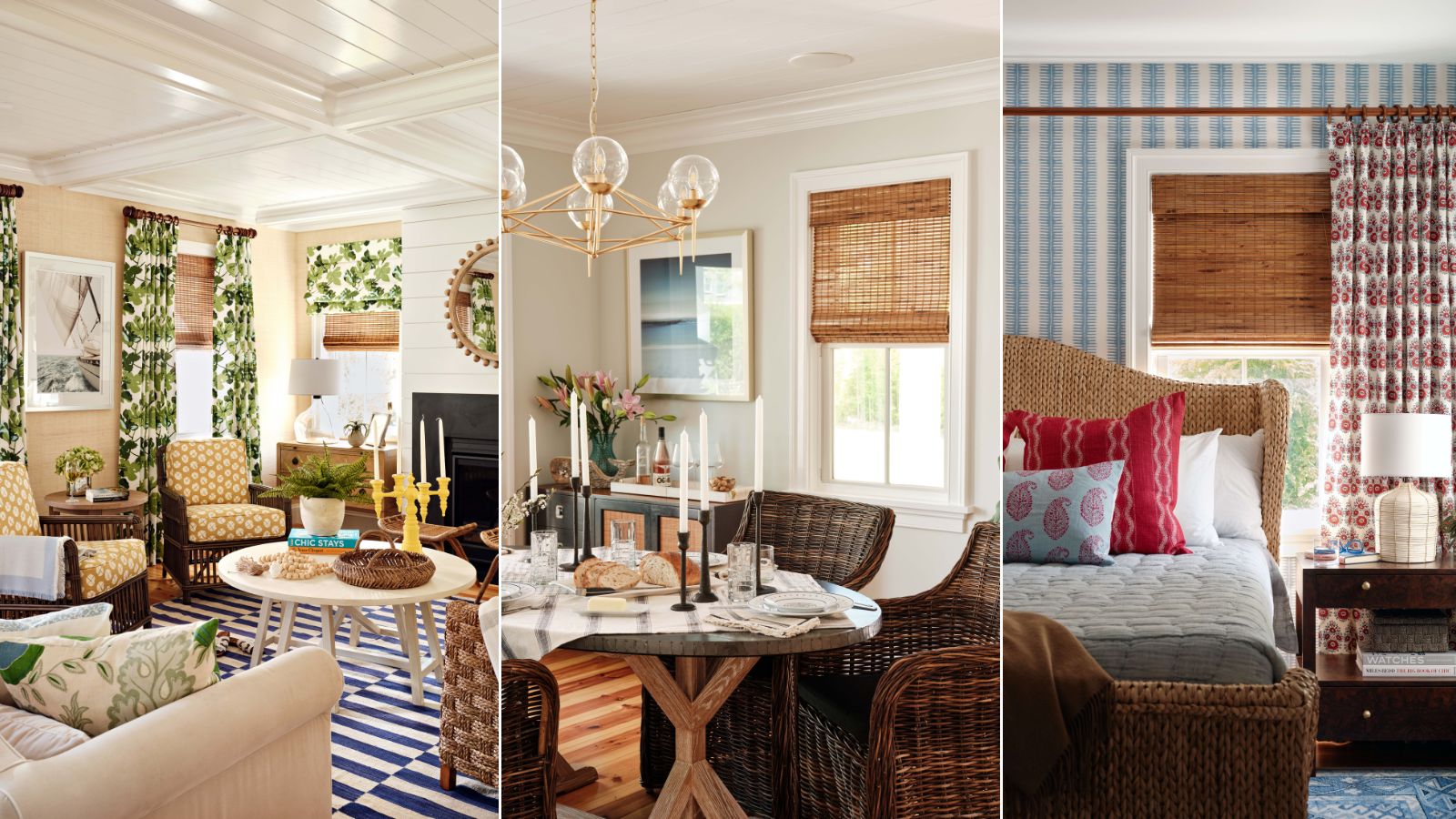
'First, I wanted to avoid what I call the Nantucket cliché, where everything is blue and white,' Robin tells H&G. 'I tried to play with some of the colors in nature outside, ensuring that they were appropriate to the landscape but making them a bit more playful and less austere. The two families coming together to share this home wanted something different – they are young and fun and didn’t want anything too precious or serious.'
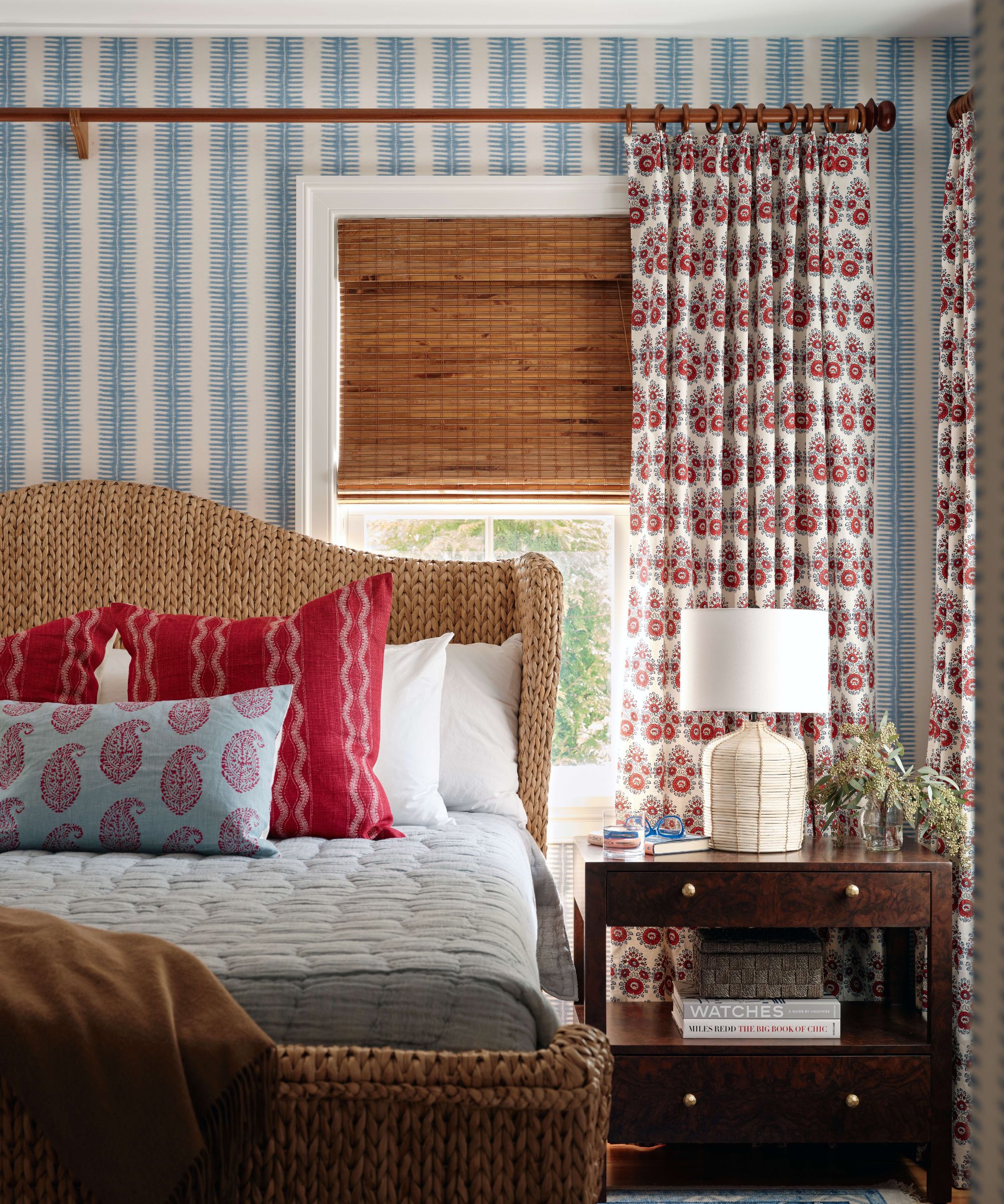
'For this project, it was all about keeping the scale of the patterns in place. I paid attention to the color and scale of each pattern and make sure that the colors intertwine,' explains Robin.
Design expertise in your inbox – from inspiring decorating ideas and beautiful celebrity homes to practical gardening advice and shopping round-ups.
This is so key when wanting to create rooms that have that very maximalist feel, but don't overwhelm. You want to clash patterns to create that initial wow factor but also ensure there's a cohesiveness to the whole room so it settles down to a liveable space.
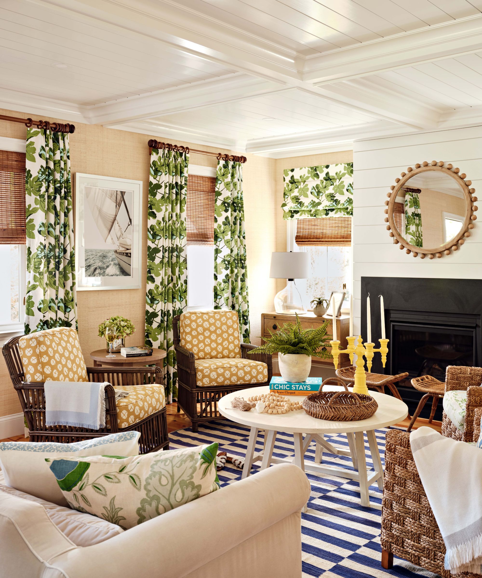
Robin continues, 'For instance, the drapery fabric in the living room is several shades of green and white. There is some green in the chinoiserie fabric on one pair of the chairs and also some yellow, which connects to the fabric of the other chairs. So weaving those colors around and playing with the scale of patterns helps it to never feel too busy.'
'I also point to the materials in the room, like the texture of the chairs and the use of seagrass and rattan. These elements add a sense of timelessness, as they've been around forever, and also give the impression that perhaps only some of the furniture is new. We always strive to incorporate vintage pieces into our projects. They add a sense of history to new homes and give them a little bit of a soul.'
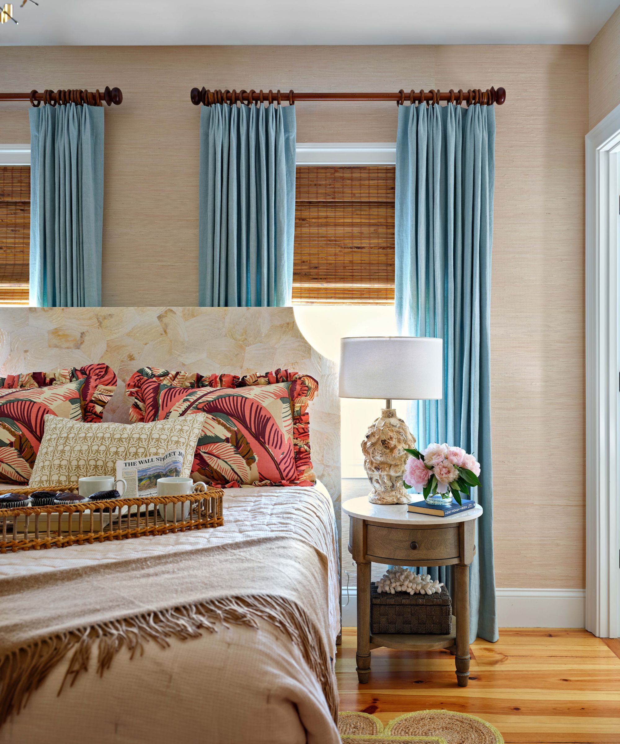
This project was a vacation home, and Robin acknowledges the fact she could go a little bolder and have more fun with the decor for this reason. She used the example of the statement drapes in the living room (bold drapes are a recurring theme throughout this home).
'The fig leaf pattern Peter Dunham drapery is one of my favorite parts of this project! I've loved and wanted to use that pattern for years. You can go a little bolder and have a little more fun in a vacation home because you don't live there full-time. It's different than when someone likes the fabric, but doing an entire room of drapery in their primary residence with it may be a bit much for them. This project allowed me to go a bit bolder. It's just such a happy space. When you walk into the living room, you're coming there for vacation, which puts a smile on your face.'
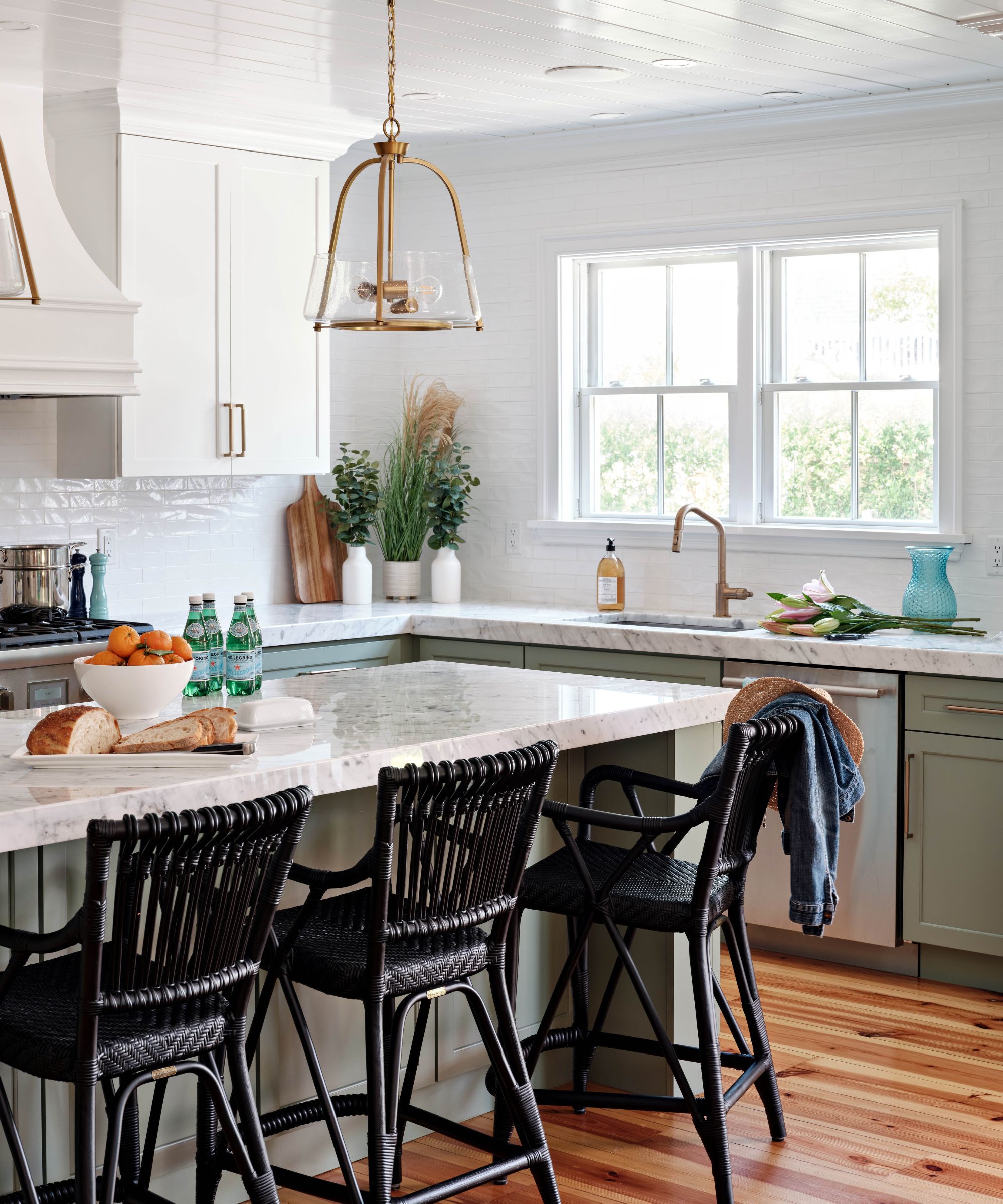
'This project didn't involve any construction,' explains Robin. 'The house had recently been finished, so naturally, there were limitations on what our clients wanted to do. This was a bit more challenging for me, as so much of what we do involves coming into spaces and really changing things around. So we had a canvas – including the black box of the gas insert fireplace – and worked around it!'
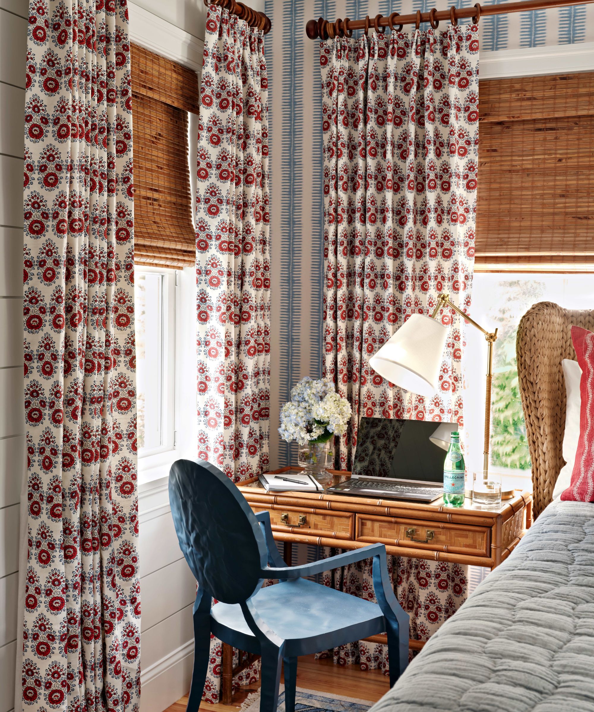
In terms of tips for recreating this beautifully layered look, maximalist but still chic and considered, Robin suggests, 'I would start with your boldest fabric and work backward. It's much harder to build something small and go up from there.'
'Think, "Is this the fabric that I want to be *the* fabric in the room?" From there, ask yourself: "Is this the sofa fabric? Is it the drapery fabric? Where do I want to use it?" Once you've got your bold, you want to keep things a little bit quieter – but you want to tie it all together. So you start to layer it from there. But your "ground" is the big ta-da moment. From there, it's easier to play with smaller patterns and build.'
'Final tip: Make sure your design is 100% complete before you do any ordering!'

I am the Head of Interiors at Homes & Gardens. I started off in the world of journalism in fashion and luxury travel and then landed my first interiors role at Real Homes and have been in the world of interior design ever since. Prior to my role at H&G I was the digital editor at Livingetc, from which I took a sabbatical to travel in my self-converted van (not as glamorous as decorating a home, but very satisfying). A year later, and with lots of technical DIY lessons learned I am back to writing and editing, sometimes even from the comfort of my home on wheels.