This bespoke, hotel-inspired home bar brings sophistication to a small, underused space – here's a look inside
In an exclusive interview with H&G, London-based interior designer and FARE INC. founder Annie Harrison shares how she created this stunning library-style home bar
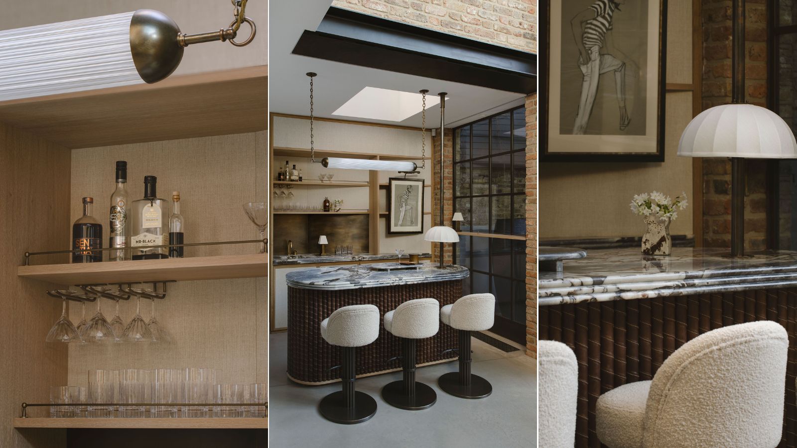

In just about every home, there's a small corner that doesn't live up to its full potential. Whether it became a catch-all for needless clutter over time, or just doesn't get enough natural light to be fully functional, these spaces go underused and cast aside. But in this London home, that corner – previously used to house a less-than-lovely reading chair and storage – was given a whole new life.
Annie Harrison, founder and creative director of London-based FARE INC. reimagined this small basement space, transforming it into a stunning and sophisticated library-style home bar. With her clients' love for hotel bars and high-end restaurants in mind, she seamlessly blended old-school glamor with modern architecture to create this chic entertainment area.
In a recent interview with Homes & Gardens, Annie shared the inspiration behind the space, plus a bit more about the many bespoke details that went into bringing the timeless home bar to life. Here's what she had to say.
A look inside the old-meets-new, hotel-inspired bar
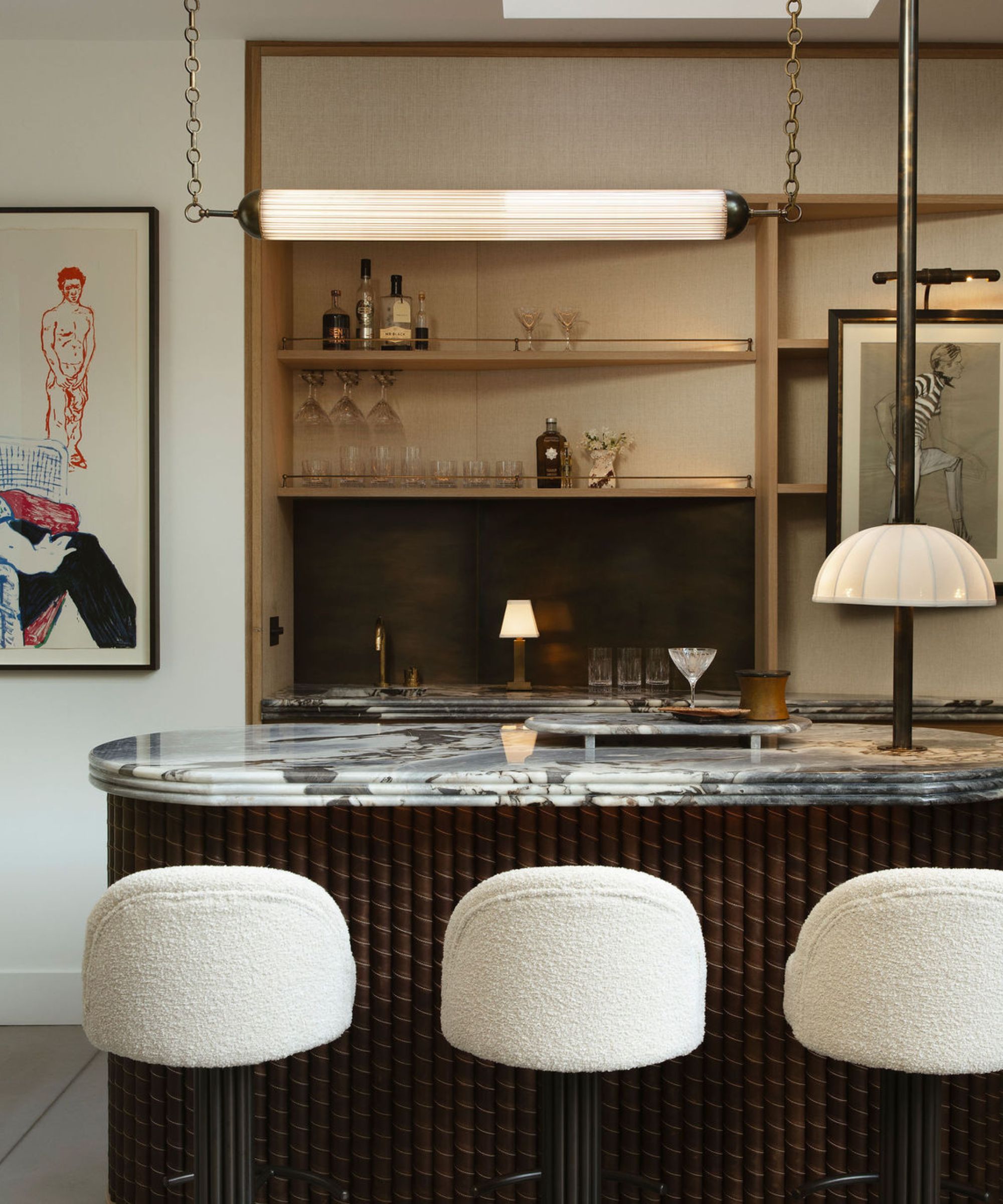
Tucked into the basement of a renovated, now-contemporary building, this entertainment space appears as if it was plucked from a high-end hotel lobby. Annie says the bar's old-school, vintage decor and appeal fit into its modern surroundings because of its pared-back style and 'airy location' within the home.
'This particular home is a converted Salvation Army house, and while it has history, the interior architecture is quite modern, which isn’t what one would expect to work for a library-style bar. However, with a more refined design, it integrates well,' she says.
Because the space is small and set back in a corner, it proved quite difficult to maneuver during the design process. To counter the size constraints, Annie installed faux cupboard fronts to 'create the illusion of a more expansive area.' In other areas of the bar setup, decorating with artwork over shallow shelves makes the space look larger and more layered.
Knowing that her clients love the classic elegance of historic bars and restaurants, Annie's ultimate goal was to 'bring the essence of their favorite venues into their home.'
Sign up to the Homes & Gardens newsletter
Design expertise in your inbox – from inspiring decorating ideas and beautiful celebrity homes to practical gardening advice and shopping round-ups.
'It becomes a personalized sanctuary where they can entertain friends in an atmosphere that resonates with their lifestyle, fostering intimate gatherings and memorable moments,' says Annie.

Annie Harrison is the Founder and Creative Director of FARE INC., an award-winning, London-based interior design firm completing projects in the hospitality industry and residential spaces.
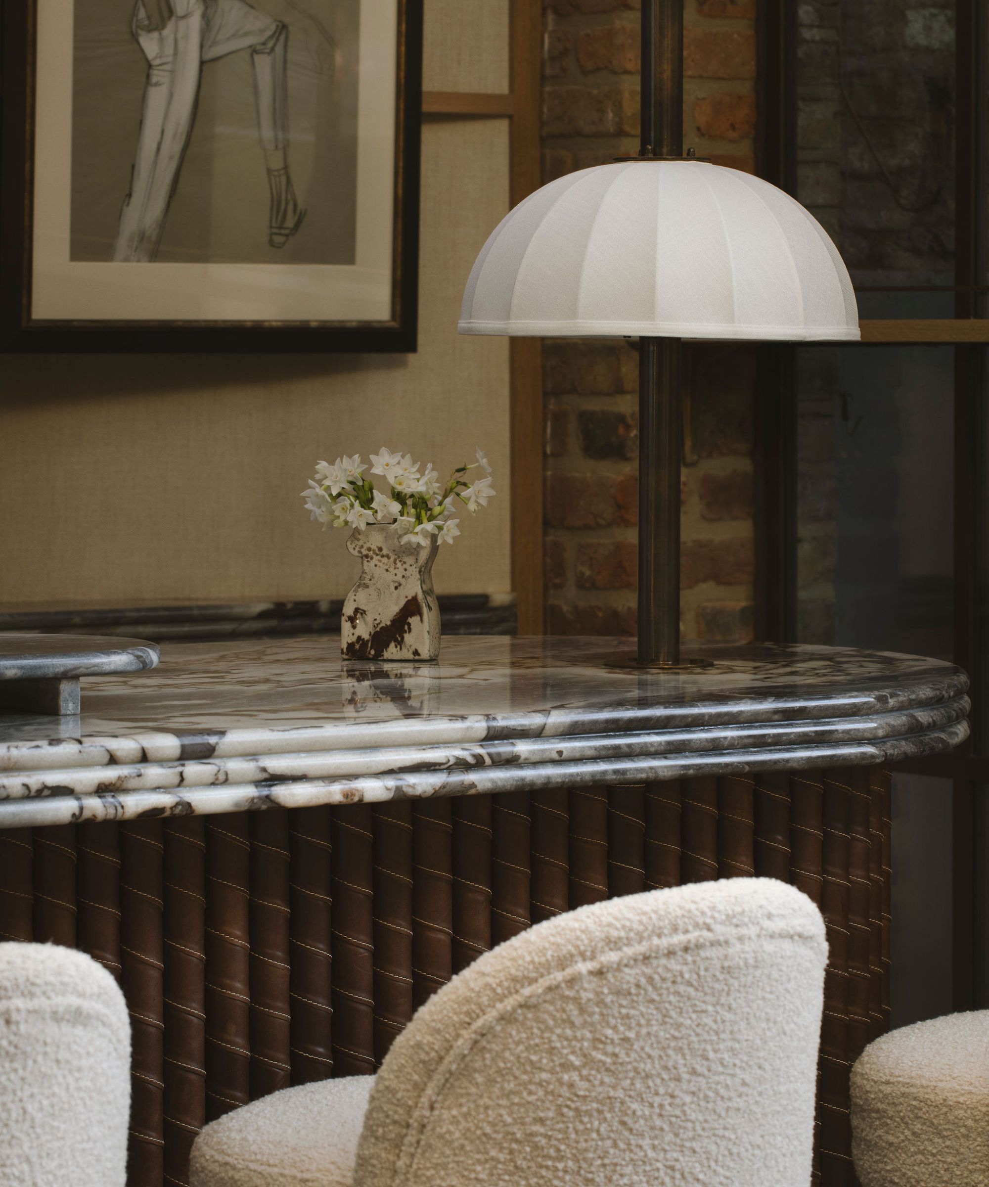
The color palette tying this lovely corner together finds a perfect balance between opulent and laid-back. Though neutral tones lay the foundation, metallic accents and warmer, darker shades bring a classic sophistication to the space.
Annie says that a key concern when picking out shades was keeping the entertainment space complementary to the existing finishes in the home's 'large, open-plan living, dining and kitchen room.' Defined by an 'industrial, mid-century style featuring walnut and gray stone joinery, a concrete floor and brickwork,' the rest of the home was distinct and couldn't be overlooked when designing the basement.
'While the bar needed to make a statement, it was essential for it to integrate seamlessly without feeling disconnected or out of place. Therefore, we selected neutrals with hints of blue to strike a harmonious balance,' says Annie.
Blue shades are brought in through the artwork, the marble sourced from Gerald Culliford. Black accents steal the show as well, and a bespoke, bar made of brown leather (meticulously crafted by Otis Ingrams) brings a sense of warmth.
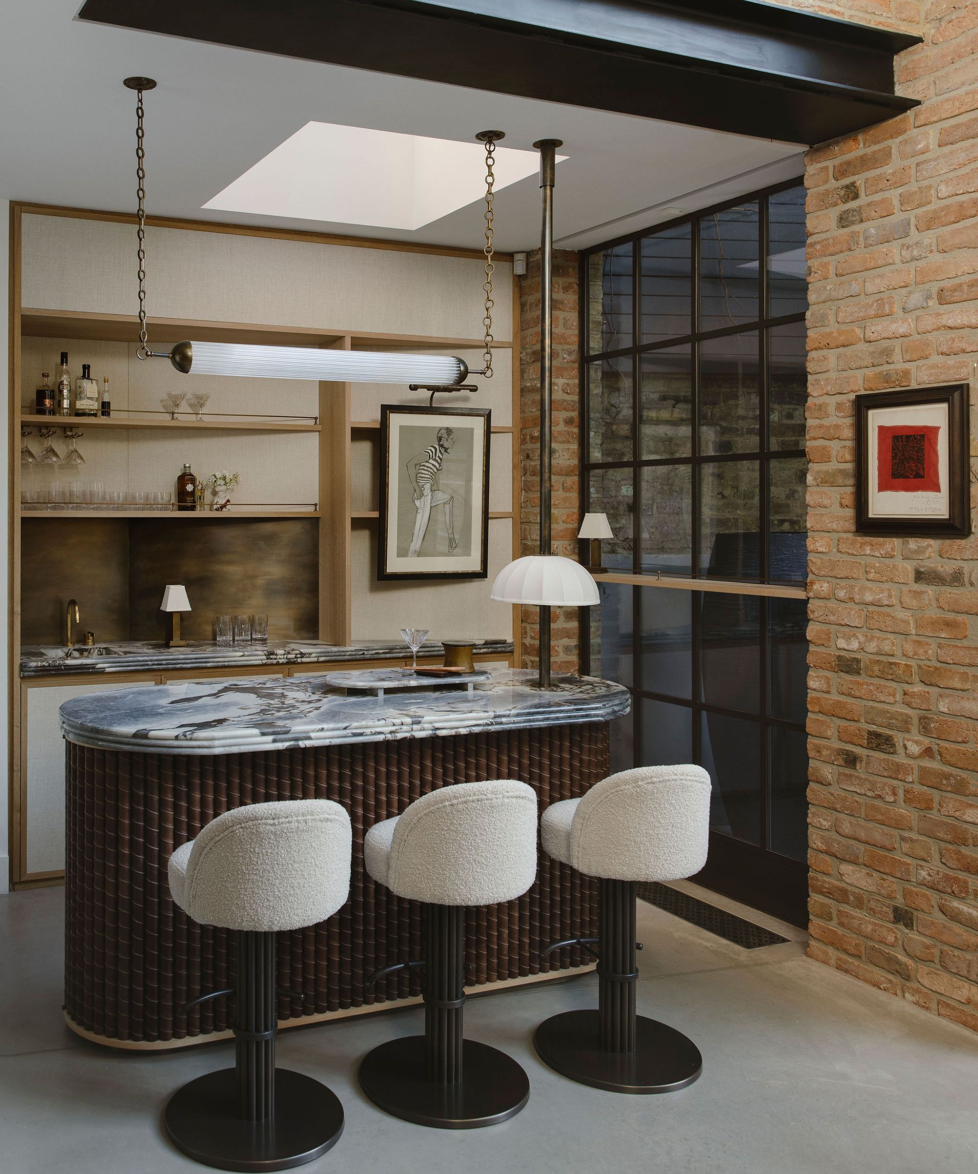
Complementing the color palette is an expansive, floor-to-ceiling window displaying a gorgeous view of a garden, curated by award-winning garden designer Charlotte Rowe. Between the sheer height of the ceilings and window, and the defining black frames, the eye is pulled immediately to the stunning view of the outdoors.
'As you walk between the back counter and the island, your attention is drawn to a magnificent large window seamlessly integrated into the design, complete with a shelf ... Whether you're stationed behind the bar or serving drinks with the garden doors open, this setup is exceptionally enjoyable for entertaining during the summer or warmer months,' says Annie.
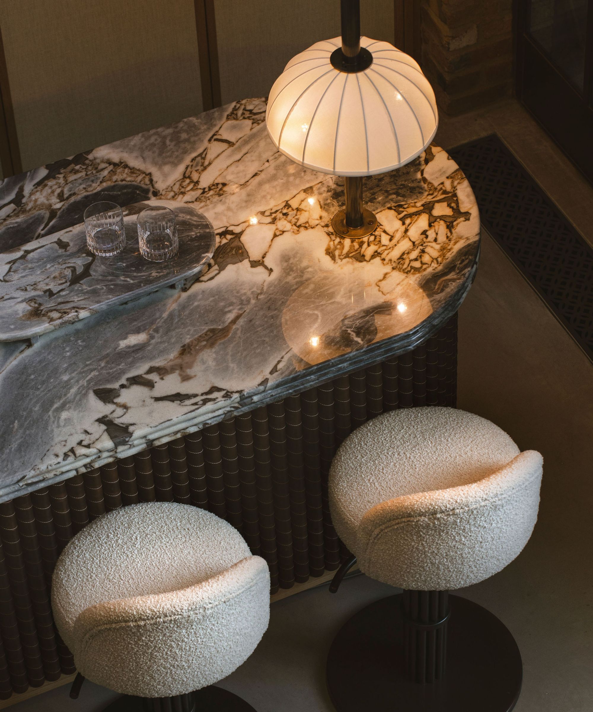
Annie says the 'individually stitched leather poles' designed by Otis comprise 'an element worth noting for its outstanding quality.'
'[They] gracefully wrap around the island, cleverly concealing curved doors at each end. We matched the brown leather to the brown veining found in the ocean blue marble, connecting the island to the back counter, which features matching triple bullnose detailing,' she says.
To integrate more lush texture into the space, Annie opted for linen wallpaper from Stereo Interiors – this helps to soften the borderline harsh look offered by the stone and metal materials throughout the space.
The linen also calls upon the design of the lampshade hovering above the bar's island. The area behind the sink, too, was designed with tactile texture front of mind.
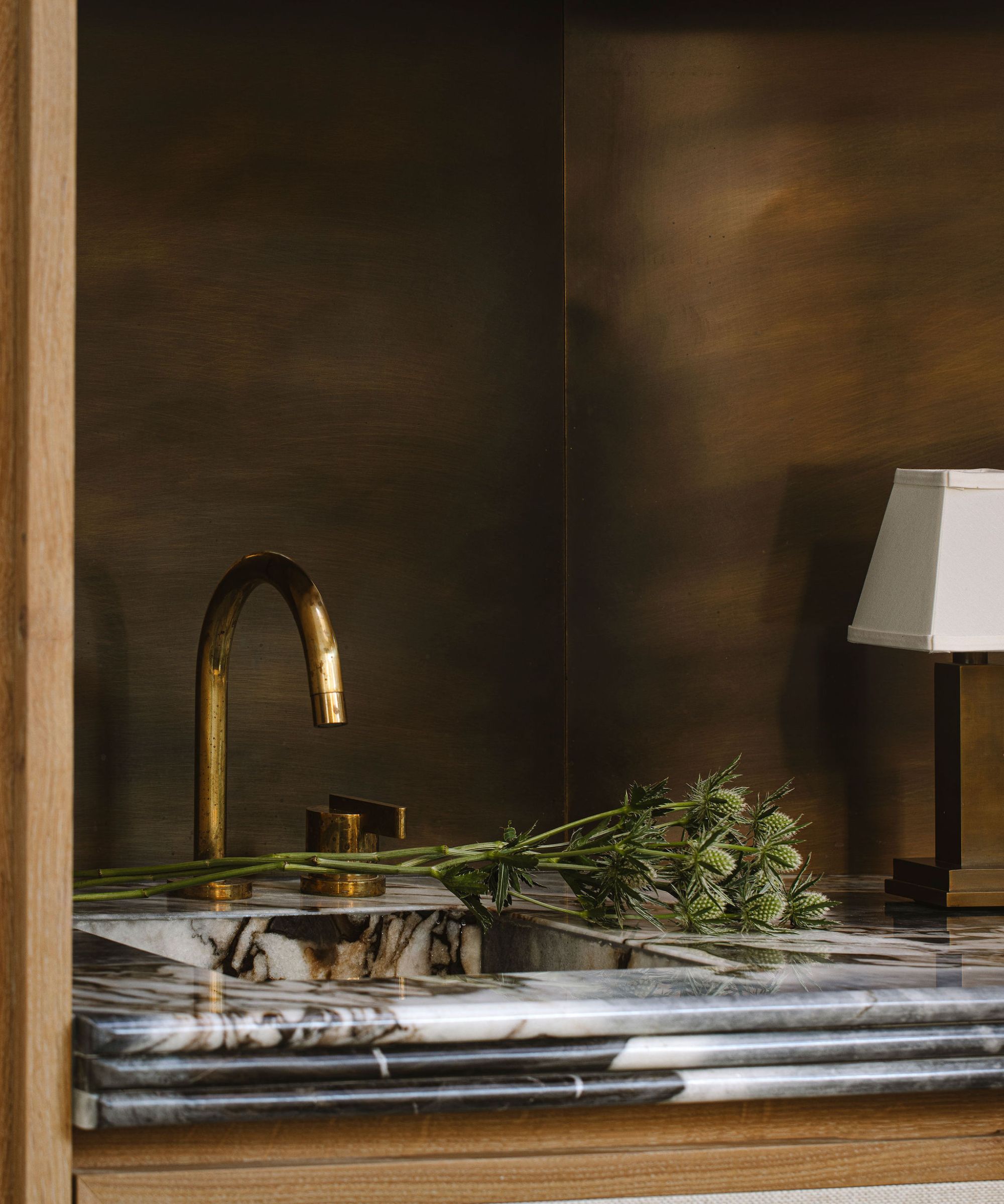
'The hand-burnished brass backsplash is designed to create a striking contrast and accents the unlacquered brass tapware, adding depth and visual interest to the space,' says Annie.
And though FARE INC. experimented with several angular renditions of the iconic marble island, they settled on this 'pill shape' to ensure the space was accessible, functional and inviting to the eye.
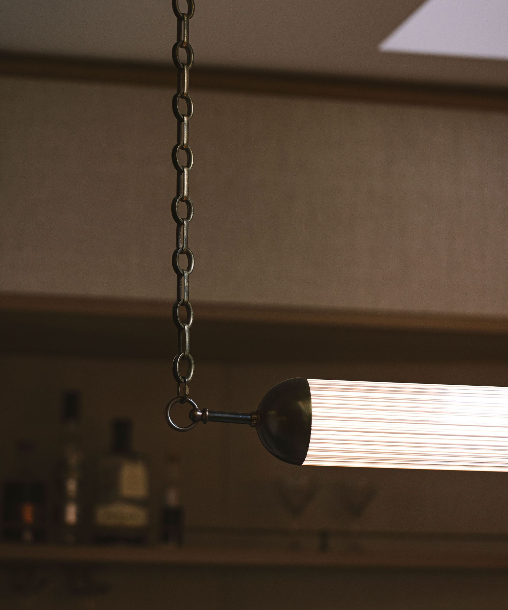
Lighting this space proved quite challenging, as pre-poured concrete flooring didn't allow Annie to run cables through the floor, a trick she would otherwise take advantage of. Instead, she decided to install a rod in the space to bring power from the ceiling. The end result is elegantly layered, and fit for any level of natural lighting.
'This allowed us to integrate lighting, complete with a shade at table-lamp level, creating a soft, low-level focal point and a distinctive lighting feature. To incorporate our clients' fondness for ribbed glass, we custom-designed the overhead light to complement the island,' says Annie.
The overhead fixture is bespoke, and intricately crafted from individual glass rods and domed caps. With a 'specialized chain' that conceals the cable coming down from the ceiling, this light fixture 'exudes sophistication,' Annie adds.
With added LED lighting installed along the shelving, and a picture light to illuminate the clients' unique artwork, the room is lit with purpose and intention.
'With a combination of various layers and depths of lighting, the space exudes warmth and atmosphere, whether it's evening or daytime. Each fixture is on its own dimmable circuit, allowing for easy adjustment of the ambiance to suit different occasions,' says Annie.
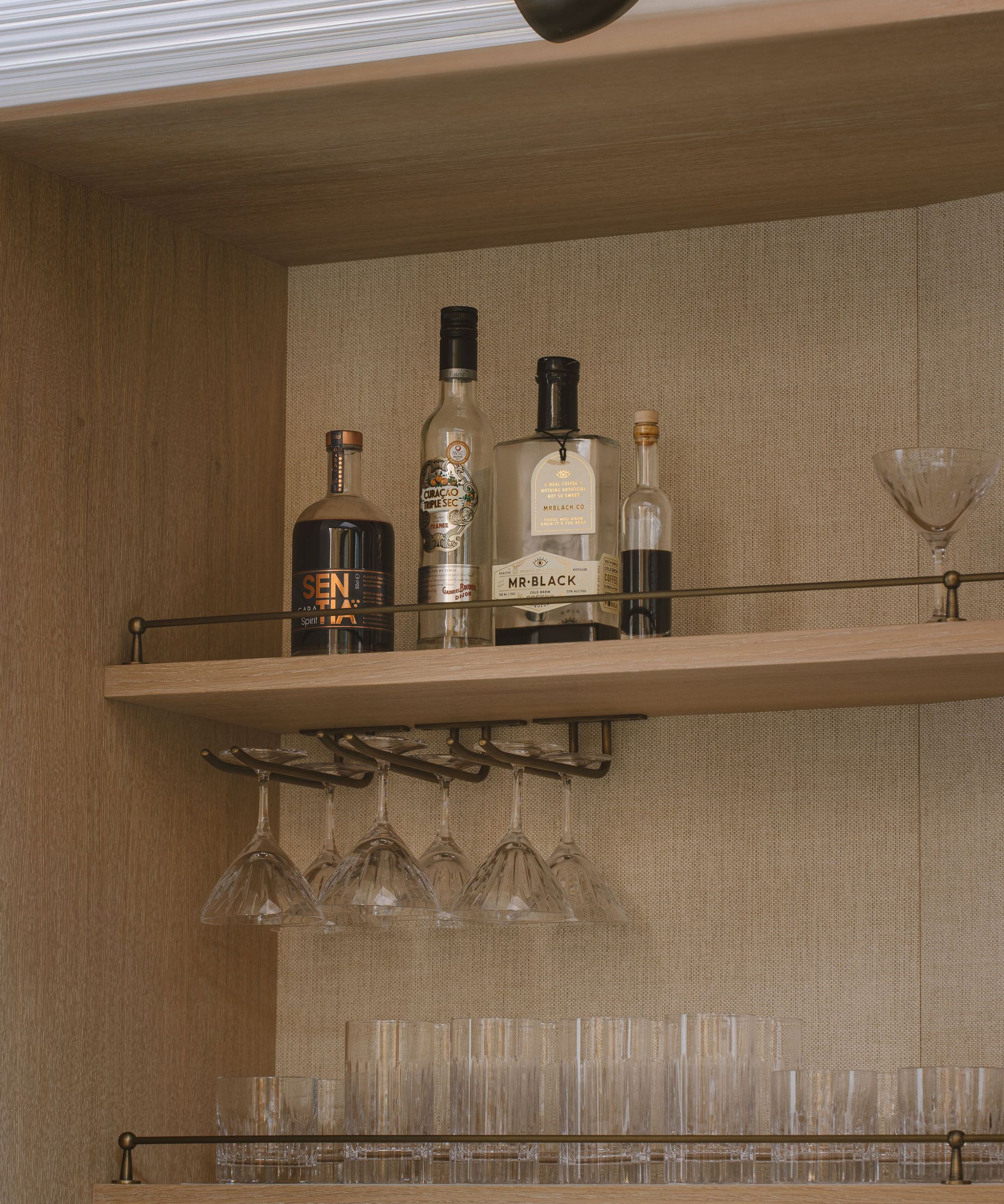
Storage is of the utmost importance in a home bar of any style, and this project integrated clever shelving and glassware storage to ensure all the essentials are easily accessible. Annie says the team 'carefully considered' their clients' collection of glassware before 'strategically planning its placement.' Some is on display, while the rest is 'discreetly tucked away in the curved cupboards of the island,' she adds.
'To infuse the design with a hospitality essence, we incorporated hanging glass racks and bronze fiddle rails. Additionally, the island features a fully integrated fridge and freezer concealed behind linen doors, which seamlessly blend into the overall design and maximize practicality when the bar is in use,' says Annie.
Because FARE INC. often works in the hospitality sector, as well as in residential spaces, Annie says this project was particularly enjoyable. She was tasked with transferring her hospitality design knowledge into the home space, an exciting challenge.
'[Our clients] were a pleasure to collaborate with, showing genuine enthusiasm throughout the process. I was confident that the result would be cherished, well-utilized, and would breathe life into a distinctive corner of their home, which is immensely rewarding,' she says.
The final product of this basement corner redesign is a breathtaking escape – and any host's absolute dream. With statement marble, thought-provoking artwork and truly intelligent design, this blend of hotel and home is undoubtedly a success.

Abby was the Interior Design News Editor at Homes & Gardens and is now studying for her Master's degree in Journalism at City University, London. Prior to joining our team, she worked with Better Homes & Gardens, where she wrote and edited content about home decor, gardening tips, food news, and more. She studied Journalism and English Literature at New York University and moved to London to pursue her love of writing in 2023.
-
 This once-dated kitchen is now a timeless space with the coziest details – and its the classic color palette that's made it a chic, welcoming space
Warming colors and natural materials combine to create this enduringly classic kitchen scheme
By Molly Malsom Published
-
 How to grow crepe myrtle in pots – and transform even the smallest of yards with dazzling flowers this summer
Growing crepe myrtles in pots will inject splashes of brilliant color into your outside space
By Thomas Rutter Published
