High Point Market 2022 highlights – and the trends emerging for 2023
I went to High Point Market for the first time this week. This is what I spotted, the events Homes & Gardens hosted – and what's new

Design expertise in your inbox – from inspiring decorating ideas and beautiful celebrity homes to practical gardening advice and shopping round-ups.
You are now subscribed
Your newsletter sign-up was successful
Want to add more newsletters?
I'd heard plenty about High Point Market before I flew in last week, but nothing could have prepared me for the sheer scale of it. I've attended Paris Deco Off and Salone di Mobile in Milan for Homes & Gardens, and both are extraordinary. But High Point Market is something else.
First there's the sheer size. Then there's the size of the brand showrooms: 20,000ft? Not unusual. Only in America! Then there's the people. I'd been told to expect a warm Southern welcome, and I wasn't disappointed, though I met incredibly friendly, engaged, fascinating people from all over the US, and all over the world. If you were one of them, keep in touch.
I was there to meet interior designers, to see what some of the best brands in the world were launching for 2023 (after all, these will dictate interior design trends for the next 12 months), and to spread the word that, though we're a British heritage magazine brand, Homes & Gardens' website talks to the US reader first (millions a month, in fact) – though we equally appreciate our millions of monthly readers from Britain and the rest of the world.
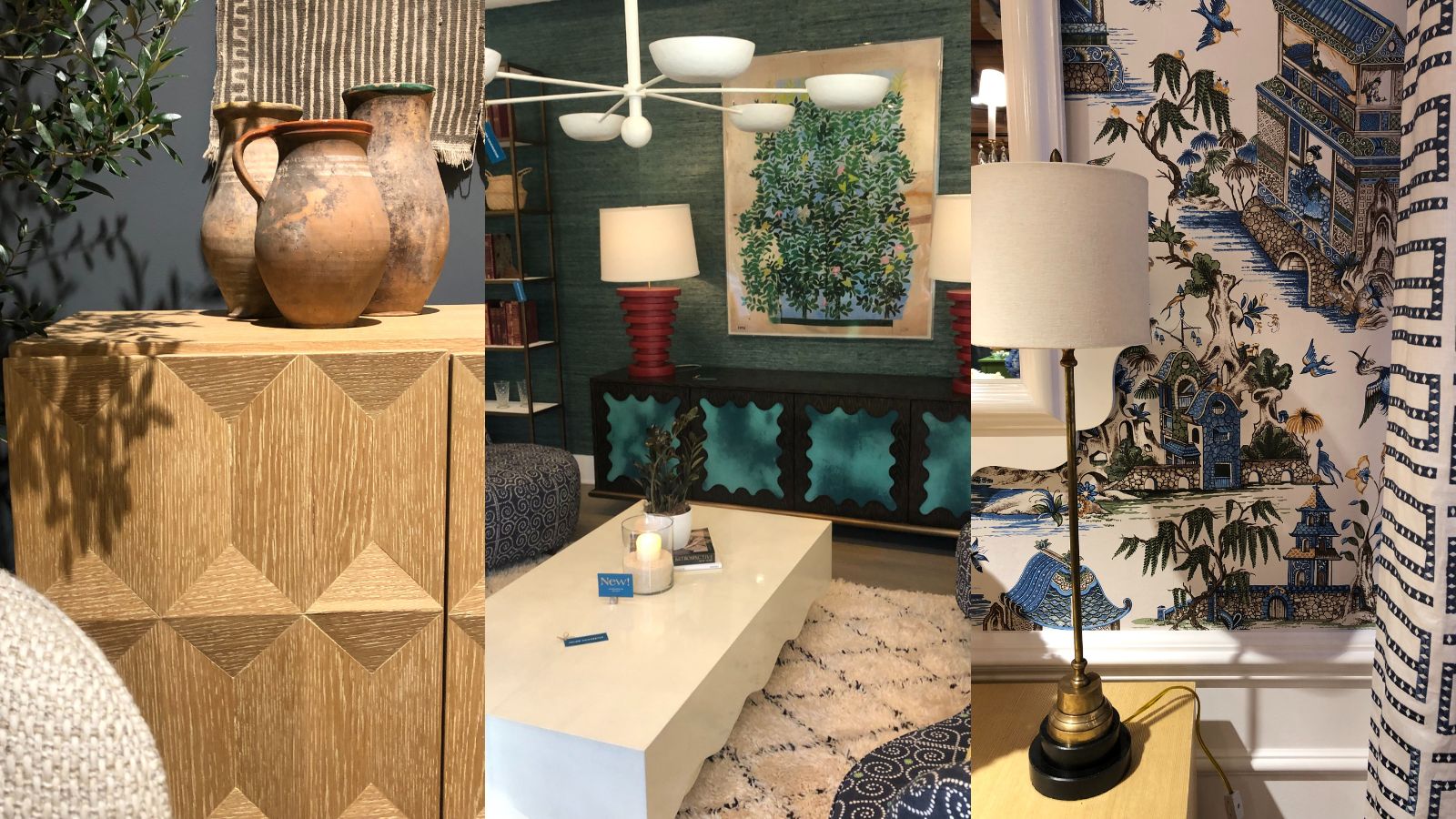
Article continues belowWhile there, I hosted a British high tea at Currey & Co, attended a dinner and (ahem, karaoke) hosted by Kravet and Mabley Handler, joined a panel talk arranged by Currey & Co and hosted by Gary Inman, and hosted a garden party at Eichholtz. And in between that, I had appointment after appointment with brands and interior designers both familiar and new to me. I'll post the highlights on Homes & Gardens' Instagram once I've had a chance to sift through the hundreds of photos I took. But in the meantime, I'm sitting on a plane with patchy WiFi and plenty of time to write, so I thought I'd share the recurring trends I spotted at High Point Market 2022, so you know what to look out for in 2023. Forgive the lack of professional photos – most were snapped at speed while there was a gap in the crowd.
High Point Market 2022 trends spot
Listed in no particular order, this are the materials, shapes, colors and themes emerging this year into next.
1. 'Emotional support' furniture
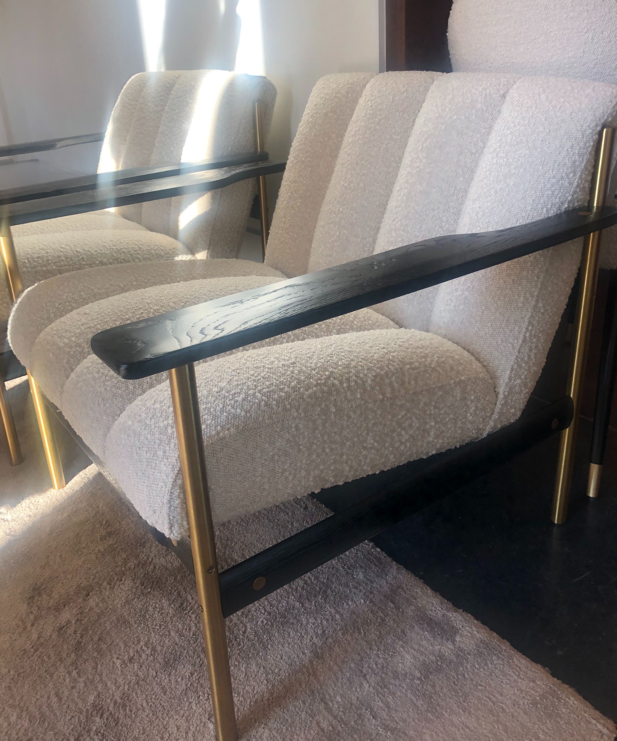
Bouclé and velvet as upholstery materials are still showing strongly, but there's a definite shift towards two new looks/finishes. The first is one that creates what I'm calling 'emotional support' furniture. Essentially, the upholstery looks and feels like a lamb's back. Or a poodle's. Or a long-haired cat's. Whatever, settle into one of these chairs and you'll find yourself unable to stop stroking the upholstery. It's incredibly relaxing and welcoming. And the effect is just as soothing as when you're stroking your pet. It's pure bliss. Eichholtz's take is pictured, and Bernhardt had plenty of these pieces, but many of the contemporary brands had their own versions too.
2. Tweed suiting upholstery
It doesn't seem long ago that furniture was covered in smart tweed-look upholstery, but it is most definitely back - last seen yesterday at Eichholtz. The benefit? The tweed generally has three to four neutral colors woven together, so it will fit seamlessly into any bolder color scheme, or bring a touch of texture to neutral rooms.
Design expertise in your inbox – from inspiring decorating ideas and beautiful celebrity homes to practical gardening advice and shopping round-ups.
3. 'Evidence of hand' & craftspersonship
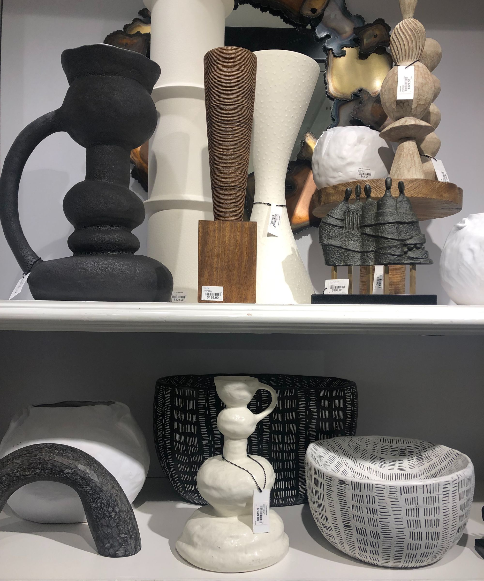
These aren't necessarily exactly the same thing. Stickley were understandably at pains to show me the traditional methods and hand-crafting that went into making their furniture, as were some of the smaller brands I discovered, whose craftspeople are based in the States and over in Europe, India, Africa and the Far East.
However, there's a real demand and desire more widely for what's being called 'evidence of hand' (I think that was coined by Christiane Lemieux of Lemieux et Cie, who was showing me her collections for Global Views (above) and Visual Comfort). It means pieces, which may or may not be mass market, but which are hand-finished or at least which look hand-finished. And it's no surprise - whether hand-made one-offs, limited editions or mass market pieces, they give homes a curated, individual appeal.
4. Calculated inconsistencies that tell a story
I'm attributing this phrase – which speaks to 'evidence of hand' and is often applied in the same way as 'calculated vintage' (below) to give a new piece an old or unique look – to Lance at Jaipur, too, though he wasn't the only person to mention it. In fact, when I met Eddie Maestri of Maestri Studios out of Texas, we discussed this – and how he was delighted with a recent eBay purchase of an Italian table that had the tiniest chip on it. 'I'm happy with the chip, it shows the table has a story behind it,' he said, or, at least, I paraphrase.
5. Calculated vintage
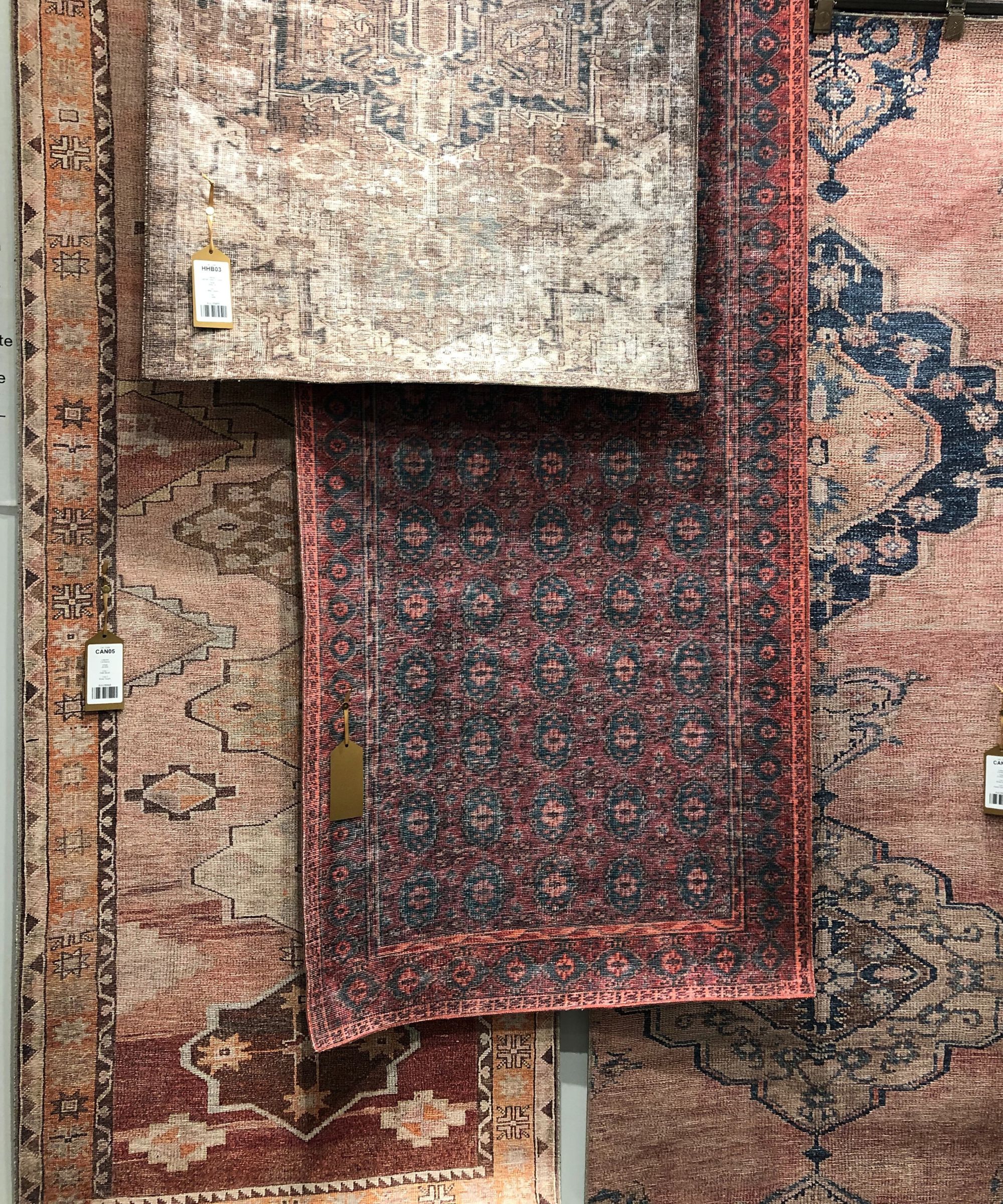
This trend came up again and again, and it speaks to the 'evidence of hand' and desire for authenticity theme I mentioned above. I have to give credit to Lance Trachier, Creative Director at Jaipur Living for this phrasing. During the fascinating tour of the showroom, he explained how original vintage rugs might be at the top of everyone's wishlist but that they are often purchased for the living room, with less expensive, much more practical lookalikes reserved for less seen or heavily used rooms beyond – think the kitchen, playroom and bedroom, where you might not want to commit your budget to a hand-made, delicate piece. The 'calculated' part of the 'vintage'? The designs and motifs mimic the originals, often through hand applied ageing so that a brand new rug can look as good as old.
6. Pseudo neutrals
Let's talk color trends. Furnishing and decorating with neutrals isn't what it used to be because neutrals are no longer limited in scope: now, everything from dusky pink to grey purple is being used as a background neutral. This was evident in Mabley Handler's pinks for Kravet right through to Fabricut's fabric range for Liberty, and it makes rooms richer, warmer and more characterful.
7. Chromophobia
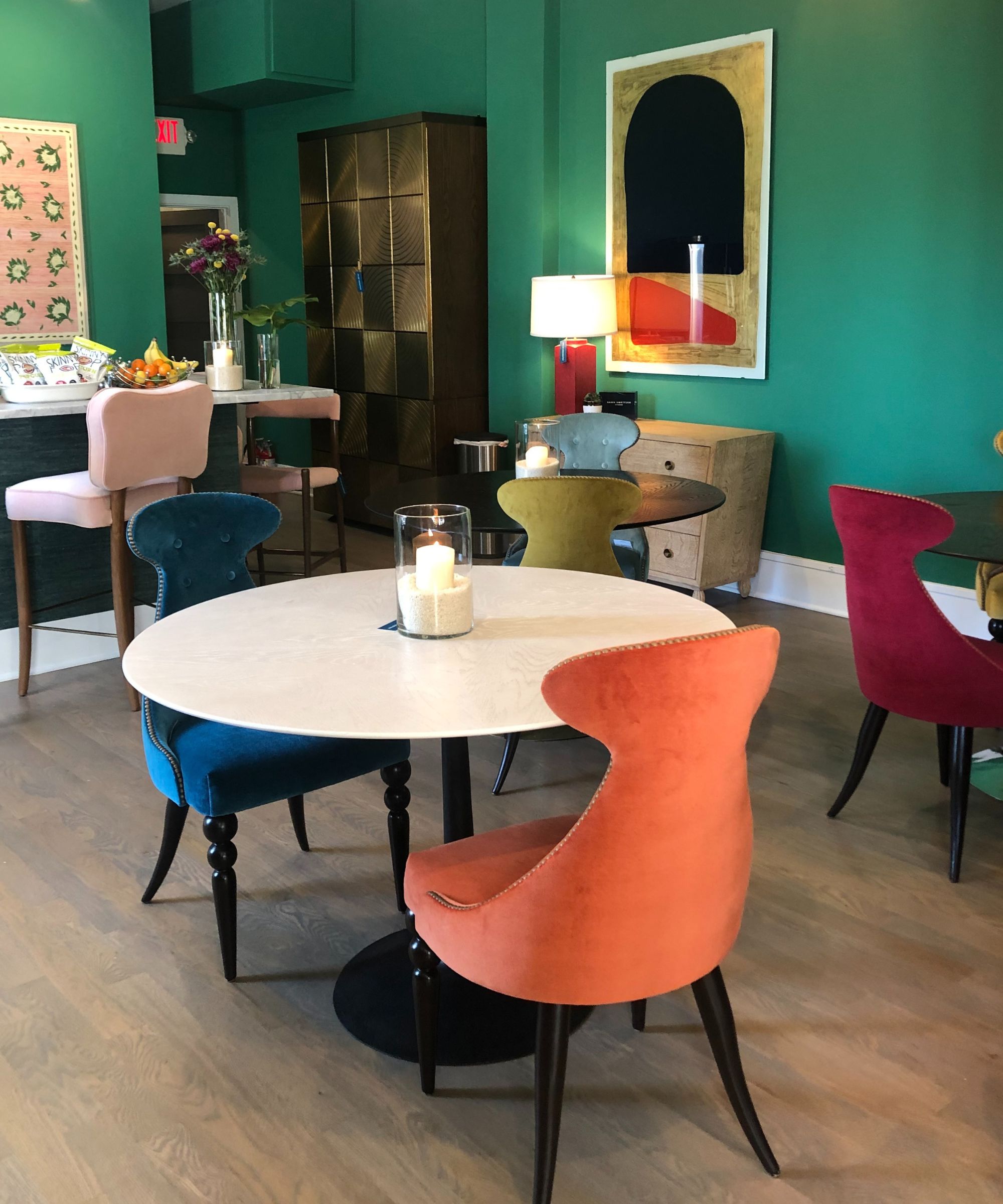
Monochromatic color schemes are out, according to many of the brands and designers I spoke to. Whether you go for the joyful colors and prints shown by Thibaut and Scot Meacham Wood Home, the fabulously colorful furnishings at Julian Chichester, or use pseudo neutrals to add color layering, it's all about variety.
8. Art Deco reinvented
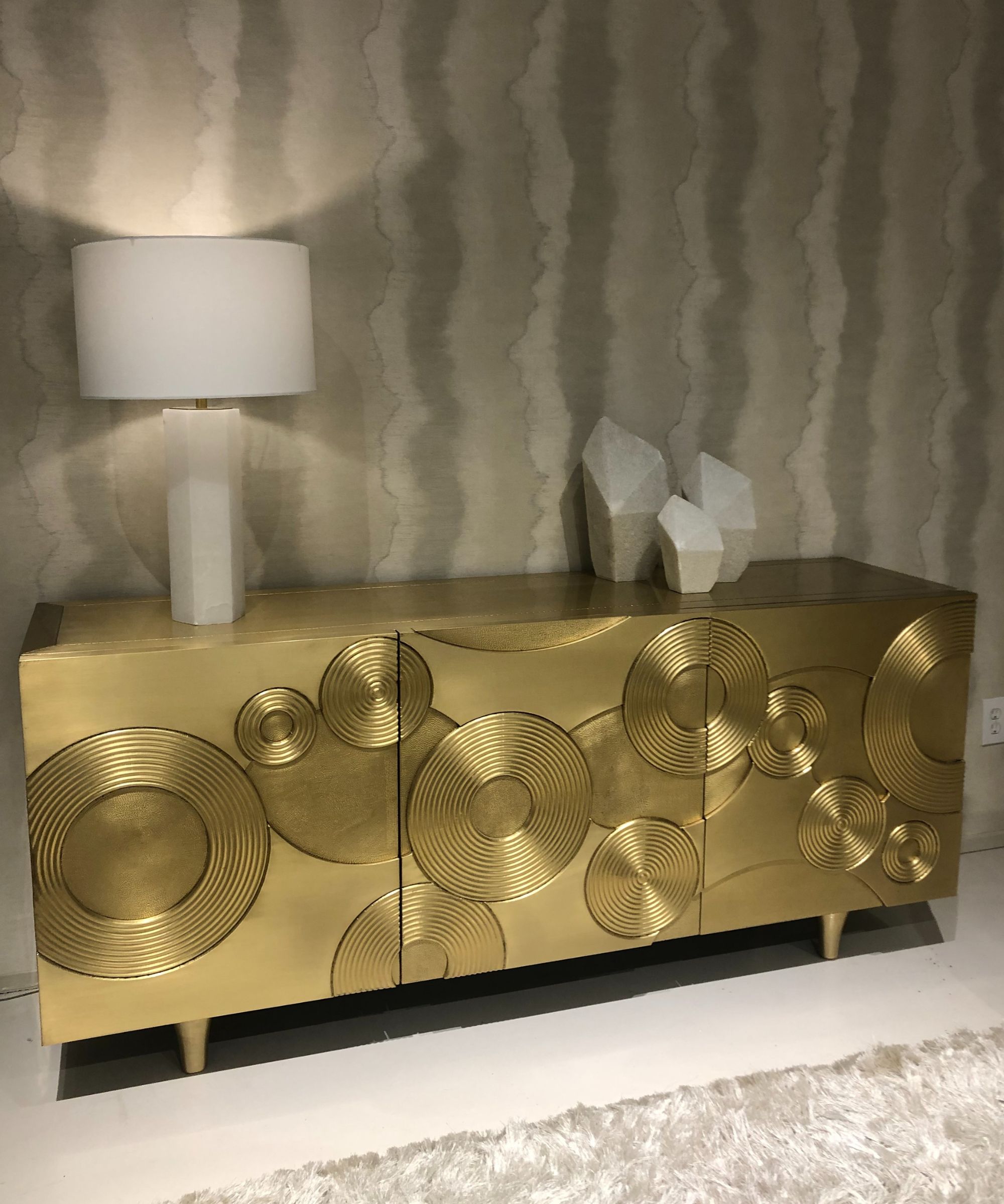
Particularly noticeable in the lighting of Hudson Lighting Group and Arteriors, the sideboards at Century and Bernhardt (above), and the home bars I saw everywhere, Art Deco decor is back. Its echoes are seen particularly in the circles and geometrics on the fronts of sideboards, in the smoked glass of lighting shades and coffee tables, in the lighting silhouettes, even in the juxtaposition of the ubiquitous curved sofas and armchairs and rectangular rugs and angular coffee tables.
9. Mixed materials
This furniture trend has been around for a while, but it's out in force, seen in lights that are a combination of glowing, inner-lit alabaster and aluminum; in furniture that's composed of ebonized wood, steel and bouclé, and in coffee tables that pack timber, metal, and natural stone into their makeup.
10. Modern fancy
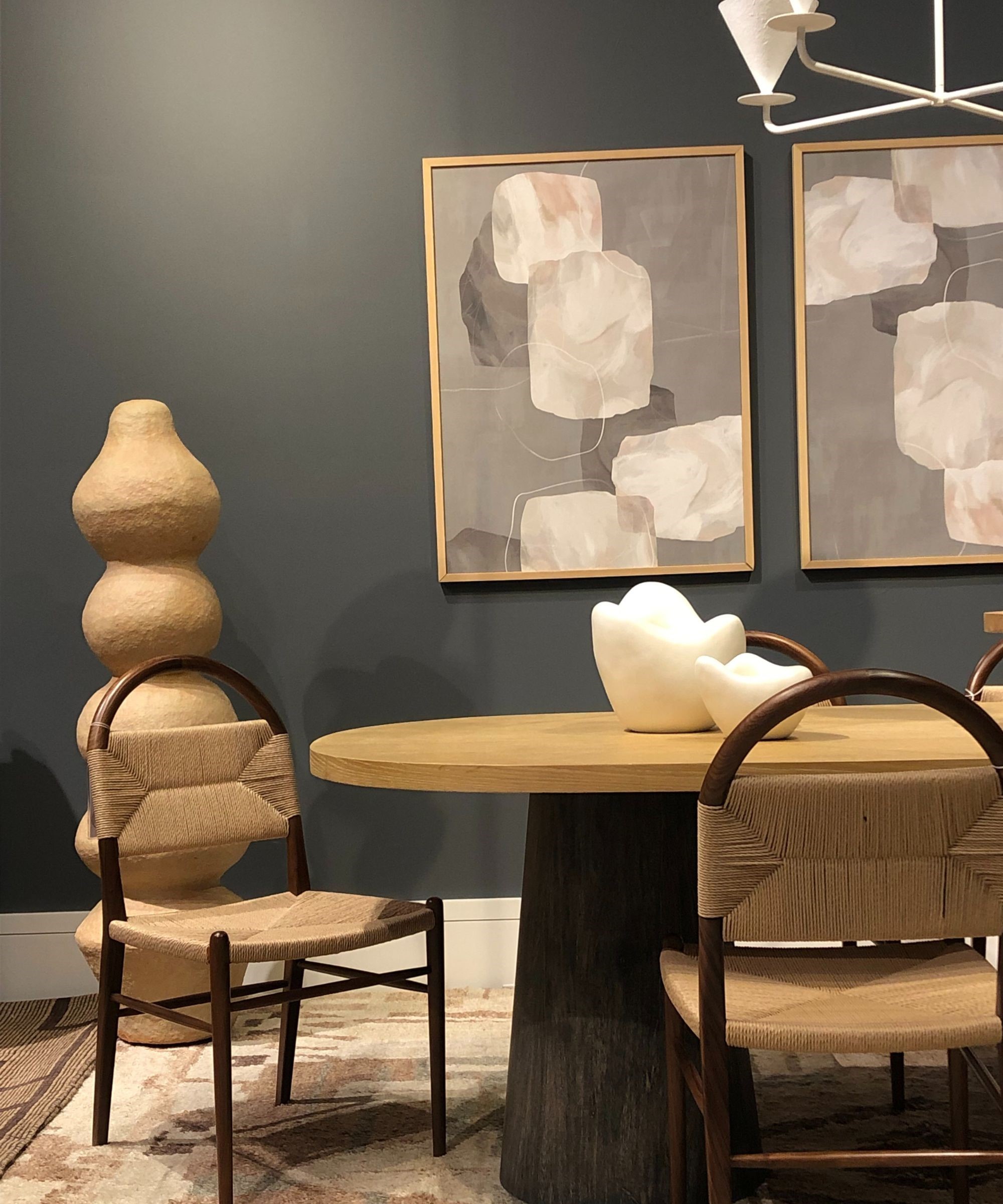
Thanks Christiane Lemieux of Lemieux et Cie for this one. I hardly know how to describe it – Christiane can no doubt correct me. The nearest I can get is that it's a contemporary aesthetic that's left that cold, sleek minimalism way behind it and incorporated so much of what I've talked about above: 'evidence of hand', intriguing combinations of materials, purposeful individuality and eye-catching shapes and textures. Above, you can see it applied in her range for Precedent.
11. Sustainability
'Buy well, buy once' is a running theme that connects us right back up to the craftspersonship I talked about above. Interior designers say their clients are much more interested in the provenance and processes involved in the materials and pieces they are sourcing, and that bleeds back to the brands and the production processes they invest in. I think brands need to talk sustainability up more – we should all know everything there is to know about what we're writing about, promoting, selling and buying.
12. The cut out club chair - that swivels!
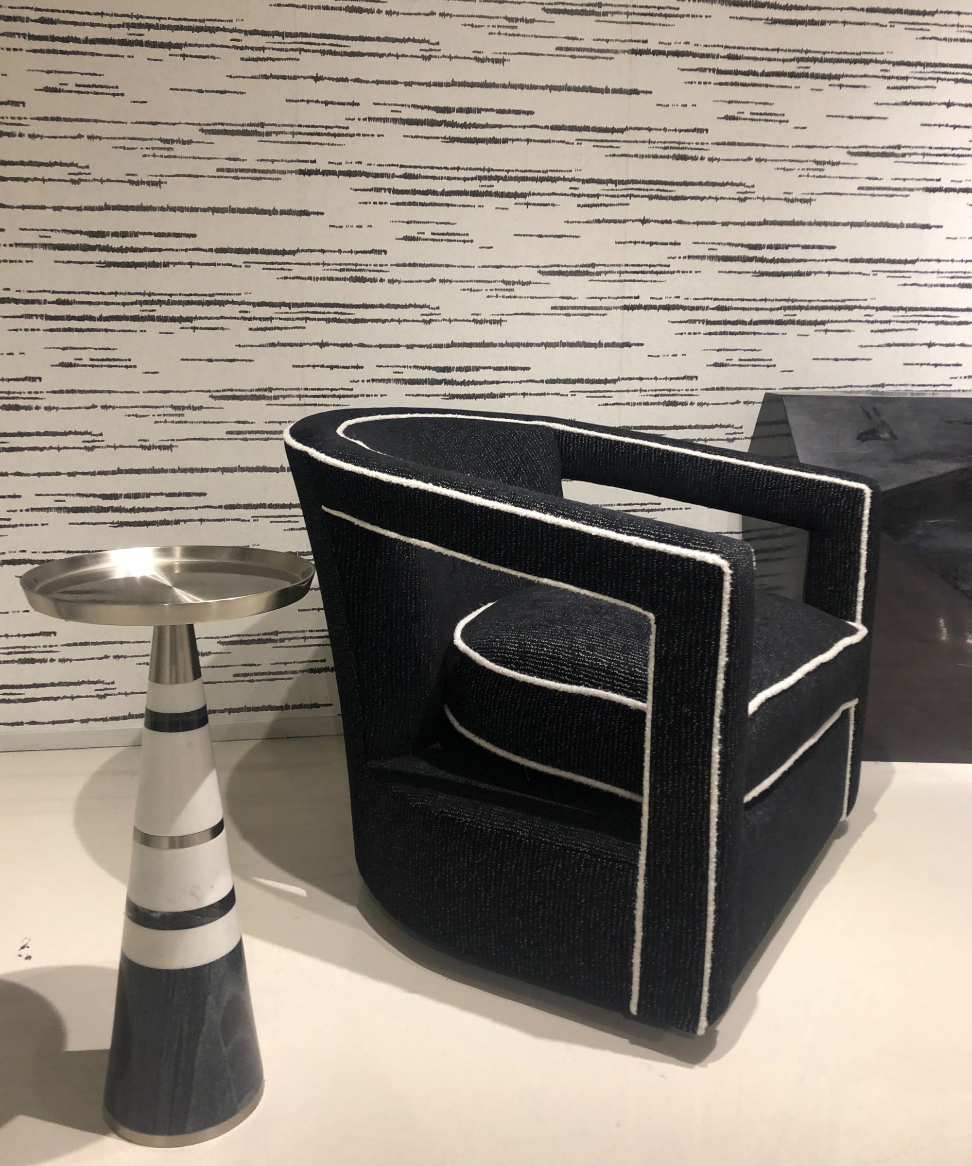
You'll have to forgive me. I'm British born and bred and, as far as I knew, you couldn't buy a swivel chair in UK high streets. I think it's probably because our homes and rooms tend to be smaller so our furniture is often pushed back against the walls, so no need, or use, for a swivel. With the advent of open plan living and multi-purpose rooms, that's going to change. Especially since, Arteriors told me, they do sell swivels into the UK, so other brands must do too. The best are those that are deceptive and don't look like they swivel, that are incredibly comfortable (to be honest, I did so much walking that they were all dreamily welcoming), and that have a fabulous silhouette. For me, that's the cut out club swivel chair, and there are models made for outdoors. Outrageously stylish for sunny afternoons.
13. Wellness
It's the obvious one, for me, to finish with. It was a hot topic at the panel discussion for Currey & Co, and I had a fascinating chat with interior designer, lifestyle and wellness expert Joshua Smith about how he incorporates it into his work. Wellness, it is evident, goes beyond the yoga mat, the spa bathroom and the perfectly curated bedroom. It's equally about choosing colors, shapes and materials that please our eyes and soothe us when we touch them, about creating rooms and finding pieces that are unique to all of us and which tell a story, and about sourcing materials and furniture that do as little harm as possible to the planet, so that our homes can be more than just well-presented showpieces, but truly personalized havens, too.

Lucy Searle has written about interiors, property and gardens since 1990, working her way around the interiors departments of women's magazines before switching to interiors-only titles in the mid-nineties. She was Associate Editor on Ideal Home, and Launch Editor of 4Homes magazine, before moving into digital in 2007, launching Channel 4's flagship website, Channel4.com/4homes. In 2018, Lucy took on the role of Global Editor in Chief for Realhomes.com, taking the site from a small magazine add-on to a global success. She was asked to repeat that success at Homes & Gardens, where she also took on the editorship of the magazine. Today, Lucy works as Content Director across Homes & Gardens, Woman & Home, Ideal Home and Real Homes.