This Hamptons shingle beach house sits on stilts six feet above the ground – perfect for seaside living
The unique design of this beach house ensures the focus is on the water. It even has a special area for clambakes and dancing in the rain
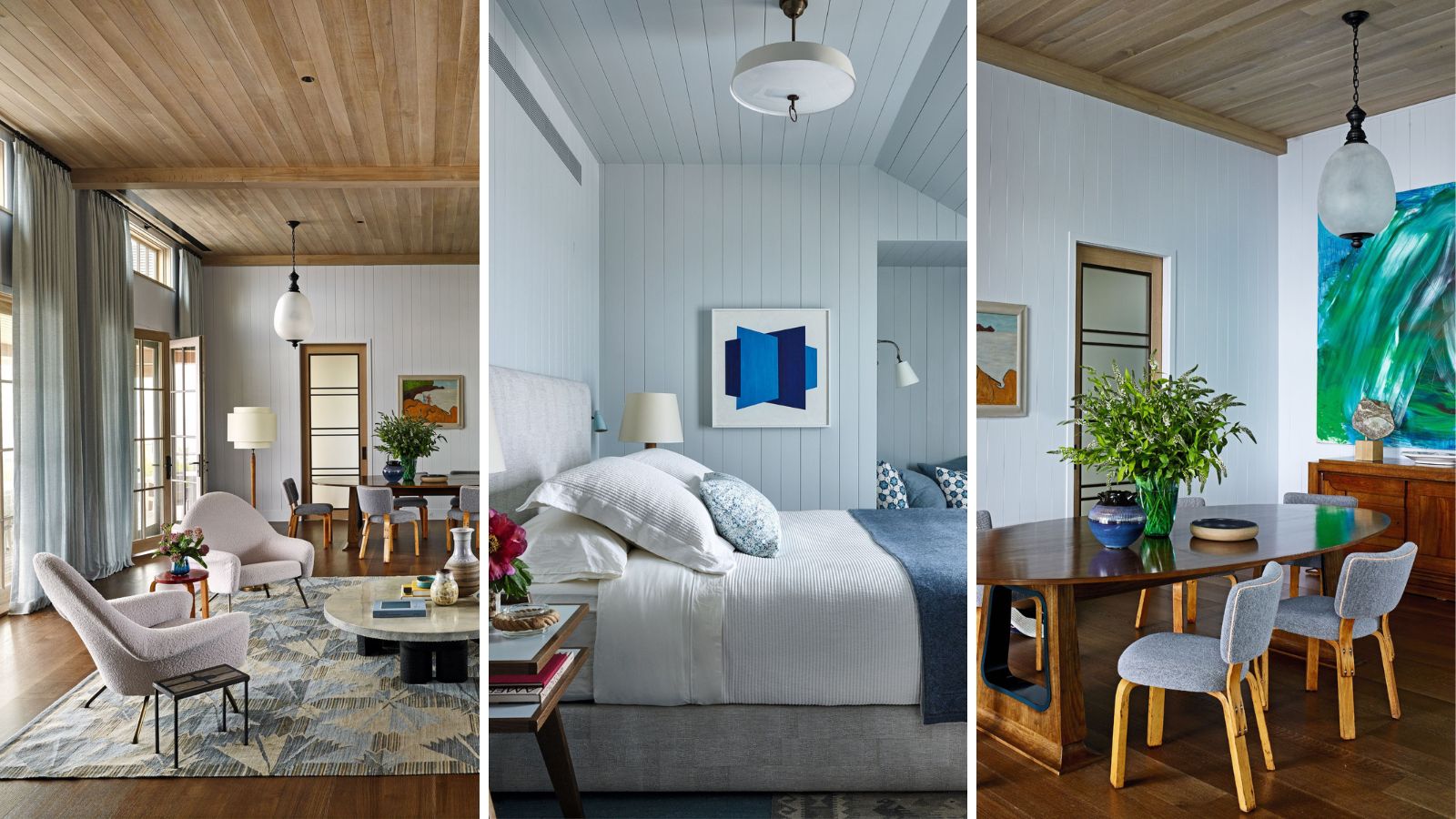

The Hamptons is renowned for its exclusive properties and exceptional house design, so it takes something special to stand out, but this shingle beach house certainly does just that. The property was a collaboration between architect Thomas A. Kligerman of Kligerman Architecture & Design and interior designer Charlie Ferrer of interior design studio Ferrer.
‘There had been a house there already, dating from around the 1950s, but the clients needed something bigger,’ explains Tom. ‘They came to us partly because we’re known for our shingle style and we decided to start over.
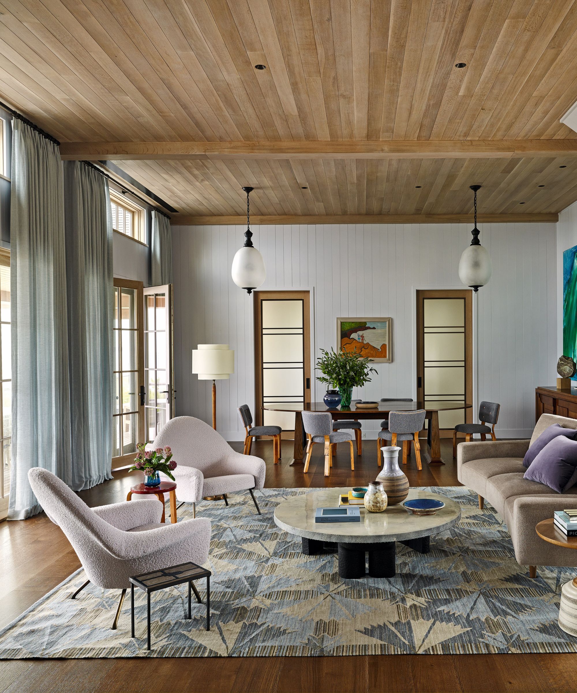
770 chairs, Antique store. Custom coffee table, Ian Felton. Swedish flatweave reproduction rug, FJ Hakimian. Walls in Violet Dusk, Benjamin Moore.
Their brief was for something that combined modern and traditional, not too fancy and comfortable – a family beach house. Because the house is in a flood zone and had to be built to withstand hurricanes, it stands on stilts six feet above the beach.
From its vantage point, it overlooks the bay and has views to the north point of Long Island. ‘When you’re inside it, all it does is focus you and orient you to the water,’ says Charlie.
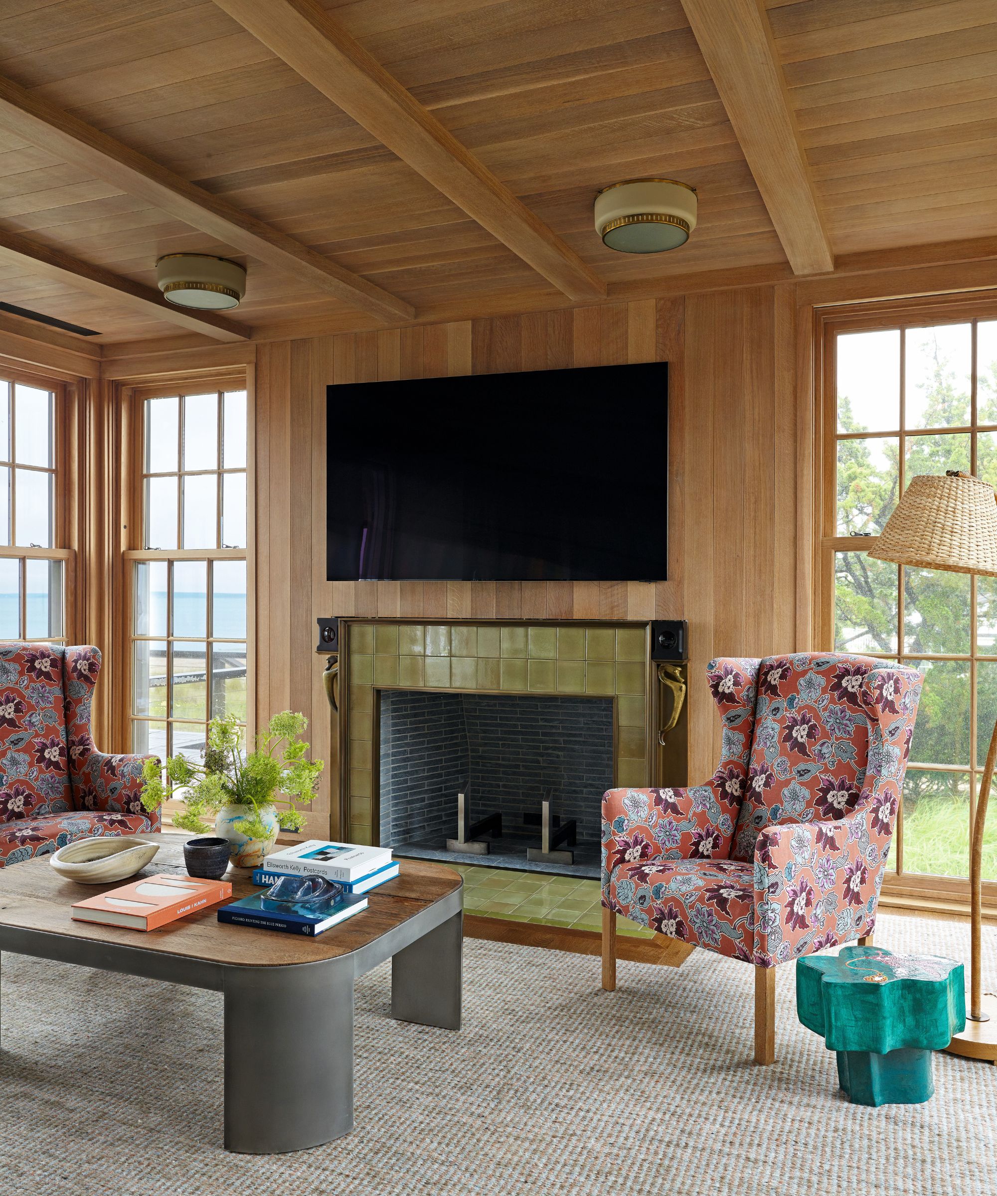
Armchairs in Bromley in Hummingbird, Le Gracieux. Custom aluminum and reclaimed oak coffee table, Ferrer.
Tom’s inspired design includes generous windows to soak up the views and a varied pace with rooms on split levels. The bedrooms, for instance, are located on their own levels ensuring privacy.
‘The house is fairly complex for a relatively small house,’ explains Tom. ‘There’s always a surprise.’ One of the surprises is what’s known as ‘the oyster house’, a cool room beneath the house that’s surrounded by sand and vegetation and forms the perfect place for a clambake.'
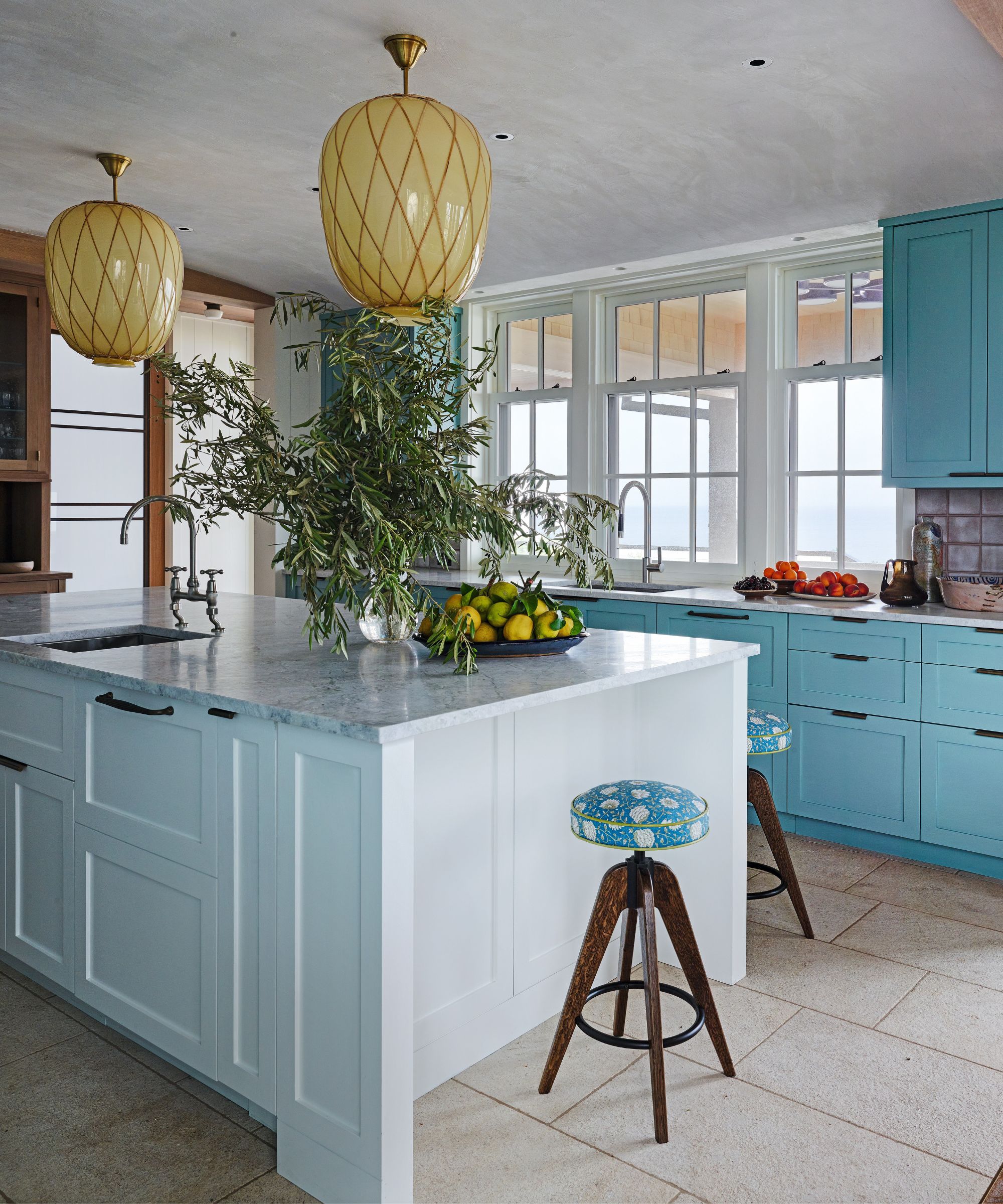
Cabinetry in All White and Green Blue, both Farrow & Ball. Bar stools, custom by Ferrer; made by Collier Webb.
The dining porch, meanwhile, plays an unexpected role. ‘The clients called and said, "We like to dance and we like to dance outside but we want to be able to dance even if it’s raining," so what was going to be an open porch gained a roof over it,’ says Tom. ‘That adds a certain amount of romance to the house.’
The interior boasts a carefully considered layout. Highlights include the sitting and dining room, the Great Room, which is one open-plan space, and the Four Seasons room, a sitting space that is an extension of the kitchen.
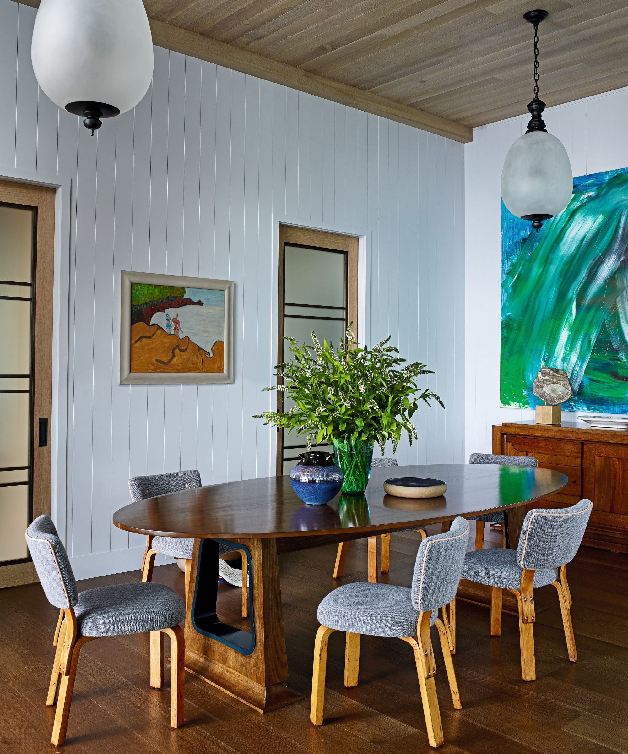
Custom pendants, Collier Webb. Table, custom by Ferrer. Chairs, Alvar Aalto for Artek. Landscape painting by Sally Michel Avery, Katharina Rich Perlow. Abstract painting by Jean Messagier, Piasa Paris.
Natural materials prevail throughout with oak ceilings a statement feature. The aim with the decor was a cozy, cottagey, historically-inspired interior with a watery palette. ‘We wanted it to feel oceanic and organic, bringing the colors in from the sunset and the way the light plays with the bay, as well as the sand,’ explains Charlie.
The Great Room, for instance, has a backdrop of lavender-blue walls. ‘We wanted this sense of a cozy neutral. It reads blue in certain light and has a wonderful dynamic range to it. So many Hamptons rooms are stark white. We wanted depth and mood.’
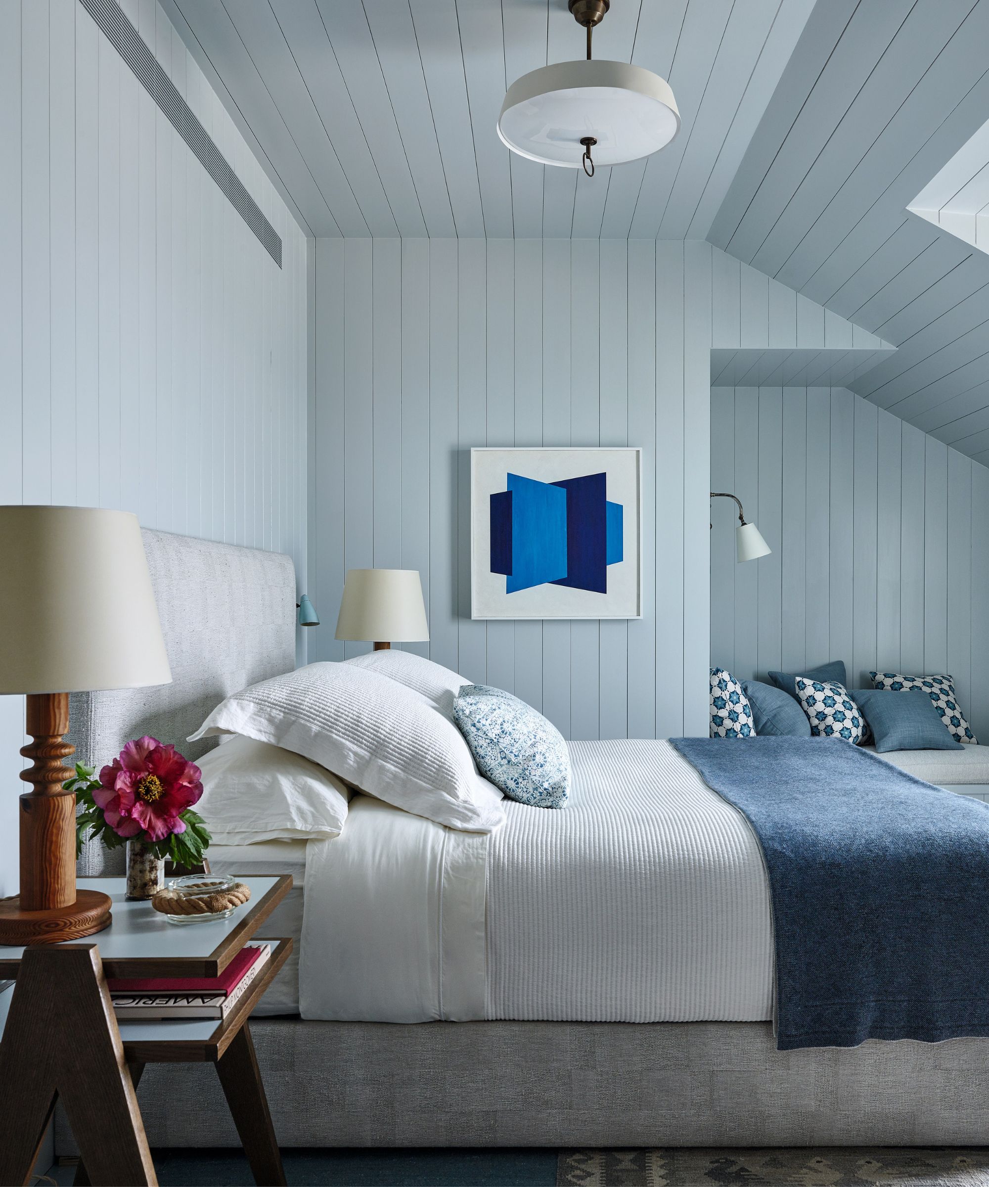
Bed and bedside table, custom by Ferrer in Rogers & Goffigon’s Cubist Silver Birch.
To that end, the interior palette spans bold maritime blues through to soft pinks, with pops of intense sea greens. The furniture throughout is a mix of mid-century modern French, Italian, and Scandinavian.
‘For me, it’s about an interesting mix of styles, materials, ideas. It’s about collecting things that are complementary of each other,’ says Charlie. Notable finds include the pendants over the kitchen island that came from a Swedish hospital complex.
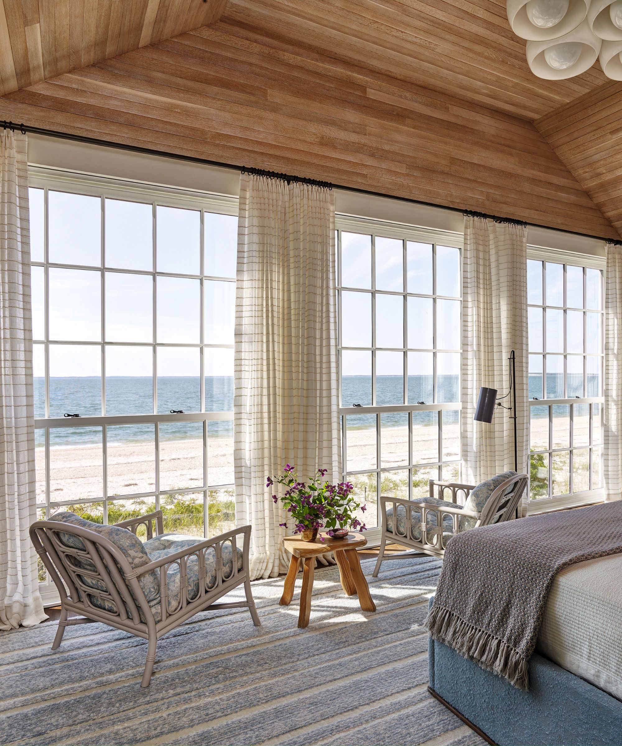
Bed, custom by Ferrer in custom fabric by Mitchell Denburg Collection. Custom bed linens, C&C Milano. Chairs, vintage. Rug and curtain fabric, custom by Mitchell Denburg Collection.
There are also subtle nautical references. ‘We put brass portholes into some doors and the doors at the back of the dining area are glass with horizontal metal bronze bands in them, which is also picked up in the bathroom details,’ explains Tom.
‘As well as mid-century, there’s a tad of the 1930s peeking in that is a nod to the elegant era of steamships.’
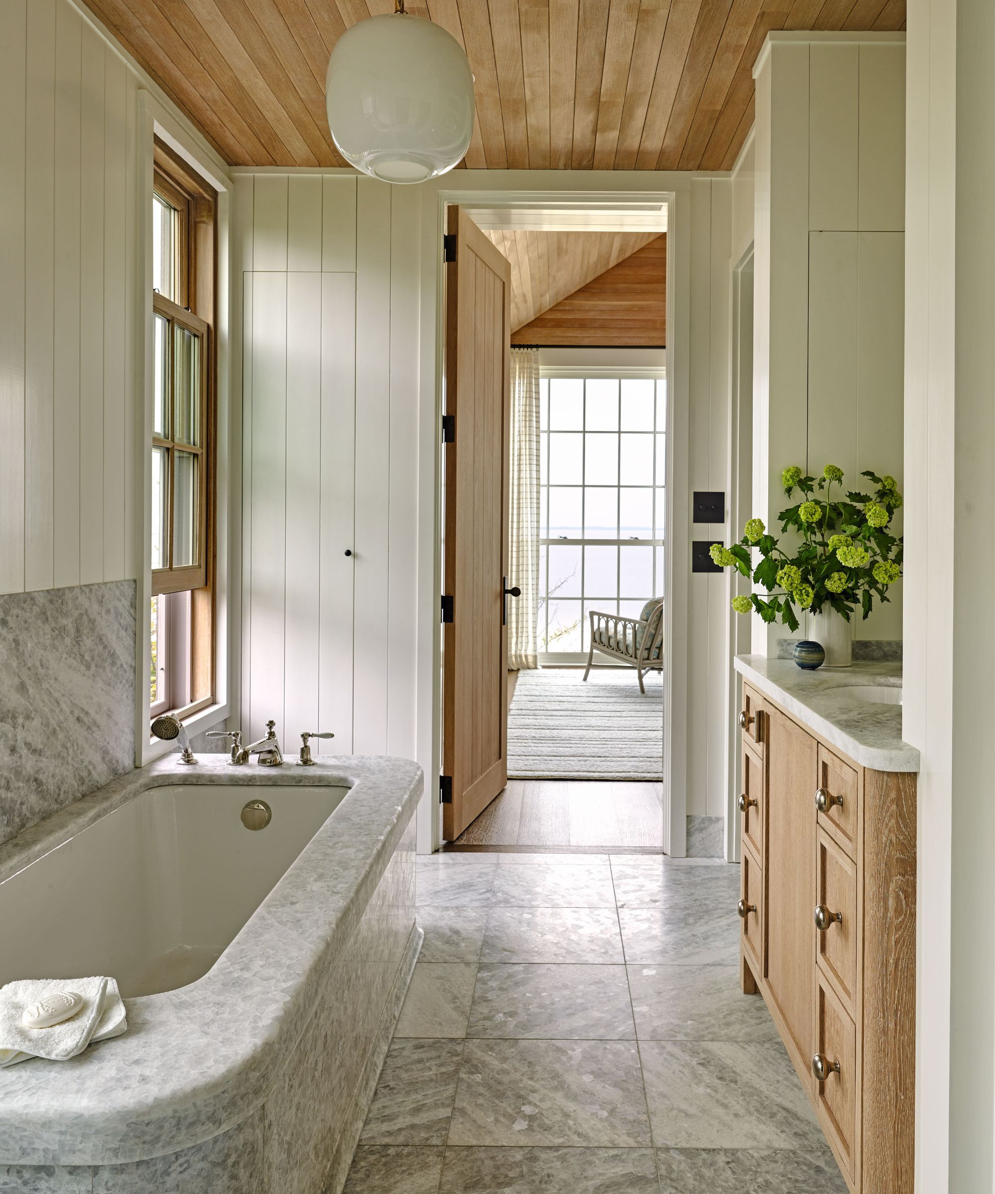
Globe pendant lamp by Venini, Antique shop. Bath, custom; fabricated in Italy by BAS Stone. Washstand, custom in white oak, with custom knobs by Lowe Hardware.
Meet the designer
Charlie Ferrer shares his style inspiration
What part of the house do you consider the greatest success?
The enfilade of rooms – from the Four Seasons room through the kitchen to the dining and sitting room.
Is there a small change you made that had a massive impact?
The elimination of all drywall in favor of boards, a combination of oak and painted, throughout – actually it was a large change but the impact of it was immense.
Which colors are your go-to?
Warm blues and desaturated purples, pinks, greens, and blues.
What's your favorite design detail?
The marriage of oak and bronze.
Can you reveal a secret shopping address?
R E Steele Antiques, East Hampton.
Which elements make the property feel 'coastal'?
The expansive deck encompassing sun chaises, a large dining area and two seating areas, and space for dancing. Also, the floor-to-ceiling custom windows in the main bedroom give the feeling of floating on the water.
How did you find inspiration?
The bay, the sea, early Hamptons cottages, English and Italian references.
Sign up to the Homes & Gardens newsletter
Design expertise in your inbox – from inspiring decorating ideas and beautiful celebrity homes to practical gardening advice and shopping round-ups.

Interiors have always been Vivienne's passion – from bold and bright to Scandi white. After studying at Leeds University, she worked at the Financial Times, before moving to Radio Times. She did an interior design course and then worked for Homes & Gardens, Country Living and House Beautiful. Vivienne’s always enjoyed reader homes and loves to spot a house she knows is perfect for a magazine (she has even knocked on the doors of houses with curb appeal!), so she became a houses editor, commissioning reader homes, writing features and styling and art directing photo shoots. She worked on Country Homes & Interiors for 15 years, before returning to Homes & Gardens as houses editor four years ago.
-
 9 of the best flowers to grow for drying – to extend the beauty of your backyard blooms
Many flowers are as beautiful dried as they are fresh
-
 Best climbers to attract hummingbirds – 5 nectar-rich vines with vibrant, colorful flowers to fill pots and borders
Hummingbirds, butterflies and bees will not be able to stay away from these easy-to-grow flowering climbers