5 colors to avoid painting a landing – and the secret to choosing the right shades
The tones in this transitional space count – these are the ones to avoid for a seamless flow throughout your home
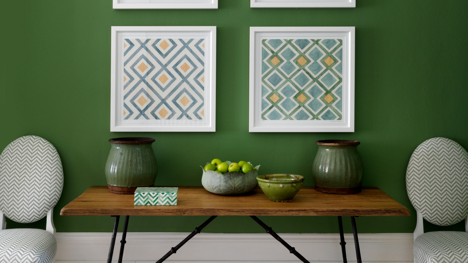

You would be forgiven for forgetting about your landing when considering color schemes for your home. This transitional area is one you pass through while en route to another social or practical space, and is often a last thought when it comes to decor. But that doesn't mean your landing ideas should be overlooked.
The color decisions you make for your landing can be incredibly impactful, improving the flow between it and the spaces off it. This is where paint ideas come into play, setting the tone for all adjoining rooms, including the staircase, and your entryway paint and hallway paint ideas above and below.
However, precisely because the landing is a space where color can be used to link rooms of different colors, it can be easy to choose the wrong shades. Therefore, knowing which hues to choose and to avoid here is key.
5 colors you should avoid painting your landing
From dark green to charcoal gray, interior designers are steering clear of some of this year's most sought-after tones on their landing. Here's what you need to know before painting.
1. Beige
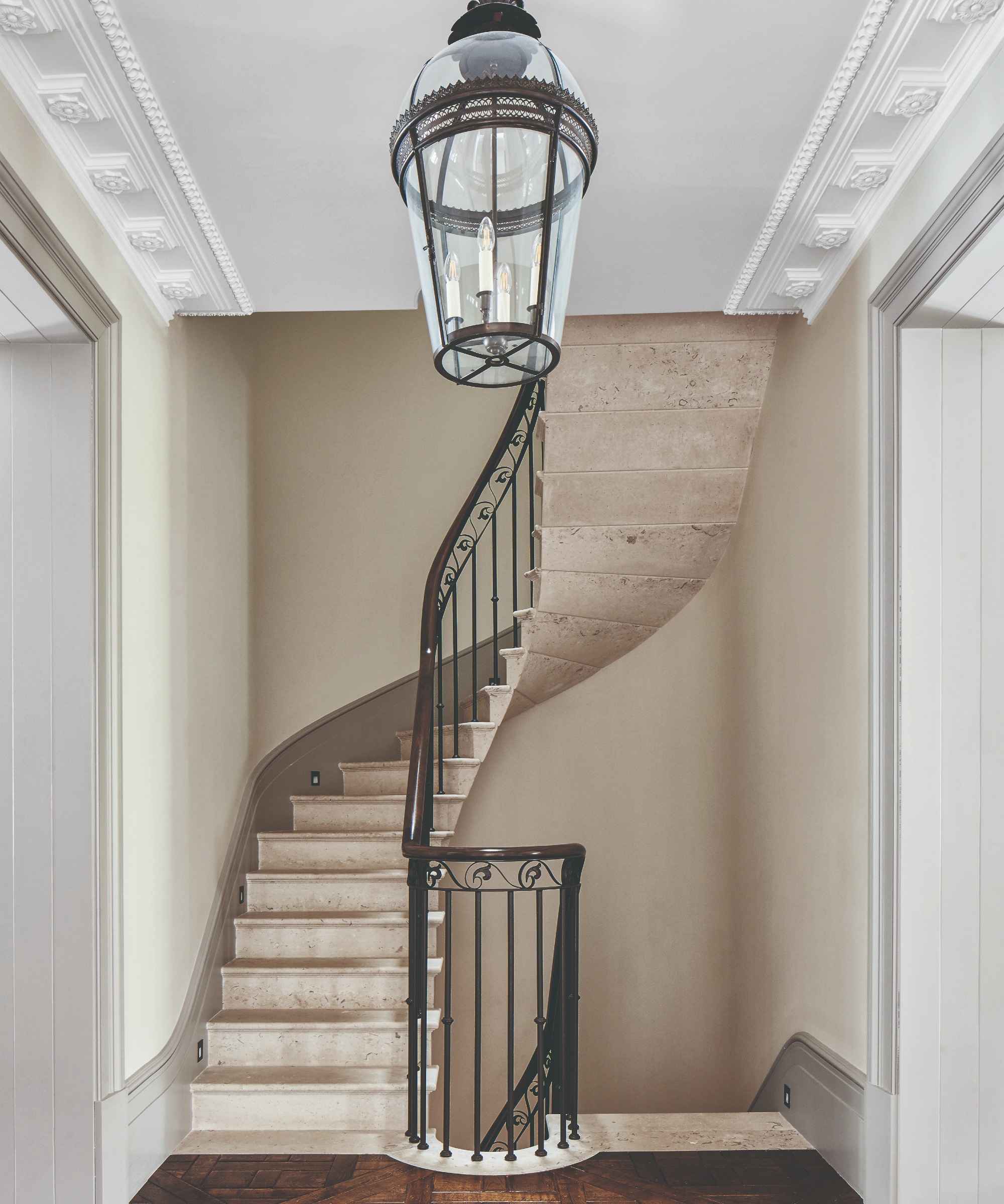
Beige living room ideas might be popular, but it's a much trickier color to use on a landing because of how it reacts in different lights and with other colors.
'I would always avoid painting a landing any type of beige. It is one of the most tricky colors that exist,' says Lucy O'Brien, the Principal Designer at Tartan & Toile. 'There are pink, gold, and yellow beiges, and all have very different colors that they can be paired with – if you pick the wrong one, the whole thing will clash.'
If you're looking for a soft tone that offers the comfort of beige without the risk of a clash, Lucy recommends opting for a warmer white or a more 'muted white' such as Farrow and Ball's Cabbage White which is among the designer's favorites.
2. Charcoal Gray
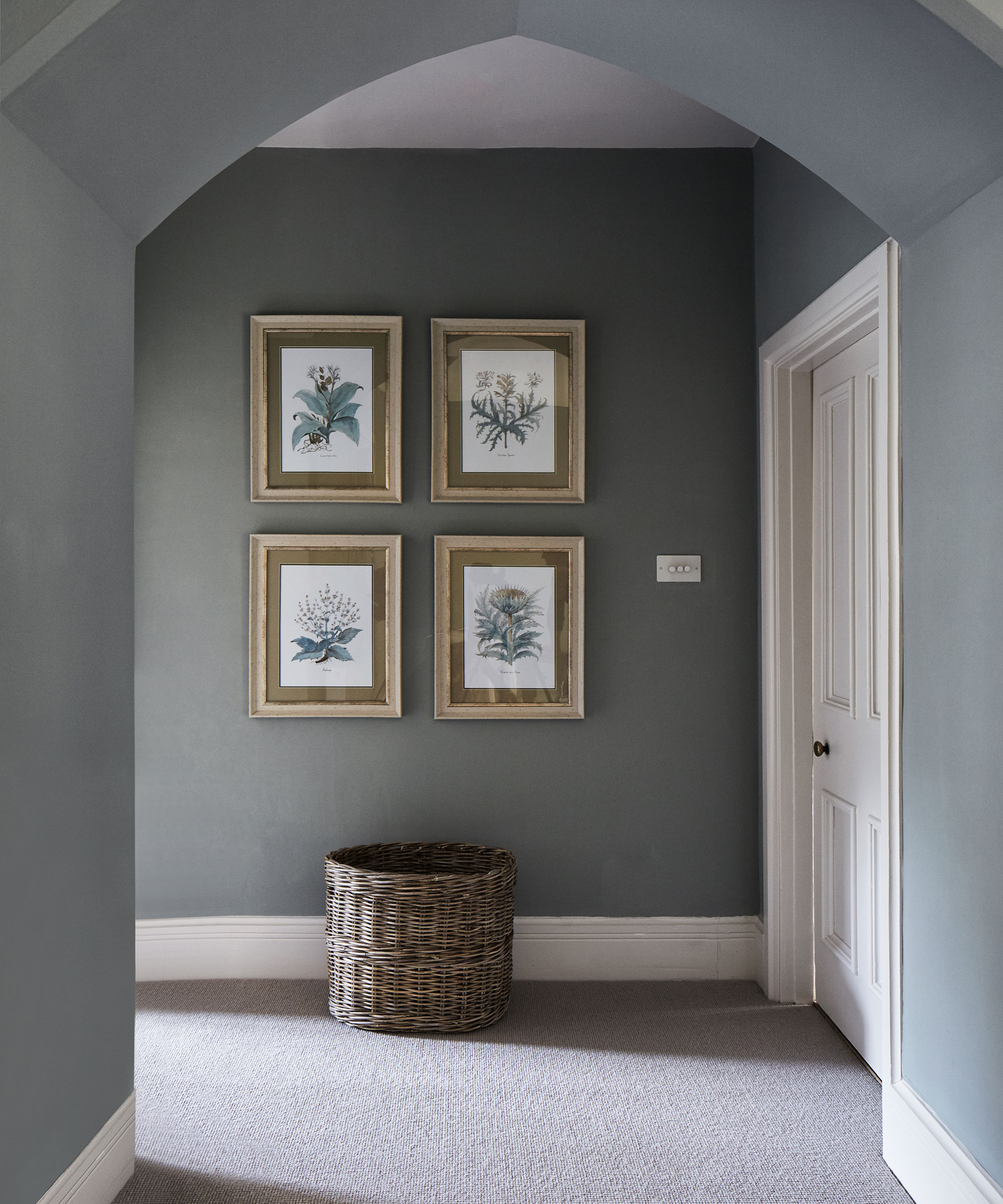
You may think it would be hard to go wrong when decorating with gray, but it is possible to be wrong-footed by certain tones in this fleeting space.
'I would never paint a landing a charcoal gray. It is a color trend that is fading out and will make your home look instantly dated,' Lucy warns.
Instead, she recommends Farrow and Ball's Pigeon, which offers a more dusty gray-blue aesthetic that is more likely to stand the test of time.
3. Black
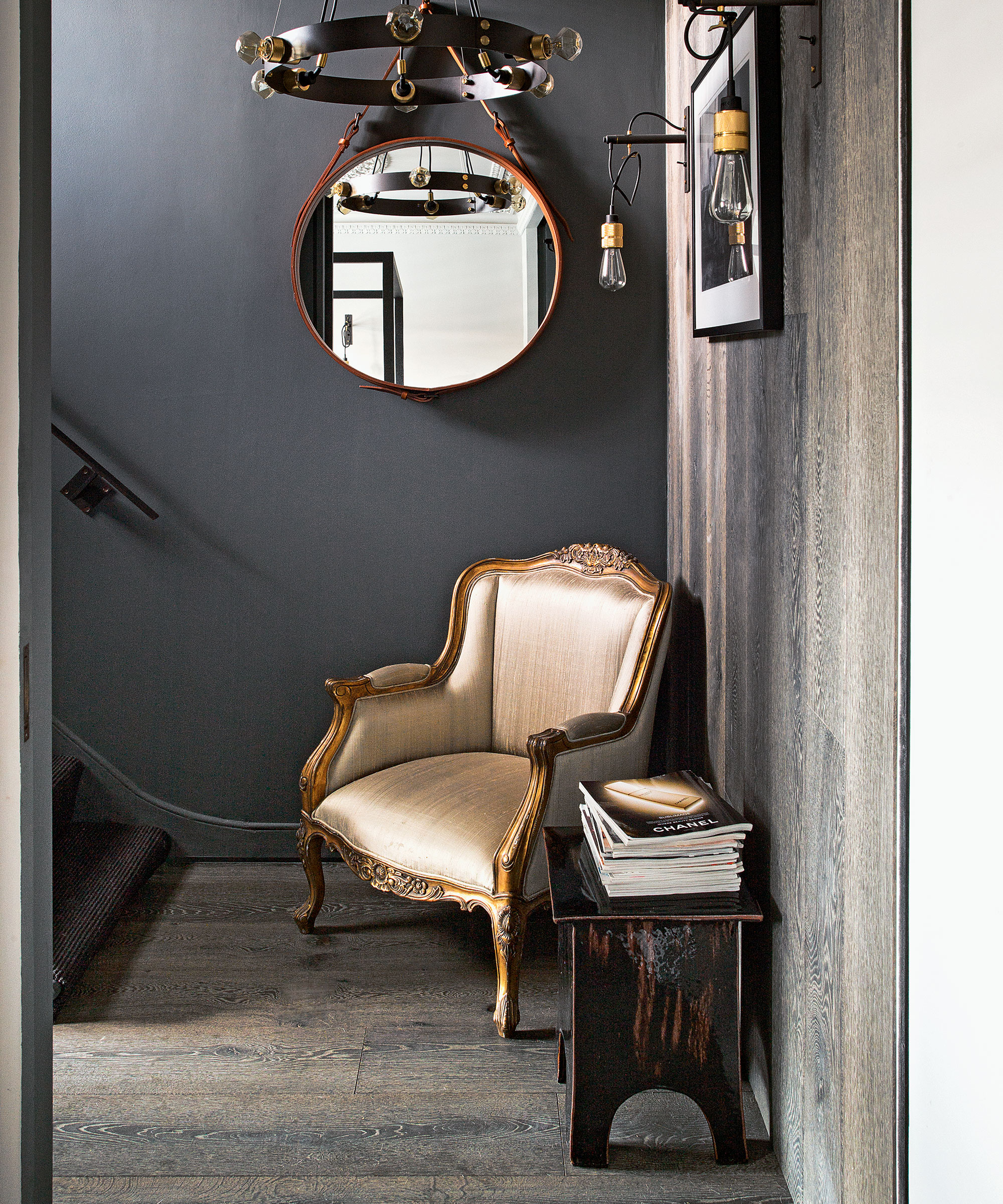
Black will always have stylish qualities, but Lisa Rickert, the CEO and Creative Director of paint company Jolie Home warns against bringing this color for practical reasons.
'Black and off-black can be very chic, but not for your landing. If lights are dimly lit at night, you do not want to risk someone falling as they try to navigate the stairs,' she says.
Since your landing is first and foremost a transitional space, the expert suggests choosing a warm white that will work seamlessly on your walls. '[It can] run through the halls of a home, creating continuity and visually enlarging the space even if you do not have much natural light in the area,' Lisa adds.
4. Bright red
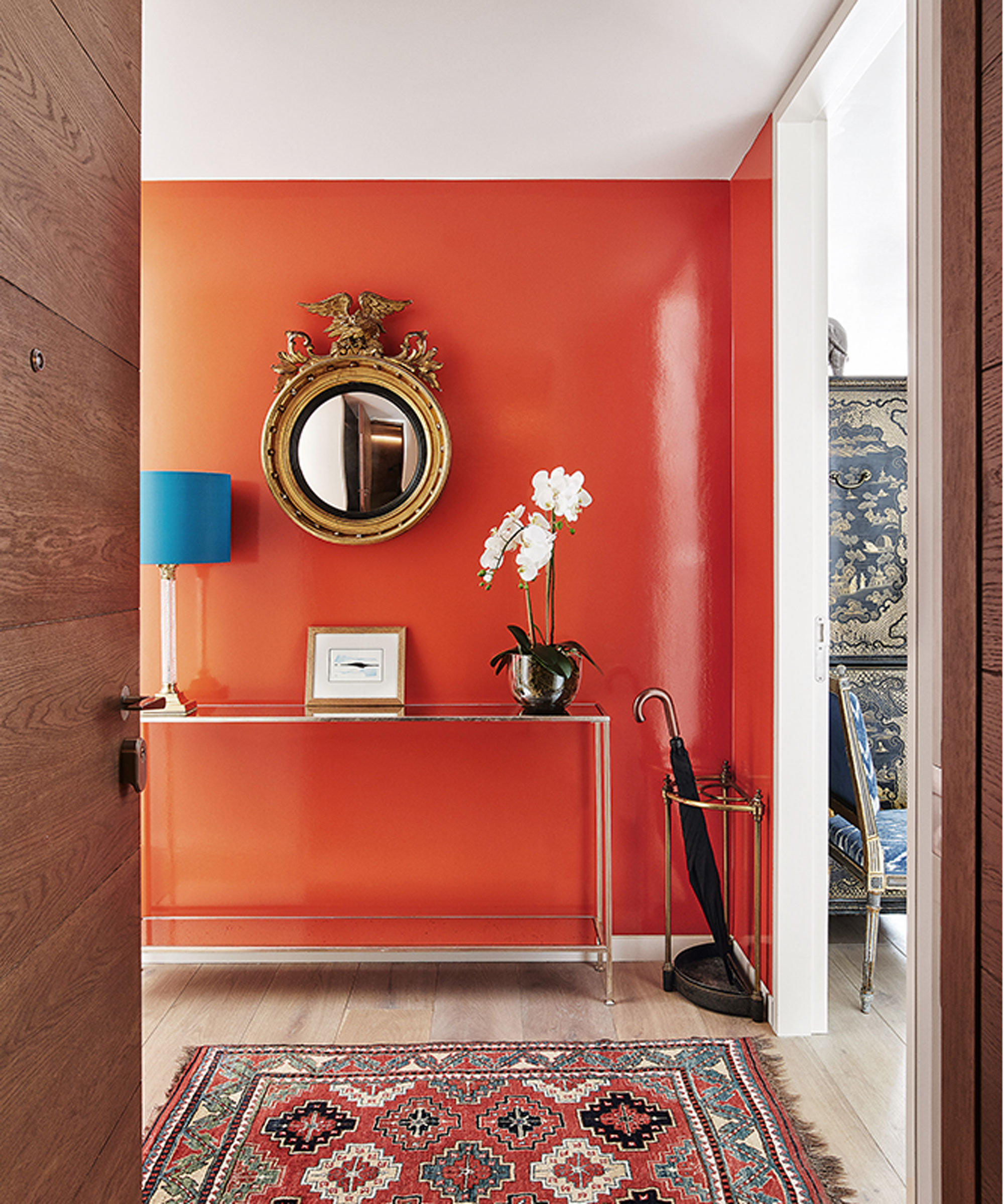
Bright and bold colors like red or orange may be stressful for people passing through your landing,' says Amy Youngblood, Owner & Principal Designer of Amy Youngblood Interiors. This color idea is best-reserved for social spaces that need to make a lasting impression, whereas your landing is best kept uncomplicated.
'You want your landing to be airy and open for company passing through. The landing is not a space for lingering, so it's a good idea to keep it neutral and simple,' the designer adds.
5. Dark greens
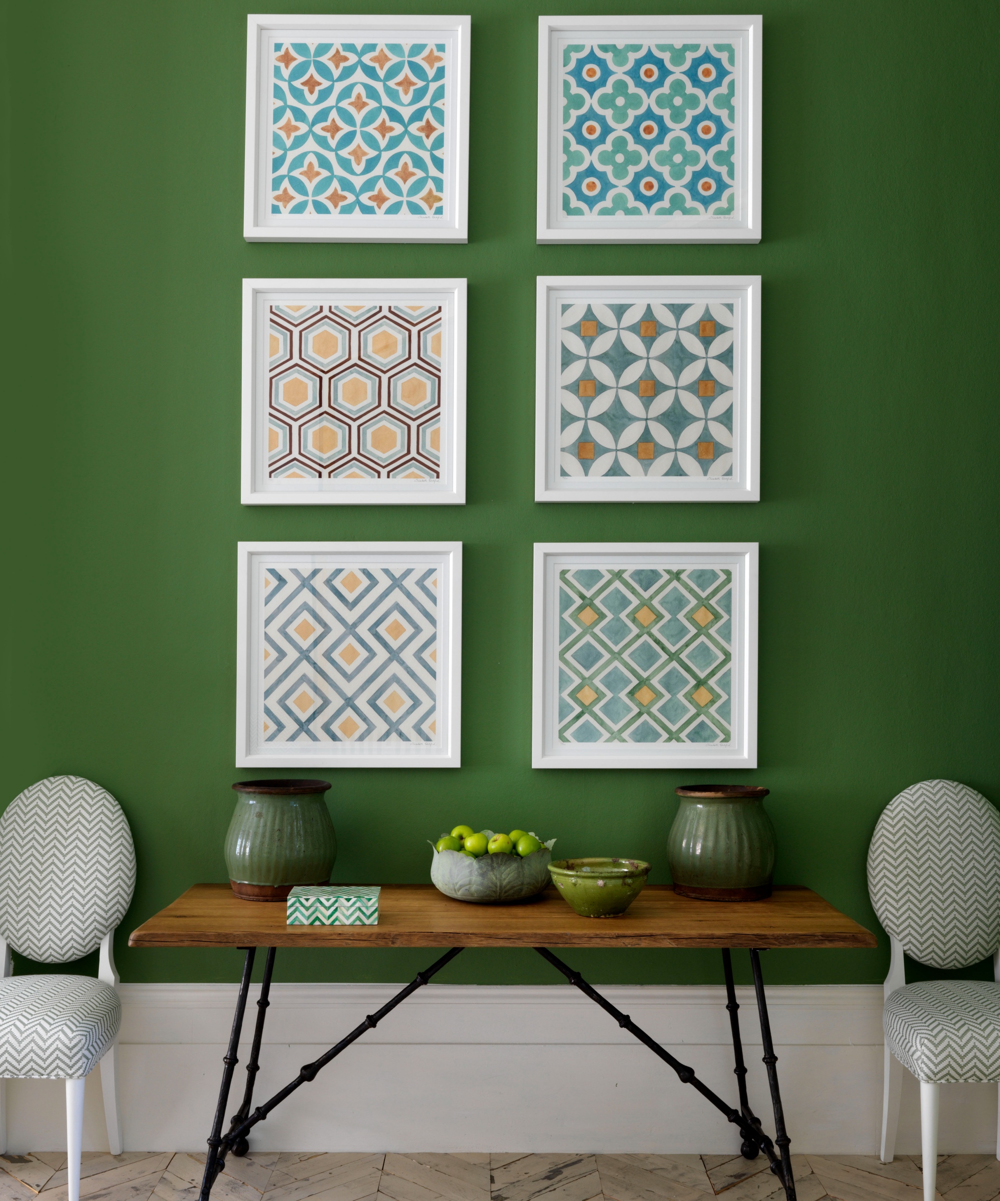
'I tend to stay away from any dark, heavy colors unless the entire staircase is painted in one solid color, and even then, it must be high gloss paint for it to work,' says Megan Dufresne, Principal Designer at MC Design. Megan warns that dark green is amongst these 'heavy colors' that are 'generally difficult to work with or get just right in your landing.'
'[These colors] also tend to make a space, especially a small space like a landing, feel even smaller and very enclosed,' Megan adds.
What color should I paint my landing?
'Since landings are connecting places it is best to choose colors that create a seamless visual link to the rooms that lead off them, though usually in a paler tone. Ideally, a whole-story palette will be complementary, even if room colors are different, so the color you choose for a landing needs to respond to this,' says Lucy Searle, Editor in Chief, Homes & Gardens.
'So, if all the rooms off your landing are in deep earthy colors, your landing is likely to be most successful being a much lighter earth-tone; if you love a coastal look, you might choose blues and whites for bedrooms and bathrooms, and then the palest of blues or bright white for your landing.
'Essentially, landing colors are most successful when they are light and neutral, so that they complement the color of the rooms beyond rather than fight for attention or clash.'
Sign up to the Homes & Gardens newsletter
Design expertise in your inbox – from inspiring decorating ideas and beautiful celebrity homes to practical gardening advice and shopping round-ups.

Megan is the Head of Celebrity Style News at Homes & Gardens, where she leads the celebrity/ news team. She has a history in interior design, travel, and news journalism, having lived and worked in New York, Paris, and, currently, London. Megan has bylines in Livingetc, The Telegraph, and IRK Magazine, and has interviewed the likes of Drew Barrymore, Ayesha Curry, Michelle Keegan, and Tan France, among others. She lives in a London apartment with her antique typewriter and an eclectic espresso cup collection, and dreams of a Kelly Wearstler-designed home.
-
 Ina Garten's storage pantry is an insightful window into all of the best cookware used by the chef – and it's easy to recreate on your kitchen shelves from $48
The beautiful dishware in The Barefoot Contessa's Hamptons pantry showcases the tools she uses most often to cook – this is exactly how you replicate it
By Sophie Edwards Published
-
 Extend the lifespan of your appliance with 5 simple but crucial washing machine maintenance tips
From cleaning the filters to keeping the door open, experts reveal the washer tips they swear by
By Andy van Terheyden Published