5 entryway mistakes we all make – and how designers suggest we avoid them
Stop painting your entryways white and ditch the console tables, say designers
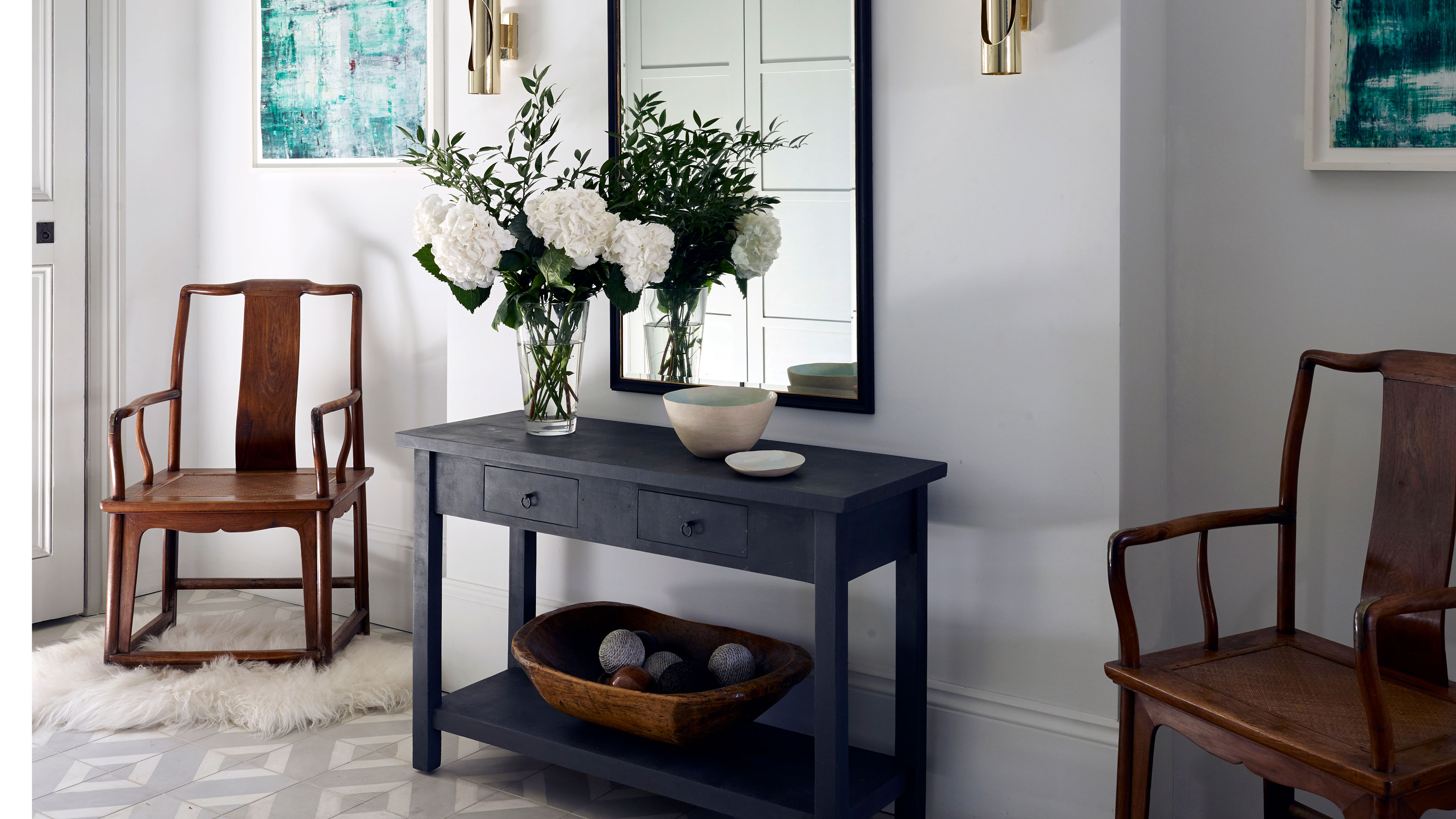

Entryways mistakes can ruin that first impression of your home. These high-traffic spaces, seen by you multiple times a day and by guests every time they come to your door, they are spaces that tend to get a bit ignored when it comes to decor. Admittedly we give them far less thought than a kitchen or a living room.
They are also rooms we don't tend to switch up too often. Whereas in more lived-in spaces we change them up with the seasons and with trends, entryways tend to get less intention and stay the same for years.
Take a look at your entryway ideas. Do they reflect the rest of your home, or does your space in fact feel a bit worn and dated in comparison to the rooms that lie beyond? There are some decor choices that, while once on trend, have fallen out of style and could be dating your entryway. So we asked designers to point these easy-to-make entryway mistakes out, so you can take a long hard look at yours and make some changes if you need to – plus be inspired by what designers say you should be doing instead.
5 entryway mistakes designers want you to avoid
These are the easiest mistakes that you should avoid when designing your entryway, plus designers' favorite solutions and alternatives.
1.Using white to 'expand' the space
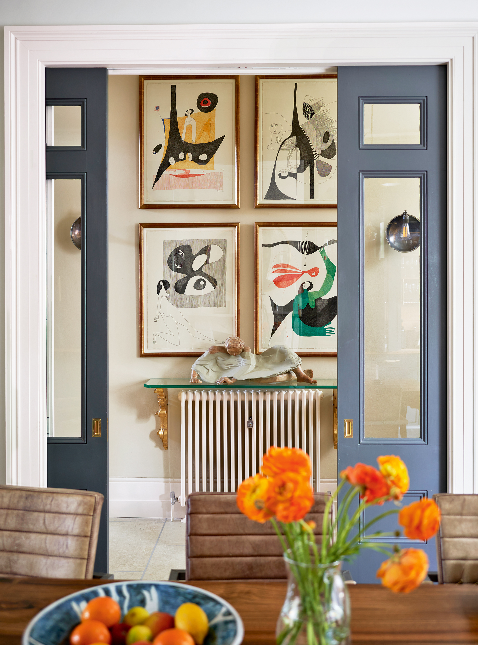
We understand why so many entryways are painted in some form of white. White is known for its space-expanding, room-enhancing qualities, and there are spaces where it does work, but an entryway, which can often be narrow and sapped of light is not one of those spaces. Be more experimental with your entryway colors, or if neutral is the only way for you, opt for a soft beige or warm cream that doesn't risk feeling cold and clinical as decorating with white.
'While white entryways have a clean and timeless appeal, today's design landscape craves more excitement and individuality in the entryway,' says designer Kati Curtis. 'Clients today crave vibrant and engaging entryways that make a bold statement about their unique tastes and preferences. The all-white entry can feel sterile and cold, failing to evoke the desired emotions and warmth that homeowners seek in a more personalized design.'
Interior designer Emma Sims Hilditch adds, 'If you have a dark entryway don’t paint it white but embrace the lack of light and add color to give atmosphere. The entryway is like the center of a wheel with all the rooms projecting off it – try to use the colorway in the entry to tie in with the adjacent rooms.'
2. Adding a feature wall to create a focal point
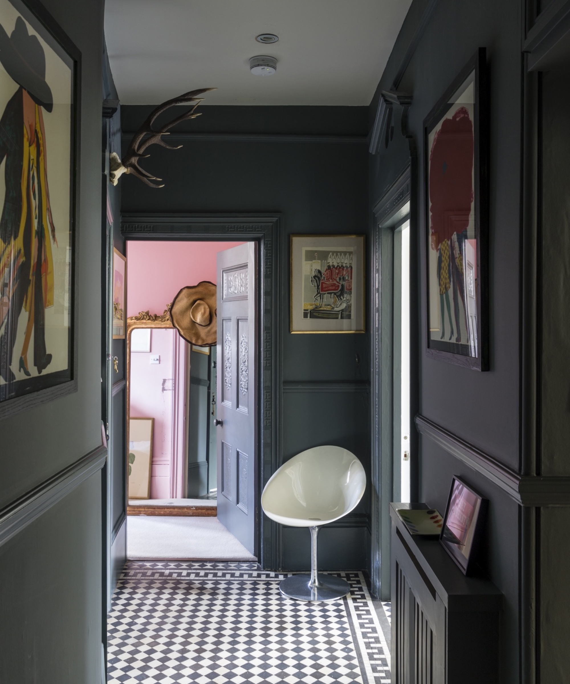
It is a classic entryway mistake, thinking this small space can't handle a bold print or color so opting for an accent wall. While feature walls do float around in interior design trends, coming and going in different forms, on the whole, they are on the out.
Accent walls were often encouraged in entryways in the past, to draw the eye away from the door and make the space feel larger, or add some interest without taking up any floor space, but now they can look dated.
As designer Jennifer Davis says, 'The once popular entryway trend of having a single accent wall with wood treatments, such as planks or herringbone patterns, is no longer in style. Instead, the focus now lies in creating more cohesive entryways that blend seamlessly with the rest of the house, promoting a natural flow.'
Instead of an accent wall, color-drench the space, taking the shade over all the walls and woodwork. It can really help make a small entryway look larger, and has far more of an impact than a single wall.
3. Relying on console tables
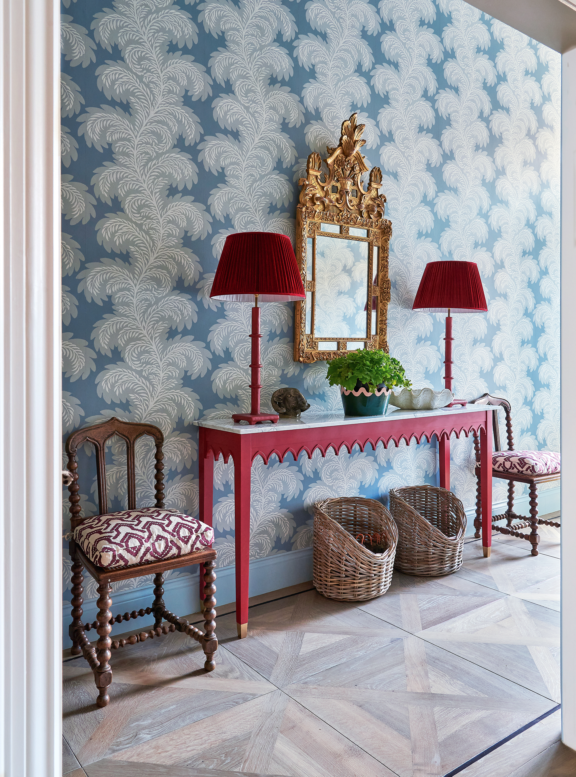
Console tables' narrow forms do make sense in an entryway, but they don't really add very much, in terms of style or in terms of practicality.
'A lot of people feel the need to fill an entryway with furniture, especially console tables. Entryways tend to be narrow spaces and adding in furniture can make them feel cramped and of course, they tend to generate clutter (mail, keys, shoes, etc). If entryway storage is an issue, a more modern alternative is bespoke floor-to-ceiling closets. They don’t have to be deep to be effective and the result is a far more contemporary feel,' suggests Tom Rutt, founder of TR Studio.
Designer Bethany Adams agrees that 'a mirror over a console table used to be the standard entryway decor, but these days I'm floating a circular table away from the wall and tucking an upholstered settee (or a few stools, depending on the size of the space) instead. Giving the space a function – the table can be a game table, extra seating for a party, or simply an enjoyable place to read the mail at the end of the day – lends more warmth to your entryway, taking it from being a pass-through space to a true part of your home.'
4. Not including some kind of seating
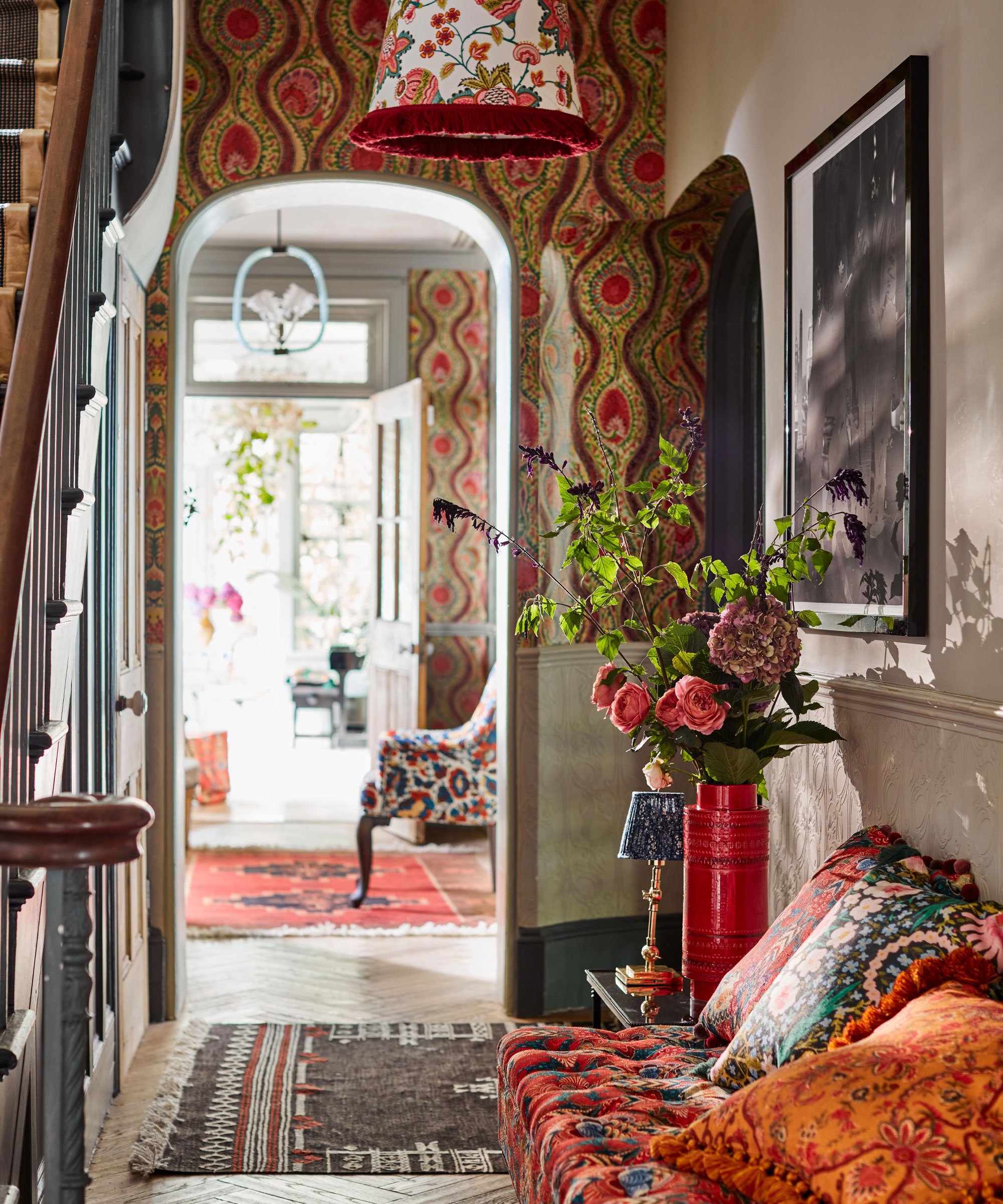
Speaking of seating, a mistake that so many of us who are blessed with larger entryways are making is not turning them into a mini second living room. Entryways are such transitional spaces and yet they needn't be – adding a love seat with a small side table or a couple of accent chairs makes an entryway more of a room, less of a corridor into the rest of the home.
'With space at a premium, ignoring your entryway altogether is a luxury few people can afford. Your foyer or front hallway is prime real estate for a console table with drawers to store all of life’s little odds and ends. Tuck some chic seating solutions underneath and pull them out when you have a crowd – there’s no need to clutter up your living room with chairs you don’t need on a daily basis,' suggests designer Robin Gannon.
5. Not planning in good lighting
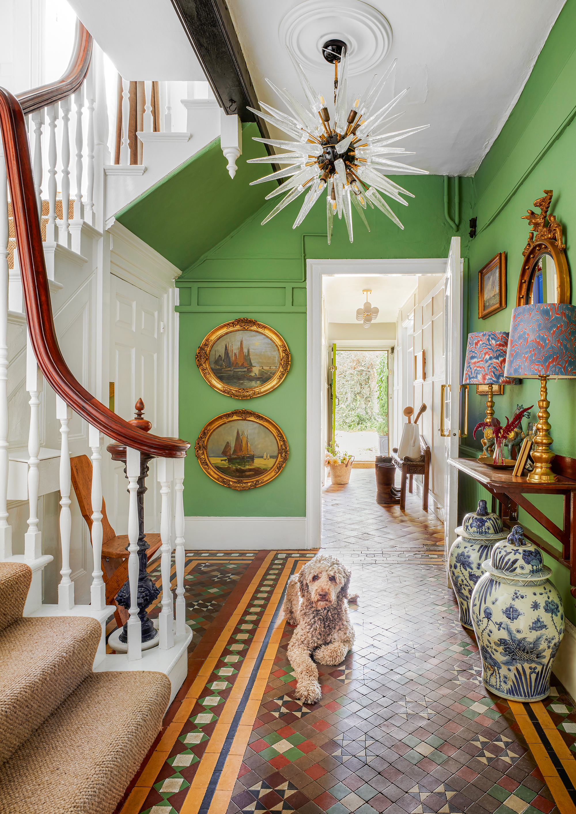
Entryway lighting is as important as the lighting anywhere else in the home, and yet a mistake so many of us make is not giving it enough consideration. Solely relying on overhead lighting does not create the soft ambient glow you want in the entrance to your home.
Just as you would in a living room or a bedroom, layer your lighting. 'Never rely on a single light source, even in an entryway where space might be tight,' says editor-in-chief of Homes & Gardens Lucy Searle. 'Use a surface space to add a table lamp, or if you don't have room for that, a floor lamp will add the same soft glow. You could also install wall sconces that would still be softer than ceiling lights and in fact a far nicer level for an entryway – plus you can double them as entryway wall decor.'

Lucy Searle has written about interiors, property and gardens for over 30 years, starting within the interiors departments of women's magazines before switching to interiors-only titles in the mid-1990s. In 2018, Lucy took on the role of Global Editor in Chief for Realhomes.com, taking the site from a small magazine add-on to a global success. She was asked to repeat that success at Homes & Gardens, where she has also taken on the editorship of the magazine, which is the UK's oldest interiors magazine at 103 years old. Lucy is a serial renovator and also owns rental properties in the UK and Europe, so brings first-hand knowledge to the subjects she oversees.
FAQs
What's the biggest entryway mistake?
The worst mistake you can make in an entryway is ignoring the need for storage. Even if you have an entryway mudroom in another part of the house where coats and shoes go, inevitably, your main entryway will become cluttered with everything from mail to school bags if you don't provide a home for them. A simple chest of drawers or tall built-in entryway closet can help you keep your space neat- and welcoming-looking.
Of course, if your space is tinier or you live in an apartment, everything is amplified. Small entryway mistakes don't just center around storage, though of course that is vital to the success of your space; another mistake is to not light your entryway properly or include a mirror. Both of these are key to making an entryway of any size feel larger and brighter.
Sign up to the Homes & Gardens newsletter
Design expertise in your inbox – from inspiring decorating ideas and beautiful celebrity homes to practical gardening advice and shopping round-ups.

I am the Head of Interiors at Homes & Gardens. I started off in the world of journalism in fashion and luxury travel and then landed my first interiors role at Real Homes and have been in the world of interior design ever since. Prior to my role at H&G I was the digital editor at Livingetc, from which I took a sabbatical to travel in my self-converted van (not as glamorous as decorating a home, but very satisfying). A year later, and with lots of technical DIY lessons learned I am back to writing and editing, sometimes even from the comfort of my home on wheels.
-
 How to create an urban oasis in a city courtyard – and escape to a tranquil, sanctuary garden
Dreaming of an urban oasis? Then step this way...
By Kayleigh Dray
-
 The most organized room in Giada DeLaurentiis' home might not be her kitchen – her closet storage is ultra-sleek (and replicable for under $20)
The chef's closet features slim hangers and floating shelves for a space that is functional, smartly designed, and visually stunning
By Hannah Ziegler