5 ways to use color to create an impactful entryway
There is one simple way to make an entryway memorable: with color. Here's how
We have all heard of the phrase curb appeal, which is the wow factor of a home’s exterior. The equivalent inside is a home’s main entrance – the first impression when entering a home.
Quite often, entryways are small and dark. As hosts, we generally don’t encourage guests to pause in this space, whisking them through to larger spaces within the home. This, in my view, is a missed opportunity.
I like to use the hallway to make an entrance – it’s the first thing anyone sees when they enter the home and, as far as I’m concerned, it provides the perfect opportunity to show off the character of your home and impress guests the moment they arrive. It is important to try to make your entryway more inviting.

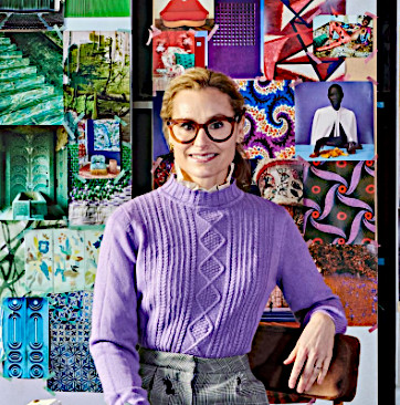
Natalie Tredgett is an interior designer known for her inimitable use of color in combination with distinctive artworks. Natalie encourages her clients to express their own creativity within the projects she creates with them – a Natalie Tredgett designed space is a clear representation of the client with her unique perspective running through it. Natalie founded her studio in 2012 having established herself under design guru Nicky Haslam. She trained in Interior Design at KLC, has an MBA from the University of Edinburgh, holds a Bachelor of Art from the University of Western Ontario and has a background in management consultancy. Natalie Tredgett Design has recently moved to a new studio in the heart of Notting Hill, London.
Using color in an entrance will make an impact and set the mood of what to expect in the rest of your home. Whether you saturate a space in paint, highlight a colorful piece of furniture or find a contrasting color that radiates energy, all of these bold choices will help set the property apart.
I encourage you to ask yourself what you want to communicate about yourself and your home when the door opens? What experience do you want you and your guests to have when inside? With these questions answered and your entrance an extension of yourself, see if those who enter your home react in the way you’d hoped and imagined. How wonderful would that be?
1. Make an entrance
Entrances are public spaces. It’s worth remembering that it’s the only space in the house that anyone visiting will definitely enter! The feeling you create in the entrance to your home – the point in which guests step over the threshold and into your world – will set the tone for their whole experience inside. So take risks, show your personality and don’t be afraid of the bold and bright.
To achieve a memorable first impression – the highly desired wow factor – I use color. Color reflects emotion and should be used to communicate how we want to feel and make others feel when they visit our home. I like to use the entrance to showcase an accent color within the home, for example if orange is your accent color throughout your home, make orange the prominent color in the entrance.
I see the entrance color specifically as an accent – something to set off the rest of the house. I especially like to use evocative colors personal to the client that reflect the way they want their guests to feel when they are greeted.
2. Let the walls do the talking

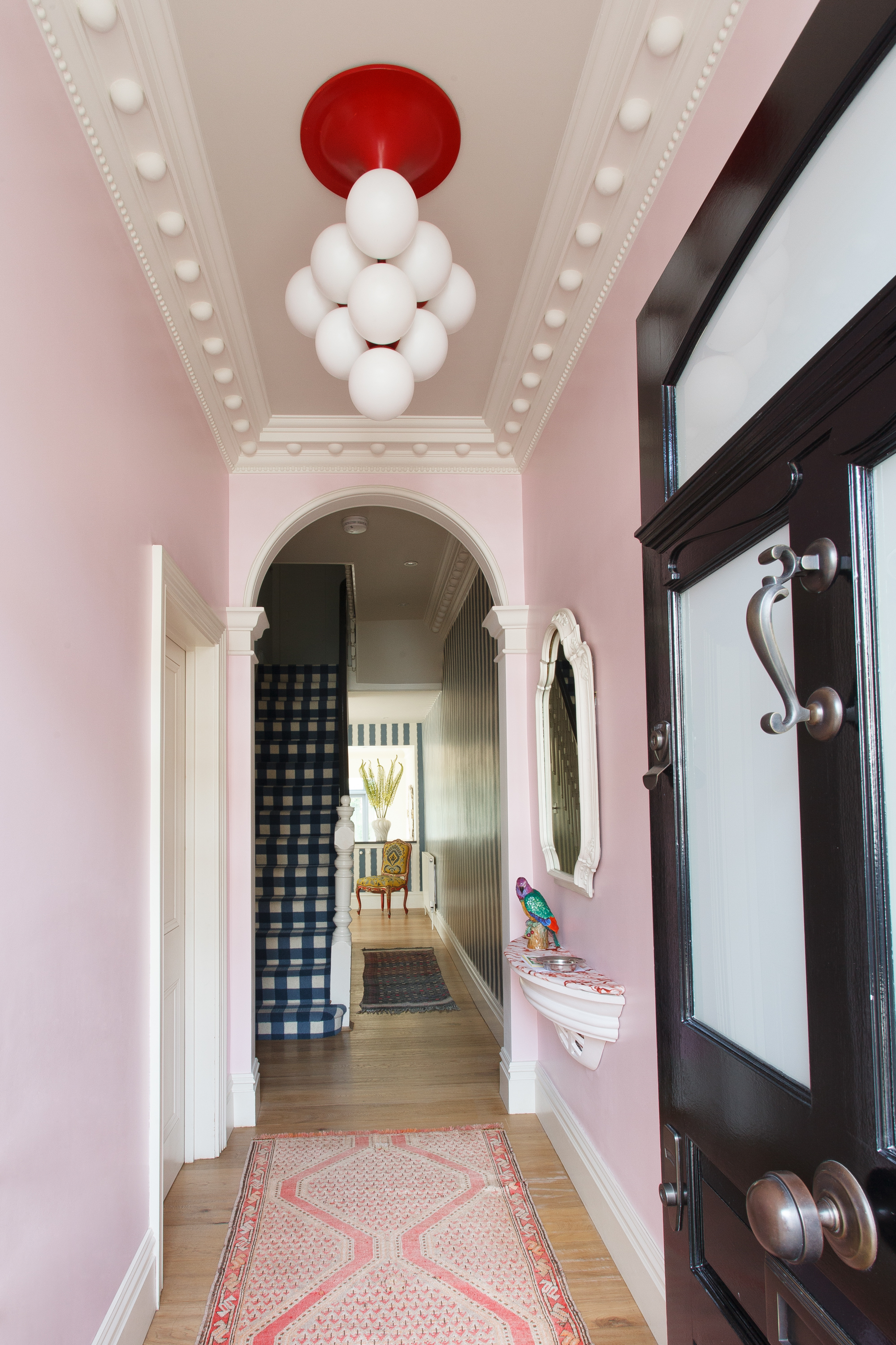
When choosing hallway color ideas, I like to think of the unexpected, such as a blooming pink, something brave that you won’t see in every home.
For one client we used Paper & Paint Library Oyster Lily. It worked so well in their home because it’s an extension of the property and their owners. Pink was used as an accent color throughout this home and I wanted to repeat it in the entrance to communicate the playful and joyful vibe of its owners.
The color pink is often associated with softness, calm and kindness. As it’s unexpected in a hall, it always surprises new arrivals and brings a big smile to everyone who is greeted at the door. It lightens the mood from the word go.
Focus on furniture
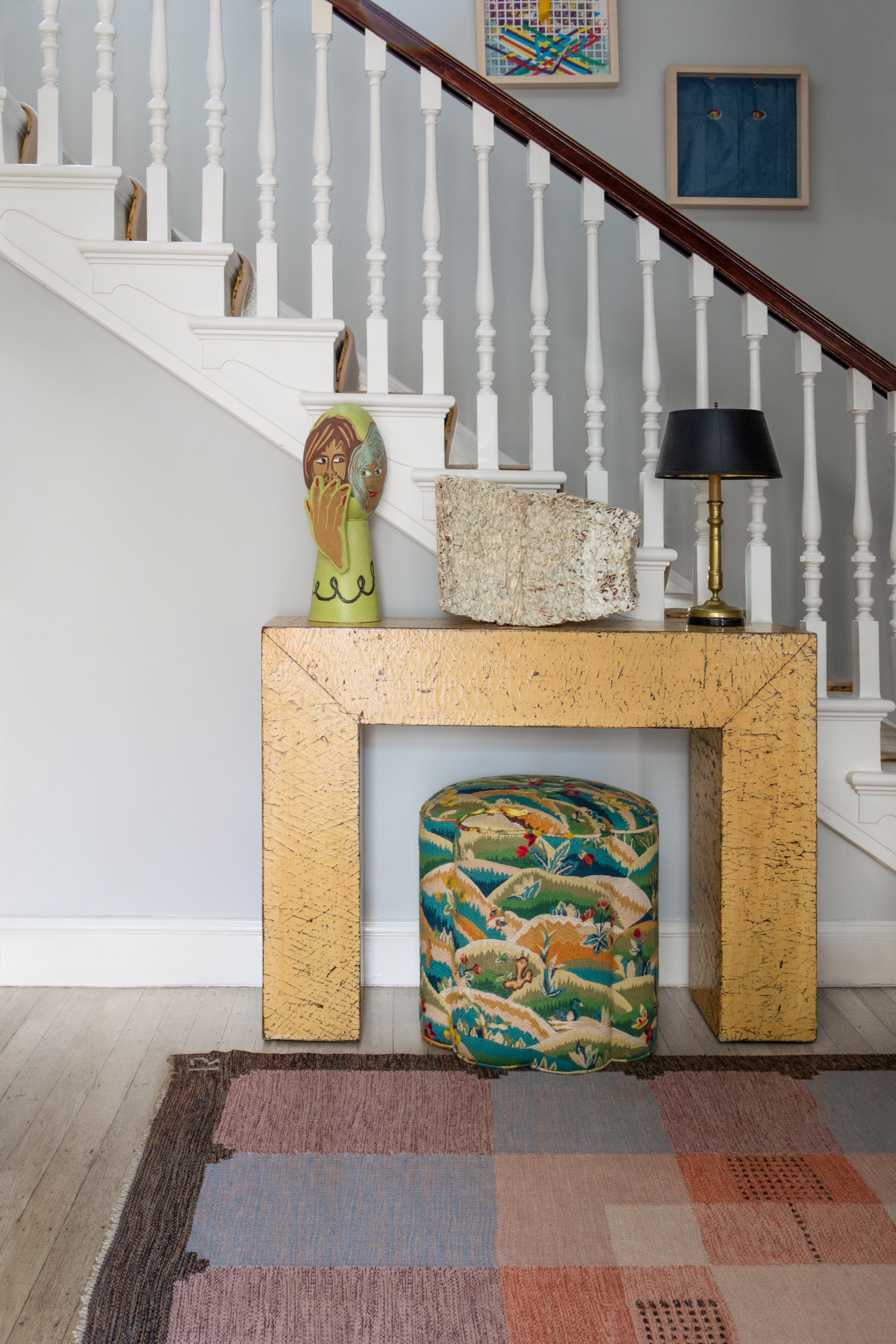
I also like to bring color to a focal point, such as entryway furniture. I took this approach for a client in west London, building the palette of the entrance to support and highlight a sunshine yellow console. The paint color which is the closest match to the yellow console is Edward Bulmer’s Warm Stone.
When choosing the surrounding colors I think it’s important to consider colors that complement rather than overshadow your focal piece. Yellow exudes brightness, energy and optimism.
When drawing the eye to a colorful focal point it’s crucial that you think about all other tones throughout the space. I find it best to look to nature for these complementary tones. Yellow, for example, always looks great with blues, greens and grays – colors that you’ll find wherever you look in nature.
You can also use contrasting colors for complexity, like peach, pink and purple. I usually achieve this by adding a rug or other soft furnishings rather than through paint on the walls.
Contradict with contrast
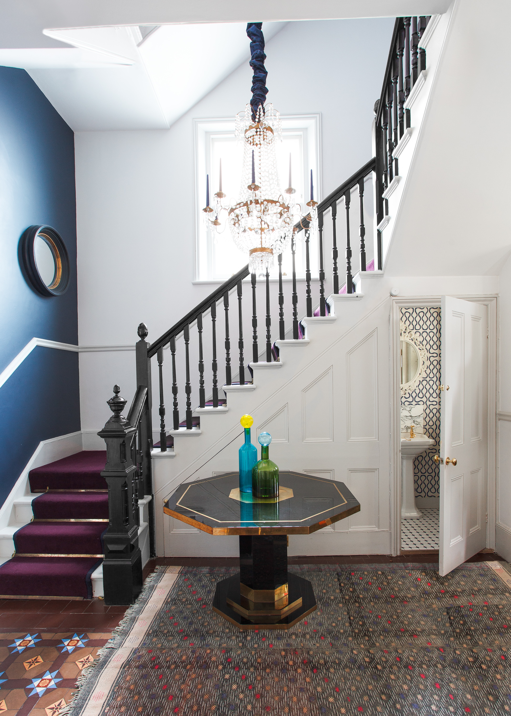
When first looking at a property, I discover the original features and weigh up how to incorporate them into the design. There’s nothing more wonderful than walking into a home in which you can feel its history.
For example, in a property in south London, the entrance had a beautiful original Victorian tiled floor – the tiles ranged from terracotta to aubergine, light brown and a little blue. These became a source of inspiration for color throughout the space.
Every space should be engaging in its own way, and in this home I achieved it by using different shades of blue on the walls. It created a really interesting contrast, but one that complemented the colors already in the space.
In this instance, I paired Edward Bulmer’s Navy Blue with Paint & Paper Library’s Blue Blood. Blue, albeit a calming and peaceful color, radiates energy when set against other colors. I just loved this contradiction and wanted to play with it as far as possible. I used a saturated version of the blue on the floor and found the wallpaper in the same color for the bathroom under the stairs.
5. Use art as an accent
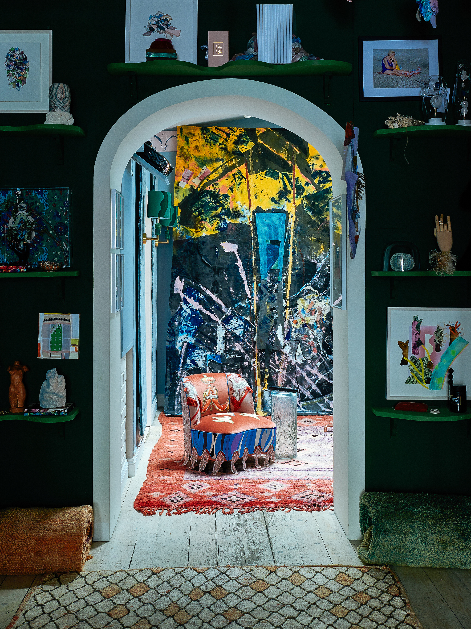
Another great way to create contrast is through art. To draw your eye to the art, use a strong cool color on the wall. In a recent project we used a deep blue on the walls to further highlight the work of artist Selena Beaudry.
Art is meant to be a statement in a room and in my opinion should never blend in, especially in an entrance. Selena’s work is layered with color and texture. We pulled the deepest tone to bring out her more vibrant contrasting colors. Here, the wall color is Konig Colours’ Needs Ore.
Sign up to the Homes & Gardens newsletter
Design expertise in your inbox – from inspiring decorating ideas and beautiful celebrity homes to practical gardening advice and shopping round-ups.

Natalie Tredgett is an interior designer known for her inimitable use of color in combination with distinctive artworks. Natalie encourages her clients to express their own creativity within the projects she creates with them – a Natalie Tredgett designed space is a clear representation of the client with her unique perspective running through it. Natalie founded her studio in 2012 having established herself under design guru Nicky Haslam. She trained in Interior Design at KLC, has an MBA from the University of Edinburgh, holds a Bachelor of Art from the University of Western Ontario and has a background in management consultancy. Natalie Tredgett Design has recently moved to a new studio in the heart of Notting Hill, London.
-
 Lavender and vanilla custard pudding with rhubarb recipe
A real crowd pleaser, this recipe both strikes nostalgic notes and feels irresistibly modern
By Alice Hart
-
 How I Host... A stunning Easter with Lucinda Chambers
The fashion maven shares how she creates a stunning Easter table setting
By Francesca York