Furniture arranging mistakes – 8 negative layouts that are ruining your space
Thinking about how to arrange furniture to increase space? Interior designers suggest that you should avoid these positions and layouts, and what to do instead
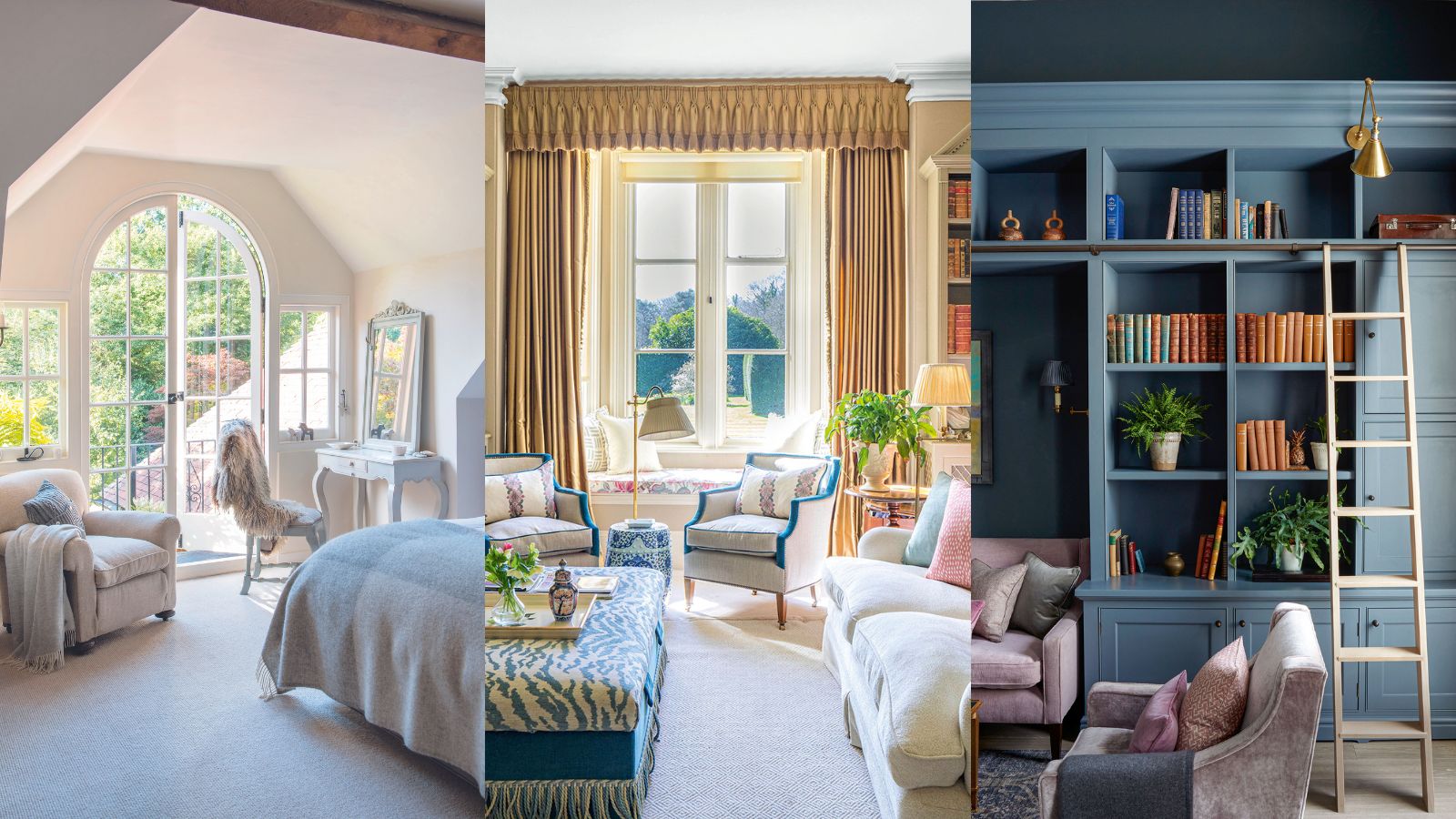

Furniture arranging mistakes are rife, but you may not be entirely aware that you are making them. Your space could be beautifully decorated, but unless you give the furniture you fill it with the proper consideration, its design just won't look or feel right. As well as the style of the furniture pieces themselves – silhouette, size, finish, fabric – you need to work out the best way to arrange them so that your room lives up to its full potential. Mastering the art of good furniture placement will ensure that your home is a happier place for you and your family, no matter the size or layout.
But remember, if you are somewhere with poor furniture placement, don’t worry. There’s always something you can do to adjust your current furniture layout and work with what you already have.
Here we've asked the experts to share the biggest furniture arranging mistakes and advice on how to arrange furniture in your home using the principles of interior designer-approved home decor ideas as guidance. If in doubt, our selection of the best indoor furniture stores will help you to source the most desired designs.
Furniture arranging mistakes
Decorating mistakes and faux pas are easy to make, especially when it comes to arranging furniture. When a room is bare, knowing where to place furniture can be daunting.
Practicality is key for small room ideas, and the layout and furniture placement you select should not only be able to accommodate your lifestyle but enhance it. Therefore, knowing what furniture arranging mistakes you're making, and how to rectify them will allow you to make the most of your existing space.
1. Pushing furniture against the wall
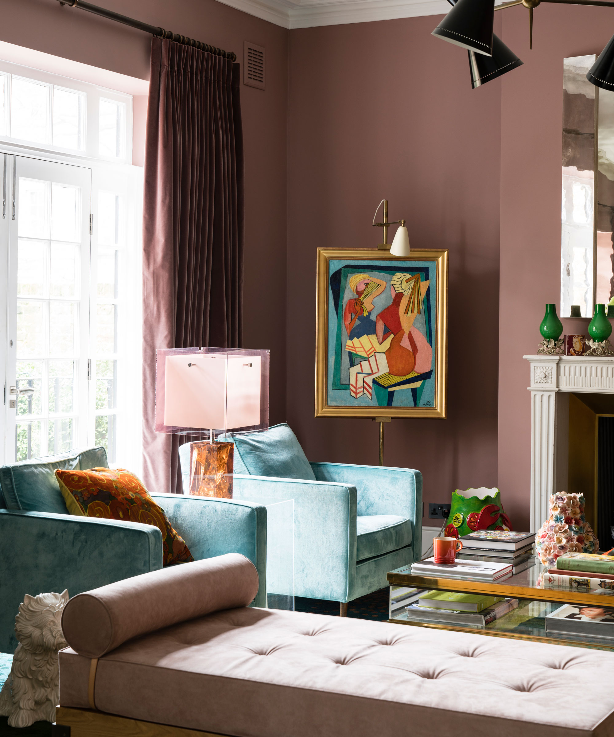
If your room is looking a little cavernous, then it could be because you have all the furniture pushed up against the wall. If that sounds familiar, this common furniture arrangement mistake could be disrupting the overall aesthetic and flow of the room.
It might seem counterintuitive, but pulling your furniture away from the walls, even by just a couple of inches, creates breathing space that will make your room appear more spacious, and allow conversations to flow better.
2. Not creating conversation areas
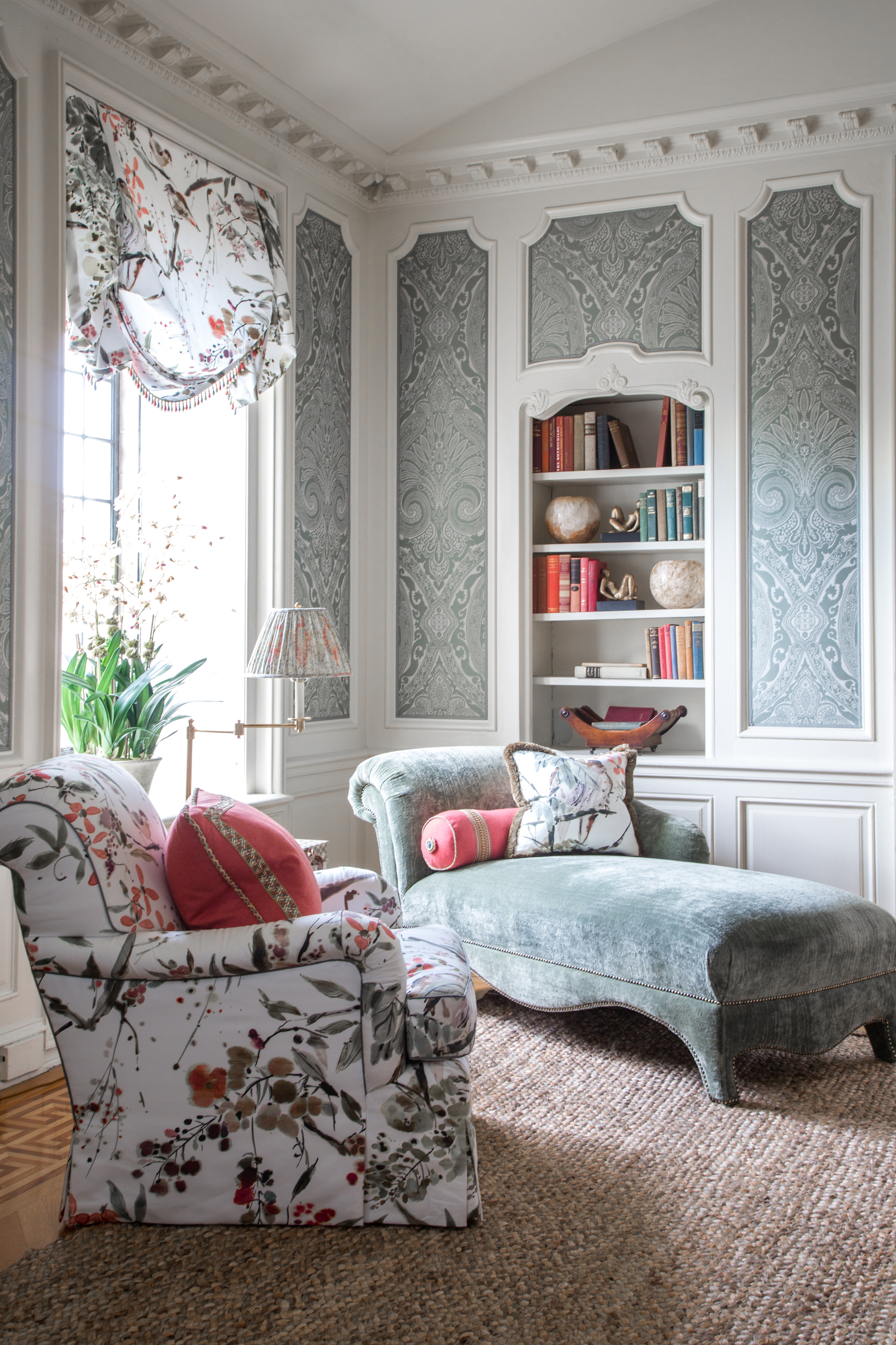
When arranging family room furniture and living room furniture, keep in mind that sofas and chairs should face each other where possible. In large spaces, this may seem too tricky to master, but remember that you can always create many smaller conversation areas in one room.
'When you have people over for gatherings, you notice when you’ve got the seating arrangements right, says renowned interior designer, Nina Campbell. 'Seating plans are very important – and not just at a dinner table. I like to think of seating plans for the living room – what I call conversational seating.'
'The number of chairs you set out is an important consideration. Odd numbers are good for seating plans in general because it allows for some rotation of guests. The interior designer Elsie de Wolfe wrote in 1913 that you must never place a chair on its own in a room; she was very shy herself and noted that it is always the shy person who arrives first, sits on the lone chair, and then is often rooted there for the whole party. But two next to each other does not always work, either. I find that two people sitting side by side do not always speak to each other, so having an occasional chair pulled in at a diagonal can create conversational triangles.'
3. Ignoring good traffic flows
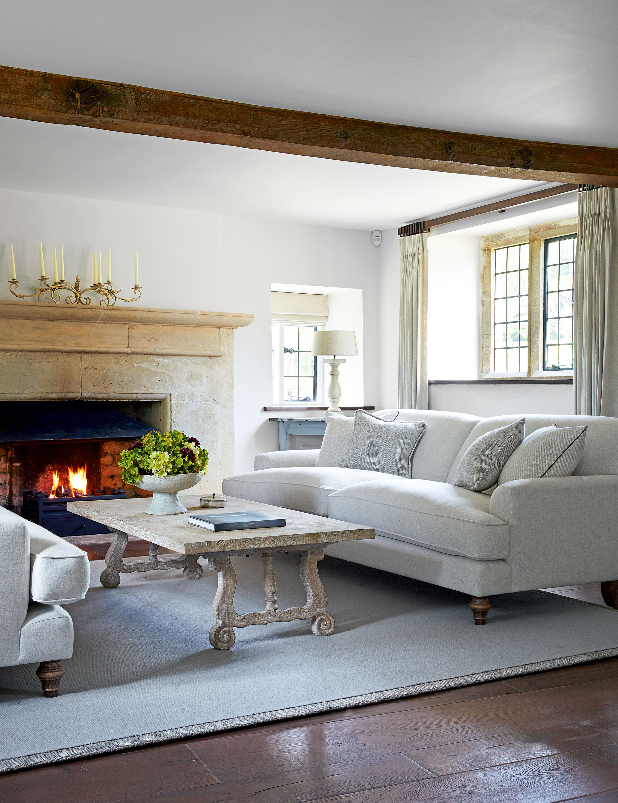
Optimum traffic flow in a room with allows residents and guests to move around freely and easily, avoiding any unnecessary obstacles for a seamless transition. Draw on its principles of Feng Shui furniture placement to design the space around a sofa, and improvements in the quality of life are promised.
The living room sofa is usually the largest – if not the most expensive – item in a room and is often the most dominant piece, so it is no surprise that the sofa is usually the flow of the room. Therefore, it is imperative to consider its location within any space.
For the best sofa placement, you'll want to position this piece of furniture in an arrangement that will allow each member of the household to feel most comfortable and at ease. L-shaped sofas and sectionals are wonderful options for your living room seating ideas and will serve to enhance the flow of conversation, as well as the traffic flow.
'You should always consider the room’s furniture layout from a social and practical point of view,' says interior designer Nina Campbell. 'Plan seating in groups to ensure the conversation flows when you have guests and consider scale and how different pieces will sit together.' Do also ensure that guests can 'leave' comfortably without causing too much disruption or intrusion.
4. Creating too many focal points
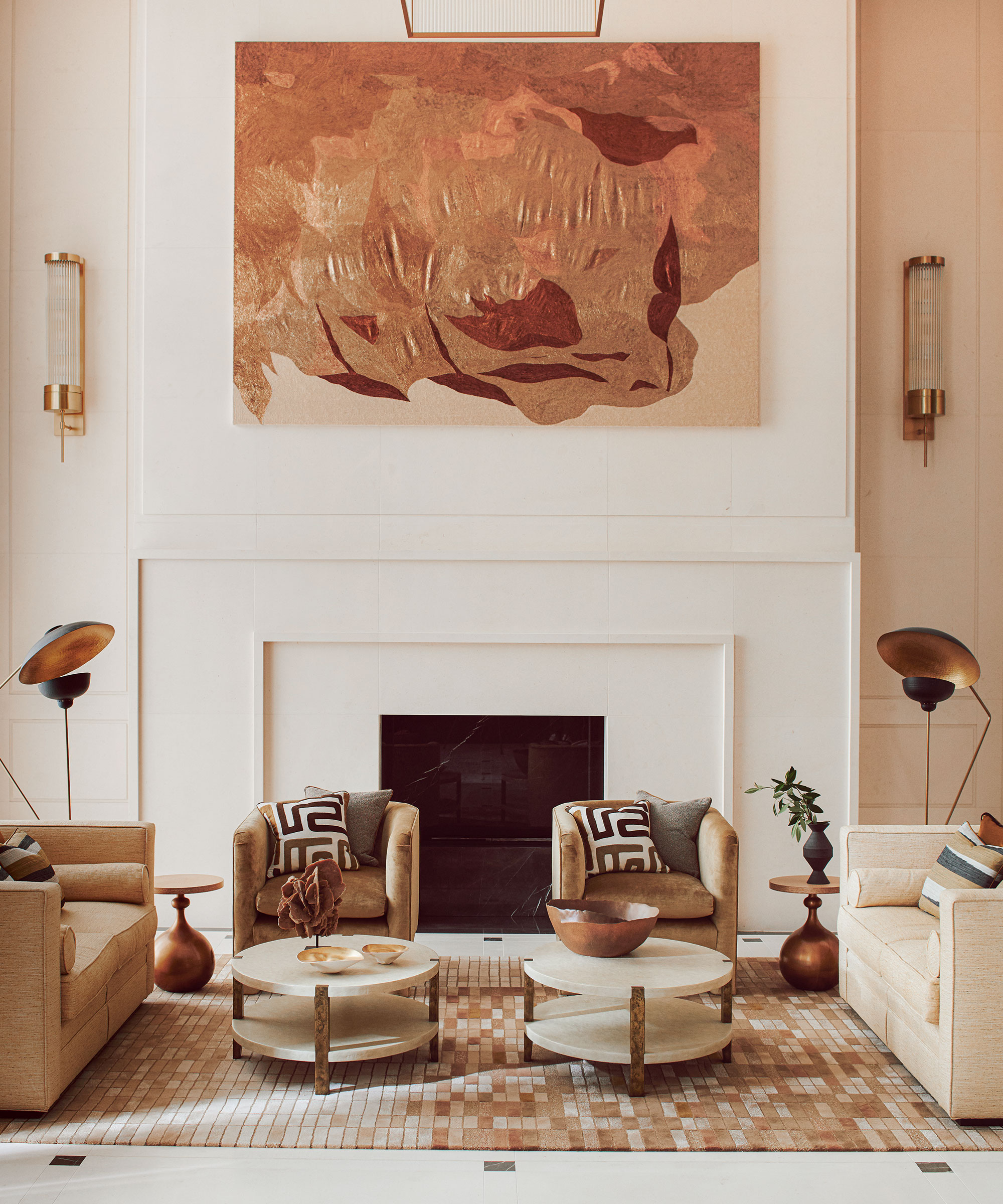
A focal point or 'decorating point' in a room is important, not only does having one help to anchor a room, but it also serves as an area to decorate around, but get carried away and you could end up ruining the entire look.
More often than not, the focal point will occur naturally within a space, be it a fireplace, window, mirror, piece of art, or an impressive architectural structure, this will help to create purpose within a room.
However, trying to create more than one point of interest will cause disharmony, confusion, and clutter. If there is only one rule you remember, be it this: every room should never have more than one focal point.
5. Blocking light from windows
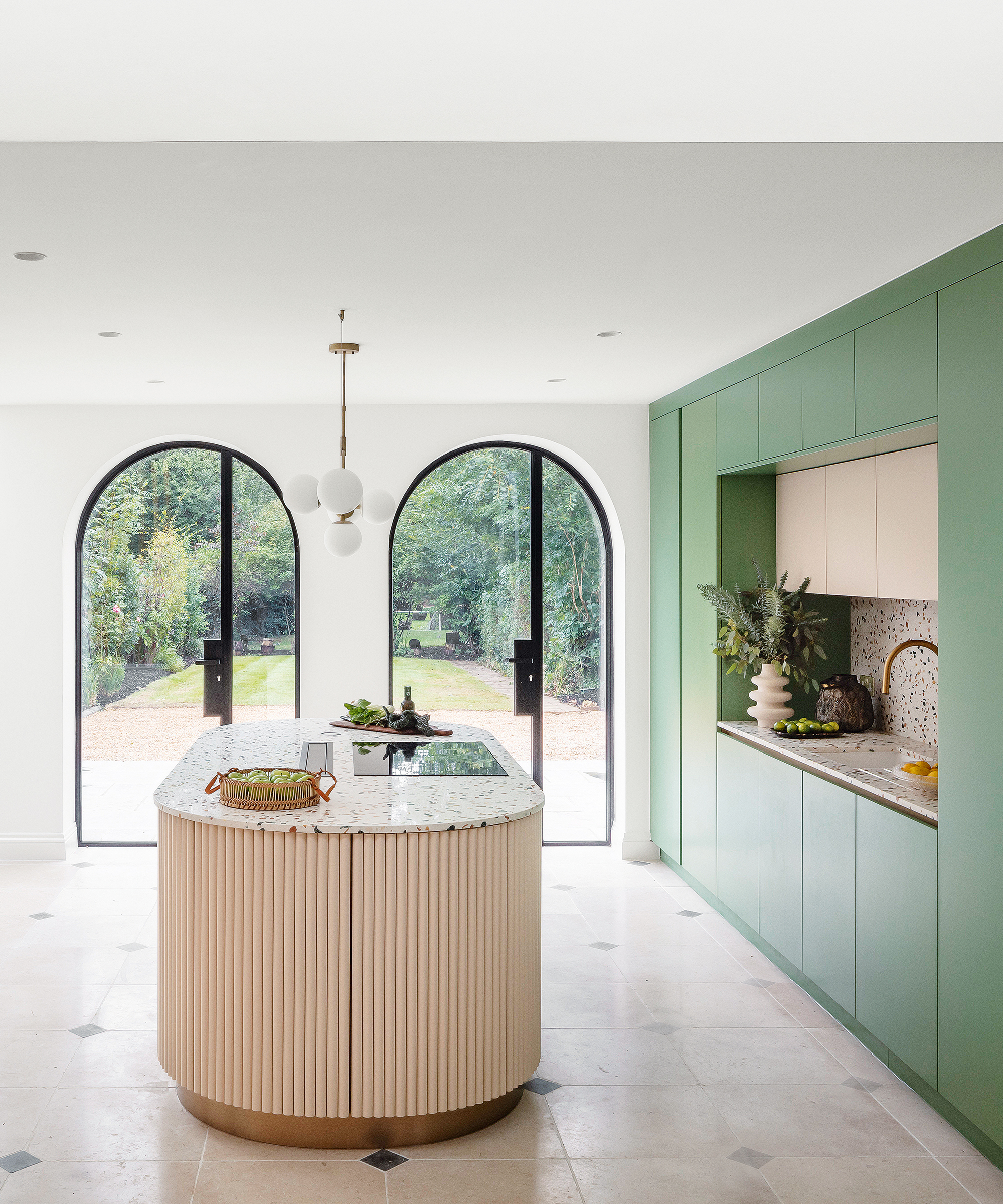
Natural light is key in any room, especially if you wish to feel happier at home, and when it comes to windows, the more the merrier. Here at H&G, we always advise people to keep furniture away from windows to avoid the risk of making an already small room feel claustrophobic or dingy.
However, if you must place furniture in front of a window – perhaps you have floor-to-ceiling windows, or a tiny room, make sure you maximize the remaining natural light with reflective surfaces. One of the easiest decorating ideas, adding a mirror to any room in your home can have a significant impact on the appearance of the space.
'To increase light, position mirrors in areas where natural light shines to reflect the light to more dimly lit areas – making the overall space feel brighter throughout the day,’ says Anna Franklin, interior designer and founder of Stone House Collective.
If your room is lacking natural light, look to artificial lighting instead. Never underestimate the power of a good lighting scheme to transform an ordinary space into something truly spectacular. Interior schemes can be greatly enhanced with the right lighting. The key is to create a layered scheme, which allows statement lighting to shine, but not dominate a space with flat light.
6. Putting style over practicality
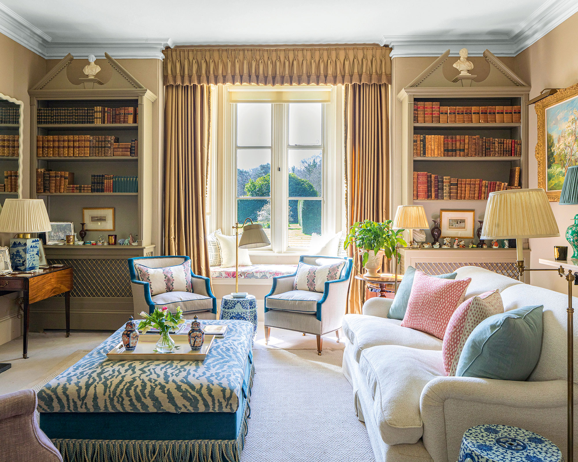
While we may wish to admire the homes we see in our favorite glossy magazines, sometimes they are not always practical to our day-to-day living. After all, interior design, like art, is entirely subjective.
The whole purpose of interior design is to create a room or rooms, which answer the needs of the individuals living in them whilst reflecting their personalities with good design, space, and functionality.
Think about how you might use your space. Draw a floorplan – add the largest furniture pieces first, make sure to include pathways, and think about the traffic flow in the room. Do you have a theme, or do you need more storage, or perhaps a place to rest your coffee? Choose your furniture accordingly. It's your home, so you should arrange the furniture in such a way that allows you to enjoy the space.
7. Overdoing storage
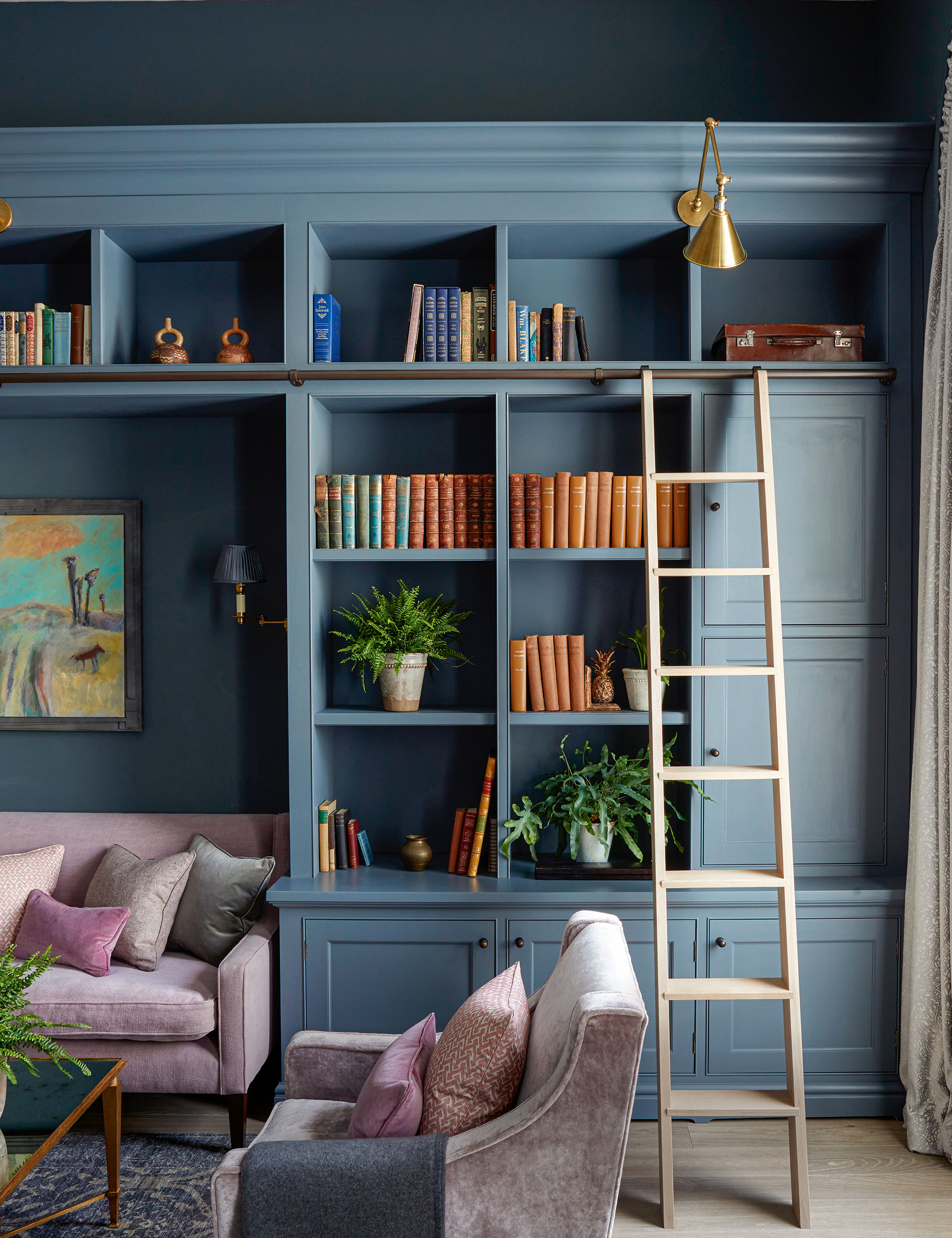
Our homes take on a myriad of guises, therefore good storage ideas are essential, but if do it wrong your space will look more like a storage unit than a home. Well-planned fittings are transformative, so plan accordingly. Before you buy any furniture, ask yourself how you will use this room. The main purpose of the room will determine the furniture and storage you need – the way the room functions really is as important as how it looks, so you can fully enjoy your home.
When it comes to conjuring the most storage space in a smaller room, be careful about furniture choices. Having too many pieces that have solid bodies will clearly provide space to store things but the risk that runs is that the visual look of the room will be compromised and rendered smaller. Be sure to have a balance of pieces that have legs or are lifted off the floor alongside any more boxy structures.
Interior designer Lucy Cunningham adds: ‘To maximize storage in smaller rooms, consider incorporating joinery such as built-in units with shelving and cupboards.’
8. Not scaling furniture according to room size
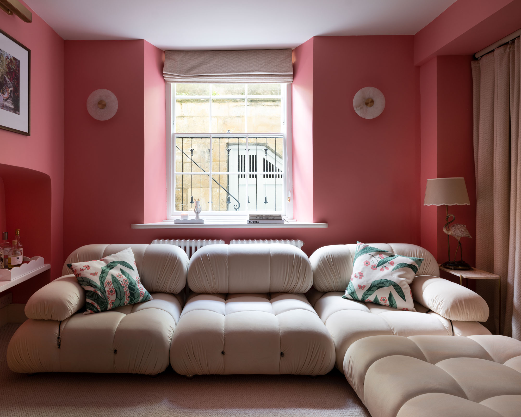
Scale in interior design is vital, so work with your room's proportions to get a good furniture balance. Generally speaking, bigger rooms can take larger pieces of furniture, and smaller rooms benefit from more petite, delicate pieces, so scale your furniture according to your space.
Proportion is about how the furniture pieces within the room relate to each other. By and large, you should look for pieces with similar proportions, but a single oversized object can add an unexpected twist that brings a space to life. High ceilings give you more scope for taller, grander pieces of furniture and low-profile furniture works best in lower-ceiling rooms.
Allow clear areas around and above furniture to give the eye somewhere to rest – this could be a patch of bare wall or an uncluttered side table.
Best places to buy furniture
Sign up to the Homes & Gardens newsletter
Design expertise in your inbox – from inspiring decorating ideas and beautiful celebrity homes to practical gardening advice and shopping round-ups.

Jennifer is the Digital Editor at Homes & Gardens. Having worked in the interiors industry for several years in both the US and UK, spanning many publications, she now hones her digital prowess on the 'best interiors website' in the world. Multi-skilled, Jennifer has worked in PR and marketing and occasionally dabbles in the social media, commercial, and the e-commerce space. Over the years, she has written about every area of the home, from compiling houses designed by some of the best interior designers in the world to sourcing celebrity homes, reviewing appliances, and even writing a few news stories or two.
-
 Zooey Deschanel and Jonathan Scott's breakfast nook is an innovative, effective use of kitchen space – it turns a 'dead area' into a cafe-style corner
Jonathan and Zooey have situated an eccentric yet elegant dining area in what may have been an otherwise underused corner
By Hannah Ziegler Published
-
 6 things you should never throw in the trash – and what to do for safe disposal instead
From batteries to space heaters, experts reveal what not to throw
By Andy van Terheyden Published