What makes a paint color flattering? Experts share their go-to shades for a universally complementary scheme
Here's what designers have to say on flattering paint colors
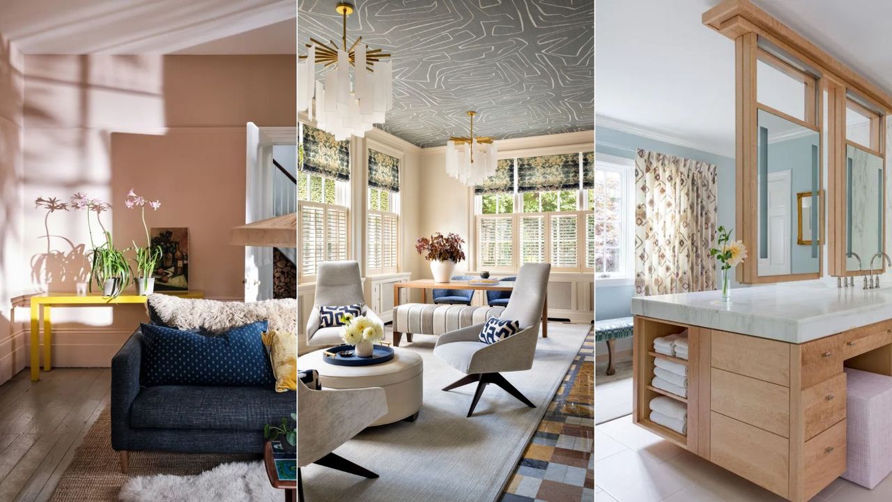
When you last embarked on choosing a paint color, you probably didn't consider whether or not it had the potential to flatter complexions. However, according to the experts, paint colors can affect how flattering – or unflattering – rooms are.
'Choosing paint colors that flatter a variety of skin tones throughout your home can create a welcoming and harmonious environment,' says interior designer Cinzia Moretti. Certain paint ideas are said to have a universally flattering appeal to them, complementing complexions and generally casting a warming glow into a room.
Before we delve in, it's worth noting that there is no such thing as one shade that flatters everybody. Since complexions and skin tones vary, what flatters one person may not flatter somebody else. Just like the color of our clothing flatters each of us differently, paint color is unique to everyone too.
What makes a paint color flattering?
Although the ability of our chosen room color ideas is fairly subtle when complementing our skin, the general advice from designers and color experts is that slightly warm-toned colors tend to be more flattering. That's not to say you should avoid decorating with your favorite paint colors because they aren't deemed 'flattering', but if you want to enhance the appeal of rooms used for getting ready, such as for your bathroom ideas and dressing room ideas, and social spaces used for entertaining, such as dining room ideas, opting for a flattering paint color won't go amiss.
'Flattering colors offer some contrast without being too overwhelming,' explains
interior designer Shalini Misra, founder of Shalini Misra Design. 'Never try to match a natural complexion, the key is finding a color versatile enough to compliment a wide spectrum of skin tones.'
Overall, flattering paint colors tend to be soft, natural-toned colors rather than anything overly saturated.
'Selecting the perfect paint colors for your home that will flatter everyone's skin tone can be tricky and it depends a lot on the light in your space,' explains interior designer Soledad Alzaga. 'Warm colors like soft gold and light pink are universally flattering. Their warm undertones cast a healthy glow on most skin tones.'
'The best way to find the most flattering colors is to experiment with samples in your own space and look at them at different times of the day,' continues Soledad. 'This will help you see how the colors work with natural and artificial light and with your skin tone.'
Keep in mind the importance of how you relate to a certain color. If a 'flattering' paint doesn't align with your interior taste or style, then it's best to stick with colors that speak to you the most. Shalini Misra adds that how certain paint colors make you feel plays an important role in achieving an overall flattering scheme:
'The application of color is about more than skin tone, it is about how it makes us feel and its relationship to the space around it. If you choose a color that brings you joy and makes you feel good, it will show. Feel good in your home and your guests will feel good too – that feeling flatters any skin tone.'
Flattering paint suggestions
Below, we've rounded up three colors that experts say are some of the most flattering. As always, when decorating with paint, test them out in your own space before committing since lighting conditions will affect how warm or cool-toned they appear.
1. Soft pinks
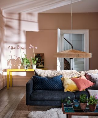
When decorating a pink room, earthy and soft shades of pink are generally seen as the most flattering paint colors, casting warmth throughout the room. 'Think soft and dusky rose tones that don’t feel too sugary, these will flatter any space,' says Helen Shaw, director at Benjamin Moore. 'Unobtrusive but offering a subtle glow to the room, neutral pinks are flattering and complement all rooms.'
'Warm pinks and peaches are so flattering on people's skin and are especially pretty in bathrooms for that reason,' says designer Alex Yeske of Alex Yeske Interiors. 'I love to use Farrow & Ball's Dimity – it's a barely pink neutral that makes everyone look amazing!'
Farrow & Ball's brand ambassador, Patrick O'Donnell agrees, adding that the most flattering shades of pink are those 'without too much blue through them', suggesting shades such as Farrow & Ball's Pink Ground and Setting Plaster, both of which will create a 'delicate atmosphere'.
2. Warm-toned neutrals
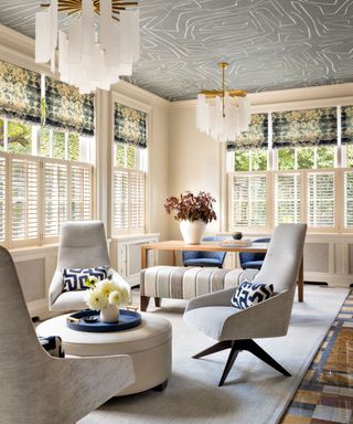
Similarly to soft pinks, the same concept applies to decorating with neutrals, especially those with a slightly warm undertone. From off-white to beige, these understated colors are universally flattering when used as a backdrop color throughout the home.
'Neutrals like creams and beiges are always a safe option because they provide a clean backdrop that won't overpower any skin tone,' says Soledad.
Taupe is a go-to paint color for Cinzia Moretti, Creative Director at Moretti Interior Design, who says that it's a 'sophisticated color that blends the warmth of brown with the neutrality of gray,' making it a 'timeless choice that pairs well with a range of colors and complements different skin tones.'
Cinzia also recommends decorating with greige to provide a flattering backdrop throughout the home. 'It provides a subtle backdrop that can highlight furnishings and decor while flattering various skin tones.'
In this living room designed by Betsy Wentz, Benjamin Moore's Sail Cloth is used across the walls. 'These soft and relatively neutral colors tend to complement a variety of different skin tones,' shares Betsy.
3. Light blues and greens
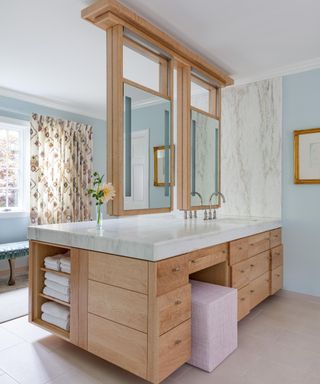
Turning to muted versions of colors associated with nature can also be considered flattering, such as powder blue and sage green. 'Colors found in nature have a connection to the human experience, so they often work well,' explains Shalini.
In this light blue bathroom designed by Betsy Wentz, Farrow & Ball's Borrowed Light is used across the walls. Although pale, this blue paint appears slightly warm-toned.
'A soft, muted blue can add a calming and serene atmosphere to a room,' adds Cinzia. 'It's a versatile color that can be both neutral and refreshing, complementing a variety of skin tones.'
Sage green is another flattering paint color, according to Cinzia. The designer explains that it's a 'soothing and earthy color that can create a relaxed and harmonious feel in a space,' while being versatile enough to 'work well with different styles and skin tones.'
There are many things to consider when choosing a flattering paint color, not least the lighting conditions of the space. While flattering colors vary from person to person, using these color families is a safe bet for a soft and gentle color scheme that creates flattering warmth throughout a room.
For further guidance, we explore how to use the color wheel in interior design in our separate guide.
Sign up to the Homes & Gardens newsletter
Design expertise in your inbox – from inspiring decorating ideas and beautiful celebrity homes to practical gardening advice and shopping round-ups.
Emily is H&G's Paint & Color Editor, covering all things color across interior design and home decor. She joined the team in the summer of 2023, having studied Fashion Communication at university before working in various creative roles ahead of making the leap into interiors. She lives in Glasgow where she loves admiring the city's architecture, frequenting her favorite coffee spots, and sourcing vintage furniture for her tenement apartment. Emily's interior style is inspired by the simplicity of midcentury design, mixed with more playful modern pieces that inject small (but bold) doses of color.
-
 How to propagate a dragon tree in 3 simple steps – plus advice from a houseplant expert on how to get it right first time
The second step will make or break your propagation success
By Tenielle Jordison Published
-
 Are weeds really the enemy? Why so-called problem plants deserve a rebrand and maybe even a place in your yard
From wildflowers to soil fixers, is it time we looked at weeds in a new light?
By Thomas Rutter Published