

Thanks in part to influencer Lucy Williams, whose vibrant living room has done numbers on Pinterest, blue is certainly having its moment in the spotlight in 2025.
A beautiful, calming, classic hue to decorate with, when I found myself mid-renovation and faced with 5 totally blank walls (I'm counting the ceiling too) to find a color scheme for, it was blue living room ideas that I turned to.
After finally settling on a shade, I called upon the Farrow & Ball color experts to seek their advice on what colors go with blue to help me find the perfect color pairings to suit my new living room color scheme. Here's everything I learned.
Farrow & Ball's color experts on creating the perfect blue living room scheme

Blue has an inherent ability to create a sense of calm and stability, which makes it a great choice for living rooms where you want to create an environment that fosters relaxation.
Airy, light-filled rooms do oh-so-well with paler shades of sky blue, while deeper jewel tones and rich navy blues have a cocooning and transformative power over smaller or darker spaces.
When searching for the right blue living room paint, I wanted it to still feel warm yet calming, a little elegant with a hint of fun, but certainly not too bold. A tall order.
After a lot of research (and a few too many swatches on the walls), I settled on Farrow & Ball’s Parma Gray, a lovely pale blue shade that shifts beautifully with the light in my living room – which is lucky to benefit from a large Edwardian bay window. And despite its name, is definitely not gray.

'Parma Gray is an easy mid-blue that will add authenticity to a regency-style interior and yet, to this day, feels thoroughly relevant due to its clean appeal,' explains Patrick O'Donnell, brand ambassador at Farrow & Ball.
'If you’re looking for a cooler color to work with, but definitely no gray, then this ticks a lot of boxes,' he continues. 'A soft blackened blue is a brilliant choice for a cleaner aesthetic, but due to its underlying color notes, it plays best in a brighter space where it will act almost as a neutral.'
While color swatching, decision making, and eventually color drenching the room took some time – decision fatigue has well and truly hit me at this stage of my slow renovating journey – the hardest part has actually been trying to find the right color combinations to pair it with.

A not gray, pale, soft blue that can be warmed up or cooled down thanks to its versatile nature.

Of course, I've fully committed to the idea of color drenching the space. So all my (still to be fitted) woodwork and trims like baseboards, cabinetry, and ceiling moldings will also be drenched in Parma Gray.
But I also have a fireplace surround to paint and am searching for the best colors to go with a navy couch that I picked up off of Facebook Marketplace a few years ago. So I asked Patrick: what colors and finishes would best compliment this dreamy hue?
'A great backdrop to pictures and a lovely foil for mid-century furniture, pale blue holds enough character to be anything but boring and is also soft enough to ‘disappear’ and not dominate a space,' Patrick explains of this versatile living room color trend.

One reason for blue’s popularity is its adaptability to different design styles. 'It is also a great choice for brightly coastal lit properties, will play effortlessly with the natural light, and works well with many colors,' says Patrick.
Whether you favor coastal, traditional, or more modern aesthetics, decorating with blue perfectly bridges the gap between trends. But it's actually this duality that struck me a little, as it left me open to so many decorating possibilities.
The unexpected color combination that I didn't expect Patrick to suggest is blue and green. Believing the design myth that 'blue and green should never be seen', I hadn't considered adding a verdant accent to my living room.
'Throw in emerald green accents to lift the blue,' says Patrick, suggesting a bolder option or the sage green and blue color combination of Parma Gray and Calke Green, as seen used above by designer Pandora Taylor, work in beautiful harmony together.

'For something softer, try delicate block prints of pink and red,' Patrick recommended as an alternative accent color. A tried-and-tested combo, blue with a little unexpected red works wonders to lift a room. While you can try something punchy like a true red, deeper burgundy hues also work well as does a rich, chocolatey brown like Deep Reddish Brown.
Additionally, if color drenching isn't your thing and you're looking to make a little more contrast with your ceiling color or woodwork, I asked Patrick to suggest complementary whites.
'To be authentic, don’t use a sharp white on your woodwork, look at something a little more, dare I say, ‘grimy’ such as School House White or Slipper Satin,' he advised.
For my own home, Patrick has certainly inspired me to think outside the box. Typically drawn to more monochromatic color schemes, he has convinced me to go a little bolder with some analogous color choices like blue and green with a few unexpected red accents thrown in for good measure. I can't wait to get mood boarding.
Whether you’re considering Parma Gray itself or a different blue hue for your own walls – or are just looking for ways to elevate your color pairings – these expert tips from the color know-alls at Farrow & Ball should help to inspire you to think outside the box.

-
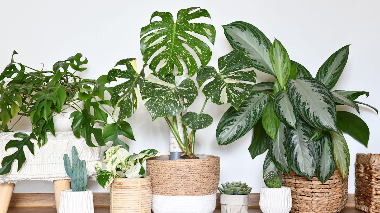 9 longest-living houseplants – expert recommendations and tips for species that can live over 10 years
Invest in these houseplants now for years of luscious foliage in your home
-
 Kris Jenner's 'organic modern' living room champions the most talked-about trend of 2025 – it's the new way to do luxe-minimalism
Simple silhouettes, organic textures, and industrial nuances infuse functional pieces with elegance to create an effortlessly chic and easy-to-live-with living space

