15 Farrow & Ball paint colors in real homes – from calming blues to warm neutrals
These Farrow & Ball paints are firm favorites among designers and homeowners alike
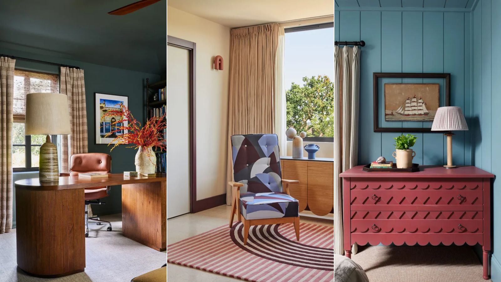

Farrow & Ball is endlessly popular among interior designers. Known for creating richly pigmented paint formulas across a wide range of timeless, liveable colors, it's no surprise that this brand is chosen by interior designers time after time.
From nuanced shades of dark black to off-white; calming blues to earthy greens, Farrow & Ball paints cover the whole range of colors, which work seamlessly in the home across many interior design styles.
To highlight some of the brand's most loved shades, we've rounded up real home interiors that use Farrow & Ball paints in their color scheme, whether that's bold and saturated or muted and pared-back.
Farrow & Ball paints in real homes
If you're looking for timeless room color ideas, these interior schemes will no doubt have you covered in the way of inspiration.
1. Light Blue
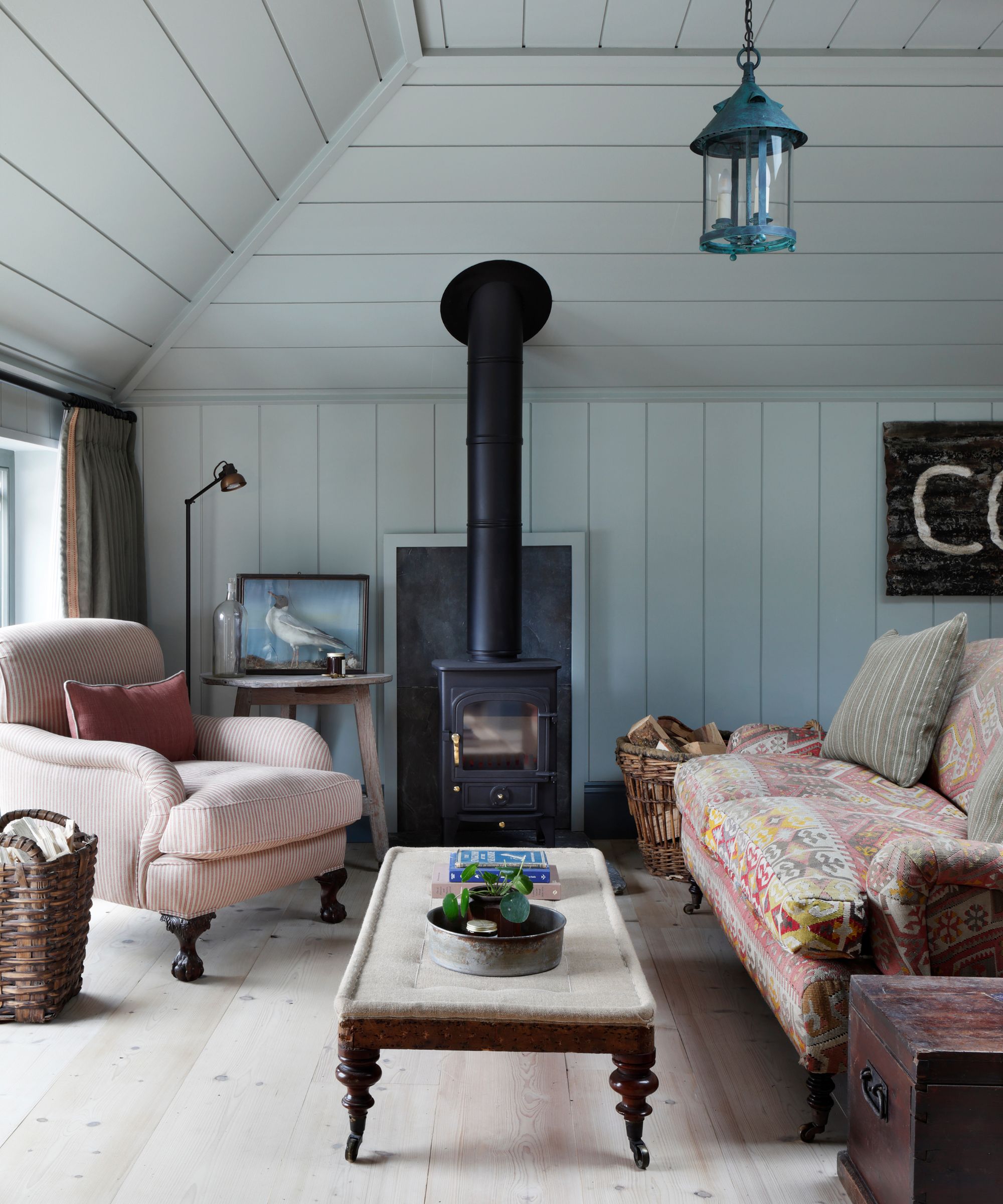
Interior design studio HÁM Interiors used Farrow & Ball's Light Blue across the shiplap boarding in the living room of this recent loft project.
'Each tone was carefully chosen to complement the coastal surroundings,' explains founder and principal designer Tom Cox. 'The colors have a powdery, mineral quality that creates warmth. On a lovely sunny day, they feel fresh and uplifting, but in the winter, when the log burner is going, they're really cozy.'
2. Berrington Blue
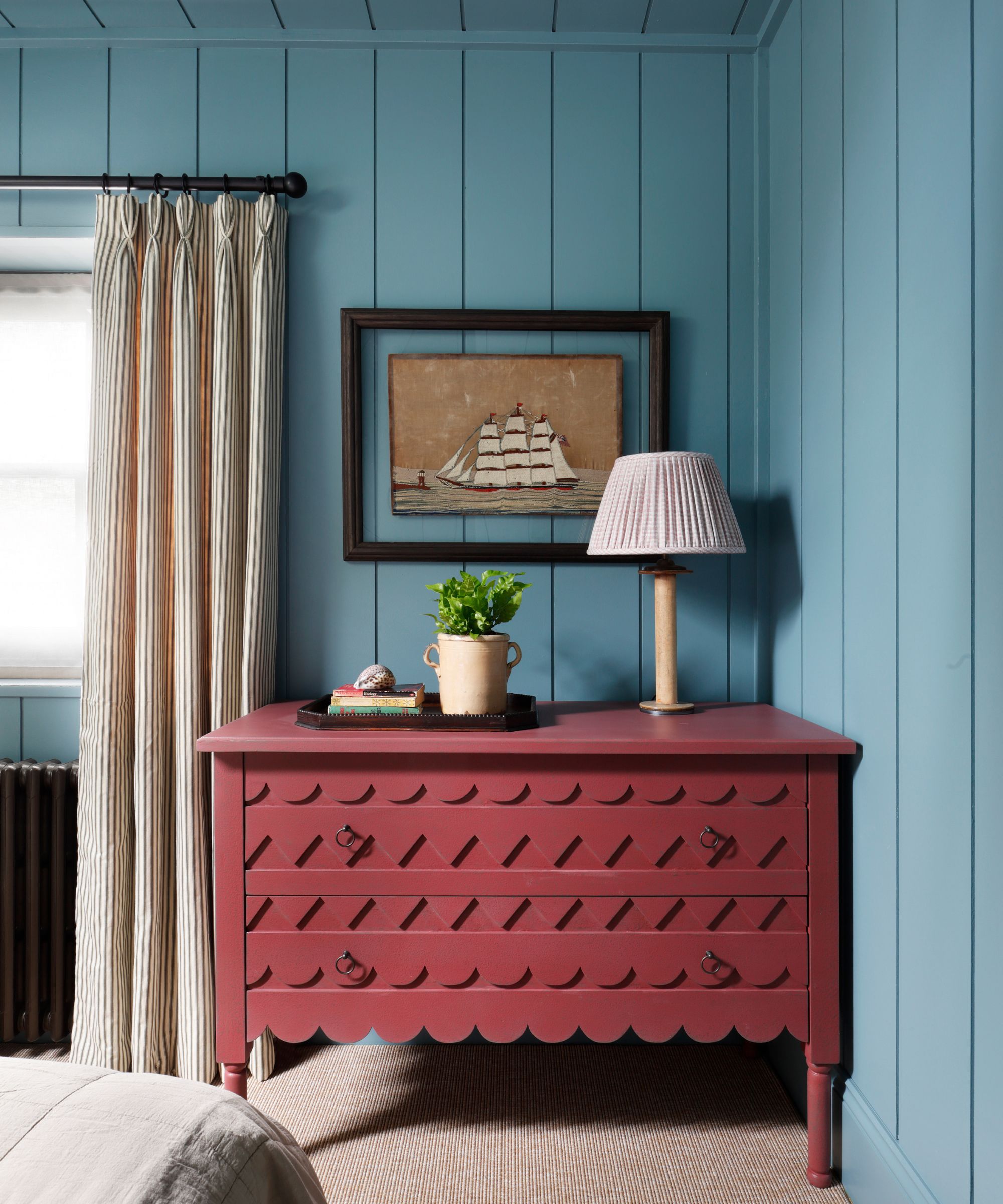
In the same loft project designed by HÁM Interiors, the bedroom features Farrow & Ball's Berrington Blue across the walls and ceiling. Described by Farrow & Ball as a 'blackened' mid-blue, this paint color has a deeply calming quality which makes it the perfect bedroom color idea.
3. Railings
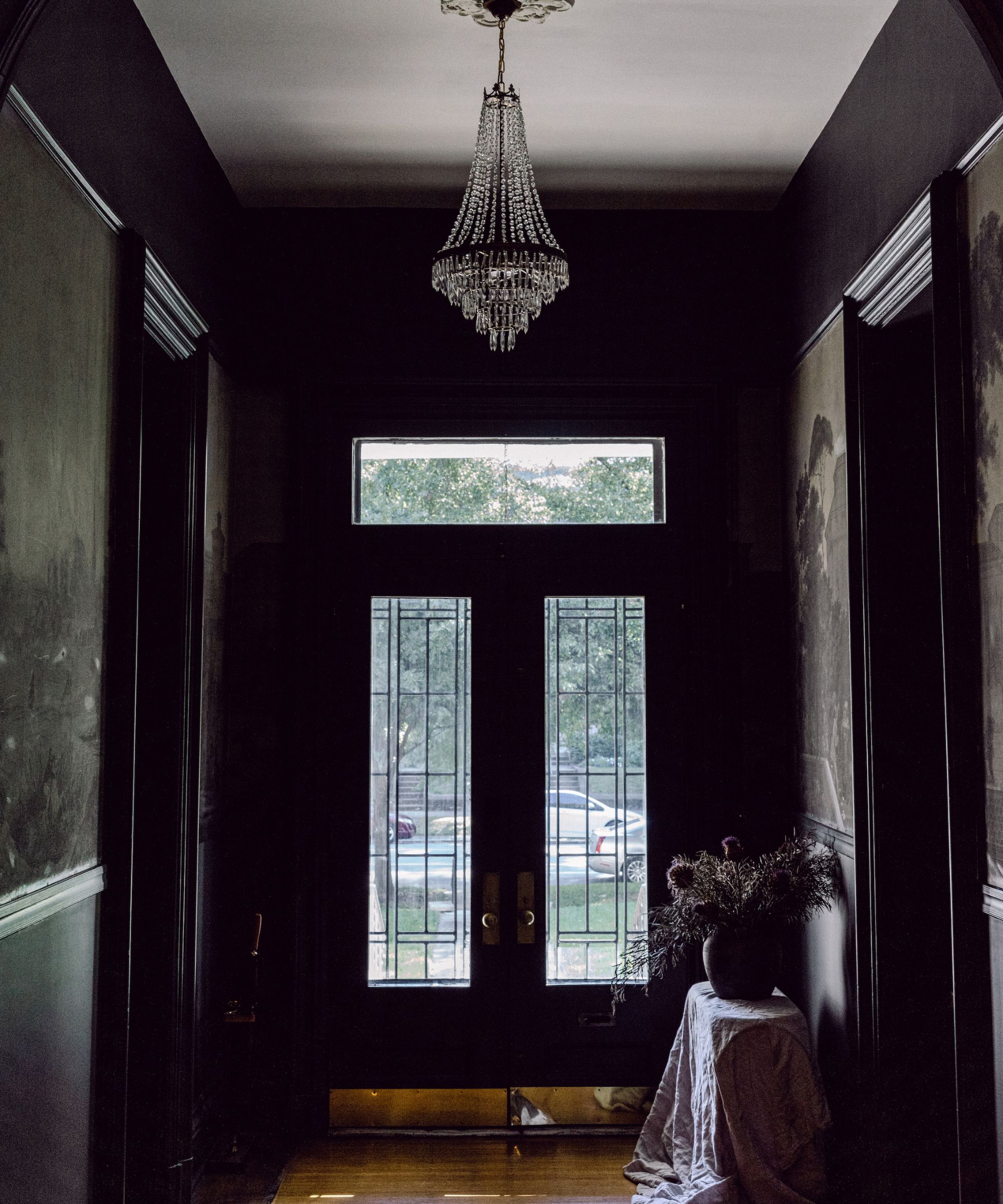
Although blue paints appear to be some of Farrow & Ball's most popular, its selection of dark and moody hues is equally as vast. Interior designer Bethany Adams used Railings, an off-black with blue undertones, in this entryway. Below, she shares why this paint was the perfect color choice to complement an original antique wallpaper in this 1800s home.
'I used Farrow and Ball's Railings with the original late 1800s Zuber wallcovering in this Louisville, Kentucky mansion to frame the pictorial paper and make the rest of the space recede. As a result, the antique wallpaper jumps off the walls and to life. Even though it is well over a hundred years old, and has suffered some inevitable damage, by keeping the contrasting color strong the effect is dramatic, and since the color is Farrow and Ball, the black steers clear of anything approaching Hollywood glam, instead providing a quietly luxurious backdrop to a heritage print.'
4. Vardo
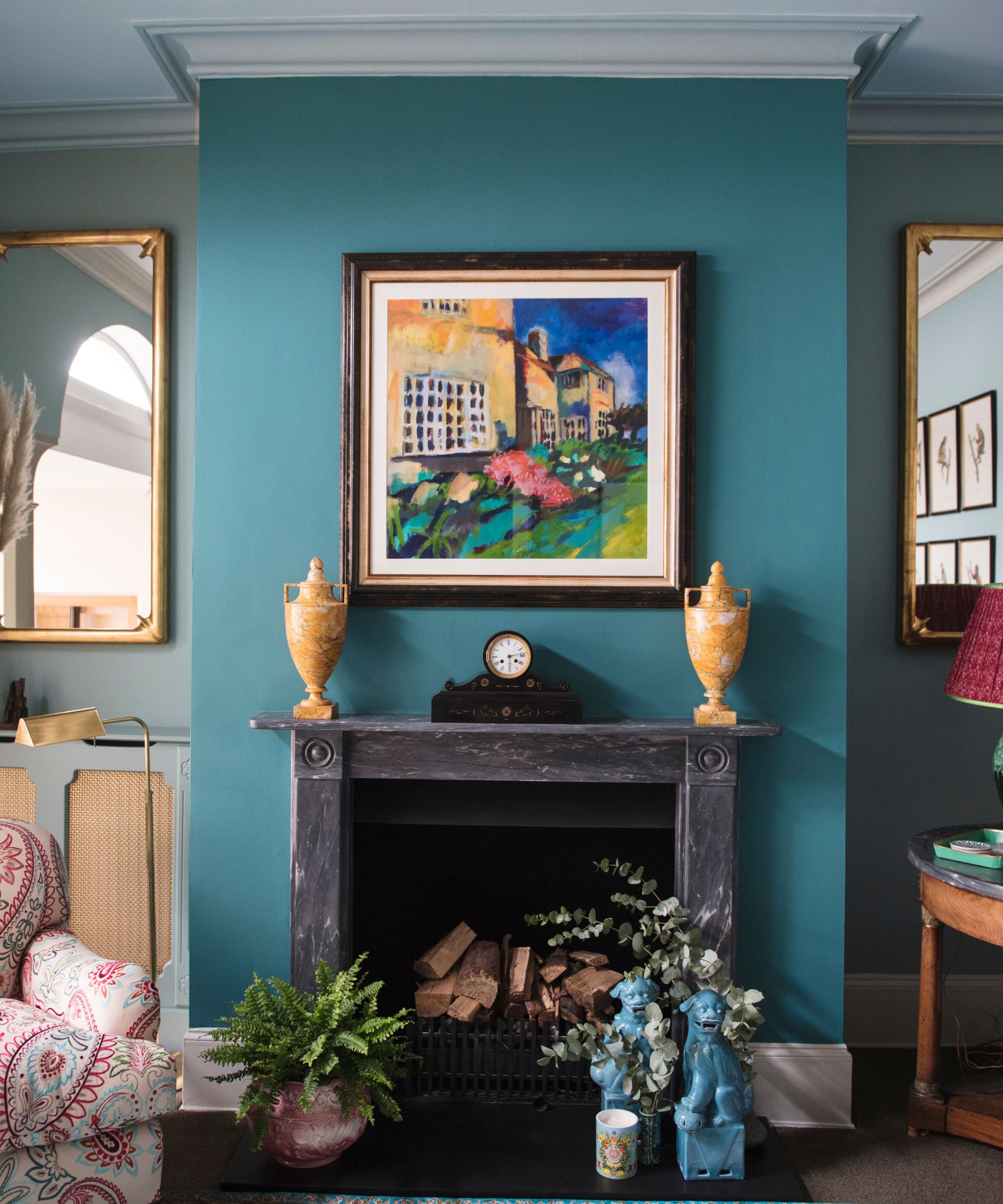
Interior designer Matthew Williamson used Farrow & Ball's Vardo, a teal color, on one wall in this living room, acting as the room's focal point. To ensure a liveable feel, the more understated Blue Ground is used on the other walls.
'This project was inspired by a turquoise, very traditional Indian rug that my client had and was keen to keep,' explains Matthew. 'The whole room came from the rug. There are two shades of blue that pick up the turquoise of the rug: Farrow & Ball Vardo on the fireplace and Blue Ground on the walls and ceiling. Color is a no-brainer for the wow factor. It really does make the room alive and jewel-like.'
5. Green Smoke
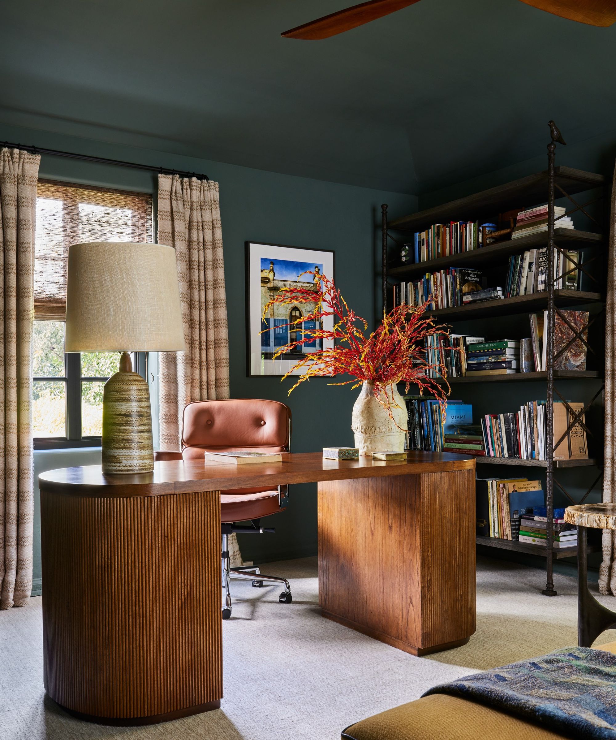
One of the most popular Farrow & Ball paint colors, Green Smoke is a slightly muted yet deep shade of green that interior designer Natalia Miyar used in this home office.
Farrow and Ball is such a favorite of mine,' says Natalia. 'Their range of colors is varied, nuanced, and original. In the office of this garden house, I used Green Smoke. This deep green provides the perfect backdrop to a sun-drenched window, overlooking the lush green of the garden. I love the richness and depth it creates in this small space.'
6. Borrowed Light
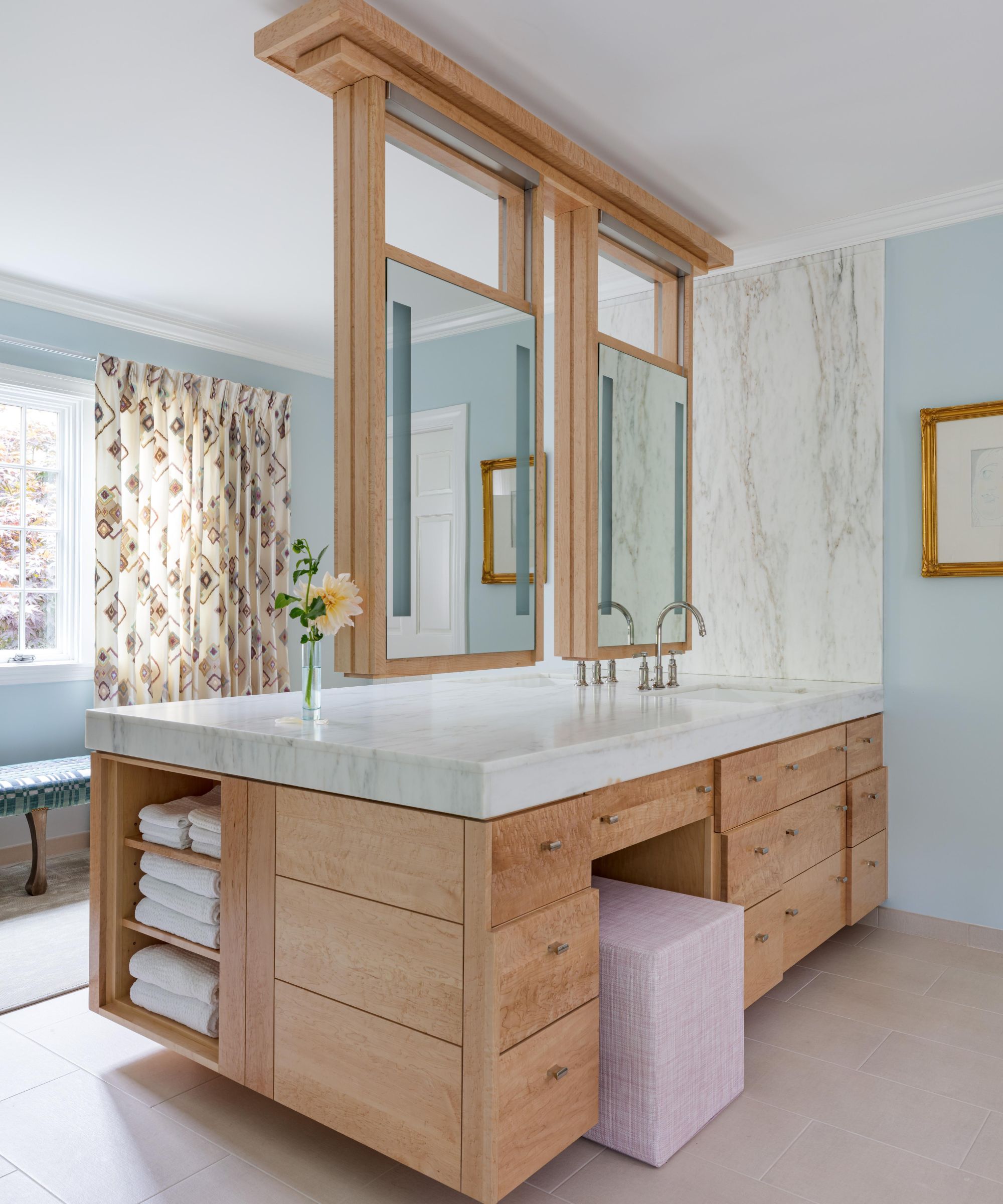
Farrow & Ball's Borrowed Light is a pale blue paint that makes a great choice for a bright and airy interior scheme. Betsy Wentz of Betsy Wentz Interior Design used this shade in this spacious bathroom.
'We selected Farrow & Ball's Borrowed Light for many of the walls in our Winter Cove, Maine project,' explains Betsy. 'It’s a great neutral with soft blue undertones. Borrowed Light has a peaceful almost ethereal feel that works equally well in rooms that have a lot of natural light and those that don’t.'
7. Brinjal
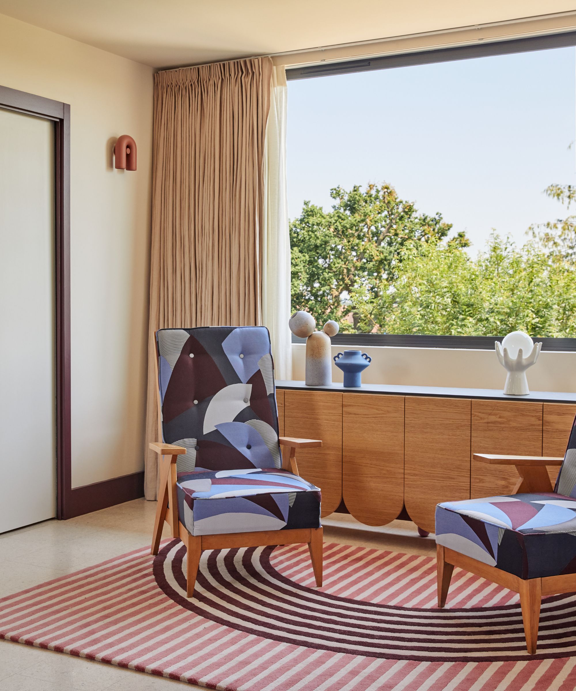
Dark aubergine tones are a color trend that's perfect for creating cozy and sophisticated spaces. But rather than using these rich colors across the walls, they can be used in smaller doses as an accent color, as demonstrated by OWL Interior Design who used Farrow & Ball's Brinjal on the skirting and architraves in this neutral bedroom.
8. Shadow White
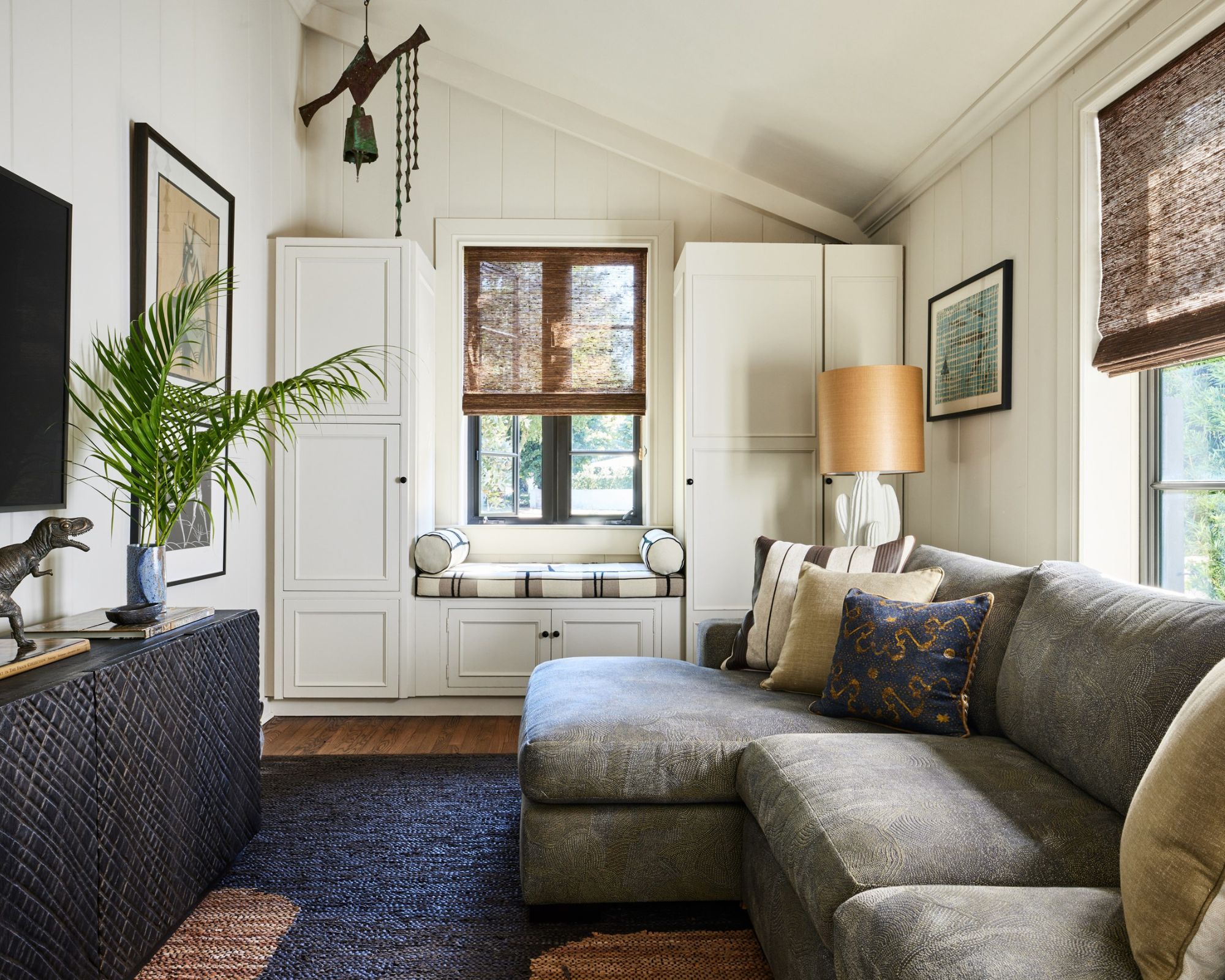
The array of white paints is vast, and finding the most flattering one for a specific space can set the tone for the whole room. Natalia Miyar opted for Farrow & Ball's Shadow White in this media room, and shares below that it has a warming quality that ensures the room feels cozy.
'Color is integral to my practice and I believe that taking the time to find the perfect shade and tone is so worthwhile. Farrow & Ball's Shadow White has a warmth and softness that elevates this media room. Coupled with beautiful natural light and organic textures, this shade creates a space that feels sophisticated and inviting rather than stark and cold.'
9. De Nimes
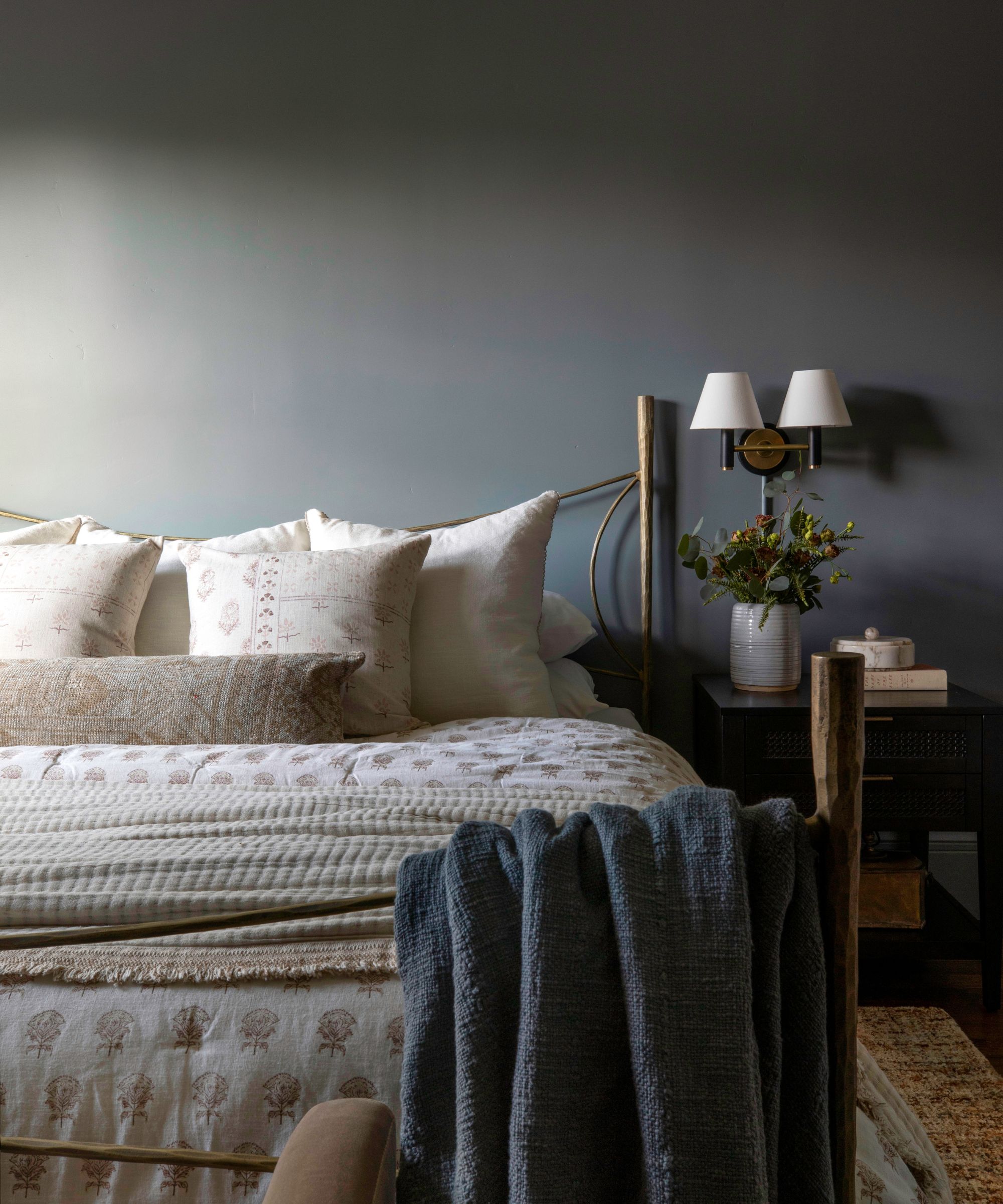
This relaxing bedroom designed by Hearth Homes Interiors uses Farrow & Ball's De Nimes on the walls, a subtle and toned-down shade of blue.
'We love De Nimes by Farrow & Ball because of the richness and depth the color provides,' shares Katie Labourdette-Martinez, co-founder of the California design firm. 'It’s a deep blue that brings the beauty of a space into focus while simultaneously creating an effortlessly polished finish.'
10. Cromarty
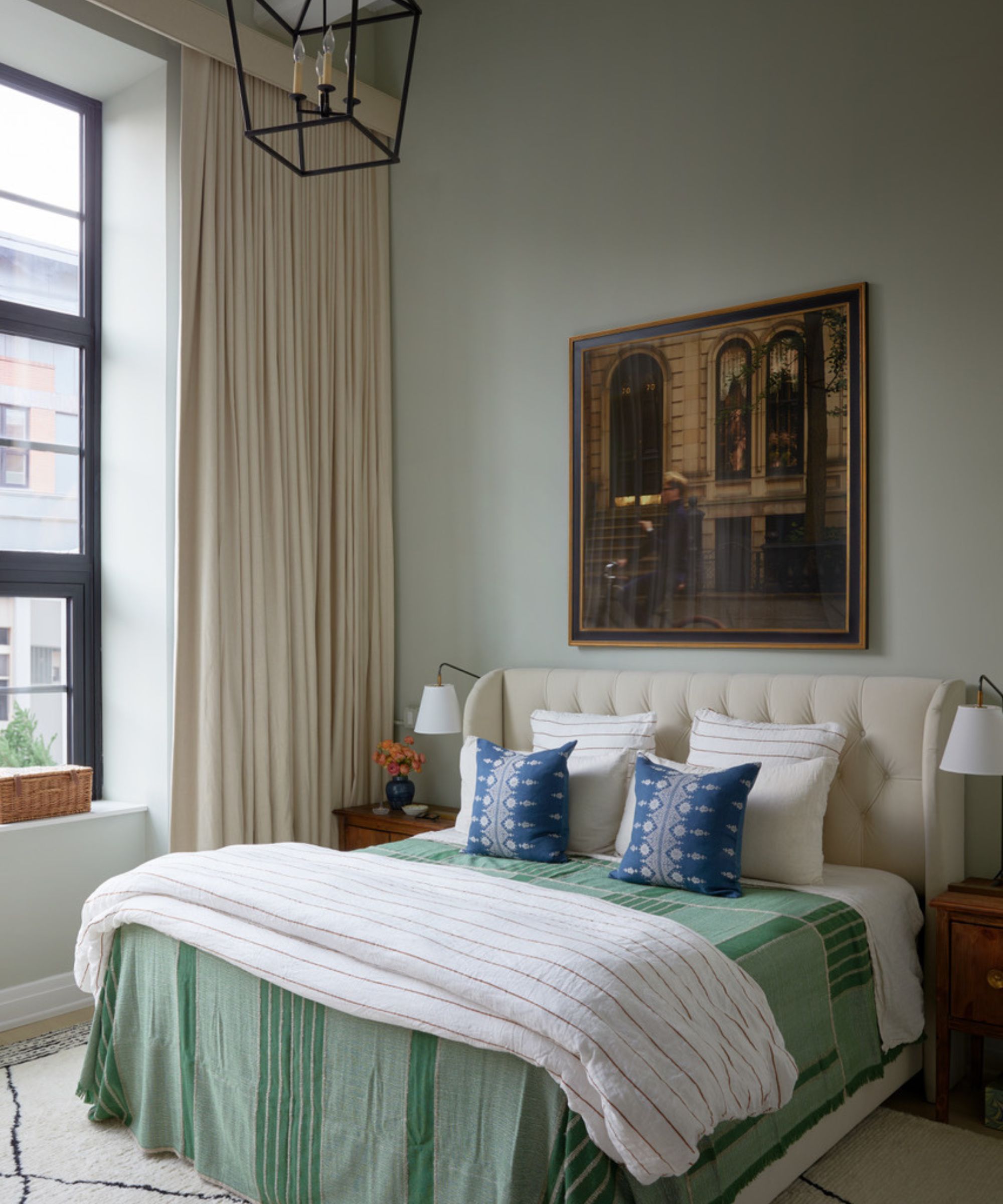
Continuing the theme of relaxing bedrooms, Farrow & Ball's Cromarty is another go-to shade that was used in this bedroom designed by Samantha Ware Designs.
A muted grayish green, Cromarty creates a calming and pared-back interior scheme. Below, the founder of the interior design studio Samantha Stathis-Lynch explains why she frequently turns to this paint color.
Speaking of Cromarty, the designer explains that she has 'used it in several projects over the years including my own bedroom', adding that it 'creates a calm and serene atmosphere.'
'The pale green with gray undertones feels evocative of misty days on the water, serene and still, which is perfect for a restful night's sleep but soft enough for blissful mornings.'
11. Elephant's Breath
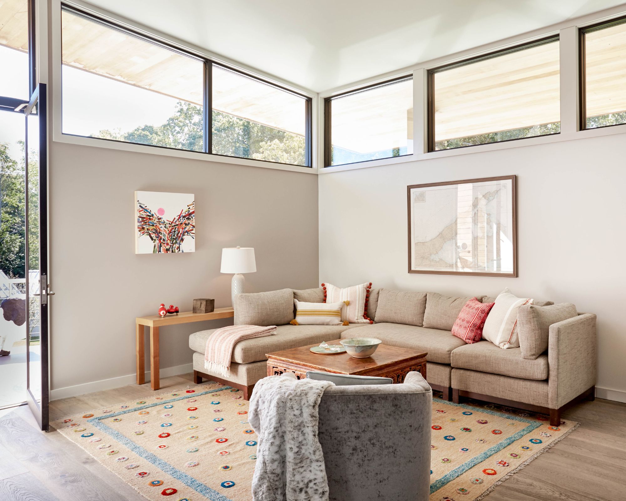
When decorating with neutrals, designers point to Farrow & Ball's Elephant's Breath which is a warm gray, meaning it doesn't feel cold which is often the risk when decorating with gray.
'We love using Farrow and Ball paints because the pigments in the hues and tones are deep and rich, no matter if you are working with a soft yellow, a taupe gray or inky blue,' says Kristen Fiore, owner and principal designer at Kristen Elizabeth Design.
The designer used Elephant's Breath in this modern living room, providing a sense of warmth to the spacious room. 'We created a cozy family room space by covering all three walls in the warmth of the taupe-mauve Elephant's Breath.'
12. Teresa's Green
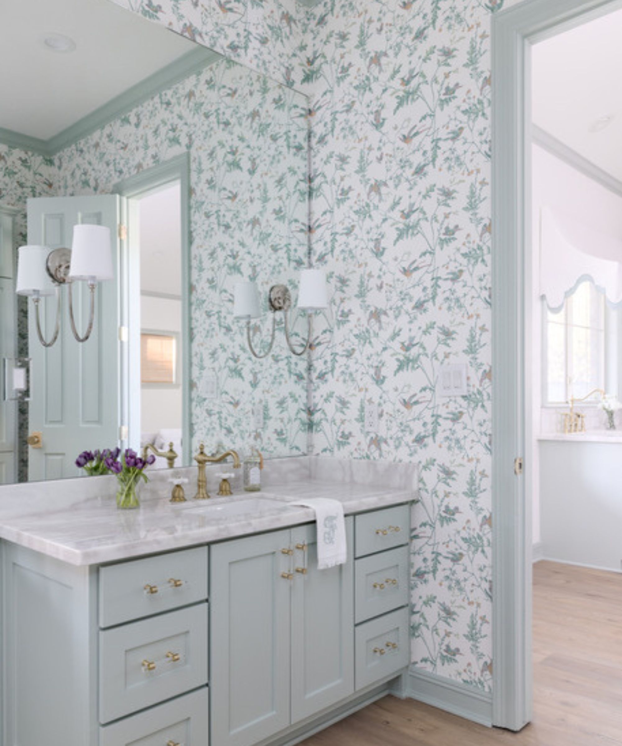
This traditional bathroom designed by Brittney Ferguson Interiors uses Farrow & Ball's Teresa’s Green on the trim and cabinets. An aqua color, Teresa's Green is reminiscent of the ocean and creates a clean and refreshing interior scheme.
While this paint color appears more of a light blue here, in other lighting conditions it can lean more toward the green color family.
13. Stony Ground
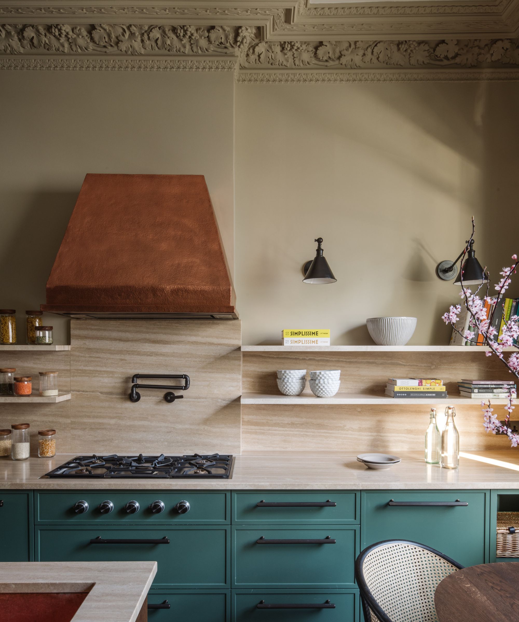
Farrow & Ball's Stony Ground is a rich beige paint with a subtle amount of red undertones that add warmth to a neutral scheme, such as this kitchen designed by Natalia Miyar. The designer says that this paint color pairs beautifully with the kitchen's warm metals, as well as the turquoise kitchen cabinets.
'One of the most important parts of introducing color into a room is creating balance and harmony with your palette,' shares Natalia. 'I love how this Farrow & Ball Stony Ground doesn’t compete but subtly enhances the warm copper finishes and striking turquoise in this kitchen.'
14. Oval Room Blue
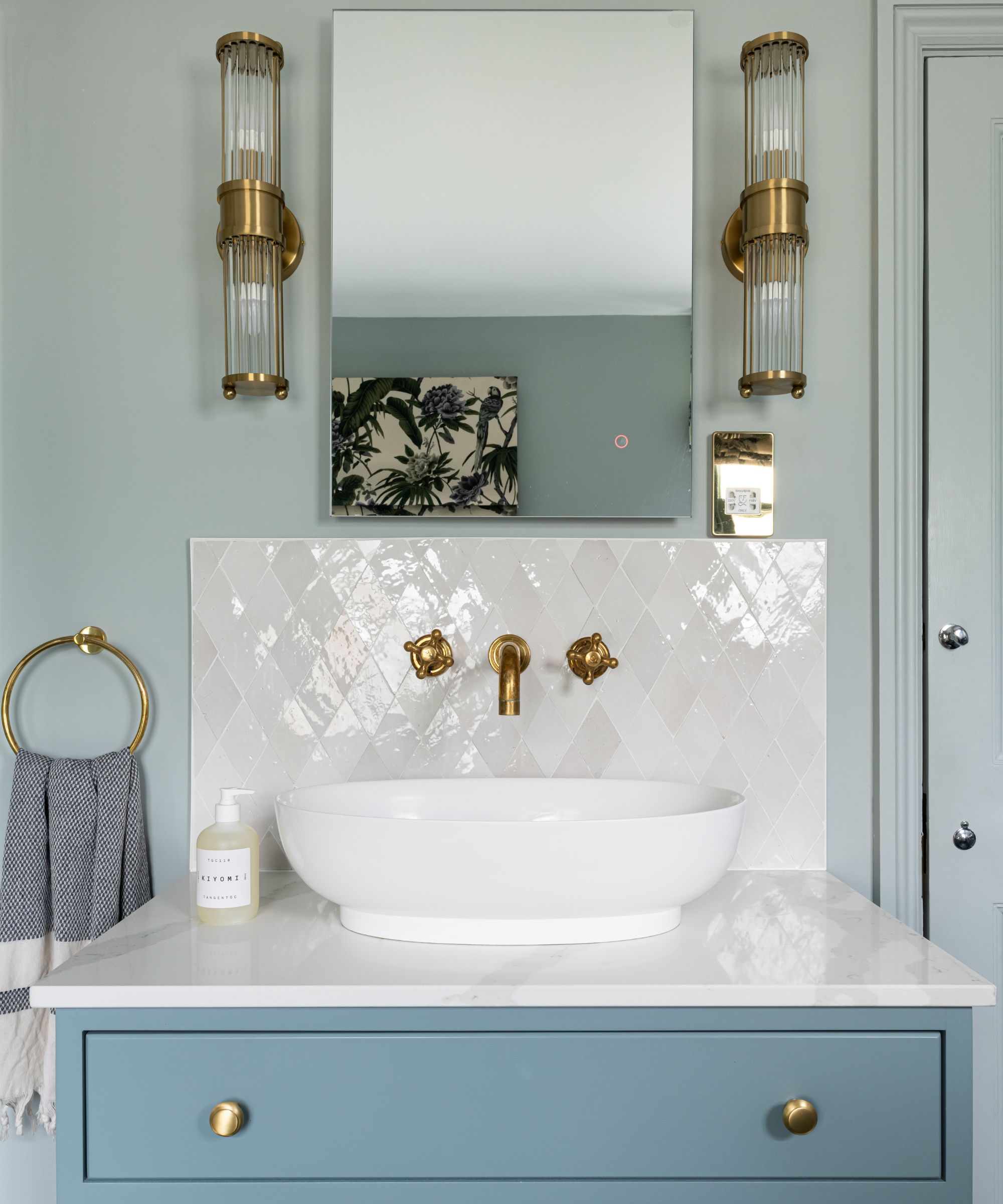
Another favorite of Farrow & Ball's blue paints is Oval Room Blue, which OWL Design used on the vanity unit in this bathroom. Contrasted with the room's crisp white fixtures, a restful feel is created.
Featuring the most black tones of all the brand's range of blue paints, Oval Room Blue has an 'aged' look, according to Farrow & Ball. Unlike some blue paints which are vibrant and stimulating, Oval Room Blue has a subdued quality which makes it liveable throughout the home and easy to pair with lots of interior design styles.
15. School House White
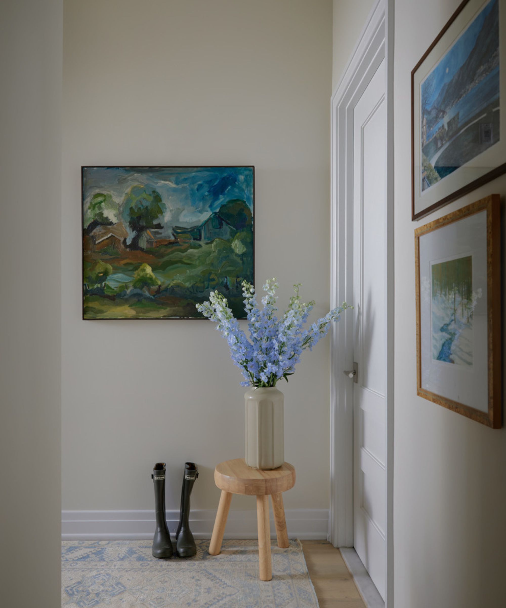
Lastly, School House White is a favorite Farrow & Ball white paint among designers. A flattering off-white color, School House White creates a light and airy feel yet avoids looking stark.
This versatile white paint was used in this entryway designed by Samantha Ware Designs, creating an understated base for the more colorful artwork.
'School House White provides the perfect neutral backdrop to any space,' says Samantha Stathis-Lynch. 'Something of an anomaly, the soft hue is neither warm nor cool, creating a timelessness that can work with all types of architecture.'
Whether used as a neutral backdrop or as a bold accent color, Farrow & Ball paints are widely used by designers to create cozy and welcoming spaces. Whether you love bold shades or prefer a pared-back scheme, these paint colors are balanced to ensure a liveable feel.
Sign up to the Homes & Gardens newsletter
Design expertise in your inbox – from inspiring decorating ideas and beautiful celebrity homes to practical gardening advice and shopping round-ups.

Emily is a freelance interior design writer based in Scotland. Prior to going freelance in the spring of 2025, Emily was Homes & Gardens’ Paint & Color Editor, covering all things color across interiors and home decor for the Homes & Gardens website. Having gained specific expertise in this area, Emily is well-versed in writing about the latest color trends and is passionate about helping homeowners understand the importance of color psychology in home design. Her own interior design style reflects the simplicity of mid-century design and she loves sourcing vintage furniture finds for her tenement flat.
-
 Looking to upgrade your curb appeal? Martha Stewart learned this exterior paint technique from someone who worked on St Patrick's Cathedral
Decades ago, Martha transformed her porch with ultra-simple yet timeless paint tips from her father's cousin – her advice still rings true today
-
 I'm a home tech editor, and I always used to put off cleaning my sofas until I started using this tiny handheld vacuum (which is now on sale)
This simple but powerful handheld vacuum from Black+Decker has transformed my living room
-
 Shea McGee has just shared her top tips for an effortlessly chic yet cozy guest bedroom
Interior designer Shea McGee explains how she designs a timeless guest bedroom that's the perfect balance of cozy and chic
-
 The best neutral paint colors for bathrooms that aren't white – 5 timeless shades designers always turn to
From earthy tones to soft pinks, these are designers' favorite neutral paints for bathrooms
-
 Storage doesn't get more chic than this – 9 designers on how they made storage a design statement
These interior designer's projects are all brilliant examples of how to make storage more than just a place to hide things away
-
 Joanna Gaines has given her Magnolia store a spring makeover – these are the 3 simple decor tips that are so easy to replicate
As spring draws near, interior designer Joanna Gaines has decorated her homeware store with farmhouse-style decor that's both elegant and uplifting
-
 How to decorate a room with a high ceiling, according to interior designers
Take advantage of a high-ceilinged room with the techniques interior designers use
-
 10 Farrow & Ball paint colors you've probably never heard of that designers swear by
Discover some of Farrow & Ball's lesser-known paint colors, from neutrals to bolds
-
 You've heard of color drenching but have you heard of stripe drenching? Here's how to bring this classic yet dramatic look into your home
We spoke with interior designers and uncovered their favorite ways to decorate with stripes in five iconic looks
-
 Shea McGee uses this unpopular paint color in her home office – but color experts say it's actually the perfect shade for a calming working environment
Move over warm browns, this interior designer has chosen an unexpected cool-toned gray for her home office due to its soothing and sophisticated qualities