Farrow & Ball kitchen color schemes – 3 expert paint palettes for a stylish heart of the home, from neutrals to brighter shades
Gain some fresh kitchen paint color inspiration with these whole-room palettes

Mastering a kitchen color scheme can often be a long and much-deliberated task. Unlike other rooms in the home, the colors in a kitchen go beyond the walls to include the cabinetry and other fixtures, so the colors that you choose need to work well together.
Thankfully, Farrow & Ball has served up some stylish kitchen color ideas, covering the walls, cabinets, and accent colors. Taking to Instagram, brand ambassador Patrick O'Donnell talks through three kitchen color schemes, ranging from plaster pinks to calming blues.
If you're looking for some guidance with your kitchen paint ideas, read on. We've rounded up each of the three schemes below, breaking down Patrick's expert advice that'll soon have your kitchen feeling stylish and cohesive.
A post shared by Farrow & Ball (@farrowandball)
A photo posted by on
Calming neutrals and earthy green
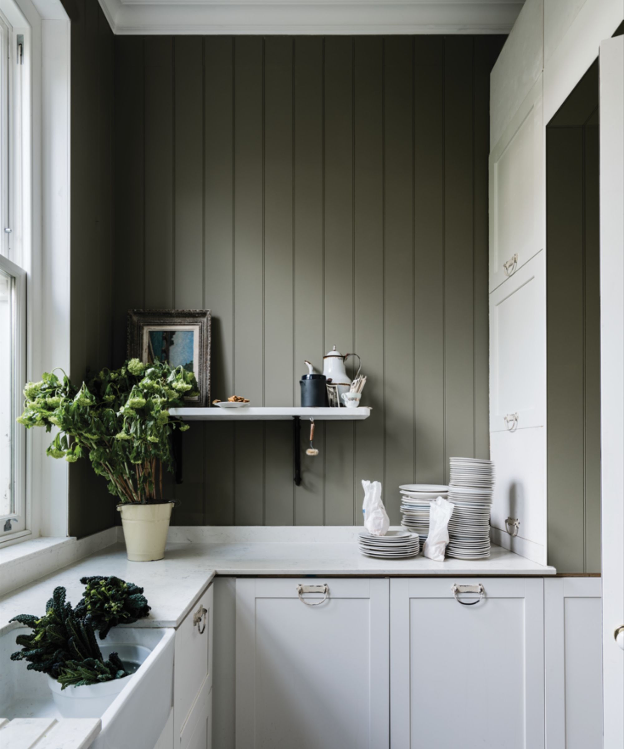
If you're looking for a timeless, can't-go-wrong kitchen color scheme, Patrick's first option has you covered. Using delicate neutrals and a hint of color with an earthy green, this scheme is restful and complementary to many design styles.
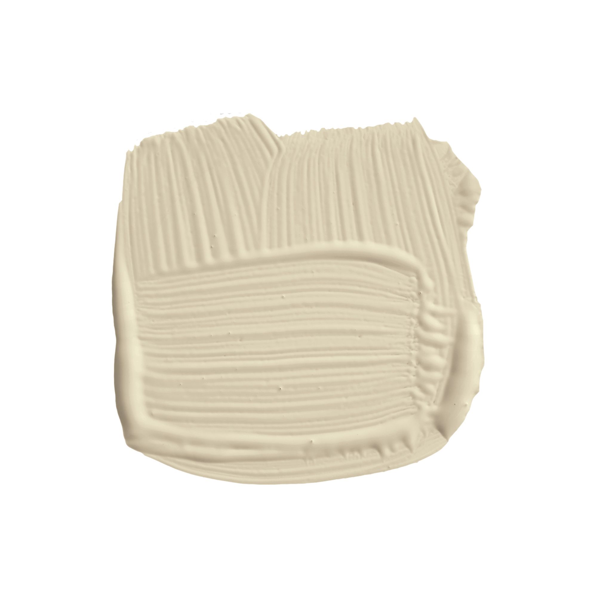
Patrick suggests painting, 'Your walls and possibly woodwork (why introduce another white?) in the lovely Slipper Satin', which is an off-white paint that appears as a light gray.
For kitchen cabinets, it's about sticking to neutrals but adding slightly more depth: 'And then your kitchen units in the same neutral family as Slipper Satin is Old White – this lovely slightly dirty classic kind of greenish yellow-based white.'
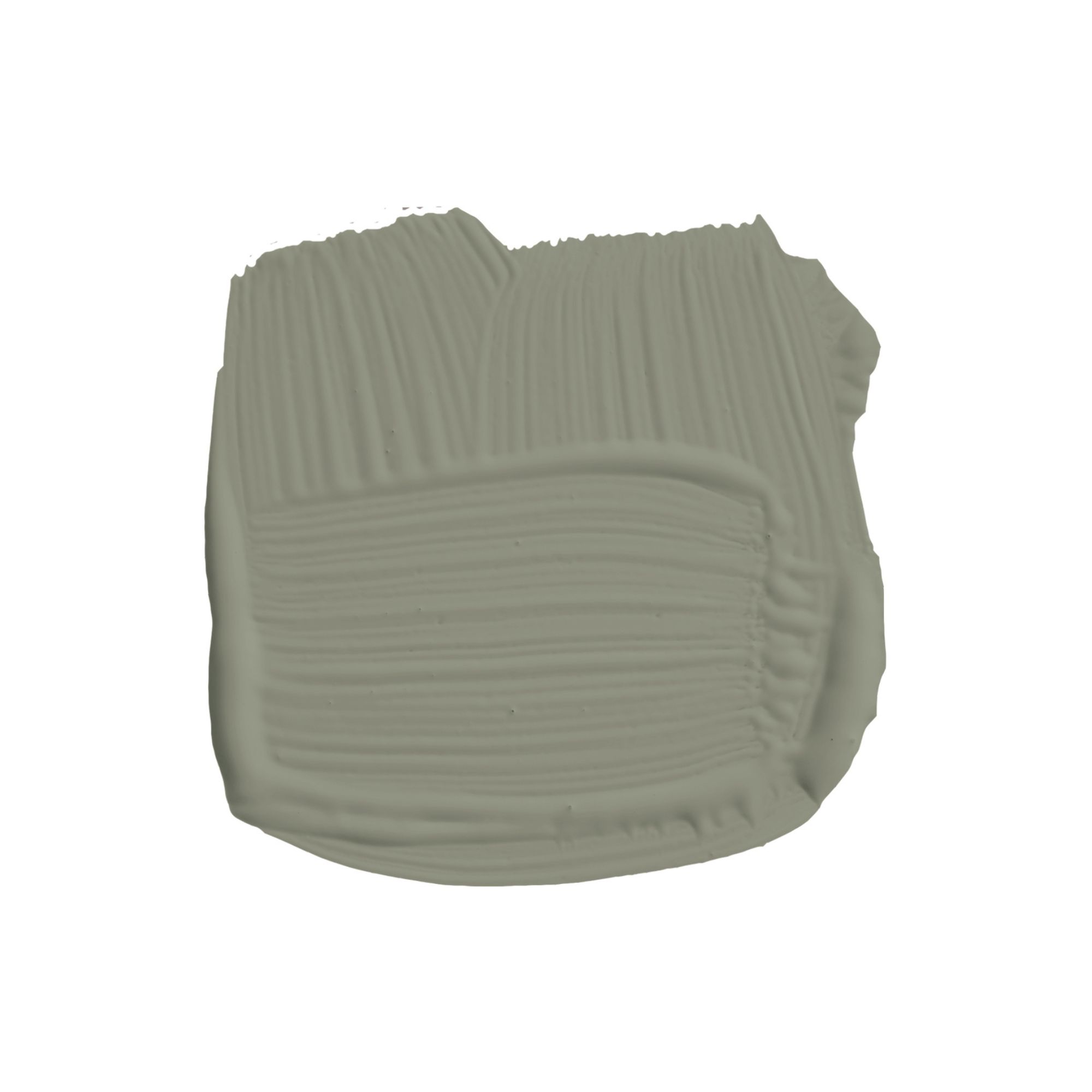
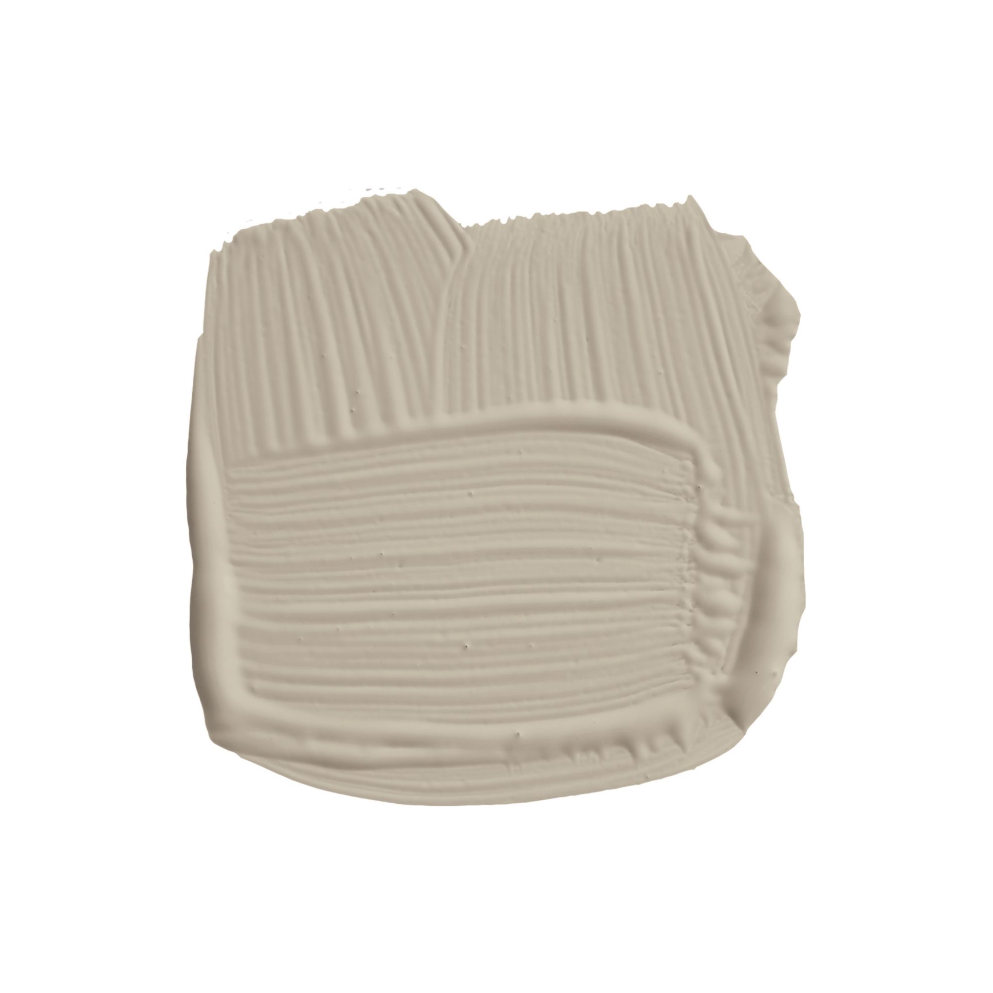
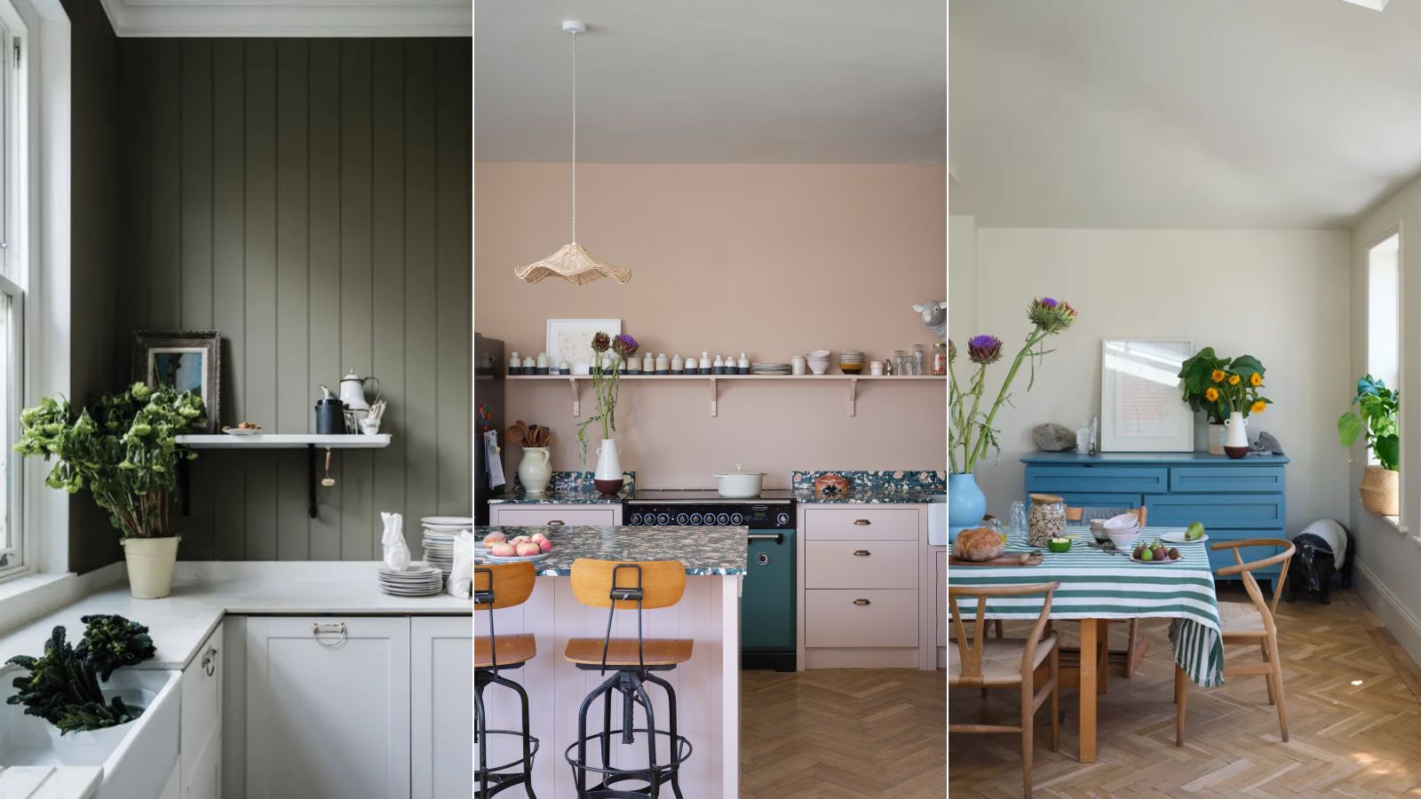
'And then your accent color here, whether it be a separate piece of furniture like an island or a larder unit... in the gorgeous drab khaki of Treron'. As demonstrated in this calming kitchen, Treron makes a great choice if you want to venture from light neutrals into the world of color, while maintaining a pared-back look.
'This is totally safe and I don’t mean boring, it’s just very safe, very easy to live with,' says Patrick.
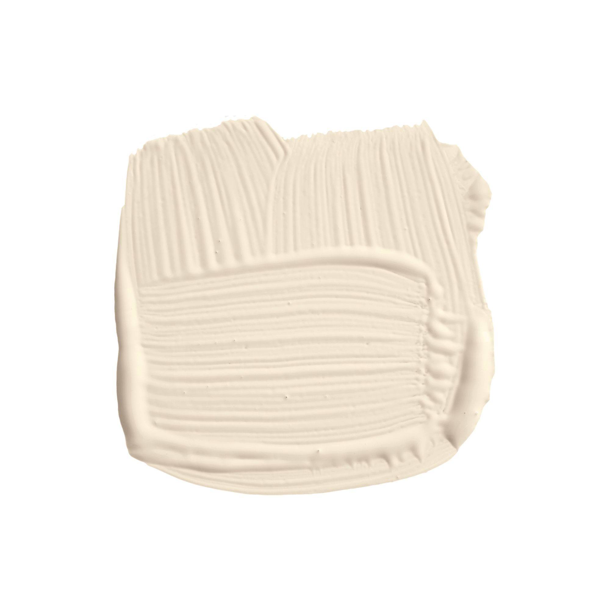
Slipper Satin is an off-white paint, creating a light and airy look without feeling stark.
Plaster pinks and a pop of red
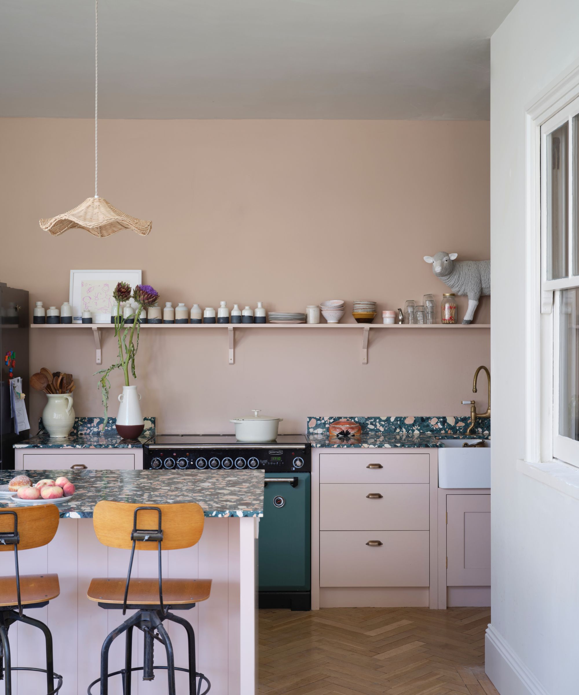
Decorating with pink in kitchens is popular right now for good reason. Earthy, plaster pinks are a stylish way to do neutrals, and embracing them in the heart of the home is a great way to add warmth and depth.
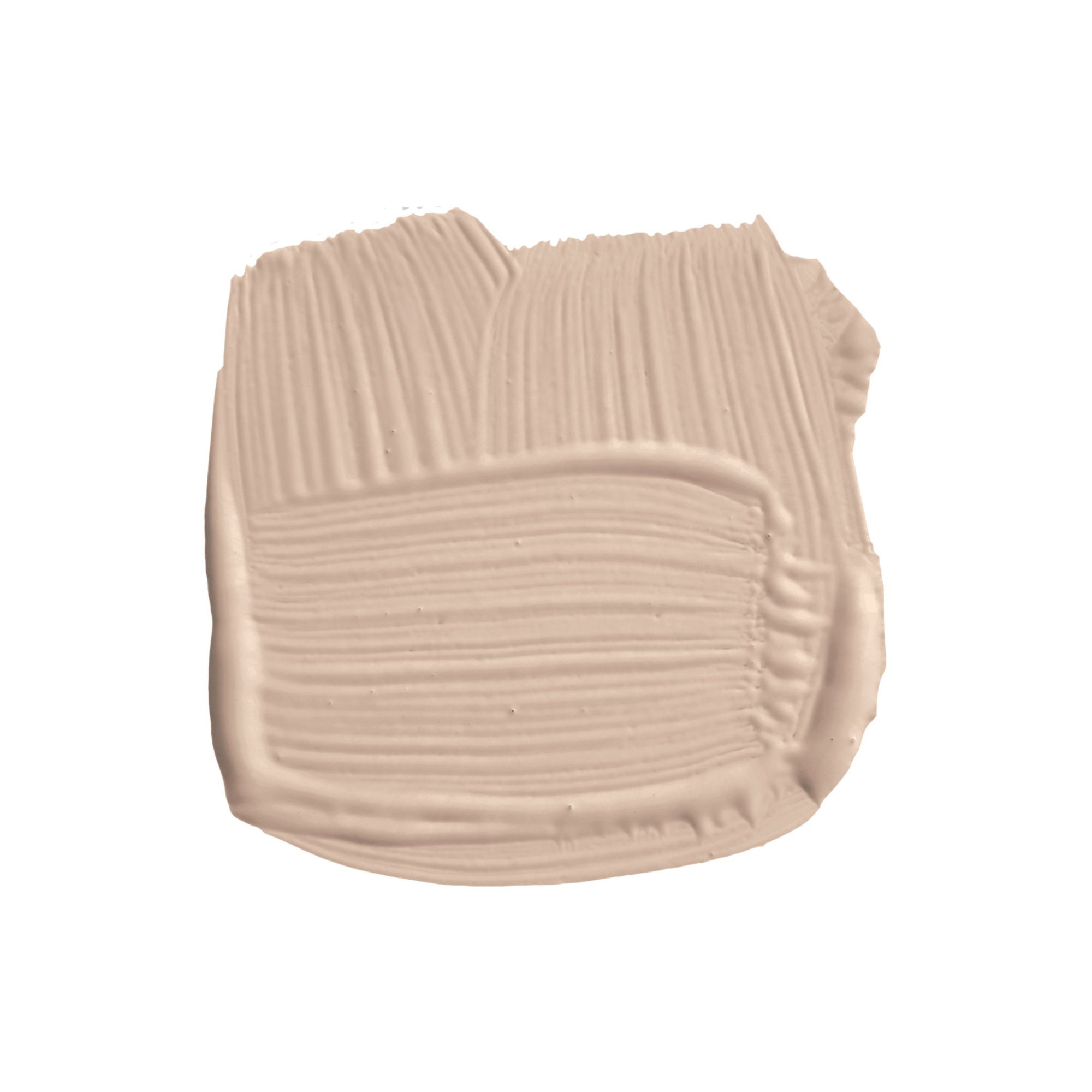
Patrick explains, 'We start off here with the lovely soft blush note of the warm white that is Dimity. And then your kitchen unit color here is Templeton Pink which is just a little bit stronger than Setting Plaster.'
While plaster pink tones are flattering in lots of spaces, Patrick adds that this combo is 'really good for poorly lit kitchens.'
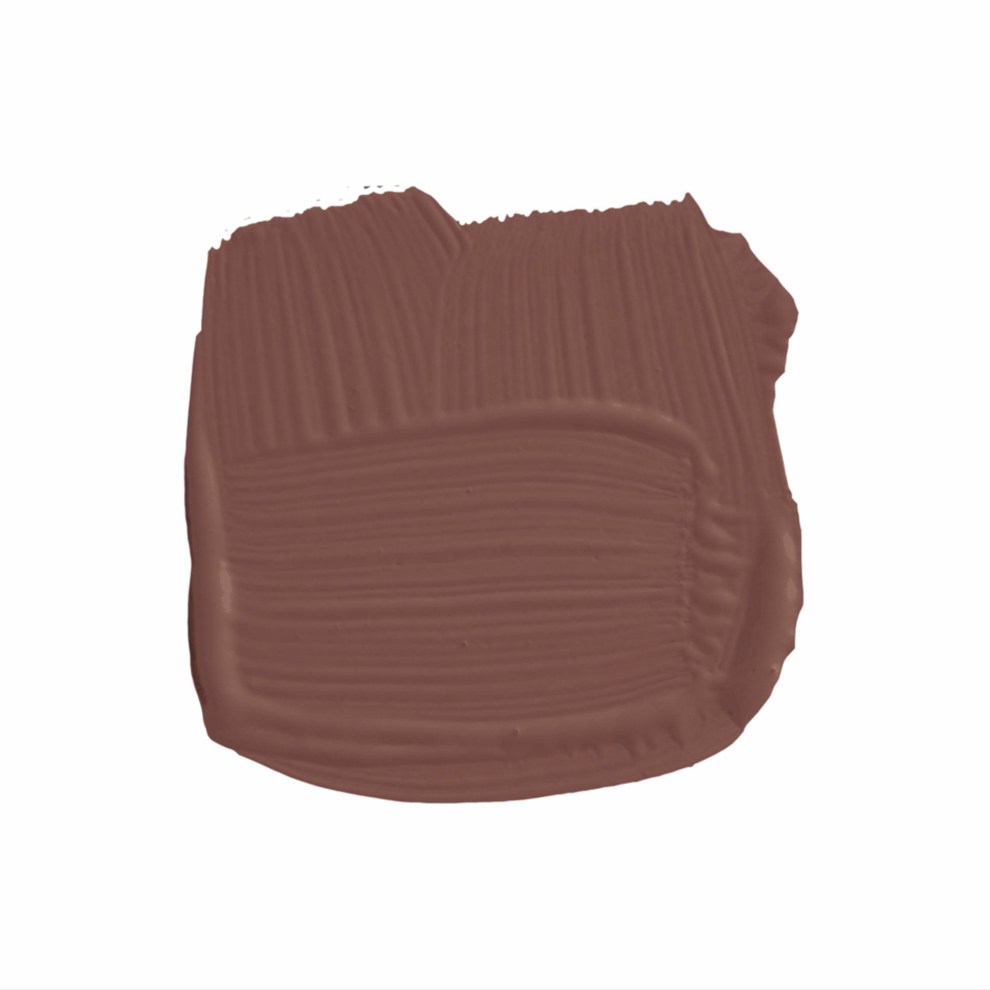
'And then your accent color here is the glorious sort of brick-baked brick red of Etruscan Red. Just utterly lovely. One of my favorite colors,' says Patrick.
This is a great way to embrace the unexpected red theory, and by using this bold color sparingly you don't need to worry about it overwhelming the room.
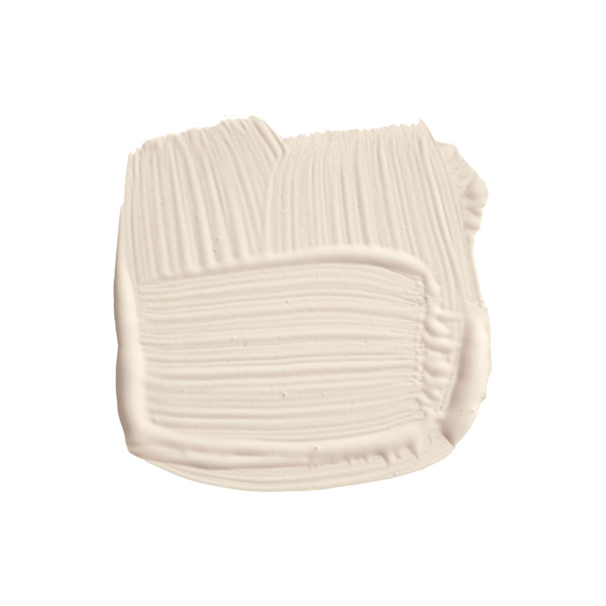
With warm, sublte pink tones, Dimity works well as backdrop color when paired with darker pinks.
Warming beige and cozy blues
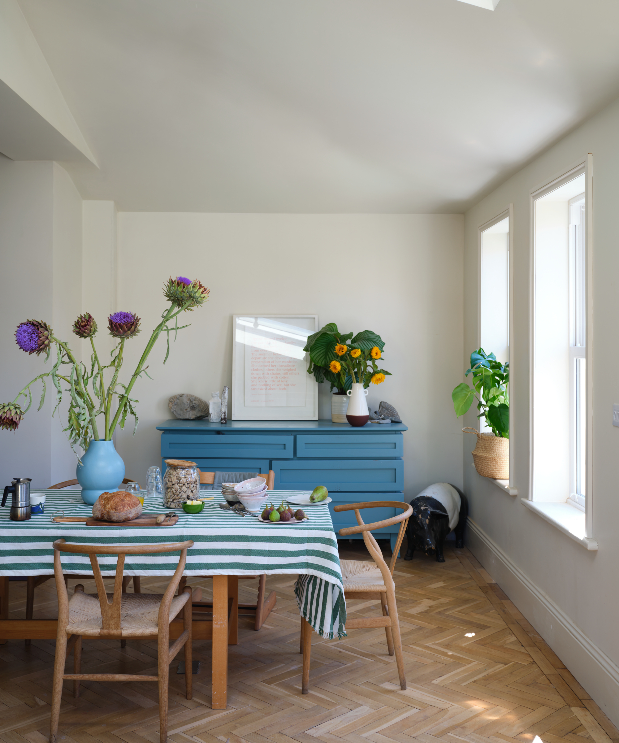
The third and final kitchen color scheme suggested by Patrick turns to decorating with blue but in a subtle and liveable way.
To begin, Patrick recommends using Drop Cloth for kitchen walls, a beige paint that he describes as 'not dissimilar to Old White, but less green through it.'
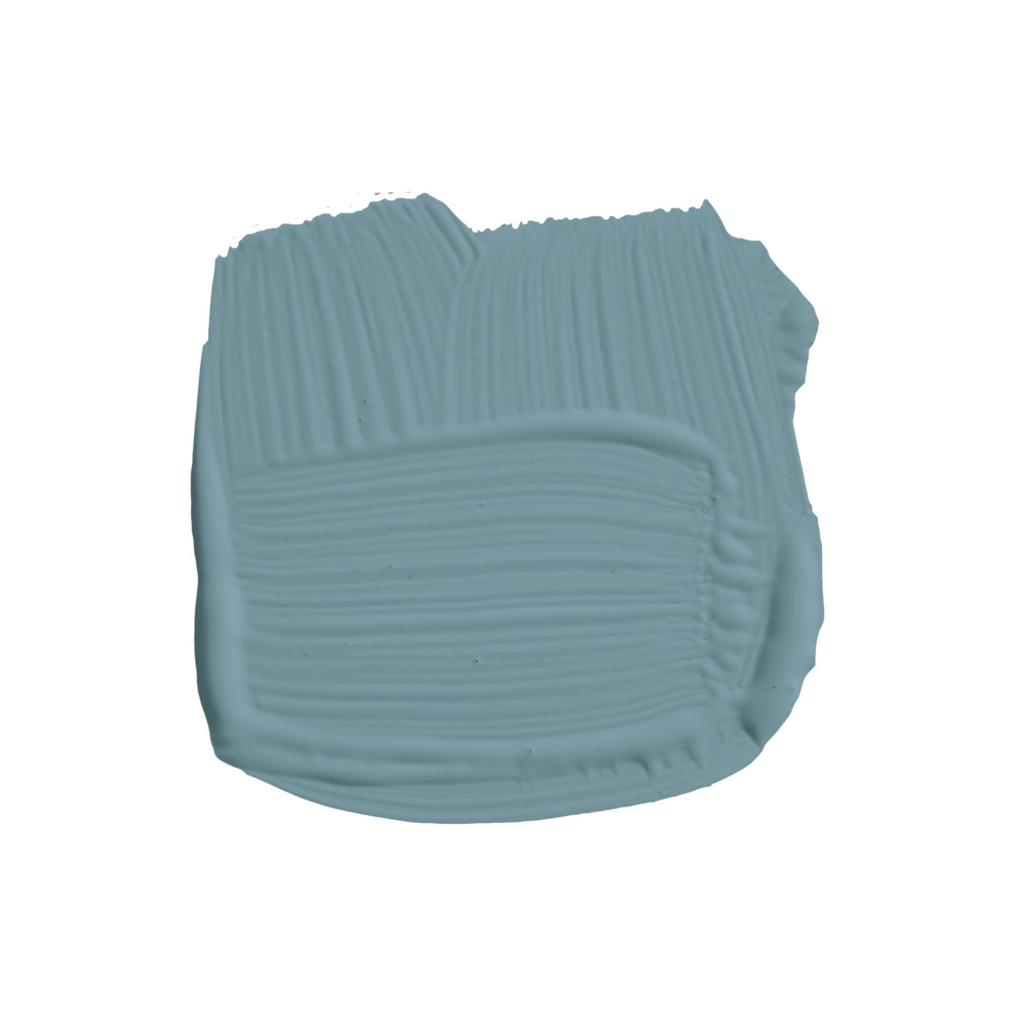
'And then your kitchen units in the beautiful Stone Blue' he adds. In this dining area, Stone Blue is used on the freestanding cabinet, uplifting the otherwise neutral scheme.
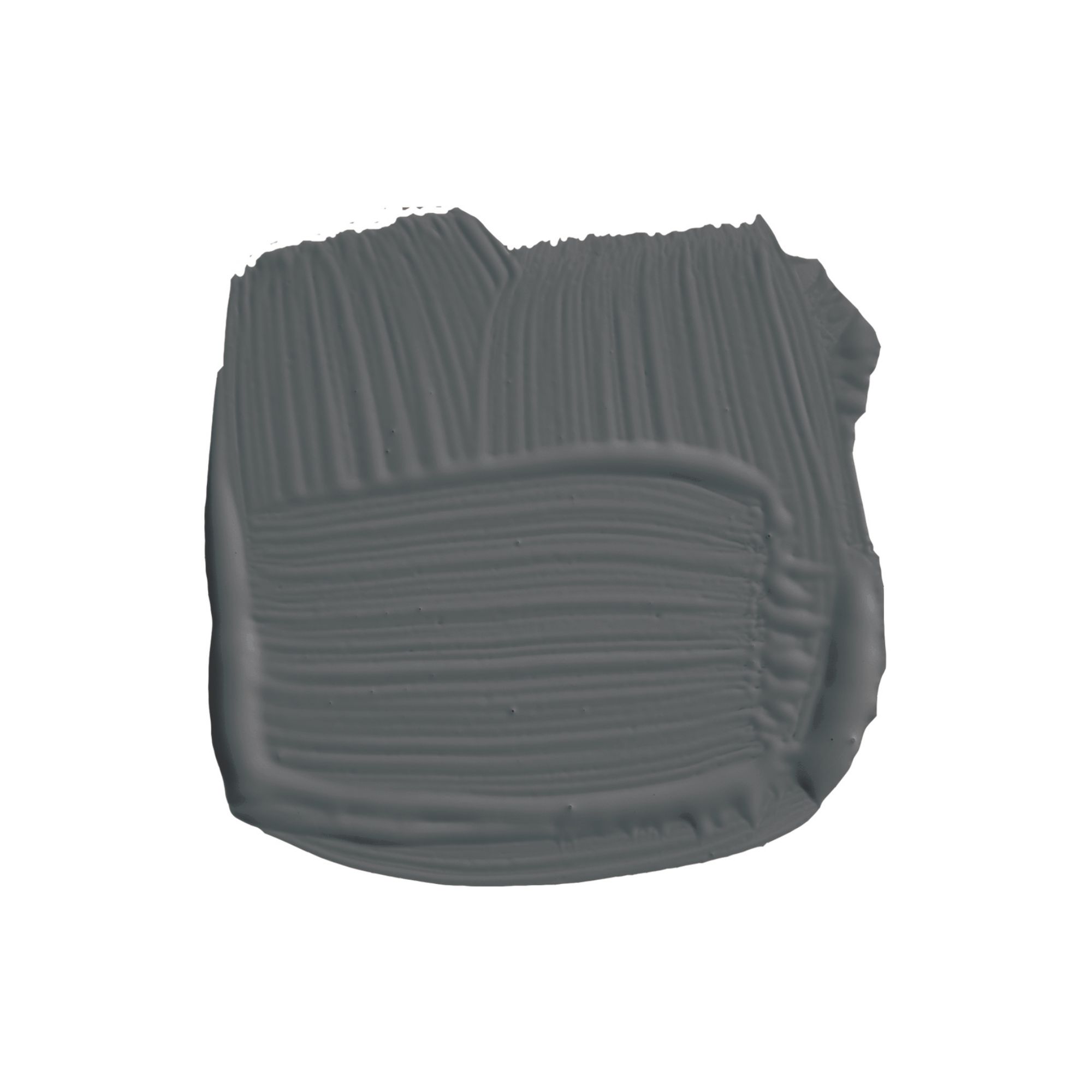
'Your accent color here is the lovely kind of bluish slate notes of Hopper Head,' adds Patrick. This charcoal paint will add plenty of depth to your kitchen scheme, and since it has a slightly muted quality, it won't appear too heavy against the lighter hues.
Which of these kitchen color schemes is your favorite? Whether you're drawn to the on-trend plaster pinks or prefer the calming appeal of layered blues, these color schemes are endlessly timeless.
Sign up to the Homes & Gardens newsletter
Design expertise in your inbox – from inspiring decorating ideas and beautiful celebrity homes to practical gardening advice and shopping round-ups.

Emily is a freelance interior design writer based in Scotland. Prior to going freelance in the spring of 2025, Emily was Homes & Gardens’ Paint & Color Editor, covering all things color across interiors and home decor for the Homes & Gardens website. Having gained specific expertise in this area, Emily is well-versed in writing about the latest color trends and is passionate about helping homeowners understand the importance of color psychology in home design. Her own interior design style reflects the simplicity of mid-century design and she loves sourcing vintage furniture finds for her tenement flat.
-
 How to grow impatiens – garden experts reveal the secrets to growing this shade-tolerant, sparkling summer plant
Both 'Busy Lizzie' and 'New Guinea' impatiens can thrive in shady yards
By Ellen Wells Published
-
 Charli XCX's dining room is a 'treasure-trove' of one-of-a-kind pieces – it's the most unique hosting space I've ever seen (and surprisingly replicable)
The singer's Tudor-style dining room features eclectic furnishings, a mix of patterns and bright colors that all work together beautifully
By Hannah Ziegler Published
