How to decorate with Farrow & Ball's Card Room Green – a 'muted and sophisticated' green paint
Grounded by its blend of green and gray, this popular green paint is an all-rounder
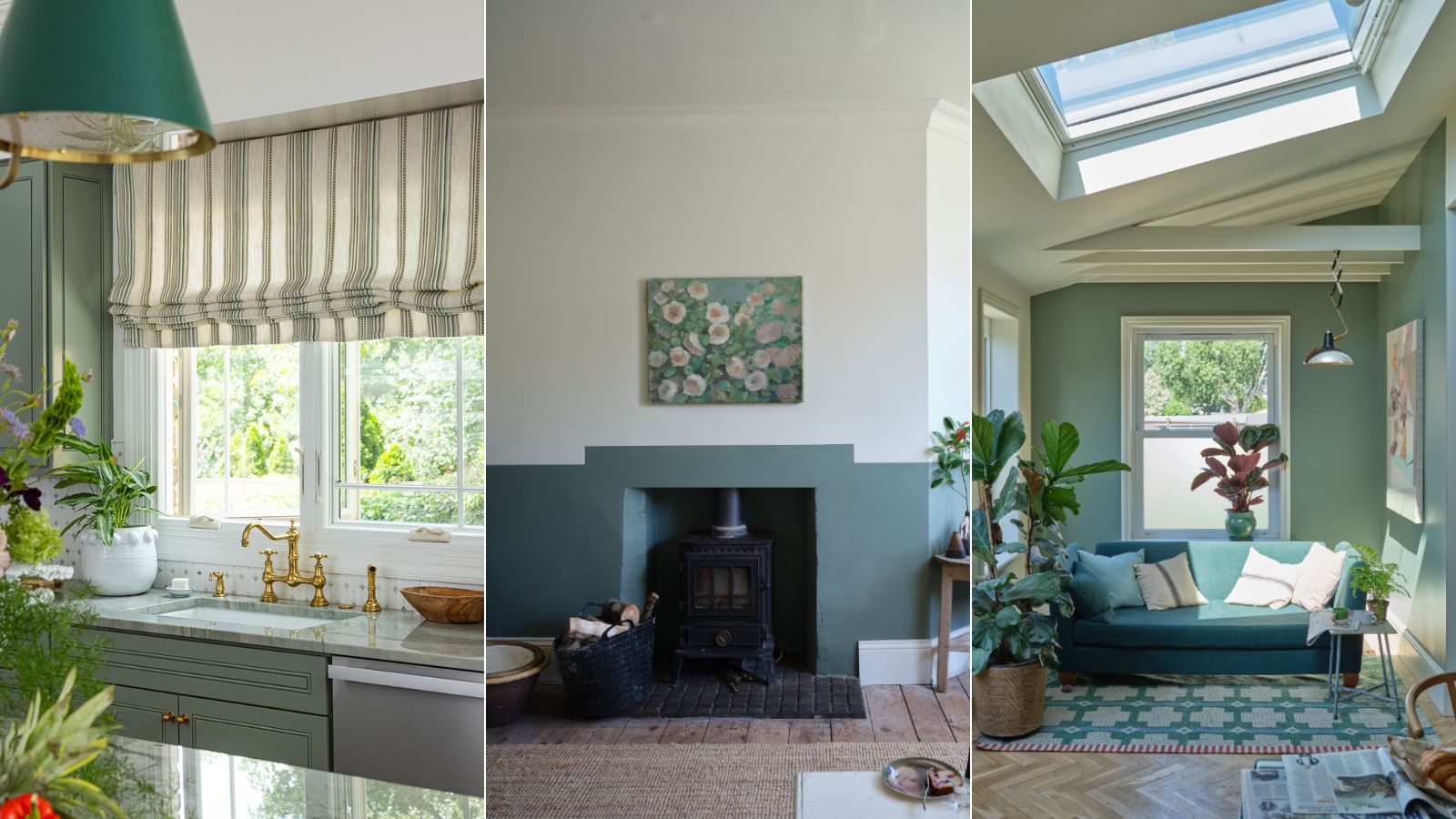

This year, we've seen lots of love for green in interior design, from dark forest greens to lighter sage green. A timeless color that brings with it a calming quality thanks to its association with the natural world, there are many good reasons to embrace this hue.
When considering which green paint to incorporate into your home, we'd recommend Farrow & Ball's Card Room Green. Not too saturated, this grown-up gray-green bridges the gap between neutrals and color.
Here, we explore all you need to know about this green paint. From colors to pair it with to the best rooms to use it in, read on to gain inspiration for your Card Room Green color scheme.
What color is Card Room Green?
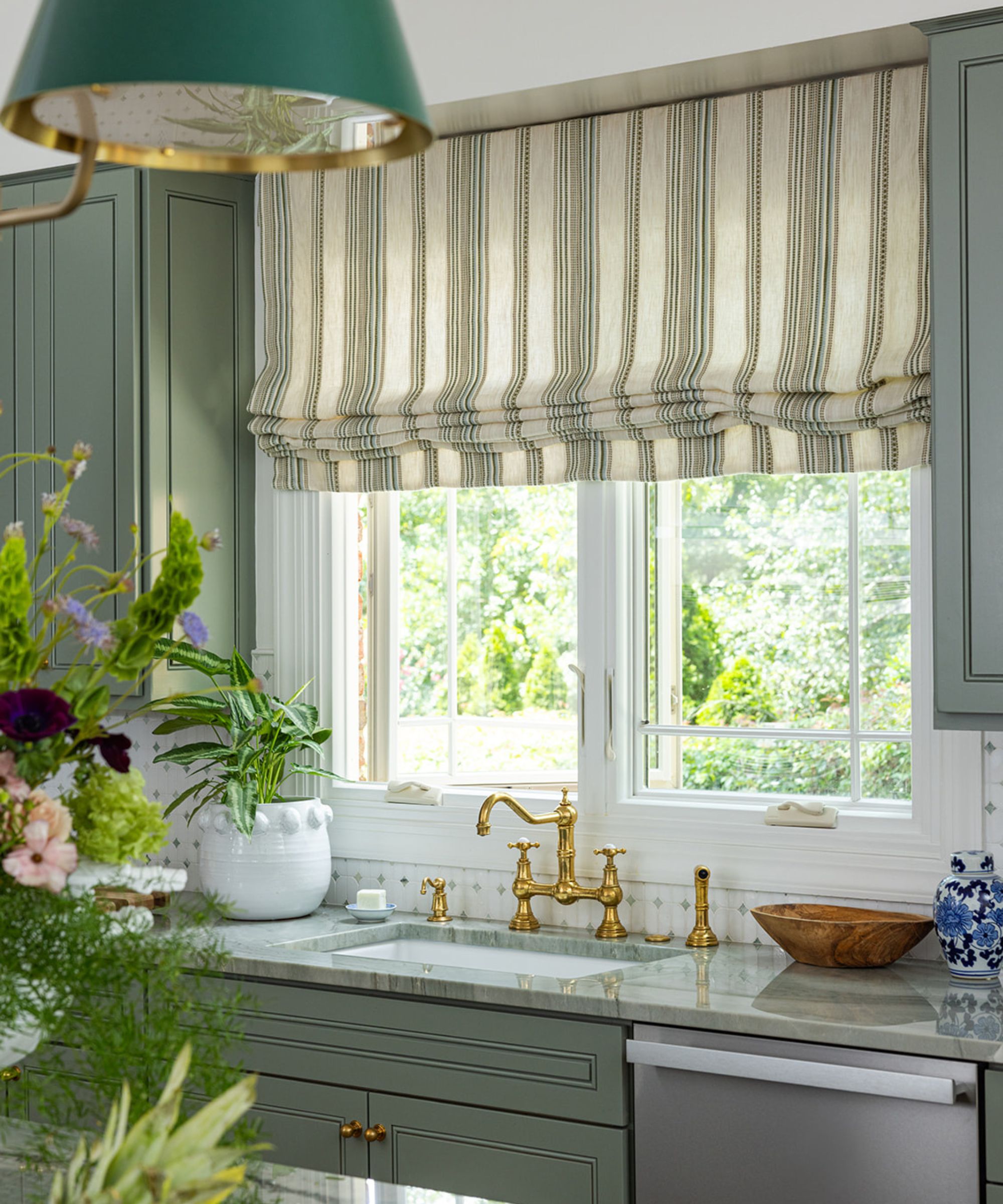
Farrow & Ball's Card Room Green is a gray-green paint, meaning that it isn't as saturated as brighter greens due to the grounding quality of the gray. Green is considered by many to be a neutral color, and this feels especially true for Card Room Green. Working as a darker, warming neutral, Card Room Green feels both soothing and welcoming, as seen in this kitchen designed by Charlotte-based interior designer Alexis Warren where it is used across the kitchen cabinets.
'I adore its muted and sophisticated tone,' says Jessika Gatewood of Gatewood Designs about this popular green paint. 'It’s the perfect shade for creating a calming and timeless space, whether in a study, dining room, or cabinetry. Its versatility allows it to work beautifully with natural wood finishes, brass hardware, and even a hint of blush for contrast.'
If you're wondering how this paint compares to other Farrow & Ball shades, it's not dissimilar to French Gray, but darker, according to designer Skip Sroka of Sroka Design: 'To me, Card Room Green is a deeper version of a French Gray with a bit of green.'
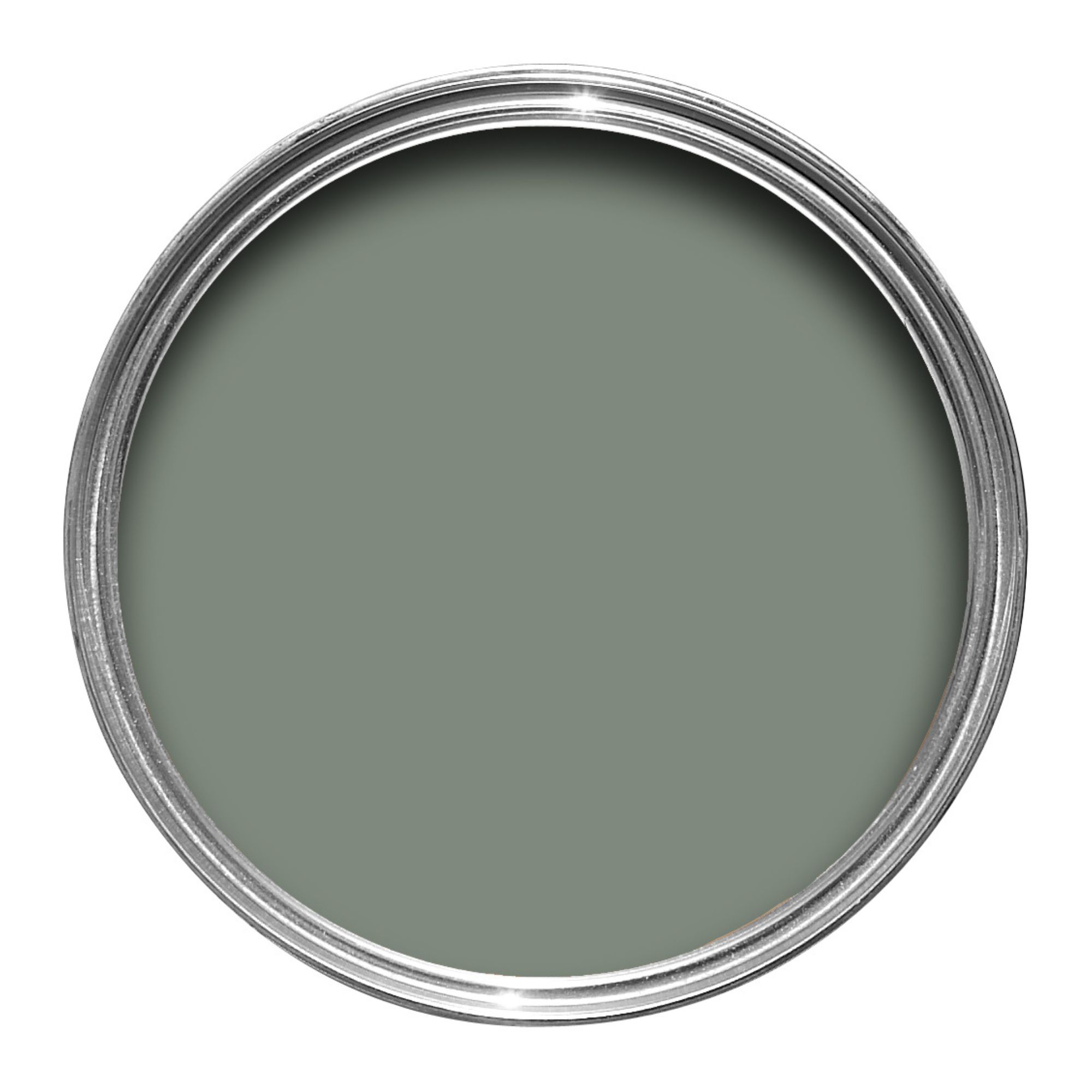
A mix of green and gray, Card Room Green feels grounding and liveable, allowing you to add color to your space while benefiting from a calming, timeless feel.
How to decorate with Card Room Green
Green is known to be a flattering paint color that pairs well with most other hues, making Card Room Green a paint color that's fairly easy to incorporate. That said, we've rounded up a few of our favorite ideas below to help you on your way.
Use Card Room Green as an accent color

You don't need to use this paint color liberally – using it in smaller proportions, whether on furniture or teamed with white paints can be just as effective, suggests Patrick O'Donnell, brand ambassador at Farrow & Ball:
'If you have some furniture in your bedroom that could do with a refresh, try painting it in Card Room Green for a pop of color. Its sober tone will sit beautifully when contrasted with Setting Plaster or a warm neutral such as Off White.'
'Alternatively, try pairing with Shaded White, a softly nuanced neutral with an underlying note of green. In this case, Card Room Green would complement beautifully as you are pulling the green tones from your neutral,' adds Patrick.
Create a welcoming living space
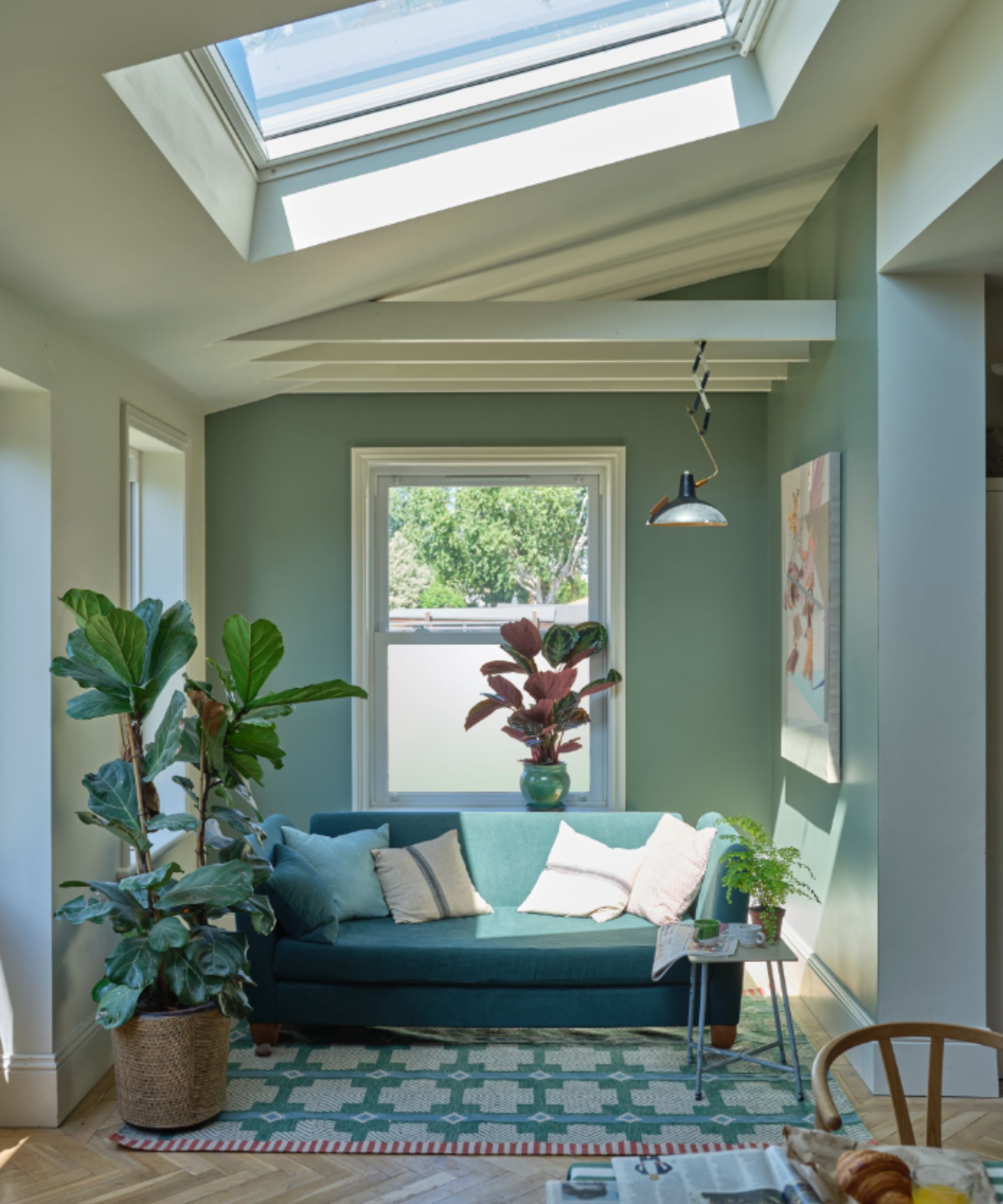
If you're looking for a new paint color for a main living space in your home, whether that be a kitchen or living room, consider using Card Room Green to add more interest than lighter neutrals while maintaining a classic look.
'Farrow and Ball’s Card Room Green is one of our go-to paint colors for its enveloping and cozy essence – it is so easy to build a scheme around this color,' says Ryan Kopet of Miles & Kirk Design. 'Inspired by nature, I don’t know anything that does not look fabulous with green. We especially love it as a unifier in a space with lots of doorways and windows. Card Room Green can cut through the formality of a living room and instantly make it more comfortable and personal.'
Pair Card Room Green with wallcoverings
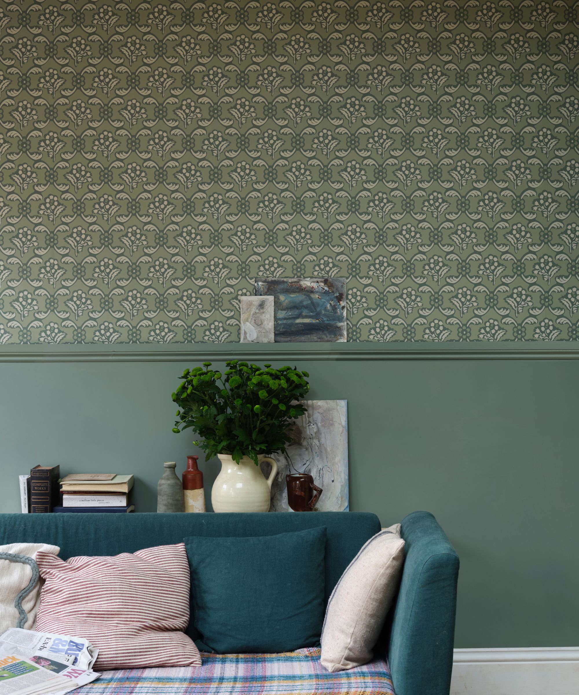
Since Card Room Green has a muted quality to it, it plays well with traditional decorating ideas. One way to emphasize its vintage look is to pair it with patterned wallcoverings with a delicate, heritage feel.
'We love to use colors like this as trim, paired with a complementary wall covering that brings out the warm greens,' says Kevie Murphy, principal and CEO at KA Murphy Interiors.
Similarly, incorporating pattern through soft furnishings is another designer-suggested way to make the most out of this green paint: 'I love this fabulous greenish tone for the way it looks different in many lights; for the bold backdrop it gives to a room; and against a floral drape, it really sings!' says Maggie Griffin, founder, and principal designer at Maggie Griffin Design.
Create a restful bedroom
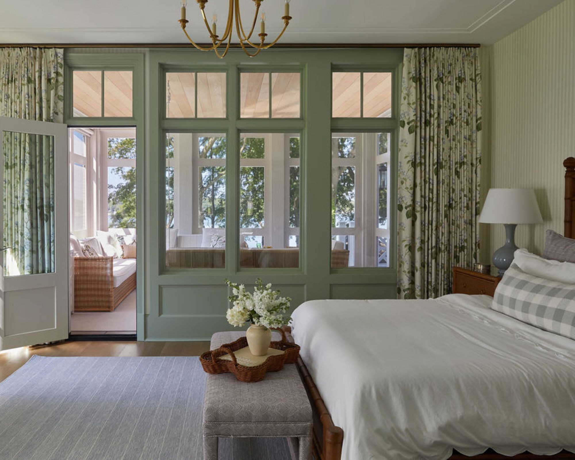
It's not just social rooms where Card Room Green shines, but calming spaces like bedrooms too. In this guest bedroom designed by Elizabeth Taich Design, Card Room Green used as an accent color aids in creating a restful feel, while pairing wonderfully with the whites and creams throughout.
'Spring is what I think of with Farrow & Ball's Card Room Green,' says Elizabeth Taich. 'It pairs so well with florals and gives that subtle punch to a room without overpowering other elements. It's just calming. Everyone who walks into this guest bedroom immediately calls dibs on it.'
Whether used in a kitchen to complement a light neutral color scheme or applied boldly to create a cozy living room, Card Room Green is a flattering shade that makes a go-to paint color for many rooms.
Sign up to the Homes & Gardens newsletter
Design expertise in your inbox – from inspiring decorating ideas and beautiful celebrity homes to practical gardening advice and shopping round-ups.

Emily is a freelance interior design writer based in Scotland. Prior to going freelance in the spring of 2025, Emily was Homes & Gardens’ Paint & Color Editor, covering all things color across interiors and home decor for the Homes & Gardens website. Having gained specific expertise in this area, Emily is well-versed in writing about the latest color trends and is passionate about helping homeowners understand the importance of color psychology in home design. Her own interior design style reflects the simplicity of mid-century design and she loves sourcing vintage furniture finds for her tenement flat.
-
 Jeremiah Brent's new NYC-inspired rug collection has got to be the easiest way to bring his modern Manhattan style into your own home
Jeremiah Brent has teamed up with Loloi Rugs to create a contemporary collection of home furnishings inspired by his city
By Eleanor Richardson
-
 I tried this one easy dishwasher trick and made the annoying need for manual drying a thing of the past
If you hate those little pools of water left on your cups and crockery, this towel trick is for you
By Punteha van Terheyden