These 6 paint colors from Farrow & Ball are equal parts calming and cozy – here's how to use these beyond-the-trend shades
From soft neutrals to soothing blues, these Farrow & Ball shades have much to offer
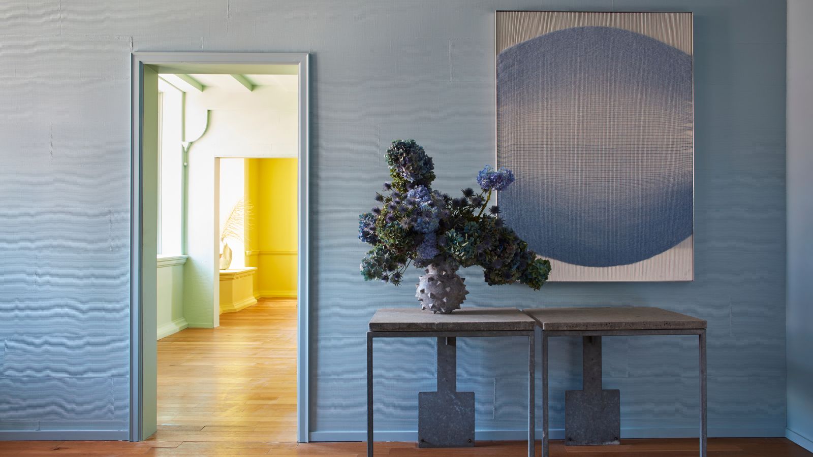

Calming and cozy are two much-desired moods when creating interior color schemes. While you may think of certain colors as calming and others as cozy, the good news is that certain shades can indeed do both.
Taking to Instagram, Farrow & Ball recently shared a paint palette of six cozy and calming colors, ranging from soft and warm neutrals to natural-world-inspired blues and green.
We spoke to a Farrow & Ball color expert to uncover all about these timeless shades, which work well in so many rooms, from bedrooms to bathrooms; living rooms to hallways.
A post shared by Farrow & Ball (@farrowandball)
A photo posted by on
1. Pointing
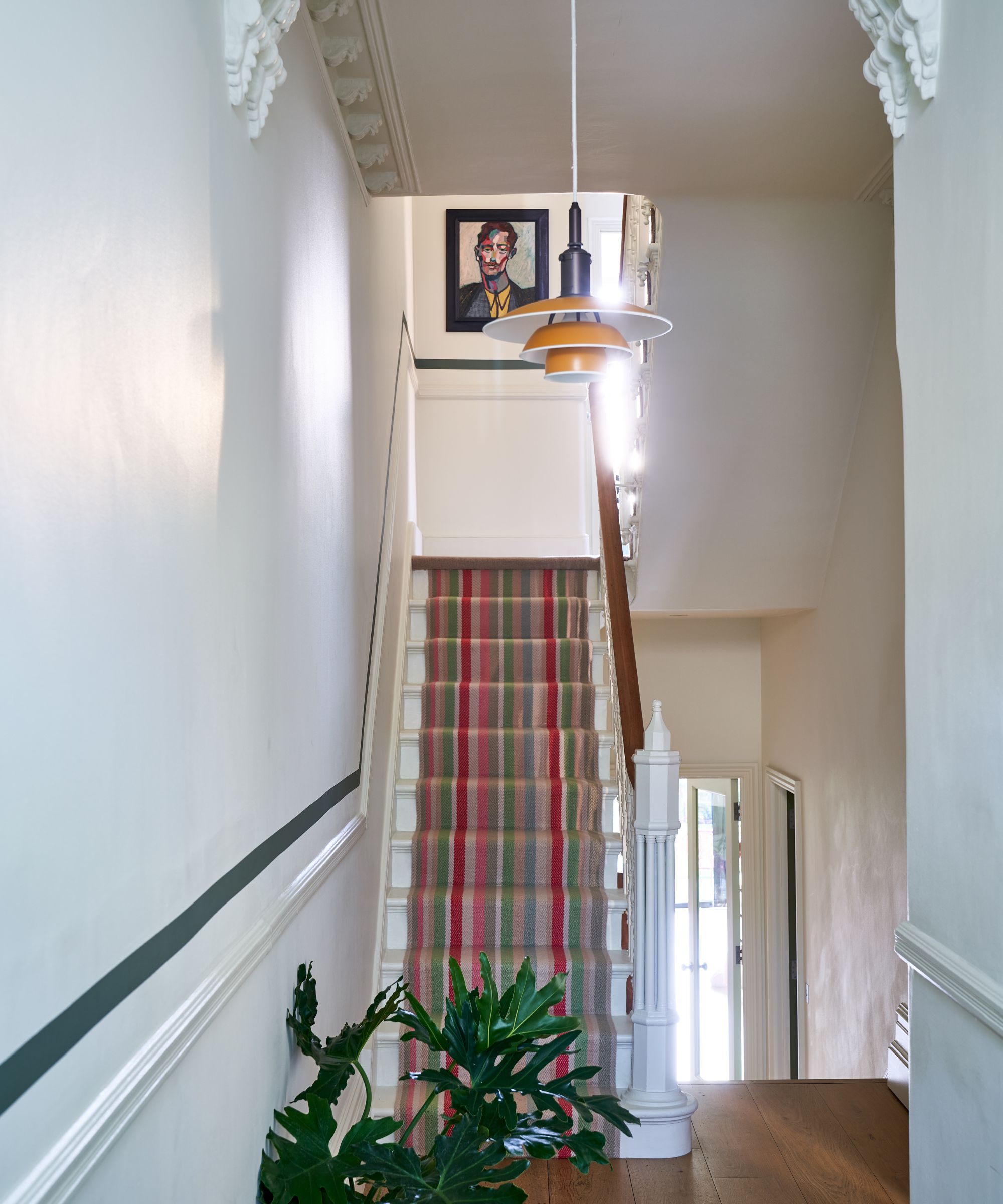
Farrow & Ball's Pointing
If you've ever sought the perfect white paint, you can probably attest to how much of a minefield it is. From warm white paints to cooler whites, it's not always too easy to know which is best suited to your space, especially with natural light that will change how the color appears throughout the day.
As a general rule, south-facing rooms can handle pure whites and those with cooler undertones thanks to the generous amounts of warm sunlight they receive. On the other hand, cooler north-facing rooms are better with warm whites, where the undertones will feel balanced against the cooler light.
'For north-facing rooms, a clean white can simply feel too chilly. Pointing is a great option due to its underlying mellow red tones,' explains Patrick O'Donnell, brand ambassador at Farrow & Ball.
In this hallway, Farrow & Ball's Pointing creates an undisturbed, calming backdrop, while the warm undertones create an inviting feel, which stark whites would fail to do.
2. Dimity
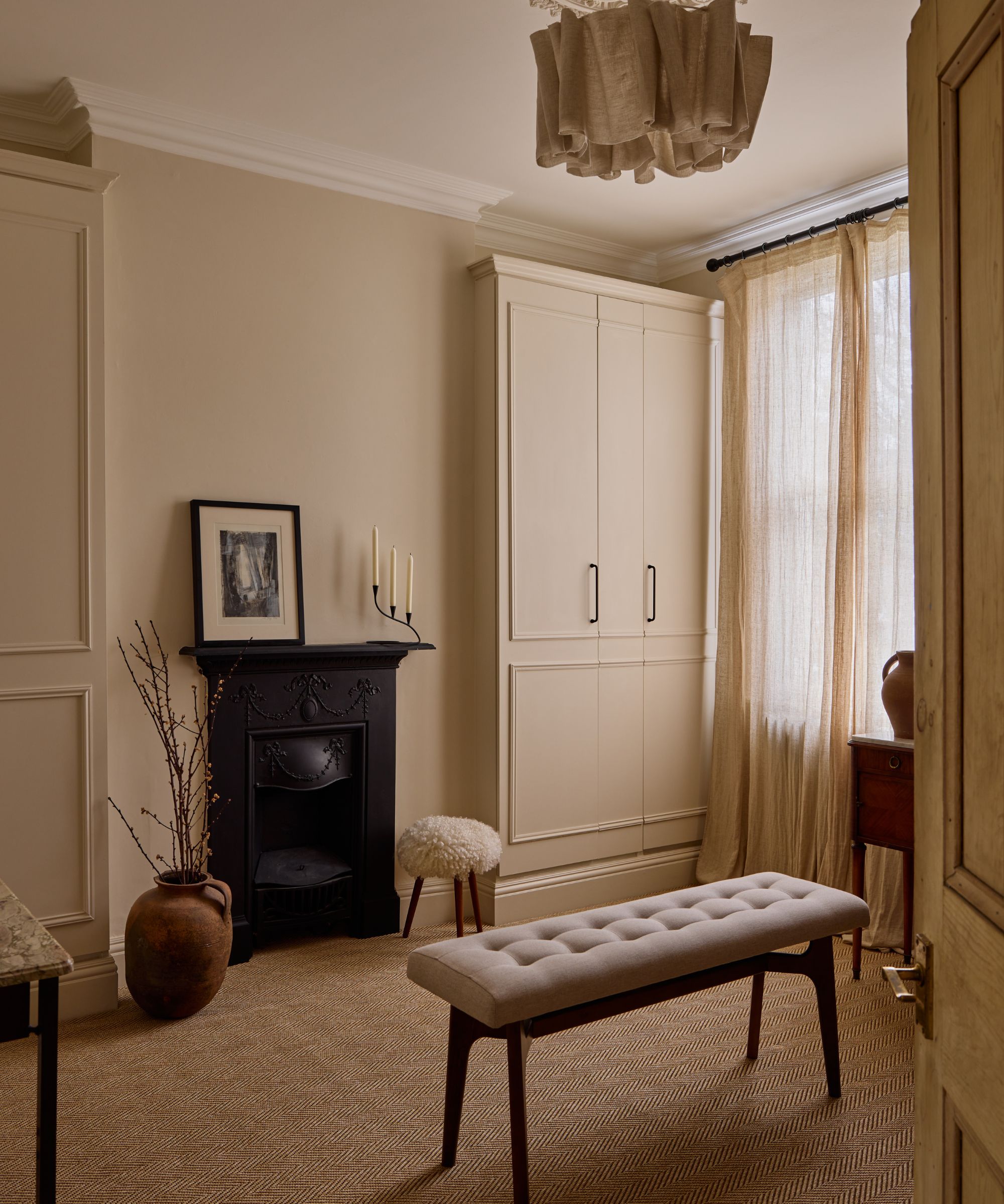
Farrow & Ball's Dimity
If you're looking for a neutral paint that offers a bit more warmth than white, look no further than Farrow & Ball's Dimity. A delicate and light taupe, this is a go-to paint color for a cozy yet calming color scheme.
'Dimity also contains underlying red tones, meaning it pairs very well with warming reds. For a relaxing scheme, try pairing it with a red-based brown like London Clay,' suggests Patrick.
Used on the walls in this dressing room, Dimity creates the ultimate calming and cozy feel, complete with neutral decor and plenty of texture to help add depth.
3. Tailor Tack
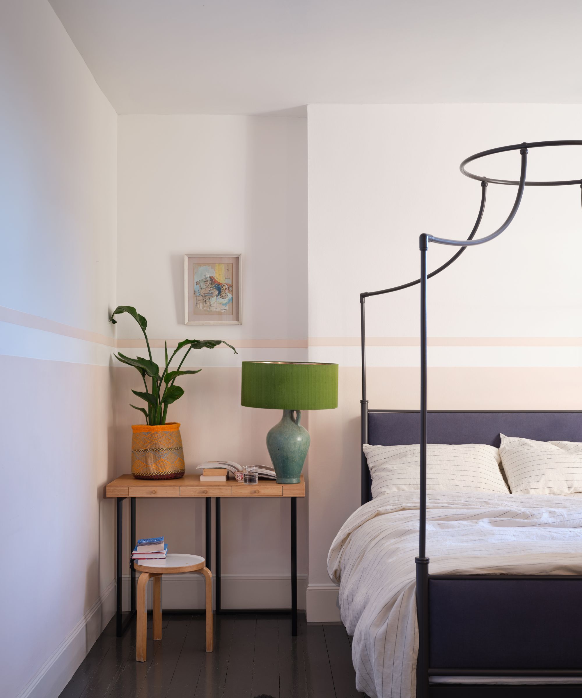
Lower walls: Farrow & Ball's Tailor Tack
Pink paints are another good idea for a subtly cozy and calming space. The lightest pinks, such as Farrow & Ball's Tailor Tack which was used on the lower walls in this relaxing bedroom, provide a warming glow while offering a bit more color than typical neutrals.
'Tailor Tack is a pink-tinged off-white shade, making it a lovely choice for someone looking to introduce pink in a more subtle way,' says Patrick.
If you're looking for the best white paint to pair with this soft pink, Farrow & Ball recommends Wimborne White which offers just enough subtle warmth to complement Tailor Tack.
4. Eddy

Farrow & Ball's Eddy
Calming colors aren't just about neutrals. In fact, green paints are some of the most soothing out there thanks to their association with the natural world, and Farrow & Ball's Eddy is light enough to leave rooms feeling undisturbed and quiet.
'A green-based grey can also provide a sanctuary of calm, with delicate colors like Eddy used across walls, woodwork, and ceiling. This shade will act as almost neutral and is easy to layer with other shades and a multitude of textures and wood tones,' explains Patrick.
Here, it is aptly used in a nursery room but you could take this color to any space that aims to feel calming with a hint of cozy color, from home offices to bedrooms.
5. Hazy
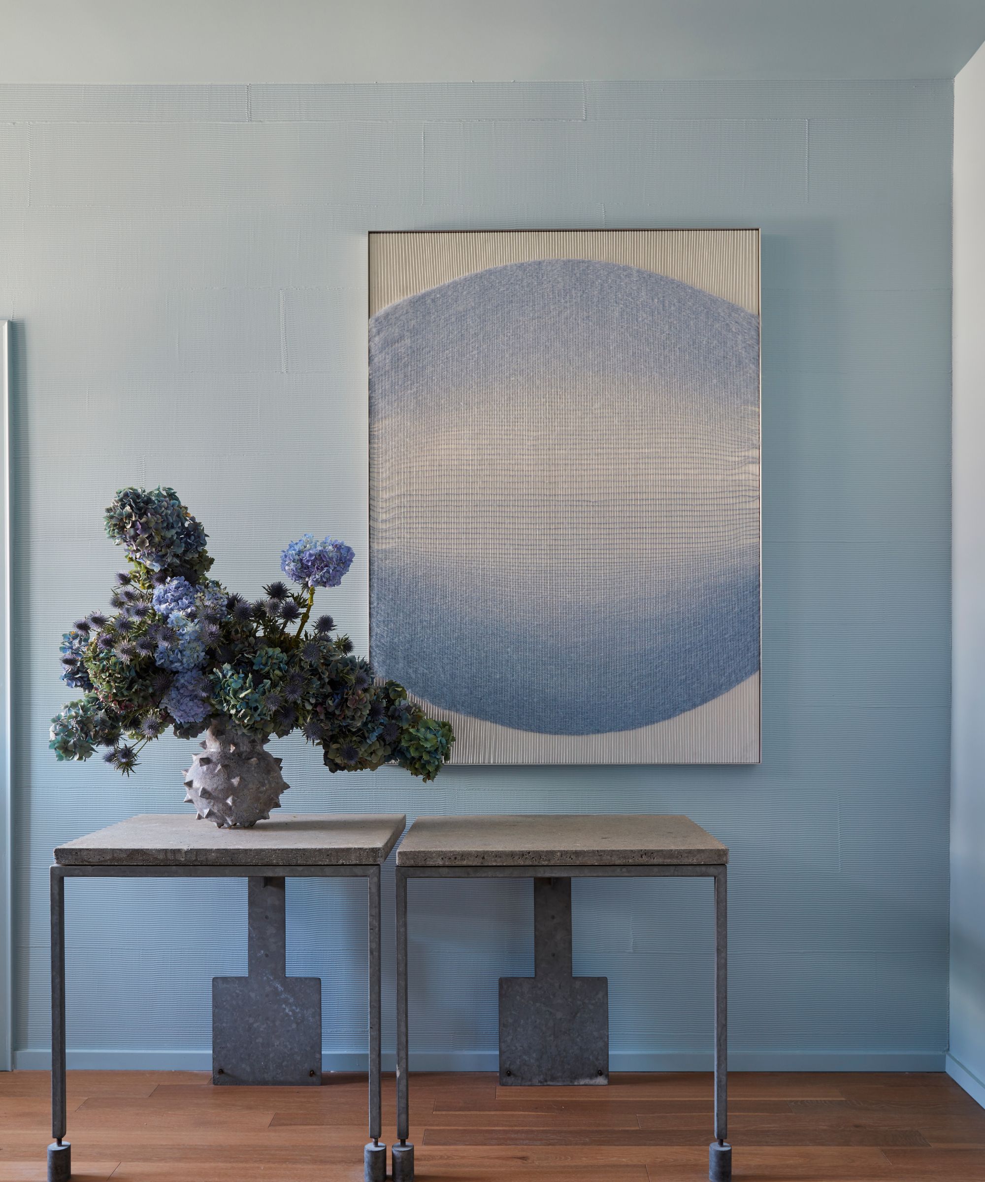
Farrow & Ball's Hazy
Blue is another calming color, and pale blue paints can also offer a cozy feel, much like Farrow & Ball's Hazy. A light blue-gray, this color isn't too lively but liveable and easy to incorporate across many interior design styles.
'Hazy is a cleaner version of Parma Gray and just begs to be used in a sun-drenched room. A perfect choice for those blessed with a coastal home – it ticks all the nautical boxes with its fresh notes. Team very simply with a flattering clean white such as Wevet for your woodwork and ceiling,' Patrick advises.
6. Ultra Marine Blue
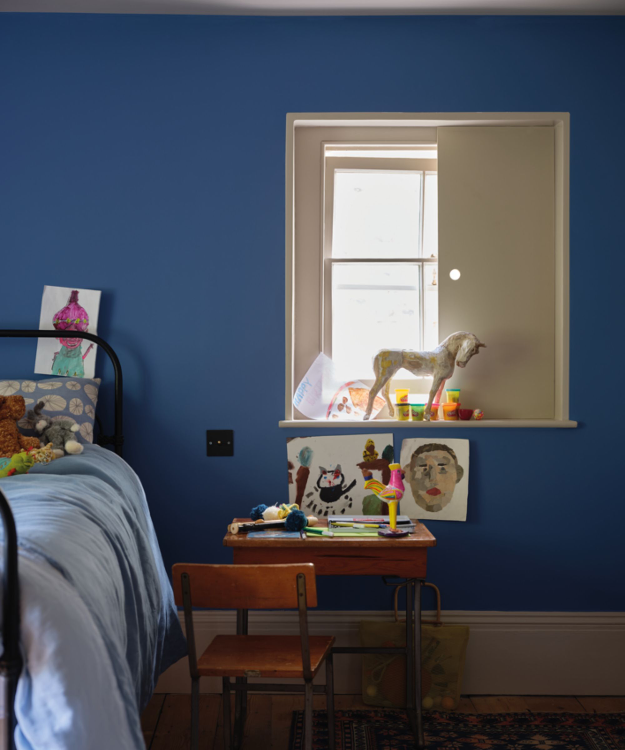
Farrow & Ball's Ultra Marine Blue
Dark blue paints are a great way to enhance the cozy feel of a bedroom, while of course still benefiting from the soothing appeal of blue. In this children's bedroom, Farrow & Ball's Ultra Marine Blue was used on the walls – an excellent color choice for a color-drenched scheme that feels snug and embracing.
That said, Patrick says this dark, coastal-inspired blue works just as well for bathroom color ideas: 'Ultra Marine Blue looks lovely in a bathroom for a coastal feel. This clean blue pairs well with the classic white sanitaryware that most of us have. Pair with All White on your woodwork and carry Ultra Marine Blue onto the ceiling for a design statement.'
From warm neutrals to soft blues and green, these paint colors offer timelessness, enduring beyond the latest color trends. Bear in mind that when decorating with these colors, it's important to sample them to see how natural light interacts with them, especially with the subtly nuanced neutrals amongst them.
Sign up to the Homes & Gardens newsletter
Design expertise in your inbox – from inspiring decorating ideas and beautiful celebrity homes to practical gardening advice and shopping round-ups.

Emily is a freelance interior design writer based in Scotland. Prior to going freelance in the spring of 2025, Emily was Homes & Gardens’ Paint & Color Editor, covering all things color across interiors and home decor for the Homes & Gardens website. Having gained specific expertise in this area, Emily is well-versed in writing about the latest color trends and is passionate about helping homeowners understand the importance of color psychology in home design. Her own interior design style reflects the simplicity of mid-century design and she loves sourcing vintage furniture finds for her tenement flat.
You must confirm your public display name before commenting
Please logout and then login again, you will then be prompted to enter your display name.
-
 Kevin Bacon and Kyra Sedgwick's rustic kitchen island is stunning, but controversial – designers say you can get the look without the hassle
A popular material finds an unorthodox home in the couple's kitchen, but experts disagree on whether it should be used – here's how to do it instead
By Sophie Edwards
-
 How to grow grapefruit for homegrown sweet and tangy, highly nutritious harvests – a fruit tree expert shares their planting and care tips
From planting to harvesting, this is all you need to know about grapefruit trees
By Drew Swainston