Exterior paint trends 2025 – 8 stylish color ideas for the outside of your home
These are the most stylish exterior paint trends for the year ahead, as explained by industry experts
Emily Moorman
Unlike painting a room inside your home, the exterior paintwork is often a far more costly and time-consuming job, so it's key that you opt for a color you truly love.
While neutrals will always be the most enduring exterior paint colors, working well across many contexts and architectural styles, there's a wide range of stylish and adventurous paint trends to explore.
Here, we enlisted industry experts who share the top exterior paint trends for 2025. From earthy colors to natural wood stains, there's much inspiration to be had. With these trends and by using the best exterior paints, your home exterior is bound to look great for years to come.
Exterior paint trends for 2025
'It’s fantastic to see a shift in the use of color for outdoor spaces. Whilst color schemes are often in keeping with a property’s period, many are embracing the use of color to create characterful, statement exteriors,' explains Ruth Mottershead Creative Director at Little Greene.
'The color confidence we have seen in recent years within interiors is certainly impacting choices in outdoor areas too. Rather than being treated separately, we are seeing interior design schemes and the use of color being taken outside, extending the color palette within the home to create a sense of flow.'
1. Earthy colors
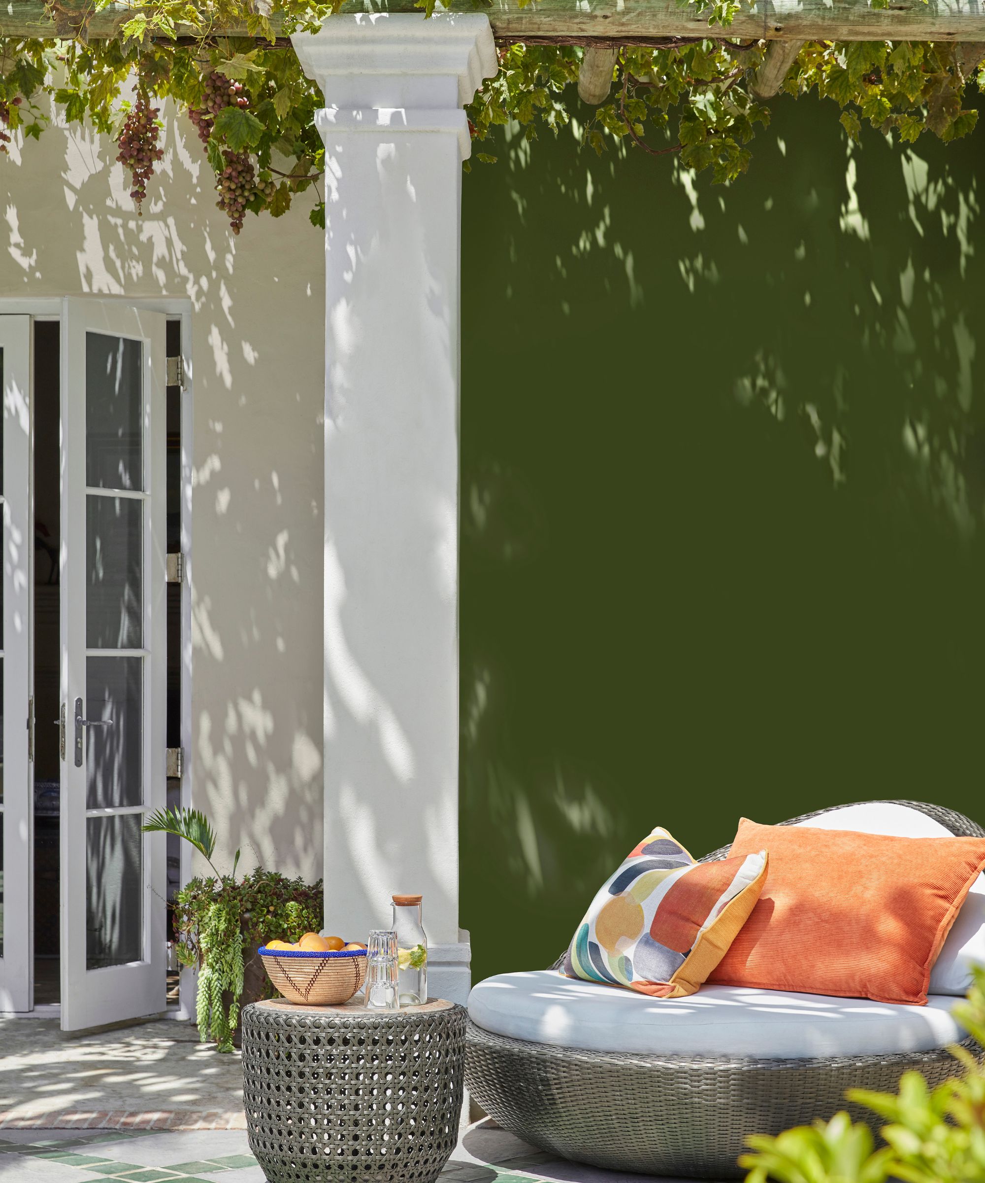
Much like the most popular interior color trends, you can expect earthy colors to lead the way across exterior paint ideas this year.
'Exterior decorating trends are very much following those we are seeing in interiors, with rich, warm, brown-based tones and earthy natural colors being embraced alongside more traditional coastal blues and sea greens,' says Ruth Mottershead.
'The use of forest, emerald, and leaf greens such as Hopper, Goblin, and Mid Azure Green in exteriors is on the rise too, with transitional spaces and garden areas being drenched in glorious greens. By using green as a backdrop to planting, you can extend and enhance the feeling of being enveloped by the natural world,' says Ruth.
2. Wood stains
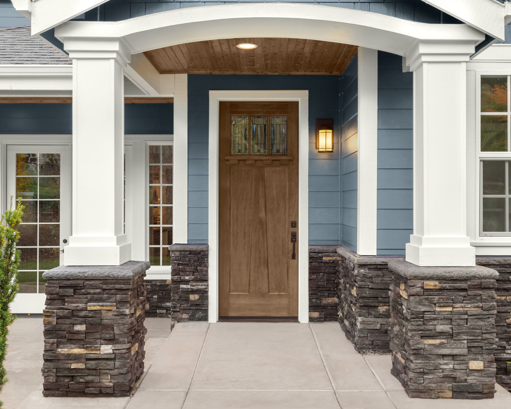
In 2025, we expect to see plenty of popularity for wood stains for a more natural look that makes the most of the natural tones of wood.
'In New England, I work often with cedar shingle siding as it ages beautifully with the climate and is sustainably sourced,' says designer Kathryn Hunt of Kathryn Hunt Studio. 'Cedar oils are a natural pest repellent also aiding in the longevity of the materials. Young untreated cedar when first installed is a warm honey tone and will age to gray over time which is the ideal look clients want.'
'I like a semi-solid or semi-transparent stain such as Benjamin Moore’s Woodlux exterior stain. This product allows us to provide the aged look from the beginning and helps the transition to the natural gray cedar. This product is water-based and has a low VOC rating. We then accentuate with a painted fascia and window trim and an accent color for doors and shutters. We like Benjamin Moore Regal Select MoorGlo Soft Gloss Exterior Paint,' adds Kathryn.
Sarah Latham of Latham Interiors is also a fan of wood stains for the year ahead, adding: 'An exterior paint color we are drawn to lately is something that combines well with natural wood paneling. We are using more stains that are semi-transparent or opaque to complement the mountain architecture in our area.'
3. Neutrals
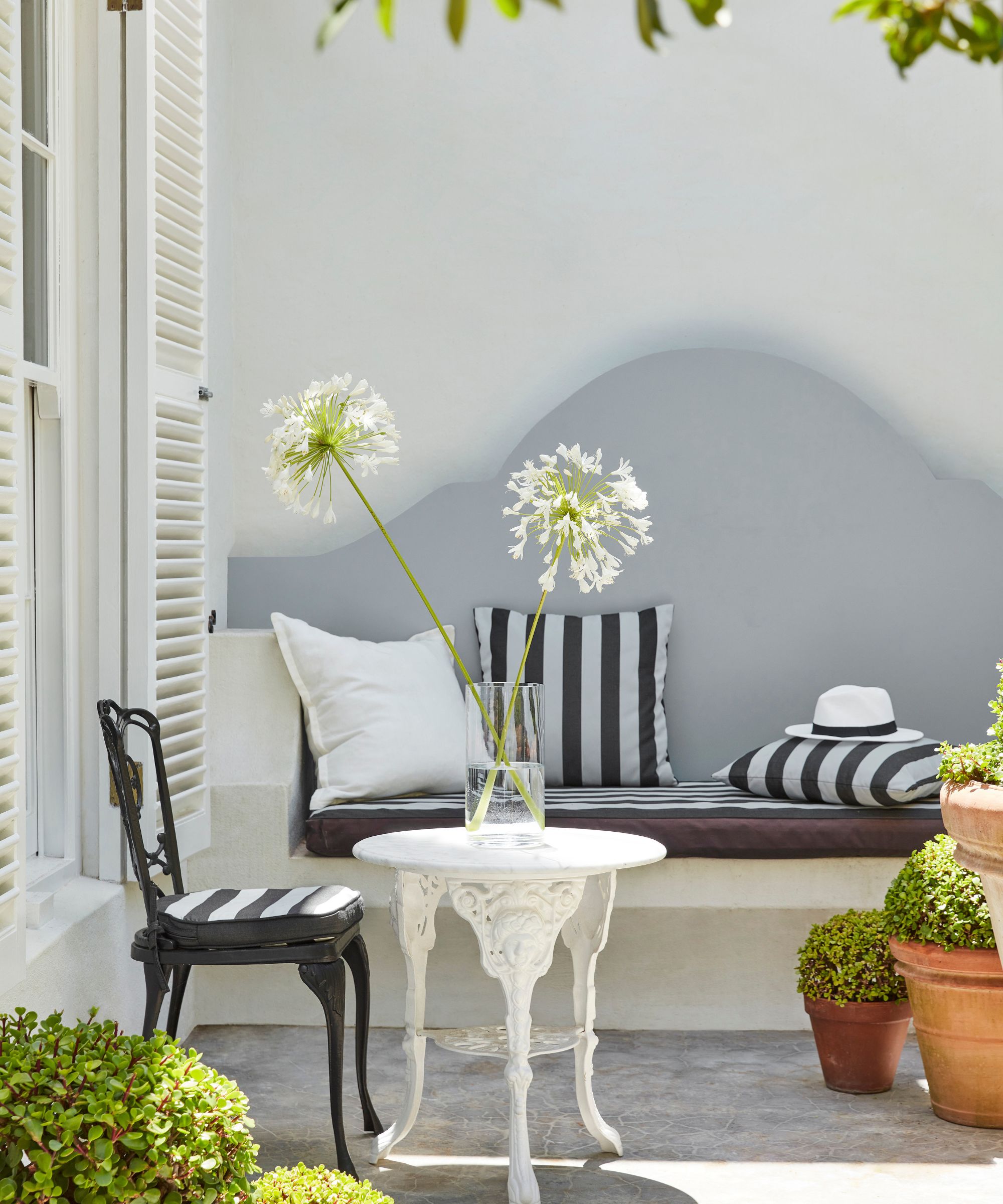
You can't go wrong with neutral paints for a home's exterior, maintaining a timeless look year long. For 2025, designers point to these enduring shades for a classic look.
'We attempt to avoid being too trendy with any of our designs,' says Chicago-based designer Andrea Goldman. 'That said, we always want to avoid selecting a paint color for the exterior of a home that will feel outdated quickly. We also prefer paint colors that have a warmer base and undertone, which is always more welcoming and works well with other exterior materials such as cedar shakes and wood-tone trim and doors.'
'Our favorite white paint for both outside and inside is Benjamin Moore’s White Dove due to its warm qualities without going too yellow. We also love a deep grey (Benjamin Moore's Gunmetal) or warm black (Benjamin Moore's Cheating Heart) for the exterior,' adds Andrea.
4. Pastels
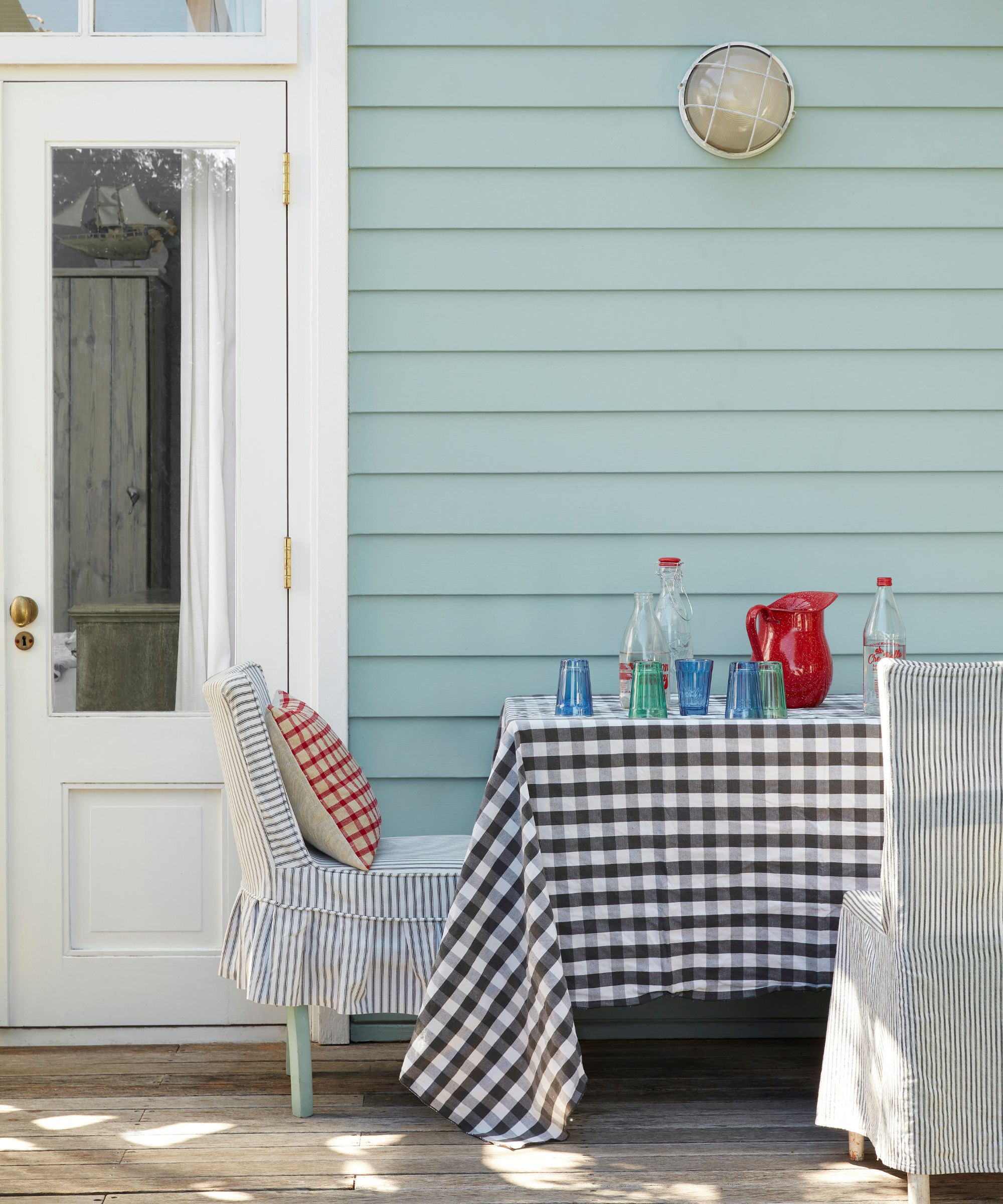
If you prefer a more colorful approach with your exterior colors, uplifting pastel tones are another predicted color trend, says Ashley McCollum, color expert, Glidden brand:
'While the idea of “reflecting one’s individuality” made its debut in 2024, you can be sure it will persevere in 2025. Playful pastels reflect a sense of creativity and can make a statement without being overly bold or intrusive. Pastels are known to evoke positive emotion, so whether you choose to promote happiness and optimism with a fun yellow or bring calm and tranquility to your doorstep with an understated blue, pastels are a great way to make your home feel fresh and inviting!'
Ashley recommends shades such as Lavender Haze, Joyful, and Blue Pearl if you want to bring this color trend to life this year.
5. Dark paint colors
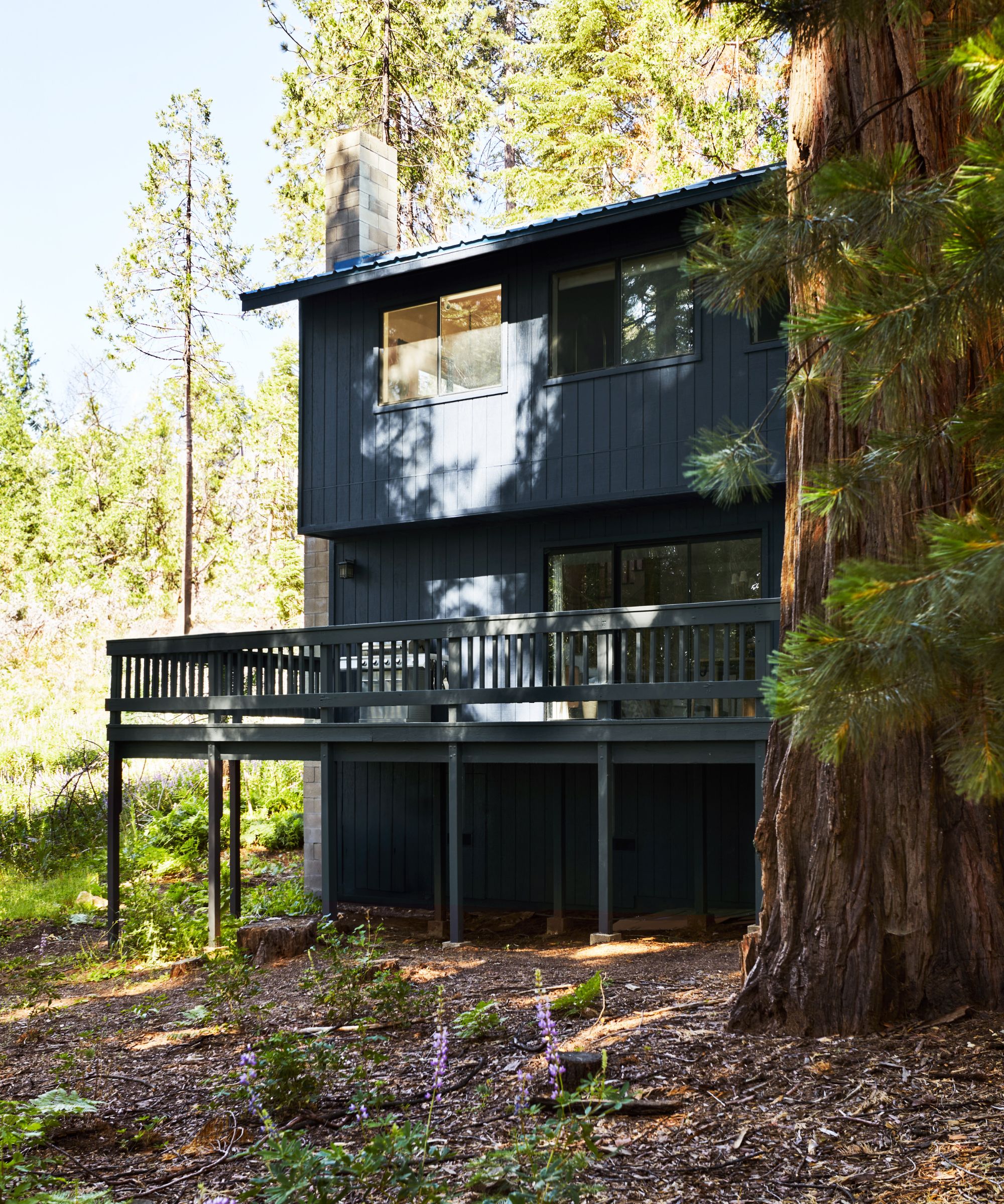
According to the experts, dark paint colors are becoming increasingly popular for home exteriors. While they aren’t for everyone, they can be a wonderful way to create a chic and edgy look. Try a brownish black or a soft black to make things easier on the eye.
‘At Clare, we do see darker colors trending upward overall and while dark shades have traditionally been viewed as a risky color choice, it seems as though customers have a growing appetite for deeper, moodier shades and are less afraid to make a bold choice’ says Nicole Gibbons, founder and CEO of Clare.
‘This exterior was previously a shade of beige and the owner wanted a dark shade to help camouflage all its imperfections and make it feel less dated and more modern. Goodnight Moon, our deep midnight blue, was a great choice. The dark shade makes the home pop, creating a strong contrast against the nature-filled setting of Yosemite where his home is located. It’s also a testament to the power of paint and how the right color can completely change the look of your home’s exterior.’
6. Colors that complement natural surroundings
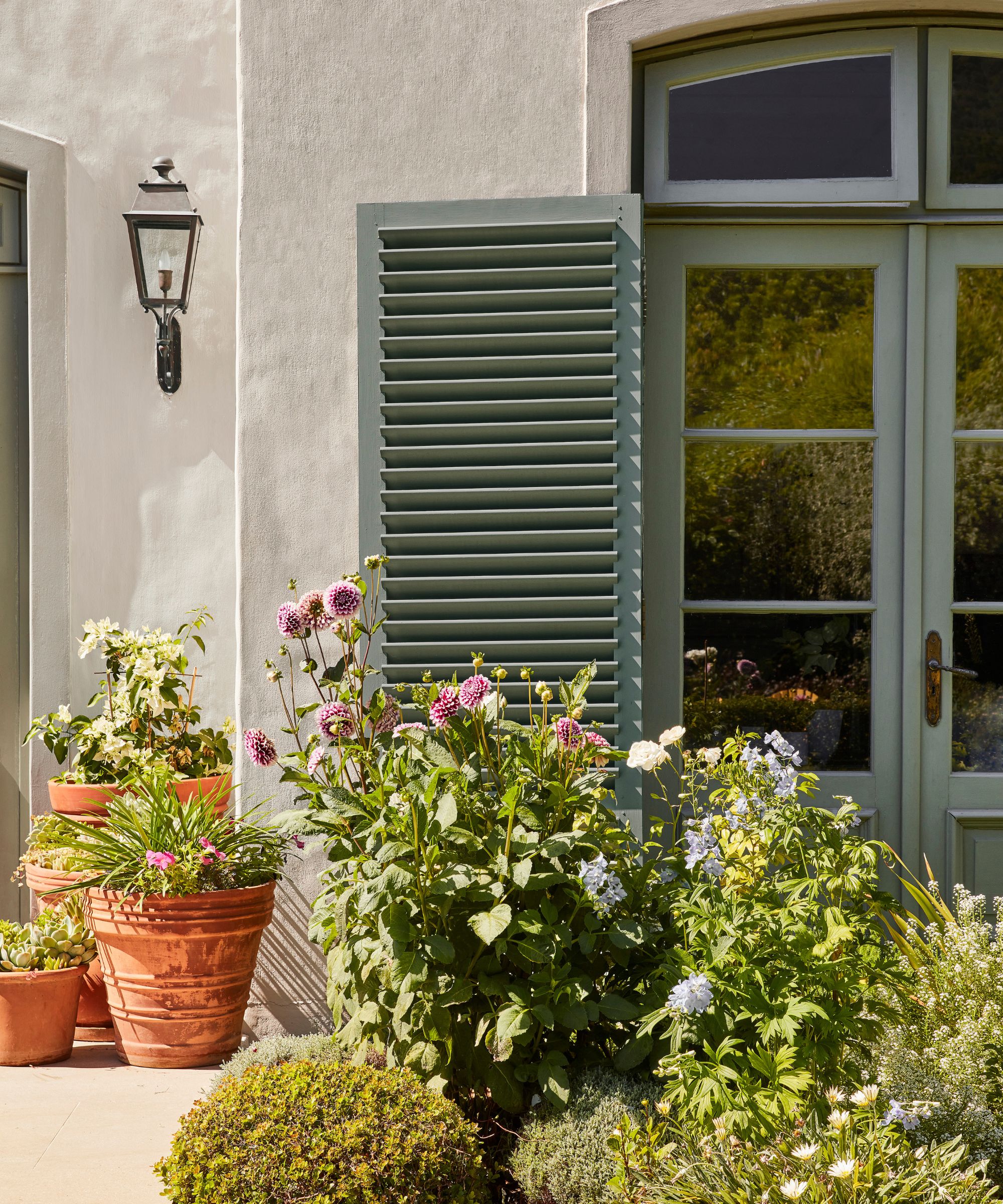
When choosing exterior paint colors architects, developers and interior designers advise drawing inspiration from the surrounding scenery to ensure the house sits harmoniously within its environment.
'Typically, we like to avoid trends when it comes to something as permanent as our client’s homes, but we have seen a shift in clients requesting more natural color palettes with darker hues that blend seamlessly into the surrounding nature. We love seeing a dark-painted home surrounded by lush landscaping,' says Cintra Sedalik, interior designer at Herlong Architecture and Interiors.
Interior designer Nitya Namya, based in India, agrees that in recent times, there has been a noticeable swing to more earthy and natural shades in exterior colors. 'Homeowners prefer colors such as sage green, muted blues or warm taupes which blend well with the nature around their houses. This increasing fashion is driven by people’s desire to have serene exterior environments that reflect the surrounding ecology.'
7. Bold colors by the patio
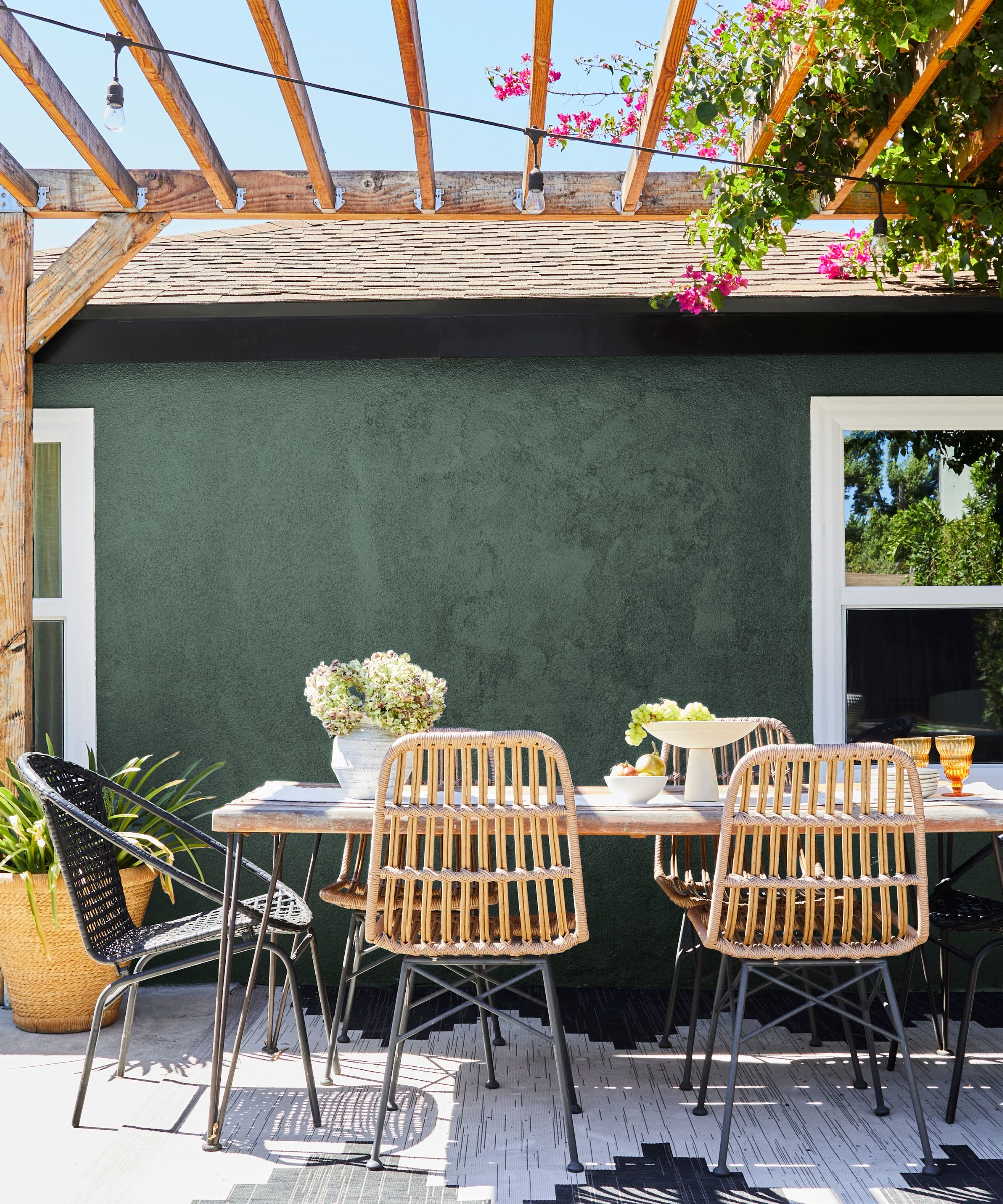
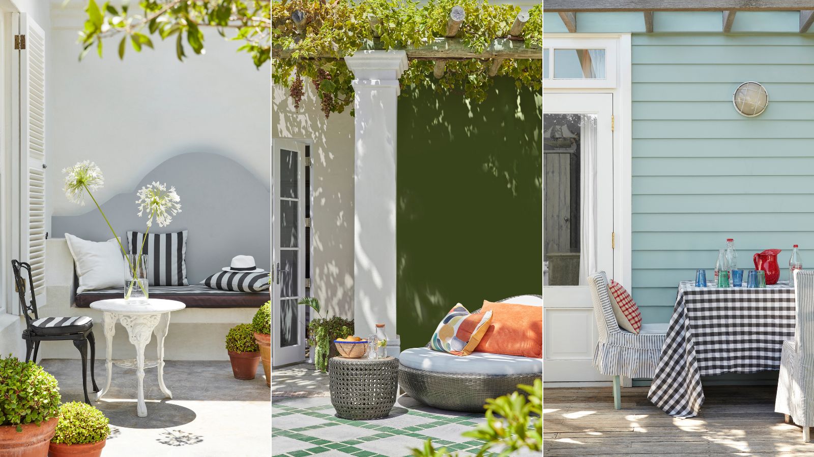
Using dark colors on walls adjacent to a patio area can be a wonderful way to bring personality to an outdoor space, and it's a trend we're noticing more and more with colors ranging from bold sunshine yellows to deep moody greens.
'Everyone’s familiar with the concept of an interior accent wall but choosing a strong accent color to highlight architectural elements of a home, or in this case, ground an outdoor living space, can really add a lot of interest to a home’s exterior color palette,' says Nicole Gibbons.
8. Bold front door colors
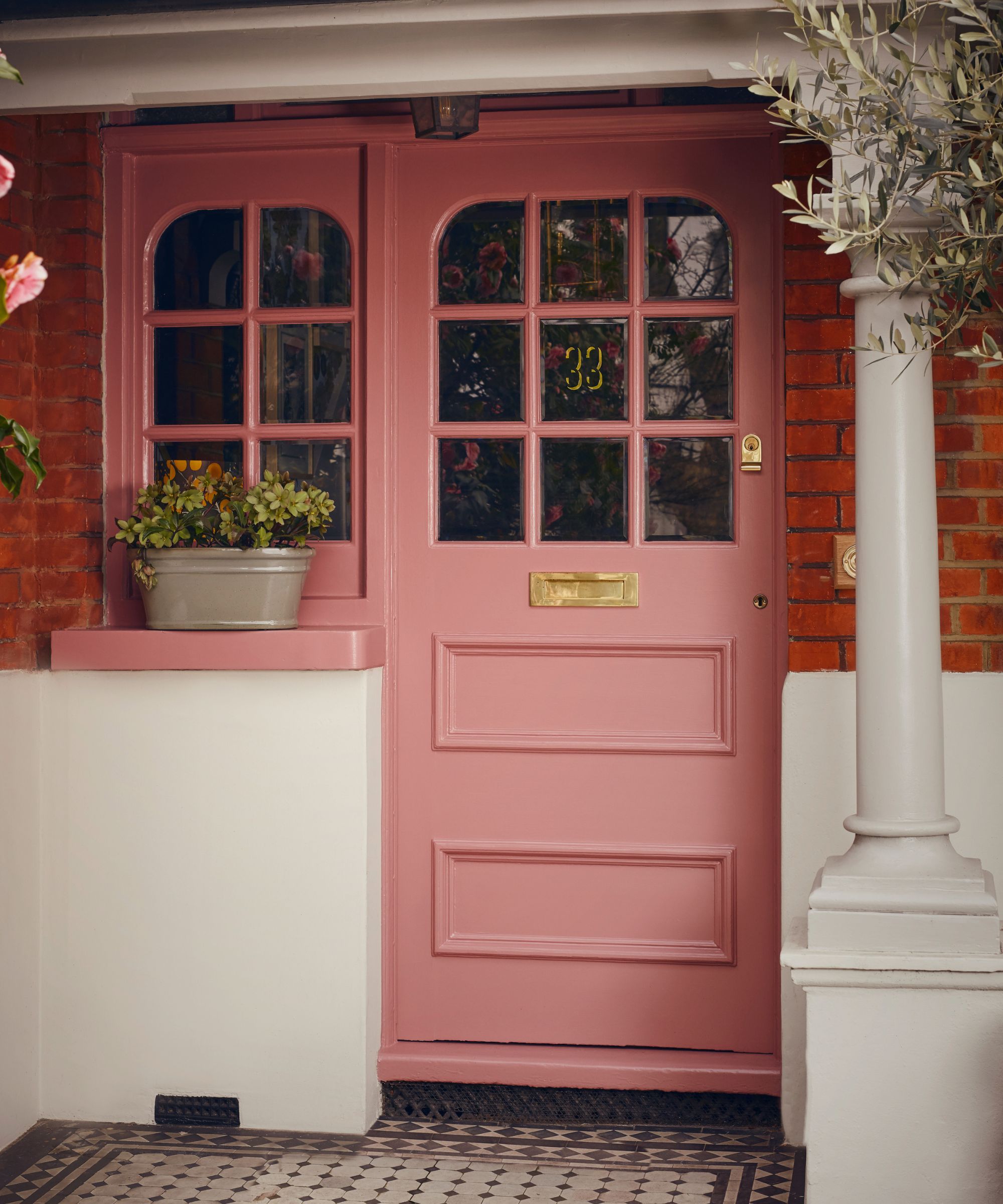
Painting the front door is an easy and quick way to stamp your personality on your home exterior and is the ultimate first impression you can make with your home. Although it's a simple DIY project that can be done over a weekend, painting a front door can make a big impact on the curb appeal of your property. Increasingly we're seeing homeowners pairing neutral walls with rich and bold front door colors and it's something noted by the color experts too.
'Enduring exterior wall colors include muted tones like Cadogan Stone No. 59 and Egyptian Grey No. 154, while doors are often in classic bolder shades like Brompton Road No. 205. We are seeing a growing popularity for red, and Blomster JB. 01 from our collection with Jinny Blom, formulated for both the interior and exterior of the home, is proving popular – try it on a window frame or front door for a pop of cheerful color,' says Dominic Myland, CEO of Mylands. 'Mixing the vibrancy and shades of exterior paints creates a dynamic look that adds character to the outside of a home, while sticking to more unified schemes allows for a seamless and sophisticated design.'
As with walls and masonry paint, the key to choosing the right shade is to be led by the architecture and your surroundings. 'When choosing your door color, think how it will respond to your brick, stone, or render. Sampling is really important before you invest in your topcoat color,' advises Patrick O'Donnell, brand ambassador at Farrow & Ball. 'We are loving ox blood reds such as Deep Reddish Brown in Full Gloss against red brick and Inchyra Blue in Exterior Eggshell looks beautiful against most stonework.'
To ensure the color and paint treatment you choose will endure over the years, be sure to take into account the context of your home, including the architectural style and its surroundings.
Sign up to the Homes & Gardens newsletter
Design expertise in your inbox – from inspiring decorating ideas and beautiful celebrity homes to practical gardening advice and shopping round-ups.

Pippa is a contributor to Homes & Gardens. A graduate of Art History and formerly Style Editor at Period Living, she is passionate about architecture, creating decorating content, interior styling and writing about craft and historic homes. She enjoys searching out beautiful images and the latest trends to share with the Homes & Gardens audience. A keen gardener, when she’s not writing, you’ll find her growing flowers on her yard for styling projects.
- Emily MoormanContributing Writer
-
 5 surprising but brilliant ways to clean with old socks – from perfectly buffing stainless steel to deterring pests naturally and more
Tackle dust in tricky corners, clean your mirrors and even banish bad odors with those rogue single socks
By Andy van Terheyden Published
-
 How to grow astilbe – expert advice on cultivating this shade-tolerant flowering perennial
Shade-tolerant and pest-resistant - astilbe are hardy and tough perennials that can thrive in many settings
By Ellen Wells Published