Explore an elegantly maximalist family home that's a 'nod to the homeowner's adventures'
Designer Mandy Cheng transformed this family home, injecting bold hues, whimsical wallpaper, and design moments inspired by travel

Design expertise in your inbox – from inspiring decorating ideas and beautiful celebrity homes to practical gardening advice and shopping round-ups.
You are now subscribed
Your newsletter sign-up was successful
Want to add more newsletters?
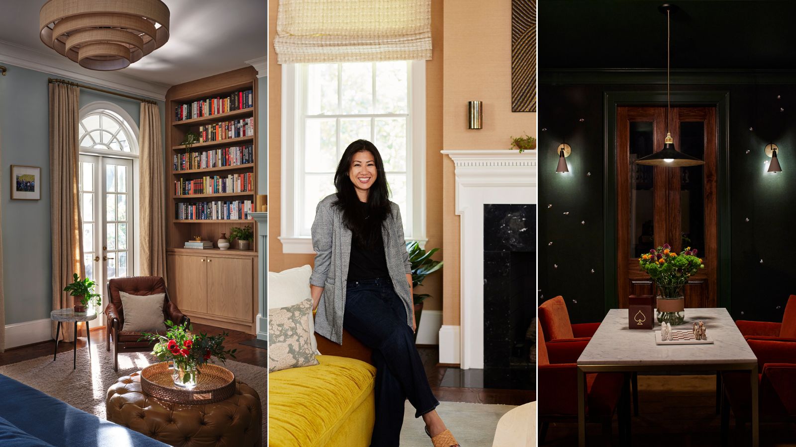
Atlanta was all new to Los Angeles-based designer Mandy Cheng when she started to transform this home. What's more, her clients were still living overseas. During planning calls conducted over Zoom, the family of five (with two dogs in tow) requested that the space feel 'young, colorful, warm, fun, and inviting.' Suffice it to say, Mandy took the direction and ran.
The final result – a 7,900-square foot home with five bedrooms – exudes character and charm, featuring bold color schemes, bespoke features, and expressive wallpaper ideas. With personality-driven rooms tailor-made for each child, and a one-of-a-kind, tropical-inspired dining room, each corner of the home is considered, chic, and cheerful.
To hear more about the design decisions Mandy Cheng made to ensure this busy family feels right at home, H&G sat down with the designer. This is what she shared about each and every room.
Article continues belowTake a tour of the colorful space
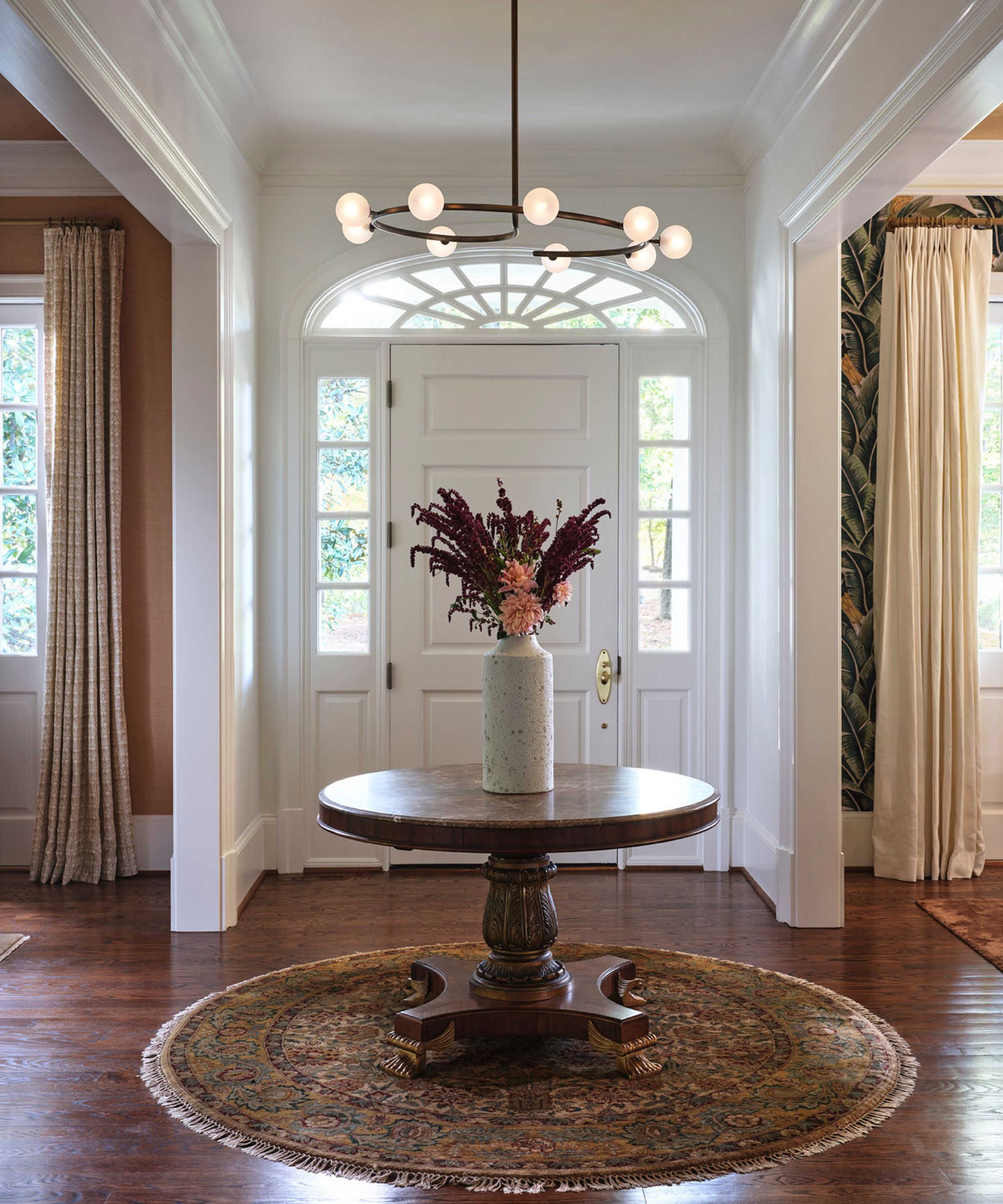
From the moment you step inside the Atlanta family home, you're greeted by a 'beautiful landing area for [the] eyes,' complete with a round wooden table, antique-inspired rug, and contemporary chandelier.
Mandy says she wanted visitors to pause in the entryway and take a look around, observing the adjacent dining and living rooms before making their way through to the rest of the space. The circle theme reflects the front door's arched details, and the open layout allows for seamless flow throughout the home.
'I like the idea of making people pause upon entering the home instead of heading straight through the house to the back and not appreciating the more formal, less utilized spaces at the front,' she says. 'Functionally, the table also gives homeowners and guests a surface to place items they might be carrying.'
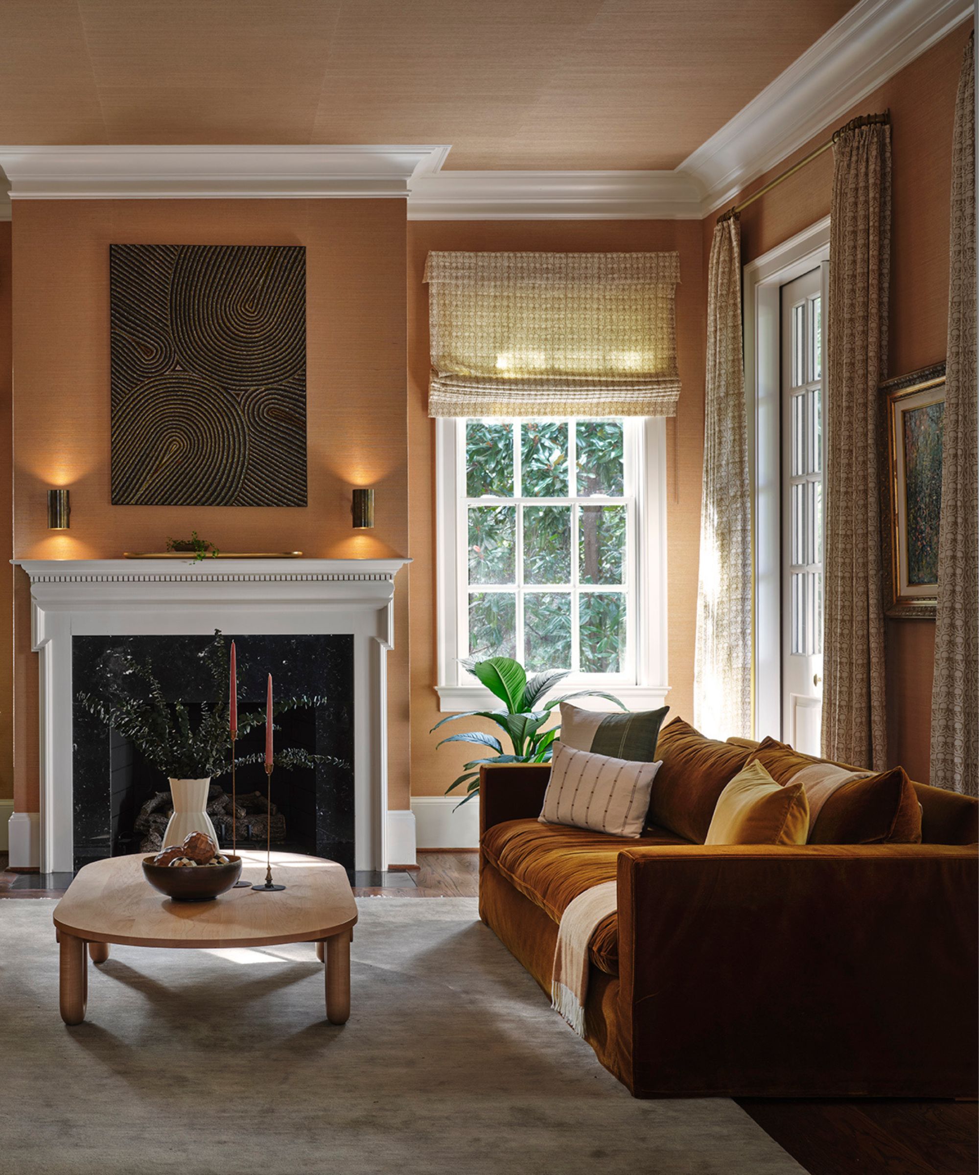
'The living room is one of the first rooms you see upon entering the home, and it’s across the foyer from the dining room, so I wanted to make sure the colors complemented these adjacent spaces and was immediately impactful,' Mandy tells H&G. 'The dining room is incredibly bold with a mix of patterns and colors, so keeping the living room in a more neutral palette, but still stunning in its own right, was important.'
Design expertise in your inbox – from inspiring decorating ideas and beautiful celebrity homes to practical gardening advice and shopping round-ups.
To make this family gathering space stand out (without going overboard), the designer intentionally selected 'rich, saturated versions of neutral colors,' a pared-back approach that still delivered on impact. A sleek fireplace and ambient lighting – achieved with sconces and semi-sheer window treatments – makes the space feel welcoming and warm.
The inclusion of grasscloth wallpaper grounds the space too, offering a 'warm, neutral backdrop' to boost the inviting furnishings. 'By picking pieces with texture, like velvet sofas and a higher pile rug, it adds to the elevated state of the room without having to choose louder colors,' she says.
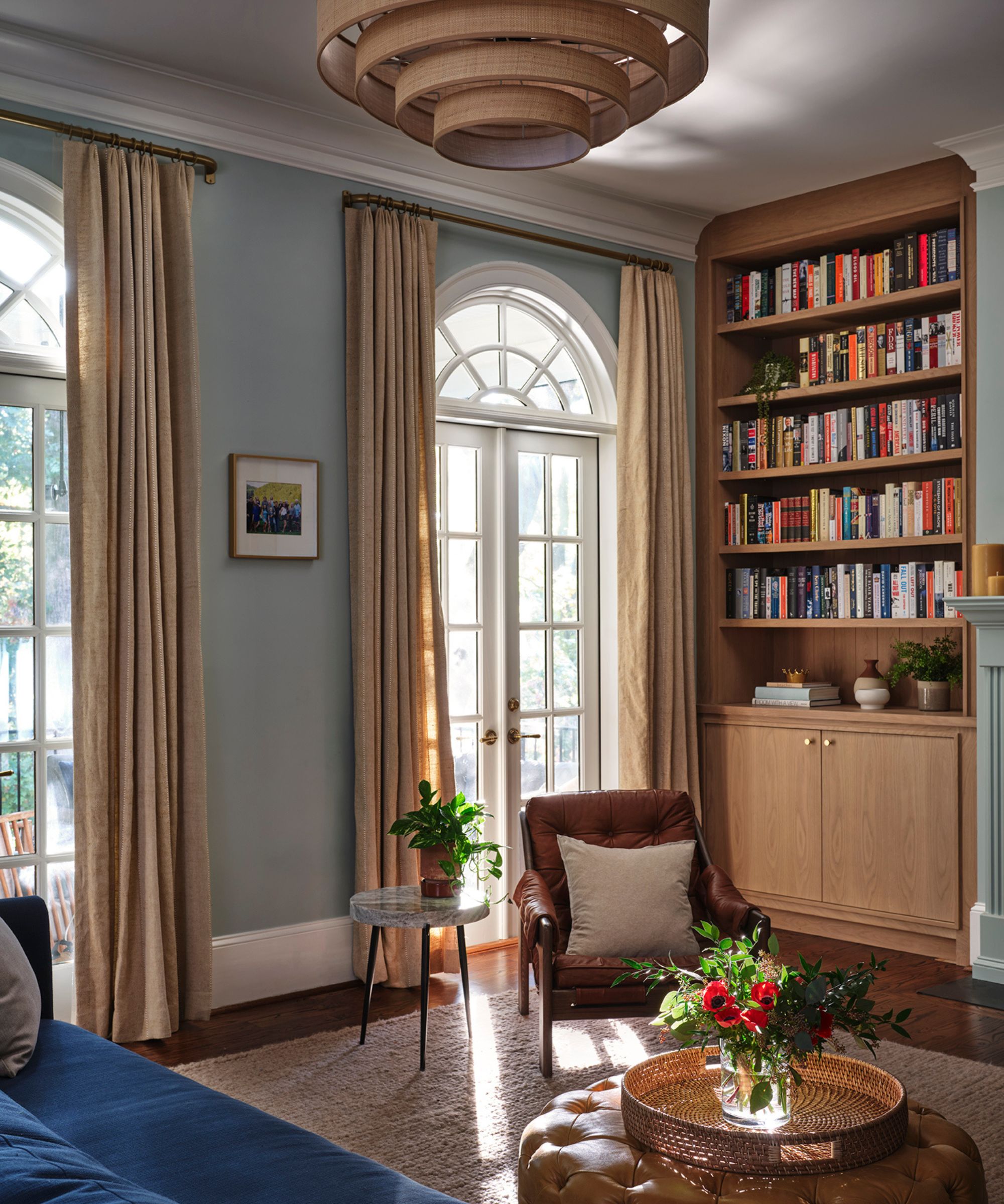
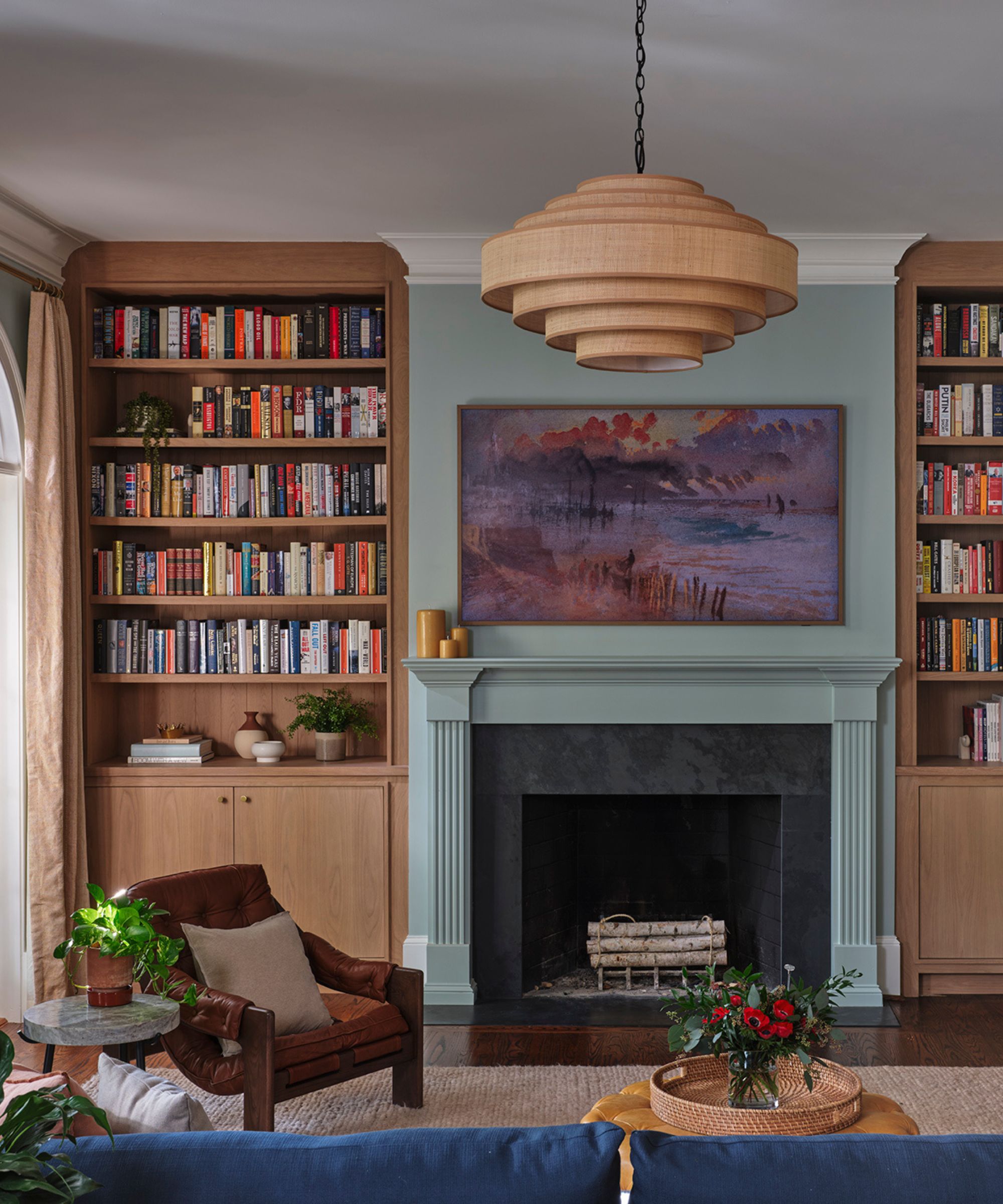
In the more laid-back family room, high-end, elegant furnishings still stand out. Mandy describes this room as the 'main hangout space for the family,' offering easy access to the kitchen and plenty of natural light. The floor-to-ceiling arched windows make the room feel airy and inviting, without losing out on its furnishings' moody appeal.
Gorgeous wooden built-in shelving defines the room, though, providing a nature-inspired look that ties in with the outdoor view. Hiding away AV equipment and board games, but placing an impressive book collection on full display, the shelves make the light blue space sing.
'Stylistically, the high ceilings allow for these built-ins to feel elegant and grand, helping to dress up an otherwise more casual space for the family, and making it flow well with the design of the rest of the home,' says Mandy.
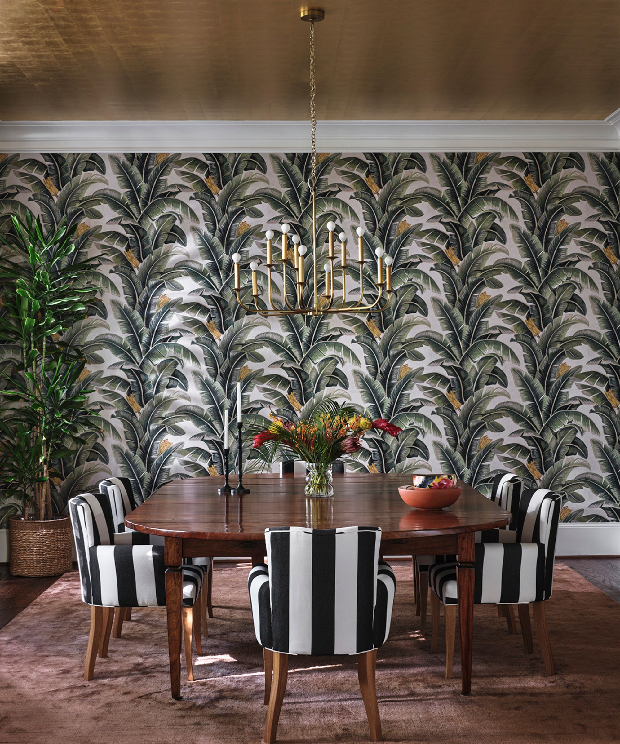
'The homeowners are very well-traveled and spent several years living in various tropical places,' Mandy shares. 'During our initial design discussions, they would point out various pieces of furniture I had selected and noted how they loved it because it reminded them of their time spent somewhere. After mentioning this a few times, I wanted to give them a room that transported them into a version of these memories, but reinvented for this particular home.'
The dining room is a masterclass in maximalism, blending black-and-white striped chairs with bold, vibrant tropical wallpaper and a shiny gold ceiling. A 'nod to their adventures,' this room is one of Mandy's favorites for its character and cohesion. A potted tree in the corner of the room ties the entire look together, blending into its backdrop but grounding the room.
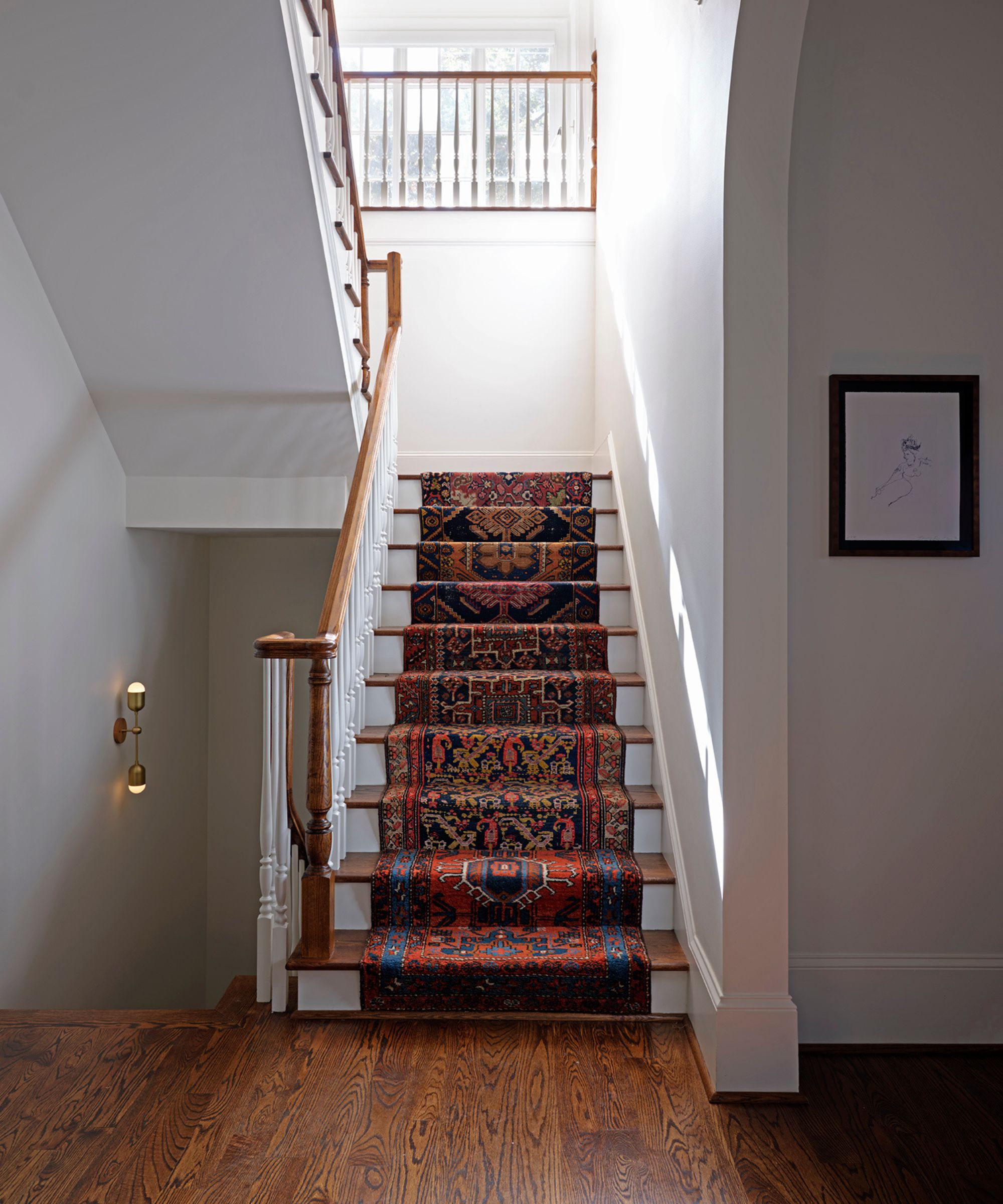
Every detail, down to the runner on the home's staircase, is tailored to the client. Because the three-story home features a staircase in a 'very prevalent space that you pass by quite often,' Mandy made it a priority to bring personality via a playful rug. 'By adding the stair runner, I was able to inject color, pattern, texture, and safety all in one fell swoop,' she says.
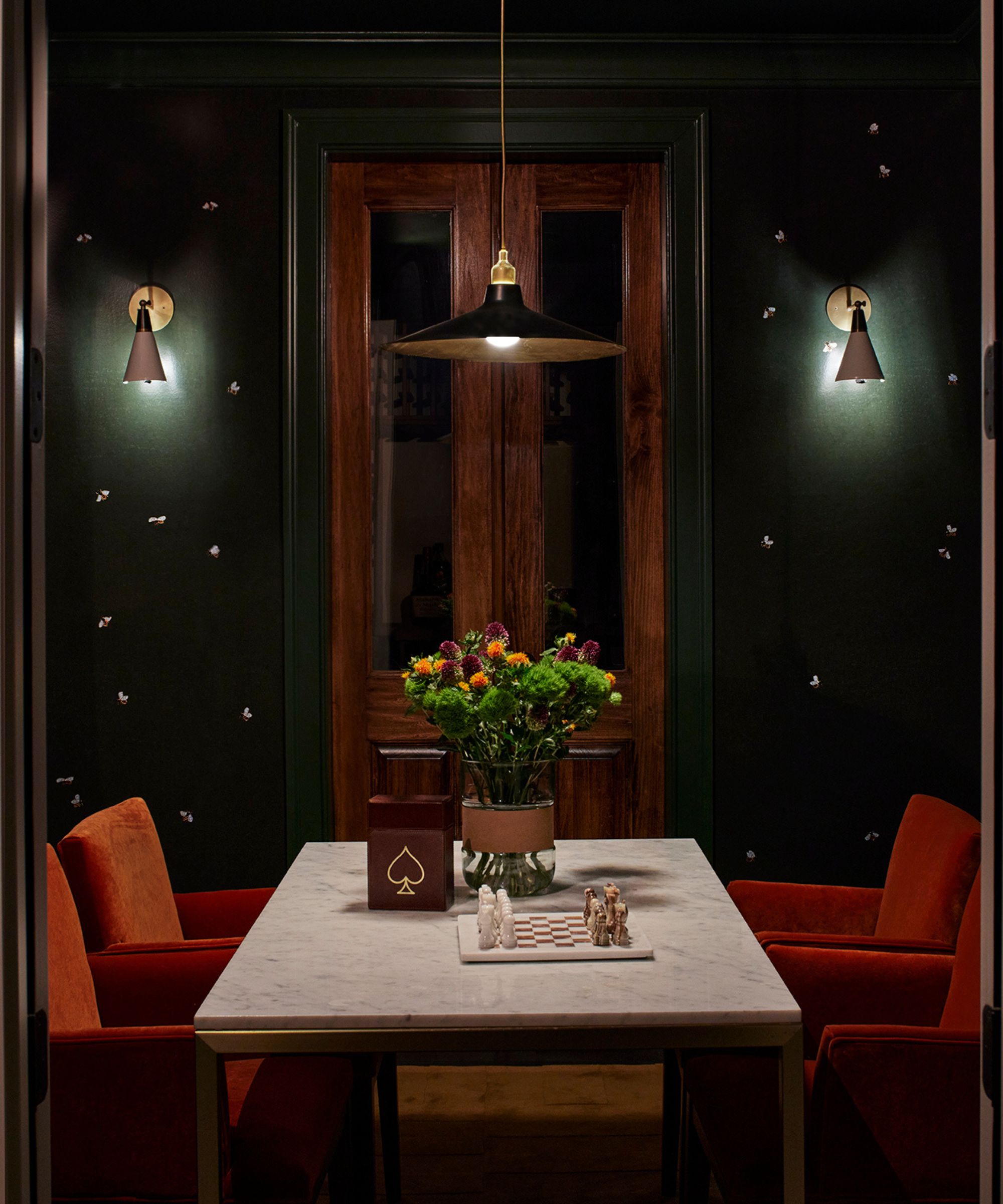
Dark, moody color has a place in this home too, seen most prominently in the basement game room. The space was made especially for the adults to retreat for a game of cards and a cocktail – but is close enough to the kids' playroom for the family to stay connected through the evening.
The combination of red-orange velvet, marble, dark wood and a deep green wallpaper (with intricate bee designs painted on) screams elegance – without losing out on the rest of the home's playful energy.
'Because it’s a windowless, small room and next to the wine cellar, I leaned into that and made it feel even more intimate by papering it in an artisanal wallpaper,' says Mandy. 'The hand-painted bees give the room an element of whimsy and sophistication at the same time.'
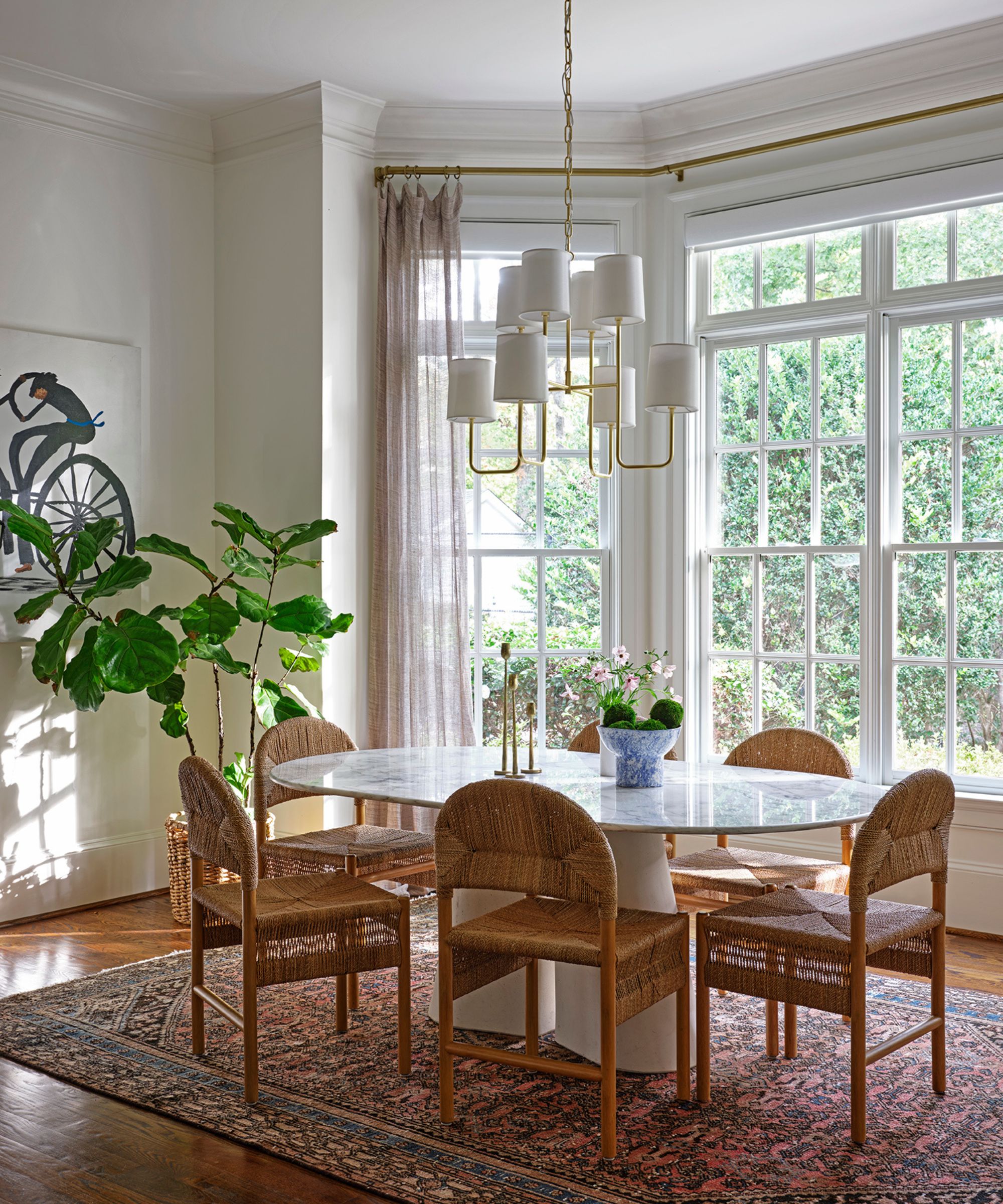
This home is blessed with high ceilings at every turn, and Mandy made sure to lean in where possible. Saying she 'loves a high ceiling', she explains that she takes a different approach to incorporating sky-high ceilings depending on the intention for the particular space. In this dining room, she embraced the ceiling height and floor-to-ceiling windows, introducing a sculptural light fixture and plenty of white paint.
'If it’s a space that should feel more intimate, say, a powder room, I might design it with darker, richer colors including the ceiling so it makes the ceiling feel a little closer,' she says. 'I might drop a pendant or chandelier down so it’s eight feet off the floor to give the illusion of a lower ceiling. However, if it’s a room that I want to feel grand and open, the higher the ceiling the better!'
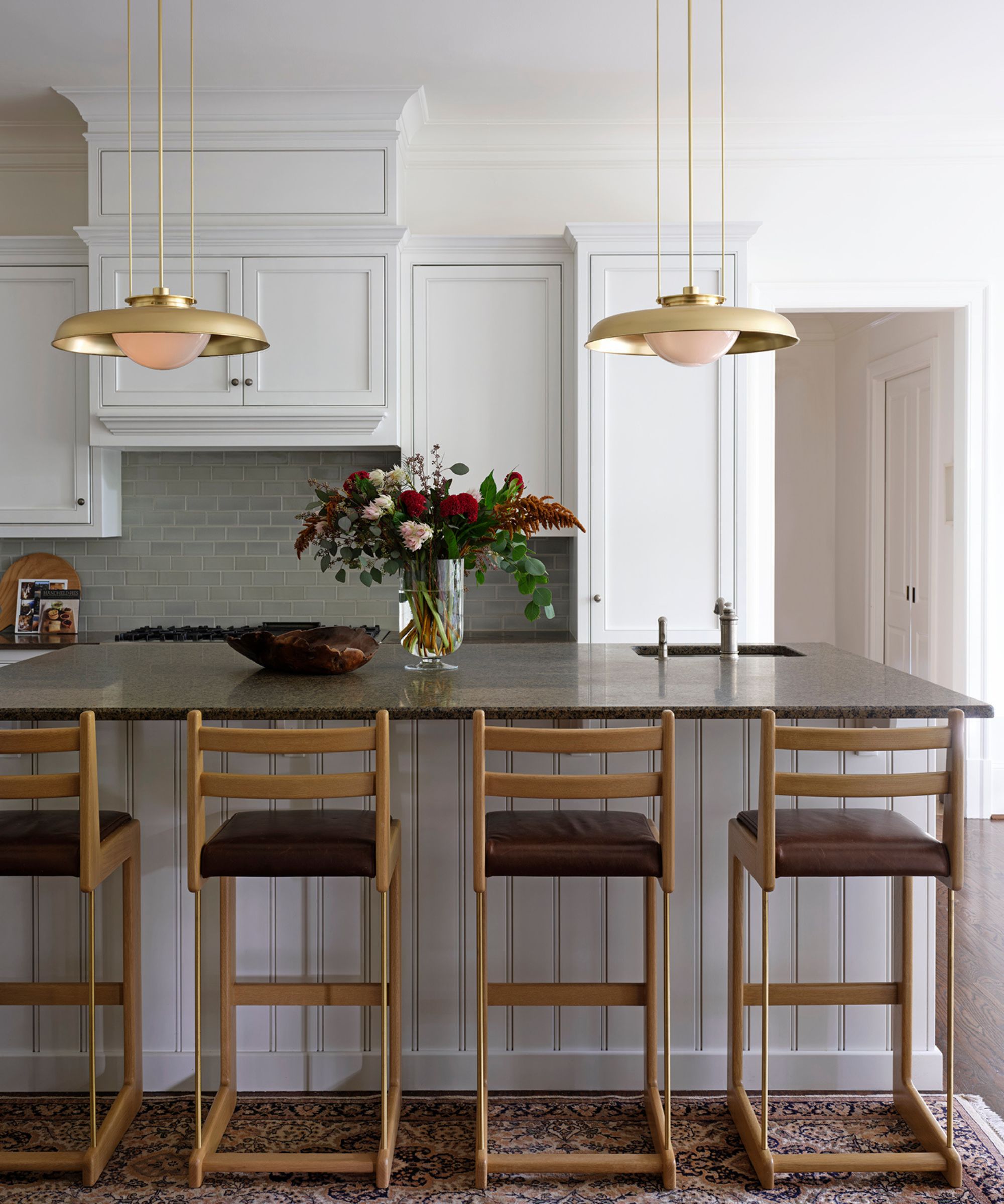
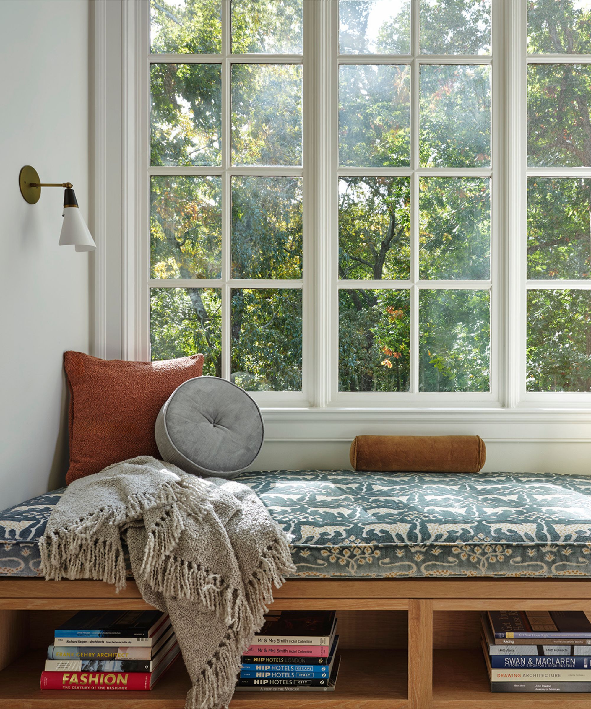
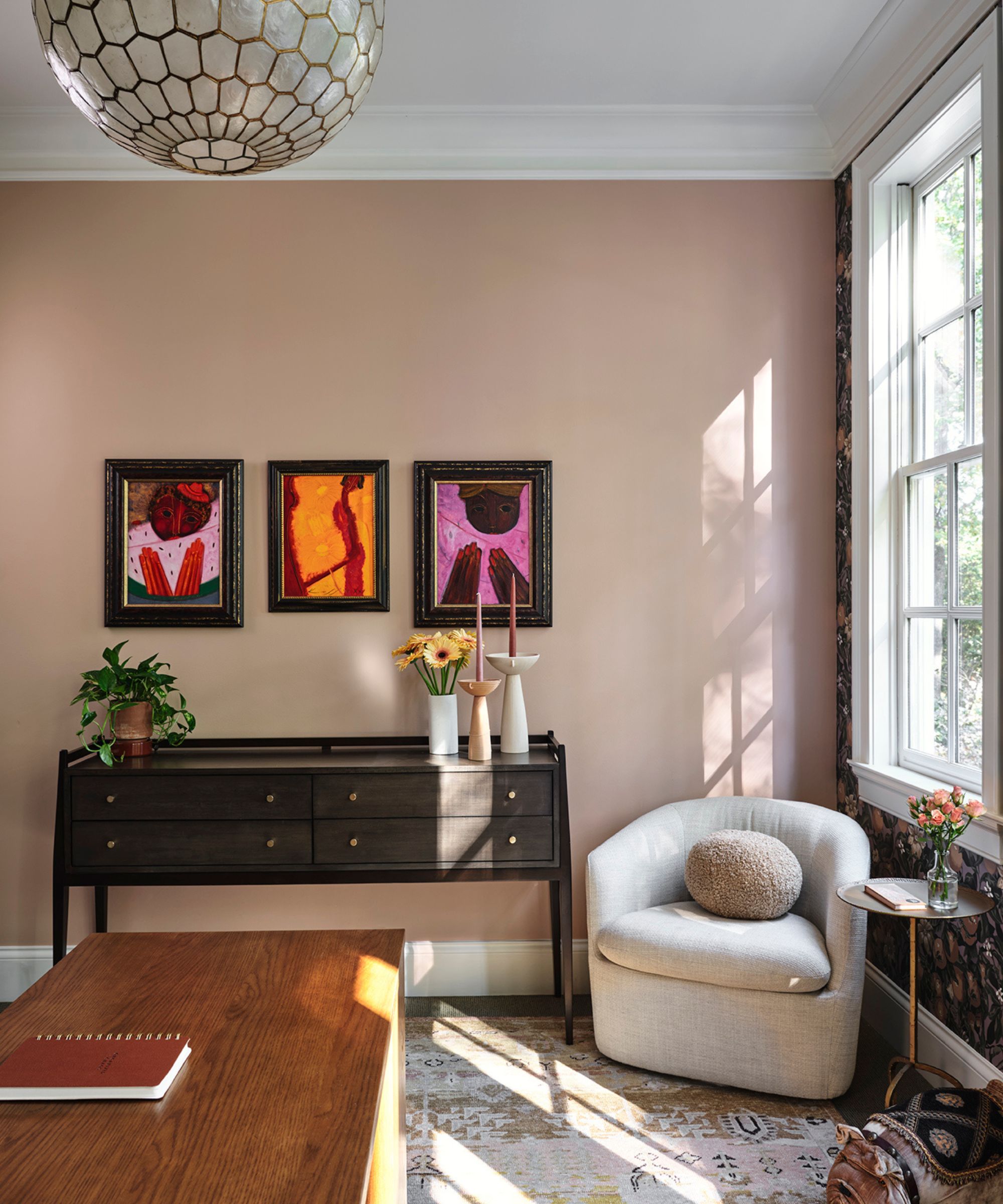
Natural light, a natural partner of high ceilings, also factored into this home, and many of its rooms incorporate it beautifully. Mandy shares that it's 'always a big consideration in any design project, and this house was no different.'
'The way the light migrates over the home throughout the day plays into the various colors I chose for each room, and gives a beautiful, saturated glow to everything,' she says. 'I especially love it when the light hits the guest bedroom with the Wallshoppe "Persimmon Birds’ grasscloth wallpaper" [pictured below] because it makes you feel like you’re outside in an orchard.'
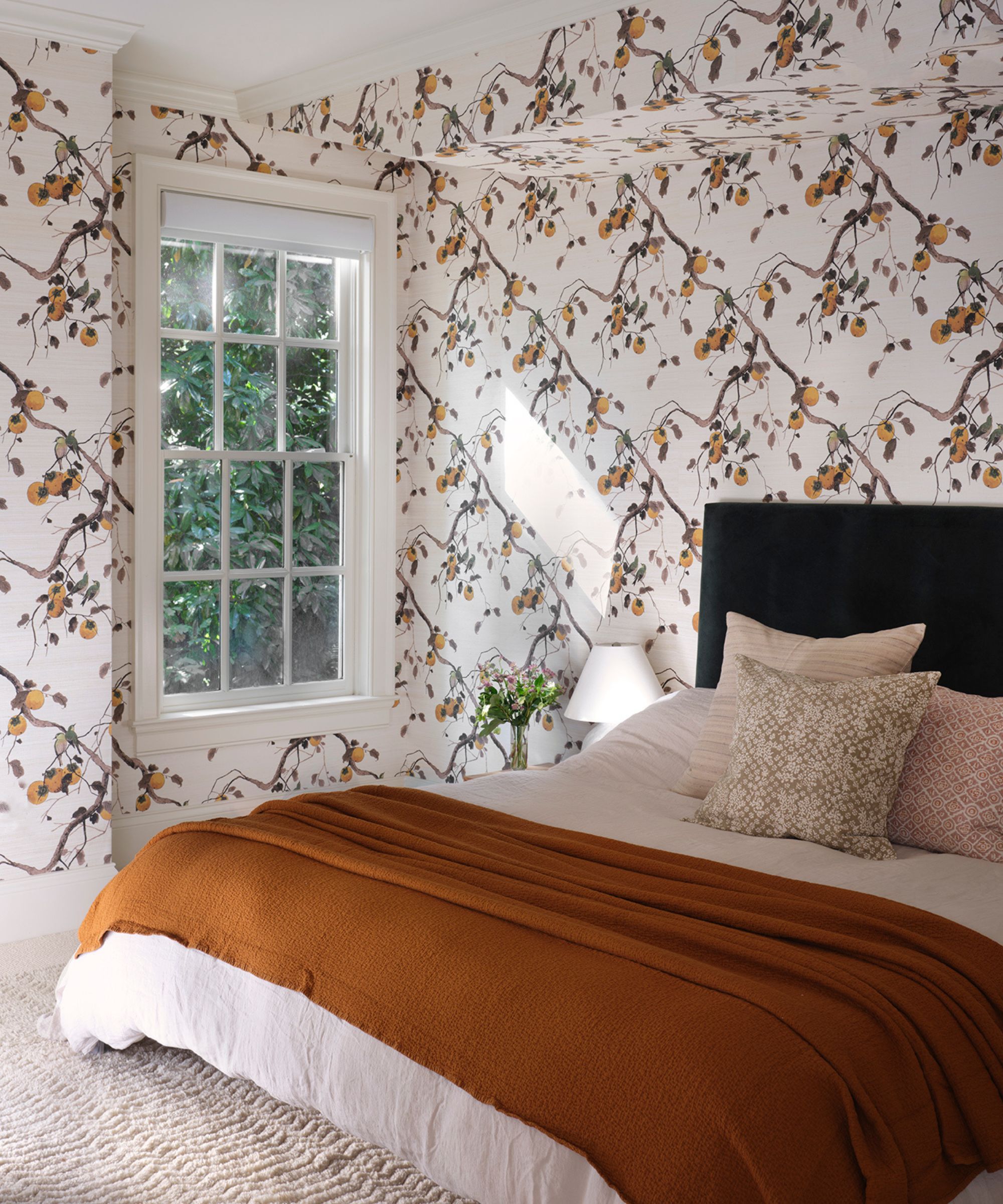
'The guest bedroom is a great place to experiment with a patterned wallpaper because it’s not a room you, as the homeowner, enters often,' Mandy says. 'So when you do, it’s a fun experience and you don’t have to worry about getting tired of seeing it every single day for hours like you might in your own primary bedroom. As a guest, it’s so charming to stay in this space for a short while and appreciate the bolder design choices.'
Every bedroom Mandy designed for this home has an entirely different atmosphere, and the guest room is by far the lightest and brightest. The vibrant wallpaper pairs beautifully with a textured area rug, a deep orange throw, and pared-back white accessories. And, as she mentioned, the natural light only accentuates the final look.
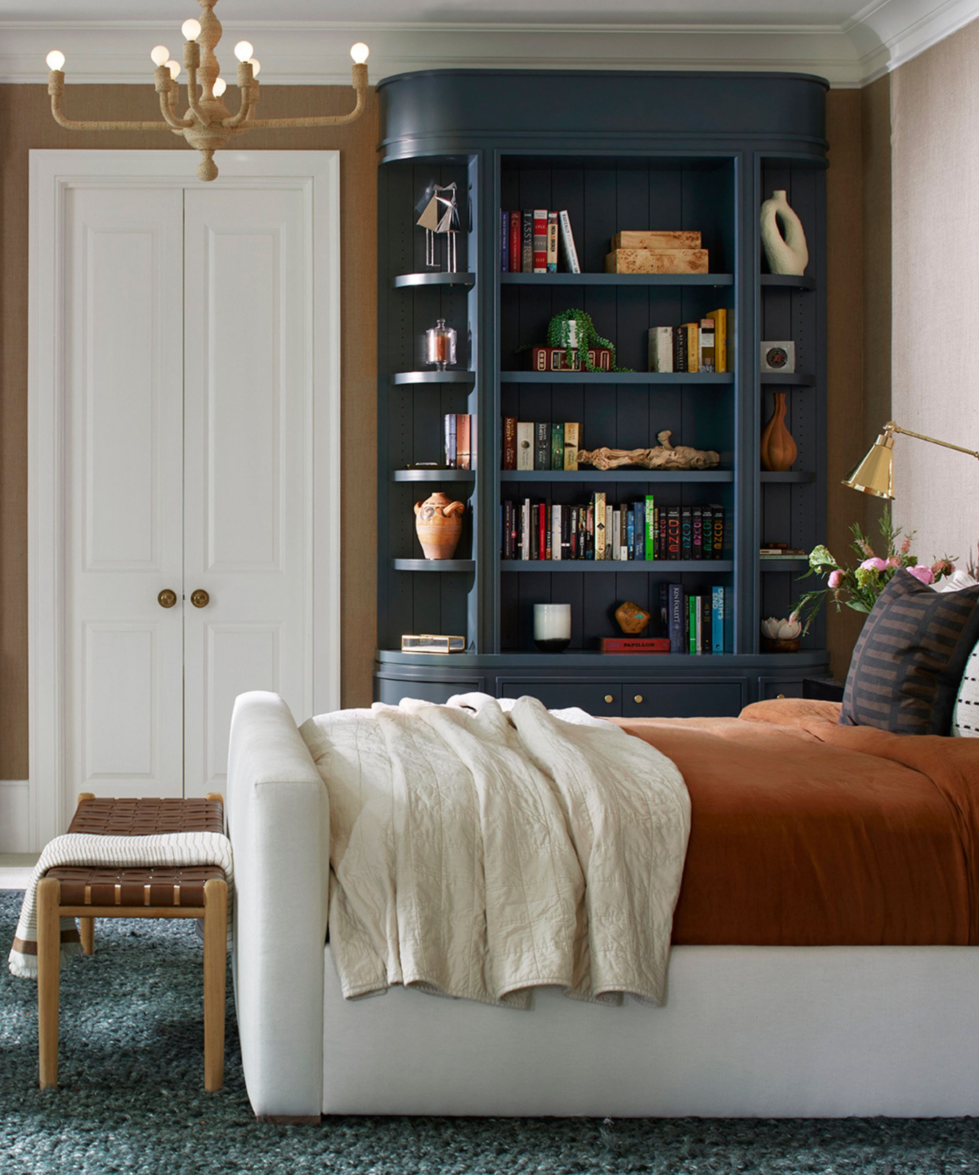
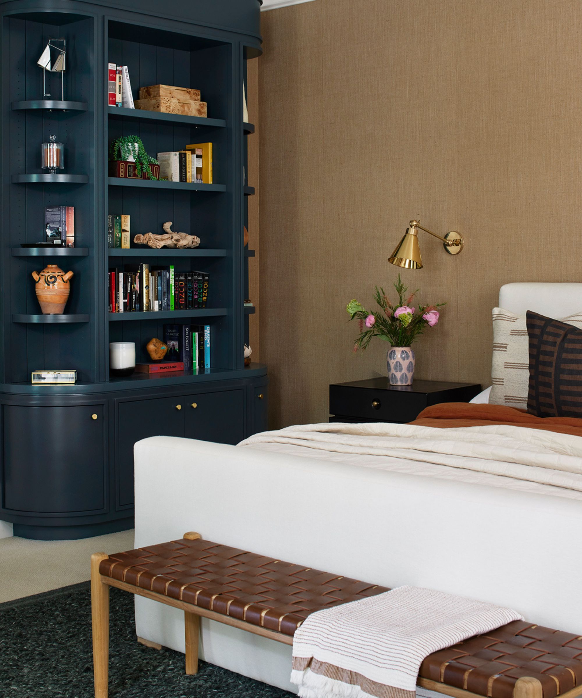
The home's main bedroom is cozy, inviting, and truly one-of-a-kind, featuring bold blue built-ins and rich, warm tones. Mandy says this room was especially fun to design, as she was able to transform it 'from a more traditionally-designed, stark white space to a warmer, more rich-colored space.'
Because the built-in shelves sit on either side of the doors leading to the closet and en-suite bathroom, Mandy says she wanted them 'to feel more like furniture with softer edges.' That way, when the family walks in and out of the room's distinct alcoves, they aren't faced with 'harsh corners.' A foot-of-the-bed bench and lush, rich textures throughout also contribute to the soft, cozy feeling.
'Upon entering the room, this back wall is the first thing you see, so having the built-ins there really dresses up the wall and fills out the space without it feeling too cluttered,' she adds.
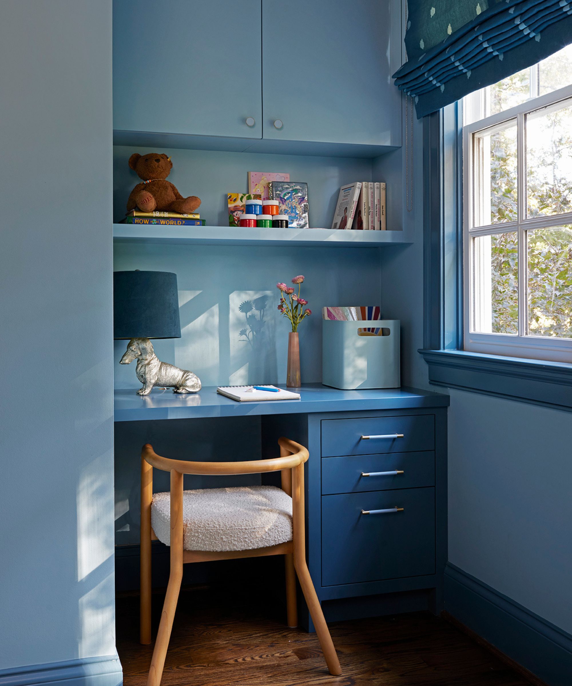
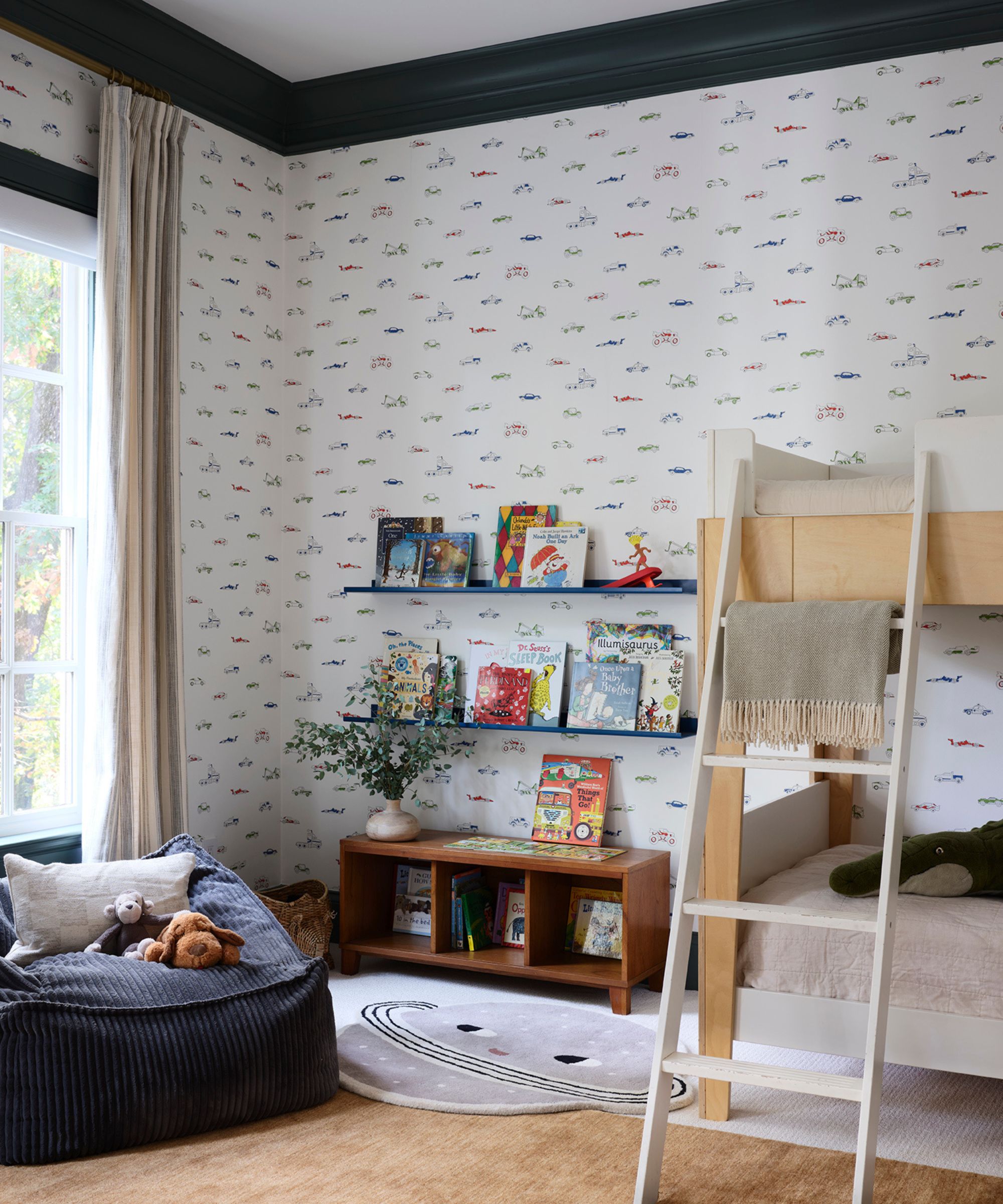
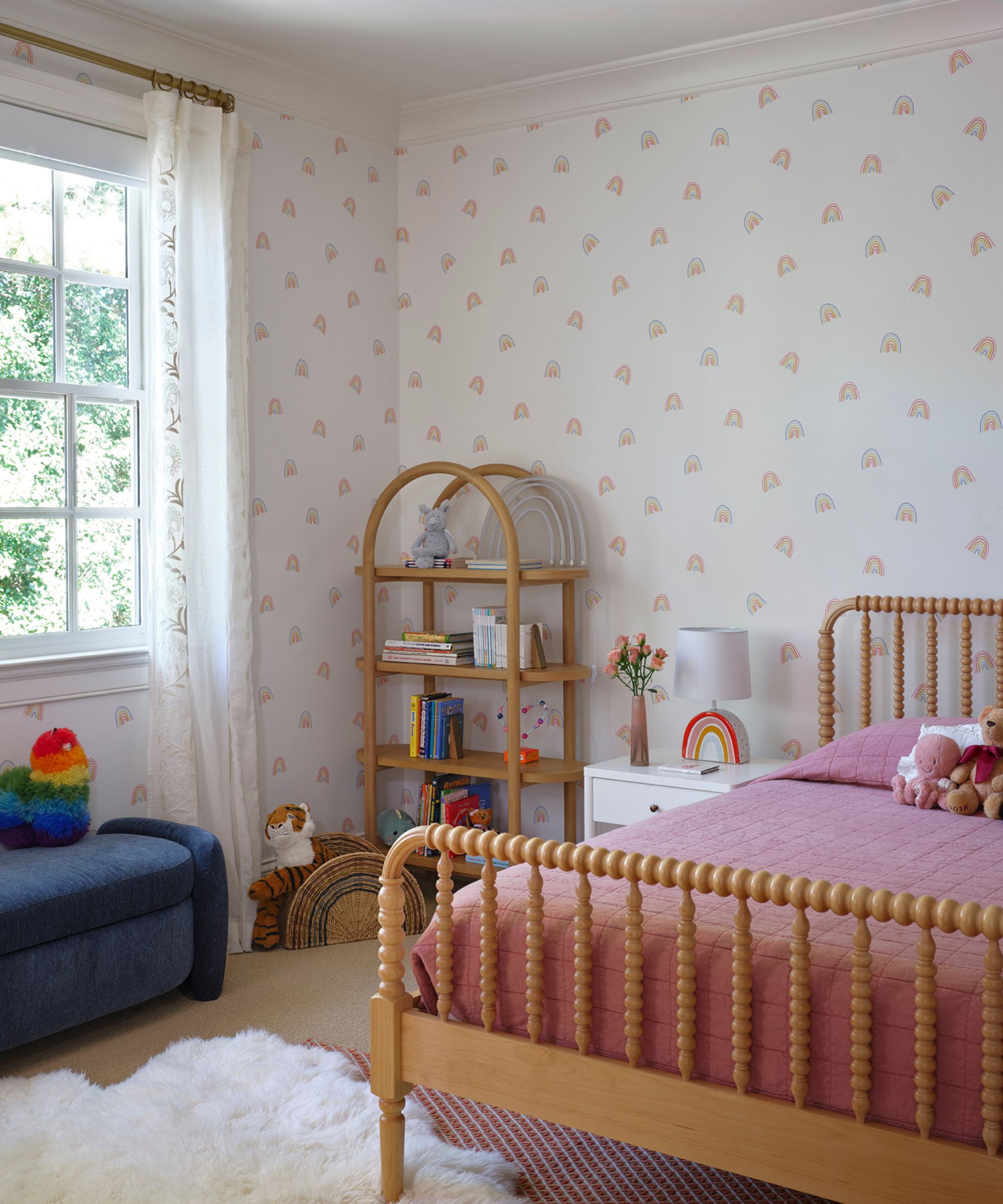
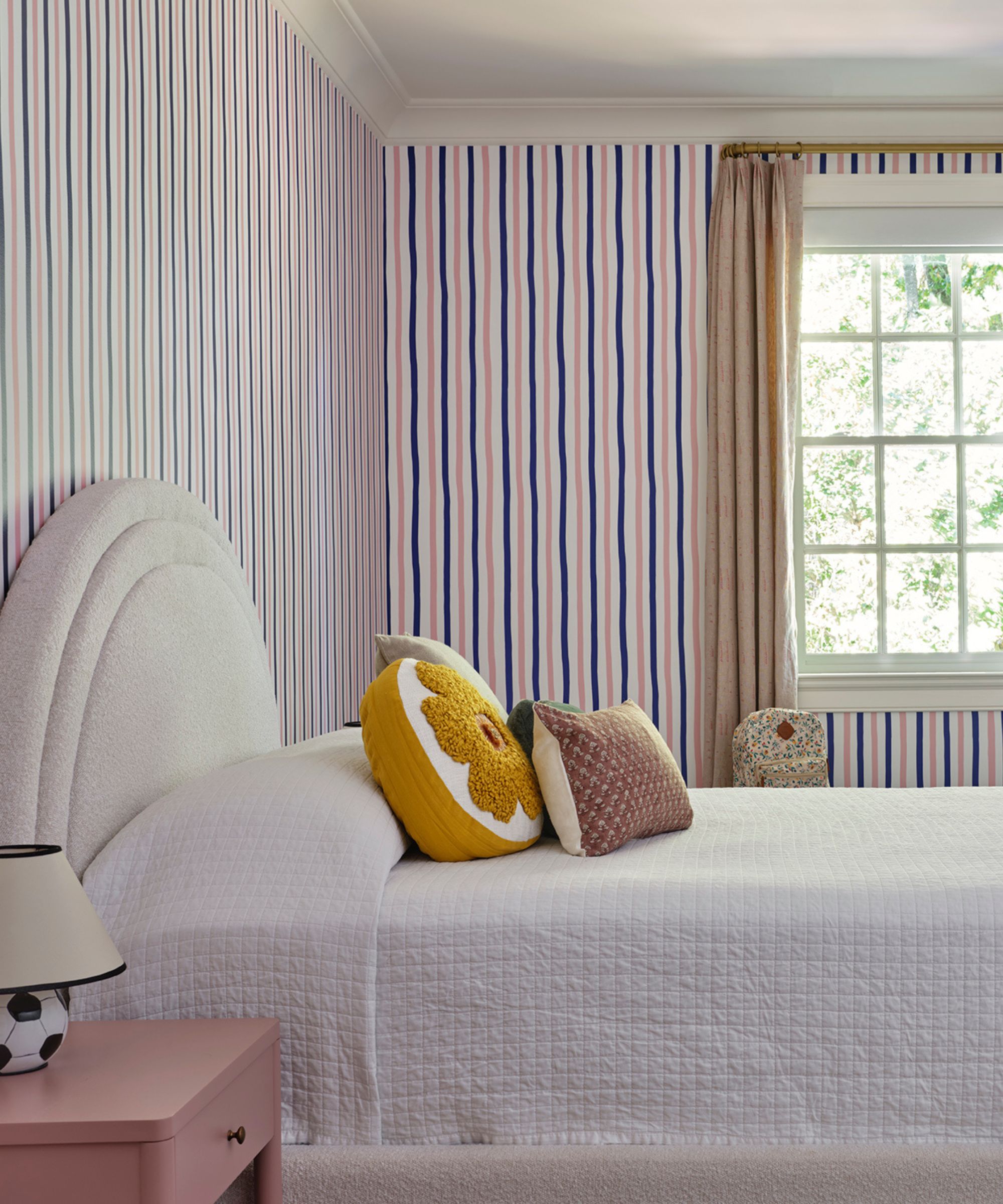
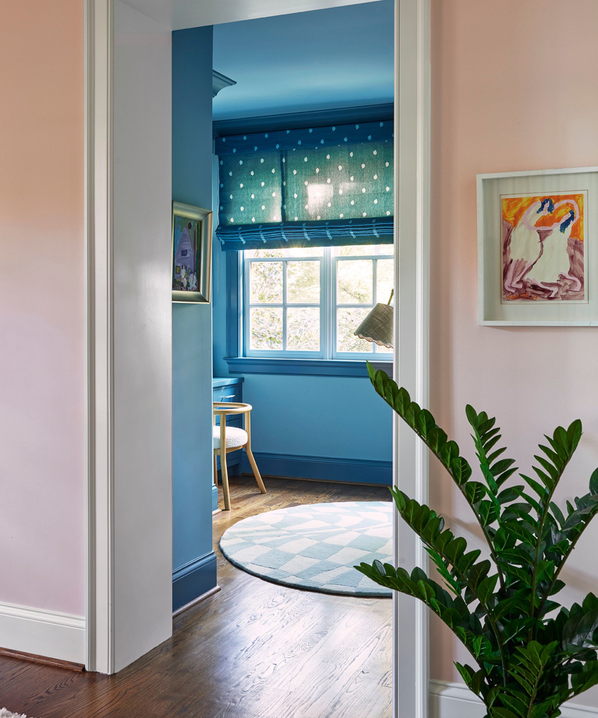
The kids' bedrooms are just as design-forward and considered, but Mandy deliberately incorporated each child's requests and color preferences. Although she struggled a bit with the oldest daughter's request for a pink and blue combination, she found a clever solution in the end – with two smaller spaces to work with, she went all in with blue in the closet and sitting room, and pink in the bedroom.
'Her room, as well as the other two kids’ bedrooms, turned out great; bright, cheerful, playful, and perfectly reflects their individuality,' she says.
'Mixing more contemporary furnishings with a traditional, Southern-style estate was such a fun challenge,' Mandy tells H&G. 'They wanted the house to feel young, colorful, warm, fun, and inviting with more contemporary elements, without taking away from the architecture of the home. I love the way it turned out!'

Abby was the Interior Design News Editor at Homes & Gardens and is now studying for her Master's degree in Journalism at City University, London. Prior to joining our team, she worked with Better Homes & Gardens, where she wrote and edited content about home decor, gardening tips, food news, and more. She studied Journalism and English Literature at New York University and moved to London to pursue her love of writing in 2023.