This designer's 'every seat needs a surface' rule has changed my living room layout forever – here's what I mean
This clever design rule has enhanced my living room both visually and functionally
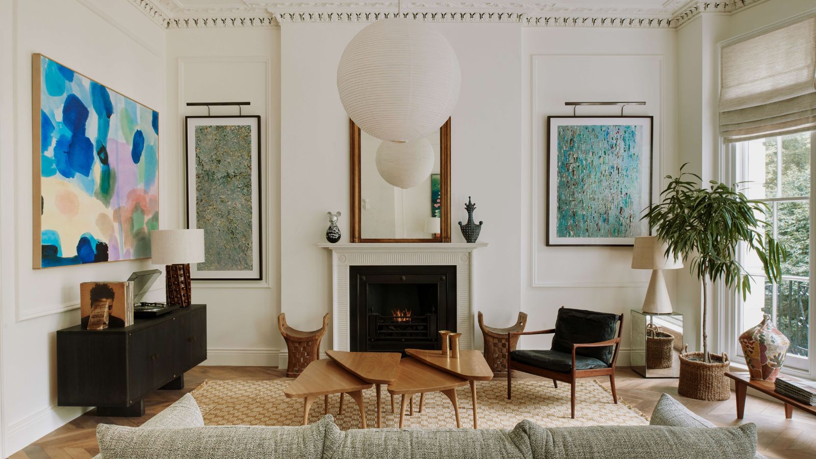

If your home is anything like mine, the living room is one of the hardest working spaces that needs a clever layout.
I live in a fairly small apartment so naturally, my living room – which also doubles as our dining space – is the most used room. From relaxing in front of the TV to entertaining guests, my living room needs to be just as functional as stylish in its layout.
Because of this, I'm always looking for useful tips from interior designers that can help me create the best living room layout, and interior designer Jordan Samson is the latest expert I'm turning to. Taking to Instagram, the designer shared a video in which he lists useful decor rules to avoid making any living room design mistakes, and within them, one stood out which has proven to elevate my home.
A post shared by Jordan Samson (@jordansamsondesign)
A photo posted by on
Jordan mentions some wonderful advice to help avoid living room faux pas, including the classic mistake we all make of pushing all your furniture up against the walls. He explains in the video that this layout 'may feel larger but it's not great for conversation, balance or flow. Instead, try floating your furniture around a focal point, it will create intentional grouping and will feel a lot more welcoming.'
But the piece of advice that stuck with me as being one I have never really thought of before is his seats and surfaces rule. He goes on to say, 'Next is making sure that every seat has a surface,' Jordan says. By this, the design expert means that every seating area – whether a sofa, armchair, or accent chair – should have a surface area within reach.
'Nobody wants to put their drink or book on the floor so including cocktail or side tables will give everyone access to a surface,' continues Jordan.
This advice is something that, unknowingly, I've been embracing in my small living room while its decor has evolved over the last couple of years. Originally, the only smaller accent table I had in the space was a coffee table, but, over time, I've added two additional side tables of different styles and heights to accompany various seating.
Sign up to the Homes & Gardens newsletter
Design expertise in your inbox – from inspiring decorating ideas and beautiful celebrity homes to practical gardening advice and shopping round-ups.
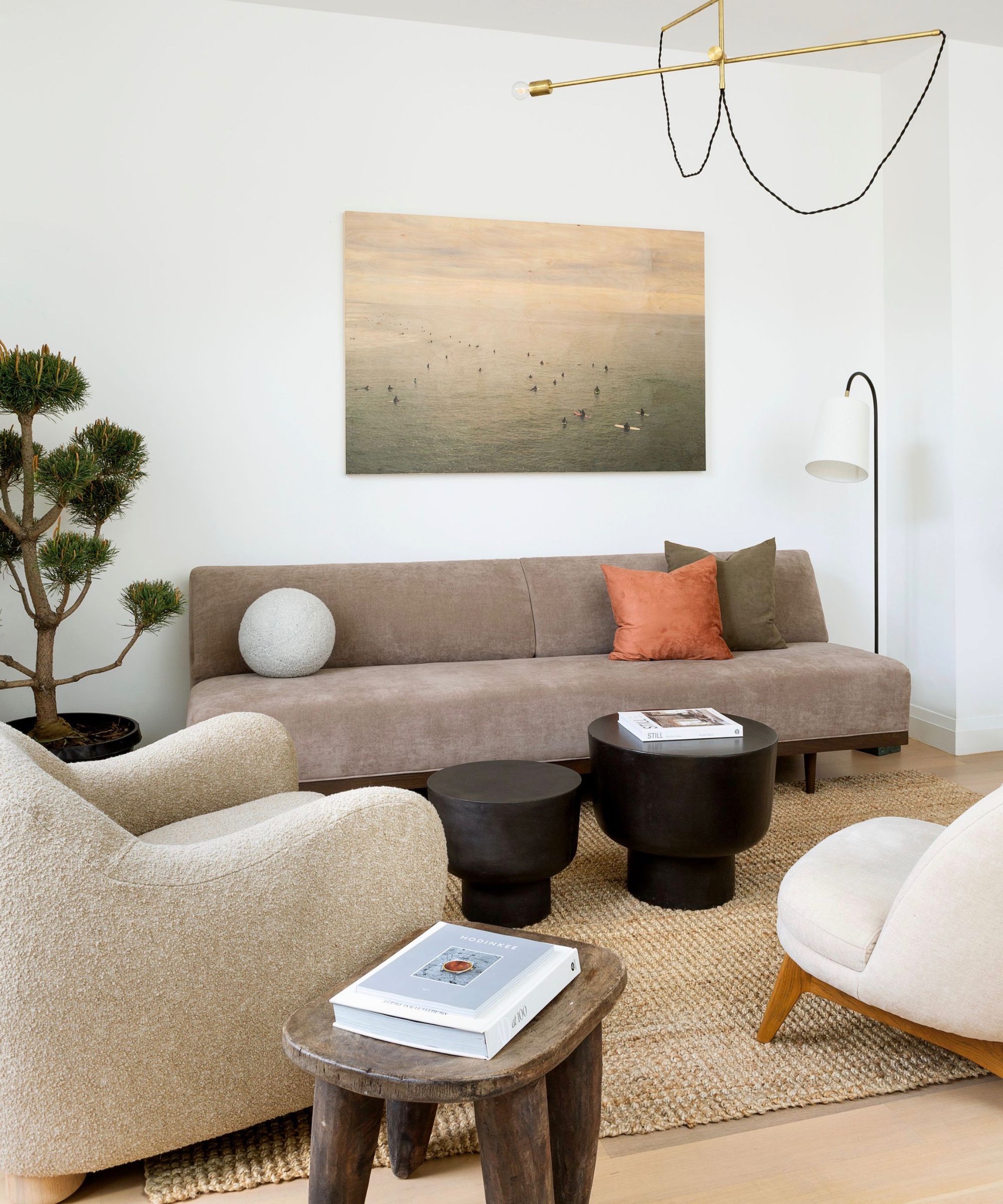
While it may sound like a lot for a small room, adding these extra accent tables has upgraded the whole space. From a practical perspective, there's plenty of space to rest drinks and they keep the coffee table from appearing cluttered, especially when hosting guests.
It has also given a better flow to the room's layout: adding a sense of zoning to each seating area instantly creates a more intimate and inviting look and feel.
Plus, and arguably my favorite part about having extra surfaces, it allows extra space to experiment with styling vignettes. Vignettes are a great way to add personality to a space, adding visual appeal through displaying decorative items. From stacking coffee table books to housing plants, the accent tables in my living room have quickly gone from being purely practical to curated corners.
The best thing about this living room design rule is that you don't need to have lots of space. Most sofas can comfortably fit a small side table beside them, while you can most likely place a small accent table or even a stool next to an accent chair.
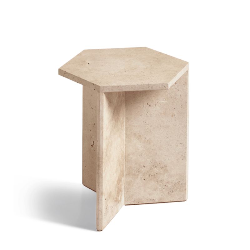
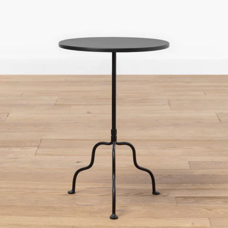
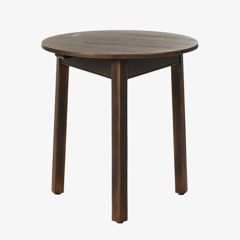
While my own living room is well and truly at capacity in terms of furniture, I've rounded up some of my favorite accent tables below. If I was looking to add another, these would rank highly on my wishlist.

Emily is a freelance interior design writer based in Scotland. Prior to going freelance in the spring of 2025, Emily was Homes & Gardens’ Paint & Color Editor, covering all things color across interiors and home decor for the Homes & Gardens website. Having gained specific expertise in this area, Emily is well-versed in writing about the latest color trends and is passionate about helping homeowners understand the importance of color psychology in home design. Her own interior design style reflects the simplicity of mid-century design and she loves sourcing vintage furniture finds for her tenement flat.
-
 Kylie Jenner, Tommy Hilfiger, and Lenny Kravitz transform their homes with prints – the London Original Print Fair Director has a method that makes their look 'accessible and affordable' in your home
Celebrities from the Kardashians to Lenny Kravitz decorate their homes with prints by famous artists, and it's easier to recreate than you might expect
By Sophie Edwards
-
 ‘Completion days’ are the answer to laundry doom piles, pro organizer claims – here’s how this hack can instantly stop fresh laundry from piling up once and for all
Stay on top of your laundry with the 'Completion days' method
By Chiana Dickson
