This is every paint color that Shea McGee used in her most recent remodel – including the best neutrals from Sherwin-Willams, Benjamin Moore and Farrow & Ball
From earthy greens to timeless warm whites, this home is filled with the most calming colors
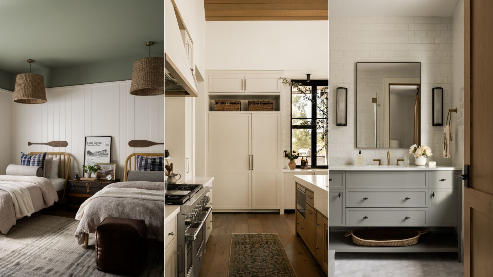
- 1. Westhighland White, Sherwin-Williams
- 2. Creamy White, Benjamin Moore
- 3. Flint, Benjamin Moore
- 4. In the Navy, Portola Paints
- 5. Dark Olive, Benjamin Moore
- 6. Nature Lover, Benjamin Moore
- 7. Retreat, Sherwin-Williams
- 8. Sandy Hook Gray, Benjamin Moore
- 9. Pigeon, Farrow & Ball
- 10. Night Train, Benjamin Moore

When it comes to timeless interiors that strike the perfect balance between modern and rustic, Studio McGee never fails to nail the aesthetic. Known for creating cozy, classic, and comfortable spaces that feel organic and full of texture, Shea McGee's interior projects always serve as inspiration.
In the design studio's latest project, Tahoe Pines, Studio McGee embodies its celebrated decorating style in every room, and one of the many elements that stand out is the dreamy array of paint colors used throughout. Inspired by the property's idyllic lakeside surroundings, the paint colors are neutral and earthy, creating a calming backdrop in every room.
Here, we take a deep dive into the standout paint colors used throughout the Tahoe Pines project. From warm white living spaces to the dark olive green home office, there are endless room color ideas to draw inspiration from.
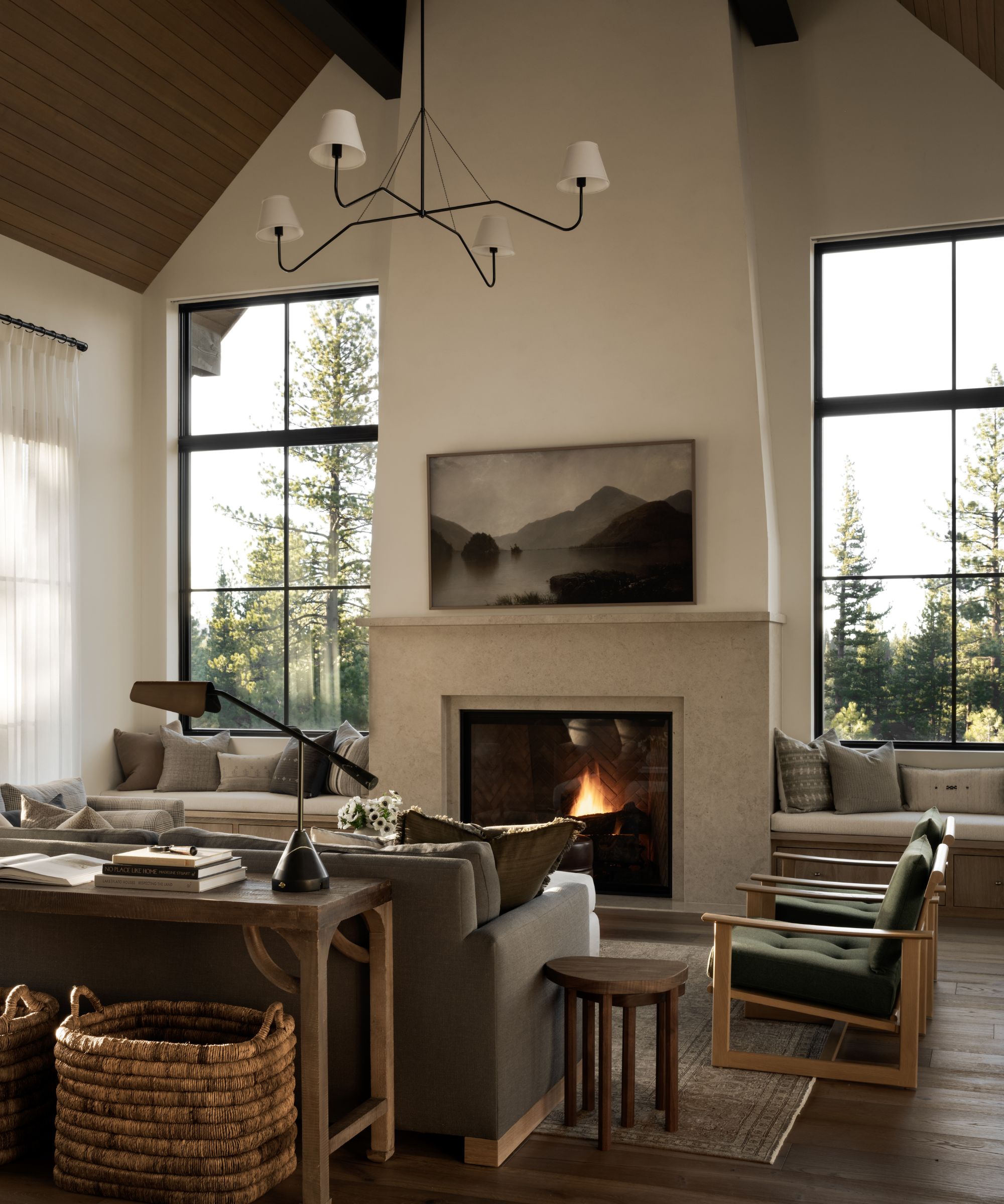
1. Westhighland White, Sherwin-Williams
Tahoe Pines
Westhighland White by Sherwin-Williams is a bright white paint that has a subtle creamy quality, making it the perfect pared-back backdrop paint color for all types of rooms and decorating styles.
In the Tahoe Pines project, this white paint was used across the walls in various rooms, including the living room, kitchen, bedrooms, and bathrooms.
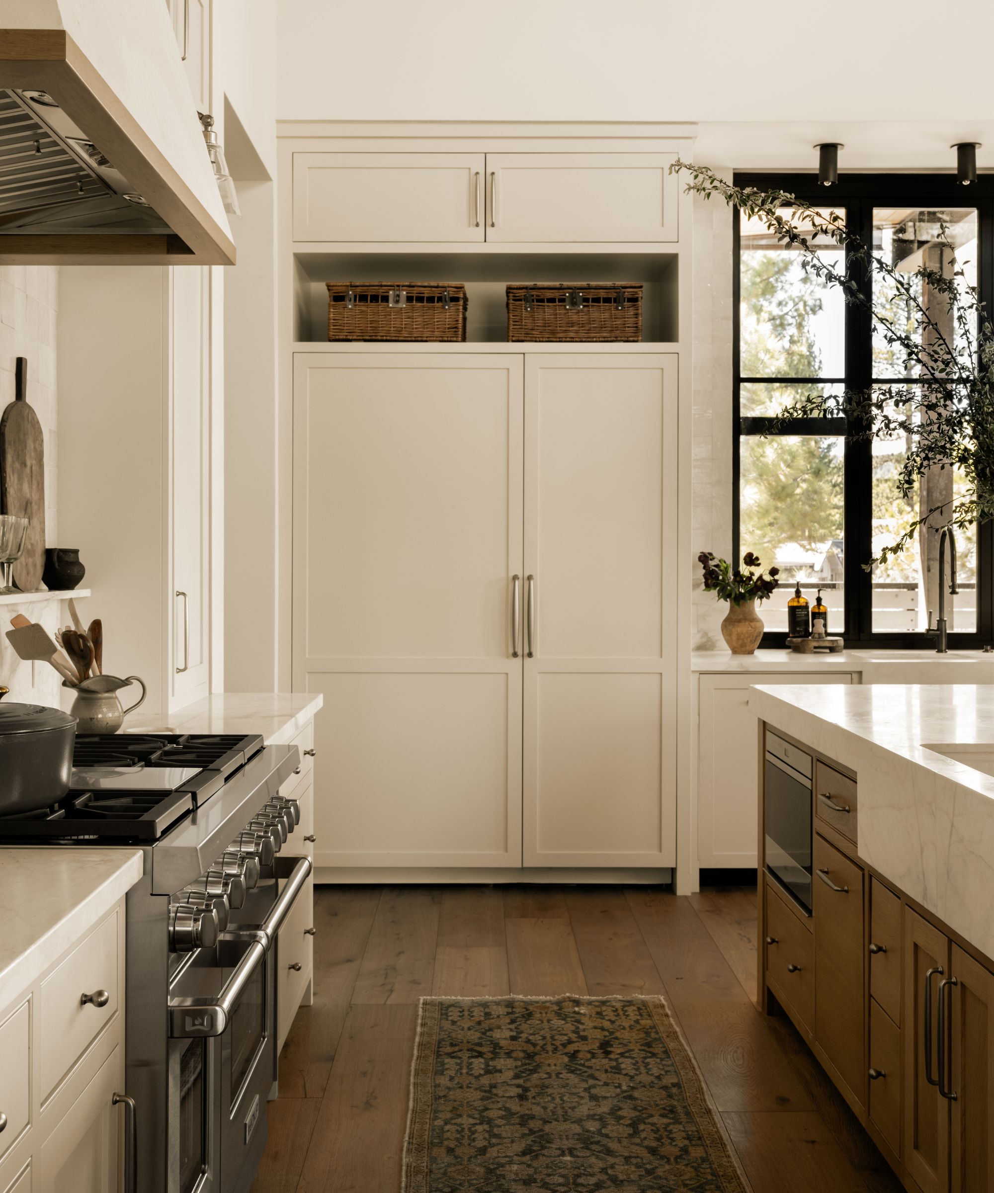
2. Creamy White, Benjamin Moore
Tahoe Pines
Another popular white paint that was used in this project is Benjamin Moore's Creamy White, a warm white paint that provides just enough warmth to create a soft and cozy look; a great alternative to stark whites.
In this kitchen, Creamy White is used across the kitchen cabinets, complementing the room's natural wood tones and organic decor.
Design expertise in your inbox – from inspiring decorating ideas and beautiful celebrity homes to practical gardening advice and shopping round-ups.
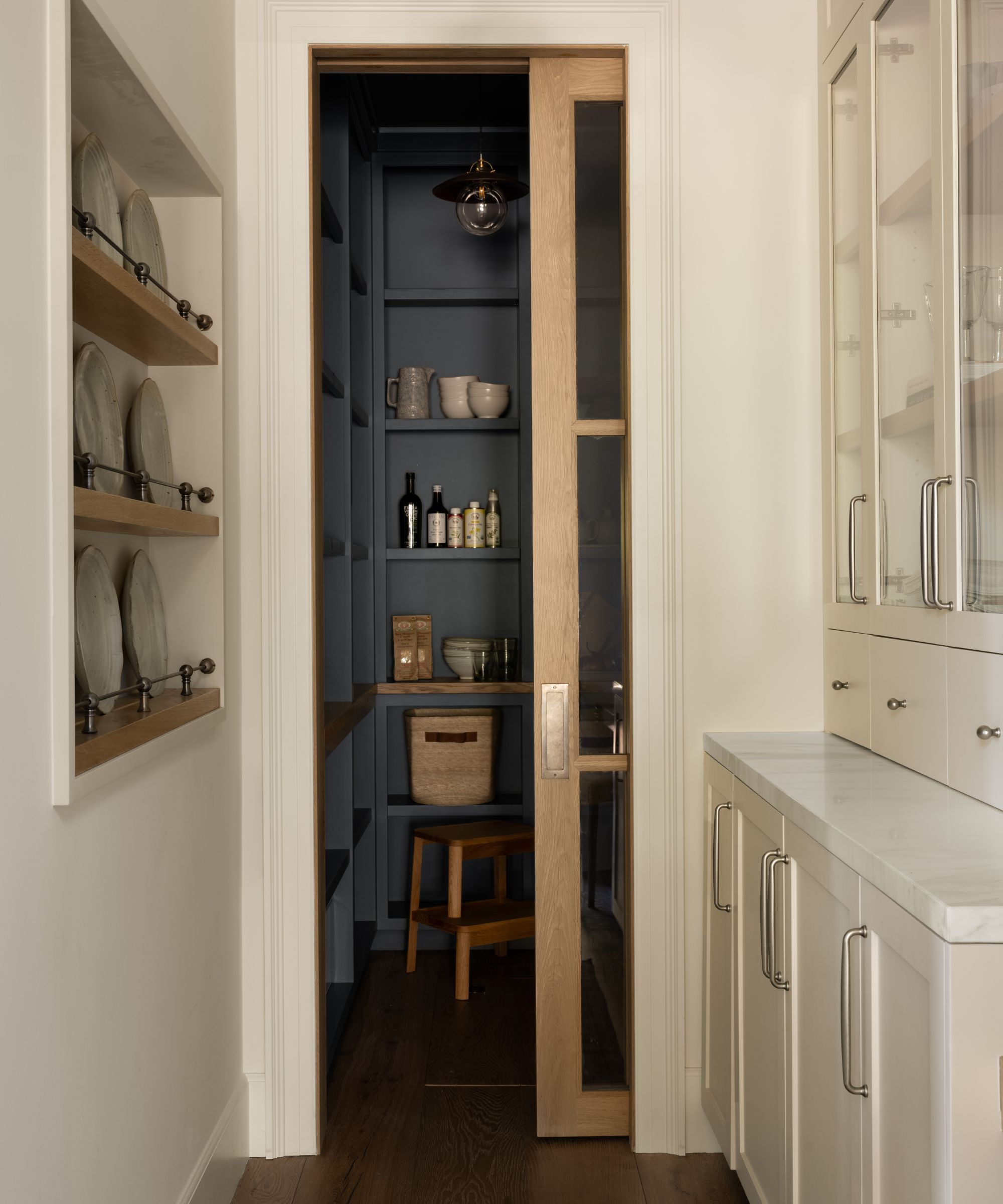
3. Flint, Benjamin Moore
Tahoe Pines
The pantry steps away from light neutrals with Benjamin Moore's Flint, a cool-toned charcoal that provides contrast to the kitchen's warm white color scheme.
If you want to venture toward the trending world of dark paints, Flint makes a great choice. It has a slightly muted quality which makes it liveable while providing a touch of drama to your color schemes.
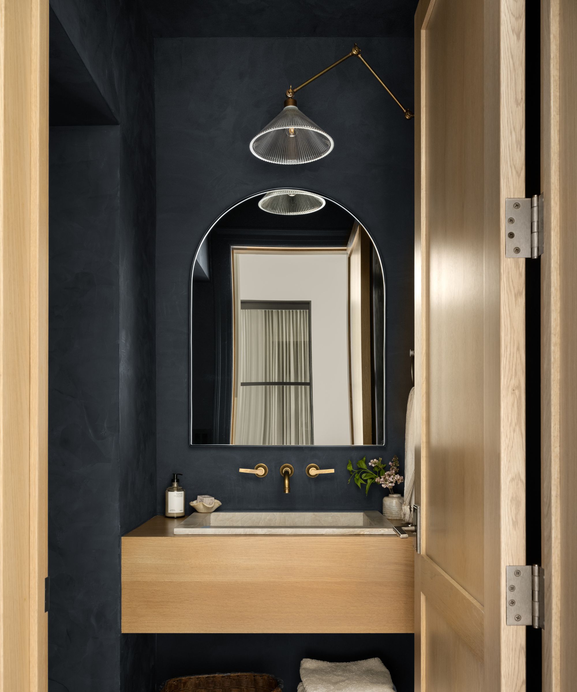
4. In the Navy, Portola Paints
Tahoe Pines
Continuing the theme of dark paint colors, Portola Paints' In the Navy with a Roman Clay finish was chosen for this powder room.
While colors as dark as this can seem daunting to decorate with, the key is to fully embrace them in small rooms with color-drenching ideas, covering the walls and the ceiling. This will result in a dramatic yet cozy and cohesive space that avoids the harsh breakups that would be apparent if certain walls or the ceiling were painted white.
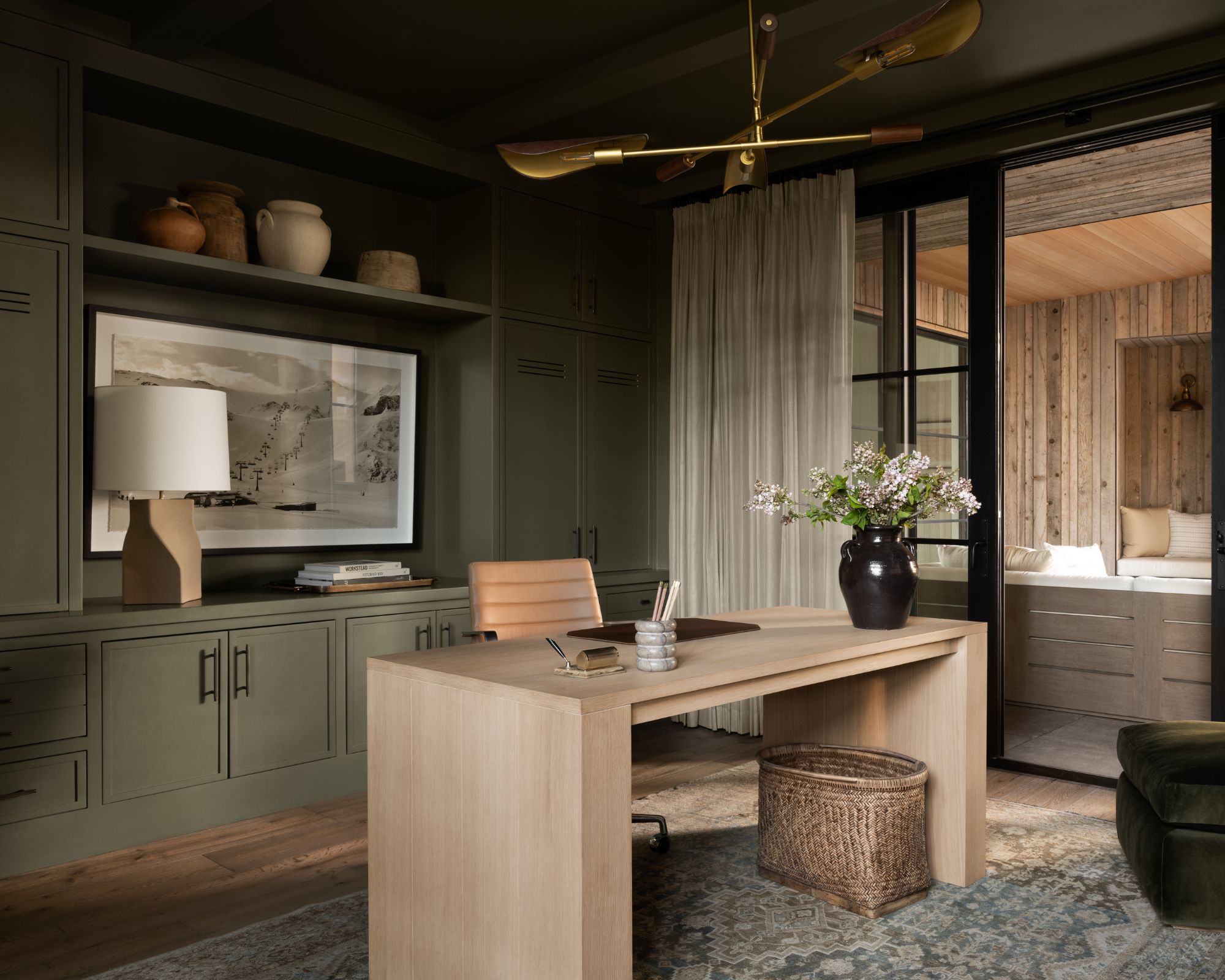
5. Dark Olive, Benjamin Moore
Tahoe Pines
Benjamin Moore's Dark Olive was selected for this moody and sophisticated home office, used across the walls and the cabinetry as well as the ceiling.
A dark shade of green with a muted quality, Dark Olive is a timeless paint color that works to create a bold look, while its earth tones ensure it's comfortable to live with.
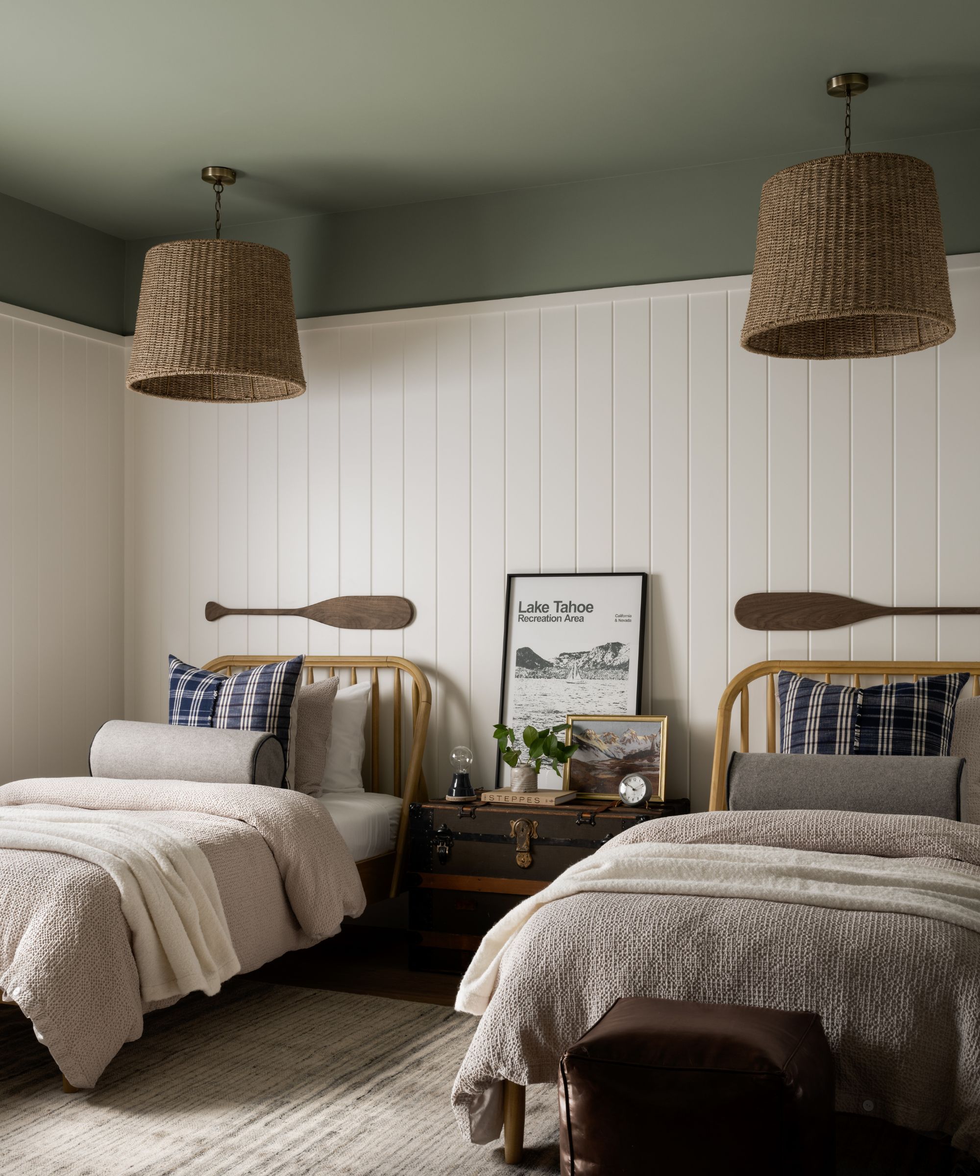
6. Nature Lover, Benjamin Moore
Tahoe Pines
Another green paint that's not quite so dark is Benjamin Moore's Nature Lover, which was used in this twin bedroom. An unexpected way of decorating with paint, the gentle green hue is used across the ceiling, creating a calming space paired with the white walls.
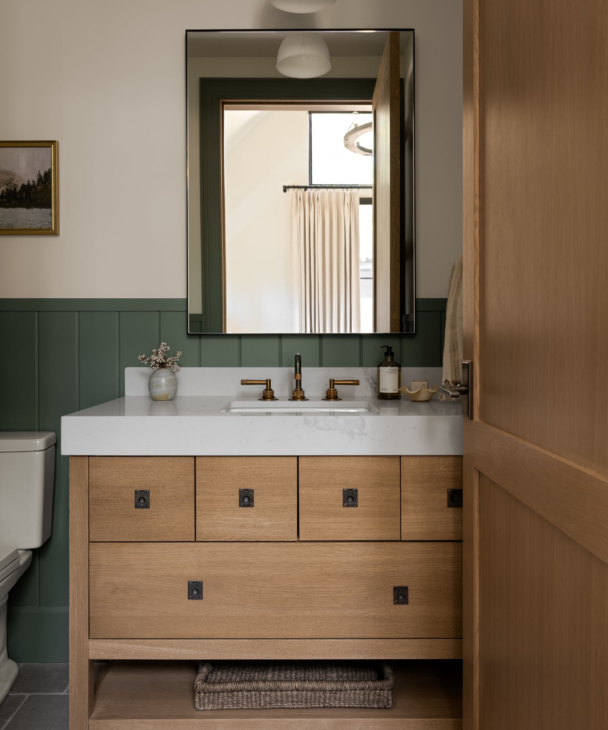
7. Retreat, Sherwin-Williams
Tahoe Pines
Sherwin-Williams Retreat is a muted green paint with undertones of blue and gray, giving it a restful feel. In this guest bedroom bathroom, this interesting paint color was used across the lower paneled walls, paired with light wood tones throughout the room which further help create a soothing feel.
8. Sandy Hook Gray, Benjamin Moore
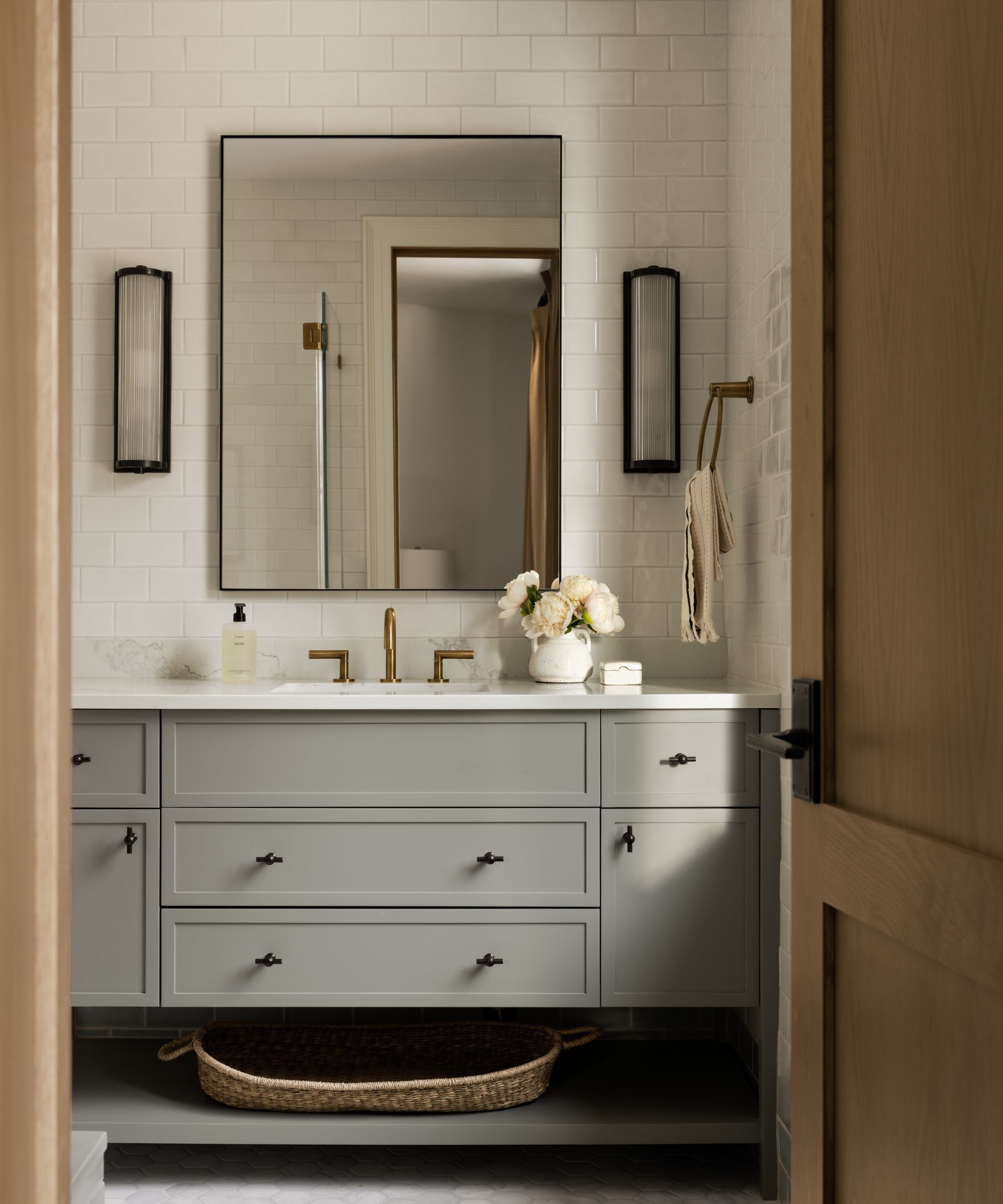
Tahoe Pines
The bathroom cabinets in this guest room were painted with Benjamin Moore's Sandy Hook Gray, a warm-toned greige that makes for a timeless neutral color choice.
Paint colors such as this are a great choice if you don't want to decorate with color but want to add more interest than classic whites; warming up the room and adding more depth.
9. Pigeon, Farrow & Ball
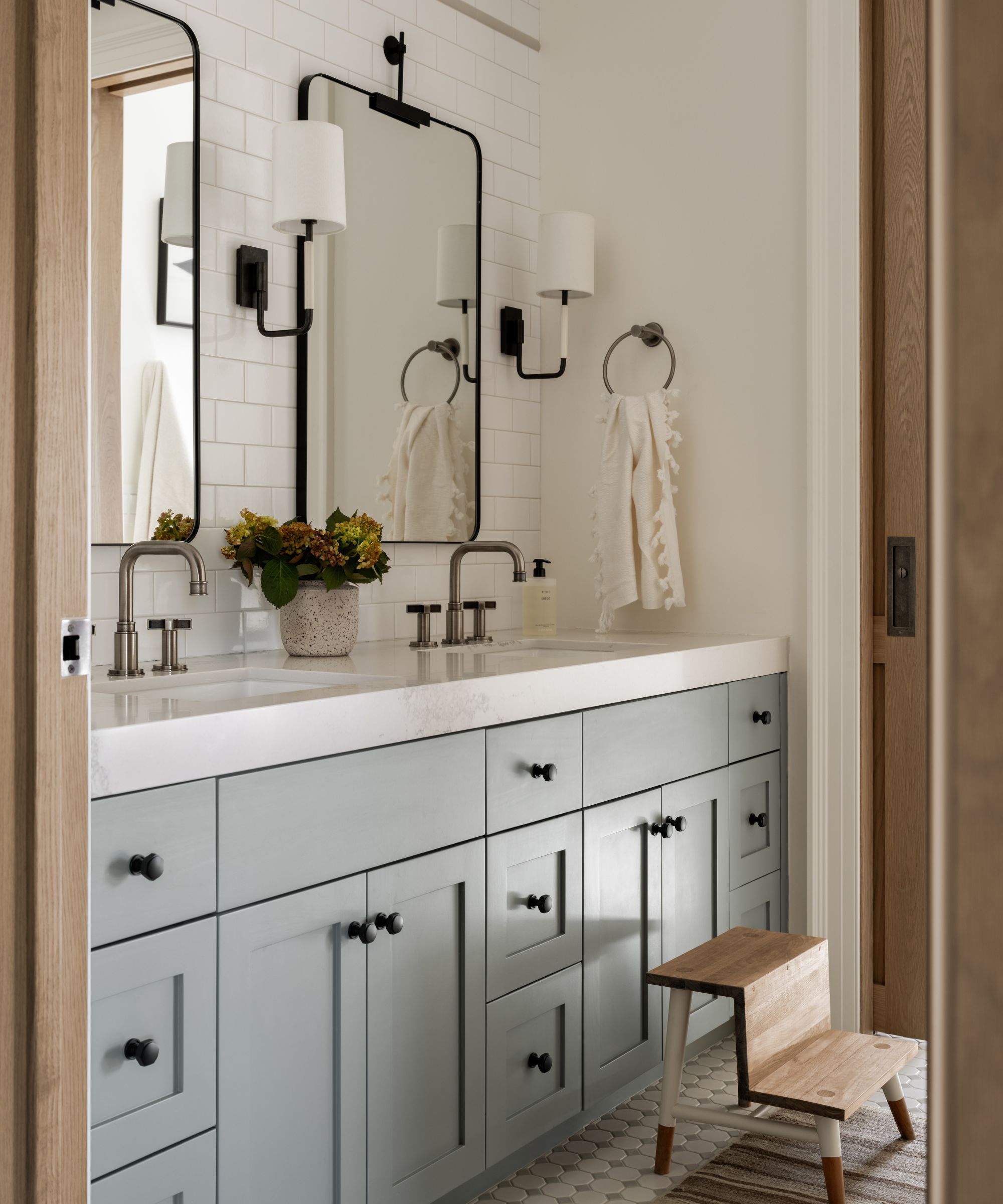
Tahoe Pines
A blend of blue and gray tones that's described as a 'chameleon' paint color, Farrow & Ball's Pigeon, was used on these bathroom cabinets.
Again, this in-between hue is an effective way to add interest to neutral color palettes, while maintaining a calming look that feels inspired by the natural world.
There are lots of ways to decorate with Farrow & Ball's Pigeon, whether you use it to color drench or as an accent color.
10. Night Train, Benjamin Moore
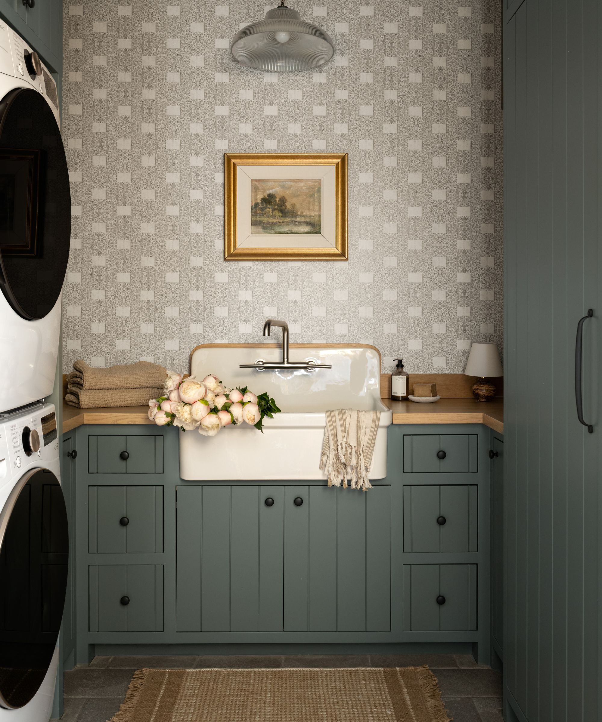
Tahoe Pines
Lastly, Benjamin Moore's Night Train is a cool dark gray-green that was used across the cabinets in this laundry room.
Similar to the bathrooms and pantry of this home, we're seeing plenty of dark, moody paint colors used in small rooms, and for good reason. These moody shades work so well in these hardworking rooms, providing an unexpected color moment where you wouldn't typically expect it.
These earthy and calming paint colors will no doubt have you dreaming of your next home decor project – whether that's refreshing a white kitchen or adding a bolder shade to a home office or pantry.

Emily is a freelance interior design writer based in Scotland. Prior to going freelance in the spring of 2025, Emily was Homes & Gardens’ Paint & Color Editor, covering all things color across interiors and home decor for the Homes & Gardens website. Having gained specific expertise in this area, Emily is well-versed in writing about the latest color trends and is passionate about helping homeowners understand the importance of color psychology in home design. Her own interior design style reflects the simplicity of mid-century design and she loves sourcing vintage furniture finds for her tenement flat.