European designers all swear by this expensive-looking color to give their rooms more elegance
Across Europe, designers are agreeing on one particular shade to use in rooms that looks expensive, elegant and works wonders on your decor
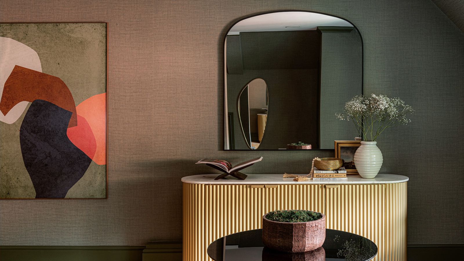
The European design scene is known internationally as the most refined. Parisian and Milanese designers tend to favor luxe surfaces and organic shapes, while British experts are embracing texture like never before. And across the continent, in countries as far-reaching as Norway and Ukraine, there is one accent color designers are agreeing on that looks expensive and makes rooms more elegant. Spoiler alert: it's red.
Red has been making design news this past year with the rise of the color trend of the Unexpected Red Theory doing the rounds on TikTok. It holds that a flash of red, when used in a room that you might not expect it (because the palette is more neutral, or dark-toned, perhaps) can totally energize a room.
'I don't think you can just insert a red accent pillow and be done with it: that's too contrived,' says the Minneapolis-based designer Anne McDonald of Anne McDonald Design. 'What works for me in that theory is that it asks you to look at your room and decide if it gives you a current of excitement or not. And if it doesn't, it may well be that you're missing an unexpected tone, which could easily be a red.' And European designers are in total agreement.
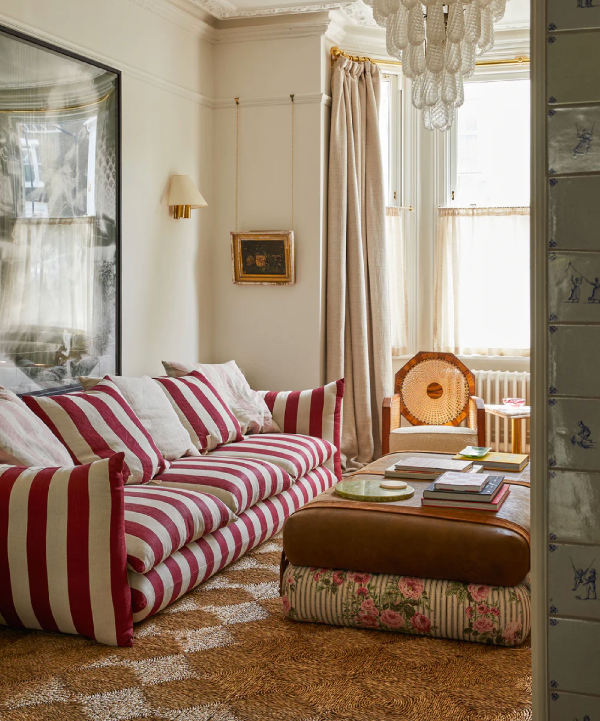
'Red is the one color that will always elevate a space,' says the British designer Angus Buchanan of Buchanan Studio. He used it to great effect on his iconic Studio Chair and Sofa (pictured above) and its dashing red and white stripes. 'You'll love red for a long time,' he adds. 'It has never been out of fashion, and it has very long-lasting appeal.'
The French designer Manola Ballerio of the Monaco-based studio Sabrina Montecarlo agrees that red is the right color for right now. 'It looks more expensive,' she says. 'When you use it as an accent, it looks like you've added some personality.'
'Red sticks in your mind – it's a real power color,' agrees British designer Lara Bates, founder of the international studio Lara Et Al .
How designers are using red to elevate any room
The Norwegian color expert Dagny Thurmann-Moe of Koi Color Studio sees red as part of a wider palette that feels exactly right for now. She thinks that 'sunset colors' like blush, yellow, orange, terracotta, and, yes, hints of red provide the elevated warmth we all crave now.
'This palette is not particularly difficult to play around with,' she says. 'Yellows, oranges, reds, and pinks are all neighbors on the color wheel so you can’t really miss when you marry them together. Just seek out differing tones - you want the elements in a room to feel like a family rather than twins. So, for example, you’d use a slightly different yellow on the drapes than on the doorframe, and a fiery red next to, say, a softer pink.'
Ukrainian designer Nastia Mirzoyan of the Kyiv-based studio Mirzoyan Studio tends to favor decorating with neutrals on the walls, but uses red as an unexpected accent. 'Color is used strategically to create focal points and add energy to the space,' she says. 'For example, a red side table brings life to otherwise neutral rooms. We use these colors sparingly to maintain balance while adding visual interest.'
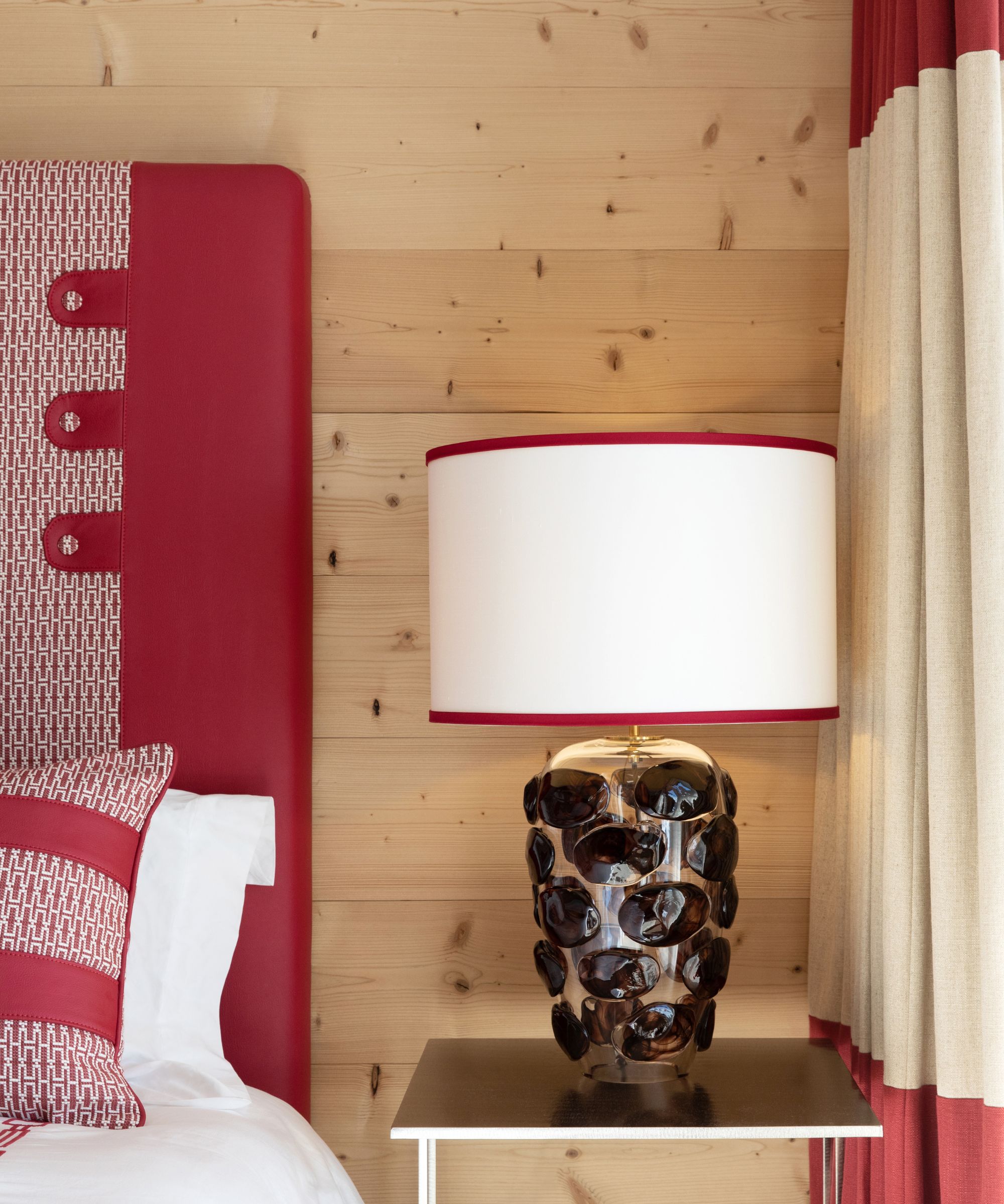
'I would steer clear of red furniture, but I love it as an accent in things like artwork, flowers or pillows,' says Manola Ballerio. 'It's so impactful as a little moment in an otherwise monochromatic scheme.' She designed this bedroom above, a haven of Alpine woods and whites, enlivened by red details.
The British color expert Joa Studholme, Color Curator for Farrow and Ball, likes to use red in smaller areas and go big on it. 'Earthy reds are very good in little spaces like powder rooms,' she says. 'And they go particularly well with browns as long as they have a red base, which I'd perhaps use on the trim.'
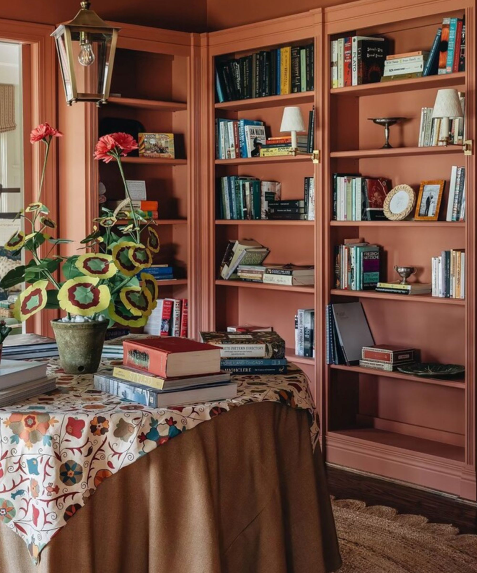
'With red, it's all about getting the shade of it right,' says London designer Lara Bates. 'You want that deep earthy red that makes it easier to work with and live with.'
Dagny's favored sunset colors tend to have orange notes in them, while oxblood is a big color trend at the moment, a darker version of red that has brown tones in it. You'll find that European designers are favoring those dusky notes over pops of crimson, like this library, above, which is painted in Red Earth by Farrow and Ball.
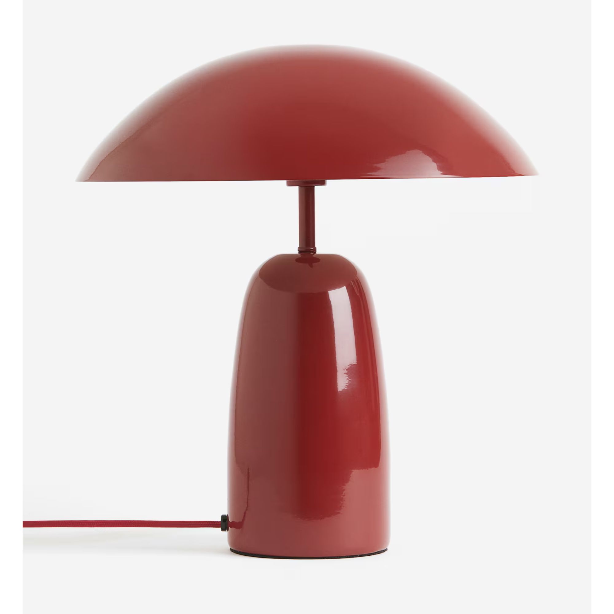
Add a touch of unexpected red to any room with this metal table lamp from H&M. Lacquered in a glossy red with a mid-century modern-shaped shade that will spread warm diffused light in a space that so often prioritizes task lights.
And that, ultimately, is why European designers love decorating with red – it's easy to use in almost any space, an instant mood booster that is both as elegant as it welcomingly energizing.
Sign up to the Homes & Gardens newsletter
Design expertise in your inbox – from inspiring decorating ideas and beautiful celebrity homes to practical gardening advice and shopping round-ups.
Pip Rich is an interiors journalist and editor with 20 years' experience, having written for all of the UK's biggest titles. Most recently, he was the Global Editor in Chief of our sister brand, Livingetc, where he now continues in a consulting role as Executive Editor. Before that, he was acting editor of Homes & Gardens, and has held staff positions at Sunday Times Style, ELLE Decoration, Red and Grazia. He has written three books – his most recent, A New Leaf, looked at the homes of architects who had decorated with house plants. Over his career, he has interviewed pretty much every interior designer working today, soaking up their knowledge and wisdom so as to become an expert himself.
-
 Bryce Dallas Howard's bedroom is the most creative, social space in her entire home – she uses 'conversational seating' to create a multifunctional 'salon'
The actress's bedroom doubles as a home office thanks to its clever layout and furnishings, proving that this area is much more than a sleep space
By Hannah Ziegler
-
 7 questions to ask yourself before moving house – realtors promise answering these questions will prevent buyer's regret
Don’t make your move harder, ask these questions before moving to avoid mistakes
By Chiana Dickson

