10 entryway trends designers predict will help you step into style in 2025
New year, new entryway – these are the top trends to help you make a statement in the first room of your home
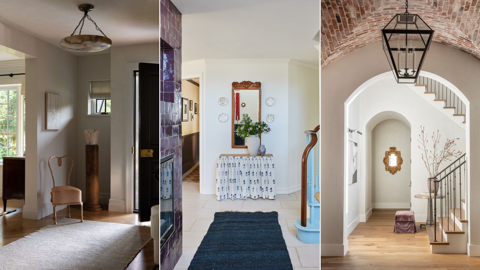
- 1. Perfecting vignettes
- 2. Showing off your personality
- 3. Using rich, bold color schemes
- 4. Create a moment with one stand-out piece
- 5. Create a place to show-off antiques
- 6. Investing in custom storage
- 7. Go big with statement lighting
- 8. Adding interest to the walls
- 9. Introducing pattern and color underfoot
- 10. Designing with glass

Charlotte Olby
The entryway has a lot of pressure riding on it. Other than the exterior of your home, it is the first peak of your home guests receive on arrival and it is the space you return home to every day.
An entryway should be welcoming, memorable, and uniquely personal. So when it comes to knowing and nailing the top trends to help you on your way to creating a really great first impression, we've done the leg work and talked to renowned experts to find out which entryway ideas will be big in 2025.
Here, we showcase the most exciting trends to help with designing an entryway or make your existing entryway more inviting.
10 stylish entryway trends for 2025
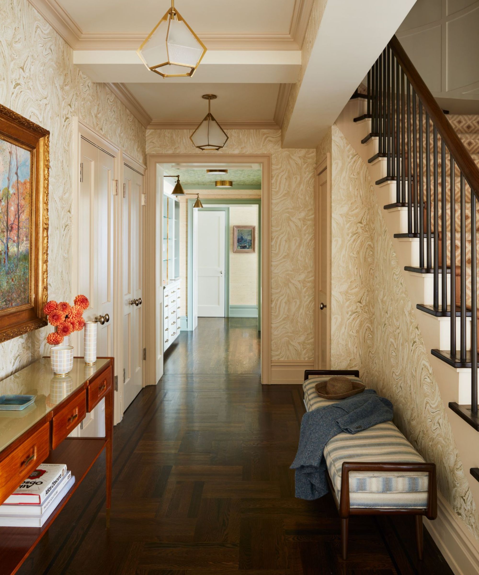
'A foyer is often the first chance to make a first impression for guests entering your home,' says Gideon Mendelson, founder and creative director of Mendelson Group. 'It’s a great way to set the tone for the space within or use it as a standout moment.'
'Instead of treating your entryway as an afterthought, create a dedicated design that fits the space. By utilizing bold and thoughtful decoration, the room can feel intentional.'
To help guide you in the right style direction, avoid any outdated entryway trends, and offer the very latest insight from the experts, we have curated a collection of the top interior design trends you need to know to make your entryway look expensive. Let's get into it.
1. Perfecting vignettes
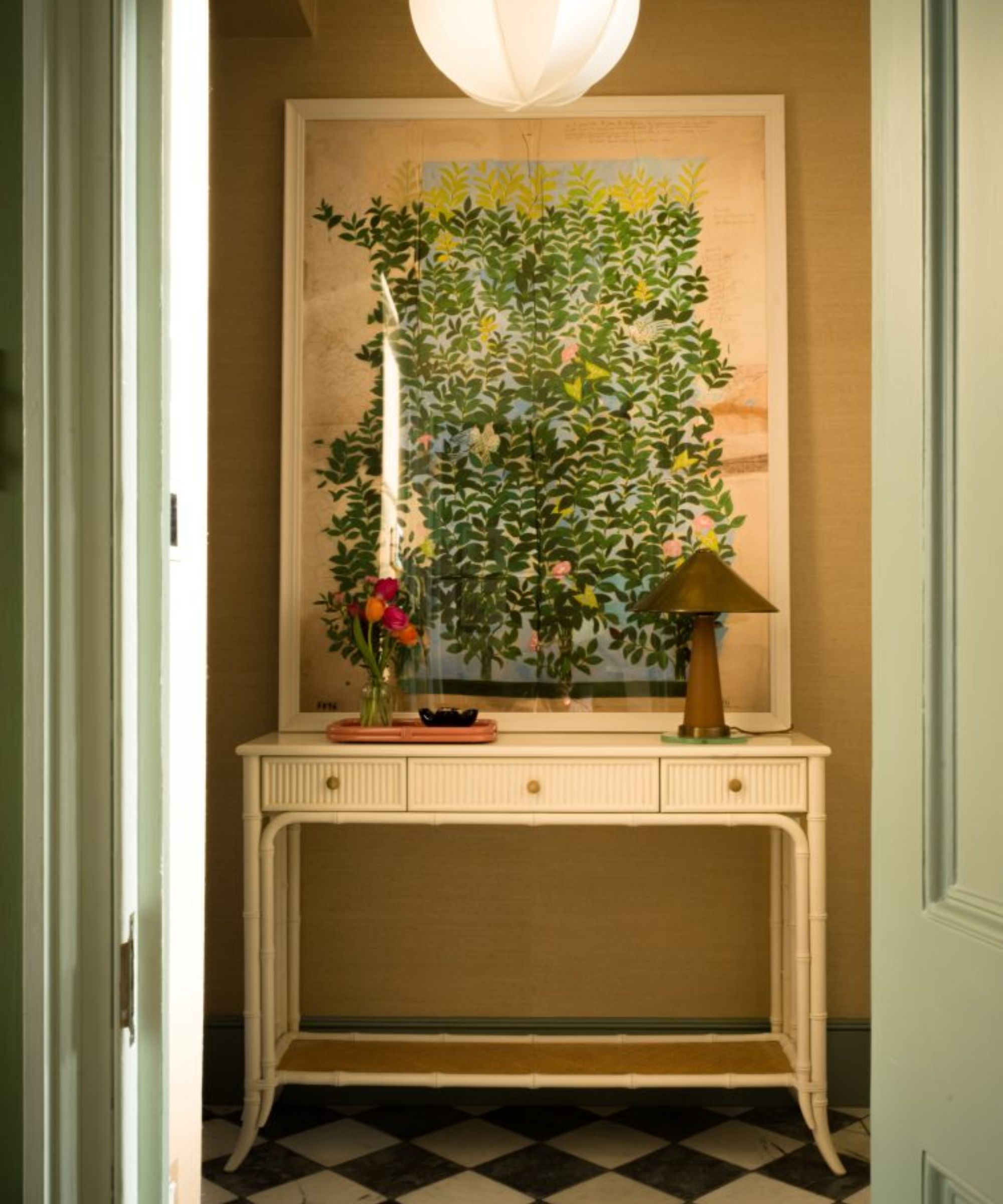
'This may be a bit broad to be considered a trend, but I think we're going to be seeing a lot more care and intention put into entryway design in the year to come,' observes interior designer Kathy Kuo.
'I've been seeing more and more styled vignettes on entryway console tables, as well as statement lighting and mini gallery wall motifs,' she adds. 'Your entryway is your home's first impression, so it really does make sense to take as much care there as you would any other space in your home.'
Start with a statement piece, such as a mirror or a piece of art, to anchor the design. Then layer smaller items like ceramic bowls for keys, a beautiful candle holder, or stacks of books to create height and dimension.
'Of course, no entryway is complete without an oversized mirror (preferably with a unique frame) and a console table styled with a mix of personal items, books, and maybe a statement lamp for that extra bit of drama,' adds designer Linda Hayslett of LH.Designs. 'It’s about making a memorable first impression that sets the tone for the rest of the home.'
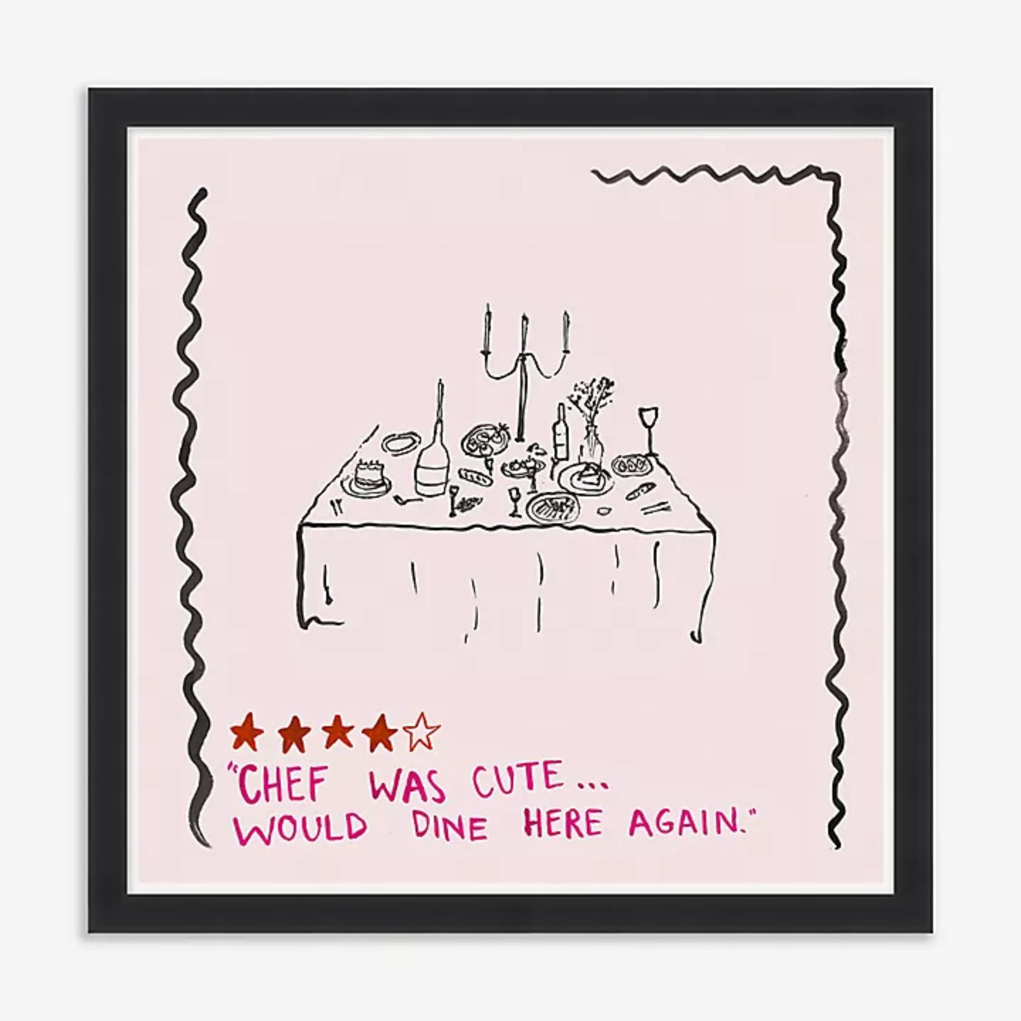
For a cute and fun entryway piece of art, this print that rates the home 'chef' after an evening at your home is super playful and chic.
2. Showing off your personality
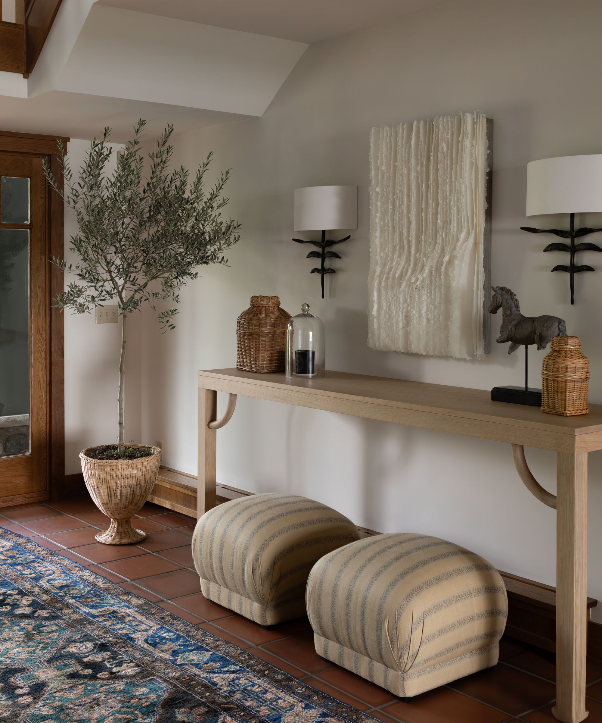
In 2025, entryways will be less about following design rules and more about reflecting the uniqueness of the homeowner. Your entryway vignette is an opportunity to create a snapshot of your personality as guests and loved ones enter your home.
'I always believe that an entryway should reflect the homeowners’ style and personality right as they entire the home,' says Taniya Nayak of Taniyak Nayak Design. 'Don’t use this space as just a pass-through. Add fun wallcoverings and chandeliers. Put down a runner or an interesting tile. Set the tone for the rest of the house the moment you walk in the door – including the hardware on your door,' she suggests.
Think curated collections of objects like travel mementos, framed family photos, or seasonal flowers to add warmth and depth to the space.
3. Using rich, bold color schemes
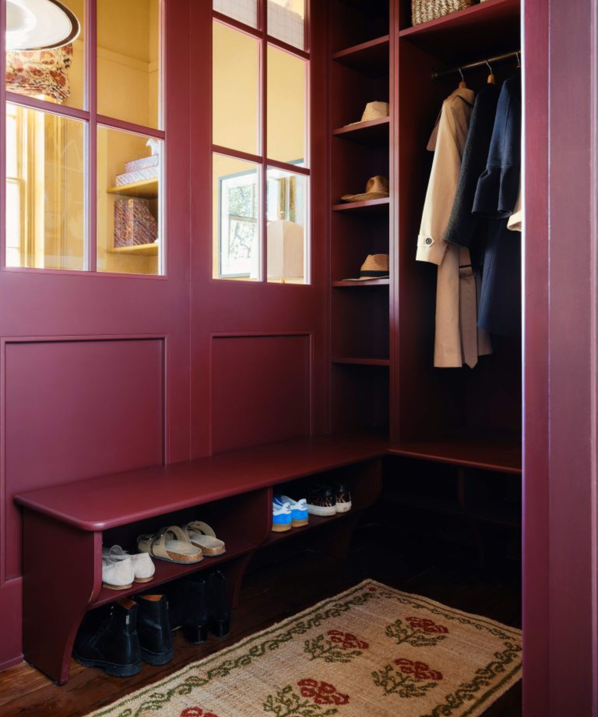
Arriving or leaving, the entryway's design sets a mood, and there is no better way to do so than with room color. 'A mix of warm, dark, and cheerful hues will be seen in entryways in 2025,' says Molly Torres Portnof of DATE Interiors.
'For 2025, entryways are getting their own star treatment with bold colors, statement lighting, and sculptural furniture,' continues Linda Hayslett. 'Designers are embracing darker, moodier tones like deep greens or navy, which make the space feel grounded and luxurious.'
Joa Studholme, color curator, Farrow & Ball champions the use of dark colors in a small room: ‘When dealing with a small or dark hall it’s best to embrace what you have rather than fight it. Paint it a strong color that will thrill you and your guests when you arrive at the house and make the rooms off it feel bigger and lighter.’
4. Create a moment with one stand-out piece
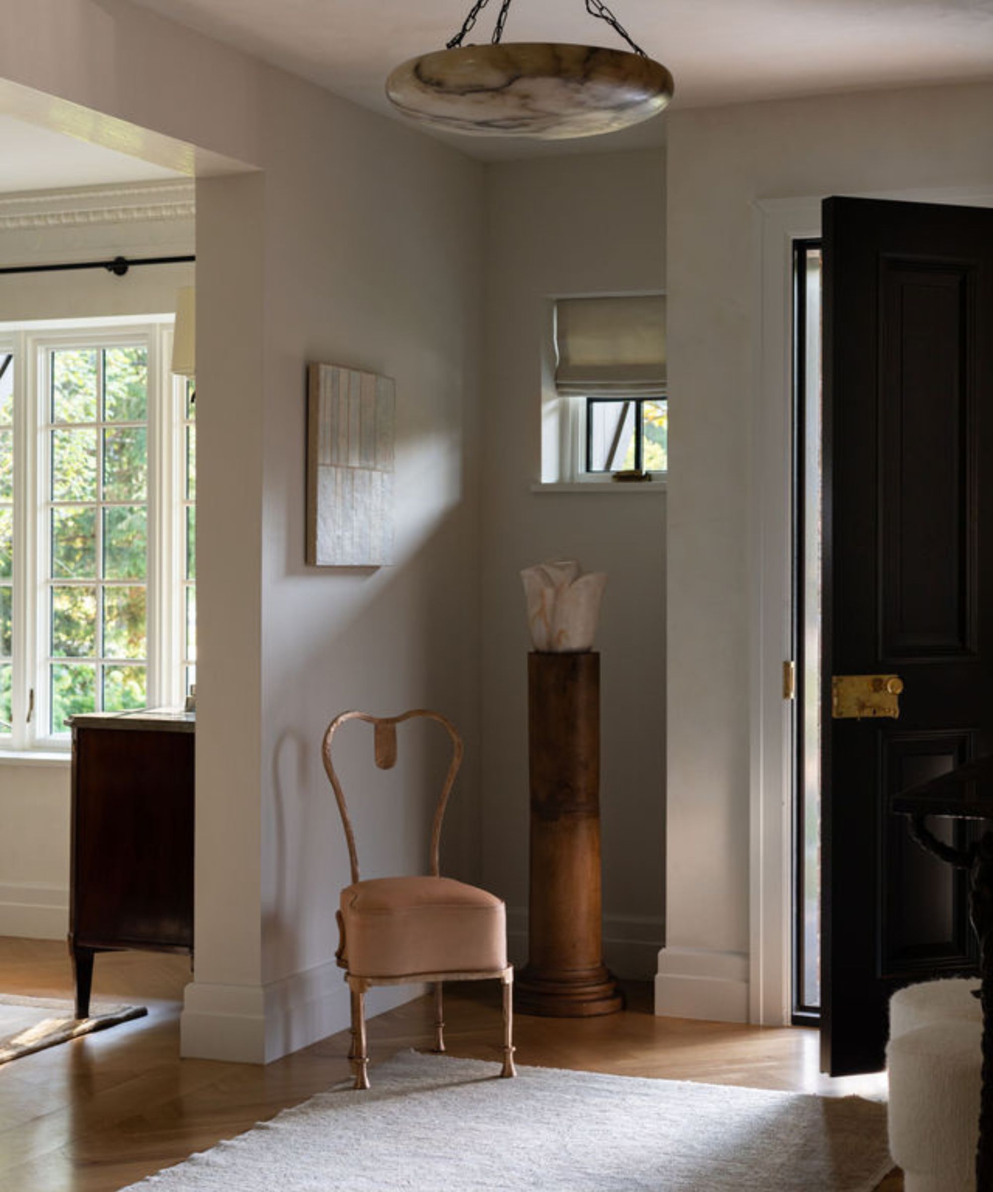
Whether it’s a bold piece of art, a striking piece of furniture, or an eye-catching light fixture, a standout element can set the tone for the rest of your home.
'Entryways are first impression areas so it's worth it to invest in special pieces and architectural elements to make it feel special and set the tone for the rest of the house,' says interior designer Wendy Labrum. 'Interesting tile on the floor, and special storage pieces like an antique commode add both style and purpose. We always like to incorporate an impactful piece of art or a beautiful antique mirror as well.'
'These pieces should all flow with the rest of the house but allow the entryway to stand alone as a special welcoming space to the home,' Wendy continues.
'We love using a statement piece in the entryway; rugs are a great alternative to crazy wallpaper,' adds Erin Fearins, Studio SFW partner. 'And it's much easier to swap it out if you get tired of it or want to change it up for the seasons.'
5. Create a place to show-off antiques
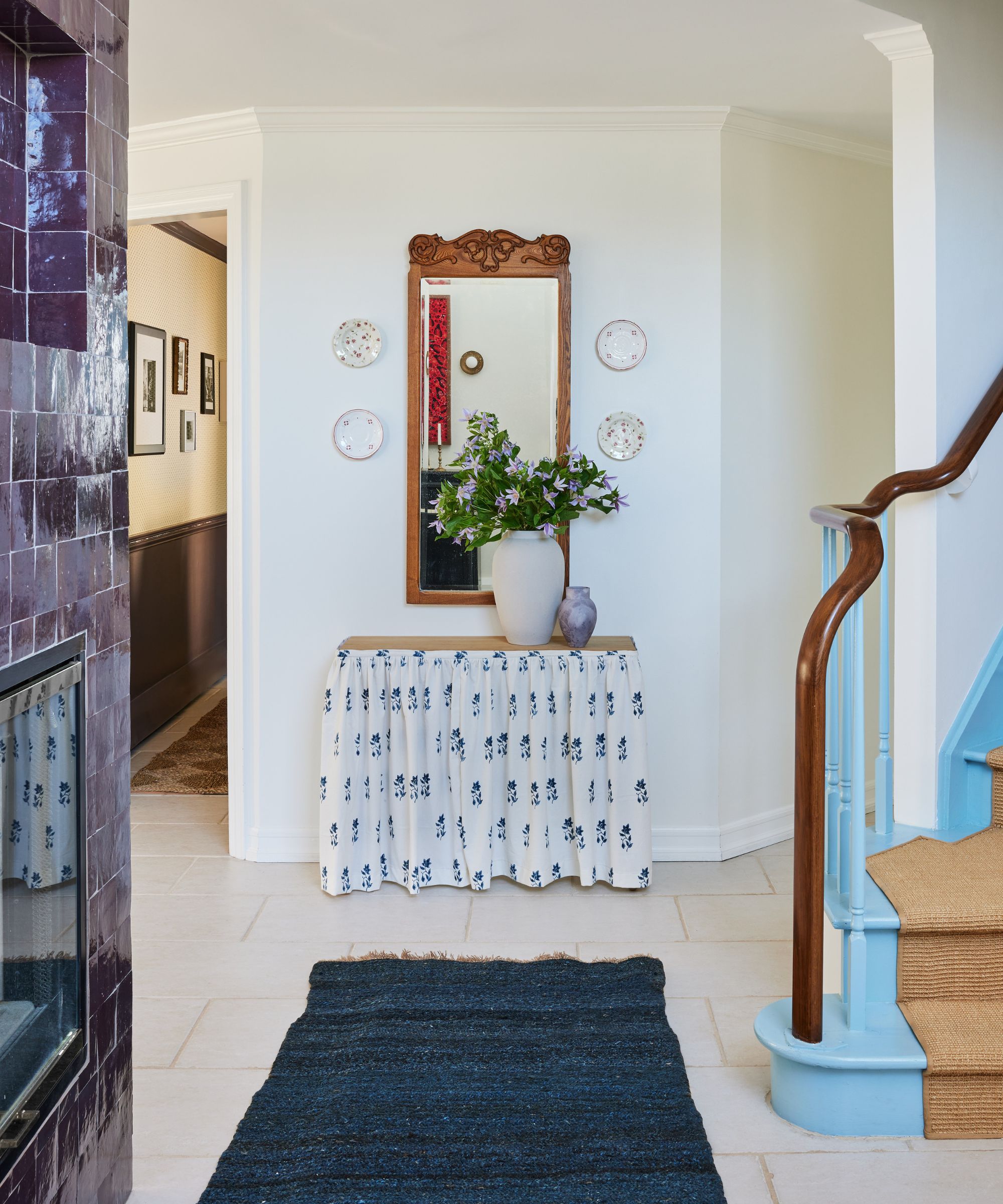
Minimal and unassuming entryways have had their day. The entryway is now being considered as a room of its own – and should be treated as such with a bold design that will wow. In 2025, designers are leaning into the idea of mixing old and new, creating entryways that feel rich with character and history.
When there is room to store the usual entryway detritus somewhere out of sight of the entrance, take the opportunity to place a favorite piece of antique entryway furniture, vintage art, or a handmade sculpture as a way of setting the stage for the rest of the decorative scheme in a house.
‘A strong, one-off unique piece of art is a great way to draw focus into a space that would otherwise be awkward or too small,’ says Jessica Bennett of Alice Lane Interior Design.
6. Investing in custom storage
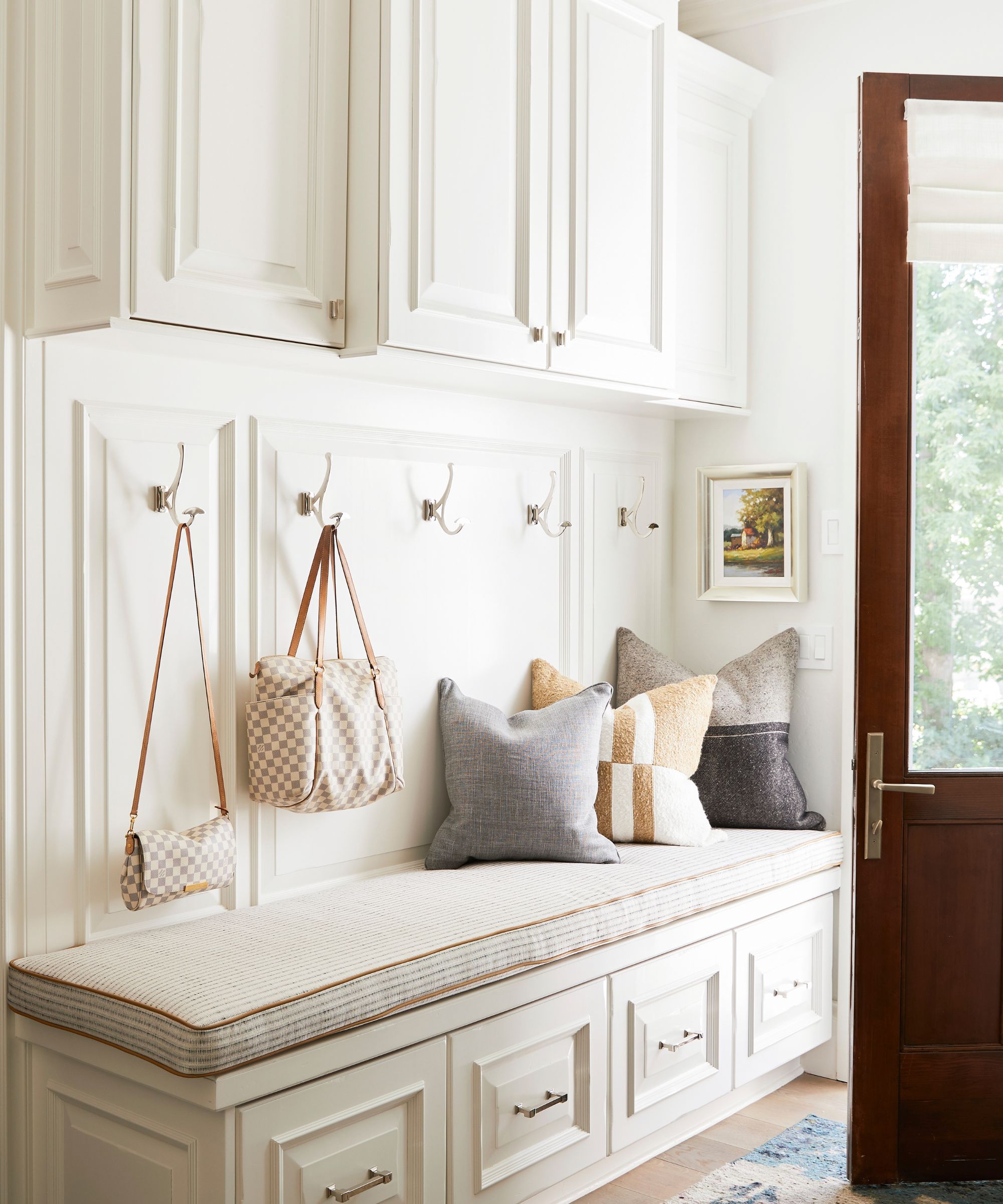
At the entrance to your home, storage should restore calm, provide display space, and be suitably chic and functional, which is why entryway storage is going full bespoke for 2025. It’s a lot for one small space to capture so thoughtful storage is vital.
When commissioning a piece of bespoke joinery, consideration is needed to ensure that the cabinetry style complements the room’s aesthetics as well as being of the correct scale and proportion, says Jessica Bennett of Alice Lane Interior Design who designed this home in Utah.
‘Built-in cabinetry is not only an investment and will hopefully add value to your property but is also personal to you as you will be living with it every day. Although more expensive than shelving, drawers, visible or behind doors, are a much more efficient way of storing and accessing items.'
Space planning with a budget to spend on bespoke joinery is the ideal solution to the small room conundrum. Ceiling-high shelving or cabinets that run up and over a door provide useful extra space.
7. Go big with statement lighting
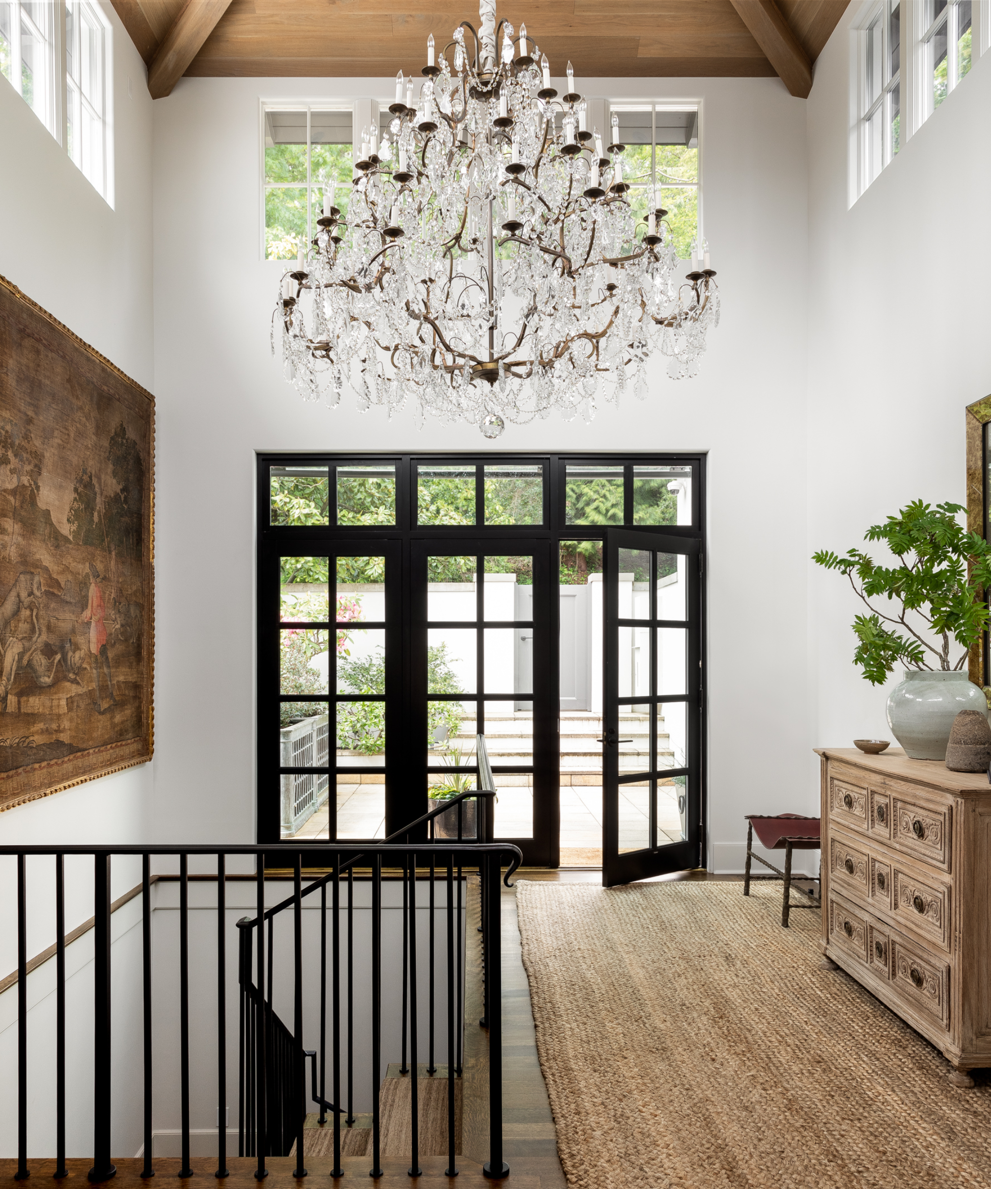
The entryway is usually one of the tiniest spaces in our homes, but the latest entryway trends suggest that we shouldn't be decorating in a small way, especially when it comes to the light fixtures we use.
From dramatic chandeliers to oversized pendants, bold lighting choices are setting the stage for memorable entrances in 2025.
'There are various entryway lighting tricks available these days to make an entrance appear more exciting – and feel grander at the same time,' says Sally Storey, creative director of John Cullen Lighting.
‘Add impact by hanging an oversized pendant and dimming it for mood, but use this in conjunction with downlights that can spotlight a picture on the wall or highlight flowers on a console table.’
Here, an oversized vintage crystal chandelier from the original Fairmont Hotel is the first element that guests notice when they visit this hillside home in Seattle. 'This was the only light fixture that wasn’t replaced when we remodeled this home,' says interior designers Tim Pfeiffer and Peak Petersen of Hoedemaker Pfeiffer.
8. Adding interest to the walls
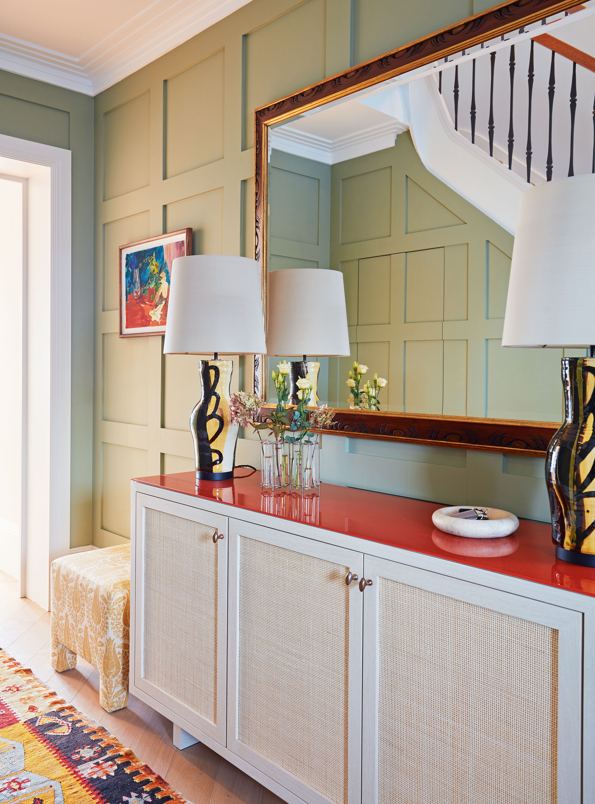
Your walls are the perfect opportunity to introduce personality and create depth in the space. From wallpapers to paneling, and curated gallery walls, designers are embracing ways to make entryway walls visually compelling.
An entryway is a perfect place for paneling as it adds character to an otherwise blank space (which might require lots of artwork to liven up). There are plenty of panel and molding options to choose from, be it a simple dado rail, or butt-and-bead joints which are typically found in period properties.
In this light-filled London house, the team at Studio Ashby added a sense of place with Jacobean-style paneling in a warm pale green and carried it up the full height of the walls, framing the doorway too. It adds immediate interest that is unrivaled. While this is a traditional English style, it also works beautifully in American homes.
9. Introducing pattern and color underfoot
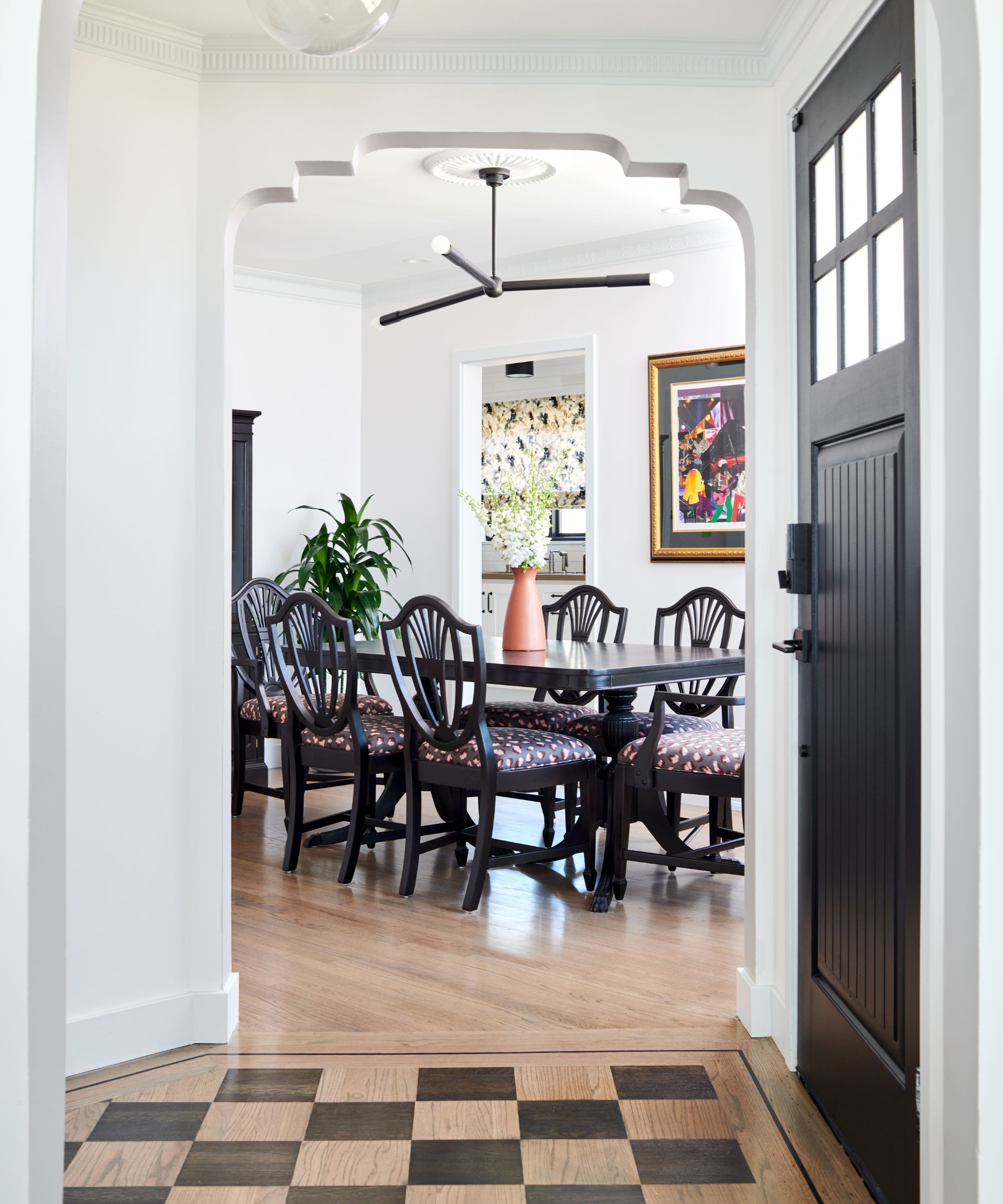
Your flooring is one of the first things people notice when they enter your home.
From patterned tiles to richly hued rugs, in 2025, entryways are stepping up their game with bold patterns and vibrant colors underfoot. 'Flooring is all about patterns in 2025 – herringbone wood, bold tile, or even inlaid designs that make a grand entrance,' says Linda Hayslett.
Tiled floors in entrance halls are an extremely practical solution for the part of the house that everyone will walk through, but they can be harsh and rather cold. Warm things up by taking a different route with carpet, suggests Irene Gunter, director of Gunter & Co Interiors. Another option is to lay down a rug. Rugs are back in a big way for entryways, so make them the star of the show in your home.
'You can either go for something decorative like a kilim rug or a natural rug in jute or sisal,' says interior designer Whittney Parkinson. 'We often use a big jute rug in a smart room to tone down the formality.'
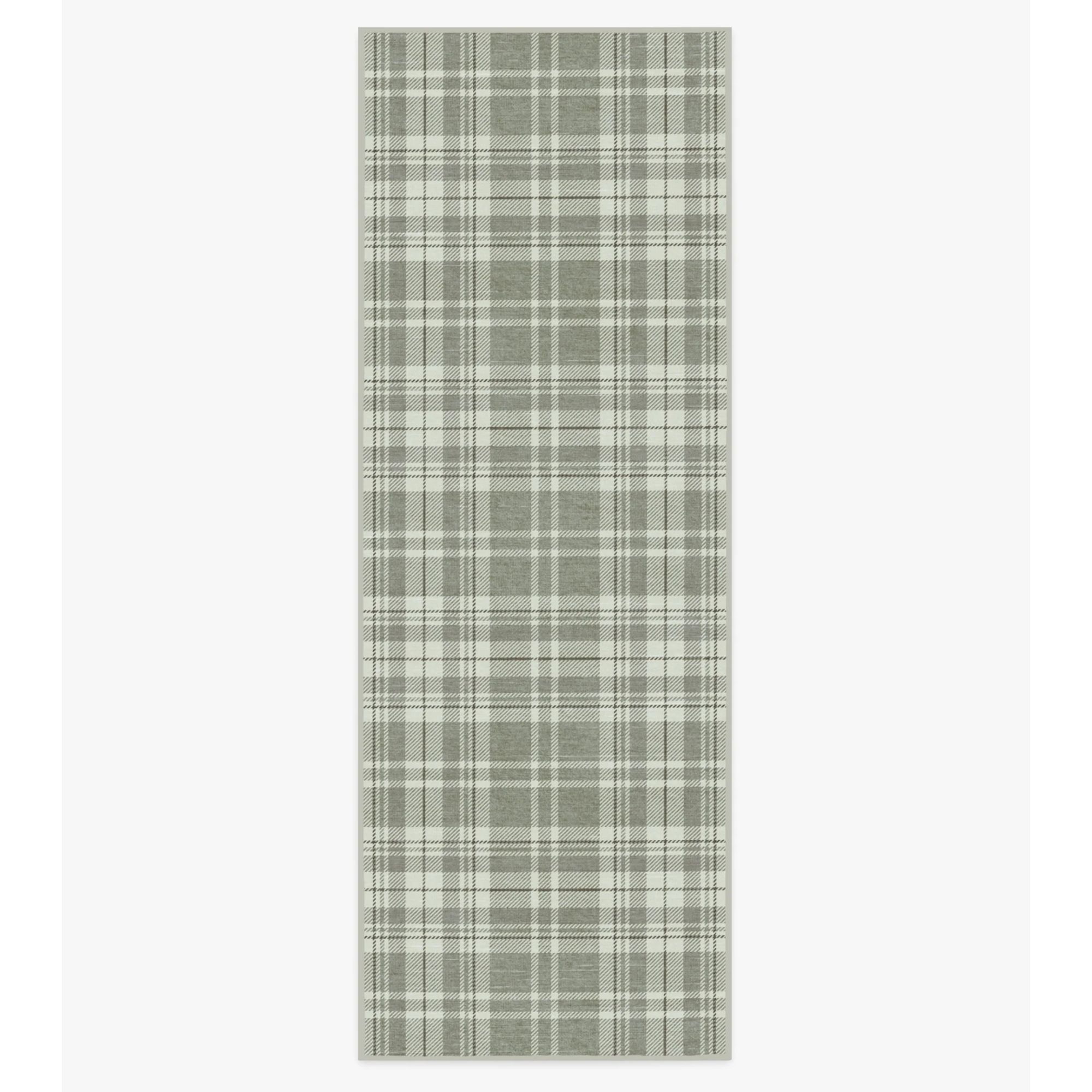
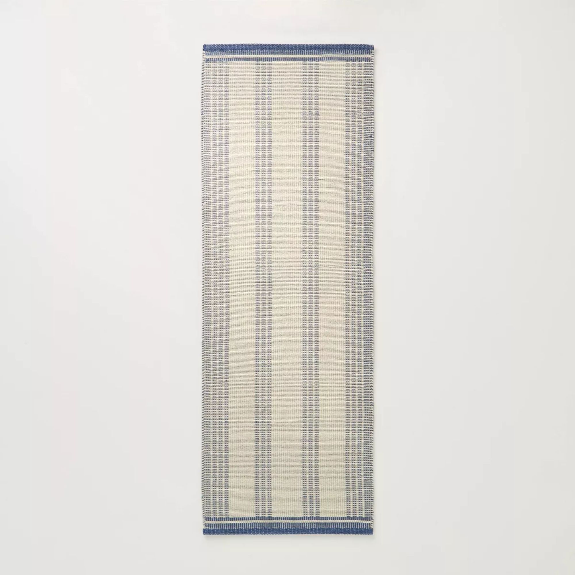
A plaid rug can make any place feel coziest and add a hint of pattern without being too over the top. With warm gray tones and pops of cream, this machine-washable runner is great for an entry.
10. Designing with glass
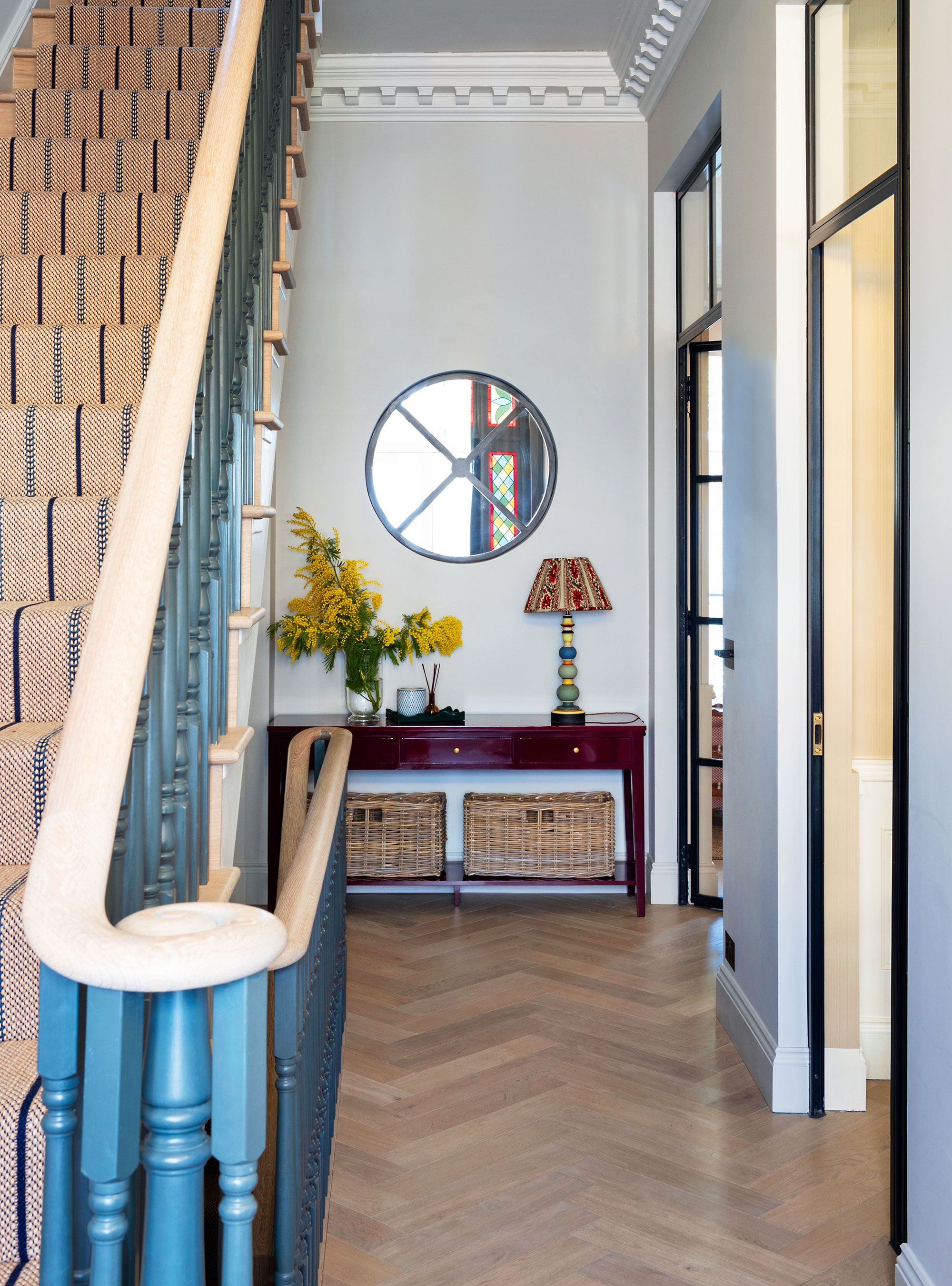
Letting light into dark spaces is one of the main attractions of designing with glass, but it can also introduce beauty and elegance, making it a pivotal entryway trend for this season.
Small entryways are notoriously lacking in natural light but one way to overcome this is to add a porthole mirror at the far end. Not only will it introduce an interesting design feature but it will also help to bounce light around the entrance.
‘By doing this, we brought light into an otherwise dark and gloomy space but I also love the way it reflects the stained glass in the front door when the light is falling in a certain way,’ adds decorator Sarah Brown who designed this house. She has embraced glass extensively in this space with two full-height glass doors replacing traditional solid ones leading off the two main living rooms.
As you look ahead to your own entryway refresh, consider these trends as a starting point for crafting a space that’s uniquely yours. With the right elements in place, you’ll ensure that the first step into your home leaves a beautiful and lasting impression.
Sign up to the Homes & Gardens newsletter
Design expertise in your inbox – from inspiring decorating ideas and beautiful celebrity homes to practical gardening advice and shopping round-ups.

Jennifer is the Digital Editor at Homes & Gardens. Having worked in the interiors industry for several years in both the US and UK, spanning many publications, she now hones her digital prowess on the 'best interiors website' in the world. Multi-skilled, Jennifer has worked in PR and marketing and occasionally dabbles in the social media, commercial, and the e-commerce space. Over the years, she has written about every area of the home, from compiling houses designed by some of the best interior designers in the world to sourcing celebrity homes, reviewing appliances, and even writing a few news stories or two.
- Charlotte OlbyStyle & Trends Editor
-
 This hot sleeper just found the perfect cooling mattress that's ended the sleepless summer nights – turns out $3,000 is the price you pay for an incredibly cool night's sleep
The Leesa Legend Chill Hybrid Mattress might be an investment, but I think it's worth it to finally find something that actually keeps me cool throughout the whole night
-
 I'm an interior stylist whose job is to make rooms look nicer in an instant – these are the 5 items I always add to a bedroom to make it look 10x better
I have styled plenty of bedrooms in my time as an interior stylist, and these are the 5 pieces I reach for time and time again to instantly elevate the room
