'That first impression sets the tone for the entire experience' – 3 entryway design rules Shea McGee says to always follow
In her new book, The Art of Home, designer Shea McGee offer her tips for styling room, here she focuses on creating the perfect entryway in a few simple steps
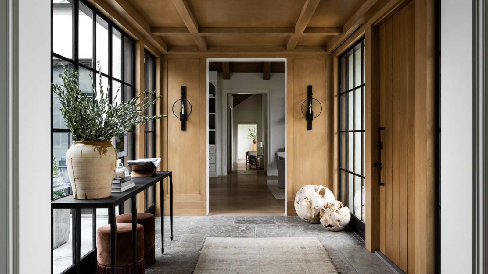
The moment you cross the threshold into a home's entryway you are handed the visual keys to how to rest of the space will unfold. Whether you are greeted by soaring ceilings and a winding staircase or a scatter rug and a few hooks on the wall, every home has an opportunity to make an entrance. I like to think of an entryway like a greeting; you can be welcoming with a warm hug or handshake - but that first impression sets the tone for the entire experience.
When designing an entryway, think beyond what you want the space to say and consider what it says about the rest of your home. This perspective will inform your decisions and how to greet your guests through the design.
Although styles and statements vary, furniture needs and combinations are often similar - think console vignettes, mirrors, bench seating or a foyer round table. Perhaps formulaic in plan, what happens next is creating an introduction to your home through pieces that speak to your style and the way you live.
1. Choose a focal point
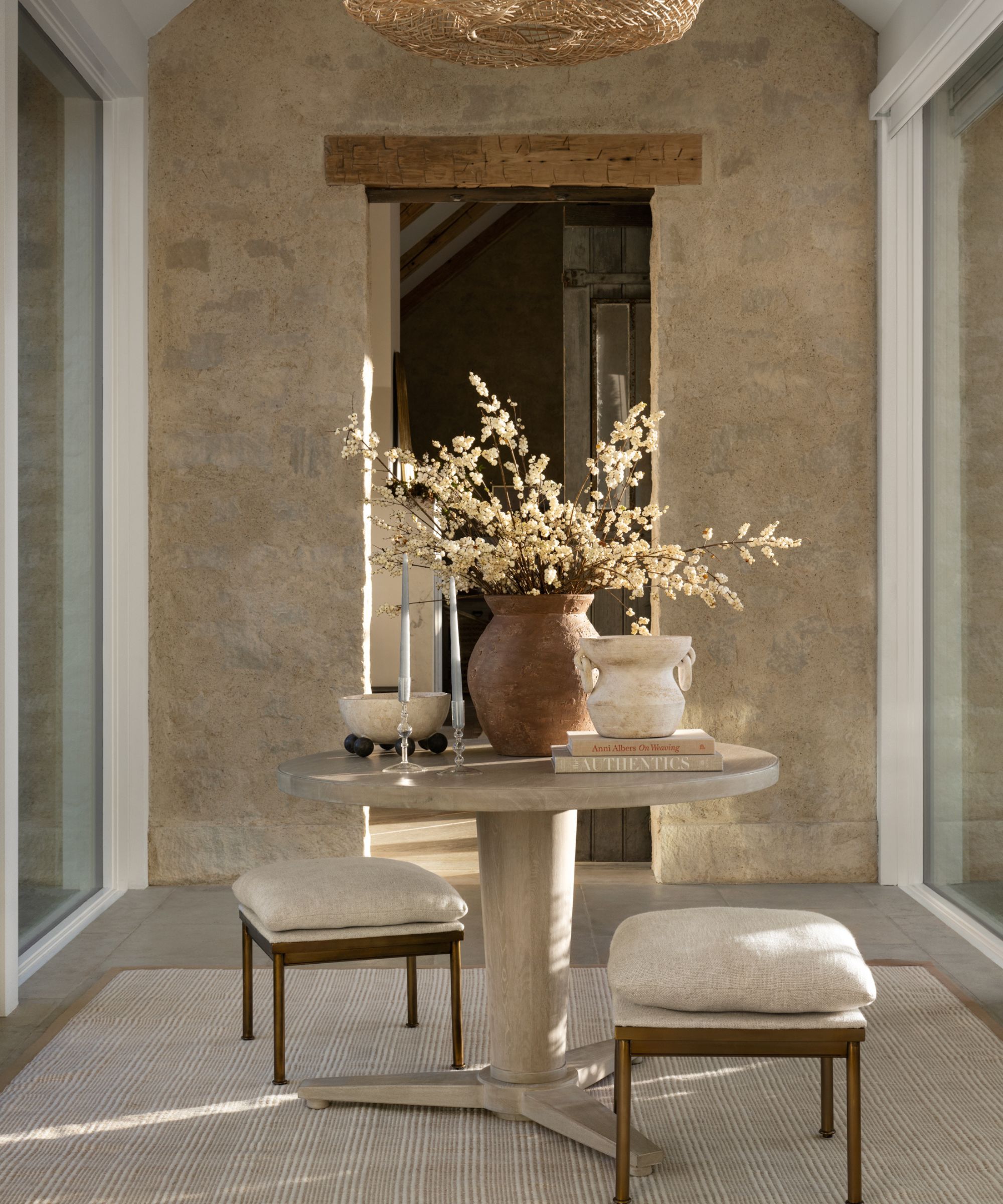
Choose a focal point, typically the largest piece in the room, and build from there. I love mirrors in an entry for many reasons - they draw your eye in, bounce light around, and give people the chance to do a quick glance on their way in and out of the door.
You can incorporate molding details or a texture like wood, stone or brick, but I find it most impactful to incorporate materials in entryways that bridge the exterior and interior of the home in either a literal or abstract way.
Tip: Carry the exterior door color inside for a simple way to connect the outside to the inside while simultaneously creating a grand appearance.
2. Add elegance with symmetry
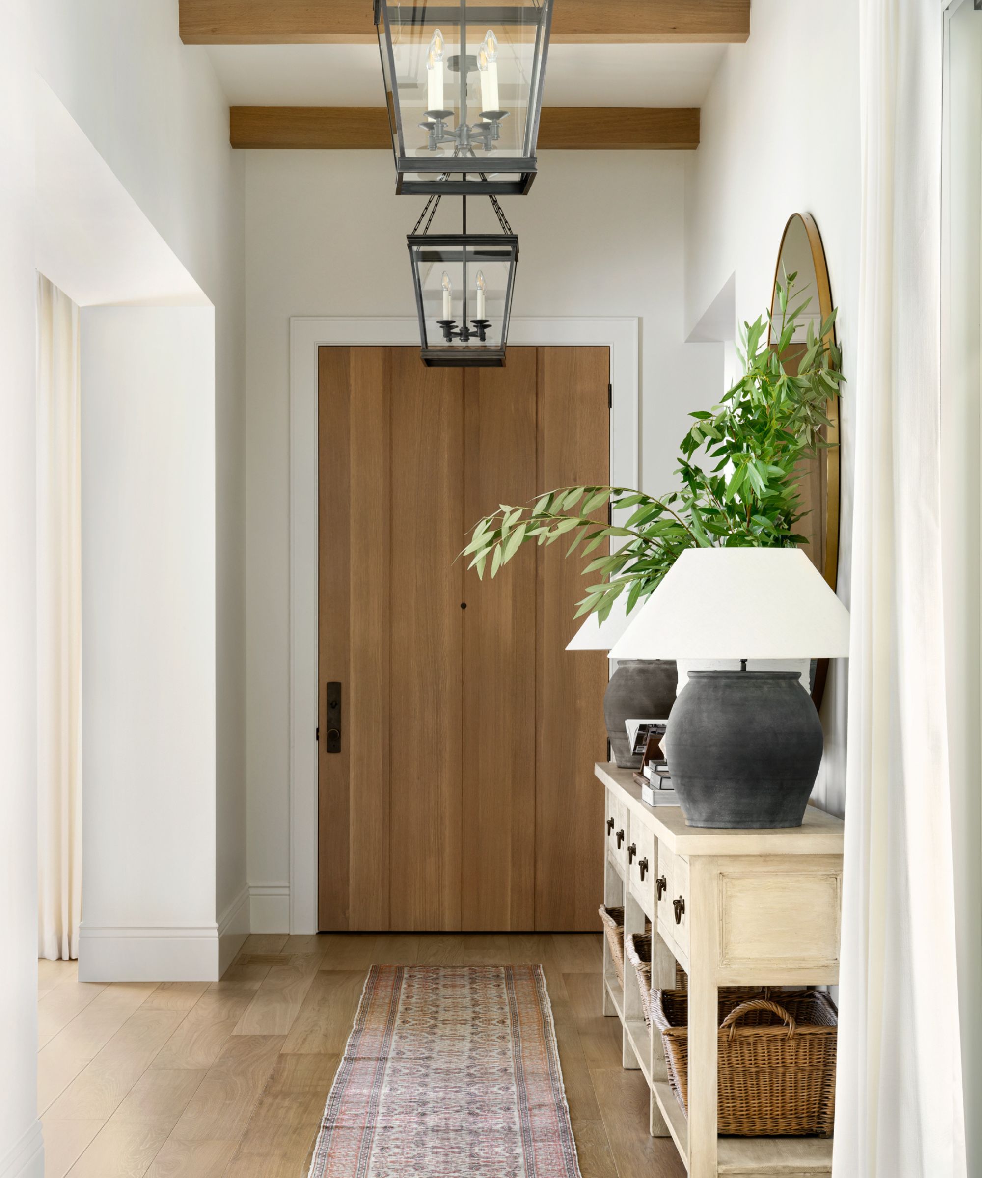
When designing this home in Marin County California, we used repetition of the oak beams and iron lanterns to highlight the length, rather than attempt to disguise the hallway-like features. A twelve-foot console is centered by an expansive gold mirror to bring a formal flair to collected finds like the antique jar lamps, and unframed oil painting, and French laundry baskets.
Tip: We often use vintage rugs in entryways to center the space and all color, pattern and eclecticism - all while hiding the dirt.
3. Add interest with console decor
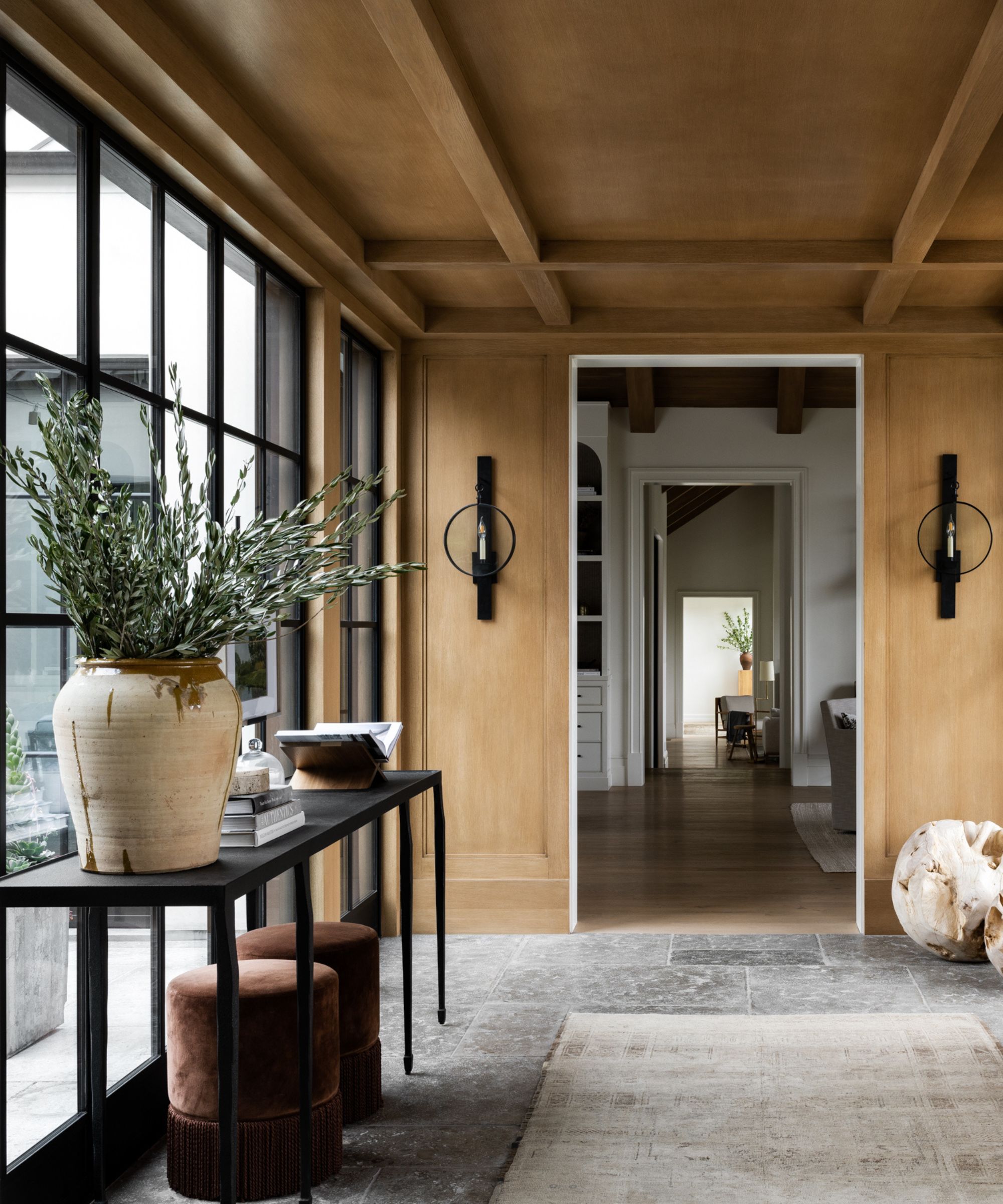
The grounding nature of organic materials resonates deep within us on a visual and emotional level. Stained-wood paneling creates a sense of intimacy with the large-scale steel windows. When styling a console pay attention to varying heights. when furniture space is limited but the room is calling for an additional layer, think no further than the floor - ottomans, a low plant, or sculptural objects add a lot without stealing square footage.
Tip: Molding details, flooring, lighting and even a floral arrangement - each decision in an entryway sets the tone for your home, down to the scent of the candles.
Book extract from Art of Home: A Designer Guide to Creating an Elevated Yet Approachable Home, Shea McGee.
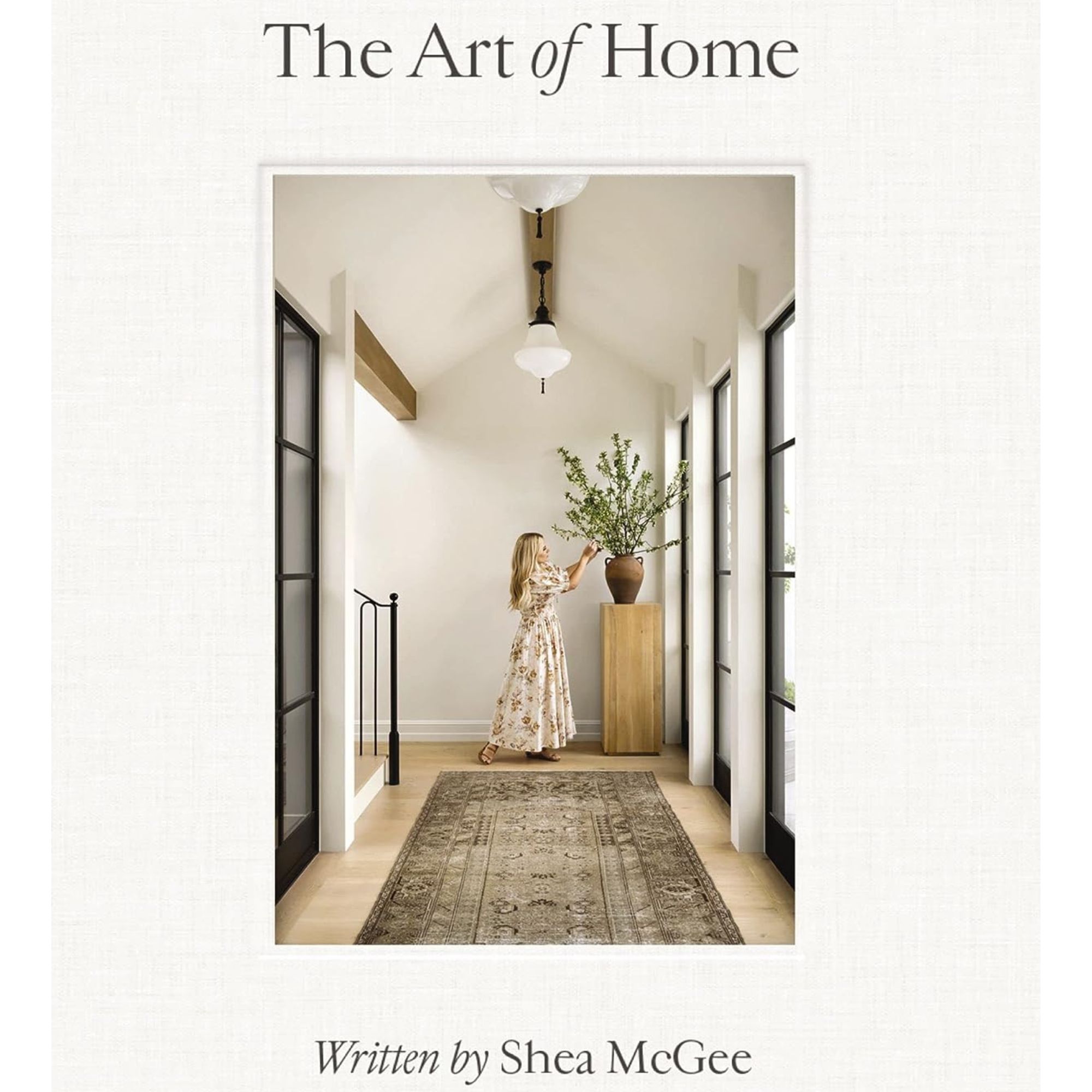
In The Art of Home, Shea McGee takes us through every room of the house, starting with an explanation of process and then guiding the way to a cohesive design. With step-by-step guides paired with her own design projects and the power of her personal stories, Shea helps us transform the most important parts of our lives and how we live.
Sign up to the Homes & Gardens newsletter
Design expertise in your inbox – from inspiring decorating ideas and beautiful celebrity homes to practical gardening advice and shopping round-ups.
-
 How to clean a patio – 6 different methods, and when you must use a chemical cleaning agent
From manual scrubbing, natural solutions or calling in the pros, industry experts reveal the benefits and considerations of each method
By Andy van Terheyden Published
-
 Kris Jenner's favorite air fryer, the Ninja Crispi, is the perfect small kitchen solution – it deserves a place on the most compact of countertops
Kris approves of this compact yet powerful air fryer, and so do our own kitchen appliance experts, praising it for its multifunctionality
By Hannah Ziegler Published