Have an awkward, empty wall in your home? Emily Henderson just shared her go-to tricks for sprucing up any blank space
The interior designer says there's so much you can do with a blank wall – all you have to is go big and get creative

It's nearly inevitable that at some point in the design process, you'll be left with a blank wall – one that's practically begging for some decoration. These vast, empty walls often cause loads of undue stress and decision fatigue, and it's difficult to know where to begin. But making sure each wall of your home has just the right amount of personality and visual interest is vital, taking you just a little bit closer to a beautifully designed dream home.
Luckily, interior designer Emily Henderson – a seasoned pro at sprucing up any space – just took to social media to share her favorite methods for bringing an empty wall to life. And while some are industry go-tos, others are refreshingly out of the box. Here's how Emily suggests filling that blank space in your home, and her best advice for getting your own wall decor ideas down.
How to fill empty walls in your home
A post shared by Emily Henderson (@em_henderson)
A photo posted by on
There's a near-endless list of ways to bring color, texture, and interest to an empty wall, so it's useful to have a cheat sheet – and Emily's supplied the perfect resource. In an Instagram video, she shows off her top three methods for styling an empty wall.
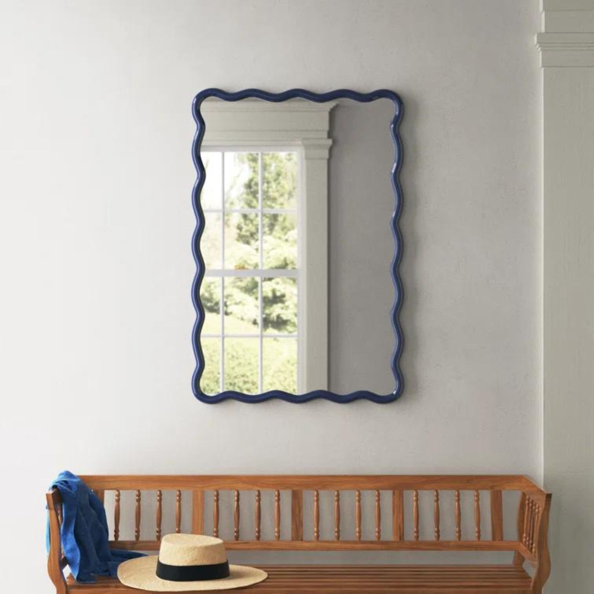
Emily calls her first trick 'art in repetition.' Select identical prints or frames and place them in symmetrical, patterned lineups on your wall for an eye-catching look that takes up just the right amount of space. This method is easily customizable, as the only rule it relies on is thoughtful spacing. While a gallery wall can easily spiral into an unmanageable collage, creating repetition in your space is difficult to get wrong – even the most indecisive of us are in the clear.
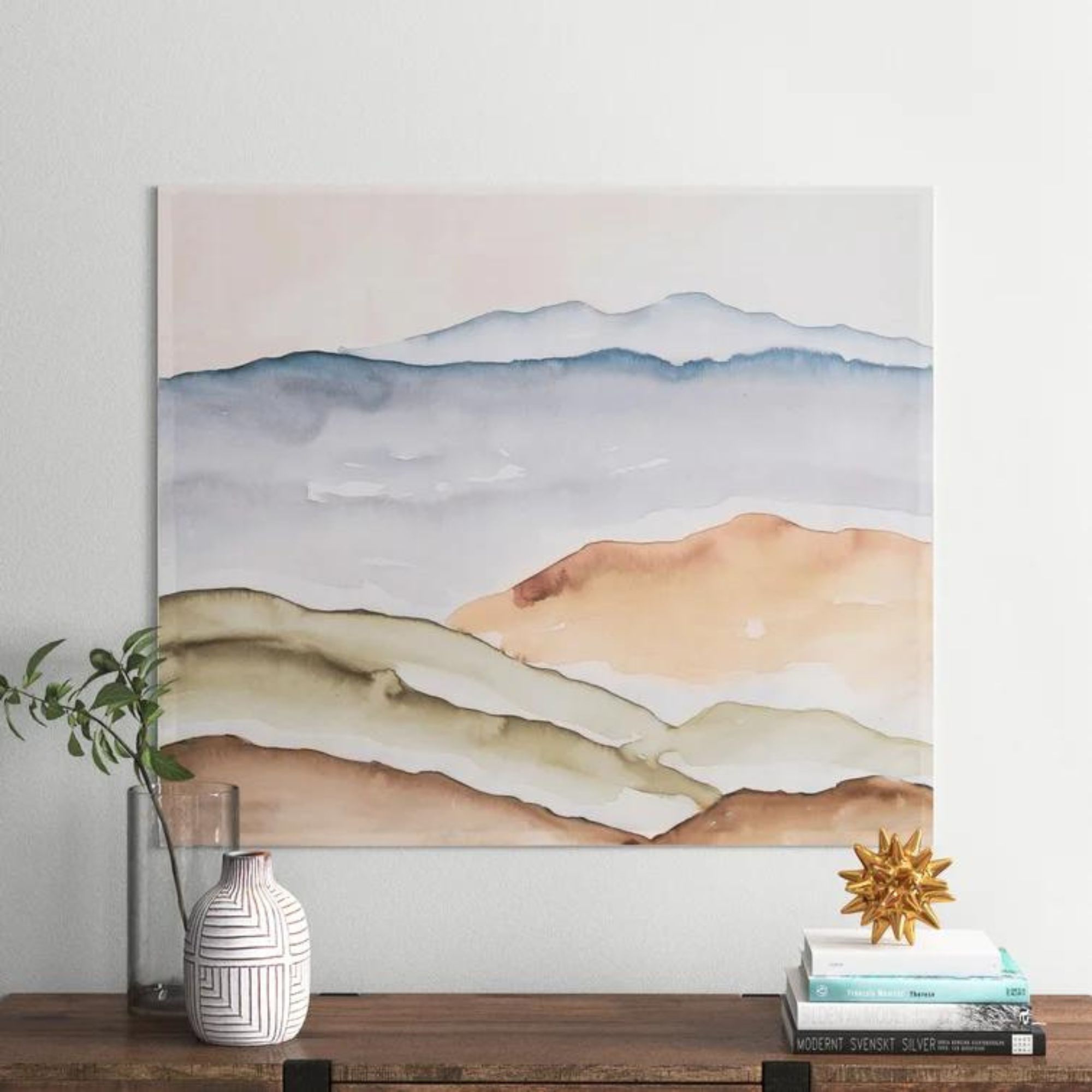
If you're looking for something a bit more 3D, Emily suggests hanging sculptures on those blank, wanting walls. In this living room, pictured below, a simplistic (yet still funky) curved sculpture accompanies a painting for a unique, unexpected vignette. And while this is a relatively pared-back example, there's no limit to the creativity that can come into play – it's all about making the space your own.
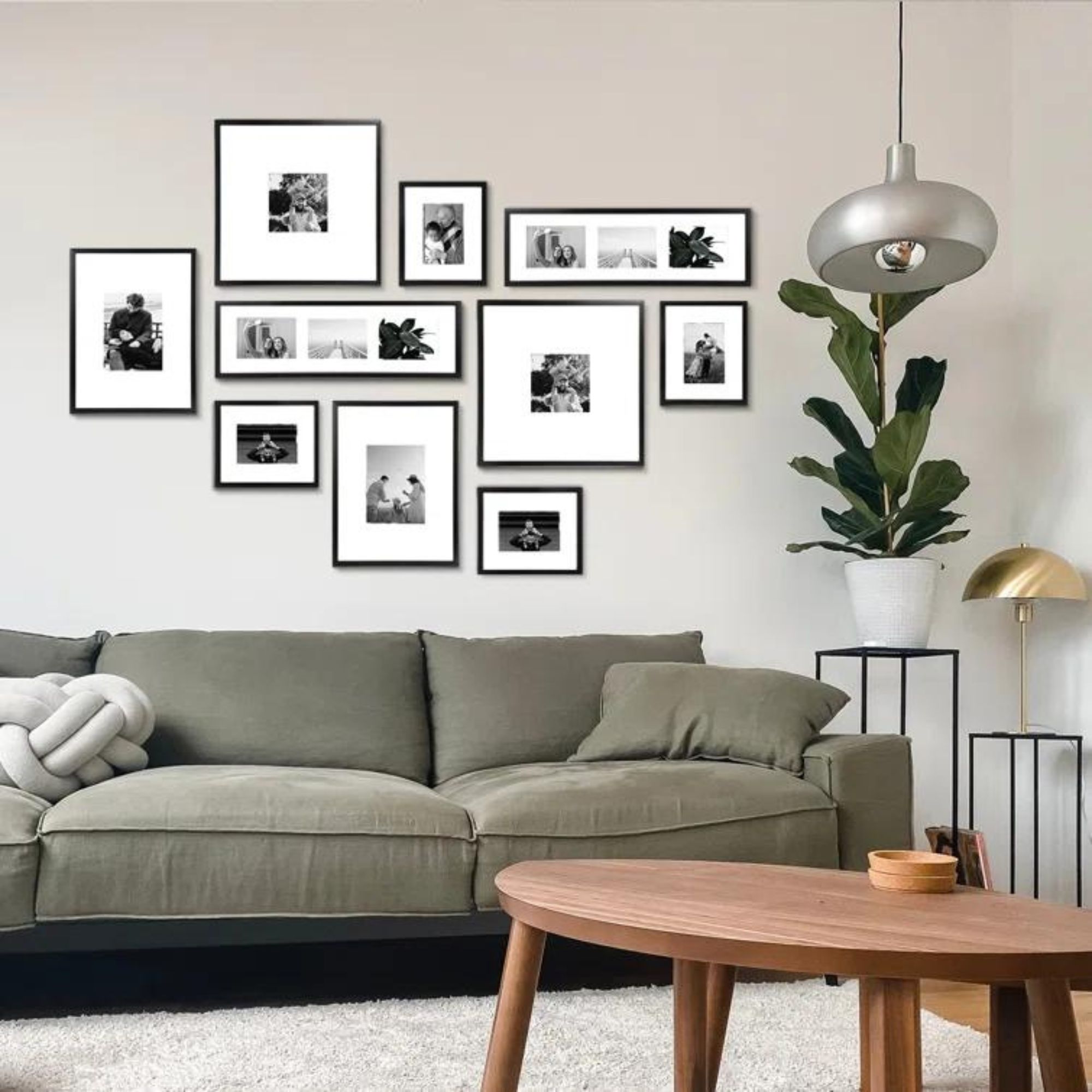
For her third tip, Emily references a classic: the gallery wall. A playful take on displaying art, the gallery wall allows you to mix and match colors, frames and art styles with ease. Gallery walls don't always have to look perfectly cohesive either – the collected, eclectic look can be just as lovely to look at.
'I’m a vintage art lover through and through so an awesome gallery wall will always be a favorite,' Emily tells H&G.
Sign up to the Homes & Gardens newsletter
Design expertise in your inbox – from inspiring decorating ideas and beautiful celebrity homes to practical gardening advice and shopping round-ups.

Sometimes, despite our design aspirations, a wall is better left empty. Though Emily says it's not often that her firm leaves a wall without any furniture or decoration, she adds that 'a very minimalist look' might benefit from one or two blank walls.
'Personally, I like to leave a little visual breathing room when it comes to decorating walls, but it’s rare that I will leave a wall completely empty without even a piece of furniture in front of it. It’s more about varying the art configurations and the pieces you place in front so that the walls aren’t competing for attention, nor are they totally blank,' she tells H&G.

Emily Henderson is Emily Henderson is a stylist, interior designer, HGTV host, and founder of Emily Henderson Design which she's been running for over a decade. Emily provides us with style inspiration every day over on her Instagram, and her blog is a great source of ideas for DIYs and making the most of your space.
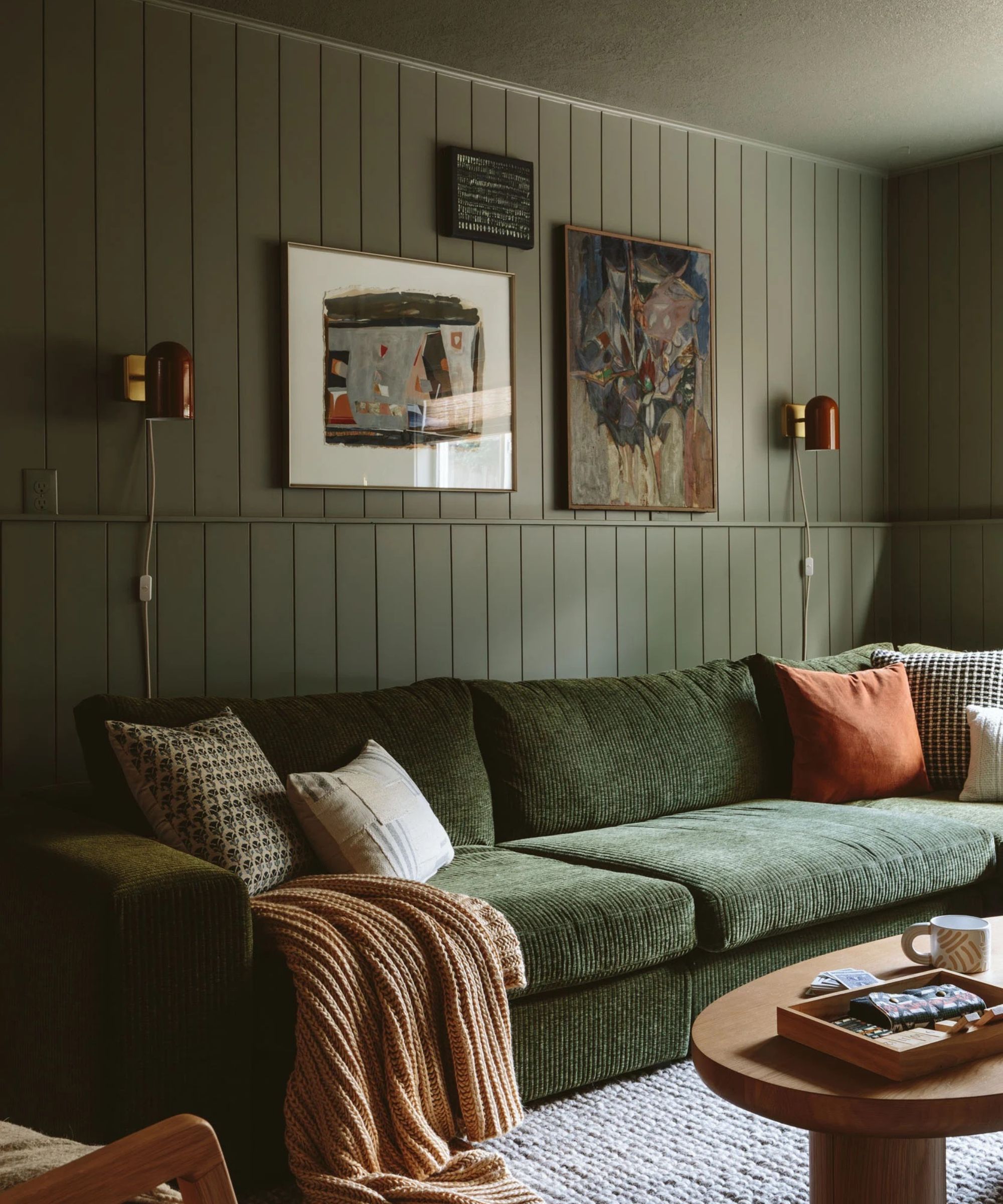
One of the biggest roadblocks of getting a wall design down is balance – and it's difficult to know where to start. Though Emily says no two spaces are the same, she offers a bit of advice for approaching the process.
'It’s so dependent on the space and your style but deciding on a focal wall will help you decide where to "go big." After that, you can see which walls could use a little more negative space so you don’t overwhelm the room visually,' she tells us.
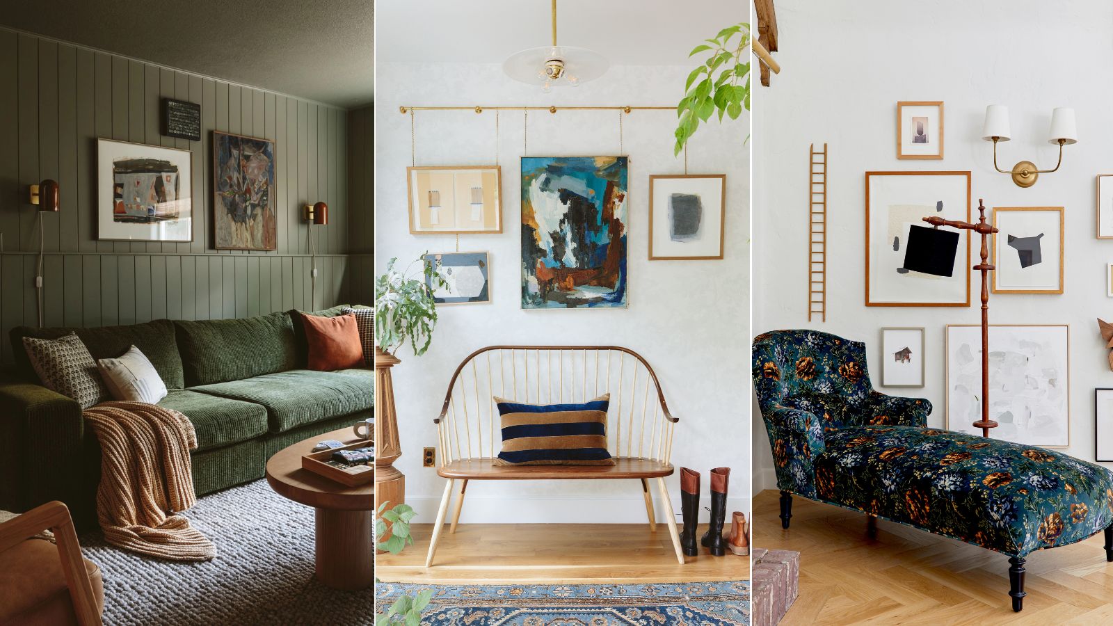
In this green living room, the focal wall features two larger pieces of art, and a set of classy sconces provides a bit of symmetry. The wall's deep, moody color palette and millwork take the layout to a new level, too, adding texture and an eye-catching foundation.
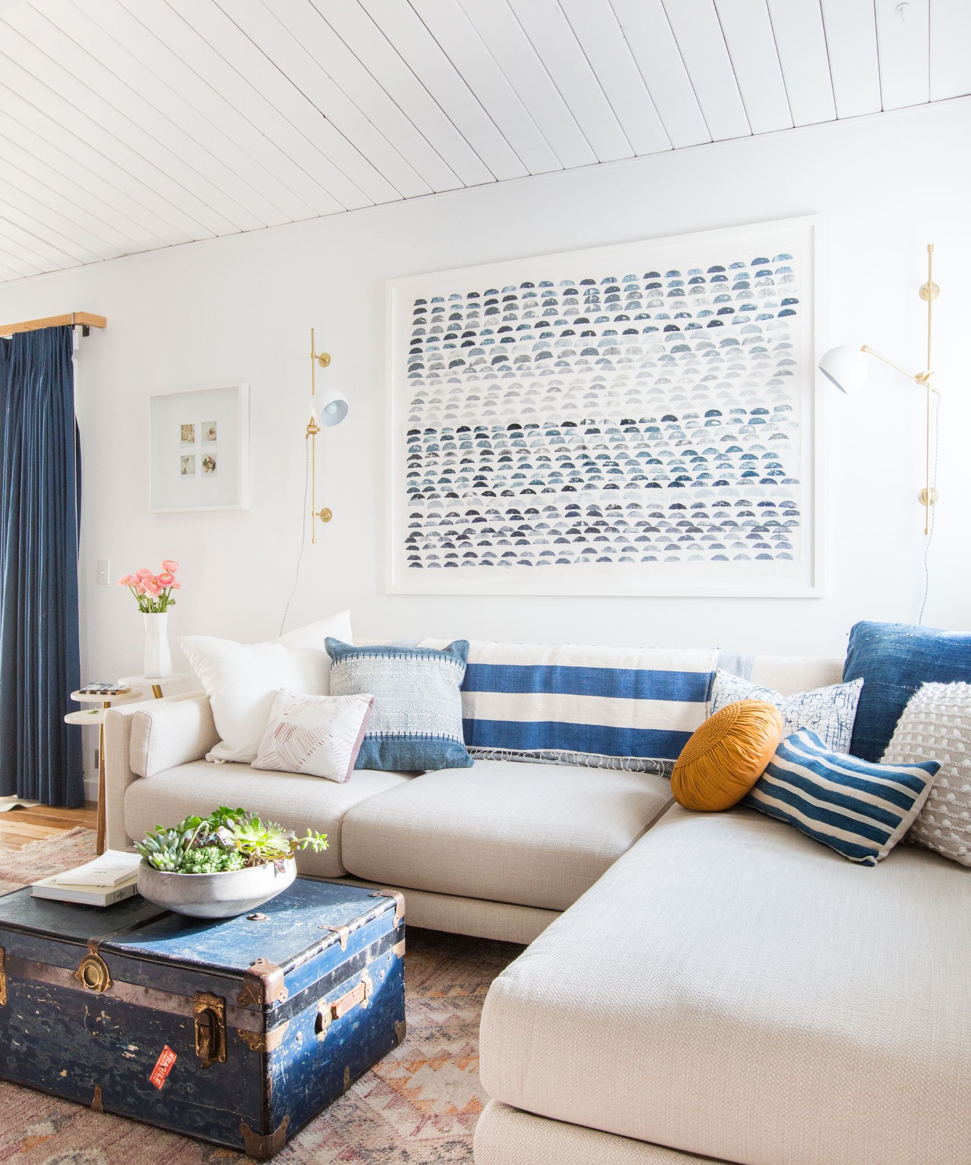
Although it's clear there's no 'right' or 'wrong' way to decorate a wall, Emily says that sticking with some general rules is best – at least until you've got a better handle on the process. She suggests starting big, and going little by little from there. With just a bit of considered adjusting, you'll have a cohesive look in no time.
'Don’t go "bitsy" with your wall pieces unless you are doing it in a real intentional way. Rules are made to be broken but unless you know how to break them it usually doesn’t end in a great result,' says Emily.
'So if you want to create, say, a gallery wall, choose a large "anchor" piece and build from there – don’t place the anchor in the center. Mixing up sizing is great and making sure, once you step back, that the colors and types of art look and feel balanced. The more you play the better you’ll get, I promise,' she continues.
There's truly an idea for every personality and design style when it comes to decorating a blank wall – it's tempting to try them all. No matter which wall styling idea is most up your street, Emily says in this case, more is more.
'Go big! So often scale is the biggest reason why a wall won’t feel right. I know bigger tends to mean more money but there are so many great DIYs out there that can help make things (like art) more affordable,' she says.

Abby was the Interior Design News Editor at Homes & Gardens and is now studying for her Master's degree in Journalism at City University, London. Prior to joining our team, she worked with Better Homes & Gardens, where she wrote and edited content about home decor, gardening tips, food news, and more. She studied Journalism and English Literature at New York University and moved to London to pursue her love of writing in 2023.
-
 Extend the lifespan of your appliance with 5 simple but crucial washing machine maintenance tips
From cleaning the filters to keeping the door open, experts reveal the washer tips they swear by
By Andy van Terheyden Published
-
 These are the 6 must-have colors to decorate with in April 2025
What do retro-inspired yellows and beautiful blues all have in common? They're on our hot list for the season ahead
By Sophia Pouget de St Victor Published
