Interior designer Jordan Samson shares the easiest way to hang artwork in just 4 steps
Follow these clever tips to ensure your art looks as cohesive as possible
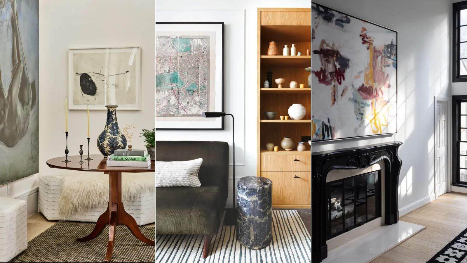

Decorating with art can be a highly effective way of adding personality to the home whilst helping tie together your whole decor scheme. Hanging art, however, can notoriously be a difficult task.
To ensure your art looks as good as possible, you will want to ensure it is hung correctly to create a balanced look with the rest of the room's decor – but it's not always clear where to start with this.
Expert interior designer Jordan Samson took to Instagram to share a video explaining his top tips for how to hang a picture, and they're really simple to follow.
A post shared by Jordan Samson (@jordansamsondesign)
A photo posted by on
Below, we've broken down Jordan's top tips for how to hang art which you can follow for your home decor ideas.
1. Measure the height

Firstly, you will want to make sure you measure the height of your artwork, depending on the space you're working with.
'For a singular piece of art, aim to hang it around 60 inches from the ground to the center of the piece which is about average eye level,' explains Jordan.
If you're working with multiple pieces of art rather than a single piece, the same rule applies, just make sure you use the middle of the grouping as your reference: 'For multiple pieces, think of them as one singular grouping. So now you're aiming for 60 inches from the ground to the center of that grouping.'
Sign up to the Homes & Gardens newsletter
Design expertise in your inbox – from inspiring decorating ideas and beautiful celebrity homes to practical gardening advice and shopping round-ups.
2. Leave enough white space
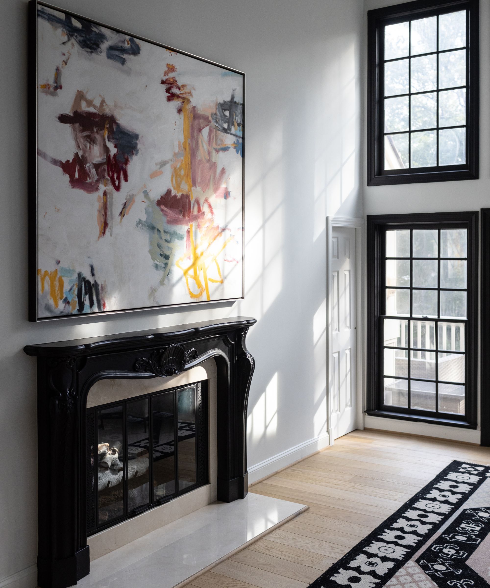
Considering how much of the wall the art you are hanging takes up is important to make sure it doesn't overpower the space. You will want to ensure there is enough white space left for the best look.
If you are working with a grouping of different artworks, the amount of white space left between each piece needs to also be considered, as Jordan explains in his video: 'For spacing, somewhere in that three to six-inch range will provide the most visually pleasing amount of white space.'
3. Pay attention to the orientation
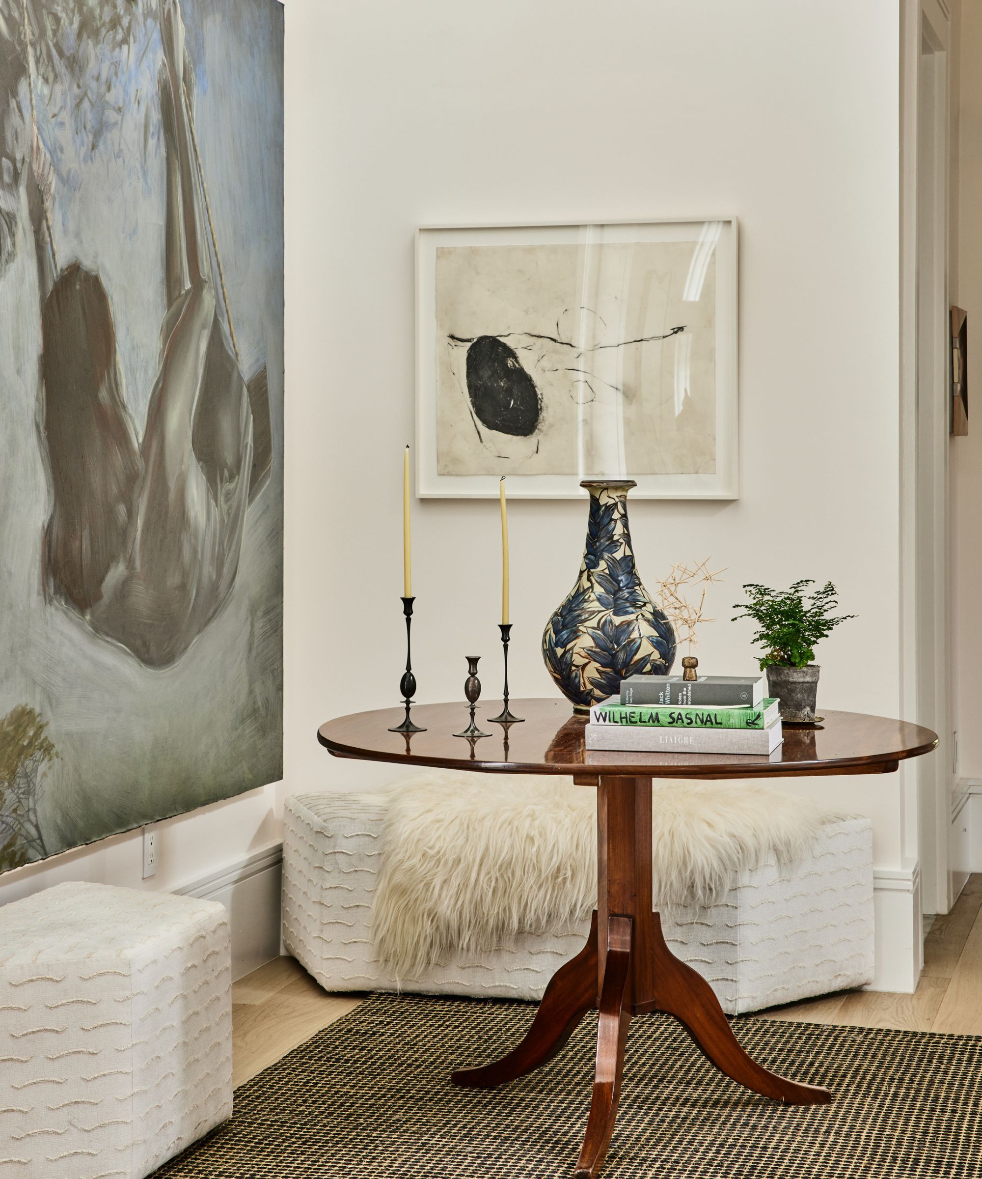
The orientation of your artwork will also play a big role in the overall look it creates. Thinking about whether you opt for a vertical or horizontal artwork will depend on the space you're working with.
In the video, Jordan shows an example of a narrow space with tall ceilings, which features a horizontal piece of artwork. He advises that this type of space would look better with a vertical piece instead, explaining that this would: 'provide a better balance of white space and draw the eye up instead of causing an awkward visual break.'
4. Factor in the furniture
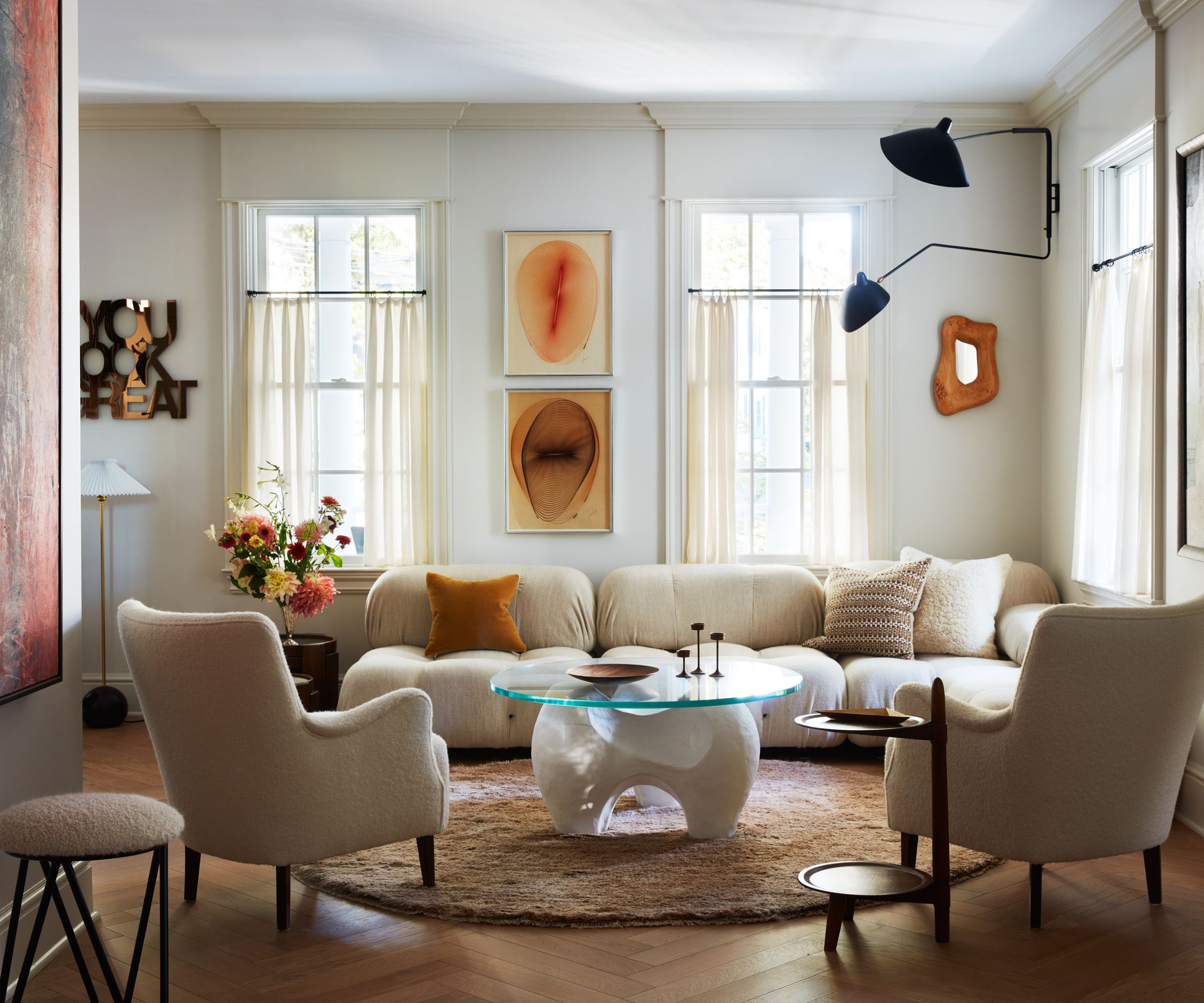
Jordan's final piece of advice is to pay attention to how large the artwork is in comparison to the furniture it sits above. This would most commonly be a sofa or a bed, so it's important to make sure the art works well with large furniture such as these.
'For art above any furniture, you want that piece to span about two-thirds the width of whatever furniture is below.' He adds: 'Aim to have about six to 10 inches between the furniture and the art piece,' to ensure the overall look is well balanced and visually appealing.
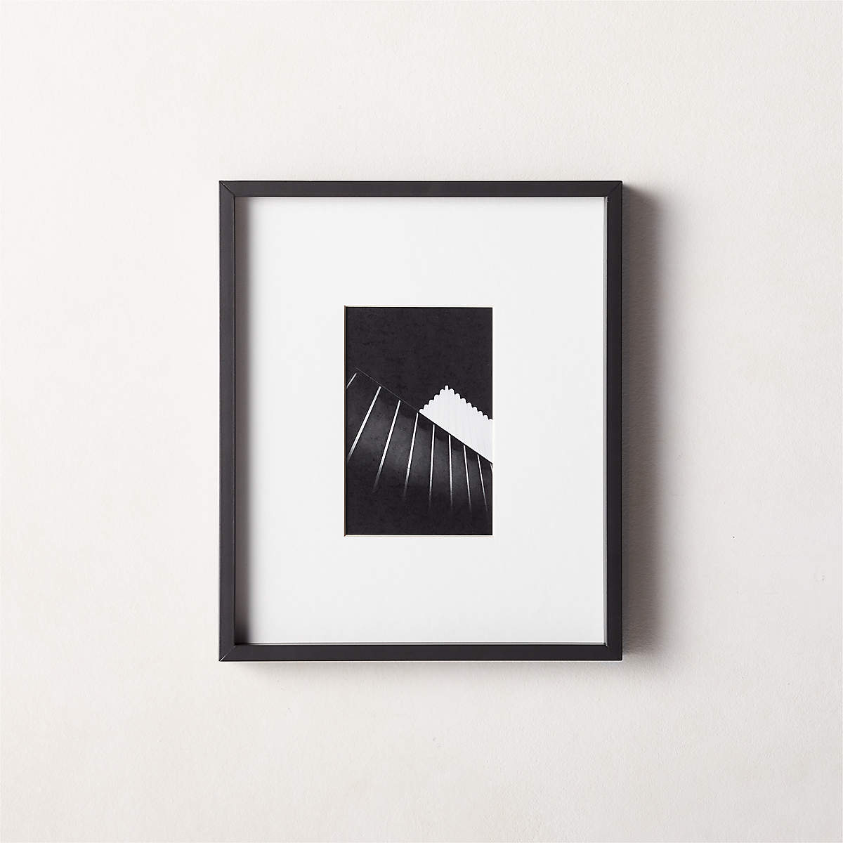
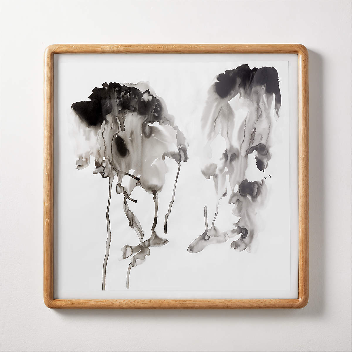
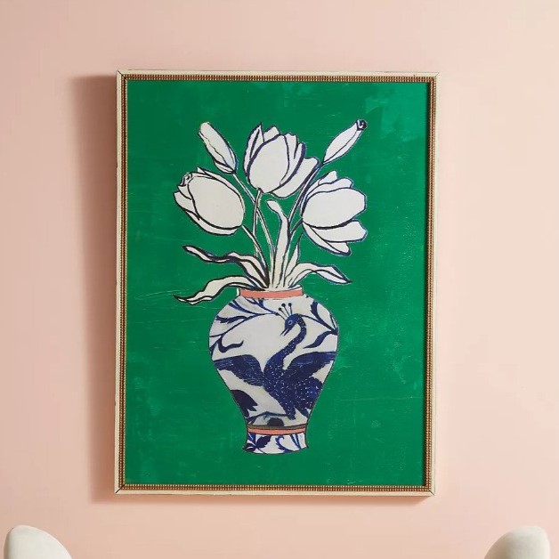
If you're looking to incorporate artwork into your home, we've rounded up some frames and wall art for you to shop below, to set you on your way by following these expert-approved steps. We've also rounded up unbreakable rules for displaying artwork to give you some more ideas.

Emily is a freelance interior design writer based in Scotland. Prior to going freelance in the spring of 2025, Emily was Homes & Gardens’ Paint & Color Editor, covering all things color across interiors and home decor for the Homes & Gardens website. Having gained specific expertise in this area, Emily is well-versed in writing about the latest color trends and is passionate about helping homeowners understand the importance of color psychology in home design. Her own interior design style reflects the simplicity of mid-century design and she loves sourcing vintage furniture finds for her tenement flat.
-
 Miley Cyrus breaks a cardinal decorating rule with her 'floating table' – her unexpected layout transforms a dead space into a stylish breakfast area
The singer tosses aside the maxim that furniture shouldn't be floating in the middle of the room with an innovative kitchen layout
By Sophie Edwards Published
-
 It’s a concept straight out of a fashionista's playbook, but I used the Sandwich Method to organize my kitchen shelves – it’s never looked sleeker
It transformed messy to mesmerizing in a matter of seconds
By Punteha van Terheyden Published
